
Search results for "Creating separate space" in Home Design Ideas
 DHD Architecture and Interior Design
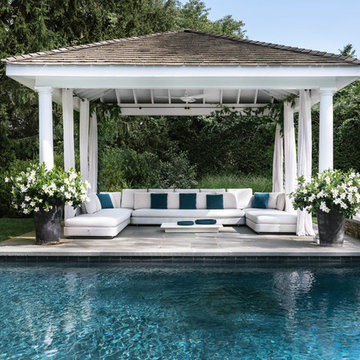
The Watermill House is a beautiful example of a classic Hamptons wood shingle style home. The design and renovation would maintain the character of the exterior while transforming the interiors to create an open and airy getaway for a busy and active family. The house comfortably sits within its one acre lot surrounded by tall hedges, old growth trees, and beautiful hydrangeas. The landscape influenced the design approach of the main floor interiors. Walls were removed and the kitchen was relocated to the front of the house to create an open plan for better flow and views to both the front and rear yards. The kitchen was designed to be both practical and beautiful. The u-shape design features modern appliances, white cabinetry and Corian countertops, and is anchored by a beautiful island with a knife-edge marble countertop. The island and the dining room table create a strong axis to the living room at the rear of the house. To further strengthen the connection to the outdoor decks and pool area of the rear yard, a full height sliding glass window system was installed. The clean lines and modern profiles of the window frames create unobstructed views and virtually remove the barrier between the interior and exterior spaces. The open plan allowed a new sitting area to be created between the dining room and stair. A screen, comprised of vertical fins, allows for a degree of openness, while creating enough separation to make the sitting area feel comfortable and nestled in its own area. The stair at the entry of the house was redesigned to match the new elegant and sophisticated spaces connected to it. New treads were installed to articulate and contrast the soft palette of finishes of the floors, walls, and ceilings. The new metal and glass handrail was intended to reduce visual noise and create subtle reflections of light.
Photo by Guillaume Gaudet
 Casework Inter Design
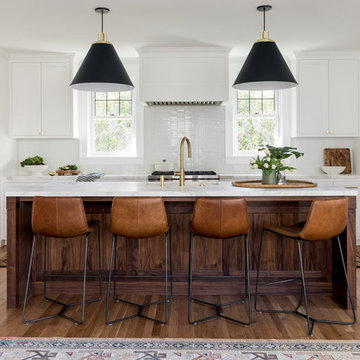
When the homeowners first purchased the 1925 house, it was compartmentalized, outdated, and completely unfunctional for their growing family. Casework designed the owner's previous kitchen and family room and was brought in to lead up the creative direction for the project. Casework teamed up with architect Paul Crowther and brother sister team Ainslie Davis on the addition and remodel of the Colonial.
The existing kitchen and powder bath were demoed and walls expanded to create a new footprint for the home. This created a much larger, more open kitchen and breakfast nook with mudroom, pantry and more private half bath. In the spacious kitchen, a large walnut island perfectly compliments the homes existing oak floors without feeling too heavy. Paired with brass accents, Calcutta Carrera marble countertops, and clean white cabinets and tile, the kitchen feels bright and open - the perfect spot for a glass of wine with friends or dinner with the whole family.
There was no official master prior to the renovations. The existing four bedrooms and one separate bathroom became two smaller bedrooms perfectly suited for the client’s two daughters, while the third became the true master complete with walk-in closet and master bath. There are future plans for a second story addition that would transform the current master into a guest suite and build out a master bedroom and bath complete with walk in shower and free standing tub.
Overall, a light, neutral palette was incorporated to draw attention to the existing colonial details of the home, like coved ceilings and leaded glass windows, that the homeowners fell in love with. Modern furnishings and art were mixed in to make this space an eclectic haven.
 Gayler Design Build
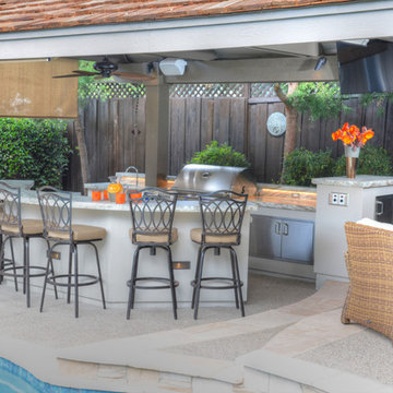
With a sizeable backyard and a love for entertaining, these clients wanted to build a covered outdoor kitchen/bar and seating area. They had one specific area by the side of their pool, with limited space, to build the outdoor kitchen.
There were immediate concerns about how to incorporate the two steps in the middle of the patio area; and they really wanted a bar that could seat at least eight people (to include an additional seating area with couches and chairs). This couple also wanted to use their outdoor living space year round. The kitchen needed ample storage and had to be easy to maintain. And last, but not least, they wanted it to look beautiful!
This 16 x 26 ft clear span pavilion was a great fit for the area we had to work with. By using wrapped steel columns in the corners in 6-foot piers, carpenter-built trusses, and no ridge beams, we created good space usage underneath the pavilion. The steps were incorporated into the space to make the transition between the kitchen area and seating area, which looked like they were meant to be there. With a little additional flagstone work, we brought the curve of the step to meet the back island, which also created more floor space in the seating area.
Two separate islands were created for the outdoor kitchen/bar area, built with galvanized metal studs to allow for more room inside the islands (for appliances and cabinets). We also used backer board and covered the islands with smooth finish stucco.
The back island housed the BBQ, a 2-burner cooktop and sink, along with four cabinets, one of which was a pantry style cabinet with pull out shelves (air tight, dust proof and spider proof—also very important to the client).
The front island housed the refrigerator, ice maker, and counter top cooler, with another set of pantry style, air tight cabinets. By curving the outside edge of the countertop we maximized the bar area and created seating for eight. In addition, we filled in the curve on the inside of the island with counter top and created two additional seats. In total, there was seating for ten people.
Infrared heaters, ceiling fans and shades were added for climate control, so the outdoor living space could be used year round. A TV for sporting events and SONOS for music, were added for entertaining enjoyment. Track lighting, as well as LED tape lights under the backsplash, provided ideal lighting for after dark usage.
The clients selected honed, Fantasy Brown Satin Quartzite, with a chipped edge detail for their countertop. This beautiful, linear design marble is very easy to maintain. The base of the islands were completed in stucco and painted satin gray to complement their house color. The posts were painted with Monterey Cliffs, which matched the color of the house shutter trim. The pavilion ceiling consisted of 2 x 6-T & G pine and was stained platinum gray.
In the few months since the outdoor living space was built, the clients said they have used it for more than eight parties and can’t wait to use it for the holidays! They also made sure to tell us that the look, feel and maintenance of the area all are perfect!
Find the right local pro for your project
 Drewett Works
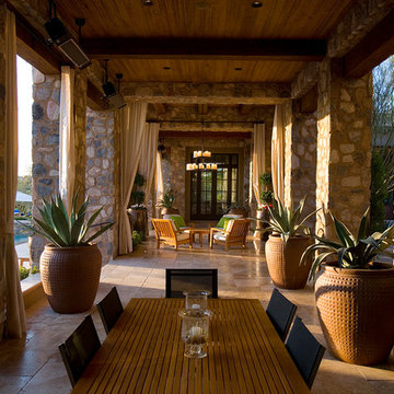
This Ranch Hacienda hillside estate boasts well over 13,000 square feet under roof. A loggia serves as the backbone for the design. Each space, both interior and exterior, has a direct response to the linear expression of outdoor space.
The exterior materials and detailing are rustic and simple in nature. The mass and scale create drama and correspond to the vast desert skyline and adjacent majestic McDowell mountain views.
Features of the house include a motor court with dual garages, a separate guest quarters, and a walk-in cooler.
Silverleaf is known for its embodiment of traditional architectural styles, and this house expresses the essence of a hacienda with its communal courtyard spaces and quiet luxury.
This was the first project of many designed by Architect C.P. Drewett for construction in Silverleaf, located in north Scottsdale.
Project Details:
Architecture | C.P. Drewett, AIA, DrewettWorks, Scottsdale, AZ
Builder | Sonora West Development, Scottsdale, AZ
Photography | Dino Tonn, Scottsdale, AZ

 Twelve Stones Designs, LLC
The owners of this kitchen had spent the money to upgrade the finishes in their kitchen upon building the home 12 years ago, but after living in the space for several years they realized how nonfunctional the layout really was. The (then) two preschool aged children had grown into busy, hungry teenagers with many friends who also liked to hang out at the house. So the family needed a more functional kitchen with better traffic flow, space for daily activities revolving around the kitchen at different times of day, and a kitchen that could accommodate cooking for and serving large groups. Furthermore, the dark, traditional finishes no longer reflected the homeowners’ style. They requested a brighter, more relaxed, coastal style that reflected their love of the seaside cities they like to visit.
Originally, the kitchen was U-shaped with a narrow island in the middle. The island created narrow aisles that bottle-necked at the dishwasher, refrigerator, and cooktop areas. There was a pass-through from the foyer into the kitchen, but the owners never liked that the pass-through was also located so close to the powder room. The awkward proximity was unappealing and made guests feel uncomfortable.
The kitchen’s storage was made up of lots of narrow cabinets, apothecary drawers, clipped corner units, and very few drawers. It lacked useful storage for the larger items the family used on a daily basis. And the kitchen’s only pantry was small closet that had only builder-grade, narrow shelving with no illumination to be able to see the contents inside.
Overall, the kitchen’s lighting plan was poorly executed. Only six recessed cans illuminated the entire kitchen and nook areas. The under cabinet lighting was not evenly distributed either. In fact, the builder had mis-placed the under cabinet lighting around the decorative pilasters which made for choppy, dark cubbies. Further, the builder didn’t include any lighting over the sink or the bar area, which meant whoever was doing the dishes was always in their own shadow. That, coupled with the steep overhang of the game room above made the bar area feel like a dim, cavernous space that wasn’t inviting or task oriented. The kitchen looked out into the main living space, but the raised bar and a narrow wall (which held the only large cabinet in the kitchen) created more of a barrier than a relationship to the living room or breakfast nook. In fact, one couldn’t even see the breakfast nook from the cooktop or sink areas due to its orientation. The raised bar top was too narrow to comfortably sit to either dine at or chat from due to the lack of knee space. The the homeowners confided that the kitchen felt more like a dark, dirty prison than place where the family, or their guests, wanted to gather and commune.
The clients' needs and desires were:
➢ to create a kitchen that would be a space the family loved to be in; to relate to the adjacent spaces all around, and to have better flow for entertaining large groups
➢ to remove the walls between the breakfast nook and living area and to be able to utilize the natural light from the windows in both those areas
➢ to incorporate a functional chopping block for prepping fresh food for home cooked meals, an island with a large sink and drain board, 2 pull out trash cans, and seating for at least the 2 teens to eat or do homework
➢ to design a kitchen and breakfast nook with an airy, coastal, relaxed vibe that blended with the rest of the house's coastal theme
➢ to integrate a layered lighting plan which would include ample general illumination, specific task lighting, decorative lighting, and lots of illuminated storage
➢ to design a kitchen with not only more storage for all the husband’s kitchen gadgets and collection of oils and spices, but smart storage, including a coffee/breakfast bar and a place to store and conceal the toaster oven and microwave
➢ to find a way to utilize the large open space between the kitchen, pantry area, and breakfast nook
Twelve Stones Designs achieved the owner's goals by:
➢ removing the walls between the kitchen and living room to allow the natural light to filter in from the adjacent rooms and to create a connection between the kitchen, nook, and living spaces for a sense of unity and communion
➢ removing the existing pantry and designing 3 large pantry style cabinets with LED tape lights and rollout drawers to house lots of kitchen appliances, gadgets, and tons of groceries. We also took the cabinets all the way up to the 9’ ceiling for additional storage for seasonal items and bulk storage.
➢ designing 2 islands - 1 with a gorgeous black walnut chopping block that houses a drawer for chopping and carving knives and a custom double pull out trash unit for point of use utilization - and 1 that houses the dishwasher, a large Blanco Gourmet sink with integrated drain board, woven baskets for fresh root vegetables and kitchen towels, plenty of drawer storage for kitchen items, and bar seating for up to 4 diners.
➢ closing off the space between the kitchen and the powder room to create a beautiful new private alcove for the powder room as well as adding some decorative storage. This also gave us space to include more tall storage near the new range for precision placement of the husband’s extensive oil and spice collection as well as a location for a combo-steam oven the wife wanted for baking and cooking healthy meals.
The project is enhanced functionally by:
➢ incorporated USB and standard receptacles for the kids’ laptops and phone charging in the large island
➢ designing the small island to include additional open shelving for items used on a daily basis such as a variety of bowls, plates, and colanders. This set up also works well for the husband who prefers to “plate” his dinners in restaurant-style fashion before presenting them to the table.
➢ the integration of specific storage units, such as double stacked cutlery drawers, a custom spice pull-out, a Kuerig coffee and tea pod drawer, and custom double stacked utensil drawers
➢ moving the refrigerator to the old oven location - this eliminated the bottle neck as well as created a better relationship to the eating table. It also utilizes the floor space between the pantry, nook, and kitchen
➢ creating a banquet style breakfast nook - this banquette seating not only doubles the amount of seating for large gatherings but it better utilizes the odd space between the kitchen and the previous nook area. It also helps to create a distinct pathway from the mudroom room through the pantry area, kitchen, nook, and living room.
➢ the coffee/breakfast bar area which includes the perfect location for the concealed microwave and toaster oven, convenient storage for the coffee pods and tea accoutrements. Roll-out drawers below also house the smoothie maker, hot water kettle, and a plethora of smoothie-making ingredients such as protein powders, smoothie additives, etc. Furthermore, the drawers below the Keurig house measuring utensil, cutlery, baking supplies and tupperware storage.
➢ incorporating lots of wide drawers and pullouts to accommodate large cookware.
➢ utilizing as much vertical space as possible by building storage to the ceiling which accommodates the family’s abundant amount of serving platters, baking sheets, bakeware, casserole dishes, and additional cutting boards.
The project is enhanced aesthetically by:
➢ new 5-piece Versailles pattern porcelain tile that now seamlessly joins the entire down stairs area together creating a bright, cohesiveness feeling instead of choppy separated spaces - it also adds a coastal feeling
➢ designing a cabinet to conceal the microwave and toaster oven
➢ the coastal influenced light fixtures over the nook table and island
➢ the sandy colors of the Langdon Cambria countertops. The swirling pattern and sparkling quartz pieces remind the homeowner of black-and-tan sandy beaches
➢ the striped banquet seating whose creamy white background and blue-green stripes were the inspiration for the cabinet and wall colors.
➢ All the interior doors were painted black to coordinate with the blacks and grays in the backsplash tile and countertop. This also adds a hint of tailored formality to an otherwise casual space.
➢ the use of WAC's Oculux small aperture LED units for the overhead lighting complimented with Diode LED strips for task lighting under the cabinets and inside the pantry and glass wall cabinets. All of the lighting applications are on separate dimmer switches.
Innovative uses of materials or construction methods by Realty Restoration LLC:
➢ Each 1-1/2” x 3” block of reclaimed end-grain black walnut that makes up the center island chopping block was hand milled and built in the shop. It was designed to look substantial and proportional to the surrounding elements, executed by creating the 4 inch tall top with a solid wood chamfered edge band.
➢ The metal doors on either side of the vent hood were also custom designed for this project and built in the Realty Restoration LLC shop. They are made 1x2, 11-gauge mild steel with ribbed glass. Weighing 60 lbs a piece, heavy duty cabinet hinges were added to support the weight of the door and keep them from sagging.
➢ Under-cabinet receptacles were added along the range wall in order to have a clean, uninterrupted backsplash.
Design obstacles to overcome:
➢ Because we were removing the demising walls between the kitchen and living room, we had to find a way to plumb and vent the new island. We did this by tunneling through the slab (the slab had post tension cables which prevented us from just trenching) to run a new wet vent through a nearby structural wall. We pulled the existing hot and cold lines between upper floor joists and ran them down the structural wall as well and up through a conduit in the tunnel.
➢ Since we were converting from wall overs to a gas range it allowed us to utilize the 220 feed for the wall ovens to provide a new sub panel for all the new kitchen circuits
➢ Due to framing deficiencies inherited from the original build there was a 1-1/2” differential in the floor-to-ceiling height over a 20 foot span; by utilizing the process of cutting and furring coupled with the crown moulding details on the cabinet elevations we were able to mask the problem and provide seamless transitions between the cabinet components.
Evidence of superior craftsmanship:
➢ uniquely designed, one-of-a-kind metal “X” end panels on the large island. The end panels were custom made in the Realty Restoration LLC shop and fitted to the exact dimensions of the island. The welding seams are completely indistinguishable - the posts look like they are cut from a single sheet of metal
➢ square metal posts on the small island were also custom made and designed to compliment and carry through the metal element s throughout the kitchen
➢ the beautiful, oversized end panels on the pantry cabinets which give the breakfast nook a tailored look
➢ integrating a large format 5 piece Versailles tile pattern to seamlessly flow from the existing spaces into the new kitchen space
➢ By constructing a custom cabinet that jogged around a corner we could not remodel (housing the entry way coat closet) we were able to camouflage the adjacent wall offset within the upper and lower cabinets. By designing around the existing jog in the structural walls we accomplished a few things: we were able to find the space to house, and hide, the microwave and toaster oven yet still have a clean cohesive appearance from the kitchen side. Additionally, the owners were able to keep their much needed coat closet and we didn’t have to increase the budget with unnecessary structural work.
 TEW Design Studio
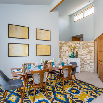
This home is a true gem in the heart of MacGregor Downs community in Cary, NC. Built in the 1980's in true Modernist design and architecture, the new owners wanted to keep the integrity of the original design. We redesigned the Half Bath, created floor plan layouts for new furniture, spec'd out furniture, accessories, flooring material, lighting, and artwork, as well as worked on brightening the wall and ceiling paint colors. One challenge we faced during the design process were the very tall ceilings, the very wide walls, and unusual angles. We chose interesting , engaging, and minimalistic artwork for the walls, which proved a successful solution. Another challenge was having a large open angled living room space; we created the perfect layout with separate functional gathering areas and eliminated unused corners.
Photo credit: Bob Fortner
 kimberly peck architect
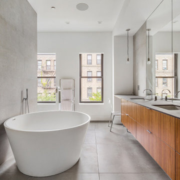
This brownstone, located in Harlem, consists of five stories which had been duplexed to create a two story rental unit and a 3 story home for the owners. The owner hired us to do a modern renovation of their home and rear garden. The garden was under utilized, barely visible from the interior and could only be accessed via a small steel stair at the rear of the second floor. We enlarged the owner’s home to include the rear third of the floor below which had walk out access to the garden. The additional square footage became a new family room connected to the living room and kitchen on the floor above via a double height space and a new sculptural stair. The rear facade was completely restructured to allow us to install a wall to wall two story window and door system within the new double height space creating a connection not only between the two floors but with the outside. The garden itself was terraced into two levels, the bottom level of which is directly accessed from the new family room space, the upper level accessed via a few stone clad steps. The upper level of the garden features a playful interplay of stone pavers with wood decking adjacent to a large seating area and a new planting bed. Wet bar cabinetry at the family room level is mirrored by an outside cabinetry/grill configuration as another way to visually tie inside to out. The second floor features the dining room, kitchen and living room in a large open space. Wall to wall builtins from the front to the rear transition from storage to dining display to kitchen; ending at an open shelf display with a fireplace feature in the base. The third floor serves as the children’s floor with two bedrooms and two ensuite baths. The fourth floor is a master suite with a large bedroom and a large bathroom bridged by a walnut clad hall that conceals a closet system and features a built in desk. The master bath consists of a tiled partition wall dividing the space to create a large walkthrough shower for two on one side and showcasing a free standing tub on the other. The house is full of custom modern details such as the recessed, lit handrail at the house’s main stair, floor to ceiling glass partitions separating the halls from the stairs and a whimsical builtin bench in the entry.
Sponsored
Columbus, OH
Free consultation for landscape design!

Peabody Landscape Group
Franklin County's Reliable Landscape Design & Contracting
 Adams + Beasley Associates
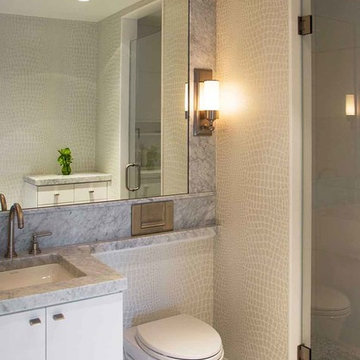
A complete full gut remodel of a 4,000 sq ft two-story penthouse residence, this project featured one of a kind views of the Boston public garden and Beacon Hill. A large central gallery flooded with gorgeous diffused light through two full stories of window glass. Clean linear millwork details compliment the structural glass, steel and walnut balustrades and handrailings that grace the upper gallery, reading nook, and stairs. A bleached walnut wet bar with backlit honey onyx backsplash and floating star fire glass shelves illuminated the lower gallery. It was part of a larger motif, which resonated through each of the unique and separate living spaces, connecting them to the larger design intention.
A bleached walnut media room doubles as a fourth bedroom. It features a king size murphy bed seamlessly integrated into the full wall panel. A gracious shower in the adjoining bathroom, cleverly concealed behind an innocuous interior door, created a truly unique formal powder room that can reveal a full bath when the house is full of guests. A blend of warm wood, soft whites, and a palate of golds reflected in the stone (calacatta/onyx) textiles and wall coverings, this project demonstrates the powerful results of a consistent design intention, thoughtful engineering, and best practice construction as executed by our talented team of craftsmen and women.
Interior Design - Lewis Interiors
Photography - Eric Roth
 Gilmans Kitchens and Baths
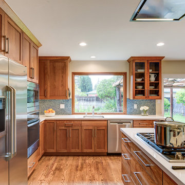
The original kitchen was tight and cramped, offering little storage and function. the clients wanted more countertop space and more storage solutions. They also wanted an open space plan, with views into their backyard, and to allow more natural light into the space.
The wall separating the kitchen and living space was removed and a large picturesque window was installed above the sink, creating a large and open space. A large island with open cubbies housed much of the homeowner's pots and pans, and other countertop appliances.
Treve Johnson Photography
 StudioLAB
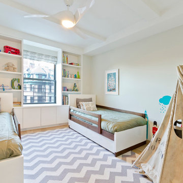
Steps from Riverside Park, the existing apartment had previously not been renovated for 30 years and was in dire need of a complete overhaul. StudioLAB was presented with the challenge of re-designing the space to fit a modern family’s lifestyle today with the flexibility to adjust as they evolve into their tomorrow. The existing formal closed kitchen and dining room were combined and opened up to allow the owners to entertain in an open living environment and allow natural light to permeate throughout different exposures of the apartment. Bathrooms were gutted, enlarged and reconfigured. Central air conditioning was added with minimal ducting as to be hidden and not seem clunky. Built-in bookshelves run the length of the perimeter walls below windows, concealing radiators and providing extra valuable storage in every room. A neutral color palette, minimalist details, and refined materials create a warm, modern atmosphere. Light brown oak veneered archways as well as LED cove ceilings are used to separate programmatic spaces visually without the use of physical partitions. A charcoal stained cube built-in was designed with in the foyer to create deep storage while continuing into the kitchen to hide the built-in refrigerator and pantry visually connecting the two spaces. The family’s two children share one large bedroom in order to create a playroom in the other which can also serves as a guest room when needed. The master bedroom features a full height grey stained ash veneered wall unit that serves as the predominant clothes storage. A panel housing the TV slides to reveal more clothes storage behind. To utilize the exiting formal maid’s room behind the kitchen, a small study and powder room were created that house laundry machines as well.
 Terravista Interior Design Group
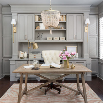
The client wanted to create a traditional rustic design with clean lines and a feminine edge. She works from her home office, so she needed it to be functional and organized with elegant and timeless lines. In the kitchen, we removed the peninsula that separated it for the breakfast room and kitchen, to create better flow and unity throughout the space.
 River Valley Landscapes
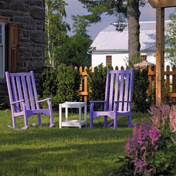
 This project presented unique opportunities that are not often found in residential landscaping. The homeowners were not only restoring their 1840's era farmhouse, a piece of their family’s history, but also enlarging and updating the home for modern living. The landscape designers continued this idea by creating a space that is a modern day interpretation of an 1840s era farm rather then a strict recreation. The resulting design combines elements of farm living from that time, as well as acknowledging the property’s history as a horse farm, with staples of 21st century landscapes such as space for outdoor living, lighting, and newer plant varieties.
Guests approach from the main driveway which winds through the property and ends at the main barn. There is secondary gated driveway just for the homeowners. Connected to this main driveway is a narrower gravel lane which leads directly to the residence. The lane passes near fruit trees planted in broken rows to give the illusion that they are the remains of an orchard that once existed on the site. The lane widens at the entrance to the gardens where there is a hitching post built into the fence that surrounds the gardens and a watering trough. The widened section is intended as a place to park a golf cart or, in a nod to the home’s past, tie up horses before entering. The gravel lane passes between two stone pillars and then ends at a square gravel court edged in cobblestones. The gravel court transitions into a wide flagstone walk bordered with yew hedges and lavender leading to the front door.
Directly to the right, upon entering the gravel court, is located a gravel and cobblestone edged walk leading to a secondary entrance into the residence. The walk is gated where it connects with the gravel court to close it off so as not to confuse visitors and guests to the main residence and to emphasize the primary entrance. An area for a bench is provided along this walk to encourage stopping to view and enjoy the gardens.
On either side of the front door, gravel and cobblestone walks branch off into the garden spaces. The one on the right leads to a flagstone with cobblestone border patio space. Since the home has no designated backyard like most modern suburban homes the outdoor living space had to be placed in what would traditionally be thought of as the front of the house. The patio is separated from the entrance walk by the yew hedge and further enclosed by three Amelanchiers and a variety of plantings including modern cultivars of old fashioned plants such as Itea and Hydrangea. A third entrance, the original front door to the 1840’s era section, connects to the patio from the home’s kitchen, making the space ideal for outdoor dining.
The gravel and cobblestone walk branching off to the left of the front door leads to the vegetable and perennial gardens. The idea for the vegetable garden was to recreate the tradition of a kitchen garden which would have been planted close to the residence for easy access. The vegetable garden is surrounded by mixed perennial beds along the inside of the wood picket fence which surrounds the entire garden space. Another area designated for a bench is provided here to encourage stopping and viewing. The home’s original smokehouse, completely restored and used as a garden shed, provides a strong architectural focal point to the vegetable garden. Behind the smokehouse is planted lilacs and other plants to give mass and balance to the corner and help screen the garden from the neighboring subdivision. At the rear corner of the garden a wood arbor was constructed to provide a structure on which to grow grapes or other vines should the homeowners choose to.
The landscape and gardens for this restored farmhouse and property are a thoughtfully designed and planned recreation of a historic landscape reinterpreted for modern living. The idea was to give a sense of timelessness when walking through the gardens as if they had been there for years but had possibly been updated and rejuvenated as lifestyles changed. The attention to materials and craftsmanship blend seamlessly with the residence and insure the gardens and landscape remain an integral part of the property. The farm has been in the homeowner’s family for many years and they are thrilled at the results and happy to see respect given to the home’s history and to its meticulous restoration.
 Hillside Nurseries
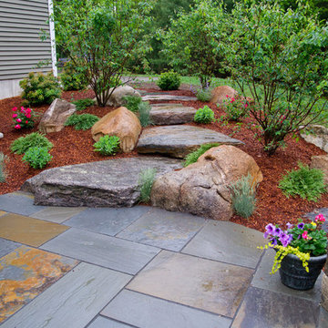
It was pretty much a blank area but with some elevation issues. The seating wall served 2 purposes as a seating space but also to retain some of the patio. Natural fieldstone steppers lead from the driveway area to the patio. An assortment of perennials and plantings soften the hardscape project. Serviceberry, hybrid dogwood, and a large dwarf pine are the anchor plants. We also created a raised vegetable garden space off the patio too.
Marc Depoto (Hillside Nurseries Inc.)

Sponsored
Columbus, OH
Free consultation for landscape design!
Peabody Landscape Group
Franklin County's Reliable Landscape Design & Contracting
 Jordan Design Build Group
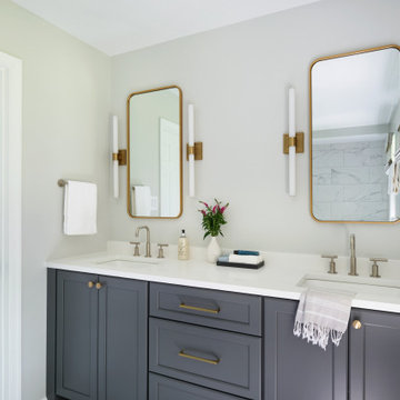
When our clients purchased their Fairfax Station home at the beginning of the pandemic, the main living areas had already been updated. However, three bathrooms were still stuck in the1980s. We tackled the upstairs primary and hall bathrooms first to ensure our clients had a working bathroom while construction was underway. Once the upstairs renovations were completed, we moved on to the main level guest bathroom.
Primary Bathroom Transformation:
The old primary bathroom had a small dark shower stall, a basic alcove tub, and the original 40-year-old plumbing, vanities, and tile. We completely gutted the space and made some minor layout changes to maximize functionality and create a serene retreat complete with free-standing soaking tub and generous walk-in shower. Expanding the shower’s footprint and replacing the full-height walls with a glass surround opened up the space, making the entire bathroom feel larger and more airy. Marble shelves and a shaving ledge add convenience and style. A large double vanity provides ample storage and a full 7 feet of countertop space. Mixed metal finishes elevate the design, with soft gold accents and brushed nickel fixtures pairing perfectly with the classic gray vanity and muted marble tiles. We reconfigured the dressing area, added custom closet built-ins, and installed new carpet throughout to complete this tailored transformation.
Hall Bathroom Update:
The hall bathroom did not require any significant layout changes, but the dated fixtures and finishes all had to go. We wanted the new bathroom to feel both classic and fresh, so we opted for a polished finish palette, including sleek white subway tiles on the walls and marble-look hexagonal on the floor. A furniture-style vanity, in dark navy, was paired with a distinctive Carrara marble top and sleek chrome fixtures for a modern twist. The tub+shower combo features both a standard shower head and multi-function handheld for optimum flexibility – great for bathing children and pets alike. This renovation blended classic details with modern functionality, creating a bathroom that’s both timeless and fresh.
Guest Bathroom Update:
The home’s main level bathroom serves as both powder room and guest bathroom with 2 separate entrances. The in-swing door from the guest bedroom made the already narrow bathroom feel even more cramped. By installing a pocket door at the guest bedroom, we immediately improved the flow and usability of the space. The shower was upgraded with handcrafted white subway tile and contrasting grout, creating a clean, tailored look that elevates the room. Thoughtful details—like discreet grab bars and a handheld shower on a slide bar—make the space adaptable and comfortable for guests of all ages. A marble mosaic floor sets a refined backdrop for the freestanding black vanity, while the cross-bar handles offer a nod to the past on these modern-day fixtures.
 OLSON LEWIS + Architects
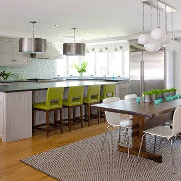
This New England home has the essence of a traditional home, yet offers a modern appeal. The home renovation and addition involved moving the kitchen to the addition, leaving the resulting space to become a formal dining and living area.
The extension over the garage created an expansive open space on the first floor. The large, cleverly designed space seamlessly integrates the kitchen, a family room, and an eating area.
A substantial center island made of soapstone slabs has ample space to accommodate prepping for dinner on one side, and the kids doing their homework on the other. The pull-out drawers at the end contain extra refrigerator and freezer space. Additionally, the glass backsplash tile offers a refreshing luminescence to the area. A custom designed informal dining table fills the space adjacent to the center island.
Paint colors in keeping with the overall color scheme were given to the children. Their resulting artwork sits above the family computers. Chalkboard paint covers the wall opposite the kitchen area creating a drawing wall for the kids. Around the corner from this, a reclaimed door from the grandmother's home hangs in the opening to the pantry. Details such as these provide a sense of family and history to the central hub of the home.
Builder: Anderson Contracting Service
Interior Designer: Kristina Crestin
Photographer: Jamie Salomon
 Arise Art Group
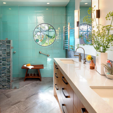
These clients have a high sense of design and have always built their own homes. They just downsized into a typical town home and needed this new space to stand out but also be accommodating of aging in place. The client, Jim, has a handful of challenges ahead of him with dealing with Parkinson and all of it symptoms. We optimized the shower, enlarging it by eliminating the tub and not using a shower door. We were able to do a curbless shower, reducing the likelihood of falling. We used larger tiles in the bathroom and shower but added the anti slip porcelain. I included a built-in seat in the shower and a stand-alone bench on the other side. We used a separate hand shower and easy to grab handles.
A natural palette peppered with some aqua and green breathes fresh, new life into a re-imagined UTC town home. Choosing materials and finishes that have higher contrast helps make the change from flooring to wall, as well as cabinet to counter, more obvious. Large glass wall tiles make the bathroom seem much larger. A flush installation of drywall to tile is easy on the eye while showing the attention to detail.
A modern custom floating vanity allows for walker wheels if needed. Personal touches like adding a filter faucet at the sink makes his trips to take medicine a bit easier.
One of my favorite things in design for any project is lighting. Not only can lighting add to the look and feel of the space, but it can also create a safer environment. Installing different types of lighting, including scones on either side of the mirror, recessed can lights both inside and outside of the shower, and LED strip lighting under the floating vanity, keep this modern bathroom current and very functional. Because of the skylight and the round window, light is allowed in to play with the different colors in the glass and the shapes around the room, which created a bright and playful bathroom.
It is not often that I get to play with stain-glass, but this existing circular window, that we could NOT change, needed some love. We used a local craftsman that allowed us to design a playful stain-glass piece for the inside of the bathroom window, reminding them of their front door in their custom home years ago.
 Haven Design and Construction
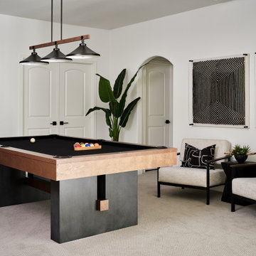
This sophisticated game room provides hours of play for a young and active family. The black, white and beige color scheme adds a masculine touch. Wood and iron accents are repeated throughout the room in the armchairs, pool table, pool table light fixture and in the custom built in bar counter. This pool table also accommodates a ping pong table top, as well, which is a great option when space doesn't permit a separate pool table and ping pong table. Since this game room loft area overlooks the home's foyer and formal living room, the modern color scheme unites the spaces and provides continuity of design. A custom white oak bar counter and iron barstools finish the space and create a comfortable hangout spot for watching a friendly game of pool.

Sponsored
Columbus, OH

Structural Remodeling
Franklin County's Heavy Timber Specialists | Best of Houzz 2020!
 BK Interior Design
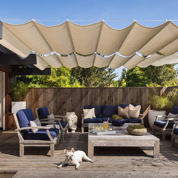
This space is perfect for entertaining! When the owners originally moved in, this deck was not here. There were several steps down from the kitchen door, and the stone slabs were a toe-stubbing minefield.
We added the deck and designed it perfectly for entertaining. Since we had several large pine trees removed from the property, we increased sun exposure creating a need for more shade. We had this awning custom made by PJ Canvas in Santa Rosa, CA. The awning tucks neatly under the roof of the house during the rainy months.
 DHD Architecture and Interior Design
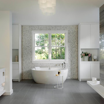
The Watermill House is a beautiful example of a classic Hamptons wood shingle style home. The design and renovation would maintain the character of the exterior while transforming the interiors to create an open and airy getaway for a busy and active family. The house comfortably sits within its one acre lot surrounded by tall hedges, old growth trees, and beautiful hydrangeas. The landscape influenced the design approach of the main floor interiors. Walls were removed and the kitchen was relocated to the front of the house to create an open plan for better flow and views to both the front and rear yards. The kitchen was designed to be both practical and beautiful. The u-shape design features modern appliances, white cabinetry and Corian countertops, and is anchored by a beautiful island with a knife-edge marble countertop. The island and the dining room table create a strong axis to the living room at the rear of the house. To further strengthen the connection to the outdoor decks and pool area of the rear yard, a full height sliding glass window system was installed. The clean lines and modern profiles of the window frames create unobstructed views and virtually remove the barrier between the interior and exterior spaces. The open plan allowed a new sitting area to be created between the dining room and stair. A screen, comprised of vertical fins, allows for a degree of openness, while creating enough separation to make the sitting area feel comfortable and nestled in its own area. The stair at the entry of the house was redesigned to match the new elegant and sophisticated spaces connected to it. New treads were installed to articulate and contrast the soft palette of finishes of the floors, walls, and ceilings. The new metal and glass handrail was intended to reduce visual noise and create subtle reflections of light.
Photo by Guillaume Gaudet
 SkB Architects
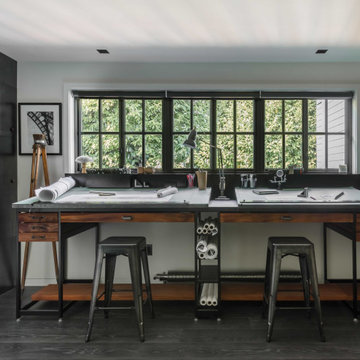
Originally built in 1955, this modest penthouse apartment typified the small, separated living spaces of its era. The design challenge was how to create a home that reflected contemporary taste and the client’s desire for an environment rich in materials and textures. The keys to updating the space were threefold: break down the existing divisions between rooms; emphasize the connection to the adjoining 850-square-foot terrace; and establish an overarching visual harmony for the home through the use of simple, elegant materials.
The renovation preserves and enhances the home’s mid-century roots while bringing the design into the 21st century—appropriate given the apartment’s location just a few blocks from the fairgrounds of the 1962 World’s Fair.
1