
Search results for "Open back frames" in Home Design Ideas
 R. Cartwright Design
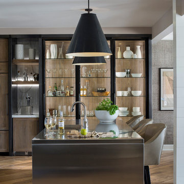
The lower level kitchen island features a two inch thick, stainless steel countertop with waterfall sides. The cabinetry on the far wall is framed in custom fabricated steel with a hand-applied black finish. The backs of the floor to ceiling open cabinets are cerused oak.
Heidi Zeiger
 BC&J Architecture
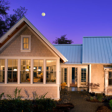
The Back Bay House is comprised of two main structures, a nocturnal wing and a daytime wing, joined by a glass gallery space. The daytime wing maintains an informal living arrangement that includes the dining space placed in an intimate alcove, a large country kitchen and relaxing seating area which opens to a classic covered porch and on to the water’s edge. The nocturnal wing houses three bedrooms. The master at the water side enjoys views and sounds of the wildlife and the shore while the two subordinate bedrooms soak in views of the garden and neighboring meadow.
To bookend the scale and mass of the house, a whimsical tower was included to the nocturnal wing. The tower accommodates flex space for a bunk room, office or studio space. Materials and detailing of this house are based on a classic cottage vernacular language found in these sorts of buildings constructed in pre-war north america and harken back to a simpler time and scale. Eastern white cedar shingles, white painted trim and moulding collectively add a layer of texture and richness not found in today’s lexicon of detail. The house is 1,628 sf plus a 228 sf tower and a detached, two car garage which employs massing, detail and scale to allow the main house to read as dominant but not overbearing.
Designed by BC&J Architecture.
 Milgard Windows & Doors
The Kiguchi family moved into their Austin, Texas home in 1994. Built in the 1980’s as part of a neighborhood development, they happily raised their family here but longed for something more contemporary. Once they became empty nesters, they decided it was time for a major remodel. After spending many years visiting Austin AIA Home Tours that highlight contemporary residential architecture, they had a lot of ideas and in 2013 were ready to interview architects and get their renovation underway.
The project turned into a major remodel due to an unstable foundation. Architects Ben Arbib and Ed Hughey, of Arbib Hughey Design were hired to solve the structural issue and look for inspiration in the bones of the house, which sat on top of a hillside and was surrounded by great views.
Unfortunately, with the old floor plan, the beautiful views were hidden by small windows that were poorly placed. In order to bring more natural light into the house the window sizes and configurations had to be addressed, all while keeping in mind the homeowners desire for a modern look and feel.
To achieve a more contemporary and sophisticated front of house, a new entry was designed that included removing a two-story bay window and porch. The entrance of the home also became more integrated with the landscape creating a template for new foliage to be planted. Older exterior materials were updated to incorporate a more muted palette of colors with a metal roof, dark grey siding in the back and white stucco in the front. Deep eaves were added over many of the new large windows for clean lines and sun protection.
“Inside it was about opening up the floor plan, expanding the views throughout the house, and updating the material palette to get a modern look that was also warm and inviting,” said Ben from Arbib Hughey Design. “Prior to the remodel, the house had the typical separation of rooms. We removed the walls between them and changed all of the windows to Milgard Thermally Improved Aluminum to connect the inside with the outside. No matter where you are you get nice views and natural light.”
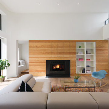
The architects wanted to create some drama, which they accomplished with the window placement and opening up the interior floor plan to an open concept approach. Cabinetry was used to help delineate intimate spaces. To add warmth to an all-white living room, white-washed oak wood floors were installed and pine planks were used around the fireplace. The large windows served as artwork bringing the color of nature into the space.
An octagon shaped, elevated dining room, (named “the turret”), had a big impact on the design of the house. They architects rounded the corners and added larger window openings overlooking a new sunken garden. The great room was also softened by rounding out the corners and that circular theme continued throughout the house, being picked up in skylight wells and kitchen cabinetry. A staircase leading to a catwalk was added and the result was a two-story window wall that flooded the home with natural light.
When asked why Milgard® Thermally Improved Aluminum windows were selected, the architectural team listed many reasons:
1) Aesthetics: “We liked the slim profiles and narrow sightlines. The window frames never get in the way of the view and that was important to us. They also have a very contemporary look that went well with our design.”
2) Options: “We liked that we could get large sliding doors that matched the windows, giving us a very cohesive look and feel throughout the project.”
3) Cost Effective: “Milgard windows are affordable. You get a good product at a good price.”
4) Custom Sizes: “Milgard windows are customizable, which allowed us to get the right window for each location.”
Ready to take on your own traditional to modern home remodeling project? Arbib Hughey Design advises, “Work with a good architect. That means picking a team that is creative, communicative, listens well and is responsive. We think it’s important for an architect to listen to their clients and give them something they want, not something the architect thinks they should have. At the same time you want an architect who is willing and able to think outside the box and offer up design options that you may not have considered. Design is about a lot of back and forth, trying out ideas, getting feedback and trying again.”
The home was completely transformed into a unique, contemporary house perfectly integrated with its site. Internally the home has a natural flow for the occupants and externally it is integrated with the surroundings taking advantage of great natural light. As a side note, it was highly praised as part of the Austin AIA homes tour.
Find the right local pro for your project
 KitchenVisions
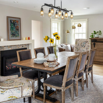
The dining room was formerly the living room. The window on the back wall was moved closer to the corner to provide an expanse for furniture. To improve flow on the first floor, part of the wall was removed near the powder room..
The opening to the right of the fireplace leads to the garage and back door to the deck. All the casings are new. Furniture is from #Arhaus.
Photography by Michael J. Lefebvre
 TKS Design Group
Download our free ebook, Creating the Ideal Kitchen. DOWNLOAD NOW
Lakefront property in the northwest suburbs of Chicago is hard to come by, so when we were hired by this young family with exactly that, we were immediately inspired by not just the unusually large footprint of this 1950’s colonial revival but also the lovely views of the manmade lake it was sited on. The large 5-bedroom home was solidly stuck in the 1980’s, but we saw tons of potential. We started out by updating the existing staircase with a fresh coat of paint and adding new herringbone slate to the entry hall.
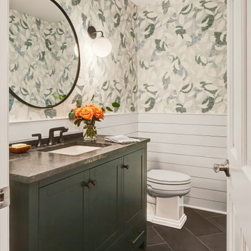
The powder room off the entryway also got a refresh - new flooring, new cabinets and fixtures. We ran the new slate right through into this space for some consistency. A fun wallpaper and shiplap trim add a welcoming feel and set the tone for the home.
Next, we tackled the kitchen. Located away from the rest of the first floor, the kitchen felt a little isolated, so we immediately began planning for how to better connect it to the rest of the first floor. We landed on removing the wall between the kitchen and dining room and designed a modified galley style space with separate cooking and clean up zones. The cooking zone consists of the refrigerator, prep sink and cooktop, along with a nice long run of prep space at the island. The cleanup side of the kitchen consists of the main sink and dishwasher. Both areas are situated so that the user can view the lake during prep work and cleanup!
One of the home’s main puzzles was how to incorporate the mudroom and area in front of the patio doors at the back of the house. We already had a breakfast table area, so the space by the patio doors was a bit of a no man’s land. We decided to separate the kitchen proper from what became the new mudroom with a large set of barn doors. That way you can quickly hide any mudroom messes but have easy access to the light coming in through the patio doors as well as the outdoor grilling station. We also love the impact the barn doors add to the overall space.
The homeowners’ first words to us were “it’s time to ditch the brown,” so we did! We chose a lovely blue pallet that reflects the home’s location on the lake which is also vibrant yet easy on the eye. Countertops are white quartz, and the natural oak floor works well with the other honey accents. The breakfast table was given a refresh with new chairs, chandelier and window treatments that frame the gorgeous views of the lake out the back.
We coordinated the slate mudroom flooring with that used in the home’s main entrance for a consistent feel. The storage area consists of open and closed storage to allow for some clutter control as needed.
Next on our “to do” list was revamping the dated brown bar area in the neighboring dining room. We eliminated the clutter by adding some closed cabinets and did some easy updates to help the space feel more current. One snag we ran into here was the discovery of a beam above the existing open shelving that had to be modified with a smaller structural beam to allow for our new design to work. This was an unexpected surprise, but in the end we think it was well worth it!
We kept the colors here a bit more muted to blend with the homeowner’s existing furnishings. Open shelving and polished nickel hardware add some simple detail to the new entertainment zone which also looks out onto the lake!
Next we tackled the upstairs starting with the homeowner’s son’s bath. The bath originally had both a tub shower and a separate shower, so we decided to swap out the shower for a new laundry area. This freed up some space downstairs in what used to be the mudroom/laundry room and is much more convenient for daily laundry needs.
We continued the blue palette here with navy cabinetry and the navy tile in the shower. Porcelain floor tile and chrome fixtures keep maintenance to a minimum while matte black mirrors and lighting add some depth the design. A low maintenance runner adds some warmth underfoot and ties the whole space together.
We added a pocket door to the bathroom to minimize interference with the door swings. The left door of the laundry closet is on a 180 degree hinge to allow for easy full access to the machines. Next we tackled the master bath which is an en suite arrangement. The original was typical of the 1980’s with the vanity outside of the bathroom, situated near the master closet. And the brown theme continued here with multiple shades of brown.
Our first move was to segment off the bath and the closet from the master bedroom. We created a short hall from the bedroom to the bathroom with his and hers walk-in closets on the left and right as well as a separate toilet closet outside of the main bathroom for privacy and flexibility.
The original bathroom had a giant soaking tub with steps (dangerous!) as well as a small shower that did not work well for our homeowner who is 6’3”. With other bathtubs in the home, they decided to eliminate the tub and create an oversized shower which takes up the space where the old tub was located. The double vanity is on the opposite wall and a bench is located under the window for morning conversations and a place to set a couple of towels.
The pallet in here is light and airy with a mix of blond wood, creamy porcelain and marble tile, and brass accents. A simple roman shade adds some texture and it’s top-down mechanism allows for light and privacy.
This large whole house remodel gave our homeowners not only the ability to maximize the potential of their home but also created a lovely new frame from which to view their fabulous lake views.
Designed by: Susan Klimala, CKD, CBD
Photography by: Michael Kaskel
For more information on kitchen and bath design ideas go to: www.kitchenstudio-ge.com
 Klopf Architecture
Klopf Architecture, Arterra Landscape Architects and Henry Calvert of Calvert Ventures Designed and built a new warm, modern, Eichler-inspired, open, indoor-outdoor home on a deeper-than-usual San Mateo Highlands property where an original Eichler house had burned to the ground.
The owners wanted multi-generational living and larger spaces than the original home offered, but all parties agreed that the house should respect the neighborhood and blend in stylistically with the other Eichlers. At first the Klopf team considered re-using what little was left of the original home and expanding on it. But after discussions with the owner and builder, all parties agreed that the last few remaining elements of the house were not practical to re-use, so Klopf Architecture designed a new home that pushes the Eichler approach in new directions.
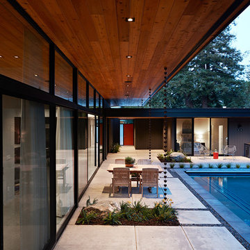
One disadvantage of Eichler production homes is that the house designs were not optimized for each specific lot. A new custom home offered the team a chance to start over. In this case, a longer house that opens up sideways to the south fit the lot better than the original square-ish house that used to open to the rear (west). Accordingly, the Klopf team designed an L-shaped “bar” house with a large glass wall with large sliding glass doors that faces sideways instead of to the rear like a typical Eichler. This glass wall opens to a pool and landscaped yard designed by Arterra Landscape Architects.
Driving by the house, one might assume at first glance it is an Eichler because of the horizontality, the overhanging flat roof eaves, the dark gray vertical siding, and orange solid panel front door, but the house is designed for the 21st Century and is not meant to be a “Likeler.” You won't see any posts and beams in this home. Instead, the ceiling decking is a western red cedar that covers over all the beams. Like Eichlers, this cedar runs continuously from inside to out, enhancing the indoor / outdoor feeling of the house, but unlike Eichlers it conceals a cavity for lighting, wiring, and insulation. Ceilings are higher, rooms are larger and more open, the master bathroom is light-filled and more generous, with a separate tub and shower and a separate toilet compartment, and there is plenty of storage. The garage even easily fits two of today's vehicles with room to spare.
A massive 49-foot by 12-foot wall of glass and the continuity of materials from inside to outside enhance the inside-outside living concept, so the owners and their guests can flow freely from house to pool deck to BBQ to pool and back.
During construction in the rough framing stage, Klopf thought the front of the house appeared too tall even though the house had looked right in the design renderings (probably because the house is uphill from the street). So Klopf Architecture paid the framer to change the roofline from how we had designed it to be lower along the front, allowing the home to blend in better with the neighborhood. One project goal was for people driving up the street to pass the home without immediately noticing there is an "imposter" on this lot, and making that change was essential to achieve that goal.
This 2,606 square foot, 3 bedroom, 3 bathroom Eichler-inspired new house is located in San Mateo in the heart of the Silicon Valley.
Klopf Architecture Project Team: John Klopf, AIA, Klara Kevane
Landscape Architect: Arterra Landscape Architects
Contractor: Henry Calvert of Calvert Ventures
Photography ©2016 Mariko Reed
Location: San Mateo, CA
Year completed: 2016
 Klopf Architecture
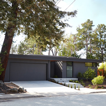
Klopf Architecture, Arterra Landscape Architects and Henry Calvert of Calvert Ventures Designed and built a new warm, modern, Eichler-inspired, open, indoor-outdoor home on a deeper-than-usual San Mateo Highlands property where an original Eichler house had burned to the ground.
The owners wanted multi-generational living and larger spaces than the original home offered, but all parties agreed that the house should respect the neighborhood and blend in stylistically with the other Eichlers. At first the Klopf team considered re-using what little was left of the original home and expanding on it. But after discussions with the owner and builder, all parties agreed that the last few remaining elements of the house were not practical to re-use, so Klopf Architecture designed a new home that pushes the Eichler approach in new directions.
One disadvantage of Eichler production homes is that the house designs were not optimized for each specific lot. A new custom home offered the team a chance to start over. In this case, a longer house that opens up sideways to the south fit the lot better than the original square-ish house that used to open to the rear (west). Accordingly, the Klopf team designed an L-shaped “bar” house with a large glass wall with large sliding glass doors that faces sideways instead of to the rear like a typical Eichler. This glass wall opens to a pool and landscaped yard designed by Arterra Landscape Architects.
Driving by the house, one might assume at first glance it is an Eichler because of the horizontality, the overhanging flat roof eaves, the dark gray vertical siding, and orange solid panel front door, but the house is designed for the 21st Century and is not meant to be a “Likeler.” You won't see any posts and beams in this home. Instead, the ceiling decking is a western red cedar that covers over all the beams. Like Eichlers, this cedar runs continuously from inside to out, enhancing the indoor / outdoor feeling of the house, but unlike Eichlers it conceals a cavity for lighting, wiring, and insulation. Ceilings are higher, rooms are larger and more open, the master bathroom is light-filled and more generous, with a separate tub and shower and a separate toilet compartment, and there is plenty of storage. The garage even easily fits two of today's vehicles with room to spare.
A massive 49-foot by 12-foot wall of glass and the continuity of materials from inside to outside enhance the inside-outside living concept, so the owners and their guests can flow freely from house to pool deck to BBQ to pool and back.
During construction in the rough framing stage, Klopf thought the front of the house appeared too tall even though the house had looked right in the design renderings (probably because the house is uphill from the street). So Klopf Architecture paid the framer to change the roofline from how we had designed it to be lower along the front, allowing the home to blend in better with the neighborhood. One project goal was for people driving up the street to pass the home without immediately noticing there is an "imposter" on this lot, and making that change was essential to achieve that goal.
This 2,606 square foot, 3 bedroom, 3 bathroom Eichler-inspired new house is located in San Mateo in the heart of the Silicon Valley.
Klopf Architecture Project Team: John Klopf, AIA, Klara Kevane
Landscape Architect: Arterra Landscape Architects
Contractor: Henry Calvert of Calvert Ventures
Photography ©2016 Mariko Reed
Location: San Mateo, CA
Year completed: 2016
Sponsored
Fredericksburg, OH

High Point Cabinets
Columbus' Experienced Custom Cabinet Builder | 4x Best of Houzz Winner
 User
UserSpectacular unobstructed views of the Bay, Bridge, Alcatraz, San Francisco skyline and the rolling hills of Marin greet you from almost every window of this stunning Provençal Villa located in the acclaimed Middle Ridge neighborhood of Mill Valley. Built in 2000, this exclusive 5 bedroom, 5+ bath estate was thoughtfully designed by architect Jorge de Quesada to provide a classically elegant backdrop for today’s active lifestyle. Perfectly positioned on over half an acre with flat lawns and an award winning garden there is unmatched sense of privacy just minutes from the shops and restaurants of downtown Mill Valley.
A curved stone staircase leads from the charming entry gate to the private front lawn and on to the grand hand carved front door. A gracious formal entry and wide hall opens out to the main living spaces of the home and out to the view beyond. The Venetian plaster walls and soaring ceilings provide an open airy feeling to the living room and country chef’s kitchen, while three sets of oversized French doors lead onto the Jerusalem Limestone patios and bring in the panoramic views.
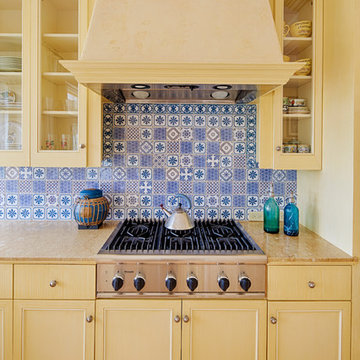
The chef’s kitchen is the focal point of the warm welcoming great room and features a range-top and double wall ovens, two dishwashers, marble counters and sinks with Waterworks fixtures. The tile backsplash behind the range pays homage to Monet’s Giverny kitchen. A fireplace offers up a cozy sitting area to lounge and watch television or curl up with a book. There is ample space for a farm table for casual dining. In addition to a well-appointed formal living room, the main level of this estate includes an office, stunning library/den with faux tortoise detailing, butler’s pantry, powder room, and a wonderful indoor/outdoor flow allowing the spectacular setting to envelop every space.
A wide staircase leads up to the four main bedrooms of home. There is a spacious master suite complete with private balcony and French doors showcasing the views. The suite features his and her baths complete with walk – in closets, and steam showers. In hers there is a sumptuous soaking tub positioned to make the most of the view. Two additional bedrooms share a bath while the third is en-suite. The laundry room features a second set of stairs leading back to the butler’s pantry, garage and outdoor areas.
The lowest level of the home includes a legal second unit complete with kitchen, spacious walk in closet, private entry and patio area. In addition to interior access to the second unit there is a spacious exercise room, the potential for a poolside kitchenette, second laundry room, and secure storage area primed to become a state of the art tasting room/wine cellar.
From the main level the spacious entertaining patio leads you out to the magnificent grounds and pool area. Designed by Steve Stucky, the gardens were featured on the 2007 Mill Valley Outdoor Art Club tour.
A level lawn leads to the focal point of the grounds; the iconic “Crags Head” outcropping favored by hikers as far back as the 19th century. The perfect place to stop for lunch and take in the spectacular view. The Century old Sonoma Olive trees and lavender plantings add a Mediterranean touch to the two lawn areas that also include an antique fountain, and a charming custom Barbara Butler playhouse.
Inspired by Provence and built to exacting standards this charming villa provides an elegant yet welcoming environment designed to meet the needs of today’s active lifestyle while staying true to its Continental roots creating a warm and inviting space ready to call home.
 Milgard Windows & Doors
The Kiguchi family moved into their Austin, Texas home in 1994. Built in the 1980’s as part of a neighborhood development, they happily raised their family here but longed for something more contemporary. Once they became empty nesters, they decided it was time for a major remodel. After spending many years visiting Austin AIA Home Tours that highlight contemporary residential architecture, they had a lot of ideas and in 2013 were ready to interview architects and get their renovation underway.
The project turned into a major remodel due to an unstable foundation. Architects Ben Arbib and Ed Hughey, of Arbib Hughey Design were hired to solve the structural issue and look for inspiration in the bones of the house, which sat on top of a hillside and was surrounded by great views.
Unfortunately, with the old floor plan, the beautiful views were hidden by small windows that were poorly placed. In order to bring more natural light into the house the window sizes and configurations had to be addressed, all while keeping in mind the homeowners desire for a modern look and feel.
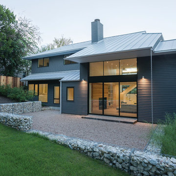
To achieve a more contemporary and sophisticated front of house, a new entry was designed that included removing a two-story bay window and porch. The entrance of the home also became more integrated with the landscape creating a template for new foliage to be planted. Older exterior materials were updated to incorporate a more muted palette of colors with a metal roof, dark grey siding in the back and white stucco in the front. Deep eaves were added over many of the new large windows for clean lines and sun protection.
“Inside it was about opening up the floor plan, expanding the views throughout the house, and updating the material palette to get a modern look that was also warm and inviting,” said Ben from Arbib Hughey Design. “Prior to the remodel, the house had the typical separation of rooms. We removed the walls between them and changed all of the windows to Milgard Thermally Improved Aluminum to connect the inside with the outside. No matter where you are you get nice views and natural light.”
The architects wanted to create some drama, which they accomplished with the window placement and opening up the interior floor plan to an open concept approach. Cabinetry was used to help delineate intimate spaces. To add warmth to an all-white living room, white-washed oak wood floors were installed and pine planks were used around the fireplace. The large windows served as artwork bringing the color of nature into the space.
An octagon shaped, elevated dining room, (named “the turret”), had a big impact on the design of the house. They architects rounded the corners and added larger window openings overlooking a new sunken garden. The great room was also softened by rounding out the corners and that circular theme continued throughout the house, being picked up in skylight wells and kitchen cabinetry. A staircase leading to a catwalk was added and the result was a two-story window wall that flooded the home with natural light.
When asked why Milgard® Thermally Improved Aluminum windows were selected, the architectural team listed many reasons:
1) Aesthetics: “We liked the slim profiles and narrow sightlines. The window frames never get in the way of the view and that was important to us. They also have a very contemporary look that went well with our design.”
2) Options: “We liked that we could get large sliding doors that matched the windows, giving us a very cohesive look and feel throughout the project.”
3) Cost Effective: “Milgard windows are affordable. You get a good product at a good price.”
4) Custom Sizes: “Milgard windows are customizable, which allowed us to get the right window for each location.”
Ready to take on your own traditional to modern home remodeling project? Arbib Hughey Design advises, “Work with a good architect. That means picking a team that is creative, communicative, listens well and is responsive. We think it’s important for an architect to listen to their clients and give them something they want, not something the architect thinks they should have. At the same time you want an architect who is willing and able to think outside the box and offer up design options that you may not have considered. Design is about a lot of back and forth, trying out ideas, getting feedback and trying again.”
The home was completely transformed into a unique, contemporary house perfectly integrated with its site. Internally the home has a natural flow for the occupants and externally it is integrated with the surroundings taking advantage of great natural light. As a side note, it was highly praised as part of the Austin AIA homes tour.
 Thomas Roszak Architecture, LLC
Photo credit: Scott McDonald @ Hedrich Blessing
7RR-Ecohome:
The design objective was to build a house for a couple recently married who both had kids from previous marriages. How to bridge two families together?
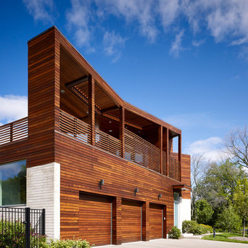
The design looks forward in terms of how people live today. The home is an experiment in transparency and solid form; removing borders and edges from outside to inside the house, and to really depict “flowing and endless space”. The house floor plan is derived by pushing and pulling the house’s form to maximize the backyard and minimize the public front yard while welcoming the sun in key rooms by rotating the house 45-degrees to true north. The angular form of the house is a result of the family’s program, the zoning rules, the lot’s attributes, and the sun’s path. We wanted to construct a house that is smart and efficient in terms of construction and energy, both in terms of the building and the user. We could tell a story of how the house is built in terms of the constructability, structure and enclosure, with a nod to Japanese wood construction in the method in which the siding is installed and the exposed interior beams are placed in the double height space. We engineered the house to be smart which not only looks modern but acts modern; every aspect of user control is simplified to a digital touch button, whether lights, shades, blinds, HVAC, communication, audio, video, or security. We developed a planning module based on a 6-foot square room size and a 6-foot wide connector called an interstitial space for hallways, bathrooms, stairs and mechanical, which keeps the rooms pure and uncluttered. The house is 6,200 SF of livable space, plus garage and basement gallery for a total of 9,200 SF. A large formal foyer celebrates the entry and opens up to the living, dining, kitchen and family rooms all focused on the rear garden. The east side of the second floor is the Master wing and a center bridge connects it to the kid’s wing on the west. Second floor terraces and sunscreens provide views and shade in this suburban setting. The playful mathematical grid of the house in the x, y and z axis also extends into the layout of the trees and hard-scapes, all centered on a suburban one-acre lot.
Many green attributes were designed into the home; Ipe wood sunscreens and window shades block out unwanted solar gain in summer, but allow winter sun in. Patio door and operable windows provide ample opportunity for natural ventilation throughout the open floor plan. Minimal windows on east and west sides to reduce heat loss in winter and unwanted gains in summer. Open floor plan and large window expanse reduces lighting demands and maximizes available daylight. Skylights provide natural light to the basement rooms. Durable, low-maintenance exterior materials include stone, ipe wood siding and decking, and concrete roof pavers. Design is based on a 2' planning grid to minimize construction waste. Basement foundation walls and slab are highly insulated. FSC-certified walnut wood flooring was used. Light colored concrete roof pavers to reduce cooling loads by as much as 15%. 2x6 framing allows for more insulation and energy savings. Super efficient windows have low-E argon gas filled units, and thermally insulated aluminum frames. Permeable brick and stone pavers reduce the site’s storm-water runoff. Countertops use recycled composite materials. Energy-Star rated furnaces and smart thermostats are located throughout the house to minimize duct runs and avoid energy loss. Energy-Star rated boiler that heats up both radiant floors and domestic hot water. Low-flow toilets and plumbing fixtures are used to conserve water usage. No VOC finish options and direct venting fireplaces maintain a high interior air quality. Smart home system controls lighting, HVAC, and shades to better manage energy use. Plumbing runs through interior walls reducing possibilities of heat loss and freezing problems. A large food pantry was placed next to kitchen to reduce trips to the grocery store. Home office reduces need for automobile transit and associated CO2 footprint. Plan allows for aging in place, with guest suite than can become the master suite, with no need to move as family members mature.
 John Cannon Homes
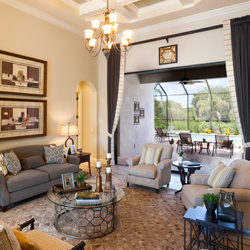
The Caaren model home designed and built by John Cannon Homes, located in Sarasota, Florida. This one-story, 3 bedroom, 3 bath home also offers a study, and family room open to the lanai and pool and spa area. Total square footage under roof is 4, 272 sq. ft. Living space under air is 2,895 sq. ft.
Elegant and open, luxurious yet relaxed, the Caaren offers a variety of amenities to perfectly suit your lifestyle. From the grand pillar-framed entrance to the sliding glass walls that open to reveal an outdoor entertaining paradise, this is a home sure to be enjoyed by generations of family and friends for years to come.
Gene Pollux Photography
 ModelDeco
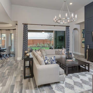
Large open family room overlooking backyard accented with dark grey walls. Grey walls are accentuated with square molding details to create interest and depth. Wood Tiles on the floors have grey and beige tones to pull in the colors and add warmth. Model Home is staged by Linfield Design to show ample seating with a large light beige sectional and brown accent chair. The entertainment piece is situated on one wall with a flat TV above. The back sliding door windows framed with blue geometric drapery panels bring light to the room. Accessories, pillows and art in blue add touches of color and interest to the family room. Large dark wood coffee table fits the oversized sectional perfectly and a light gey and white shag area rug soften the space. Shop for pieces at ModelDeco.com
 USI Design & Remodeling
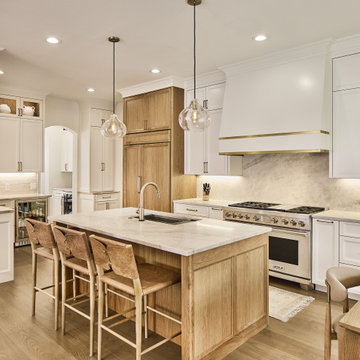
Remodel-Kitchen & Family Room: Quiet Luxury with a Natural Palette
This remodel reimagines the heart of the home by seamlessly integrating the kitchen and family room into a refined yet inviting open-concept space, grounded in a “quiet luxury” aesthetic and a natural palette.
Kitchen Transformation:
The kitchen layout is completely reworked for improved flow and functionality. Major appliances have been reassigned for efficiency:
• The refrigerator is built in and anchors the focal wall providing improved access to both prep and serving areas.
• The range has been centered on the back wall, framed by two- toned cabinetry and a low-profile custom hood accented with brass that blends seamlessly into the wall for an understated look.
• The dishwasher and sink have been relocated to the new central island, allowing for uninterrupted views across the room and better interaction with guests or family.
At the heart of the space is a large central island, topped with Taj Mahal quartzite in soft beige and taupe tones. The island serves as a multi-functional hub.
The cabinetry is custom-built in white oak, finished in a matte clear coat that highlights the wood’s natural grain. Hardware is kept minimal, in brushed brass for a touch of subdued elegance.
Natural Palette & Materials:
The entire space embraces a natural color scheme—warm whites, layered pastel beiges and natural wood tones—accented with natural stone. Leathered Taj Mahal backsplash with subtle texture adds quiet visual interest without overpowering the calm atmosphere.
Family Room Integration:
The kitchen flows effortlessly into the family room, unified by wide-plank oak flooring and soft lighting. A fluted marble-clad fireplace anchors the space, surrounded by, built-in shelving with the same oak finish inside as the kitchen cabinetry. Furnishings follow the same philosophy: clean lines, neutral fabrics, and a mix of soft textures. Think boucle armchairs, a deep linen sectional, and a reclaimed wood coffee table.
Lighting & Finishing Touches:
Soft, layered lighting—including recessed lights, sculptural clear pendant lights above the island, and concealed LED strips—enhances the serene mood.
Sponsored
Delaware, OH

Buckeye Basements, Inc.
Central Ohio's Basement Finishing ExpertsBest Of Houzz '13-'21
 Decorating Den Interiors - Bromberek Design Team
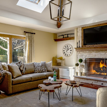
We replaced the brick with a Tuscan-colored stacked stone and added a wood mantel; the television was built-in to the stacked stone and framed out for a custom look. This created an updated design scheme for the room and a focal point. We also removed an entry wall on the east side of the home, and a wet bar near the back of the living area. This had an immediate impact on the brightness of the room and allowed for more natural light and a more open, airy feel, as well as increased square footage of the space. We followed up by updating the paint color to lighten the room, while also creating a natural flow into the remaining rooms of this first-floor, open floor plan.
After removing the brick underneath the shelving units, we added a bench storage unit and closed cabinetry for storage. The back walls were finalized with a white shiplap wall treatment to brighten the space and wood shelving for accessories. On the left side of the fireplace, we added a single floating wood shelf to highlight and display the sword.
The popcorn ceiling was scraped and replaced with a cleaner look, and the wood beams were stained to match the new mantle and floating shelves. The updated ceiling and beams created another dramatic focal point in the room, drawing the eye upward, and creating an open, spacious feel to the room. The room was finalized by removing the existing ceiling fan and replacing it with a rustic, two-toned, four-light chandelier in a distressed weathered oak finish on an iron metal frame.
Photo Credit: Nina Leone Photography
 MSA ARCHITECTURE + INTERIORS
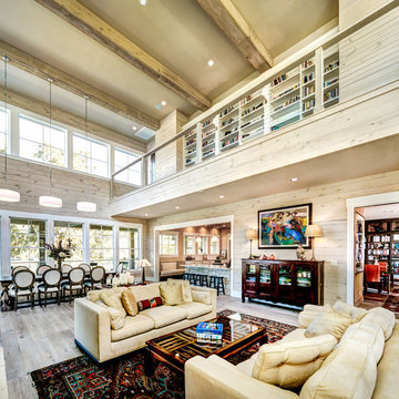
Example of a country open concept light wood floor living room design in Austin
 Klopf Architecture
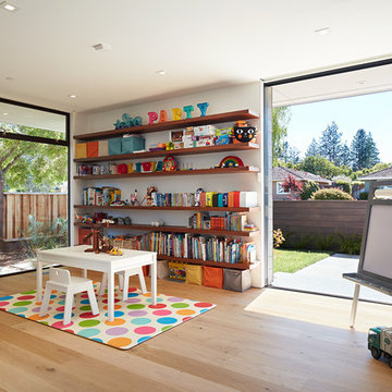
Klopf Architecture and Outer space Landscape Architects designed a new warm, modern, open, indoor-outdoor home in Los Altos, California. Inspired by mid-century modern homes but looking for something completely new and custom, the owners, a couple with two children, bought an older ranch style home with the intention of replacing it.
Created on a grid, the house is designed to be at rest with differentiated spaces for activities; living, playing, cooking, dining and a piano space. The low-sloping gable roof over the great room brings a grand feeling to the space. The clerestory windows at the high sloping roof make the grand space light and airy.
Upon entering the house, an open atrium entry in the middle of the house provides light and nature to the great room. The Heath tile wall at the back of the atrium blocks direct view of the rear yard from the entry door for privacy.
The bedrooms, bathrooms, play room and the sitting room are under flat wing-like roofs that balance on either side of the low sloping gable roof of the main space. Large sliding glass panels and pocketing glass doors foster openness to the front and back yards. In the front there is a fenced-in play space connected to the play room, creating an indoor-outdoor play space that could change in use over the years. The play room can also be closed off from the great room with a large pocketing door. In the rear, everything opens up to a deck overlooking a pool where the family can come together outdoors.
Wood siding travels from exterior to interior, accentuating the indoor-outdoor nature of the house. Where the exterior siding doesn’t come inside, a palette of white oak floors, white walls, walnut cabinetry, and dark window frames ties all the spaces together to create a uniform feeling and flow throughout the house. The custom cabinetry matches the minimal joinery of the rest of the house, a trim-less, minimal appearance. Wood siding was mitered in the corners, including where siding meets the interior drywall. Wall materials were held up off the floor with a minimal reveal. This tight detailing gives a sense of cleanliness to the house.
The garage door of the house is completely flush and of the same material as the garage wall, de-emphasizing the garage door and making the street presentation of the house kinder to the neighborhood.
The house is akin to a custom, modern-day Eichler home in many ways. Inspired by mid-century modern homes with today’s materials, approaches, standards, and technologies. The goals were to create an indoor-outdoor home that was energy-efficient, light and flexible for young children to grow. This 3,000 square foot, 3 bedroom, 2.5 bathroom new house is located in Los Altos in the heart of the Silicon Valley.
Klopf Architecture Project Team: John Klopf, AIA, and Chuang-Ming Liu
Landscape Architect: Outer space Landscape Architects
Structural Engineer: ZFA Structural Engineers
Staging: Da Lusso Design
Photography ©2018 Mariko Reed
Location: Los Altos, CA
Year completed: 2017
 Klopf Architecture
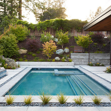
Klopf Architecture, Arterra Landscape Architects and Henry Calvert of Calvert Ventures Designed and built a new warm, modern, Eichler-inspired, open, indoor-outdoor home on a deeper-than-usual San Mateo Highlands property where an original Eichler house had burned to the ground.
The owners wanted multi-generational living and larger spaces than the original home offered, but all parties agreed that the house should respect the neighborhood and blend in stylistically with the other Eichlers. At first the Klopf team considered re-using what little was left of the original home and expanding on it. But after discussions with the owner and builder, all parties agreed that the last few remaining elements of the house were not practical to re-use, so Klopf Architecture designed a new home that pushes the Eichler approach in new directions.
One disadvantage of Eichler production homes is that the house designs were not optimized for each specific lot. A new custom home offered the team a chance to start over. In this case, a longer house that opens up sideways to the south fit the lot better than the original square-ish house that used to open to the rear (west). Accordingly, the Klopf team designed an L-shaped “bar” house with a large glass wall with large sliding glass doors that faces sideways instead of to the rear like a typical Eichler. This glass wall opens to a pool and landscaped yard designed by Arterra Landscape Architects.
Driving by the house, one might assume at first glance it is an Eichler because of the horizontality, the overhanging flat roof eaves, the dark gray vertical siding, and orange solid panel front door, but the house is designed for the 21st Century and is not meant to be a “Likeler.” You won't see any posts and beams in this home. Instead, the ceiling decking is a western red cedar that covers over all the beams. Like Eichlers, this cedar runs continuously from inside to out, enhancing the indoor / outdoor feeling of the house, but unlike Eichlers it conceals a cavity for lighting, wiring, and insulation. Ceilings are higher, rooms are larger and more open, the master bathroom is light-filled and more generous, with a separate tub and shower and a separate toilet compartment, and there is plenty of storage. The garage even easily fits two of today's vehicles with room to spare.
A massive 49-foot by 12-foot wall of glass and the continuity of materials from inside to outside enhance the inside-outside living concept, so the owners and their guests can flow freely from house to pool deck to BBQ to pool and back.
During construction in the rough framing stage, Klopf thought the front of the house appeared too tall even though the house had looked right in the design renderings (probably because the house is uphill from the street). So Klopf Architecture paid the framer to change the roofline from how we had designed it to be lower along the front, allowing the home to blend in better with the neighborhood. One project goal was for people driving up the street to pass the home without immediately noticing there is an "imposter" on this lot, and making that change was essential to achieve that goal.
This 2,606 square foot, 3 bedroom, 3 bathroom Eichler-inspired new house is located in San Mateo in the heart of the Silicon Valley.
Klopf Architecture Project Team: John Klopf, AIA, Klara Kevane
Landscape Architect: Arterra Landscape Architects
Contractor: Henry Calvert of Calvert Ventures
Photography ©2016 Mariko Reed
Location: San Mateo, CA
Year completed: 2016

 Built by Krueger
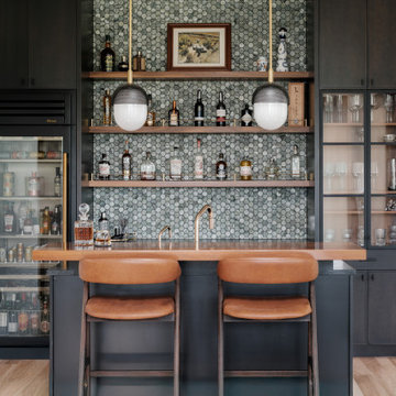
This sophisticated home bar strikes a perfect balance between function and high-end design. Open floating shelves stretch across the wall, showcasing an impressive bottle collection beneath a striking hexagon-pattern tile backsplash that climbs all the way to the ceiling. Rich, dark wood cabinets offer storage and depth, while glass-front cabinets elegantly display glassware for easy access. A large beverage fridge ensures everything stays chilled and ready. The bar is finished with a sleek gold faucet and matching water spout above the integrated sink, while open-back bar stools sit neatly at the wood-topped counter—inviting guests to gather in style.
 Dynia Architects
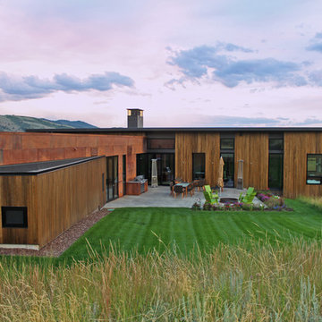
Extensive valley and mountain views inspired the siting of this simple L-shaped house that is anchored into the landscape. This shape forms an intimate courtyard with the sweeping views to the south. Looking back through the entry, glass walls frame the view of a significant mountain peak justifying the plan skew.
The circulation is arranged along the courtyard in order that all the major spaces have access to the extensive valley views. A generous eight-foot overhang along the southern portion of the house allows for sun shading in the summer and passive solar gain during the harshest winter months. The open plan and generous window placement showcase views throughout the house. The living room is located in the southeast corner of the house and cantilevers into the landscape affording stunning panoramic views.
Project Year: 2012
 Dura Supreme Cabinetry
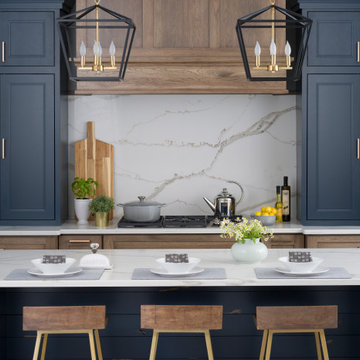
This modern farmhouse kitchen features a beautiful combination of Navy Blue painted and gray stained Hickory cabinets that’s sure to be an eye-catcher. The elegant “Morel” stain blends and harmonizes the natural Hickory wood grain while emphasizing the grain with a subtle gray tone that beautifully coordinated with the cool, deep blue paint.
The “Gale Force” SW 7605 blue paint from Sherwin-Williams is a stunning deep blue paint color that is sophisticated, fun, and creative. It’s a stunning statement-making color that’s sure to be a classic for years to come and represents the latest in color trends. It’s no surprise this beautiful navy blue has been a part of Dura Supreme’s Curated Color Collection for several years, making the top 6 colors for 2017 through 2020.
Beyond the beautiful exterior, there is so much well-thought-out storage and function behind each and every cabinet door. The two beautiful blue countertop towers that frame the modern wood hood and cooktop are two intricately designed larder cabinets built to meet the homeowner’s exact needs.
The larder cabinet on the left is designed as a beverage center with apothecary drawers designed for housing beverage stir sticks, sugar packets, creamers, and other misc. coffee and home bar supplies. A wine glass rack and shelves provides optimal storage for a full collection of glassware while a power supply in the back helps power coffee & espresso (machines, blenders, grinders and other small appliances that could be used for daily beverage creations. The roll-out shelf makes it easier to fill clean and operate each appliance while also making it easy to put away. Pocket doors tuck out of the way and into the cabinet so you can easily leave open for your household or guests to access, but easily shut the cabinet doors and conceal when you’re ready to tidy up.
Beneath the beverage center larder is a drawer designed with 2 layers of multi-tasking storage for utensils and additional beverage supplies storage with space for tea packets, and a full drawer of K-Cup storage. The cabinet below uses powered roll-out shelves to create the perfect breakfast center with power for a toaster and divided storage to organize all the daily fixings and pantry items the household needs for their morning routine.
On the right, the second larder is the ultimate hub and center for the homeowner’s baking tasks. A wide roll-out shelf helps store heavy small appliances like a KitchenAid Mixer while making them easy to use, clean, and put away. Shelves and a set of apothecary drawers help house an assortment of baking tools, ingredients, mixing bowls and cookbooks. Beneath the counter a drawer and a set of roll-out shelves in various heights provides more easy access storage for pantry items, misc. baking accessories, rolling pins, mixing bowls, and more.
The kitchen island provides a large worktop, seating for 3-4 guests, and even more storage! The back of the island includes an appliance lift cabinet used for a sewing machine for the homeowner’s beloved hobby, a deep drawer built for organizing a full collection of dishware, a waste recycling bin, and more!
All and all this kitchen is as functional as it is beautiful!
Request a FREE Dura Supreme Brochure Packet:
http://www.durasupreme.com/request-brochure
1