
Search results for "Accomplish" in Home Design Ideas
 Wreedone | Kitchen & Bath
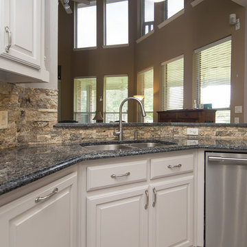
This repeat customer asked that we help them to lighten/brighten their kitchen. To accomplish this goal, we repainted both their walls and previously stained kitchen cabinets, along with replacing their old and cracked 12x12 floors tiles and replace with contemporary rectangular porcelain tiles. Mission accomplished!
 Fish Creek Finish Carpentry
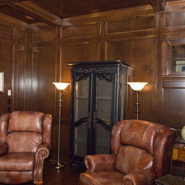
These homeowners came to us through a recommendation from a client who was extremely happy with the work we did for them in the past. This project was in the inner city and the homeowners tore down their old house and built their new home in its place. Keeping with the charm of the original home, the main goal for the home was to make it look like a brand new 100 year old home. We were brought on to work on the entire home with the exception of the kitchen (entry, family room, ceiling work, office/ den, living room, fireplace, window trims, 5 bedrooms, and 4 bathrooms).
In addition to our custom woodworking, these homeowners leaned heavily on our design suggestions. From an execution standpoint, this home was extremely detailed, and getting the balance from room to room and throughout the entire home was crucial for achieving the correct look. In addition, the methods and materials used 100 years ago have since had drastic improvements, making the lifetime and quality of the finished product substantially better, but also adding a higher degree of difficulty to accomplish accurate looking details.
The end result of this project was a work of art. A home that thad the appearance of a 100 year old home, with modern materials and methods to ensure quality and longevity. Everything from their dramatic entry and staircase to their floor-to-ceiling hand-finished den showcases a skill set and eye for detail essential to accomplishing the lofty goals of this home.
 Michael Nash Design, Build & Homes
Starting Each Day Clean and Refreshed In This Classically-Modern, Marble Masterpiece
In 1985, the previous owner of the house had added an addition of which part included a 17 feet by 13 feet space off the master bedroom for both a master bath and walk-in closet. Irrespective of the dated red carpet that blanketed the entire bathroom of this 1964 colonial in Annandale, VA, the combination bathroom/closet space had its other oddities, primarily in that there was no shower. The current homeowners -- a family of five, who has been in the home for 7 years, was tired of going down the hall to use the kids’ bathroom to take a shower before work. The renovation that they have created now is a bright and luxurious space that one could bask in all day. They used this bathroom renovation opportunity to total remake the layout and function of this essential room that sets the tone for the day ahead.
Prior to the renovation, the existing bathroom oddly had two entrances, a typical one off of the master bedroom, but another straight off the upstairs hallway. As the toilet was out in the open in the previous design, ensuring that this second door was closed when company was in town was essential and a nuisance. As you entered the room, situated below the arc window, a large soaking tub that was covered on three sides with wooden steps dominated the room from the corner it projected. A relatively small 42” single bowl sink did not leave much space for his and hers toiletries, and there was no other linen closet or cabinetry for storage in the bathroom. The 8 foot by 5 foot closet with accordion doors had poorly laid out rungs not letting the storage space to be fully utilized. At over 220 square feet, the room did offer considerable space to work with, yet the existing layout, which even included a partition wall behind the vanity, felt cramped and dysfunctional.
The homeowners wished to create a classic yet modern, private, deluxe bathroom that would better integrate into their master suite and enable them to start and end each day in a luxurious way. They wanted to maintain having a soaking tub, add in a large shower, have an enclosed commode, expand to include double sinks, and add more storage for toiletries and linens. We worked with the customer to develop a creative design with extensive plumbing rework that accomplished all these needs and more.
The first order of business was to gut out all the carpet, tub, cabinetry, and non-load bearing partition walls. The new tub would be generally in the same location, but as the previous walk-in closet would be repurposed for the commode and the walk-in shower additional water lines, plumbing, and draining needed to be added; fortunately the room below is the garage, which enabled the team to frame out some bulkheads to accomplish this complex plumbing. Following the framing, including walling up the second entrance to the bathroom, adding in a pocket door for the commode, and creating the shape of the new shower, the team also laid down the wiring for one of the luxuries of this room – heated flooring. A glossy percaline boarder, and two-inch hexagon shape percaline tiles cover the entire floor, making it much easier and cleaner than the previous carpet.
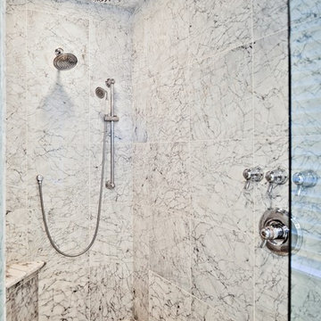
Marble look tile is predominant throughout the bathroom as despite the angled frameless glass door, the entire shower is covered in 18 inch polished marble look tiles. The shower coats the user in water from either the overhead rain head, large main showerhead and/or the hand held sprayer. Over 7 feet of white Italian Statuetto marble countertop, enable the couple to have two sink bowls and plenty of room on each side. The bowls are exposed in this stainless steel console sink design which required the team to ensure that the exposed plumbing looked pristine, and painting the bottom of the porcelain bowl to match the coloring.
The white cast-iron 72-inch Cecilia claw-foot soaking tub and its chrome lion’s paws complement that other chrome and white used throughout the room. A tall, almost floor-to-ceiling linen closet finished in arctic white is nestled in the corner near the tub, enabling ample storage of towels, etc. Other cabinetry includes an 18 inch-wide vanity with decorative footing is centered between the two sinks, and a 27 inch wall mounted cabinet with shelf is above the Kohler Devonshire elongated toilet.
Billowing cloud colored grey blue paint was a great choice for this room to pick up on the veining in the marble. Mirrored medicine chests, a chandelier, wall sconces, and overhead recessed lighting also were incorporated into the design and function of the new room.
The artful combination of classic design from material choices, such as free-standing Victorian claw-foot tub along with the modern design as seen in the angled shower, frameless medicine cabinet mirrors, and frosted glass pocket door on the commode, make this bathroom quite a masterpiece.
The clients are enjoying having their private space and not having the use the kids’ bathroom anymore.
Find the right local pro for your project
 Renovation Solutions
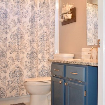
Following the purchase of this beautiful home, we were brought on to create living spaces tailored to the needs it's new occupants and provide a much needed update. This included the kitchen, common areas, 3 bedrooms, 2 bathrooms, paint, new floors, countertops, and more.
Working around a price sensitive budget for this home's full renovation was a nice challenge and our biggest accomplishment. It was essential for the finished product to be high-end, while maintaining it's functionality and durability for years to come. We accomplished this with lots research to find the same high-quality materials at the best price points, as well as alternative products of equal quality and design impact.
What was once an outdated house falling short of its immense potential has since been transformed into a beautiful home perfect for both living and entertaining.
 Grande Decor
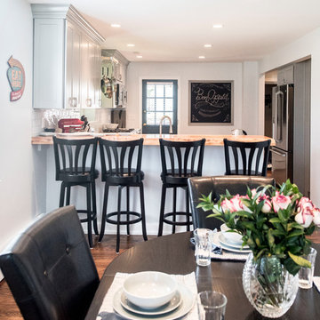
 We wanted to create a kitchen in Haverford Township that accomplished all the wishes, wants and needs of the client. By removing 2 structural walls and using warm materials, we accomplished this goal! Stainless steel, grey Kemper cabinets, wood floors, wood countertop, granite countertop, white farm house sink with stainless steel 3 hole faucet, garbage disposal button and soap dispenser. Also incorporated is a chalk board wall for daily menus, kitchen sayings and sending other family members messages.
 Wreedone | Kitchen & Bath
This repeat customer asked that we help them to lighten/brighten their kitchen. To accomplish this goal, we repainted both their walls and previously stained kitchen cabinets, along with replacing their old and cracked 12x12 floors tiles and replace with contemporary rectangular porcelain tiles. Mission accomplished!
 Harbor Kitchen Design
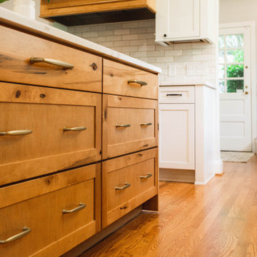
Preview of this kitchen remodel in homeland neighborhood of Baltimore. An update and opening up of a 1960's style Kitchen with metal cabinets and Lime green wallpaper and separate Dining Room covered in patterned wallpaper.
We went back with some rustic wood cabinets to tie the houses heritage into the more transitional looking white shaker cabinet. We utilized KraftMaid Cabinetry's inset look for our design. On the white cabinets this was accomplished by installing 3" wide columns both between every cabinet and at the end of every run. 3" Columns were set 15/16" proud of the cabinet face frame bringing them flush with the full overlay cabinet doors. On the rustic maple, stained cabinets this was accomplished by installing 3/4" wide panels with finished edges set using the same method used on the 3" wall columns.
 Wreedone | Kitchen & Bath
This repeat customer asked that we help them to lighten/brighten their kitchen. To accomplish this goal, we repainted both their walls and previously stained kitchen cabinets, along with replacing their old and cracked 12x12 floors tiles and replace with contemporary rectangular porcelain tiles. Mission accomplished!
 Michael Nash Design, Build & Homes
Starting Each Day Clean and Refreshed In This Classically-Modern, Marble Masterpiece
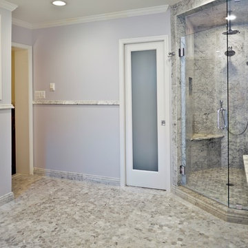
In 1985, the previous owner of the house had added an addition of which part included a 17 feet by 13 feet space off the master bedroom for both a master bath and walk-in closet. Irrespective of the dated red carpet that blanketed the entire bathroom of this 1964 colonial in Annandale, VA, the combination bathroom/closet space had its other oddities, primarily in that there was no shower. The current homeowners -- a family of five, who has been in the home for 7 years, was tired of going down the hall to use the kids’ bathroom to take a shower before work. The renovation that they have created now is a bright and luxurious space that one could bask in all day. They used this bathroom renovation opportunity to total remake the layout and function of this essential room that sets the tone for the day ahead.
Prior to the renovation, the existing bathroom oddly had two entrances, a typical one off of the master bedroom, but another straight off the upstairs hallway. As the toilet was out in the open in the previous design, ensuring that this second door was closed when company was in town was essential and a nuisance. As you entered the room, situated below the arc window, a large soaking tub that was covered on three sides with wooden steps dominated the room from the corner it projected. A relatively small 42” single bowl sink did not leave much space for his and hers toiletries, and there was no other linen closet or cabinetry for storage in the bathroom. The 8 foot by 5 foot closet with accordion doors had poorly laid out rungs not letting the storage space to be fully utilized. At over 220 square feet, the room did offer considerable space to work with, yet the existing layout, which even included a partition wall behind the vanity, felt cramped and dysfunctional.
The homeowners wished to create a classic yet modern, private, deluxe bathroom that would better integrate into their master suite and enable them to start and end each day in a luxurious way. They wanted to maintain having a soaking tub, add in a large shower, have an enclosed commode, expand to include double sinks, and add more storage for toiletries and linens. We worked with the customer to develop a creative design with extensive plumbing rework that accomplished all these needs and more.
The first order of business was to gut out all the carpet, tub, cabinetry, and non-load bearing partition walls. The new tub would be generally in the same location, but as the previous walk-in closet would be repurposed for the commode and the walk-in shower additional water lines, plumbing, and draining needed to be added; fortunately the room below is the garage, which enabled the team to frame out some bulkheads to accomplish this complex plumbing. Following the framing, including walling up the second entrance to the bathroom, adding in a pocket door for the commode, and creating the shape of the new shower, the team also laid down the wiring for one of the luxuries of this room – heated flooring. A glossy percaline boarder, and two-inch hexagon shape percaline tiles cover the entire floor, making it much easier and cleaner than the previous carpet.
Marble look tile is predominant throughout the bathroom as despite the angled frameless glass door, the entire shower is covered in 18 inch polished marble look tiles. The shower coats the user in water from either the overhead rain head, large main showerhead and/or the hand held sprayer. Over 7 feet of white Italian Statuetto marble countertop, enable the couple to have two sink bowls and plenty of room on each side. The bowls are exposed in this stainless steel console sink design which required the team to ensure that the exposed plumbing looked pristine, and painting the bottom of the porcelain bowl to match the coloring.
The white cast-iron 72-inch Cecilia claw-foot soaking tub and its chrome lion’s paws complement that other chrome and white used throughout the room. A tall, almost floor-to-ceiling linen closet finished in arctic white is nestled in the corner near the tub, enabling ample storage of towels, etc. Other cabinetry includes an 18 inch-wide vanity with decorative footing is centered between the two sinks, and a 27 inch wall mounted cabinet with shelf is above the Kohler Devonshire elongated toilet.
Billowing cloud colored grey blue paint was a great choice for this room to pick up on the veining in the marble. Mirrored medicine chests, a chandelier, wall sconces, and overhead recessed lighting also were incorporated into the design and function of the new room.
The artful combination of classic design from material choices, such as free-standing Victorian claw-foot tub along with the modern design as seen in the angled shower, frameless medicine cabinet mirrors, and frosted glass pocket door on the commode, make this bathroom quite a masterpiece.
The clients are enjoying having their private space and not having the use the kids’ bathroom anymore.
 O'Hanlon Kitchen & Bath
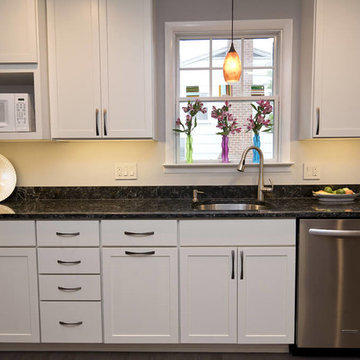
This kitchen is a great example of creativity. By removing the soffit, adding cabinets by the window, and wrapping cabinetry around a corner, this space becomes inviting and cohesive. When the homeowners were asked what they wanted in their new kitchen, they had this to say . . . “keeping the breakfast bench area where everyone gathers, increasing the counter space (which was accomplished by moving the pantry), and figuring some storage and a small counter area by the window that doesn’t block the window itself (accomplished with the angled top). With all the streamlined design elements, the colors brought in by the homeowner really make the space unique and fun.
 Cabinets by Trivonna
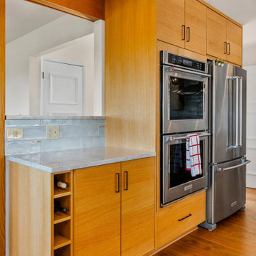
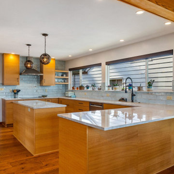
This client is a young medical professional who had purchased his first home. Although it’s his first he is planning on it being his forever home. He wanted sleek, unique and high end. Each room has it’s own theme and we had a lot of fun helping make his dream come true without breaking the bank. To help him save we recommended Bellmont’s 1600 series, although they feature exceptional quality and a limited life time warranty, the series’ pricing is very modest. Splurging a little on the Rift Cut White Oak gave the kitchen the sleek look that a less expensive Red Oak just would not accomplish.
The bathrooms in Cherry with a toffee stain accomplished a rich look with a modestly priced material. Adding pops of color and class with the hardware, tile and countertops helped finish off the look.
 Harbor Kitchen Design
Preview of this kitchen remodel in homeland neighborhood of Baltimore. An update and opening up of a 1960's style Kitchen with metal cabinets and Lime green wallpaper and separate Dining Room covered in patterned wallpaper.
We went back with some rustic wood cabinets to tie the houses heritage into the more transitional looking white shaker cabinet. We utilized KraftMaid Cabinetry's inset look for our design. On the white cabinets this was accomplished by installing 3" wide columns both between every cabinet and at the end of every run. 3" Columns were set 15/16" proud of the cabinet face frame bringing them flush with the full overlay cabinet doors. On the rustic maple, stained cabinets this was accomplished by installing 3/4" wide panels with finished edges set using the same method used on the 3" wall columns.
 Cabinets by Trivonna
This client is a young medical professional who had purchased his first home. Although it’s his first he is planning on it being his forever home. He wanted sleek, unique and high end. Each room has it’s own theme and we had a lot of fun helping make his dream come true without breaking the bank. To help him save we recommended Bellmont’s 1600 series, although they feature exceptional quality and a limited life time warranty, the series’ pricing is very modest. Splurging a little on the Rift Cut White Oak gave the kitchen the sleek look that a less expensive Red Oak just would not accomplish.
The bathrooms in Cherry with a toffee stain accomplished a rich look with a modestly priced material. Adding pops of color and class with the hardware, tile and countertops helped finish off the look.
 Renaissance Conservatories
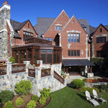
The plan for this sensational residence was the original creation of Ken Andersen and his associates at the
venerable firm of R.S. Granoff Architects. After enjoying their beautiful home for eight years, the owners felt
the time had arrived to expand and enhance their outside living space, and to complement it with an elegant
conservatory. Naturally, they turned to Ken for inspiration, who to our gratitude called on the Renaissance
Design Team to assist in bringing his plan and his clients’ dreams to fruition.
Meeting an exceptionally tight completion schedule was but one of many challenges for this fast-track job.
Thanks to the cooperation of every participant, first-shovel to completion was accomplished in an incredibly
short twelve weeks; all with minimal disruption to the family’s daily routine.
Ken Andersen’s relentless attention to the many intricacies clearly resonates in the glorious finished product.
GOALS:
• Create a conservatory garden room from which to savor the
seasonal splendor of the home’s expansive yards.
• Add a new stone patio and open air kitchen, easily accessible
from the new conservatory’s dining area.
• Provide access from the adjacent family room and the
convenience of a direct pathway to the kitchen.
• Eliminate the shared family room wall to enhance room size,
traffic flow, and natural lighting.
• Accomplish all this in a manner consistent with the home’s
fine Tudor-inspired architecture.
FEATURES:
• The suggestion of traditional hewn timber frame construction
through the use of chamfered pilasters, ceiling beams, and
lantern rafters.
• The warmth of naturally finished mahogany accentuating a
painted beaded ceiling.
• Delicately mullioned transom sash articulated in German
Antique art glass with soldered copper cames.
• Renaissance’s Signature Revival Series oiled bronze push-pull
window hardware.
• Concealed rolling insect screens with beaded head valences.
• Raised paneling at the knee wall and light shaft, matching
those found elsewhere in the home.
• A venting roof lantern with motorized sash.
• Copper roofing, gutters, spouting, and finial posts.
 Fish Creek Finish Carpentry
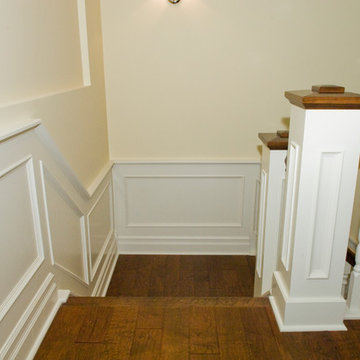
These homeowners came to us through a recommendation from a client who was extremely happy with the work we did for them in the past. This project was in the inner city and the homeowners tore down their old house and built their new home in its place. Keeping with the charm of the original home, the main goal for the home was to make it look like a brand new 100 year old home. We were brought on to work on the entire home with the exception of the kitchen (entry, family room, ceiling work, office/ den, living room, fireplace, window trims, 5 bedrooms, and 4 bathrooms).
In addition to our custom woodworking, these homeowners leaned heavily on our design suggestions. From an execution standpoint, this home was extremely detailed, and getting the balance from room to room and throughout the entire home was crucial for achieving the correct look. In addition, the methods and materials used 100 years ago have since had drastic improvements, making the lifetime and quality of the finished product substantially better, but also adding a higher degree of difficulty to accomplish accurate looking details.
The end result of this project was a work of art. A home that thad the appearance of a 100 year old home, with modern materials and methods to ensure quality and longevity. Everything from their dramatic entry and staircase to their floor-to-ceiling hand-finished den showcases a skill set and eye for detail essential to accomplishing the lofty goals of this home.
 Harbor Kitchen Design
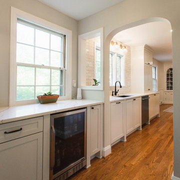
Preview of this kitchen remodel in homeland neighborhood of Baltimore. An update and opening up of a 1960's style Kitchen with metal cabinets and Lime green wallpaper and separate Dining Room covered in patterned wallpaper.
We went back with some rustic wood cabinets to tie the houses heritage into the more transitional looking white shaker cabinet. We utilized KraftMaid Cabinetry's inset look for our design. On the white cabinets this was accomplished by installing 3" wide columns both between every cabinet and at the end of every run. 3" Columns were set 15/16" proud of the cabinet face frame bringing them flush with the full overlay cabinet doors. On the rustic maple, stained cabinets this was accomplished by installing 3/4" wide panels with finished edges set using the same method used on the 3" wall columns.
 Stuart Kitchens Inc.
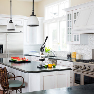
A newly designed kitchen for a large extended family where food preparation and serving/sharing could be accomplished. A buffet was designed and built in to the space to separate the kitchen from the eating area with a custom table to accommodate seating for 14. The gathering place needed to have the look of driftwood which was accomplished with a translucent white paint on cherry that allowed the grain patterns of the wood to peak through. The "sand through" technique further enhanced the look of driftwood. The style is classic with small rails on the top and larger rails below with a flat center panel. Simple hardware completes the look. Special soapstone was found that reflected the ocean with deep green and blue areas that swirl like water. Small mosaic tile were mixed with mother of pearl. Pendant light reflected by nautical lanterns complete the scene.
 Renovation Solutions
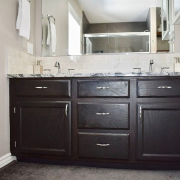
Following the purchase of this beautiful home, we were brought on to create living spaces tailored to the needs it's new occupants and provide a much needed update. This included the kitchen, common areas, 3 bedrooms, 2 bathrooms, paint, new floors, countertops, and more.
Working around a price sensitive budget for this home's full renovation was a nice challenge and our biggest accomplishment. It was essential for the finished product to be high-end, while maintaining it's functionality and durability for years to come. We accomplished this with lots research to find the same high-quality materials at the best price points, as well as alternative products of equal quality and design impact.
What was once an outdated house falling short of its immense potential has since been transformed into a beautiful home perfect for both living and entertaining.
 Wreedone | Kitchen & Bath
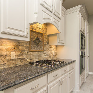
This repeat customer asked that we help them to lighten/brighten their kitchen. To accomplish this goal, we repainted both their walls and previously stained kitchen cabinets, along with replacing their old and cracked 12x12 floors tiles and replace with contemporary rectangular porcelain tiles. Mission accomplished!
 Wisconsin Building Supply
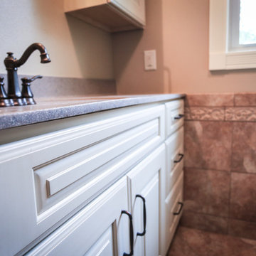
The upper hall closet was moved back over the top of the stairway to accommodate moving the bathroom door over 15" to create a longer vanity for the guest bath upstairs. The door's hinging was changed to have the door open in front of the shower and toward the vanity.
The banjo vanity top allows for additional countertop space as well as a more balanced feel with adding small wall cabinets on either side of the sink. This provides storage space for the guest's amenities without having to use valuable countertop space.
The tiled shower with built in shampoo alcove was used to maximize the space in the shower, since an acrylic shower interior is 3" less.
To make this bathroom feel more spacious, yet warm and inviting, the client chose Dura Supreme's antique white with espresso glaze.
60