
Search results for "Accumulator" in Home Design Ideas
 LiLu Interiors
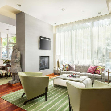
Christy and Matt have traveled the world, picking up a love of Monet’s garden in France and many unique artifacts along the way. They had accumulated an extensive art collection of their own which expanded to include an eclectic array of folk art inherited from Christy’s mom. With an eye on downsizing, the couple realized their living environment had become cluttered. They wanted a more serene feeling in their home…like a modern version of Monet’s Garden. LiLu’s inspiration began with a new color palette, using green as a neutral and adding a mixture of vibrant colors reminiscent of a garden. Sheer drapes in the living room diffuse the natural light, almost as if the sun is being filtered through a canopy of trees. The design team also brought focus to their art collection by designing custom built-ins to display their artwork. The dark wood finish relates to the color of the custom dining table creating a cohesive composition. The clean-lined furniture features soft curves to suggest a more botanical feel. The result has brought dazzling serenity to this condo hidden among the busy streets of downtown Minneapolis.
----
Project designed by Minneapolis interior design studio LiLu Interiors. They serve the Minneapolis-St. Paul area including Wayzata, Edina, and Rochester, and they travel to the far-flung destinations that their upscale clientele own second homes in.
----
For more about LiLu Interiors, click here: https://www.liluinteriors.com/
---
To learn more about this project, click here:
https://www.liluinteriors.com/blog/portfolio-items/secret-garden/

 User
The 5,000 square foot private residence is located in the community of Horseshoe Bay, above the shores of Lake LBJ, and responds to the Texas Hill Country vernacular prescribed by the community: shallow metal roofs, regional materials, sensitive scale massing and water-wise landscaping. The house opens to the scenic north and north-west views and fractures and shifts in order to keep significant oak, mesquite, elm, cedar and persimmon trees, in the process creating lush private patios and limestone terraces.
The Owners desired an accessible residence built for flexibility as they age. This led to a single level home, and the challenge to nestle the step-less house into the sloping landscape.
Full height glazing opens the house to the very beautiful arid landscape, while porches and overhangs protect interior spaces from the harsh Texas sun. Expansive walls of industrial insulated glazing panels allow soft modulated light to penetrate the interior while providing visual privacy. An integral lap pool with adjacent low fenestration reflects dappled light deep into the house.
Chaste stained concrete floors and blackened steel focal elements contrast with islands of mesquite flooring, cherry casework and fir ceilings. Selective areas of exposed limestone walls, some incorporating salvaged timber lintels, and cor-ten steel components further the contrast within the uncomplicated framework.
The Owner’s object and art collection is incorporated into the residence’s sequence of connecting galleries creating a choreography of passage that alternates between the lucid expression of simple ranch house architecture and the rich accumulation of their heritage.
The general contractor for the project is local custom homebuilder Dauphine Homes. Structural Engineering is provided by Structures Inc. of Austin, Texas, and Landscape Architecture is provided by Prado Design LLC in conjunction with Jill Nokes, also of Austin.
Paul Bardagjy Photography
 LiLu Interiors
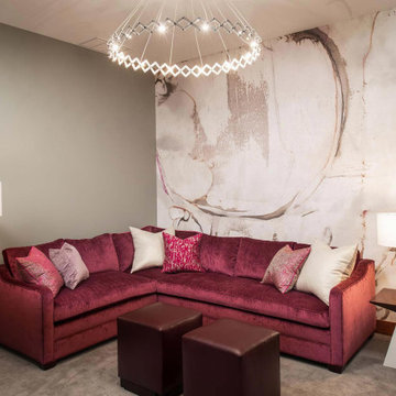
Christy and Matt have traveled the world, picking up a love of Monet’s garden in France and many unique artifacts along the way. They had accumulated an extensive art collection of their own which expanded to include an eclectic array of folk art inherited from Christy’s mom. With an eye on downsizing, the couple realized their living environment had become cluttered. They wanted a more serene feeling in their home…like a modern version of Monet’s Garden. LiLu’s inspiration began with a new color palette, using green as a neutral and adding a mixture of vibrant colors reminiscent of a garden. Sheer drapes in the living room diffuse the natural light, almost as if the sun is being filtered through a canopy of trees. The design team also brought focus to their art collection by designing custom built-ins to display their artwork. The dark wood finish relates to the color of the custom dining table creating a cohesive composition. The clean-lined furniture features soft curves to suggest a more botanical feel. The result has brought dazzling serenity to this condo hidden among the busy streets of downtown Minneapolis.
----
Project designed by Minneapolis interior design studio LiLu Interiors. They serve the Minneapolis-St. Paul area including Wayzata, Edina, and Rochester, and they travel to the far-flung destinations that their upscale clientele own second homes in.
----
For more about LiLu Interiors, click here: https://www.liluinteriors.com/
----
To learn more about this project, click here:
https://www.liluinteriors.com/blog/portfolio-items/secret-garden/
Find the right local pro for your project


 Tiger Lily's Greenwich
Kyle Norton
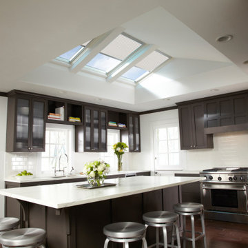
Family room - eclectic family room idea in New York with gray walls
Family room - eclectic family room idea in New York with gray walls
 Functional Interior Design
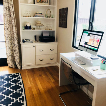
This built is at the end of a long room with a kitchen at the other end, a dining table in the middle and a desk nearby. This is a small 1600 ft house. Smart storage is needed. It made since to combine dining, and office storage because they share the same space. Shelves are notorious for looking untidy. Notice there is balanced open space and not tons of little objects. I started with what needed to be stored first, the printer and office supplies on the bottom shelf. If this built in was closer to the dining table I may have wanted to put everyday dishes on it. Things that would be easy to grab. Instead the easy to grab items came from the office. Behind the built-in door is a shredder. The deep drawers hold the ugly office and art supplies. I choose a small desk because the space is small and needed to be used as a walk through to the backyard. Also the larger the desk the more stuff that accumulates on it. A smaller surface is a natural system that encourages tidiness. The key is that is also needs to look good, so people honor it and usually take care of it. I call it creating a sacred space that demands respect. It really works, like magic. But only if everything has a place and if not something needs to go. Purging is powerful!

 Advance Design Studio, Ltd.
Jennifer and Dan have lived in their Deer Park Illinois home for 15 years, slowly making minor fixes like painting and decorating; but they had a new plan for their kitchen the entire time. An awkwardly placed garage door, and an island cooktop with a terrible downdraft made a full-scale kitchen remodel an absolute must. Jennifer had many ideas in mind and wanted to work with a company that could provide high-end work, while partnering with a designer that would tailor the kitchen to her ideas.
She was intrigued by the phrase “Common Sense Remodeling” in Advance Design’s feature she discovered while perusing an issue of the community’s Quintessential Barrington Magazine. Doing further research on the company’s website, as she looked through project profiles and read about Advance Design’s “Common Sense Remodeling” philosophy, she promptly scheduled an appointment to see if the people and ideas she read about were truly who they said they were. The more she read, the more she knew that the “Common Sense” approach to remodeling they described was exactly the type of company she was looking for.
The partnership was sealed after an initial consultation with Owner Todd Jurs and Project Designer Michelle Lecinski. They displayed a combination of friendliness, professionalism and respect that was unmatched by any of the other companies Jennifer talked to. She knew that with Advance Design, she would be able to retain the vision that she had in mind with high-quality craftsmanship.
“I reached out to Advance Design because of the ‘Common Sense Remodeling’ tagline,” Jennifer said. “That’s what lingered for me”. “Advance Design was the most respectful- of the house and of my design ideas, and the most professional of the handful of companies that looked at my project”.
Soon after the meeting Jennifer began working with Michelle on the project design. They quickly developed chemistry. Jennifer loved how Michelle researched and located every detail that Jennifer wanted for the kitchen. Between the two of them, every concept and idea was worked through and perfected. “Jennifer had definite ideas about what she wanted the new kitchen to look like, she just didn’t know how to bring it all together. We worked together really well to make her ideas into the practical reality necessary for a well-functioning kitchen, with the look and feel that she had envisioned”, says Michelle.
“Michelle was wonderful in using the CAD system she would show me new drawings every time we changed the layout while working through the design,” Jennifer said. “She was a really wonderful partner in execution, she made sure everything happened quickly and easily.”
The finished design drew out elements of Jennifer’s style and personality. The pair call the look “sophisticated farmhouse” to describe the kitchen renovation to family and friends. The result was a beautifully crafted, authentic-feeling space that satisfied Jennifer’s dreams 15 years in the making. The whole project consisted of a kitchen remodel, mudroom upgrade with powder room, and garage entry relocation. “The projects I personally like the best, are the ones that put the client’s dreams on display,” Project Designer Michelle said. “And this is one of those projects.”
The main focal point of the kitchen is custom zinc and brass ventilation hood with a vintage sheen, which was hand made to order by a small company in Indiana named Vogler Metalworking. “It’s like sculpture, a true work of art”, says Jennifer. Your eye is immediately drawn towards this elegant yet practical hood that eliminated the home’s downdraft problem and added a striking conversation piece at the same time. The carpenters had to use special gloves when transporting and installing it, so they didn’t smudge it with fingerprints. The beautiful hood centers proudly over the stunning black enamel and brass LaCornue Range. “I had a friend who had a LaCornue range and after learning how easy it was to cook perfect meals, I was convinced I wanted to have one”, says Jennifer. This unique, breathtaking combination anchors the entire kitchen and is apparent immediately as you walk into the great room the surrounds the space.
DuraSupreme Crestwood cabinets with a Kendall Panel add function and sophistication. A custom gray paint color paired with a storm blue was developed so that the new kitchen looked like it belonged to the existing space. Unlacquered brass faucets and hardware were important to Jennifer because she wanted the living finishes to age over time. Remarkable brass diamond mesh cabinet door inserts imported from the UK continue to add this one-of-a-kind kitchen renovation; giving it a “you won’t see this everywhere” quality. The use of old railcar flooring for the coffee bar countertop and reclaimed oak for the open shelving gives an authenticity to the space uncommon in kitchens today.
Jennifer and Michelle fell in love with the Limestone Grey Stone while they were investigating unique island countertop ideas. They liked the fact that the limestone as a living finish will age and change over time. Calcutta Miel Quartz countertops made for an excellent pairing around the perimeter, as it’s durable and perfect for cooking preparations. A textured white subway tile backsplash that runs to the ceiling keeps your eye moving towards the open shelving, and to the main focal point of the stunning range hood combination.
“The kitchen functions beautifully, and it’s gorgeous,” beams Jennifer as she gestures with both hands while smiling ear to ear. “The most important thing was I wanted a kitchen that had a wonderful flow, cooked beautiful meals and was a great gathering place for family and friends, and this space does that perfectly! Beauty wise, it turned out exactly how I had envisioned. I felt the function part was the hardest part, and that was nailed”!
Relocating the garage entry to the new mudroom was a huge priority and has finally separated the family’s arriving home functions from their kitchen. Now coats and shoes and bags have their own area for dropping once members arrive home. Matching gray DuraSupreme cabinetry helped create gorgeous, purposeful lockers for the family. A reclaimed vintage sink and custom wall paper were added to the tiny powder room to beautify the once previously only functional space. Advance Design was even able to create a custom space for their dog to sleep while the family is away.
“It was unbelievable that a project of this size was completed in such a short time, and I think that’s because of the large amount of planning and preparation that went into it,” Jennifer marveled, “When we started, we were ready, and everything was prepared”.
When it came to execution, Project Manager Justin Davis and his crew were quick, accessible, and organized. Projects like this kitchen are typically completed in as little as 8-10 weeks. Jennifer’s kitchen however despite the relocation of some challenging HVAC in a soffit and moving of an exterior door was completed remarkably fast in part because the team was working with an existing tile floor that ran throughout the first floor that the client really loved.
“You get to know these people really well because they’re living in your house while you’re living in your house. They were so fast and really good, it didn’t take as long as even planned” reported Jennifer. “I would text Justin and he always responded almost immediately. I got to know all the guys who were working in our house and they were all wonderful people”.
Details in a customized kitchen like this one require skill and care from the people who install it. “All the guys on the job were skilled at what the did. I wanted small details like little feet to look like furniture, that is where their carpentry skill came in to make these all perfect”, said Jennifer. “The tile guys were wonderful. They even let me determine how I wanted the texture with the grout to appear for a salt and pepper look; now that is a very skilled trade person making it custom”.
In Jennifer’s interview, she continued to reference Advance Design’s “Common Sense Remodeling”, so I took a minute to ask her exactly what that phrase meant to her and how it played out in her experience with her project and the Advance Design team. Here is what she said: “I was intrigued about Common Sense Remodeling and in my head that there would be clear costs and prices, great communication between the design team, the execution team and me”, said Jennifer. They did deliver on that, it was so clear about the cost breakdown, what I could expect from everyone who came to my house, and everything that we had ordered. That to me is the Common Sense”!
It’s great to see a client take literally our assertion that a well-planned remodeling project is simply “Common Sense”! She anticipated each step of the way would be clear, concise, and predictable, all the while protecting the outcome due to the careful upfront planning. “Advance Design delivered on their ‘Common Sense Remodeling’ promise,” Jennifer said. “From the design team, to the execution team - everything was straight forward like I imagined. The project turned out exactly how I envisioned, I enjoyed this process and absolutely would recommend Advance Design Studio to anyone.”


 Redl World Class Kitchens
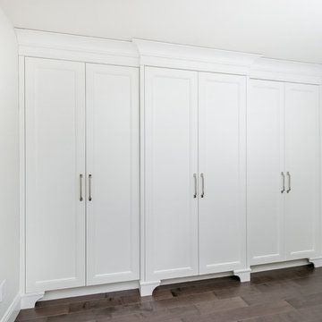
Master bedroom closet looks stunning done in a simple white lacquer finish.
Redl Kitchens
156 Jessop Avenue
Saskatoon, SK S7N 1Y4
10341-124th Street
Edmonton, AB T5N 3W1
1733 McAra St
Regina, SK, S4N 6H5


 User
The 5,000 square foot private residence is located in the community of Horseshoe Bay, above the shores of Lake LBJ, and responds to the Texas Hill Country vernacular prescribed by the community: shallow metal roofs, regional materials, sensitive scale massing and water-wise landscaping. The house opens to the scenic north and north-west views and fractures and shifts in order to keep significant oak, mesquite, elm, cedar and persimmon trees, in the process creating lush private patios and limestone terraces.
The Owners desired an accessible residence built for flexibility as they age. This led to a single level home, and the challenge to nestle the step-less house into the sloping landscape.
Full height glazing opens the house to the very beautiful arid landscape, while porches and overhangs protect interior spaces from the harsh Texas sun. Expansive walls of industrial insulated glazing panels allow soft modulated light to penetrate the interior while providing visual privacy. An integral lap pool with adjacent low fenestration reflects dappled light deep into the house.
Chaste stained concrete floors and blackened steel focal elements contrast with islands of mesquite flooring, cherry casework and fir ceilings. Selective areas of exposed limestone walls, some incorporating salvaged timber lintels, and cor-ten steel components further the contrast within the uncomplicated framework.
The Owner’s object and art collection is incorporated into the residence’s sequence of connecting galleries creating a choreography of passage that alternates between the lucid expression of simple ranch house architecture and the rich accumulation of their heritage.
The general contractor for the project is local custom homebuilder Dauphine Homes. Structural Engineering is provided by Structures Inc. of Austin, Texas, and Landscape Architecture is provided by Prado Design LLC in conjunction with Jill Nokes, also of Austin.
Cecil Baker + Partners Photography

 Ebenisterie GMRS
Resurfaçage d’armoires de cuisine : un autre service qu’on offre chez GMRS.
?? Voici un autre projet signée GMRS réalisé en collaboration avec Brigitte Poitras de IDéco !
Notre mandat pour ce projet fut de remplacer les portes existantes de la cuisine, tout en conservant la majorité des caissons. Afin d’accueillir la nouvelle hotte micro-onde, nous avons dû changer l’armoire du haut pour la rendre plus grande, et ainsi avoir une hotte “flush” avec les armoires du haut. Aussi, nous avons dû changer l’armoire qui servait auparavant à loger le micro-onde. Étant donné que les clients désiraient avoir plus de rangement au sein de la péninsule, nous avons eu besoin de changer les armoires afin d’incorporer des tiroirs.
Aussi, au lieu d’avoir des tablettes amovibles dans le garde-manger, nous avons installer 4 tiroirs afin d’optimiser le rangement et l’accessibilité. Enfin, nous avons fermé les armoires jusqu’au plafond afin d’empêcher la poussière de s’accumuler au-dessus des armoires !
Que pensez-vous du résultat ?
Crédit photo : Marie-Claude Larose
 Ebenisterie GMRS
Resurfaçage d’armoires de cuisine : un autre service qu’on offre chez GMRS.
?? Voici un autre projet signée GMRS réalisé en collaboration avec Brigitte Poitras de IDéco !
Notre mandat pour ce projet fut de remplacer les portes existantes de la cuisine, tout en conservant la majorité des caissons. Afin d’accueillir la nouvelle hotte micro-onde, nous avons dû changer l’armoire du haut pour la rendre plus grande, et ainsi avoir une hotte “flush” avec les armoires du haut. Aussi, nous avons dû changer l’armoire qui servait auparavant à loger le micro-onde. Étant donné que les clients désiraient avoir plus de rangement au sein de la péninsule, nous avons eu besoin de changer les armoires afin d’incorporer des tiroirs.
Aussi, au lieu d’avoir des tablettes amovibles dans le garde-manger, nous avons installer 4 tiroirs afin d’optimiser le rangement et l’accessibilité. Enfin, nous avons fermé les armoires jusqu’au plafond afin d’empêcher la poussière de s’accumuler au-dessus des armoires !
Que pensez-vous du résultat ?
Crédit photo : Marie-Claude Larose
 Ebenisterie GMRS
Resurfaçage d’armoires de cuisine : un autre service qu’on offre chez GMRS.
?? Voici un autre projet signée GMRS réalisé en collaboration avec Brigitte Poitras de IDéco !
Notre mandat pour ce projet fut de remplacer les portes existantes de la cuisine, tout en conservant la majorité des caissons. Afin d’accueillir la nouvelle hotte micro-onde, nous avons dû changer l’armoire du haut pour la rendre plus grande, et ainsi avoir une hotte “flush” avec les armoires du haut. Aussi, nous avons dû changer l’armoire qui servait auparavant à loger le micro-onde. Étant donné que les clients désiraient avoir plus de rangement au sein de la péninsule, nous avons eu besoin de changer les armoires afin d’incorporer des tiroirs.
Aussi, au lieu d’avoir des tablettes amovibles dans le garde-manger, nous avons installer 4 tiroirs afin d’optimiser le rangement et l’accessibilité. Enfin, nous avons fermé les armoires jusqu’au plafond afin d’empêcher la poussière de s’accumuler au-dessus des armoires !
Que pensez-vous du résultat ?
Crédit photo : Marie-Claude Larose
 Ebenisterie GMRS
Resurfaçage d’armoires de cuisine : un autre service qu’on offre chez GMRS.
?? Voici un autre projet signée GMRS réalisé en collaboration avec Brigitte Poitras de IDéco !
Notre mandat pour ce projet fut de remplacer les portes existantes de la cuisine, tout en conservant la majorité des caissons. Afin d’accueillir la nouvelle hotte micro-onde, nous avons dû changer l’armoire du haut pour la rendre plus grande, et ainsi avoir une hotte “flush” avec les armoires du haut. Aussi, nous avons dû changer l’armoire qui servait auparavant à loger le micro-onde. Étant donné que les clients désiraient avoir plus de rangement au sein de la péninsule, nous avons eu besoin de changer les armoires afin d’incorporer des tiroirs.
Aussi, au lieu d’avoir des tablettes amovibles dans le garde-manger, nous avons installer 4 tiroirs afin d’optimiser le rangement et l’accessibilité. Enfin, nous avons fermé les armoires jusqu’au plafond afin d’empêcher la poussière de s’accumuler au-dessus des armoires !
Que pensez-vous du résultat ?
Crédit photo : Marie-Claude Larose

 The Kitchenworks
This photo depicts how perfectly the hood was matched to stainless steel of the Wolf gas stove and oven. We also see the marble slabs in the back move to reveal secret spice cabinets. What an innovative way to make use of all the space!
Photo credits: Matthew Horton
 Functional Interior Design
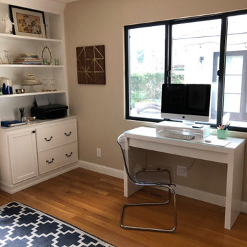
This built is at the end of a long room with a kitchen at the other end, a dining table in the middle and a desk nearby. This is a small 1600 ft house. Smart storage is needed. It made since to combine dining, and office storage because they share the same space. Shelves are notorious for looking untidy. Notice there is balanced open space and not tons of little objects. I started with what needed to be stored first, the printer and office supplies on the bottom shelf. If this built in was closer to the dining table I may have wanted to put everyday dishes on it. Things that would be easy to grab. Instead the easy to grab items came from the office. Behind the built-in door is a shredder. The deep drawers hold the ugly office and art supplies. I choose a small desk because the space is small and needed to be used as a walk through to the backyard. Also the larger the desk the more stuff that accumulates on it. A smaller surface is a natural system that encourages tidiness. The key is that is also needs to look good, so people honor it and usually take care of it. I call it creating a sacred space that demands respect. It really works, like magic. But only if everything has a place and if not something needs to go. Purging is powerful!

 Blue River Cabinetry Kitchen & Bath
StarMark cherry cabinets with slate stain, granite countertop with flat polish edge, Kohler verticyl rectangle sink with July faucet in chrome, white subway tile shower and hex and dot floor, white beadboard and chairrail with blue paint. Sliding door medicine cabinet over sink.
 User
The 5,000 square foot private residence is located in the community of Horseshoe Bay, above the shores of Lake LBJ, and responds to the Texas Hill Country vernacular prescribed by the community: shallow metal roofs, regional materials, sensitive scale massing and water-wise landscaping. The house opens to the scenic north and north-west views and fractures and shifts in order to keep significant oak, mesquite, elm, cedar and persimmon trees, in the process creating lush private patios and limestone terraces.
The Owners desired an accessible residence built for flexibility as they age. This led to a single level home, and the challenge to nestle the step-less house into the sloping landscape.
Full height glazing opens the house to the very beautiful arid landscape, while porches and overhangs protect interior spaces from the harsh Texas sun. Expansive walls of industrial insulated glazing panels allow soft modulated light to penetrate the interior while providing visual privacy. An integral lap pool with adjacent low fenestration reflects dappled light deep into the house.
Chaste stained concrete floors and blackened steel focal elements contrast with islands of mesquite flooring, cherry casework and fir ceilings. Selective areas of exposed limestone walls, some incorporating salvaged timber lintels, and cor-ten steel components further the contrast within the uncomplicated framework.
The Owner’s object and art collection is incorporated into the residence’s sequence of connecting galleries creating a choreography of passage that alternates between the lucid expression of simple ranch house architecture and the rich accumulation of their heritage.
The general contractor for the project is local custom homebuilder Dauphine Homes. Structural Engineering is provided by Structures Inc. of Austin, Texas, and Landscape Architecture is provided by Prado Design LLC in conjunction with Jill Nokes, also of Austin.
Cecil Baker + Partners Photography

 Atlantic Water Gardens
Bubbling natural basalt columns
This is an example of a contemporary water fountain landscape in Cleveland.
This is an example of a contemporary water fountain landscape in Cleveland.
29