
Search results for "Achieved" in Home Design Ideas
 JH Builders
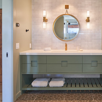
brass faucet, brass sconces, single handle faucet, circular mirror, gold faucet, mosaic floor tile, nest thermostat, pocket door,
Example of a transitional white tile and mosaic tile gray floor bathroom design in Other with green cabinets, beige walls, an undermount sink, white countertops and flat-panel cabinets
Example of a transitional white tile and mosaic tile gray floor bathroom design in Other with green cabinets, beige walls, an undermount sink, white countertops and flat-panel cabinets
 GAYLA BECHTOL ARCHITECT
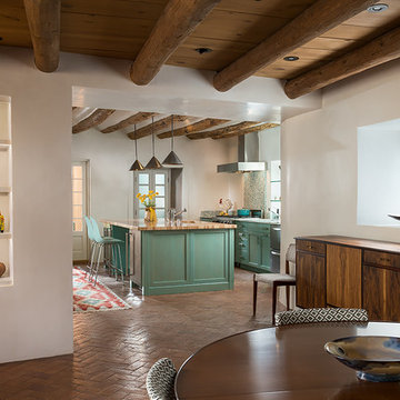
This kitchen and dining space beautifully embodies Santa Fe Style Architecture, where traditional adobe-inspired elements meet modern function. Exposed vigas and smooth plaster walls anchor the space in the legacy of Adobe Architecture, while custom wood cabinetry and artisanal niches highlight the craftsmanship valued in Historic Preservation Santa Fe. The turquoise kitchen island adds a contemporary yet regionally inspired touch, blending seamlessly into the home’s Custom Residential Design Santa Fe. Guided by the vision of a skilled Santa Fe Architect, the design achieves warmth, authenticity, and livable elegance, honoring history while embracing modern living.
 Tom Bassett-Dilley Architect, Ltd.
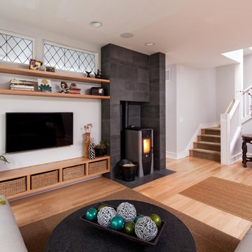
Inside and out, this is a complete “green” house. Designed using Passive House methodology with energy consultant CTI, the house achieves 70% better energy performance than a new built-to-code house, while stylishly fitting the block. Walls and roofs were constructed from 12” Structural Insulated Panels, and triple-glazed Loewen windows completed the high-performance thermal package. Materials and fixtures were selected for efficiency, recycled content, local production, non-toxicity, and durability. Landscape design uses native plantings, a water garden, and permeable paving. As an all-electric house, it uses heat pumps for space conditioning and water heating, and features a pellet stove for supplemental space heating.
Find the right local pro for your project
 Swift Creek Cabinets & Design
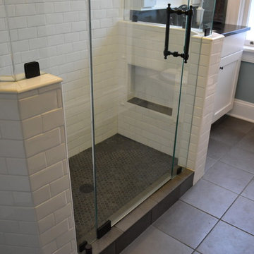
Keeping the shower floor the same color as the main bathroom floor helps visually expand the space, creating a more open and seamless feel. By continuing the flooring into the shower, visual breaks are minimized and the entire room feels larger.
Notice the angled half walls at the shower—this detail plays an important role in softening what would otherwise feel like a tight space. It also allowed us to gain additional depth in the shower. Without those angles, the shower would have been approximately 6 inches shallower due to underlying structural and layout constraints.
Achieving this look with a traditional curb can be challenging. Most tile installers today prefer using a stone curb, which often creates a clear separation between the bathroom floor and the shower floor—breaking that seamless effect.
The most effective way to maintain a continuous look is with a curbless (zero-entry) shower. This allows the flooring to flow uninterrupted, creating a clean, modern design.
At the time this project was completed, curbless systems like Schluter were not widely available. Today, with systems like Schluter’s zero-entry shower solutions, achieving this seamless, continuous look is much more accessible and reliable.
The result is a bathroom that feels larger, cleaner, and thoughtfully designed—both visually and functionally.
 Nar Design Group
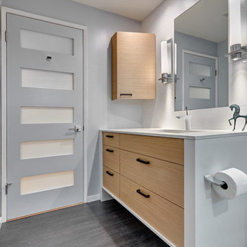
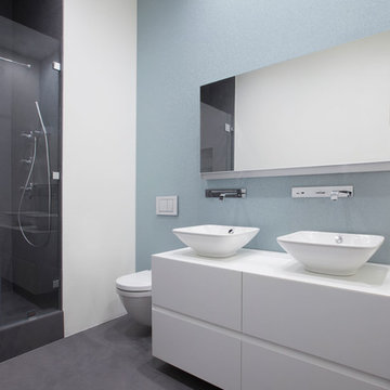
This previously small and under-utilized hall bathroom presented several design challenges. Maximizing storage and creating a big feeling with limited square footage was priority. It was also imperative that the end result be bright yet warm, durable and easy to maintain while achieving a sleek contemporary look.
The solution was multifold. The fixture layout was rearranged to maximize function. European frameless cabinetry with large drawers was used to maximize storage. A larger medicine cabinet was custom designed and placed on an angle to give maximum storage above the vanity. Warmth was brought into the space with the charcoal wood grain patterned floor tile and Rift White Oak horizontal grain cabinetry. A soft blue grey hue was chosen for the walls and a new 5 lite door, bringing serenity and peace to the space. Updated LED recessed lights bounce off the Porcelonosa wall tile and highlight the subtle stripe detail. The old light bar was replaced with sleek wall sconces providing more flattering light both outward for the user and down to the counter to illuminate items gracing the surface.
Special details such as the stone wrapped vanity were achieved through acute intention by the designer and skillful execution by fine local craftsman. Dekton was used as the wrap and is a striking and unexpected detail creating abundant simplicity and modern elegance while providing a durable and easy to maintain surface. The mirror was inset flush with the surrounding Porcelanosa wall tile and its edges align perfectly with the lines of the tile. Wall to wall Euro glass sliding shower doors maximize the spacious feeling and slide seamlessly on a brushed nickel mechanical rail system.
 BLU Interiors: Chelsea Dunbar
Photo Credit: Willett Photography http://www.willettphoto.com
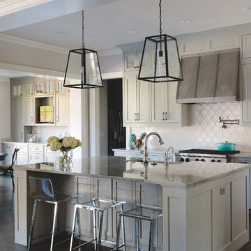
The home is located in Atlanta, GA and was a complete ground up project. We worked with the very talented architect Rodolfo Castro. We worked closely with him and the clients to achieve the right interior layout as well as the furniture plan. As far as the interior design, we helped with the selections of the various finishes (flooring, bathroom tiles, paint colors for both interior and exterior, hardware, furniture and light fixtures). Working with great vendors such as Francois & Co. for the kitchen hood and the fireplace, Specialty Tile, Circa Lighting, Century Furniture, and many other wonderful local vendors. This helped us achieve the perfect atmosphere and architectural detail in the space. The clients were very involved in the selection process and so it helped that they had great taste! It was a great project from concept to the finished design.
 Donald Lococo Architects
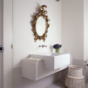
Inspiration for a contemporary powder room remodel in DC Metro with a wall-mount sink

Sponsored
Columbus, OH

Wannemacher Interiors
Customized Award-Winning Interior Design Solutions in Franklin Cnty OH
 Beth Haley Design
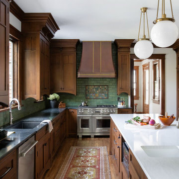
Arts and crafts u-shaped medium tone wood floor and brown floor kitchen photo in Nashville with an undermount sink, shaker cabinets, medium tone wood cabinets, green backsplash, stainless steel appliances, an island and black countertops
 Darci Hether
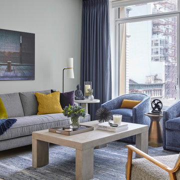
Our client for this project has a beautiful home in the suburbs but wanted a second home in NYC. He's a financier and spends 2-4 nights per week in the city, so he came to our New York City design studio to design his new build pied-à-terre in Tribeca. He wanted an upscale, family-friendly apartment as his college-age children might use the apartment, too. Our goal was to create a soothing, moody, textural, comfortable, and contemporary home. The entryway welcomes you with dark gray, deeply textured wallpaper and statement pieces like the angular mirror and black metal table that are an ode to NYC industrial style. The open kitchen and dining are sleek and flaunt statement metal lights, while the living room features textured contemporary furniture and a stylish bar cart. The bedroom is an oasis of calm and relaxation, with the textured wallpaper playing the design focal point. The luxury extends to the powder room with modern brass pendants, warm-toned natural stone, deep-toned walls, and organic-inspired artwork.
 Barley|Pfeiffer Architecture
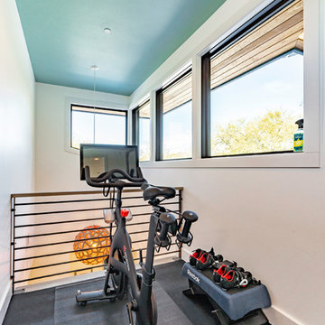
Our inspiration for this home was an updated and refined approach to Frank Lloyd Wright’s “Prairie-style”; one that responds well to the harsh Central Texas heat. By DESIGN we achieved soft balanced and glare-free daylighting, comfortable temperatures via passive solar control measures, energy efficiency without reliance on maintenance-intensive Green “gizmos” and lower exterior maintenance.
The client’s desire for a healthy, comfortable and fun home to raise a young family and to accommodate extended visitor stays, while being environmentally responsible through “high performance” building attributes, was met. Harmonious response to the site’s micro-climate, excellent Indoor Air Quality, enhanced natural ventilation strategies, and an elegant bug-free semi-outdoor “living room” that connects one to the outdoors are a few examples of the architect’s approach to Green by Design that results in a home that exceeds the expectations of its owners.
Photo by Mark Adams Media


 Axis Mundi
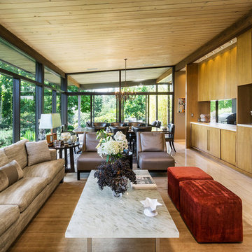
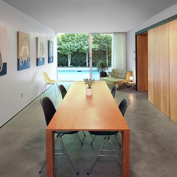
When the Gimbels department store chain closed in 1986, many of its selling floors were converted into luxury apartments, including those of this branch at 86th Street and Lexington Avenue. The retailer’s soaring ceilings allowed Axis Mundi to create bedroom mezzanine spaces overlooking the living and dining rooms. Defining them with translucent glass welcomed natural light while retaining privacy. Downstairs, spaces bleed one into another, their basic monochromatic black-and-white palette acting as a unifying leitmotif. Yet each space feels distinct, with its own programmatic purpose, a feat largely achieved by varying floor and wall treatments—a graphic tile pattern in the entry, a red wall in the hall leading to the master suite, a colorful area rug in the living room. In the retailer’s heyday, the then-common saying, “Would Macy’s tell Gimbels?” implied the strategies the competitors kept from each other to gain the upper hand. Here, a structure iconic in its day also conceals something: a handsome, wholly contemporary repurposing that represents just the sort of innovation that made Gimbels the celebrated name that it was.
 Carolina V. Gentry, RID
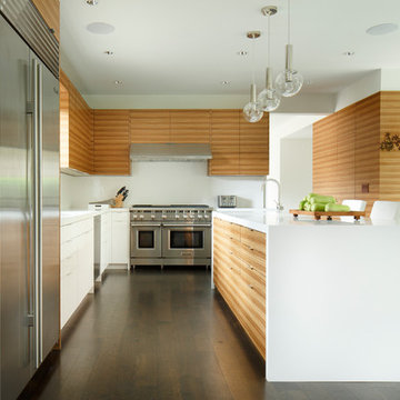
This forever home, perfect for entertaining and designed with a place for everything, is a contemporary residence that exudes warmth, functional style, and lifestyle personalization for a family of five. Our busy lawyer couple, with three close-knit children, had recently purchased a home that was modern on the outside, but dated on the inside. They loved the feel, but knew it needed a major overhaul. Being incredibly busy and having never taken on a renovation of this scale, they knew they needed help to make this space their own. Upon a previous client referral, they called on Pulp to make their dreams a reality. Then ensued a down to the studs renovation, moving walls and some stairs, resulting in dramatic results. Beth and Carolina layered in warmth and style throughout, striking a hard-to-achieve balance of livable and contemporary. The result is a well-lived in and stylish home designed for every member of the family, where memories are made daily.
 Jobe Corral Architects
Casey Dunn
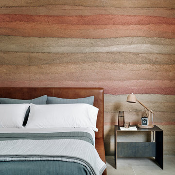
Bedroom - southwestern gray floor bedroom idea in Other with multicolored walls
Bedroom - southwestern gray floor bedroom idea in Other with multicolored walls
 Jessica Lagrange Interiors
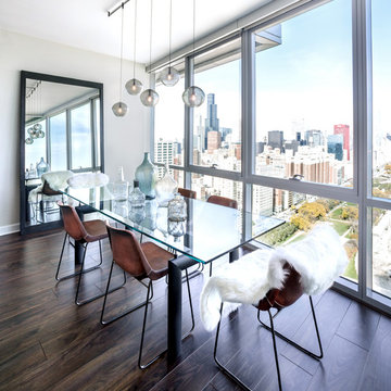
South Loop Residence, Jessica Lagrange Interiors LLC, Photo by Kelly Allison
Dining room - contemporary dining room idea in Chicago
Dining room - contemporary dining room idea in Chicago
 AoDK Inc.
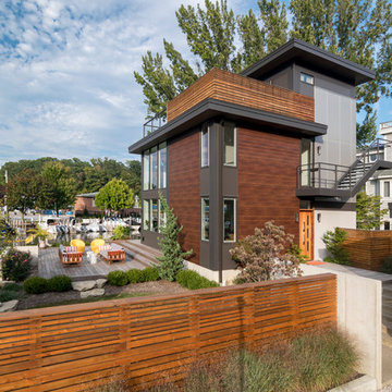
A couple wanted a weekend retreat without spending a majority of their getaway in an automobile. Therefore, a lot was purchased along the Rocky River with the vision of creating a nearby escape less than five miles away from their home. This 1,300 sf 24’ x 24’ dwelling is divided into a four square quadrant with the goal to create a variety of interior and exterior experiences while maintaining a rather small footprint.
Typically, when going on a weekend retreat one has the drive time to decompress. However, without this, the goal was to create a procession from the car to the house to signify such change of context. This concept was achieved through the use of a wood slatted screen wall which must be passed through. After winding around a collection of poured concrete steps and walls one comes to a wood plank bridge and crosses over a Japanese garden leaving all the stresses of the daily world behind.
The house is structured around a nine column steel frame grid, which reinforces the impression one gets of the four quadrants. The two rear quadrants intentionally house enclosed program space but once passed through, the floor plan completely opens to long views down to the mouth of the river into Lake Erie.
On the second floor the four square grid is stacked with one quadrant removed for the two story living area on the first floor to capture heightened views down the river. In a move to create complete separation there is a one quadrant roof top office with surrounding roof top garden space. The rooftop office is accessed through a unique approach by exiting onto a steel grated staircase which wraps up the exterior facade of the house. This experience provides an additional retreat within their weekend getaway, and serves as the apex of the house where one can completely enjoy the views of Lake Erie disappearing over the horizon.
Visually the house extends into the riverside site, but the four quadrant axis also physically extends creating a series of experiences out on the property. The Northeast kitchen quadrant extends out to become an exterior kitchen & dining space. The two-story Northwest living room quadrant extends out to a series of wrap around steps and lounge seating. A fire pit sits in this quadrant as well farther out in the lawn. A fruit and vegetable garden sits out in the Southwest quadrant in near proximity to the shed, and the entry sequence is contained within the Southeast quadrant extension. Internally and externally the whole house is organized in a simple and concise way and achieves the ultimate goal of creating many different experiences within a rationally sized footprint.
Photo: Sergiu Stoian


 rho architects
John Granen Photography
http://www.johngranen.com/
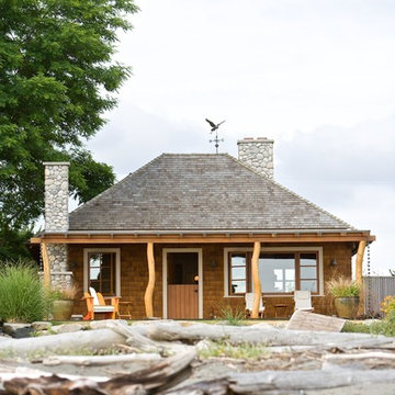
Mid-sized beach style brown wood exterior home photo in Seattle with a hip roof
Mid-sized beach style brown wood exterior home photo in Seattle with a hip roof
130