
Search results for "Activity originating" in Home Design Ideas
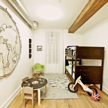
 Marie Burgos Design
Established in 1895 as a warehouse for the spice trade, 481 Washington was built to last. With its 25-inch-thick base and enchanting Beaux Arts facade, this regal structure later housed a thriving Hudson Square printing company. After an impeccable renovation, the magnificent loft building’s original arched windows and exquisite cornice remain a testament to the grandeur of days past. Perfectly anchored between Soho and Tribeca, Spice Warehouse has been converted into 12 spacious full-floor lofts that seamlessly fuse Old World character with modern convenience. Steps from the Hudson River, Spice Warehouse is within walking distance of renowned restaurants, famed art galleries, specialty shops and boutiques. With its golden sunsets and outstanding facilities, this is the ideal destination for those seeking the tranquil pleasures of the Hudson River waterfront.
Expansive private floor residences were designed to be both versatile and functional, each with 3 to 4 bedrooms, 3 full baths, and a home office. Several residences enjoy dramatic Hudson River views.
This open space has been designed to accommodate a perfect Tribeca city lifestyle for entertaining, relaxing and working.
The design reflects a tailored “old world” look, respecting the original features of the Spice Warehouse. With its high ceilings, arched windows, original brick wall and iron columns, this space is a testament of ancient time and old world elegance.
This kids' bedroom design has been created keeping the old world style in mind. It features an old wall fabric world map, a bunk bed, a fun chalk board kids activity table and other fun industrial looking accents.
Photography: Francis Augustine


 Lori Jolin Design, LLC.
Sutter Photographers
2014 CotY Award - Entire House Under $250,000
-The home office area is perfect for the homeowner to work from home or keep track of family activities.
-The bench is on wheels, which allows her to meet with clients or give small group presentations.
-Filing cabinets are hidden within the moveable bench.
-The desk top can be extended by lifting the side panel and securing it in place. This was in response to the height of the existing window interfering with the size of the desk.
-The original baseboards and casings were removed and labeled. They were reinstalled where possible after new flooring was in place.
-The new door on the laundry room has a magnetic blackboard on one side to attach artwork, to-do lists, or photographs.
-A small closet was installed with several electrical outlets and a docking center for cell phones and other electronic devices (right of laundry room door, not seen in photograph).
Find the right local pro for your project
 Decorating Den Interiors- Clark Team Designs
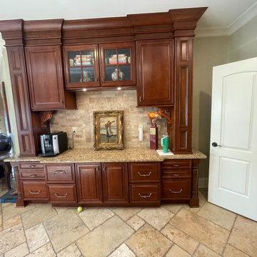
The original kitchen featured dark cherry cabinetry with ornate corbels, Tuscan-inspired tile, outdated bronze hardware, and insufficient lighting that made the space feel heavy and visually closed off. While the cabinetry itself was high quality, the clients were unsure whether to paint or replace it and wanted reassurance that their investment would feel timeless. The design solution focused on refinement rather than removal. Existing cabinetry was repainted in a warm neutral tone to immediately brighten the space while complementing the existing stone flooring, and decorative corbels were replaced with simplified profiles to modernize the cabinetry without altering its original construction.
Moon Valley quartz countertops established a cohesive palette with subtle warm undertones, while Tuscan-style tile was replaced with classic white subway tile to visually open the space. Patterned tile accents were selectively incorporated at the range and adjacent coffee station, and the range feature was simplified by eliminating the original arch to create a cleaner focal point. Lighting played a critical role in the transformation, with glass and brushed gold fixtures significantly improving brightness and maintaining open sightlines into the adjacent living and dining areas. A new side-by-side refrigerator was custom paneled to match the cabinetry profile, and bulky island seating was replaced with slim-profile barstools upholstered in durable performance materials—supporting an active, family-focused lifestyle. The result is a warm, cohesive transitional kitchen defined by thoughtful restraint, improved function, and lasting appeal.
 Twelve Stones Designs, LLC
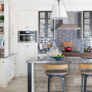
The owners of this kitchen had spent the money to upgrade the finishes in their kitchen upon building the home 12 years ago, but after living in the space for several years they realized how nonfunctional the layout really was. The (then) two preschool aged children had grown into busy, hungry teenagers with many friends who also liked to hang out at the house. So the family needed a more functional kitchen with better traffic flow, space for daily activities revolving around the kitchen at different times of day, and a kitchen that could accommodate cooking for and serving large groups. Furthermore, the dark, traditional finishes no longer reflected the homeowners’ style. They requested a brighter, more relaxed, coastal style that reflected their love of the seaside cities they like to visit.
Originally, the kitchen was U-shaped with a narrow island in the middle. The island created narrow aisles that bottle-necked at the dishwasher, refrigerator, and cooktop areas. There was a pass-through from the foyer into the kitchen, but the owners never liked that the pass-through was also located so close to the powder room. The awkward proximity was unappealing and made guests feel uncomfortable.
The kitchen’s storage was made up of lots of narrow cabinets, apothecary drawers, clipped corner units, and very few drawers. It lacked useful storage for the larger items the family used on a daily basis. And the kitchen’s only pantry was small closet that had only builder-grade, narrow shelving with no illumination to be able to see the contents inside.
Overall, the kitchen’s lighting plan was poorly executed. Only six recessed cans illuminated the entire kitchen and nook areas. The under cabinet lighting was not evenly distributed either. In fact, the builder had mis-placed the under cabinet lighting around the decorative pilasters which made for choppy, dark cubbies. Further, the builder didn’t include any lighting over the sink or the bar area, which meant whoever was doing the dishes was always in their own shadow. That, coupled with the steep overhang of the game room above made the bar area feel like a dim, cavernous space that wasn’t inviting or task oriented. The kitchen looked out into the main living space, but the raised bar and a narrow wall (which held the only large cabinet in the kitchen) created more of a barrier than a relationship to the living room or breakfast nook. In fact, one couldn’t even see the breakfast nook from the cooktop or sink areas due to its orientation. The raised bar top was too narrow to comfortably sit to either dine at or chat from due to the lack of knee space. The the homeowners confided that the kitchen felt more like a dark, dirty prison than place where the family, or their guests, wanted to gather and commune.
The clients' needs and desires were:
➢ to create a kitchen that would be a space the family loved to be in; to relate to the adjacent spaces all around, and to have better flow for entertaining large groups
➢ to remove the walls between the breakfast nook and living area and to be able to utilize the natural light from the windows in both those areas
➢ to incorporate a functional chopping block for prepping fresh food for home cooked meals, an island with a large sink and drain board, 2 pull out trash cans, and seating for at least the 2 teens to eat or do homework
➢ to design a kitchen and breakfast nook with an airy, coastal, relaxed vibe that blended with the rest of the house's coastal theme
➢ to integrate a layered lighting plan which would include ample general illumination, specific task lighting, decorative lighting, and lots of illuminated storage
➢ to design a kitchen with not only more storage for all the husband’s kitchen gadgets and collection of oils and spices, but smart storage, including a coffee/breakfast bar and a place to store and conceal the toaster oven and microwave
➢ to find a way to utilize the large open space between the kitchen, pantry area, and breakfast nook
Twelve Stones Designs achieved the owner's goals by:
➢ removing the walls between the kitchen and living room to allow the natural light to filter in from the adjacent rooms and to create a connection between the kitchen, nook, and living spaces for a sense of unity and communion
➢ removing the existing pantry and designing 3 large pantry style cabinets with LED tape lights and rollout drawers to house lots of kitchen appliances, gadgets, and tons of groceries. We also took the cabinets all the way up to the 9’ ceiling for additional storage for seasonal items and bulk storage.
➢ designing 2 islands - 1 with a gorgeous black walnut chopping block that houses a drawer for chopping and carving knives and a custom double pull out trash unit for point of use utilization - and 1 that houses the dishwasher, a large Blanco Gourmet sink with integrated drain board, woven baskets for fresh root vegetables and kitchen towels, plenty of drawer storage for kitchen items, and bar seating for up to 4 diners.
➢ closing off the space between the kitchen and the powder room to create a beautiful new private alcove for the powder room as well as adding some decorative storage. This also gave us space to include more tall storage near the new range for precision placement of the husband’s extensive oil and spice collection as well as a location for a combo-steam oven the wife wanted for baking and cooking healthy meals.
The project is enhanced functionally by:
➢ incorporated USB and standard receptacles for the kids’ laptops and phone charging in the large island
➢ designing the small island to include additional open shelving for items used on a daily basis such as a variety of bowls, plates, and colanders. This set up also works well for the husband who prefers to “plate” his dinners in restaurant-style fashion before presenting them to the table.
➢ the integration of specific storage units, such as double stacked cutlery drawers, a custom spice pull-out, a Kuerig coffee and tea pod drawer, and custom double stacked utensil drawers
➢ moving the refrigerator to the old oven location - this eliminated the bottle neck as well as created a better relationship to the eating table. It also utilizes the floor space between the pantry, nook, and kitchen
➢ creating a banquet style breakfast nook - this banquette seating not only doubles the amount of seating for large gatherings but it better utilizes the odd space between the kitchen and the previous nook area. It also helps to create a distinct pathway from the mudroom room through the pantry area, kitchen, nook, and living room.
➢ the coffee/breakfast bar area which includes the perfect location for the concealed microwave and toaster oven, convenient storage for the coffee pods and tea accoutrements. Roll-out drawers below also house the smoothie maker, hot water kettle, and a plethora of smoothie-making ingredients such as protein powders, smoothie additives, etc. Furthermore, the drawers below the Keurig house measuring utensil, cutlery, baking supplies and tupperware storage.
➢ incorporating lots of wide drawers and pullouts to accommodate large cookware.
➢ utilizing as much vertical space as possible by building storage to the ceiling which accommodates the family’s abundant amount of serving platters, baking sheets, bakeware, casserole dishes, and additional cutting boards.
The project is enhanced aesthetically by:
➢ new 5-piece Versailles pattern porcelain tile that now seamlessly joins the entire down stairs area together creating a bright, cohesiveness feeling instead of choppy separated spaces - it also adds a coastal feeling
➢ designing a cabinet to conceal the microwave and toaster oven
➢ the coastal influenced light fixtures over the nook table and island
➢ the sandy colors of the Langdon Cambria countertops. The swirling pattern and sparkling quartz pieces remind the homeowner of black-and-tan sandy beaches
➢ the striped banquet seating whose creamy white background and blue-green stripes were the inspiration for the cabinet and wall colors.
➢ All the interior doors were painted black to coordinate with the blacks and grays in the backsplash tile and countertop. This also adds a hint of tailored formality to an otherwise casual space.
➢ the use of WAC's Oculux small aperture LED units for the overhead lighting complimented with Diode LED strips for task lighting under the cabinets and inside the pantry and glass wall cabinets. All of the lighting applications are on separate dimmer switches.
Innovative uses of materials or construction methods by Realty Restoration LLC:
➢ Each 1-1/2” x 3” block of reclaimed end-grain black walnut that makes up the center island chopping block was hand milled and built in the shop. It was designed to look substantial and proportional to the surrounding elements, executed by creating the 4 inch tall top with a solid wood chamfered edge band.
➢ The metal doors on either side of the vent hood were also custom designed for this project and built in the Realty Restoration LLC shop. They are made 1x2, 11-gauge mild steel with ribbed glass. Weighing 60 lbs a piece, heavy duty cabinet hinges were added to support the weight of the door and keep them from sagging.
➢ Under-cabinet receptacles were added along the range wall in order to have a clean, uninterrupted backsplash.
Design obstacles to overcome:
➢ Because we were removing the demising walls between the kitchen and living room, we had to find a way to plumb and vent the new island. We did this by tunneling through the slab (the slab had post tension cables which prevented us from just trenching) to run a new wet vent through a nearby structural wall. We pulled the existing hot and cold lines between upper floor joists and ran them down the structural wall as well and up through a conduit in the tunnel.
➢ Since we were converting from wall overs to a gas range it allowed us to utilize the 220 feed for the wall ovens to provide a new sub panel for all the new kitchen circuits
➢ Due to framing deficiencies inherited from the original build there was a 1-1/2” differential in the floor-to-ceiling height over a 20 foot span; by utilizing the process of cutting and furring coupled with the crown moulding details on the cabinet elevations we were able to mask the problem and provide seamless transitions between the cabinet components.
Evidence of superior craftsmanship:
➢ uniquely designed, one-of-a-kind metal “X” end panels on the large island. The end panels were custom made in the Realty Restoration LLC shop and fitted to the exact dimensions of the island. The welding seams are completely indistinguishable - the posts look like they are cut from a single sheet of metal
➢ square metal posts on the small island were also custom made and designed to compliment and carry through the metal element s throughout the kitchen
➢ the beautiful, oversized end panels on the pantry cabinets which give the breakfast nook a tailored look
➢ integrating a large format 5 piece Versailles tile pattern to seamlessly flow from the existing spaces into the new kitchen space
➢ By constructing a custom cabinet that jogged around a corner we could not remodel (housing the entry way coat closet) we were able to camouflage the adjacent wall offset within the upper and lower cabinets. By designing around the existing jog in the structural walls we accomplished a few things: we were able to find the space to house, and hide, the microwave and toaster oven yet still have a clean cohesive appearance from the kitchen side. Additionally, the owners were able to keep their much needed coat closet and we didn’t have to increase the budget with unnecessary structural work.
 User
Sight & Sound
This clean modern south Oakville Ontario remodel proves you don’t need to move
to a condo to completely update your surroundings.
These Oakville empty nesters with an active social life aren't interested in “fuddy-duddy” decor.
On the contrary, they are interested in the latest design trends, as well as the most current audio/visual components.
The original stone fireplace was updated with a custom designed mantle and a new gas insert. The updated warm grey
colour palette balances the natural stone making it an inviting focal point. The interior design included reconfiguring the room layout. Originally a smaller TV was located in-between the window and the fireplace and the sofa was where the current cabinet is now.
Our new layout opens up the room taking full advantage of it’s size. The sumptuous sectional allows for relaxed tete a tete
evenings as well as seating for larger groups. The additional leather occasional chair completes the conversation circle too. We naturally selected fabrics that are family friendly to ensure the grandchildren and adults can all be at ease. The flexibility of the 3
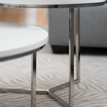
piece coffee table is both practical and adds an element of modern artistry. Grounding the room is a carpet graphic grey animal
skin custom sized into an area rug. Components as well as miscellaneous items are easily stored in the customised wood cabinet.
Stephani Buchman Photography
 Next Stage Design + Build
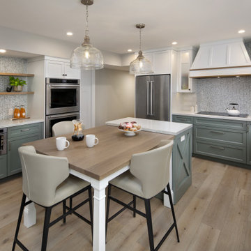
Update to a 1966 Kitchen in the Willow Glen neighborhood of San Jose, California. In the original floorplan, a peninsula off the sink wall divided the space in half making it feel and look smaller and posing a challenge for gathering in the space.
We removed the peninsula to create space for a small work island with a wood topped extension for casual dining. The kitchen is now zoned for specific work tasks and activities.
Other updates to the home included adding a Barn Door to the dining room, refacing the fireplace and adding bookshelves, and redesigning the staircase.
Sponsored
Plain City, OH

The Creative Kitchen Company
Columbus Area Kitchen Remodeling and Refacing Professional
 User
This Greek Revival row house in Boerum Hill was previously owned by a local architect who renovated it several times, including the addition of a two-story steel and glass extension at the rear. The new owners came to us seeking to restore the house and its original formality, while adapting it to the modern needs of a family of five. The detailing of the 25 x 36 foot structure had been lost and required some sleuthing into the history of Greek Revival style in historic Brooklyn neighborhoods.
In addition to completely re-framing the interior, the house also required a new south-facing brick façade due to significant deterioration. The modern extension was replaced with a more traditionally detailed wood and copper- clad bay, still open to natural light and the garden view without sacrificing comfort. The kitchen was relocated from the first floor to the garden level with an adjacent formal dining room. Both rooms were enlarged from their previous iterations to accommodate weekly dinners with extended family. The kitchen includes a home office and breakfast nook that doubles as a homework station. The cellar level was further excavated to accommodate finished storage space and a playroom where activity can be monitored from the kitchen workspaces.
The parlor floor is now reserved for entertaining. New pocket doors can be closed to separate the formal front parlor from the more relaxed back portion, where the family plays games or watches TV together. At the end of the hall, a powder room with brass details, and a luxe bar with antique mirrored backsplash and stone tile flooring, leads to the deck and direct garden access. Because of the property width, the house is able to provide ample space for the interior program within a shorter footprint. This allows the garden to remain expansive, with a small lawn for play, an outdoor food preparation area with a cast-in-place concrete bench, and a place for entertaining towards the rear. The newly designed landscaping will continue to develop, further enhancing the yard’s feeling of escape, and filling-in the views from the kitchen and back parlor above. A less visible, but equally as conscious, addition is a rooftop PV solar array that provides nearly 100% of the daily electrical usage, with the exception of the AC system on hot summer days.
The well-appointed interiors connect the traditional backdrop of the home to a youthful take on classic design and functionality. The materials are elegant without being precious, accommodating a young, growing family. Unique colors and patterns provide a feeling of luxury while inviting inhabitants and guests to relax and enjoy this classic Brooklyn brownstone.
This project won runner-up in the architecture category for the 2017 NYC&G Innovation in Design Awards and was featured in The American House: 100 Contemporary Homes.
Photography by Francis Dzikowski / OTTO
 User
Sight & Sound
This clean modern south Oakville Ontario remodel proves you don’t need to move
to a condo to completely update your surroundings.
These Oakville empty nesters with an active social life aren't interested in “fuddy-duddy” decor.
On the contrary, they are interested in the latest design trends, as well as the most current audio/visual components.
The original stone fireplace was updated with a custom designed mantle and a new gas insert. The updated warm grey
colour palette balances the natural stone making it an inviting focal point. The interior design included reconfiguring the room layout. Originally a smaller TV was located in-between the window and the fireplace and the sofa was where the current cabinet is now.
Our new layout opens up the room taking full advantage of it’s size. The sumptuous sectional allows for relaxed tete a tete
evenings as well as seating for larger groups. The additional leather occasional chair completes the conversation circle too. We naturally selected fabrics that are family friendly to ensure the grandchildren and adults can all be at ease. The flexibility of the 3
piece coffee table is both practical and adds an element of modern artistry. Grounding the room is a carpet graphic grey animal
skin custom sized into an area rug. Components as well as miscellaneous items are easily stored in the customised wood cabinet.
Stephani Buchman Photography
 User
The Clients contacted Cecil Baker + Partners to reconfigure and remodel the top floor of a prominent Philadelphia high-rise into an urban pied-a-terre. The forty-five story apartment building, overlooking Washington Square Park and its surrounding neighborhoods, provided a modern shell for this truly contemporary renovation. Originally configured as three penthouse units, the 8,700 sf interior, as well as 2,500 square feet of terrace space, was to become a single residence with sweeping views of the city in all directions.
The Client’s mission was to create a city home for collecting and displaying contemporary glass crafts. Their stated desire was to cast an urban home that was, in itself, a gallery. While they enjoy a very vital family life, this home was targeted to their urban activities - entertainment being a central element.
The living areas are designed to be open and to flow into each other, with pockets of secondary functions. At large social events, guests feel free to access all areas of the penthouse, including the master bedroom suite. A main gallery was created in order to house unique, travelling art shows.
Stemming from their desire to entertain, the penthouse was built around the need for elaborate food preparation. Cooking would be visible from several entertainment areas with a “show” kitchen, provided for their renowned chef. Secondary preparation and cleaning facilities were tucked away.
The architects crafted a distinctive residence that is framed around the gallery experience, while also incorporating softer residential moments. Cecil Baker + Partners embraced every element of the new penthouse design beyond those normally associated with an architect’s sphere, from all material selections, furniture selections, furniture design, and art placement.
Barry Halkin and Todd Mason Photography
 User
The Clients contacted Cecil Baker + Partners to reconfigure and remodel the top floor of a prominent Philadelphia high-rise into an urban pied-a-terre. The forty-five story apartment building, overlooking Washington Square Park and its surrounding neighborhoods, provided a modern shell for this truly contemporary renovation. Originally configured as three penthouse units, the 8,700 sf interior, as well as 2,500 square feet of terrace space, was to become a single residence with sweeping views of the city in all directions.
The Client’s mission was to create a city home for collecting and displaying contemporary glass crafts. Their stated desire was to cast an urban home that was, in itself, a gallery. While they enjoy a very vital family life, this home was targeted to their urban activities - entertainment being a central element.
The living areas are designed to be open and to flow into each other, with pockets of secondary functions. At large social events, guests feel free to access all areas of the penthouse, including the master bedroom suite. A main gallery was created in order to house unique, travelling art shows.
Stemming from their desire to entertain, the penthouse was built around the need for elaborate food preparation. Cooking would be visible from several entertainment areas with a “show” kitchen, provided for their renowned chef. Secondary preparation and cleaning facilities were tucked away.
The architects crafted a distinctive residence that is framed around the gallery experience, while also incorporating softer residential moments. Cecil Baker + Partners embraced every element of the new penthouse design beyond those normally associated with an architect’s sphere, from all material selections, furniture selections, furniture design, and art placement.
Barry Halkin and Todd Mason Photography
 Nicole Arnold Interiors
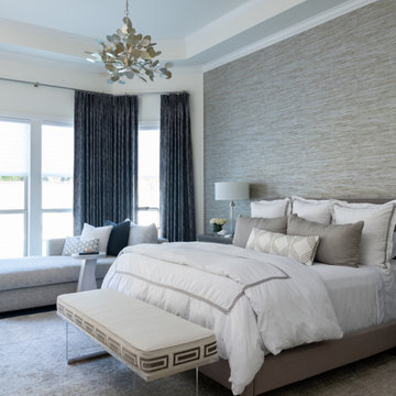
Refurnishing this Melshire Estates home with a fresh, transitional look and feel was just what this client wanted. We mainly leveraged neutrals and some blues to keep things visually calm and then it was all about delivering comfort for their active family. The fireplace was updated with a cast stone surround, giving this family room focal point a much needed facelift. The powder bath received a sophisticated renovation and light fixtures throughout the home were replaced with fixtures that uniquely reflect the client’s personality in every room. The star of the show in this home is the dining room, featuring a large, commissioned original art piece as well as the most stunning ceiling light fixture. It’s impossible to feel anything but cheery when you walk by this room!

 ZeroEnergy Design
This modern green home offers both a vacation destination on Cape Cod near local family members and an opportunity for rental income.
FAMILY ROOTS. A West Coast couple living in the San Francisco Bay Area sought a permanent East Coast vacation home near family members living on Cape Cod. As academic professionals focused on sustainability, they sought a green, energy efficient home that was well-aligned with their values. With no green homes available for sale on Cape Cod, they decided to purchase land near their family and build their own.
SLOPED SITE. Comprised of a 3/4 acre lot nestled in the pines, the steeply sloping terrain called for a plan that embraced and took advantage of the slope. Of equal priority was optimizing solar exposure, preserving privacy from abutters, and creating outdoor living space. The design accomplished these goals with a simple, rectilinear form, offering living space on the both entry and lower/basement levels. The stepped foundation allows for a walk-out basement level with light-filled living space on the down-hill side of the home. The traditional basement on the eastern, up-hill side houses mechanical equipment and a home gym. The house welcomes natural light throughout, captures views of the forest, and delivers entertainment space that connects indoor living space to outdoor deck and dining patio.
MODERN VISION. The clean building form and uncomplicated finishes pay homage to the modern architectural legacy on the outer Cape. Durable and economical fiber cement panels, fixed with aluminum channels, clad the primary form. Cedar clapboards provide a visual accent at the south-facing living room, which extends a single roof plane to cover the entry porch.
SMART USE OF SPACE. On the entry level, the “L”-shaped living, dining, and kitchen space connects to the exterior living, dining, and grilling spaces to effectively double the home’s summertime entertainment area. Placed at the western end of the entry level (where it can retain privacy but still claim expansive downhill views) is the master suite with a built-in study. The lower level has two guest bedrooms, a second full bathroom, and laundry. The flexibility of the space—crucial in a house with a modest footprint—emerges in one of the guest bedrooms, which doubles as home office by opening the barn-style double doors to connect it to the bright, airy open stair leading up to the entry level. Thoughtful design, generous ceiling heights and large windows transform the modest 1,100 sf* footprint into a well-lit, spacious home. *(total finished space is 1800 sf)
RENTAL INCOME. The property works for its owners by netting rental income when the owners are home in San Francisco. The house especially caters to vacationers bound for nearby Mayo Beach and includes an outdoor shower adjacent to the lower level entry door. In contrast to the bare bones cottages that are typically available on the Cape, this home offers prospective tenants a modern aesthetic, paired with luxurious and green features. Durable finishes inside and out will ensure longevity with the heavier use that comes with a rental property.
COMFORT YEAR-ROUND. The home is super-insulated and air-tight, with mechanical ventilation to provide continuous fresh air from the outside. High performance triple-paned windows complement the building enclosure and maximize passive solar gain while ensuring a warm, draft-free winter, even when sitting close to the glass. A properly sized air source heat pump offers efficient heating & cooling, and includes a carefully designed the duct distribution system to provide even comfort throughout the house. The super-insulated envelope allows us to significantly reduce the equipment capacity, duct size, and airflow quantities, while maintaining unparalleled thermal comfort.
ENERGY EFFICIENT. The building’s shell and mechanical systems play instrumental roles in the home’s exceptional performance. The building enclosure reduces the most significant energy glutton: heating. Continuous super-insulation, thorough air sealing, triple-pane windows, and passive solar gain work together to yield a miniscule heating load. All active energy consumers are extremely efficient: an air source heat pump for heating and cooling, a heat pump hot water heater, LED lighting, energy recovery ventilation (ERV), and high efficiency appliances. The result is a home that uses 70% less energy than a similar new home built to code requirements.
OVERALL. The home embodies the owners’ goals and values while comprehensively enabling thermal comfort, energy efficiency, a vacation respite, and supplementary income.
PROJECT TEAM
ZeroEnergy Design - Architect & Mechanical Designer
A.F. Hultin & Co. - Contractor
Pamet Valley Landscape Design - Landscape & Masonry
Lisa Finch - Original Artwork
European Architectural Supply - Windows
Eric Roth Photography - Photography
Sponsored
Columbus, OH

Wannemacher Interiors
Customized Award-Winning Interior Design Solutions in Franklin Cnty OH
 Better Builders
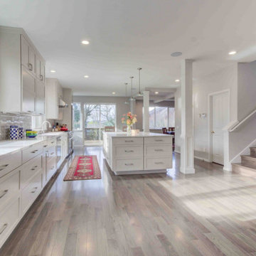
These clients enjoy cooking and entertaining, so their vision was to open and connect three separate rooms—the kitchen, sitting, and formal dining rooms—to create a single open and modern space where everyone could engage and participate in the activities.
Opening these spaces required complex structural engineering. The wall removals required supporting the loads from the second floor and meeting the engineering requirements for shear wall and lateral support. These beams and their connections to the posts they sit on were a challenge to install because of the complex nature of the home's original framed. All these loads had to be carried through the finished basement below and rest on new footings below the basement floor.
The center kitchen island was expansive, with a single slab countertop that would provide both workspace and counter seating. This slab, at 64x120 and 789 lbs., required careful planning for on-site labor, transfer routing, and precision installation. Natural daylight now floods the space from all directions. Recessed can lighting runs throughout the space, all on dimmers for maximum control of ambiance.
The Better Builders design team guided the selection of hardwoods, staircase details, cabinetry, countertops, tile, and color. The muted palette and clean lines work well with our couple’s eclectic furnishings and artworks. Now, traffic and activities flow better, and every inch of the previously divided space is utilized and enjoyed. The outcome is exactly as our homeowners envisioned…and as we intended.
 Better Builders
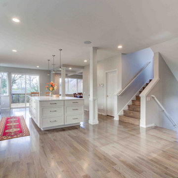
These clients enjoy cooking and entertaining, so their vision was to open and connect three separate rooms—the kitchen, sitting, and formal dining rooms—to create a single open and modern space where everyone could engage and participate in the activities.
Opening these spaces required complex structural engineering. The wall removals required supporting the loads from the second floor and meeting the engineering requirements for shear wall and lateral support. These beams and their connections to the posts they sit on were a challenge to install because of the complex nature of the home's original framed. All these loads had to be carried through the finished basement below and rest on new footings below the basement floor.
The center kitchen island was expansive, with a single slab countertop that would provide both workspace and counter seating. This slab, at 64x120 and 789 lbs., required careful planning for on-site labor, transfer routing, and precision installation. Natural daylight now floods the space from all directions. Recessed can lighting runs throughout the space, all on dimmers for maximum control of ambiance.
The Better Builders design team guided the selection of hardwoods, staircase details, cabinetry, countertops, tile, and color. The muted palette and clean lines work well with our couple’s eclectic furnishings and artworks. Now, traffic and activities flow better, and every inch of the previously divided space is utilized and enjoyed. The outcome is exactly as our homeowners envisioned…and as we intended.
 Better Builders
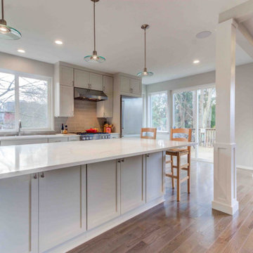
These clients enjoy cooking and entertaining, so their vision was to open and connect three separate rooms—the kitchen, sitting, and formal dining rooms—to create a single open and modern space where everyone could engage and participate in the activities.
Opening these spaces required complex structural engineering. The wall removals required supporting the loads from the second floor and meeting the engineering requirements for shear wall and lateral support. These beams and their connections to the posts they sit on were a challenge to install because of the complex nature of the home's original framed. All these loads had to be carried through the finished basement below and rest on new footings below the basement floor.
The center kitchen island was expansive, with a single slab countertop that would provide both workspace and counter seating. This slab, at 64x120 and 789 lbs., required careful planning for on-site labor, transfer routing, and precision installation. Natural daylight now floods the space from all directions. Recessed can lighting runs throughout the space, all on dimmers for maximum control of ambiance.
The Better Builders design team guided the selection of hardwoods, staircase details, cabinetry, countertops, tile, and color. The muted palette and clean lines work well with our couple’s eclectic furnishings and artworks. Now, traffic and activities flow better, and every inch of the previously divided space is utilized and enjoyed. The outcome is exactly as our homeowners envisioned…and as we intended.
 Better Builders
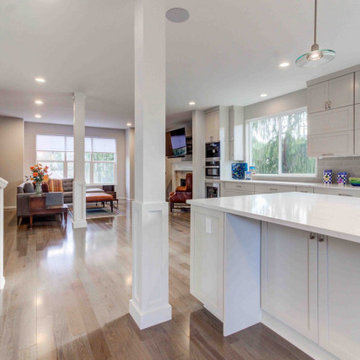
These clients enjoy cooking and entertaining, so their vision was to open and connect three separate rooms—the kitchen, sitting, and formal dining rooms—to create a single open and modern space where everyone could engage and participate in the activities.
Opening these spaces required complex structural engineering. The wall removals required supporting the loads from the second floor and meeting the engineering requirements for shear wall and lateral support. These beams and their connections to the posts they sit on were a challenge to install because of the complex nature of the home's original framed. All these loads had to be carried through the finished basement below and rest on new footings below the basement floor.
The center kitchen island was expansive, with a single slab countertop that would provide both workspace and counter seating. This slab, at 64x120 and 789 lbs., required careful planning for on-site labor, transfer routing, and precision installation. Natural daylight now floods the space from all directions. Recessed can lighting runs throughout the space, all on dimmers for maximum control of ambiance.
The Better Builders design team guided the selection of hardwoods, staircase details, cabinetry, countertops, tile, and color. The muted palette and clean lines work well with our couple’s eclectic furnishings and artworks. Now, traffic and activities flow better, and every inch of the previously divided space is utilized and enjoyed. The outcome is exactly as our homeowners envisioned…and as we intended.
Sponsored
Columbus, OH
Wannemacher Interiors
Customized Award-Winning Interior Design Solutions in Franklin Cnty OH
 Better Builders
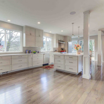
These clients enjoy cooking and entertaining, so their vision was to open and connect three separate rooms—the kitchen, sitting, and formal dining rooms—to create a single open and modern space where everyone could engage and participate in the activities.
Opening these spaces required complex structural engineering. The wall removals required supporting the loads from the second floor and meeting the engineering requirements for shear wall and lateral support. These beams and their connections to the posts they sit on were a challenge to install because of the complex nature of the home's original framed. All these loads had to be carried through the finished basement below and rest on new footings below the basement floor.
The center kitchen island was expansive, with a single slab countertop that would provide both workspace and counter seating. This slab, at 64x120 and 789 lbs., required careful planning for on-site labor, transfer routing, and precision installation. Natural daylight now floods the space from all directions. Recessed can lighting runs throughout the space, all on dimmers for maximum control of ambiance.
The Better Builders design team guided the selection of hardwoods, staircase details, cabinetry, countertops, tile, and color. The muted palette and clean lines work well with our couple’s eclectic furnishings and artworks. Now, traffic and activities flow better, and every inch of the previously divided space is utilized and enjoyed. The outcome is exactly as our homeowners envisioned…and as we intended.
 Better Builders
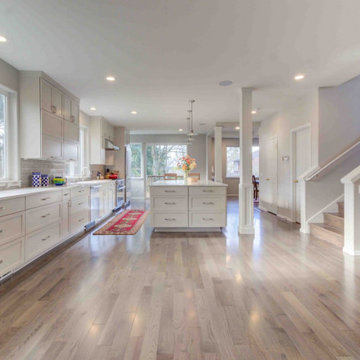
These clients enjoy cooking and entertaining, so their vision was to open and connect three separate rooms—the kitchen, sitting, and formal dining rooms—to create a single open and modern space where everyone could engage and participate in the activities.
Opening these spaces required complex structural engineering. The wall removals required supporting the loads from the second floor and meeting the engineering requirements for shear wall and lateral support. These beams and their connections to the posts they sit on were a challenge to install because of the complex nature of the home's original framed. All these loads had to be carried through the finished basement below and rest on new footings below the basement floor.
The center kitchen island was expansive, with a single slab countertop that would provide both workspace and counter seating. This slab, at 64x120 and 789 lbs., required careful planning for on-site labor, transfer routing, and precision installation. Natural daylight now floods the space from all directions. Recessed can lighting runs throughout the space, all on dimmers for maximum control of ambiance.
The Better Builders design team guided the selection of hardwoods, staircase details, cabinetry, countertops, tile, and color. The muted palette and clean lines work well with our couple’s eclectic furnishings and artworks. Now, traffic and activities flow better, and every inch of the previously divided space is utilized and enjoyed. The outcome is exactly as our homeowners envisioned…and as we intended.
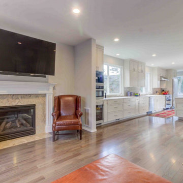 Better Builders
These clients enjoy cooking and entertaining, so their vision was to open and connect three separate rooms—the kitchen, sitting, and formal dining rooms—to create a single open and modern space where everyone could engage and participate in the activities.
Opening these spaces required complex structural engineering. The wall removals required supporting the loads from the second floor and meeting the engineering requirements for shear wall and lateral support. These beams and their connections to the posts they sit on were a challenge to install because of the complex nature of the home's original framed. All these loads had to be carried through the finished basement below and rest on new footings below the basement floor.
The center kitchen island was expansive, with a single slab countertop that would provide both workspace and counter seating. This slab, at 64x120 and 789 lbs., required careful planning for on-site labor, transfer routing, and precision installation. Natural daylight now floods the space from all directions. Recessed can lighting runs throughout the space, all on dimmers for maximum control of ambiance.
The Better Builders design team guided the selection of hardwoods, staircase details, cabinetry, countertops, tile, and color. The muted palette and clean lines work well with our couple’s eclectic furnishings and artworks. Now, traffic and activities flow better, and every inch of the previously divided space is utilized and enjoyed. The outcome is exactly as our homeowners envisioned…and as we intended.
23