
Search results for "Actual goal" in Home Design Ideas
 OLSON LEWIS + Architects
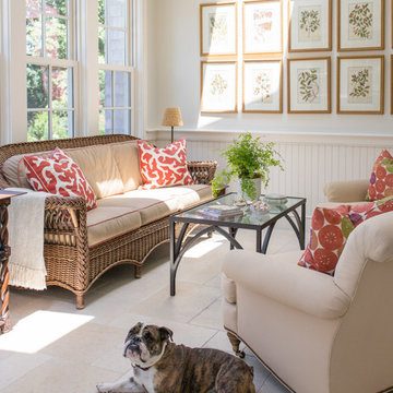
Published in the NORTHSHORE HOME MAGAZINE Fall 2015 issue, this home was dubbed 'Manchester Marvel'.
Before its renovation, the home consisted of a street front cottage built in the 1820’s, with a wing added onto the back at a later point. The home owners required a family friendly space to accommodate a large extended family, but they also wished to retain the original character of the home.
The design solution was to turn the rectangular footprint into an L shape. The kitchen and the formal entertaining rooms run along the vertical wing of the home. Within the central hub of the home is a large family room that opens to the kitchen and the back of the patio. Located in the horizontal plane are the solarium, mudroom and garage.
Client Quote
"He (John Olson of OLSON LEWIS + Architects) did an amazing job. He asked us about our goals and actually walked through our former house with us to see what we did and did not like about it. He also worked really hard to give us the same level of detail we had in our last home."
“Manchester Marvel” clients.
Photo Credits:
Eric Roth
 Tiffany Brooks, HGTV Host & Interior Designer
Inquire About Our Design Services
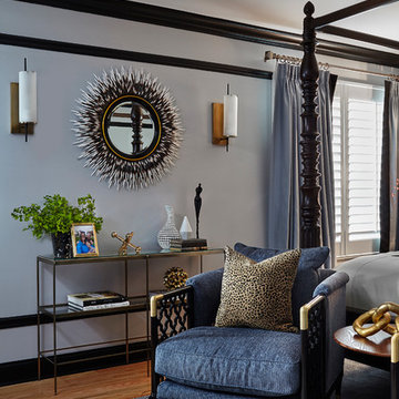
When we first started talking in the spring of 2015, I was impressed. She was witty, realistic, and understood that as much as she loves my shows on HGTV, design does not does not happen in 43 minutes! She told me about her space, and how she felt that her bedroom seemed “blah” to her. She had no retreat. Molly desperately longed for a place that she could spend time in, read in, play in and above all, relax in.
What we did:
Many people are terrified of hiring a designer. Rightfully so, they are investing a pretty penny in their homes. They want to make sure that everything, down to the last floral arrangement, is to their liking, because they will have to live it (and pay for it). Unfortunately, a client can unintentionally stifle a designer’s creativity through micro-management. This can produce lackluster results and ultimately cause more time (and money) to be spent on a project than is really necessary.
With Molly, that was never an issue. Before she even showed me the room in question, she said that I could have full creative license to do what I needed to do to her bedroom. SAY WHAAH!?
With Molly giving me complete creative freedom, I planned everything out and got down to business. The result: Bite-your-bottom-lip sexy. I don’t get jealous of too many of my clients’ spaces, but this one still takes my breath away every time I look at the pics!
The craziest part was that by adding more furniture, it actually made the space feel larger.
Molly and her husband Patrick loved the finished space, and promised me I will be back to finish the rest of the house!
Here’s the highlights of the rest of the project:
I came up with a space plan with three options.
Next, we reviewed mood boards and fabric schemes that would work for both Molly and her hubby Patrick.
We started with the bed. My goal was to add edge to its otherwise traditional style.
We decided to spice things up by painting the trim work in the room black.
We built in layers of lighting with dimmers. In a bedroom everything should be on dimmers, right? Right.
We designed and customized bedding, chairs and window treatments.
Together with Molly, we selected the most perfect wallpaper. This geometric “grasscloth” adds so much depth and dimension that was just missing before.
What I love:
That light fixture. I mean it is really, really amazing in person.
The porcupine mirror. This thing came packaged like it was the hope diamond, and everyone was terrified to handle it. But it really became a highlight of the room.

 Metro Interiors
I first came to Mary Beth’s home to help with her living room. But that changed when we looked at the office, and started talking about how it wasn’t working. When I stepped it to take a look, I immediately noticed how heavy and cramped it felt. Too many large pieces and clutter created a feeling of overwhelm.
It needed to be redone. Since Mary Beth works full time from home, I wanted to help her make this a space where she could be productive, and feel good about being in for long periods of time.
The end result is an impressive transformation – and it was done very affordably. “Prior to the re-design, my office was a cluttered, disorganized mess that really said nothing about who I am. I tended to use it as a catch all for things I didn’t know where to put or what to do with,” tells Mary Beth. Now, she says it feels so much better working in there, and even got rave reviews from her family when they visited for the Holidays. “It’s now well-organized, bright and seems to flow in the way it’s laid out”.
To remove clutter and the “heavy” feeling, two large bookcases and the couch were removed, and lots of time was spent decluttering. A nicer bookcase was moved to a place that made more sense; together with a cozy rug and upholstered chair we created a lovely reading area, a place she can also relax.
A neutral green on the walls is also soothing, and brings an element of nature inside. Groupings of photos from her travels hang on the walls now, and a larger piece of art creates a focal point. A piece I was delighted to help her find – hand-painted but affordably priced – it makes Mary Beth feel happy, “The art above the desk is beautiful, and it showed me that big doesn’t have to be overwhelming”.
A new desk, relocated to the “command position” in the room (a more powerful placement) is also less weighty than what she had before, but functionally allows for more workspace. We upgraded her desk chair to a high-back leather one. In total, this setup was intentional, for an enhanced feeling of being in control. Mary Beth notes, “I love the desk and how it sits. I can either work by the window and look out at the garden and at the birds, which I love to do, or look out into the living room and be part of anything going on there”.
On the windows we replaced metal blinds with woven roman shades, also with a natural look. They’re cordless, so nothing hangs in front of the beautiful backyard view, and they feel lighter. With the new office design, we also gave Mary Beth plenty of places for storage. Now the things she does use and need don’t need to be out in plain sight, cluttering things up.
In the end, we accomplished our goal of creating a space for Mary Beth conducive to work and also enjoyable. She says, “My work attitude and feeling of what the office is has definitely changed – I like to be there even when I’m not working. It doesn’t feel only like an office but is actually a relaxing place to be”.
Find the right local pro for your project
 OLSON LEWIS + Architects
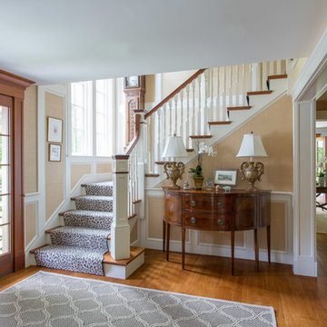
Published in the NORTHSHORE HOME MAGAZINE Fall 2015 issue, this home was dubbed 'Manchester Marvel'.
Before its renovation, the home consisted of a street front cottage built in the 1820’s, with a wing added onto the back at a later point. The home owners required a family friendly space to accommodate a large extended family, but they also wished to retain the original character of the home.
The design solution was to turn the rectangular footprint into an L shape. The kitchen and the formal entertaining rooms run along the vertical wing of the home. Within the central hub of the home is a large family room that opens to the kitchen and the back of the patio. Located in the horizontal plane are the solarium, mudroom and garage.
Client Quote
"He (John Olson of OLSON LEWIS + Architects) did an amazing job. He asked us about our goals and actually walked through our former house with us to see what we did and did not like about it. He also worked really hard to give us the same level of detail we had in our last home."
“Manchester Marvel” clients.
Photo Credits:
Eric Roth
 Chi Renovation & Design
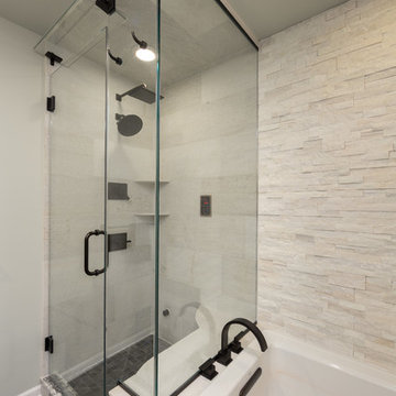
Our goal here was to offer our clients a full spa-like experience. From the unique aesthetic to the luxury finishes, this master bathroom now has a completely new look and function!
For a true spa experience, we installed a shower steam, rain head shower fixture, and whirlpool tub. The bathtub platform actually extends into the shower, working as a bench for the clients to relax on while steaming! Convenient corner shelves optimize shower storage whereas a custom walnut shelf above the bath offers the perfect place to store dry towels.
We continued the look of rich, organic walnut with a second wall-mounted shelf above the toilet and a large, semi-customized vanity, where the louvered doors accentuate the natural beauty of this material. The white brick accent wall, herringbone patterned flooring, and black hardware were introduced for texture and a trendy, timeless look that our clients will love for years to come.
Designed by Chi Renovation & Design who serve Chicago and it's surrounding suburbs, with an emphasis on the North Side and North Shore. You'll find their work from the Loop through Lincoln Park, Skokie, Wilmette, and all of the way up to Lake Forest.
For more about Chi Renovation & Design, click here: https://www.chirenovation.com/
To learn more about this project, click here: https://www.chirenovation.com/galleries/bathrooms/
 Total Home
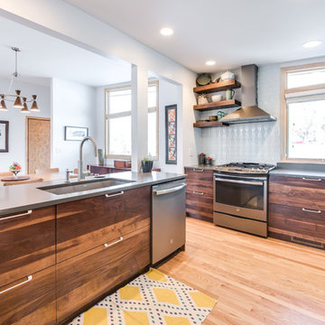
The homeowners of this retro inspired space, are a young couple that desired to create an open kitchen and dining area. The remodeling goal was to have a space to entertain family and friends. The challenge was to keep the architecture true to the original 1960s mid-century ranch home, while gaining the function of a modern day home.The major structural change came from removing part of the wall that existed between the kitchen and the dining room. This opened up a whole new world of entertaining space. Now it actually feels like they gained square footage by removing that section of wall. New updated appliances were added to give the homeowners fashionable function in a modern kitchen. The original hardwood flooring, was hidden under carpeting and was restored by local floor specialists.
 User
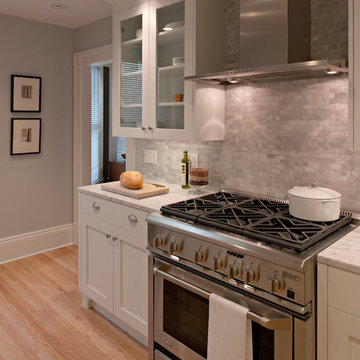
UserThe first priority for these new homeowners was to convert their small, serviceable kitchen into their dream kitchen with actual cooking being a distant second priority. They wanted the styling to be traditional, in keeping with the Edwardian details of their home, white, and fresh looking. Michael Merrill Design Studio designed this space with a goal of creating an area that was wonderful to look at and possibly to cook in.
The floor plan was reworked to create an over-scaled galley kitchen. The refrigerator was relocated, making room for a wonderful pantry while the opening between the kitchen and the dining room was positioned where it should have been all along. White painted cabinets, stainless steel appliances, high backsplashes, and Carrera marble countertops provide a modern take on a traditional look. (2006-2007)
 Tiffany Brooks, HGTV Host & Interior Designer
Inquire About Our Design Services
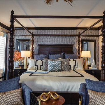
When we first started talking in the spring of 2015, I was impressed. She was witty, realistic, and understood that as much as she loves my shows on HGTV, design does not does not happen in 43 minutes! She told me about her space, and how she felt that her bedroom seemed “blah” to her. She had no retreat. Molly desperately longed for a place that she could spend time in, read in, play in and above all, relax in.
What we did:
Many people are terrified of hiring a designer. Rightfully so, they are investing a pretty penny in their homes. They want to make sure that everything, down to the last floral arrangement, is to their liking, because they will have to live it (and pay for it). Unfortunately, a client can unintentionally stifle a designer’s creativity through micro-management. This can produce lackluster results and ultimately cause more time (and money) to be spent on a project than is really necessary.
With Molly, that was never an issue. Before she even showed me the room in question, she said that I could have full creative license to do what I needed to do to her bedroom. SAY WHAAH!?
With Molly giving me complete creative freedom, I planned everything out and got down to business. The result: Bite-your-bottom-lip sexy. I don’t get jealous of too many of my clients’ spaces, but this one still takes my breath away every time I look at the pics!
The craziest part was that by adding more furniture, it actually made the space feel larger.
Molly and her husband Patrick loved the finished space, and promised me I will be back to finish the rest of the house!
Here’s the highlights of the rest of the project:
I came up with a space plan with three options.
Next, we reviewed mood boards and fabric schemes that would work for both Molly and her hubby Patrick.
We started with the bed. My goal was to add edge to its otherwise traditional style.
We decided to spice things up by painting the trim work in the room black.
We built in layers of lighting with dimmers. In a bedroom everything should be on dimmers, right? Right.
We designed and customized bedding, chairs and window treatments.
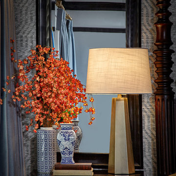
Together with Molly, we selected the most perfect wallpaper. This geometric “grasscloth” adds so much depth and dimension that was just missing before.
What I love:
That light fixture. I mean it is really, really amazing in person.
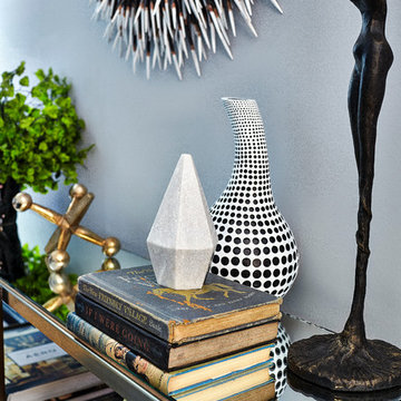
The porcupine mirror. This thing came packaged like it was the hope diamond, and everyone was terrified to handle it. But it really became a highlight of the room.
 OLSON LEWIS + Architects
Published in the NORTHSHORE HOME MAGAZINE Fall 2015 issue, this home was dubbed 'Manchester Marvel'.
Before its renovation, the home consisted of a street front cottage built in the 1820’s, with a wing added onto the back at a later point. The home owners required a family friendly space to accommodate a large extended family, but they also wished to retain the original character of the home.
The design solution was to turn the rectangular footprint into an L shape. The kitchen and the formal entertaining rooms run along the vertical wing of the home. Within the central hub of the home is a large family room that opens to the kitchen and the back of the patio. Located in the horizontal plane are the solarium, mudroom and garage.
Client Quote
"He (John Olson of OLSON LEWIS + Architects) did an amazing job. He asked us about our goals and actually walked through our former house with us to see what we did and did not like about it. He also worked really hard to give us the same level of detail we had in our last home."
“Manchester Marvel” clients.
Photo Credits:
Eric Roth
 Tiffany Brooks, HGTV Host & Interior Designer
Inquire About Our Design Services
When we first started talking in the spring of 2015, I was impressed. She was witty, realistic, and understood that as much as she loves my shows on HGTV, design does not does not happen in 43 minutes! She told me about her space, and how she felt that her bedroom seemed “blah” to her. She had no retreat. Molly desperately longed for a place that she could spend time in, read in, play in and above all, relax in.
What we did:
Many people are terrified of hiring a designer. Rightfully so, they are investing a pretty penny in their homes. They want to make sure that everything, down to the last floral arrangement, is to their liking, because they will have to live it (and pay for it). Unfortunately, a client can unintentionally stifle a designer’s creativity through micro-management. This can produce lackluster results and ultimately cause more time (and money) to be spent on a project than is really necessary.
With Molly, that was never an issue. Before she even showed me the room in question, she said that I could have full creative license to do what I needed to do to her bedroom. SAY WHAAH!?
With Molly giving me complete creative freedom, I planned everything out and got down to business. The result: Bite-your-bottom-lip sexy. I don’t get jealous of too many of my clients’ spaces, but this one still takes my breath away every time I look at the pics!
The craziest part was that by adding more furniture, it actually made the space feel larger.
Molly and her husband Patrick loved the finished space, and promised me I will be back to finish the rest of the house!
Here’s the highlights of the rest of the project:
I came up with a space plan with three options.
Next, we reviewed mood boards and fabric schemes that would work for both Molly and her hubby Patrick.
We started with the bed. My goal was to add edge to its otherwise traditional style.
We decided to spice things up by painting the trim work in the room black.
We built in layers of lighting with dimmers. In a bedroom everything should be on dimmers, right? Right.
We designed and customized bedding, chairs and window treatments.
Together with Molly, we selected the most perfect wallpaper. This geometric “grasscloth” adds so much depth and dimension that was just missing before.
What I love:
That light fixture. I mean it is really, really amazing in person.
The porcupine mirror. This thing came packaged like it was the hope diamond, and everyone was terrified to handle it. But it really became a highlight of the room.
 Tiffany Brooks, HGTV Host & Interior Designer
Inquire About Our Design Services
When we first started talking in the spring of 2015, I was impressed. She was witty, realistic, and understood that as much as she loves my shows on HGTV, design does not does not happen in 43 minutes! She told me about her space, and how she felt that her bedroom seemed “blah” to her. She had no retreat. Molly desperately longed for a place that she could spend time in, read in, play in and above all, relax in.
What we did:
Many people are terrified of hiring a designer. Rightfully so, they are investing a pretty penny in their homes. They want to make sure that everything, down to the last floral arrangement, is to their liking, because they will have to live it (and pay for it). Unfortunately, a client can unintentionally stifle a designer’s creativity through micro-management. This can produce lackluster results and ultimately cause more time (and money) to be spent on a project than is really necessary.
With Molly, that was never an issue. Before she even showed me the room in question, she said that I could have full creative license to do what I needed to do to her bedroom. SAY WHAAH!?
With Molly giving me complete creative freedom, I planned everything out and got down to business. The result: Bite-your-bottom-lip sexy. I don’t get jealous of too many of my clients’ spaces, but this one still takes my breath away every time I look at the pics!
The craziest part was that by adding more furniture, it actually made the space feel larger.
Molly and her husband Patrick loved the finished space, and promised me I will be back to finish the rest of the house!
Here’s the highlights of the rest of the project:
I came up with a space plan with three options.
Next, we reviewed mood boards and fabric schemes that would work for both Molly and her hubby Patrick.
We started with the bed. My goal was to add edge to its otherwise traditional style.
We decided to spice things up by painting the trim work in the room black.
We built in layers of lighting with dimmers. In a bedroom everything should be on dimmers, right? Right.
We designed and customized bedding, chairs and window treatments.
Together with Molly, we selected the most perfect wallpaper. This geometric “grasscloth” adds so much depth and dimension that was just missing before.
What I love:
That light fixture. I mean it is really, really amazing in person.
The porcupine mirror. This thing came packaged like it was the hope diamond, and everyone was terrified to handle it. But it really became a highlight of the room.
 Corine Maggio Design
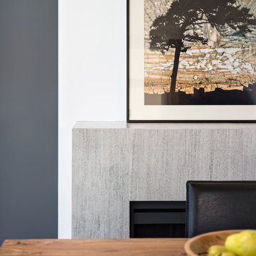
This condo was designed for a great client: a young professional male with modern and unfussy sensibilities. The goal was to create a space that represented this by using clean lines and blending natural and industrial tones and materials. Great care was taken to be sure that interest was created through a balance of high contrast and simplicity. And, of course, the entire design is meant to support and not distract from the incredible views.
Photos by: Chipper Hatter
 WC Design Center
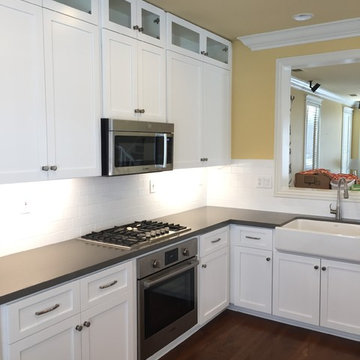
Contemporary Kitchen re-face in White Shaker cabinetry with 12" glass front upper display cabinets, Pental Stormy Sky quartz countertops and white 3 x 6 subway tile.
 Klopf Architecture
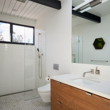
Located in Palo Alto's flood zone, this Eichler home underwent a phased renovation thoughtfully redesigned to accommodate a growing family of five, with an emphasis on school proximity and nearby grandparents. The bedroom wing was completely reconfigured, including a new front addition as a guest suite for grandparents, expanding the house to five bedrooms and three baths. Taller 9-foot ceilings were introduced in some areas, enhancing the overall openness—a lofty goal for an Eichler.
The tranquil courtyard, a favorite spot for the family, was redesigned to allow parents to watch the kids while cooking. The backyard became a relaxing lounging area connected to the living room. Once dark living spaces were modernized by removing a low-hanging beam in the kitchen, adding skylights for natural light, and eliminating the fireplace to create a more functional entertainment space. Finally, new landscaping reflecting the client's heritage and some of the home's architectural elements, creates a harmonious indoor-outdoor flow.
Klopf Architecture Project Team: John Klopf, AIA and Angela Alexander
Interior Architecture: Klopf Architecture
Bathroom Materials and Light Fixture Selection: Lucile Glessner
Landscape Architect: Thuilot and Associates
Photography: ©2024 Mariko Reed
Year Completed: 2024
Location: Palo Alto, CA
 Klopf Architecture
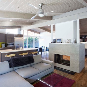
 The goal was to modernize and brighten a dark, closed-in, chopped-up 1960's Brown and Kaufman home. The solution, create space, light and flow by taking away internal walls that were barriers to light and adding windows. Klopf actually decreased the size of the living room to add a master walk-in closet and laundry room/ desk area, yet the space feels bigger, brighter and flows. They also re-designed the kitchen windows and removed the partition wall so a once dark and dingy kitchen now feels open and bright.
Klopf Architecture Project Team: John Klopf, AIA, Jackie Detamore, AIA, and Angela Todorova
Contractor: William Lowe Construction
Photography ©2013 Mariko Reed
Location: Palo Alto, CA
Year completed: 2013
 Klopf Architecture
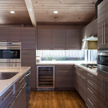
 The goal was to modernize and brighten a dark, closed-in, chopped-up 1960's Brown and Kaufman home. The solution, create space, light and flow by taking away internal walls that were barriers to light and adding windows. Klopf actually decreased the size of the living room to add a master walk-in closet and laundry room/ desk area, yet the space feels bigger, brighter and flows. They also re-designed the kitchen windows and removed the partition wall so a once dark and dingy kitchen now feels open and bright.
Klopf Architecture Project Team: John Klopf, AIA, Jackie Detamore, AIA, and Angela Todorova
Contractor: William Lowe Construction
Photography ©2013 Mariko Reed
Location: Palo Alto, CA
Year completed: 2013
 Advance Design Studio, Ltd.
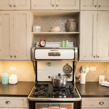
Curtis and Peggy had been thinking of a kitchen remodel for quite some time, but they knew their house would have a unique set of challenges. Their older Victorian house was built in 1891. The kitchen cabinetry was original, and they wanted to keep the authenticity of their period home while adding modern comforts that would improve their quality of life.
A friend recommended Advance Design Studio for their exceptional experience and quality of work. After meeting with designer Michelle Lecinski at Advance Design, they were confident they could partner with Advance to accomplish the unique kitchen renovation they’d been talking about for years. “We wanted to do the kitchen for a long, long time,” Curtis said. “(We asked ourselves) what are we actually going to do? How are we going to do this? And who are we going to find to do exactly what we want?”
The goal for the project was to keep the home renovation and new kitchen feeling authentic to the time in which it was built. They desperately wanted the modern comforts that come with a larger refrigerator and the dishwasher that they never had! The old home was also a bit drafty so adding a fireplace, wall insulation and new windows became a priority. They very much wanted to create a comfortable hearth room adjacent to the kitchen, complete with old world brick.
The original cabinetry had to go to make way for beautiful new kitchen cabinetry that appears as if it was a hundred years old, but with all the benefits of cutting-edge storage, self-closing drawers, and a brand-new look. “We just wanted to keep it old looking, but with some modern updates,” Peggy said.
Dura Supreme Highland Cabinets with a Heritage Old World Painted Finish replaced the original 1891 cabinets. The hand-applied careful rubbed-off detailing makes these exquisite cabinets look as if they came from a far-gone era. Despite the small size of the kitchen, Peggy, Curtis and Michelle utilized every inch with custom cabinet sizes to increase storage capacity. The custom cabinets allowed for the addition of a 24” Fisher Paykel dishwasher with a concealing Dura Supreme door panel. Michelle was also able to work into the new design a larger 30” Fisher Paykel French refrigerator. “We made every ¼ inch count in this small space,” designer Michelle said. “Having the ability to custom size the cabinetry was the only way to achieve this.”
“The kitchen essentially was designed around the Heartland Vintage range and oven,” says Michelle. A classic appliance that combines nostalgic beauty and craftsmanship for modern cooking, with nickel plated trim and elegantly shaped handles and legs; the not to miss range is a striking focal point of the entire room and an engaging conversation piece.
Granite countertops in Kodiak Satin with subtle veining kept with the old-world style. The delicate porcelain La Vie Crackle Sonoma tile kitchen backsplash compliments the home’s style perfectly. A handcrafted passthrough designed to show off Peggy’s fine china was custom built by project carpenters Justin Davis and Jeff Dallain to physically and visually open the space. Additional storage was created in the custom panty room with Latte Edinburg cabinets, hand-made weathered wood shelving with authentic black iron brackets, and an intricate tin copper ceiling.
Peggy and Curtis loved the idea of adding a Vermont stove to make the hearth-room not only functional, but a truly beckoning place to be. A stunning Bordeaux red Vermont Castings Stove with crisp black ventilation was chosen and combined with the authentic reclaimed Chicago brick wall. Advance’s talented carpenters custom-built elegant weathered shelves to house family memorabilia, installed carefully chosen barn sconces, and made the hearth room an inviting place to relax with a cup of coffee and a good book.
“Peggy and Curtis’ project was so much fun to work on. Creating a space that looks and feels like it always belonged in this beautiful old Victorian home is a designer’s dream. To see the delight in their faces when they saw the design details coming together truly made it worth the time and effort that went into making the very compact kitchen space work”, said Michelle. “The result is an amazing custom kitchen, packed with functionality in every inch, nook and cranny!” exclaims Michelle.
The renovation didn’t end with the kitchen. New Pella windows were added to help lessen the drafts. The removal of the original windows and trim necessitated the re-creation of hand-made corbels and trim details no longer available today. The talented carpenter team came to the rescue, crafting new pieces and masterfully finishing them as if they were always there. New custom gutters were formed and installed with a front entry rework necessary to accommodate the changes.
The whole house functions better, but it still feels like the original 1891 home. “From start to finish it’s just a much better space than we used to have,” Peggy said. “Jeff and Justin were amazing.” Curtis added; “We were lucky to find Advance Design, because they really came through for us. I loved that they had everything in house, anything you needed to have done, they could do it”.
 Edgewater Design Group
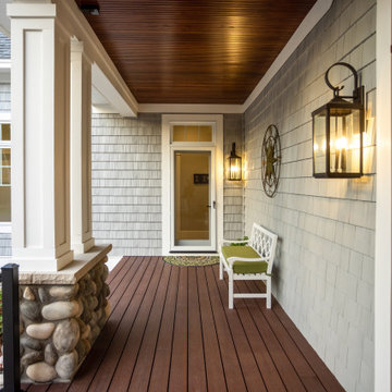
Our clients were relocating from the upper peninsula to the lower peninsula and wanted to design a retirement home on their Lake Michigan property. The topography of their lot allowed for a walk out basement which is practically unheard of with how close they are to the water. Their view is fantastic, and the goal was of course to take advantage of the view from all three levels. The positioning of the windows on the main and upper levels is such that you feel as if you are on a boat, water as far as the eye can see. They were striving for a Hamptons / Coastal, casual, architectural style. The finished product is just over 6,200 square feet and includes 2 master suites, 2 guest bedrooms, 5 bathrooms, sunroom, home bar, home gym, dedicated seasonal gear / equipment storage, table tennis game room, sauna, and bonus room above the attached garage. All the exterior finishes are low maintenance, vinyl, and composite materials to withstand the blowing sands from the Lake Michigan shoreline.

14