
Search results for "Actual goal" in Home Design Ideas
 Klopf Architecture
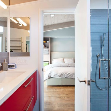
 The goal was to modernize and brighten a dark, closed-in, chopped-up 1960's Brown and Kaufman home. The solution, create space, light and flow by taking away internal walls that were barriers to light and adding windows. Klopf actually decreased the size of the living room to add a master walk-in closet and laundry room/ desk area, yet the space feels bigger, brighter and flows. They also re-designed the kitchen windows and removed the partition wall so a once dark and dingy kitchen now feels open and bright.
Klopf Architecture Project Team: John Klopf, AIA, Jackie Detamore, AIA, and Angela Todorova
Contractor: William Lowe Construction
Photography ©2013 Mariko Reed
Location: Palo Alto, CA
Year completed: 2013
 Mom's Design Build
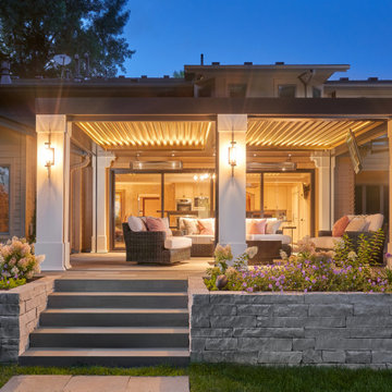
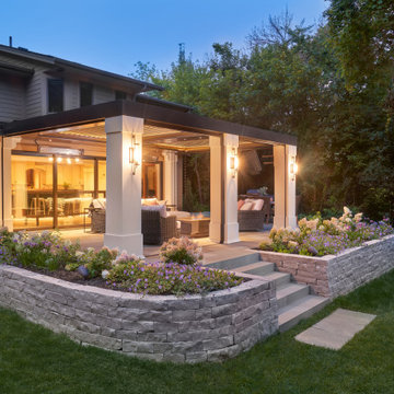
These clients wanted to connect their
new kitchen bump out to the outdoors
via a sheltered area that would block
bugs and rain but not the view of the
lake below. The NARI member
contractor exceeded those goals with a
design that actually makes the lake
appear closer and seamlessly integrates
indoors and out. It even expanded cool
weather use with strategically placed
heaters and a large fire table. The
project features an operable pergola
with motorized screen walls and
architectural columns over a bluestone
patio.
The client says it’s a lovely place for
open-air naps. “With the wall of Loewen
doors open and the pergola screens
down, our house has never been so
open. We love the design and the final
product. We definitely would hire the
company again and recommend
After Before them,” she said.
 Helman Sechrist Stoelting Architecture
Todd Allen
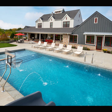
Pool fountain - mid-sized country backyard concrete and rectangular pool fountain idea
Pool fountain - mid-sized country backyard concrete and rectangular pool fountain idea
Find the right local pro for your project
 J.THOM Residential Design & Cabinetry
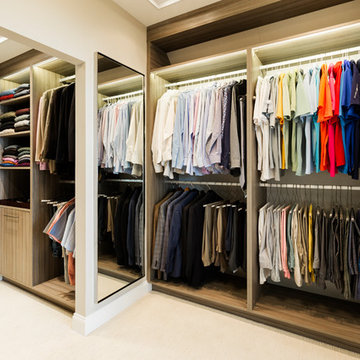
This clients Bedroom was actually too large and didn't have enough closet space which is not uncommon for a premium spec home by a National Builder / Developer. Our goal was to create an Owner's Bedroom Suite that felt more intimate and cozy as opposed to vast open space. In addition, more wardrobe space was a 'must have'.
We took the over-sized bedroom with cathedral ceiling and created smaller ancillary spaces like a sitting nook, walk-in wardrobe and shoe & accessory closet. We flattened out the cathedral ceiling to create a contemporary tray ceiling with ambient light.
By re-scaling the room, we added more storage and functional spaces that created a sense of purpose, intimacy and coziness. The result was a welcoming bedroom that is scaled appropriately for the Owner's furniture and art collection.
 Mom's Design Build
These clients wanted to connect their
new kitchen bump out to the outdoors
via a sheltered area that would block
bugs and rain but not the view of the
lake below. The NARI member
contractor exceeded those goals with a
design that actually makes the lake
appear closer and seamlessly integrates
indoors and out. It even expanded cool
weather use with strategically placed
heaters and a large fire table. The
project features an operable pergola
with motorized screen walls and
architectural columns over a bluestone
patio.
The client says it’s a lovely place for
open-air naps. “With the wall of Loewen
doors open and the pergola screens
down, our house has never been so
open. We love the design and the final
product. We definitely would hire the
company again and recommend
After Before them,” she said.
 Landis Architects | Builders
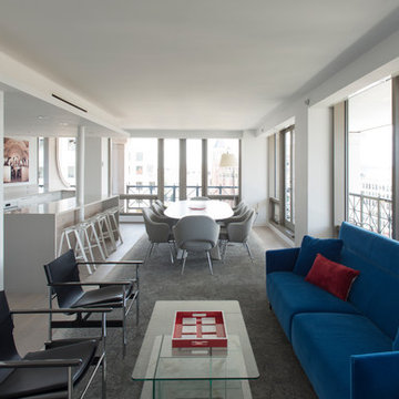
We worked with a corporation and their out-of-town architect on this residential condominium construction in Washington D.C. The company uses the apartment for executive housing and meetings. Its goal was to create a flexible space to be used for both purposes. We renovated the kitchen, two bathrooms, and one bedroom. The central focus is the sleek new open kitchen, though we worked on the entire 1200 square foot apartment.
The client provided the architectural design for the kitchen and the rest of the apartment. The biggest layout changes were:
*Removing the walls of the existing kitchen to create a dramatic open kitchen that runs all the way to the window on one side and an island with a waterfall countertop on the other side.
*A layout that provided space for a large conference table
*Closing off one door of the bedroom and creating a larger opening from the living room side and installing pocket doors
These changes required extensive systems work throughout the apartment, including redoing all the ductwork, modifying the sprinkler system and relocating sprinkler heads to meet fire code. We didn’t run into any surprises with the systems because our team had investigated the structure in the pre-construction stage and cut holes in the drywall to locate the plumbing pipes, columns, and wiring. We had to turn and move the existing HVAC system so we could hide it in one of the kitchen cabinets.
We built the structure that anchors one end of the kitchen. It hides a refrigerator (with flush panel doors), electrical panel, and writing for the flat screen television. A soffit above the kitchen hides all the ductwork, and is fitted with recessed lights and LED cove lighting above.
The client supplied the kitchen cabinetry. The countertops are quartz by Caesarstone in Haze. We installed the flooring material on the base of one side of the island.
Backsplash. The dramatic backsplash is made of thin sheets of porcelain. The 5 mm thick material by Fiandre comes in 5-foot by 10-foot sheets that comes in a continuous pattern or can be book-matched. A fabricator measured the layout and cuts for the wall outlets, cut the material and installed it. Our team delivered three sheets of the material up the stairwell of the building. Though they created a template of the material out of wood to make sure it would fit, the actual material was more rigid and it took them a while to maneuver it.
The new wide opening at the end of the living room has pocket doors. We closed off the original hallway door to the bedroom.
Michael K. Wilkinson
 Degnan Design-Build-Remodel
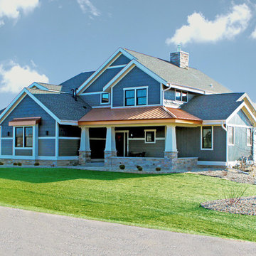
For this custom built home, we had the privilege of working alongside our client, an architect, who had a vision of his dream home that we were to bring to life. Designed to comfortably house two adults and eight children, this home was designed to perfection. Our goal was to pull those design ideas from the head of our client, put them on to paper, and make them a reality. Creating a set of plans that met not only our client's design ideas, but the neighborhood developers as well, took extensive teamwork and negotiations.
 Siegler Design Services + INTERIORS
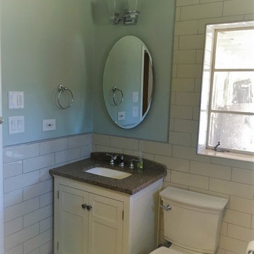
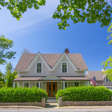
This home in a popular neighborhood close to Arizona State University dates probably to just before "mid-century and now has all NEW Fixtures and Finishes. The room was gutted and a new bathroom created. The goal of the project was to have a bathroom for this 1940's cottage that looked like it could be original but, was clean and fresh and healthy. Actually the windows and millwork and door openings are all original. The fixtures and finishes selected were to be in character with the decade in which the home was built which means the look is more World War II era and cottage / bungalow in ambiance. All this was softly and gently dramatized with the use and design of the 2 tone tile in creamy white and soft gray tiles throughout.
 OLSON LEWIS + Architects
Published in the NORTHSHORE HOME MAGAZINE Fall 2015 issue, this home was dubbed 'Manchester Marvel'.
Before its renovation, the home consisted of a street front cottage built in the 1820’s, with a wing added onto the back at a later point. The home owners required a family friendly space to accommodate a large extended family, but they also wished to retain the original character of the home.
The design solution was to turn the rectangular footprint into an L shape. The kitchen and the formal entertaining rooms run along the vertical wing of the home. Within the central hub of the home is a large family room that opens to the kitchen and the back of the patio. Located in the horizontal plane are the solarium, mudroom and garage.
Client Quote
"He (John Olson of OLSON LEWIS + Architects) did an amazing job. He asked us about our goals and actually walked through our former house with us to see what we did and did not like about it. He also worked really hard to give us the same level of detail we had in our last home."
“Manchester Marvel” clients.
Photo Credits:
Eric Roth
 N C R
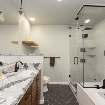
N C ROur goal here was to offer our clients a full spa-like experience. From the unique aesthetic to the luxury finishes, this master bathroom now has a completely new look and function!
For a true spa experience, we installed a shower steam, rain head shower fixture, and whirlpool tub. The bathtub platform actually extends into the shower, working as a bench for the clients to relax on while steaming! Convenient corner shelves optimize shower storage whereas a custom walnut shelf above the bath offers the perfect place to store dry towels.
We continued the look of rich, organic walnut with a second wall-mounted shelf above the toilet and a large, semi-customized vanity, where the louvered doors accentuate the natural beauty of this material. The white brick accent wall, herringbone patterned flooring, and black hardware were introduced for texture and a trendy, timeless look that our clients will love for years to come.
Designed by Chi Renovation & Design who serve Chicago and it's surrounding suburbs, with an emphasis on the North Side and North Shore. You'll find their work from the Loop through Lincoln Park, Skokie, Wilmette, and all of the way up to Lake Forest.
 J.THOM Residential Design & Cabinetry
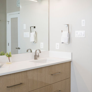
This clients Bedroom was actually too large and didn't have enough closet space which is not uncommon for a premium spec home by a National Builder / Developer. Our goal was to create an Owner's Bedroom Suite that felt more intimate and cozy as opposed to vast open space. In addition, more wardrobe space was a 'must have'.
We took the over-sized bedroom with cathedral ceiling and created smaller ancillary spaces like a sitting nook, walk-in wardrobe and shoe & accessory closet. We flattened out the cathedral ceiling to create a contemporary tray ceiling with ambient light.
By re-scaling the room, we added more storage and functional spaces that created a sense of purpose, intimacy and coziness. The result was a welcoming bedroom that is scaled appropriately for the Owner's furniture and art collection.
 Rhodes Architecture + Light
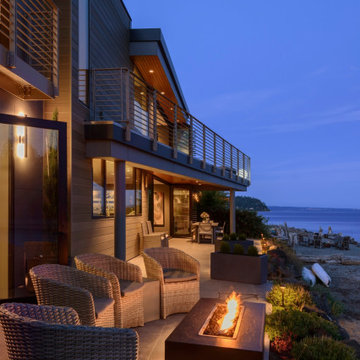
A transformation inspired by the owner’s love of modern architecture, art and color (and the adjacent sand, rock, water, and the northwest landscape), the Indianola House sought to bring the soul of a home to a colorless muted box. The original house was a drab 1990’s-era box with no personality or presence sited on a beautiful secluded bay, facing water and island views, northwest of the City of Seattle. The existing mono-colored stucco-clad exterior and pyramidal glass-block openings had led the neighborhood to dub the structure, unflatteringly, “The Miami Vice House”.
Rhodes Architecture’s Residential Architects careful use of natural light, rich, collaged finishes and ability to open the house to gardens, beach, and outdoor gathering was critical to the design. The house soon became “The Gallery”.
The original home’s grey stucco exterior made the house seem both large and featureless; the introduction of no-maintenance exterior materials that collage and complement each other was a goal of the homeowner and the Seattle Architects who teamed up for this residential design. The bloated scale of the house cried out for the establishment and definition of the parts of the structure, a breaking down of the home’s form and its apparent bland size.
Living, sleeping, and bathing areas that started as staid spaces were in need of opening to the natural environment with additions of large doors, folding glass walls and useable balconies were crucial to each space having a dialogue with the outdoors.
The owner’s extensive art collection was highlighted and became the focus of interior places, well-lit naturally and through a new lighting system. Energy use and sustainable systems were a key component of the design which used high-efficacy lighting, better cladding on a rain-screen system, high-efficiency doors and windows, new insulation and weather barriers, and which added a photovoltaic-generated electrical system. The contemporary design sought to integrate all of these systems, materials, and finishes into a seamless whole that lent interest and drama to a residence which was previously lusterless.
How radically this house was transformed is evident in the exteriors, gardens and the natural spaces the house now opens to, as well as the gallery-like interiors. This home is a stunning testament to what is possible “before-and-after” when remade by Rhodes Architecture + Light.
The clients are an older couple with long professional and political careers, a love of art and a clear desire to connect with the Northwest environment and enliven their daily lives with spaces full of color and natural light.
Rhodes Architecture + Light was hired in 2019 to add new exteriors and interiors, natural light, larger openings to beach and bay, seismic and foundation upgrades to the home, and to infuse life into the house through the re-use of existing space and varied materials, color, textures, and lighting. The only actual change to the exterior “shell” of the house was the introduction of a low “gull-wing” roof with wood soffits above the central atrium space, to add drama and bring natural light into the entry gallery space. Interior spaces, including bedrooms and bathrooms, were re-planned and opened to each other, to greater natural light, to roof decks, and to the incredible views and sea-side environment.
The Builder, Fairbank Construction Company of Bainbridge Island, Washington, met the challenge of the design, first completely deconstructing the finishes inside and out, then precisely interlocking new claddings, windows and doors, cabinetry, finishes and a new gull-wing central roof in a beautiful transformation. The construction was total, thorough, and very detailed, resulting a house that, far from seeming a “remodeling”, is far more present and fitting to the owner’s lives and the natural environment than the house we started with.
 Woodling Landscape Design
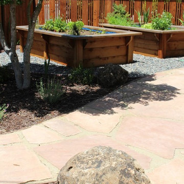
The owners of this very small home have no back yard and wanted to pack a lot of features into the sunny front yard. Designing small gardens can actually be challenging as using the space has to be ultra-efficient. Design goals included an area to grow vegetables, space to sit in the sun and privacy from the busy street. Gently curving Arizona flagstone pathways connect all of the garden features which include two large redwood raised vegetable beds. These special beds have seating walls on all four sides for enjoying your glass of wine and maximizing the space. We installed new redwood fences, pergolas and gates to provide a sense of enclosure from the street. Mounding, drought-tolerant Mediterranean plants create year-round color and invite insect activity. Hidden beneath the surface is a series of drains to address slope and runoff issues in the rainy season. You don't need a lot of space to enjoy the beautiful Santa Cruz outdoors!
 Paul Krause, LLC
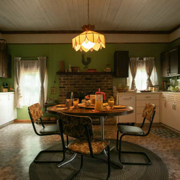
Cabinetry Design, fabrication and installation for Arrived Stranger Things Byer's House. Goal was to replicate the Set Kitchen used for filming . . . which was different than the actual house (used for exterior/outside filming only.
 Chateau Chic Designs
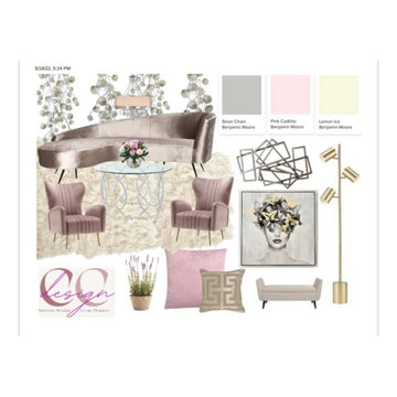
Mood boards can serve many purposes, starting with organizing the inspiration around a project. They can be a valuable resource throughout the design project, to help keep the style and aesthetic consistent and on track with a client’s goals and expectations.
Mood boards are also an excellent way to refine a project’s style before diving into the actual design process. They’re a much lower investment than mock ups and prototypes in terms of resources and time and can convey a lot about the look and feel of the final design.
 Leigh Designs
AFTER-
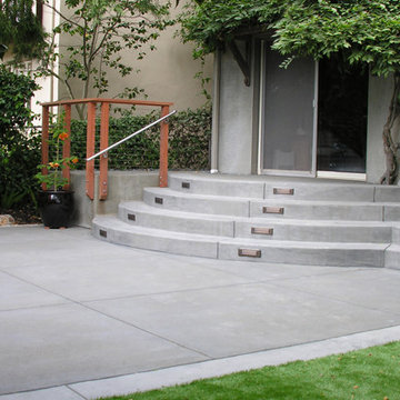
This was a very shady and enclosed backyard. The goal was to create lounge and dining areas, as well as a play area for the kids. Creating curved stairs provided a graceful aesthetic solution and practical access to any direction. The clients were amazed at how much more usable space the actually had. Artificial turf proved the best solution for soccer cleats, low water, and maintenance.
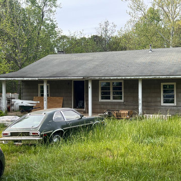 Paul Krause, LLC
Cabinetry Design, fabrication and installation for Arrived Stranger Things Byer's House. Goal was to replicate the Set Kitchen used for filming . . . which was different than the actual house (used for exterior/outside filming only.
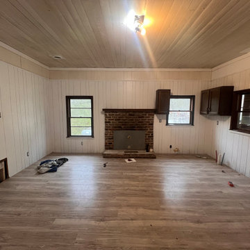 Paul Krause, LLC
Cabinetry Design, fabrication and installation for Arrived Stranger Things Byer's House. Goal was to replicate the Set Kitchen used for filming . . . which was different than the actual house (used for exterior/outside filming only.
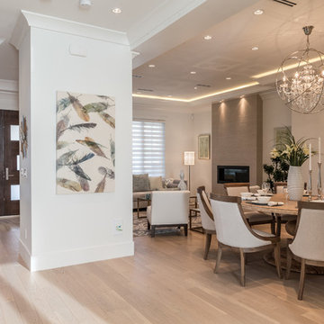
 Red Plum Design Inc.
Contemporary Living Room photographed by Wade Zaharko Photography
Inspiration for a mid-sized contemporary open concept light wood floor living room remodel in Vancouver with white walls, a ribbon fireplace and a tile fireplace
Inspiration for a mid-sized contemporary open concept light wood floor living room remodel in Vancouver with white walls, a ribbon fireplace and a tile fireplace
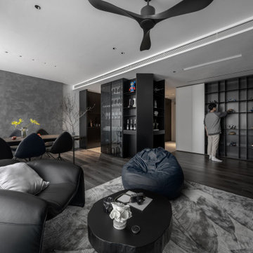
 D2 Architects
"We often rush to divide everything as white and black and store them separately in a separate place. But seemingly opposing things that are inseparable - that is the world - are a mixture of different things." _Matisyahu_
The contrast between black and white is not only a choice but also a way to make it special. When stepping into an all-white or all-black living space, it is easy to feel purity or luxury, but it can also suggest a little skepticism about the monotony or oppressiveness it brings. So using black and white is therefore not difficult but definitely not easy.
In the apartment project at Vinhomes Symphony apartment that we implemented this time, white and black are no longer just two opposing colors, but they are combined and mixed, intertwined creatively to create a unity. As an expression of day and night, brilliance and mystery, white and black have adopted tricks and materials, arrays of blocks and light, blending together with the goal of creating living spaces with comfort, convenience and luxury.
"This is probably a very special and interesting project for me and my colleagues, right from the first approach, the investor is also a sister, a person with a young, dynamic way of thinking with a very special and very own taste. After each actual project, we keep a diary of the conceptualization, design and execution process. Join us to look back on the process of project formation as well as better understand the philosophy, ideas and functions that have been sent in the project" - Kts. Dang Duong - Founder of D2Architects.
The current status of the project is 2 apartments located at location A-20 and A-21 in S6A building of Vinhomes Symphony apartment. With an east-facing façade, the apartment is endowed with the advantage of natural light as well as excellent panoramic views. The highlight of this apartment is the view opening to the Phuc Loi lotus lagoon with a large area, more than 10 hectares and airy landscape by the Duong River.
These are not merely apartments, but they are also places to express creativity and make harmonious use of natural light and surrounding nature. Every view from these apartments not only opens up amazing scenery but also a lifestyle full of relaxation and tranquility amidst the noisy city.
With the special importance of location and unique views, making perfect use of space and light here is not only an advantage but also a great potential to create a sophisticated and classy living space. The sophistication in design and handling of space has been put on top by us, in order to make the most of these extremely special advantages.
In order for a living space to truly become a place called "Home" – a place where we want to return and feel peaceful while there, we have carefully researched the preferences and desires of the owner. Sharing with me about her hobby, Ms. Yen expressed that she loves a modern space with minimalist style and cool tones, creating a sense of tranquility and elegance. This is clearly reflected in the original idea for the apartment.
What's even more interesting is his teenage son's hobby of playing Lego. This is not only a personal preference but also a special source of inspiration for the design process. From these data, we built a preliminary idea for the comprehensive living space of the apartment.
The combination of the requirement of modern, minimalist space and cool tones along with creative elements from his son's personal hobby of playing Lego has created a unique living space, both reflecting the owner's own personality and meeting the needs of living and personal preferences. This is the foundation for creating a real home, where each member of the family feels content and peaceful every time they return.
The project uses the main tone of industrial wood painted in dark gray, white and dark veneer. Versatile combination with other modern materials such as smoke glass and artificial stone,... Create a work of architectural art where everything intersects harmoniously with natural light like a great symphony.
The contrast between the bass of the cool tone and the warm, gentle touch of the light creates an impressive picture of a delicate blend of opposing elements. The soft, beautiful touch of this space is hidden in the strength and modernity of the materials used. This is not only a house, but also a mirror that clearly reflects the personality and philosophy of life of the owner.
The modern, youthful spirit is clearly shown from the moment you cross the threshold to enter the house. Flexibility, creativity and the harmonious intersection of materials and light have created a colorful and sophisticated living space, while celebrating the beauty of modernity and youthful vitality.
LIVING ROOM:
The living room is not merely a living area or common living space of the family, but according to feng shui concept, this is the place where the best energy of the house is concentrated. Therefore, creating a special living room space is extremely important.
Neutral gray-white tones are made in the background, creating the foundation for sophistication and elegance. Color accents are subtly applied, creating a unique touch for the house, increasing the creativity and style of the owner.
Maintaining the spirit of LEGO - unlimited creativity - through every corner, every architectural line has created an interesting space experience right in the living room. It stimulates the imagination of all ages, opening up space for each person to freely create, build and connect with each other through the common language of LEGO.
KITCHEN & DINNING ROOM:
The kitchen is an indispensable piece in every family, this place is likened to the heart of the whole house. All one needs to create great taste is love and creativity in the kitchen. Because the kitchen with family meals is the emotional bond between members. Therefore, designing a beautiful and functional kitchen requires a delicate combination of colors, shapes and meticulousness in choosing the right materials.
Today's kitchen is invested by many people in both form and quality, so a beautiful, luxurious, modern, comfortable kitchen that fully meets the needs of each family is the design criterion D2 Architects aims for.
The Lego House project is not just a project anymore but it is really the result of sending all our core values and creative spirit to create a living space that symbolizes the interconnectedness of design, art and soul.
D2Architects
A : Khuat Duy Tien -Thanh Xuan Bac - Ha Noi – Viet Nam
M: d2architects.vn@gmail.com
W: d2architects.vn
P: 0965551101 - 0965554792
18