
Search results for "Additional layer" in Home Design Ideas
 Tile Doctor Ltd
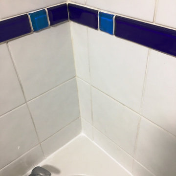
A family living in Guildford were in touch recently about restoring the appearance of their Ceramic tiled shower and bathroom. They were about to put the property up for sale and were concerned the grubby grout might put off potential buyers. First impressions do count so renovating a bathroom or kitchen before selling is a really good idea and will help you achieve a better price.
In this case the Ceramic tiles were dirty and black with mould in places which looked unhygienic and uninviting. Additionally, the mastic sealant between the tile and bath was tired and worn to the extent that water could end up leaking behind the seal. After visiting the property, they were pleased to hear I could help and happily accepted our quote which was based around a days work and some materials.
Firstly, I cleaned the grout using a Tile Doctor product called Duo Clean which is designed to tackle dirty grout and mould. I sprayed the product along all the grout lines and left it to soak in for about fifteen minutes. Once ready I brushed them with a firm wire brush then rinsed off with water. Next, I cleaned the tiles using a strong dilution of Tile Doctor Pro-Clean which was decanted into a spray bottle and sprayed onto the wall tiles. After ten minutes I then used a handheld buffing machine fitted with a small white buffing pad to shift the dirt and buff up the white tiles. After rinsing the slurry off with water you could see a marked improvement.
I hand dried the tile and grout with a cloth and then set about stripping out the old white mastic sealer with a sharp knife. This took some time, as you have to be careful not to scratch the bath or the tile.
By this time the grout had dried off fully and I was able to see if more work was required. To achieve a uniform colour throughout. Mould and some cleaning products can discolour grout permanently and, in this case, there was some grout staining I was unable to remove. We had discussed this possibility earlier and how it would be best resolved using a white grout colourant. So, I carefully applied Tile Doctor Grout Colour which is painted on with a small brush with any excess wiped off the tile before it can set. This resulted in a uniform white grout throughout and really gave the whole bathroom a lift.
With the cleaning process completed I applied a new white mastic between the bath and tile and along the verticals. This is done with the bath filled with water and then left for 24 hours to allow the silicone to fully cure.
After the grout colour had dried, I applied an aerosol Tile and Grout sealer over the whole surface and then lightly polished off any excess with a clean cloth. This does two things; one it adds a further layer of protection to the new grout colour and to the surface of the tiles. Secondly Ceramic tiles are non-porous, but bacterial dirt can still get a grip on the surface, with the sealer in place you will find water quickly runs off without getting a chance to get a hold.
Sealers do wear off, so I recommended re-applying it every year. I had plenty left over and gave it to the customer when I finished using it. For regular cleaning of tiled shower areas, I recommend they use Tile Doctor Aqua-Pro this will neutralise any acid build-up caused by acidic shampoos etc.
West Surrey Tile Doctor
Rupert Mcleod
 E.L. Designs
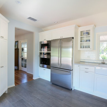
What an honor it was to be part of this Classic California Ranch remodel! Originally built in 1940 with the architectural influence of the iconic William Wurster, this beautiful home had a small, dated kitchen that didn't do it justice. The floor plan had become rather compartmentalized due to remodels and additions by the previous homeowners, and the current homeowners wanted to thoughtfully re-design the kitchen paying tribute to its roots, while also gaining more open and functional space. Ultimately, we relocated the kitchen from it's original location to what was an informal dining space. We reconfigured the mud/laundry room, as well as the space adjacent to it and the kitchen, to allow for a more natural flow between kitchen, dining, and living. The space that previously housed the kitchen was turned into a gallery, where the homeowners can sit and enjoy their morning coffee while viewing the golf course. In the gallery, the original brick from the exterior patio was uncovered under many layers of flooring, and the contractor was able to restore the brick and re-install it for the gallery floor, creating a space that truly emphasizes the leisurely, laid back California lifestyle that blends the indoor and outdoor spaces that the architecture of William Wurster so beautifully emphasizes.
 ALTER Design Studio
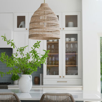
We met with our clients a few times over six months before we starting designing. They had an interesting existing layout and a very specific list of wants. We worked with their architect, re-working the home to achieve the open, light filled space they dreamed of. With roots in Australia, they wanted an elevated coastal vibe. We used muted blues, layered in texture and warm finishes - the results speak for themselves. Storage was a big challenge in the very small original kitchen. In addition to the large island and run of cabinets, we added a hidden pantry.
Find the right local pro for your project
 Klopf Architecture
From Mid-Century Classic to the Present
An iconic design updated with comfort, function, and flow for today.
A Remodel That Balances Past and Present
What started as a desire to update a classic Eichler soon became an exploration of how Mid-Century Modern design can successfully evolve for today. The client, a tech professional with a passion for scuba diving and underwater photography, wanted a home that would both honor its original character and feel tailored to his daily life. A lifelong technology enthusiast, he still owns the very first Mac desktop he saved up for as a teenager working at Radio Shack, a detail that underscores his appreciation for design that melds function and form.
Honoring Separation While Expanding Possibility
Unlike many contemporary remodels where walls are opened up to create expansive living spaces, this project took a more restrained approach. The client valued the defined rooms of the original plan and wanted to preserve as much wall space as possible for displaying his large-format underwater photography. The emphasis was not on dramatic spatial reinvention, but on thoughtful refinements. Klopf Architecture shaped a gallery-like backdrop while also expanding the primary suite, modernizing materials and fixtures throughout the home, and improving the functionality and layout of the kitchen. The finished home feels at once timeless and renewed, an Eichler that continues to inspire while fully supporting the lifestyle of its present-day owner.
A major turning point came mid-design. The original project brief had not included an addition, but as the reconfiguration of the primary bedroom and bath unfolded, it became clear that an expansion was the best approach to achieve the client’s vision of a more spacious suite. Fortunately, the adjustment came at a stage when revisions were still manageable and was integrated seamlessly, showing how thoughtful course corrections can strengthen a project rather than hinder it.
Navigating Challenges With Precision
The design development included multiple conceptual rounds, balancing preservation with subtle expansion. During construction, an existing post previously thought to be load-bearing turned out not to be. The structural engineer was able to pivot quickly, and both the post and the cross beam that had been intended to replace it could be omitted, allowing the original rhythm of the Eichler beam bays to be preserved.
Sustainability was not just a checklist item, but a way to align the home with the client’s values of simplicity, efficiency, and long-term functionality. R-38 roof insulation reduced energy usage, solar panels with battery storage provided independence and resilience, and passive comfort strategies eliminated the need forenergy-intensive air conditioning. An electric vehicle charger and an on-demand hot water recirculation system (with call buttons as opposed to having constant circulation) add to the home’s long-term efficiency factors. Together, these moves created a home that is quieter, more comfortable, and better equipped for the future, qualities that supported the client’s pragmatic approach to design and living lightly.
Details That Respect the Eichler DNA
The remodel carries forward the Eichler’s original spirit while introducing new layers of modern livability. Originally, the house was approached along a deep, narrow walk, with the garage on one side and the house on the other, leaving the front door tucked far back within this chasm-like space. By pulling the entry forward, the design reshaped the arrival experience, creating a clearer threshold and a natural drop-off zone for bags, shoes, and keys. This shift also made room for a custom bench at the entry that extends seamlessly through the glass sidelight. The bench and drop-off zone now work together as a single, integrated sequence that supports everyday living while offering a tactile reminder of Eichler’s philosophy of connectedness.
At the client’s request, Klopf reintroduced a classic Eichler gesture by extending the exterior siding into the entry and living room. The detail reinforces a sense of indoor/outdoor continuity while providing a subtle architectural surface that allows the client’s photography to take visual precedence.
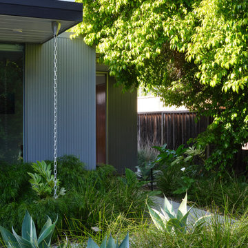
The signature concrete masonry wall at the front was reconstructed using blocks sourced to match the originals, now strengthened with rebar for seismic resilience while maintaining a private outdoor courtyard, visually extending the kitchen outward. A decorative trellis element, a detail borrowed from a neighboring Eichler, restores a familiar mid-century modern architectural motif. At the courtyard entry door, a custom etched glass sidelight with an ocean-themed design featuring kelp and jellyfish serves as a subtle homage to the client’s passion for deep-sea diving.
Landscaping became an integral part of the overall transformation. The homeowner engaged landscape architect Randi Johnsen of Third Nature Studio to shape a series of calm, inviting outdoor rooms that read as a natural extension of the interiors. While technically outside of the core construction scope, the landscape design proved central to achieving a sense of completeness and connectedness across the property. Such whole-property considerations often emerge as design ideas take shape, underscoring the importance of flexibility in planning and budgeting, as well as close collaboration among the design team starting early in the process.
The Value of Evolving Scope
As with many custom residential projects, the scope evolved during the design process. What began as a targeted remodel grew to include a new/expanded primary suite, a rebuilt CMU patio wall for strength and longevity, and a solar panel array and battery storage for energy resilience and carbon-reduction. Each thoughtful decision represented a conscious investment in the home’s performance and character, rather than a cost overrun.
The result was a project delivered on schedule, tailored precisely to the client’s lifestyle, and positioned to add long-term value both functionally and aesthetically. By embracing scope evolution as an opportunity rather than a challenge, and relying on good design paired with transparent communication, this remodel demonstrates how Eichler homes can be adapted for contemporary living without erasing their DNA.
Klopf Architecture project team: John Klopf, AIA, and Klara Kevane, Elise Webb and Nicholas LaNasa.
Contractor: Golden Cove Construction
Landscape Design: Third Nature Studio
Structural Engineer: Daniel Bastiao Design
Photography: ©2025 Mariko Reed
Year Completed: 2024
Location: Sunnyvale, CA
 D&G Construction
This full-home remodel blends modern sophistication with functional comfort, creating a space that feels inviting, elegant, and beautifully cohesive.
The kitchen is the heart of the home, featuring white cabinetry, a statement range hood, and a spacious granite island that anchors the open-concept layout. Subtle herringbone tile details and sleek pendant lighting add depth and warmth, while the adjoining dining area showcases custom millwork and soft neutral tones for a perfect balance of formality and ease.
A butler’s pantry connects the kitchen to the entertaining spaces, offering additional storage, a beverage station, and glass-front cabinetry for display — proving that practicality and beauty can coexist effortlessly.
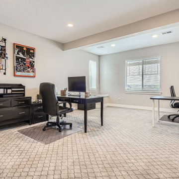
Downstairs, the home transforms into an entertainer’s retreat with a luxurious theater room, complete with tiered seating and custom ceiling accents. The adjoining office space provides a quiet corner for productivity without sacrificing style.
Bathrooms throughout the home feature elegant tilework, quartz and granite countertops, and thoughtful layouts — from a spa-like primary suite with a soaking tub and walk-in shower to a charming Jack-and-Jill bath designed for everyday family living.
Finishes are clean, layered, and timeless: soft gray cabinetry, matte black and chrome fixtures, warm wood floors, and inviting textures that bring continuity throughout the home.
From the laundry room’s efficient built-ins to the family room’s stone fireplace, every space was designed to feel lived-in yet elevated — a reflection of D&G Construction’s belief that great design starts with how you want to live, and ends with how beautifully it’s built.
 Sansa Interiors
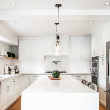
Sansa Interiors transformed what used to be a 1950s outdated bungalow into a simple, functional and bright space for a family of four.
The original interior was gut renovated while incorporating a second level as an addition to the building structure. The facade remains true to the feel of the neighbourhood, balancing a clean traditional ground level and a slick minimal upper plane.
Choosing an interior palette that consists of white tones and warm greys allows the home to feel even more spacious and serene. Introducing white oak accents through out the home brings in an extra layer of warmth.
We worked very closely with our clients to tailor the space to their lifestyle, entertainment needs and basic functional requirements. We provided an open riser staircase as a visual element that connects all levels of the home and allows light through.
The greatest part about this renovation is that it allowed us to place large windows, bringing nature in and constantly opening the home up to ultimate daylight.
Location: Mississauga
 In Detail Interiors
A master bedroom with rich color, texture and personality!
With a colorful master bathroom that blends the perfect matte finish, semi-primitive blast of pattern with rich, saturated jewel tones and a little calacatta gold tile – determining the best fabrics and finishes for the master bedroom felt like a HUGE challenge. How do you stand up to something so fabulously unique and still create a soft respite for someone to slumber?!
This bedroom was a small space with existing Vetrazzo floors and an entire wall dedicated to floor-to-ceiling fixed glass pane windows. Between the cracks in the plaster ceiling and the lacquered pink dresser we knew we had our work cut out.
Saturated colors create a fairy tale bedroom
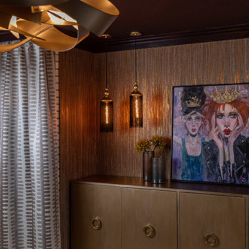
Fast forward to finding the perfect, sumptuously soft evergreen mohair for the headboard and furry tuffets for the foot of the bed. Texture became the name of the game and a certain level of color variation had to tie through from selection to selection. Cladding the walls with a gilt woven cloth wall covering that also pulled a sort of skin-tone clay from detail found in the Vetrazzo flooring (OMG! so pretty!) and grounding everything with a sort of deco-inspired one-of-a-kind wool rug. The layers of unexpected style helped develop a more collected – less stylized – feeling overall.
Then it was bye-bye to the pink lacquer! A local artisan worked on a faux finish for the custom dresser that the client had already invested in and we just gave it a refresh with a deep bronze finish. Balancing this piece with the playful silk tassel pendant lights that frame a beautiful original painting of red headed queens by artist Nancy Rhodes Harper.
Exquisite lighting for a sexy master bedroom
Additionally, the swirl and swoop of the forged metal light fixture overhead play off the more structured spinal-column type pattern of the black out window treatments that truly act as their own piece of art. Each element has its place and plays with the visual and textural aesthetics that make our client (and our team) swoon.
Want more colorful and moody interior spaces? Check out another one of our recent projects here! Then call us for more information on how we can help you! Read more about our full-service interior design here!
Sponsored
Columbus, OH

Structural Remodeling
Franklin County's Heavy Timber Specialists | Best of Houzz 2020!
 GreenKeepers Landscaping
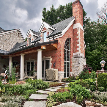
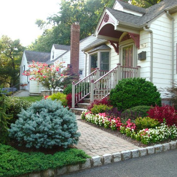
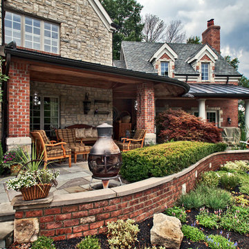
Along with the new portico, new railings for the steps and a lamppost were installed, as well as a new belgian block lined asphalt driveway. The landscape was designed with mostly evergreen shrubs. Annuals are changed out for additional seasonal color.
 Stalburg Design
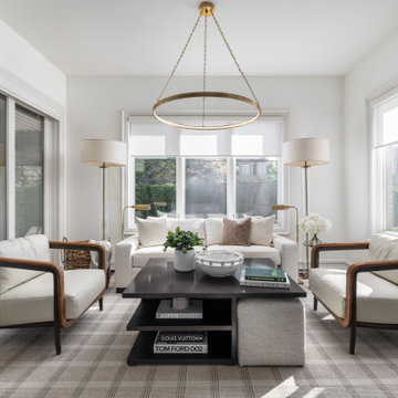
This sitting room off of the kitchen became the main hangout space for family, friends and more for our clients located in Birmingham, MI. Completed in September of 2023, the space needed to provide as much seating and flexibility as possible for people to gather. We also needed to maintain access to the adjacent patio. Previously used as a breakfast nook, this small sunroom contained oversized and bulky furniture along its walls.
To reinvent this space, we added a custom sofa, two lounge chairs, and two ottomans that could be re-arranged for various uses. During the summer months, when circulation is needed at the patio doorway, the accent chairs fit perfectly along the opposite wall and smaller, moveable ottomans are in place at the doorwall. When not in use, the ottomans tuck away in our custom designed coffee table and keep this space flexible and functional. The individually placed chairs provided symmetry and elegance along either side of the sofa.
Our large central cocktail table acts as an additional place to set out food or dine over. Layered lighting provides options for daytime use as well as evening reading. And finally, the custom area rug anchors and defines the space and holds together this elevated and flexible sunroom. The result is both beautiful and functional for year round use!
 Zola European Windows
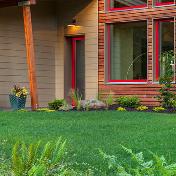
Essential, contemporary, and inviting defines this extremely energy efficient, Energy Star certified, Passive House design-inspired home in the Pacific Northwest. Designed for an active family of four, the one-story 3 bedroom, 2 bath floor plan offers tasteful aging in place features, a strong sense of privacy, and a low profile that doesn’t impinge on the natural landscape. This house will heat itself in the dead of winter with less energy than it takes to run a hair dryer, and be sensual to live in while it does it. The forms throughout the home are simple and neutral, allowing for ample natural light, rich warm materials, and of course, room for the Guinea pigs makes this a great example of artful architecture applied to a genuine family lifestyle.
This ultra energy efficient home relies on extremely high levels of insulation, air-tight detailing and construction, and the implementation of high performance, custom made European windows and doors by Zola Windows. Zola’s ThermoPlus Clad line, which boasts R-11 triple glazing and is thermally broken with a layer of patented German Purenit®, was selected for the project. Natural daylight enters both from the tilt & turn and fixed windows in the living and dining areas, and through the terrace door that leads seamlessly outside to the natural landscape.
Project Designed & Built by: artisansgroup
Certifications: Energy Star & Built Green Lvl 4
Photography: Art Gray of Art Gray Photography
 Slovack-Bass
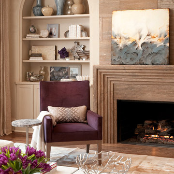
A pair of matching sofas with custom metal frames and soft contrast fabric create a luxurious formal living space. Fireside chairs in a purple velvet provide a pop of color and additional seating. The stone surround at the fireplace is a modern interpretation of the classic over-mantle. The richness of the stone draws the eye to fireplace and showcases the abstract artwork. Flanking the fireplace, two niches showcase the eclectic collections cherished by the clients. To soften the space and add warmth and texture, a pieced hair-on-hide rug layers on top of warm medium-toned wood flooring. Sheer drapery filter light from the adjacent pool space.
Photos by: Don Glentzer
 House of a Different Color
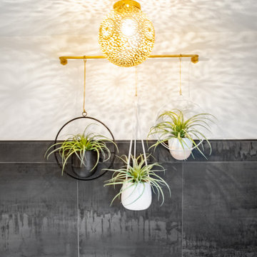
Primary bathroom renovation. Navy, gray, and black are balanced by crisp whites and light wood tones. Eclectic mix of geometric shapes and organic patterns. Featuring 3D porcelain tile from Italy, hand-carved geometric tribal pattern in vanity's cabinet doors, hand-finished industrial-style navy/charcoal 24x24" wall tiles, and oversized 24x48" porcelain HD printed marble patterned wall tiles. Flooring in waterproof LVP, continued from bedroom into bathroom and closet. Brushed gold faucets and shower fixtures. Authentic, hand-pierced Moroccan globe light over tub for beautiful shadows for relaxing and romantic soaks in the tub. Vanity pendant lights with handmade glass, hand-finished gold and silver tones layers organic design over geometric tile backdrop. Open, glass panel all-tile shower with 48x48" window (glass frosted after photos were taken). Shower pan tile pattern matches 3D tile pattern. Arched medicine cabinet from West Elm. Separate toilet room with sound dampening built-in wall treatment for enhanced privacy. Frosted glass doors throughout. Vent fan with integrated heat option. Tall storage cabinet for additional space to store body care products and other bathroom essentials. Original bathroom plumbed for two sinks, but current homeowner has only one user for this bathroom, so we capped one side, which can easily be reopened in future if homeowner wants to return to a double-sink setup.
Expanded closet size and completely redesigned closet built-in storage. Please see separate album of closet photos for more photos and details on this.
 Klopf Architecture
From Mid-Century Classic to the Present
An iconic design updated with comfort, function, and flow for today.
A Remodel That Balances Past and Present
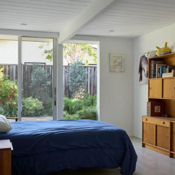
What started as a desire to update a classic Eichler soon became an exploration of how Mid-Century Modern design can successfully evolve for today. The client, a tech professional with a passion for scuba diving and underwater photography, wanted a home that would both honor its original character and feel tailored to his daily life. A lifelong technology enthusiast, he still owns the very first Mac desktop he saved up for as a teenager working at Radio Shack, a detail that underscores his appreciation for design that melds function and form.
Honoring Separation While Expanding Possibility
Unlike many contemporary remodels where walls are opened up to create expansive living spaces, this project took a more restrained approach. The client valued the defined rooms of the original plan and wanted to preserve as much wall space as possible for displaying his large-format underwater photography. The emphasis was not on dramatic spatial reinvention, but on thoughtful refinements. Klopf Architecture shaped a gallery-like backdrop while also expanding the primary suite, modernizing materials and fixtures throughout the home, and improving the functionality and layout of the kitchen. The finished home feels at once timeless and renewed, an Eichler that continues to inspire while fully supporting the lifestyle of its present-day owner.
A major turning point came mid-design. The original project brief had not included an addition, but as the reconfiguration of the primary bedroom and bath unfolded, it became clear that an expansion was the best approach to achieve the client’s vision of a more spacious suite. Fortunately, the adjustment came at a stage when revisions were still manageable and was integrated seamlessly, showing how thoughtful course corrections can strengthen a project rather than hinder it.
Navigating Challenges With Precision
The design development included multiple conceptual rounds, balancing preservation with subtle expansion. During construction, an existing post previously thought to be load-bearing turned out not to be. The structural engineer was able to pivot quickly, and both the post and the cross beam that had been intended to replace it could be omitted, allowing the original rhythm of the Eichler beam bays to be preserved.
Sustainability was not just a checklist item, but a way to align the home with the client’s values of simplicity, efficiency, and long-term functionality. R-38 roof insulation reduced energy usage, solar panels with battery storage provided independence and resilience, and passive comfort strategies eliminated the need forenergy-intensive air conditioning. An electric vehicle charger and an on-demand hot water recirculation system (with call buttons as opposed to having constant circulation) add to the home’s long-term efficiency factors. Together, these moves created a home that is quieter, more comfortable, and better equipped for the future, qualities that supported the client’s pragmatic approach to design and living lightly.
Details That Respect the Eichler DNA
The remodel carries forward the Eichler’s original spirit while introducing new layers of modern livability. Originally, the house was approached along a deep, narrow walk, with the garage on one side and the house on the other, leaving the front door tucked far back within this chasm-like space. By pulling the entry forward, the design reshaped the arrival experience, creating a clearer threshold and a natural drop-off zone for bags, shoes, and keys. This shift also made room for a custom bench at the entry that extends seamlessly through the glass sidelight. The bench and drop-off zone now work together as a single, integrated sequence that supports everyday living while offering a tactile reminder of Eichler’s philosophy of connectedness.
At the client’s request, Klopf reintroduced a classic Eichler gesture by extending the exterior siding into the entry and living room. The detail reinforces a sense of indoor/outdoor continuity while providing a subtle architectural surface that allows the client’s photography to take visual precedence.
The signature concrete masonry wall at the front was reconstructed using blocks sourced to match the originals, now strengthened with rebar for seismic resilience while maintaining a private outdoor courtyard, visually extending the kitchen outward. A decorative trellis element, a detail borrowed from a neighboring Eichler, restores a familiar mid-century modern architectural motif. At the courtyard entry door, a custom etched glass sidelight with an ocean-themed design featuring kelp and jellyfish serves as a subtle homage to the client’s passion for deep-sea diving.
Landscaping became an integral part of the overall transformation. The homeowner engaged landscape architect Randi Johnsen of Third Nature Studio to shape a series of calm, inviting outdoor rooms that read as a natural extension of the interiors. While technically outside of the core construction scope, the landscape design proved central to achieving a sense of completeness and connectedness across the property. Such whole-property considerations often emerge as design ideas take shape, underscoring the importance of flexibility in planning and budgeting, as well as close collaboration among the design team starting early in the process.
The Value of Evolving Scope
As with many custom residential projects, the scope evolved during the design process. What began as a targeted remodel grew to include a new/expanded primary suite, a rebuilt CMU patio wall for strength and longevity, and a solar panel array and battery storage for energy resilience and carbon-reduction. Each thoughtful decision represented a conscious investment in the home’s performance and character, rather than a cost overrun.
The result was a project delivered on schedule, tailored precisely to the client’s lifestyle, and positioned to add long-term value both functionally and aesthetically. By embracing scope evolution as an opportunity rather than a challenge, and relying on good design paired with transparent communication, this remodel demonstrates how Eichler homes can be adapted for contemporary living without erasing their DNA.
Klopf Architecture project team: John Klopf, AIA, and Klara Kevane, Elise Webb and Nicholas LaNasa.
Contractor: Golden Cove Construction
Landscape Design: Third Nature Studio
Structural Engineer: Daniel Bastiao Design
Photography: ©2025 Mariko Reed
Year Completed: 2024
Location: Sunnyvale, CA
Sponsored
Columbus, OH
Structural Remodeling
Franklin County's Heavy Timber Specialists | Best of Houzz 2020!
 Moss Building & Design
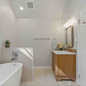
Our customers loved their home but always knew they wanted to remodel their primary and upstairs hallway bathrooms. Both were original to the home, and functionality, look, and amenities desperately needed updating. Inspired by the stunning blue tile that they themselves found, our customers partnered with MOSS to create a primary bathroom that better suited their needs. From the vanities with tip outs, pull outs and much better storage, to the elegant soaking tub that is better suited to the homeowners, and finally, to the shower with the rain system they had always wanted, the primary bathroom is now the space our customers can enjoy for years to come. Additionally, the upstairs hallway bathroom was updated to create a better space for the children in the home, with more storage, more attractive and unique floor and shower tile, and much more. Touches of design choices here and there added the final layer of perfection to these beautiful new bathrooms.
 Phoenix Home Remodeling
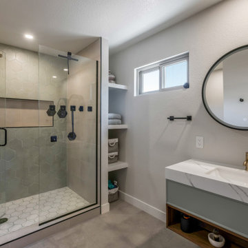
Sarah & Warren desperately needed a master bathroom update. Their existing tub shower combo was dark and drab.
The room struggled to meet their needs. The areas meant for storage were not designed properly that created a lot of wasted space.
The vanity was bulky and was not functioning properly for them. The oversized mirror was dated. The room also had a very large clear window that was covered up by blinds that just attracted dust.
By stripping back, the layers, the tub was not a feature this couple needed, the vanity became floating, and the window was downsized to fit more with their desires. The wasted space to the right of the shower became usable to them by allowing storage for extra bath towel and showering accessories. The panty to the left because a dedicated storage tucked away out of sight.
Lighting improved because of the additional light above the shower and the toilet. We also removed the traditional light above the sinks and installed recessed can lighting throughout the bathroom.
The round storage mirrors side open to reveal hidden storage for all the small items you typically have in a bathroom. Their modern double vanity called Aron was installed floating with 3 functional drawers and a storage opening featuring a mint green and walnut finish and the top is quartz featuring rectangular sinks.
The shower wall tile paired together is a brushed concrete pattern tile called Reside beige from Arizona Tile and the back wall is a light green hexagon tile called Springtime Green from the Tile Shop. The mini hex mosaic floor is white and green mini glass hexagons called Geo from Arizona Tile.
The Delta Trinsic collection is featured in this bathroom with the matte black finish in the bath accessories and the faucets in the Champagne Bronze finish. A light-colored floor brings all elements together and allows the eyes to bounce around the room.
 Living with Lolo
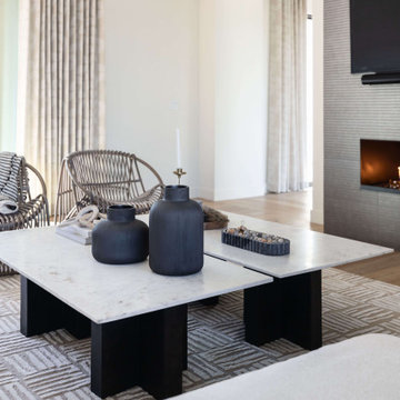
Living Room in Bronco | Key Feature: A Scottsdale new-build rooted in sculptural modernism, Bronco Revival balances bold black-and-white contrast with organic textures, natural wood elements, and statement lighting. As a groundbreaking “Live Lab” designer residence, it’s a first-of-its-kind space where luxury furnishings are tested in real-world conditions before being introduced into high-profile client homes.
Challenge: Because Bronco Revival was the designer’s personal residence, the project carried a unique level of pressure and intention. The challenge was creating a Scottsdale new-build that felt elevated and editorial while still functioning as a true family home. Every selection had to balance bold sculptural modernism (high contrast, statement lighting, architectural furnishings) with durability, comfort, and day-to-day livability. In addition, the home served as a “Live Lab,” meaning new vendors, materials, and luxury furnishings needed to be tested in real-life conditions before being trusted for future high-profile client projects.
Solution: We approached the project with a highly curated, test-and-refine design strategy, treating each space as both a finished interior and a real-world evaluation environment. Key furnishings, textiles, and materials were selected to support the modern organic vision while also standing up to the demands of everyday family life. We worked through selections intentionally, layering in bold contrast, natural woods, and sculptural statement pieces, while prioritizing performance materials, pet-friendly durability, and timeless foundational elements. By using the home as a lived-in showroom, we were able to validate what truly performs beautifully, refine our vendor relationships, and confidently carry those proven selections into future client designs.
Materials: MadeGoods: Sculptural Davion coffee tables |
Loloi: Custom performance rug collection |
Schumacher: Bespoke drapery fabrication |
Aesthetic Wall Coverings: Pioneering wallpaper application on ceiling beams |
Zac + Fox: Exclusive textile collaboration via Made Resource Group |
Budget ($ Range): $300K |
Timeline (Duration): 4 MONTHS
 Innovate Design Collective
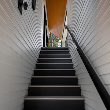
We were very blessed to work with these clients who came to us with a wooded lot in North Saanich and wanted to create a home for themselves that worked with their lifestyle and aesthetic. Both clients are avid bikers and kayakers and wanted to be able to get out and enjoy the outdoors and be able to feel like they lived in the wilderness of B.C. We completed as little tree removal as necessary, including putting effort into maintaining the fern and salal landscape that encompassed the woodlands surrounding the project. Staging area for construction and material storage were also limited, and scheduling the subtrades for their work was tight, but with competent site management, we left the site in a natural state. The energy efficiency was close to net zero, but the solar component and the proximity of the many trees made it difficult to attain a complete net zero level. We included a 6” rock wool exterior insulation layer around the entire home, under-slab insulation and other key items to maximize the efficiency of the living areas. Additional seismic components were also included to increase the longevity of the home and protection of the occupants should a seismic event occur.
Sponsored
Columbus, OH
Structural Remodeling
Franklin County's Heavy Timber Specialists | Best of Houzz 2020!
 Bradford & Kent Home Remodeling
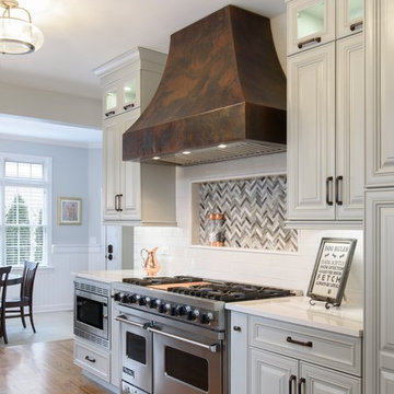
This kitchen provides a very open feel that is great for entertaining guests or for functionality in terms of cooking and eating. The hardwood floors work well with the dark hood against the stainless steel and white cabinets to create contrast and a truly contemporary style. The hanging lights add layers to the room and enhance the style of the back-splash. The upper cabinets provide additional space and storage while the kitchen still maintains its open feel.
 Affecting Spaces Design Studio
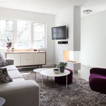
Warm grey finishes are layered with a classic white background creating a bright and open modern living room. The addition of an open modern fireplace adds warmth and interest to the overall space
 George Ocampo
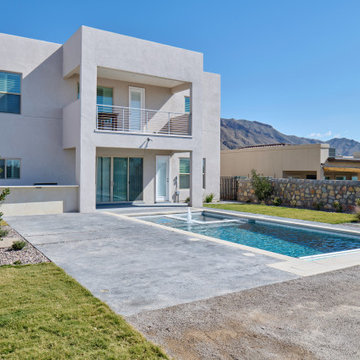
The Contemporary Retreat....This backyard retreat was designed with therapy in mind. Dancing water for tranquility. Walk-in spa & just the right size pool to cool off or work out. Plenty of places to relax & lounge in side the pool & spa or catching rays, sun bathing. The pool view from inside adds another element that can be used all year long. An automatic pool cover makes this space easy for maintenance & adds another barrier for safety. The green lawn accents softens every turn and allows for each space to be its own destination. Outdoor dining at the outdoor kitchen is made easy with a bar side & seating for four, however plenty of space in this plan to add tables & chairs to sit and relax anywhere. The landscape designed on purpose with layers of evergreen & deciduous plantings to ensure a good look during any season. As the plants mature they will create a barrier of oneness that surrounds our clients energy, of course. A raised garden bed creates a wind block for an additional destination space the was designed for a firepit or more lounge seating. Retreat or Entertainment mecca....
100