
Search results for "Adjacent dimension" in Home Design Ideas


 Dura Supreme Cabinetry
Media Centers are a fashionable feature in new homes and a popular remodeling project for existing homes. With open floor plans, the media room is often designed adjacent to the kitchen, and it makes good sense to visually tie these rooms together with coordinating cabinetry styling and finishes.
Dura Supreme’s entertainment cabinetry is designed to fit the conventional sizing requirements for media components. With our entertainment accessories, your sound system, speakers, gaming systems, and movie library can be kept organized and accessible.
The entertainment center shown here is just one example of the many different looks that can be created with Dura Supreme’s entertainment cabinetry. The quality construction you expect from Dura Supreme Cabinetry, with all of our cabinet door styles, wood species, and finishes, to create the one-of-a-kind look that perfectly complements your home and your lifestyle.
This entertainment center/ media center features an attractive built-in surround for this flat-screen TV. It is designed with a middle console and two tall entertainment cabinets to add additional storage and frame the TV. Designer Cabinetry by Dura Supreme is shown with "Vintage Beaded Panel" cabinet door style in Cherry wood, with Dura Supreme's Heavy Heirloom “K” finish.
Dura Supreme's "Heirloom" is a finish collection of stains and glazes that are hand-detailed to create an “antiqued” / "aged" appearance with beautiful dimension and depth. Before the finish is applied, corners and edges are softened and the surface of the wood is hand “distressed” by a professional artisan to create a look of an aged and time-worn character. The glaze is then applied to accentuate the carved details of the door. Heavy Heirloom finishes are chiseled and rasped to create a more rustic appearance. Heirloom finishes are exceptionally artistic, hand-detailed finishes that will exhibit unique, subtle variations.
Request a FREE Dura Supreme Brochure Packet:
http://www.durasupreme.com/request-brochure
Find a Dura Supreme Showroom near you today:
http://www.durasupreme.com/dealer-locator
 Donald Lococo Architects
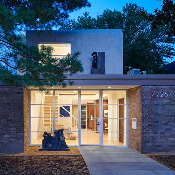
Designed in 1970 for an art collector, the existing referenced 70’s architectural principles. With its cadence of ‘70’s brick masses punctuated by a garage and a 4-foot-deep entrance recess. This recess, however, didn’t convey to the interior, which was occupied by disjointed service spaces. To solve, service spaces are moved and reorganized in open void in the garage. (See plan) This also organized the home: Service & utility on the left, reception central, and communal living spaces on the right.
To maintain clarity of the simple one-story 70’s composition, the second story add is recessive. A flex-studio/extra bedroom and office are designed ensuite creating a slender form and orienting them front to back and setting it back allows the add recede. Curves create a definite departure from the 70s home and by detailing it to "hover like a thought" above the first-floor roof and mentally removable sympathetic add.Existing unrelenting interior walls and a windowless entry, although ideal for fine art was unconducive for the young family of three. Added glass at the front recess welcomes light view and the removal of interior walls not only liberate rooms to communicate with each other but also reinform the cleared central entry space as a hub.
Even though the renovation reinforms its relationship with art, the joy and appreciation of art was not dismissed. A metal sculpture lost in the corner of the south side yard bumps the sculpture at the front entrance to the kitchen terrace over an added pedestal. (See plans) Since the roof couldn’t be railed without compromising the one-story '70s composition, the sculpture garden remains physically inaccessible however mirrors flanking the chimney allow the sculptures to be appreciated in three dimensions. The mirrors also afford privacy from the adjacent Tudor's large master bedroom addition 16-feet away.
Find the right local pro for your project
 Donald Lococo Architects
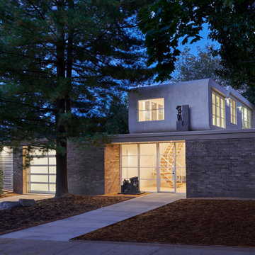
Designed in 1970 for an art collector, the existing referenced 70’s architectural principles. With its cadence of ‘70’s brick masses punctuated by a garage and a 4-foot-deep entrance recess. This recess, however, didn’t convey to the interior, which was occupied by disjointed service spaces. To solve, service spaces are moved and reorganized in open void in the garage. (See plan) This also organized the home: Service & utility on the left, reception central, and communal living spaces on the right.
To maintain clarity of the simple one-story 70’s composition, the second story add is recessive. A flex-studio/extra bedroom and office are designed ensuite creating a slender form and orienting them front to back and setting it back allows the add recede. Curves create a definite departure from the 70s home and by detailing it to "hover like a thought" above the first-floor roof and mentally removable sympathetic add.Existing unrelenting interior walls and a windowless entry, although ideal for fine art was unconducive for the young family of three. Added glass at the front recess welcomes light view and the removal of interior walls not only liberate rooms to communicate with each other but also reinform the cleared central entry space as a hub.
Even though the renovation reinforms its relationship with art, the joy and appreciation of art was not dismissed. A metal sculpture lost in the corner of the south side yard bumps the sculpture at the front entrance to the kitchen terrace over an added pedestal. (See plans) Since the roof couldn’t be railed without compromising the one-story '70s composition, the sculpture garden remains physically inaccessible however mirrors flanking the chimney allow the sculptures to be appreciated in three dimensions. The mirrors also afford privacy from the adjacent Tudor's large master bedroom addition 16-feet away.
 Donald Lococo Architects
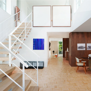
Designed in 1970 for an art collector, the existing referenced 70’s architectural principles. With its cadence of ‘70’s brick masses punctuated by a garage and a 4-foot-deep entrance recess. This recess, however, didn’t convey to the interior, which was occupied by disjointed service spaces. To solve, service spaces are moved and reorganized in open void in the garage. (See plan) This also organized the home: Service & utility on the left, reception central, and communal living spaces on the right.
To maintain clarity of the simple one-story 70’s composition, the second story add is recessive. A flex-studio/extra bedroom and office are designed ensuite creating a slender form and orienting them front to back and setting it back allows the add recede. Curves create a definite departure from the 70s home and by detailing it to "hover like a thought" above the first-floor roof and mentally removable sympathetic add.Existing unrelenting interior walls and a windowless entry, although ideal for fine art was unconducive for the young family of three. Added glass at the front recess welcomes light view and the removal of interior walls not only liberate rooms to communicate with each other but also reinform the cleared central entry space as a hub.
Even though the renovation reinforms its relationship with art, the joy and appreciation of art was not dismissed. A metal sculpture lost in the corner of the south side yard bumps the sculpture at the front entrance to the kitchen terrace over an added pedestal. (See plans) Since the roof couldn’t be railed without compromising the one-story '70s composition, the sculpture garden remains physically inaccessible however mirrors flanking the chimney allow the sculptures to be appreciated in three dimensions. The mirrors also afford privacy from the adjacent Tudor's large master bedroom addition 16-feet away.
 Donald Lococo Architects
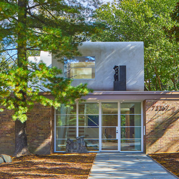
Designed in 1970 for an art collector, the existing referenced 70’s architectural principles. With its cadence of ‘70’s brick masses punctuated by a garage and a 4-foot-deep entrance recess. This recess, however, didn’t convey to the interior, which was occupied by disjointed service spaces. To solve, service spaces are moved and reorganized in open void in the garage. (See plan) This also organized the home: Service & utility on the left, reception central, and communal living spaces on the right.
To maintain clarity of the simple one-story 70’s composition, the second story add is recessive. A flex-studio/extra bedroom and office are designed ensuite creating a slender form and orienting them front to back and setting it back allows the add recede. Curves create a definite departure from the 70s home and by detailing it to "hover like a thought" above the first-floor roof and mentally removable sympathetic add.Existing unrelenting interior walls and a windowless entry, although ideal for fine art was unconducive for the young family of three. Added glass at the front recess welcomes light view and the removal of interior walls not only liberate rooms to communicate with each other but also reinform the cleared central entry space as a hub.
Even though the renovation reinforms its relationship with art, the joy and appreciation of art was not dismissed. A metal sculpture lost in the corner of the south side yard bumps the sculpture at the front entrance to the kitchen terrace over an added pedestal. (See plans) Since the roof couldn’t be railed without compromising the one-story '70s composition, the sculpture garden remains physically inaccessible however mirrors flanking the chimney allow the sculptures to be appreciated in three dimensions. The mirrors also afford privacy from the adjacent Tudor's large master bedroom addition 16-feet away.
 Donald Lococo Architects
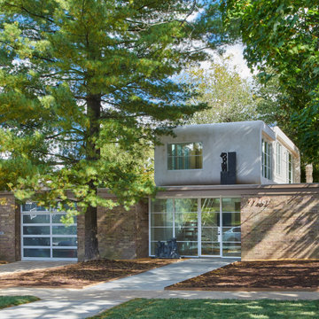
Designed in 1970 for an art collector, the existing referenced 70’s architectural principles. With its cadence of ‘70’s brick masses punctuated by a garage and a 4-foot-deep entrance recess. This recess, however, didn’t convey to the interior, which was occupied by disjointed service spaces. To solve, service spaces are moved and reorganized in open void in the garage. (See plan) This also organized the home: Service & utility on the left, reception central, and communal living spaces on the right.
To maintain clarity of the simple one-story 70’s composition, the second story add is recessive. A flex-studio/extra bedroom and office are designed ensuite creating a slender form and orienting them front to back and setting it back allows the add recede. Curves create a definite departure from the 70s home and by detailing it to "hover like a thought" above the first-floor roof and mentally removable sympathetic add.Existing unrelenting interior walls and a windowless entry, although ideal for fine art was unconducive for the young family of three. Added glass at the front recess welcomes light view and the removal of interior walls not only liberate rooms to communicate with each other but also reinform the cleared central entry space as a hub.
Even though the renovation reinforms its relationship with art, the joy and appreciation of art was not dismissed. A metal sculpture lost in the corner of the south side yard bumps the sculpture at the front entrance to the kitchen terrace over an added pedestal. (See plans) Since the roof couldn’t be railed without compromising the one-story '70s composition, the sculpture garden remains physically inaccessible however mirrors flanking the chimney allow the sculptures to be appreciated in three dimensions. The mirrors also afford privacy from the adjacent Tudor's large master bedroom addition 16-feet away.

 Donald Lococo Architects
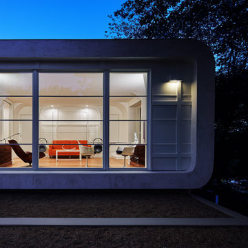
Designed in 1970 for an art collector, the existing referenced 70’s architectural principles. With its cadence of ‘70’s brick masses punctuated by a garage and a 4-foot-deep entrance recess. This recess, however, didn’t convey to the interior, which was occupied by disjointed service spaces. To solve, service spaces are moved and reorganized in open void in the garage. (See plan) This also organized the home: Service & utility on the left, reception central, and communal living spaces on the right.
To maintain clarity of the simple one-story 70’s composition, the second story add is recessive. A flex-studio/extra bedroom and office are designed ensuite creating a slender form and orienting them front to back and setting it back allows the add recede. Curves create a definite departure from the 70s home and by detailing it to "hover like a thought" above the first-floor roof and mentally removable sympathetic add.Existing unrelenting interior walls and a windowless entry, although ideal for fine art was unconducive for the young family of three. Added glass at the front recess welcomes light view and the removal of interior walls not only liberate rooms to communicate with each other but also reinform the cleared central entry space as a hub.
Even though the renovation reinforms its relationship with art, the joy and appreciation of art was not dismissed. A metal sculpture lost in the corner of the south side yard bumps the sculpture at the front entrance to the kitchen terrace over an added pedestal. (See plans) Since the roof couldn’t be railed without compromising the one-story '70s composition, the sculpture garden remains physically inaccessible however mirrors flanking the chimney allow the sculptures to be appreciated in three dimensions. The mirrors also afford privacy from the adjacent Tudor's large master bedroom addition 16-feet away.
 Donald Lococo Architects
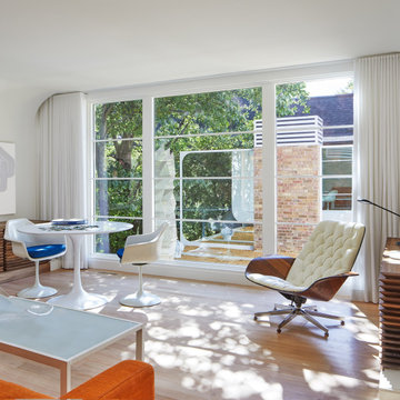
Designed in 1970 for an art collector, the existing referenced 70’s architectural principles. With its cadence of ‘70’s brick masses punctuated by a garage and a 4-foot-deep entrance recess. This recess, however, didn’t convey to the interior, which was occupied by disjointed service spaces. To solve, service spaces are moved and reorganized in open void in the garage. (See plan) This also organized the home: Service & utility on the left, reception central, and communal living spaces on the right.
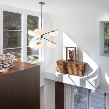
To maintain clarity of the simple one-story 70’s composition, the second story add is recessive. A flex-studio/extra bedroom and office are designed ensuite creating a slender form and orienting them front to back and setting it back allows the add recede. Curves create a definite departure from the 70s home and by detailing it to "hover like a thought" above the first-floor roof and mentally removable sympathetic add.Existing unrelenting interior walls and a windowless entry, although ideal for fine art was unconducive for the young family of three. Added glass at the front recess welcomes light view and the removal of interior walls not only liberate rooms to communicate with each other but also reinform the cleared central entry space as a hub.
Even though the renovation reinforms its relationship with art, the joy and appreciation of art was not dismissed. A metal sculpture lost in the corner of the south side yard bumps the sculpture at the front entrance to the kitchen terrace over an added pedestal. (See plans) Since the roof couldn’t be railed without compromising the one-story '70s composition, the sculpture garden remains physically inaccessible however mirrors flanking the chimney allow the sculptures to be appreciated in three dimensions. The mirrors also afford privacy from the adjacent Tudor's large master bedroom addition 16-feet away.
 Donald Lococo Architects
Designed in 1970 for an art collector, the existing referenced 70’s architectural principles. With its cadence of ‘70’s brick masses punctuated by a garage and a 4-foot-deep entrance recess. This recess, however, didn’t convey to the interior, which was occupied by disjointed service spaces. To solve, service spaces are moved and reorganized in open void in the garage. (See plan) This also organized the home: Service & utility on the left, reception central, and communal living spaces on the right.
To maintain clarity of the simple one-story 70’s composition, the second story add is recessive. A flex-studio/extra bedroom and office are designed ensuite creating a slender form and orienting them front to back and setting it back allows the add recede. Curves create a definite departure from the 70s home and by detailing it to "hover like a thought" above the first-floor roof and mentally removable sympathetic add.Existing unrelenting interior walls and a windowless entry, although ideal for fine art was unconducive for the young family of three. Added glass at the front recess welcomes light view and the removal of interior walls not only liberate rooms to communicate with each other but also reinform the cleared central entry space as a hub.
Even though the renovation reinforms its relationship with art, the joy and appreciation of art was not dismissed. A metal sculpture lost in the corner of the south side yard bumps the sculpture at the front entrance to the kitchen terrace over an added pedestal. (See plans) Since the roof couldn’t be railed without compromising the one-story '70s composition, the sculpture garden remains physically inaccessible however mirrors flanking the chimney allow the sculptures to be appreciated in three dimensions. The mirrors also afford privacy from the adjacent Tudor's large master bedroom addition 16-feet away.
 Powell Construction
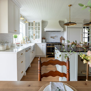
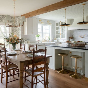
This charming kitchen renovation seamlessly blends nostalgia with modern functionality, transforming this homeowner’s childhood kitchen into a sophisticated culinary space. Nestled in the picturesque countryside with views from every window, this farmhouse has been a beloved family home for generations.
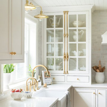
Balancing tradition and timeless design, we incorporated elements that would evoke a sense of nostalgia and warmth. The kitchen’s glass china hutch takes center stage, adorned with French antique brass cremone bolts. For these cooking enthusiasts, the striking Italian Ilve range with double ovens and a large burner top offer both style and functionality. With its brass detailing, it is truly a showstopper. A custom arched range hood is the crowning complement to this beautiful range.
Soft, warm white inset cabinetry is paired with unlacquered brass hardware that will develop a rich patina over time. The Shaws original farm sink adds a classic farmhouse touch, and a handmade Moroccan zellige tile backsplash brings dimension and texture. Brass fixtures, including the bridge sink faucet and pot filler, further enhance the traditional aesthetic, while new designer light fixtures illuminate the space with an inviting glow. Millwork details such as the tongue and groove paneling on the kitchen ceiling & the dining room wainscotting were added to provide depth to the space.
The structural beam was wrapped with reclaimed rough-cut barn wood, salvaged from the century-old barn on the property, and the new European white oak hardwood floors further enhance the sense of timeless character. In the adjacent dining room, a natural landscape wallpaper complements the pastural views and the soft colors of the kitchen, combining to create such a serene dining space.
The island’s soft sage green echoes the tones of the dining room wallpaper. It also features a hidden rollout baking station with a butcherblock countertop – providing the perfect workspace for creating delicious treats. A black granite countertop pairs with the other black accents of the kitchen – the range, pendant light fixtures, and sunroom door. A wall of built-in pantry cabinets and a beverage bar adds additional storage. The beverage bar is complete with brass rails for lovely display storage.
This renovation is a stunning example of how thoughtful design and quality craftsmanship can enhance both form and function, honoring the past while embracing the future.
Photos by MK Photography
 Powell Construction
This charming kitchen renovation seamlessly blends nostalgia with modern functionality, transforming this homeowner’s childhood kitchen into a sophisticated culinary space. Nestled in the picturesque countryside with views from every window, this farmhouse has been a beloved family home for generations.
Balancing tradition and timeless design, we incorporated elements that would evoke a sense of nostalgia and warmth. The kitchen’s glass china hutch takes center stage, adorned with French antique brass cremone bolts. For these cooking enthusiasts, the striking Italian Ilve range with double ovens and a large burner top offer both style and functionality. With its brass detailing, it is truly a showstopper. A custom arched range hood is the crowning complement to this beautiful range.
Soft, warm white inset cabinetry is paired with unlacquered brass hardware that will develop a rich patina over time. The Shaws original farm sink adds a classic farmhouse touch, and a handmade Moroccan zellige tile backsplash brings dimension and texture. Brass fixtures, including the bridge sink faucet and pot filler, further enhance the traditional aesthetic, while new designer light fixtures illuminate the space with an inviting glow. Millwork details such as the tongue and groove paneling on the kitchen ceiling & the dining room wainscotting were added to provide depth to the space.
The structural beam was wrapped with reclaimed rough-cut barn wood, salvaged from the century-old barn on the property, and the new European white oak hardwood floors further enhance the sense of timeless character. In the adjacent dining room, a natural landscape wallpaper complements the pastural views and the soft colors of the kitchen, combining to create such a serene dining space.
The island’s soft sage green echoes the tones of the dining room wallpaper. It also features a hidden rollout baking station with a butcherblock countertop – providing the perfect workspace for creating delicious treats. A black granite countertop pairs with the other black accents of the kitchen – the range, pendant light fixtures, and sunroom door. A wall of built-in pantry cabinets and a beverage bar adds additional storage. The beverage bar is complete with brass rails for lovely display storage.
This renovation is a stunning example of how thoughtful design and quality craftsmanship can enhance both form and function, honoring the past while embracing the future.
Photos by MK Photography
 Powell Construction
This charming kitchen renovation seamlessly blends nostalgia with modern functionality, transforming this homeowner’s childhood kitchen into a sophisticated culinary space. Nestled in the picturesque countryside with views from every window, this farmhouse has been a beloved family home for generations.
Balancing tradition and timeless design, we incorporated elements that would evoke a sense of nostalgia and warmth. The kitchen’s glass china hutch takes center stage, adorned with French antique brass cremone bolts. For these cooking enthusiasts, the striking Italian Ilve range with double ovens and a large burner top offer both style and functionality. With its brass detailing, it is truly a showstopper. A custom arched range hood is the crowning complement to this beautiful range.
Soft, warm white inset cabinetry is paired with unlacquered brass hardware that will develop a rich patina over time. The Shaws original farm sink adds a classic farmhouse touch, and a handmade Moroccan zellige tile backsplash brings dimension and texture. Brass fixtures, including the bridge sink faucet and pot filler, further enhance the traditional aesthetic, while new designer light fixtures illuminate the space with an inviting glow. Millwork details such as the tongue and groove paneling on the kitchen ceiling & the dining room wainscotting were added to provide depth to the space.
The structural beam was wrapped with reclaimed rough-cut barn wood, salvaged from the century-old barn on the property, and the new European white oak hardwood floors further enhance the sense of timeless character. In the adjacent dining room, a natural landscape wallpaper complements the pastural views and the soft colors of the kitchen, combining to create such a serene dining space.
The island’s soft sage green echoes the tones of the dining room wallpaper. It also features a hidden rollout baking station with a butcherblock countertop – providing the perfect workspace for creating delicious treats. A black granite countertop pairs with the other black accents of the kitchen – the range, pendant light fixtures, and sunroom door. A wall of built-in pantry cabinets and a beverage bar adds additional storage. The beverage bar is complete with brass rails for lovely display storage.
This renovation is a stunning example of how thoughtful design and quality craftsmanship can enhance both form and function, honoring the past while embracing the future.
Photos by MK Photography
Sponsored
Columbus, OH

Hope Restoration & General Contracting
Columbus Design-Build, Kitchen & Bath Remodeling, Historic Renovations
 Donald Lococo Architects
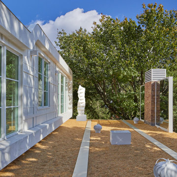
Designed in 1970 for an art collector, the existing referenced 70’s architectural principles. With its cadence of ‘70’s brick masses punctuated by a garage and a 4-foot-deep entrance recess. This recess, however, didn’t convey to the interior, which was occupied by disjointed service spaces. To solve, service spaces are moved and reorganized in open void in the garage. (See plan) This also organized the home: Service & utility on the left, reception central, and communal living spaces on the right.
To maintain clarity of the simple one-story 70’s composition, the second story add is recessive. A flex-studio/extra bedroom and office are designed ensuite creating a slender form and orienting them front to back and setting it back allows the add recede. Curves create a definite departure from the 70s home and by detailing it to "hover like a thought" above the first-floor roof and mentally removable sympathetic add.Existing unrelenting interior walls and a windowless entry, although ideal for fine art was unconducive for the young family of three. Added glass at the front recess welcomes light view and the removal of interior walls not only liberate rooms to communicate with each other but also reinform the cleared central entry space as a hub.
Even though the renovation reinforms its relationship with art, the joy and appreciation of art was not dismissed. A metal sculpture lost in the corner of the south side yard bumps the sculpture at the front entrance to the kitchen terrace over an added pedestal. (See plans) Since the roof couldn’t be railed without compromising the one-story '70s composition, the sculpture garden remains physically inaccessible however mirrors flanking the chimney allow the sculptures to be appreciated in three dimensions. The mirrors also afford privacy from the adjacent Tudor's large master bedroom addition 16-feet away.

 User
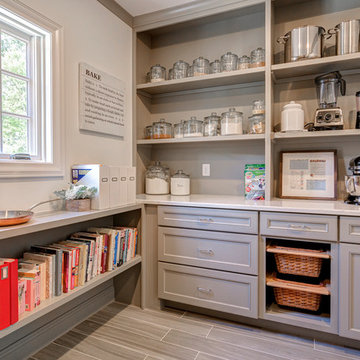
This Customer elected to reface the existing Oak raised panel kitchen cabinets in this classic East Vancouver 100 year old Heritage home. New cabinets were not an option as the kitchen floor had been tiled in Italian antique ceramic tiles and the lower base cabinets already had granite countertops.
Prior to refacing, a few changes were made. First, a 5-sided corner upper cabinet was removed where a peninsula once extended over the lower-peninsula cabinets. This was then replaced with a custom sized conventional cabinet to match the dimensions of the adjacent wall cabinets.
Then a new bank of custom sized lower cabinets was installed below the kitchen window that overlooks the outside deck. One side was fitted with new 15” deep pot drawers, constructed of solid dovetailed Maple with Blum full extension SoftClose hardware. The other side of this cabinet bank was left as simple open shelving for cook books, etc. To finish this off, the cabinet was crowned with a custom solid Cherry butcher-block countertop for special accent.
The kitchen refacing consisted of an Antique White (Featherdown) solid color of veneer over the existing cabinets while the new cabinets were faced in the same way.
The new doors chosen were a new “Designer Series” of Shaker style Maple door featuring a 3” framework and a unique “curved-bevel” of the horizontal components of the door construction – again in the Featherdown solid color.
The large drawer fronts for the new cabinets below the window matched the doors, while all remaining drawer fronts (smaller variety) were in a simple slab look of painted Maple.
All new doors were fitted with modern Blum hidden hinges which included the SoftClose feature.
As the finishing touch, Amerock Stainless bar-style handles were implemented to adorn all cabinet openings while a new tile backsplash was added to give the look of a new and modern ‘subway glass’ detail.
 Donald Lococo Architects
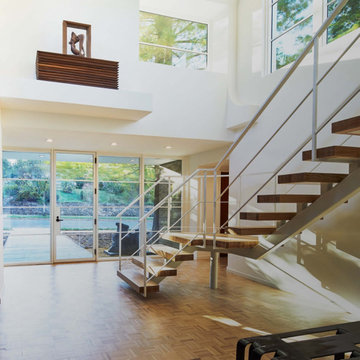
Designed in 1970 for an art collector, the existing referenced 70’s architectural principles. With its cadence of ‘70’s brick masses punctuated by a garage and a 4-foot-deep entrance recess. This recess, however, didn’t convey to the interior, which was occupied by disjointed service spaces. To solve, service spaces are moved and reorganized in open void in the garage. (See plan) This also organized the home: Service & utility on the left, reception central, and communal living spaces on the right.
To maintain clarity of the simple one-story 70’s composition, the second story add is recessive. A flex-studio/extra bedroom and office are designed ensuite creating a slender form and orienting them front to back and setting it back allows the add recede. Curves create a definite departure from the 70s home and by detailing it to "hover like a thought" above the first-floor roof and mentally removable sympathetic add.Existing unrelenting interior walls and a windowless entry, although ideal for fine art was unconducive for the young family of three. Added glass at the front recess welcomes light view and the removal of interior walls not only liberate rooms to communicate with each other but also reinform the cleared central entry space as a hub.
Even though the renovation reinforms its relationship with art, the joy and appreciation of art was not dismissed. A metal sculpture lost in the corner of the south side yard bumps the sculpture at the front entrance to the kitchen terrace over an added pedestal. (See plans) Since the roof couldn’t be railed without compromising the one-story '70s composition, the sculpture garden remains physically inaccessible however mirrors flanking the chimney allow the sculptures to be appreciated in three dimensions. The mirrors also afford privacy from the adjacent Tudor's large master bedroom addition 16-feet away.
 Donald Lococo Architects
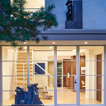
Designed in 1970 for an art collector, the existing referenced 70’s architectural principles. With its cadence of ‘70’s brick masses punctuated by a garage and a 4-foot-deep entrance recess. This recess, however, didn’t convey to the interior, which was occupied by disjointed service spaces. To solve, service spaces are moved and reorganized in open void in the garage. (See plan) This also organized the home: Service & utility on the left, reception central, and communal living spaces on the right.
To maintain clarity of the simple one-story 70’s composition, the second story add is recessive. A flex-studio/extra bedroom and office are designed ensuite creating a slender form and orienting them front to back and setting it back allows the add recede. Curves create a definite departure from the 70s home and by detailing it to "hover like a thought" above the first-floor roof and mentally removable sympathetic add.Existing unrelenting interior walls and a windowless entry, although ideal for fine art was unconducive for the young family of three. Added glass at the front recess welcomes light view and the removal of interior walls not only liberate rooms to communicate with each other but also reinform the cleared central entry space as a hub.
Even though the renovation reinforms its relationship with art, the joy and appreciation of art was not dismissed. A metal sculpture lost in the corner of the south side yard bumps the sculpture at the front entrance to the kitchen terrace over an added pedestal. (See plans) Since the roof couldn’t be railed without compromising the one-story '70s composition, the sculpture garden remains physically inaccessible however mirrors flanking the chimney allow the sculptures to be appreciated in three dimensions. The mirrors also afford privacy from the adjacent Tudor's large master bedroom addition 16-feet away.
Sponsored
Sunbury, OH

J.Holderby - Renovations
Franklin County's Leading General Contractors - 2X Best of Houzz!
 User
This Customer elected to reface the existing Oak raised panel kitchen cabinets in this classic East Vancouver 100 year old Heritage home. New cabinets were not an option as the kitchen floor had been tiled in Italian antique ceramic tiles and the lower base cabinets already had granite countertops.
Prior to refacing, a few changes were made. First, a 5-sided corner upper cabinet was removed where a peninsula once extended over the lower-peninsula cabinets. This was then replaced with a custom sized conventional cabinet to match the dimensions of the adjacent wall cabinets.
Then a new bank of custom sized lower cabinets was installed below the kitchen window that overlooks the outside deck. One side was fitted with new 15” deep pot drawers, constructed of solid dovetailed Maple with Blum full extension SoftClose hardware. The other side of this cabinet bank was left as simple open shelving for cook books, etc. To finish this off, the cabinet was crowned with a custom solid Cherry butcher-block countertop for special accent.
The kitchen refacing consisted of an Antique White (Featherdown) solid color of veneer over the existing cabinets while the new cabinets were faced in the same way.
The new doors chosen were a new “Designer Series” of Shaker style Maple door featuring a 3” framework and a unique “curved-bevel” of the horizontal components of the door construction – again in the Featherdown solid color.
The large drawer fronts for the new cabinets below the window matched the doors, while all remaining drawer fronts (smaller variety) were in a simple slab look of painted Maple.
All new doors were fitted with modern Blum hidden hinges which included the SoftClose feature.
As the finishing touch, Amerock Stainless bar-style handles were implemented to adorn all cabinet openings while a new tile backsplash was added to give the look of a new and modern ‘subway glass’ detail.
 User
This Customer elected to reface the existing Oak raised panel kitchen cabinets in this classic East Vancouver 100 year old Heritage home. New cabinets were not an option as the kitchen floor had been tiled in Italian antique ceramic tiles and the lower base cabinets already had granite countertops.
Prior to refacing, a few changes were made. First, a 5-sided corner upper cabinet was removed where a peninsula once extended over the lower-peninsula cabinets. This was then replaced with a custom sized conventional cabinet to match the dimensions of the adjacent wall cabinets.
Then a new bank of custom sized lower cabinets was installed below the kitchen window that overlooks the outside deck. One side was fitted with new 15” deep pot drawers, constructed of solid dovetailed Maple with Blum full extension SoftClose hardware. The other side of this cabinet bank was left as simple open shelving for cook books, etc. To finish this off, the cabinet was crowned with a custom solid Cherry butcher-block countertop for special accent.
The kitchen refacing consisted of an Antique White (Featherdown) solid color of veneer over the existing cabinets while the new cabinets were faced in the same way.
The new doors chosen were a new “Designer Series” of Shaker style Maple door featuring a 3” framework and a unique “curved-bevel” of the horizontal components of the door construction – again in the Featherdown solid color.
The large drawer fronts for the new cabinets below the window matched the doors, while all remaining drawer fronts (smaller variety) were in a simple slab look of painted Maple.
All new doors were fitted with modern Blum hidden hinges which included the SoftClose feature.
As the finishing touch, Amerock Stainless bar-style handles were implemented to adorn all cabinet openings while a new tile backsplash was added to give the look of a new and modern ‘subway glass’ detail.
 User
This Customer elected to reface the existing Oak raised panel kitchen cabinets in this classic East Vancouver 100 year old Heritage home. New cabinets were not an option as the kitchen floor had been tiled in Italian antique ceramic tiles and the lower base cabinets already had granite countertops.
Prior to refacing, a few changes were made. First, a 5-sided corner upper cabinet was removed where a peninsula once extended over the lower-peninsula cabinets. This was then replaced with a custom sized conventional cabinet to match the dimensions of the adjacent wall cabinets.
Then a new bank of custom sized lower cabinets was installed below the kitchen window that overlooks the outside deck. One side was fitted with new 15” deep pot drawers, constructed of solid dovetailed Maple with Blum full extension SoftClose hardware. The other side of this cabinet bank was left as simple open shelving for cook books, etc. To finish this off, the cabinet was crowned with a custom solid Cherry butcher-block countertop for special accent.
The kitchen refacing consisted of an Antique White (Featherdown) solid color of veneer over the existing cabinets while the new cabinets were faced in the same way.
The new doors chosen were a new “Designer Series” of Shaker style Maple door featuring a 3” framework and a unique “curved-bevel” of the horizontal components of the door construction – again in the Featherdown solid color.
The large drawer fronts for the new cabinets below the window matched the doors, while all remaining drawer fronts (smaller variety) were in a simple slab look of painted Maple.
All new doors were fitted with modern Blum hidden hinges which included the SoftClose feature.
As the finishing touch, Amerock Stainless bar-style handles were implemented to adorn all cabinet openings while a new tile backsplash was added to give the look of a new and modern ‘subway glass’ detail.
23