
Search results for "Admitted" in Home Design Ideas

 Taylor Design
This guest bath features a stacked stone feature wall with a backlit mirror. The mercury glass pendant is a elegant accent. The vessel sink adds visual interest and the wall-mounted faucet is a fun touch.

 Floriana Interiors
Designer: Floriana Petersen - Floriana Interiors,
Contractor: Steve Werney -Teutonic Construction,
Photo: Christopher Stark
Inspiration for a mid-sized modern master beige tile and ceramic tile ceramic tile japanese bathtub remodel in San Francisco with flat-panel cabinets, light wood cabinets, a one-piece toilet, white walls, a vessel sink and limestone countertops
Inspiration for a mid-sized modern master beige tile and ceramic tile ceramic tile japanese bathtub remodel in San Francisco with flat-panel cabinets, light wood cabinets, a one-piece toilet, white walls, a vessel sink and limestone countertops

 Randy Angell Designs
Our clients wish list was fairly simple: a small, traditional pool with a raised spa. They wanted enough deck space for light entertaining around the pool, but due to their generous covered veranda, they did not require much more than that. Oh--and a little yard space for the dog!
The entire design was really driven by a very strong central sight line through the house, all the way from the front door. Using this as the center-line for the pool, we pushed the pool as far toward the rear property line as code would allow and then created the main focal feature of the project: a seven-foot-tall limestone and cast stone wall, with a laser-cut steel sculpture, created the project designer. The cast stone columns and center arch echo the architecture of the home and create the perfect backdrop for the raised spa. The same wrought-iron gas lanterns used at the front entry of the home are repeated on columns here.
The color palette is subtle and classic, much like the interior of the home and the decor within the grand veranda directly adjacent the pool. 18"x30" blocks of limestone were used to create the wall at the rear of the property, and harmonizing with the veneer on the home. The pool is finished with Pennsylvania Premier coping, with a bull-nosed edge, shadowed by a 2" band of black granite. The surrounding decks are Travertine pavers in a 'Versailles' pattern, bordered by a 12" band of Pennsylvania stone. The pool utilizes three different glass tiles for a highly customized style. The glass mosaic on the wet deck and in the spa is a custom blend created by the homeowner and the designer. A grey/green Diamondbrite interior finish completes the soft hues that make this project aesthetically soothing to the eye.
The homeowner had been through 4 different home builders during the construction of their dream home. Understandably, when it came to the pool, they wanted to be certain they didn't go through the same difficulties and sought out a company with the reputation and the creativity that would exceed their expectations. After seeing our detailed design study for their admittedly "compact space", they knew they had found just the right company.
Find the right local pro for your project

 Darden Building Materials
Mid-sized minimalist carpeted curved staircase photo in Dallas with white walls and carpeted risers
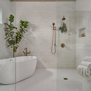
Inspiration for a mid-sized coastal master white tile white floor and porcelain tile corner bathtub remodel in Tampa with white walls, a hinged shower door and a niche
 Refine Design Architecture
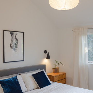
This bedroom is shaped by the geometry of its roofline. A single-slope vaulted ceiling rises away from the bed, the angled plane reading clearly against the flat soffit above the window wall and giving the modest footprint a sense of volume and lift. The architecture leans on three complementary light sources rather than a single overhead fixture: a suspended paper-globe pendant that doubles as a soft focal mass within the vaulted void, a wall-mounted task sconce at the bedside that grazes the wall plane, and natural daylight admitted through a curtained window at the far corner. The restrained envelope—uninterrupted white wall surfaces, minimal trim, a plain ceiling plane—is intentional, letting the ceiling's pitch and the layered illumination define the spatial character. The corner placement of the window and the asymmetry of the slope suggest a room carved from beneath an upper roof, a common and economical move for capturing usable height in a compact plan.

 Standard Tile
3x6 Tumbled Picasso - with Seal and Enhance
Hallway - traditional hallway idea in New York
Hallway - traditional hallway idea in New York

 Bennett Contracting, Inc.
This Loudonville couple started by getting a quote to finish their attic space, but then changed gears and decided the kitchen was more important at this time. Estimator Anthony and designer Justina from Bennett Contracting went to work on a new design. The home is an older colonial with classic features, and the existing kitchen was a poorly laid out 90’s nightmare. With children in the home the island cooktop alone was a constant danger. By adding a window and removing the wall from the dining room, the new kitchen is much brighter and connected to the rest of the home. Bennett removed the old vinyl tile and continued the wood flooring into the new kitchen space. Justina admits it was so much fun working on this project because the owners were open to all sorts of design features. Roll-outs in most cabinets, hidden bread boards, hutch coffee bar, brass chicken wire, and the very cool antique foot rail. Then there are the custom cabinet colors. RD Henry Cabinets matched Glidden paint colors to get the exact color the client desired. They even sent three cabinet samples to get it right. These classic features combined with the modern design brings new life to the space.

 Simply Home Decorating
This 1990's home, located in North Vancouver's Lynn Valley neighbourhood, had high ceilings and a great open plan layout but the decor was straight out of the 90's complete with sponge painted walls in dark earth tones. The owners, a young professional couple, enlisted our help to take it from dated and dreary to modern and bright. We started by removing details like chair rails and crown mouldings, that did not suit the modern architectural lines of the home. We replaced the heavily worn wood floors with a new high end, light coloured, wood-look laminate that will withstand the wear and tear from their two energetic golden retrievers. Since the main living space is completely open plan it was important that we work with simple consistent finishes for a clean modern look. The all white kitchen features flat doors with minimal hardware and a solid surface marble-look countertop and backsplash. We modernized all of the lighting and updated the bathrooms and master bedroom as well. The only departure from our clean modern scheme is found in the dressing room where the client was looking for a more dressed up feminine feel but we kept a thread of grey consistent even in this more vivid colour scheme. This transformation, featuring the clients' gorgeous original artwork and new custom designed furnishings is admittedly one of our favourite projects to date!

 Tali Hardonag Architect
Tali Hardonag
Color Consulting: Penelope Jones Interior Design
Inspiration for a mid-sized transitional wooden u-shaped staircase remodel in San Francisco with painted risers
Inspiration for a mid-sized transitional wooden u-shaped staircase remodel in San Francisco with painted risers
 Simply Home Decorating
This 1990's home, located in North Vancouver's Lynn Valley neighbourhood, had high ceilings and a great open plan layout but the decor was straight out of the 90's complete with sponge painted walls in dark earth tones. The owners, a young professional couple, enlisted our help to take it from dated and dreary to modern and bright. We started by removing details like chair rails and crown mouldings, that did not suit the modern architectural lines of the home. We replaced the heavily worn wood floors with a new high end, light coloured, wood-look laminate that will withstand the wear and tear from their two energetic golden retrievers. Since the main living space is completely open plan it was important that we work with simple consistent finishes for a clean modern look. The all white kitchen features flat doors with minimal hardware and a solid surface marble-look countertop and backsplash. We modernized all of the lighting and updated the bathrooms and master bedroom as well. The only departure from our clean modern scheme is found in the dressing room where the client was looking for a more dressed up feminine feel but we kept a thread of grey consistent even in this more vivid colour scheme. This transformation, featuring the clients' gorgeous original artwork and new custom designed furnishings is admittedly one of our favourite projects to date!

 Urban Chalet Inc.
Photos by Dana Hoff
Open concept kitchen - mid-sized eclectic l-shaped medium tone wood floor and brown floor open concept kitchen idea in New York with a farmhouse sink, shaker cabinets, white cabinets, quartz countertops, multicolored backsplash, cement tile backsplash, stainless steel appliances, an island and gray countertops
Open concept kitchen - mid-sized eclectic l-shaped medium tone wood floor and brown floor open concept kitchen idea in New York with a farmhouse sink, shaker cabinets, white cabinets, quartz countertops, multicolored backsplash, cement tile backsplash, stainless steel appliances, an island and gray countertops

 ODS Architecture
Powder room with floating vanity, black stone tile wall and new skylight.
Large trendy black tile and mosaic tile beige floor and light wood floor powder room photo in San Francisco with flat-panel cabinets, light wood cabinets, a wall-mount toilet, black walls, an integrated sink, solid surface countertops and white countertops
Large trendy black tile and mosaic tile beige floor and light wood floor powder room photo in San Francisco with flat-panel cabinets, light wood cabinets, a wall-mount toilet, black walls, an integrated sink, solid surface countertops and white countertops


 Bilotta Kitchen & Home
Beauty meets practicality in this Florida Contemporary on a Boca golf course. The indoor – outdoor connection is established by running easy care wood-look porcelain tiles from the patio to all the public rooms. The clean-lined slab door has a narrow-raised perimeter trim, while a combination of rift-cut white oak and “Super White” balances earthy with bright. Appliances are paneled for continuity. Dramatic LED lighting illuminates the toe kicks and the island overhang.
Instead of engineered quartz, these countertops are engineered marble: “Unique Statuario” by Compac. The same material is cleverly used for carved island panels that resemble cabinet doors. White marble chevron mosaics lend texture and depth to the backsplash.
The showstopper is the divider between the secondary sink and living room. Fashioned from brushed gold square metal stock, its grid-and-rectangle motif references the home’s entry door. Wavy glass obstructs kitchen mess, yet still admits light. Brushed gold straps on the white hood tie in with the divider. Gold hardware, faucets and globe pendants add glamour.
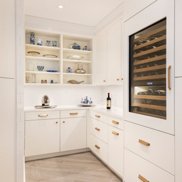
In the pantry, kitchen cabinetry is repeated, but here in all white with Caesarstone countertops. Flooring is laid diagonally. Matching panels front the wine refrigerator. Open cabinets display glassware and serving pieces.
This project was done in collaboration with JBD JGA Design & Architecture and NMB Home Management Services LLC. Bilotta Designer: Randy O’Kane. Photography by Nat Rea.
Description written by Paulette Gambacorta adapted for Houzz.

 MainStreet Design Build
This retired couple loves their home, cook daily meals and spend much of their time together in the kitchen. Our goal was to create a simple update that gave the homeowners a more comfortable feel of the space and a convenient way to work together in this new stage of their lives. Keeping the simplicity of the design was important, but it also needed to reflect 21st-century amenities. With this in mind, they chose a 36" SS Wolf Pro Gas Cooktop 18K Burner w/LED Indicators (CG365P/S) because they prefer to cook gas, loved the 5-burner setup and the knob location in the lower right corner of the unit. They were extremely excited about the DD36-SS ventilation with the concealed controls located in the drawer, as it works perfectly with the clean lines of the kitchen. One of the couple's favorite amenity in the kitchen is the Wolf WGCO100S Countertop oven. The recessed appliance garage was re-built with a stainless door specifically to house this unit. Felt pads have been applied to the feet to ensure our clients can pull the oven in and out for everyday use. They hate to admit it, but this may be their favorite appliance in the kitchen as they are now just cooking every day for two!

 russ4456
Pete Molick Photography
Mid-sized trendy l-shaped light wood floor eat-in kitchen photo in Houston with an undermount sink, flat-panel cabinets, light wood cabinets, marble countertops, white backsplash, ceramic backsplash, stainless steel appliances, an island and white countertops
Mid-sized trendy l-shaped light wood floor eat-in kitchen photo in Houston with an undermount sink, flat-panel cabinets, light wood cabinets, marble countertops, white backsplash, ceramic backsplash, stainless steel appliances, an island and white countertops

 ZeroEnergy Design
 (ZED) created this modern home for a progressive family in the desirable community of Lexington.
Thoughtful Land Connection. The residence is carefully sited on the infill lot so as to create privacy from the road and neighbors, while cultivating a side yard that captures the southern sun. The terraced grade rises to meet the house, allowing for it to maintain a structured connection with the ground while also sitting above the high water table. The elevated outdoor living space maintains a strong connection with the indoor living space, while the stepped edge ties it back to the true ground plane. Siting and outdoor connections were completed by ZED in collaboration with landscape designer Soren Deniord Design Studio.
Exterior Finishes and Solar. The exterior finish materials include a palette of shiplapped wood siding, through-colored fiber cement panels and stucco. A rooftop parapet hides the solar panels above, while a gutter and site drainage system directs rainwater into an irrigation cistern and dry wells that recharge the groundwater.
Cooking, Dining, Living. Inside, the kitchen, fabricated by Henrybuilt, is located between the indoor and outdoor dining areas. The expansive south-facing sliding door opens to seamlessly connect the spaces, using a retractable awning to provide shade during the summer while still admitting the warming winter sun. The indoor living space continues from the dining areas across to the sunken living area, with a view that returns again to the outside through the corner wall of glass.
Accessible Guest Suite. The design of the first level guest suite provides for both aging in place and guests who regularly visit for extended stays. The patio off the north side of the house affords guests their own private outdoor space, and privacy from the neighbor. Similarly, the second level master suite opens to an outdoor private roof deck.
Light and Access. The wide open interior stair with a glass panel rail leads from the top level down to the well insulated basement. The design of the basement, used as an away/play space, addresses the need for both natural light and easy access. In addition to the open stairwell, light is admitted to the north side of the area with a high performance, Passive House (PHI) certified skylight, covering a six by sixteen foot area. On the south side, a unique roof hatch set flush with the deck opens to reveal a glass door at the base of the stairwell which provides additional light and access from the deck above down to the play space.
Energy. Energy consumption is reduced by the high performance building envelope, high efficiency mechanical systems, and then offset with renewable energy. All windows and doors are made of high performance triple paned glass with thermally broken aluminum frames. The exterior wall assembly employs dense pack cellulose in the stud cavity, a continuous air barrier, and four inches exterior rigid foam insulation. The 10kW rooftop solar electric system provides clean energy production. The final air leakage testing yielded 0.6 ACH 50 - an extremely air tight house, a testament to the well-designed details, progress testing and quality construction. When compared to a new house built to code requirements, this home consumes only 19% of the energy.
Architecture & Energy Consulting: ZeroEnergy Design
Landscape Design: Soren Deniord Design
Paintings: Bernd Haussmann Studio
Photos: Eric Roth Photography
 Studio InSitu Architects
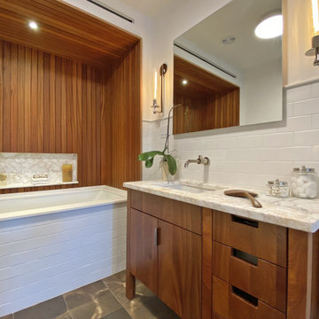
In an ever-evolving homestead on the Connecticut River, this bath serves two guest bedrooms as well as the Master.
In renovating the original 1983 bathspace and its unusual 6ft by 24ft footprint, our design divides the room's functional components along its length. A deep soaking tub in a Sepele wood niche anchors the primary space. Opposing entries from Master and guest sides access a neutral center area with a sepele cabinet for linen and toiletries. Fluted glass in a black steel frame creates discretion while admitting daylight from a South window in the 6ft by 8ft river-side shower room.
 Simply Home Decorating
This 1990's home, located in North Vancouver's Lynn Valley neighbourhood, had high ceilings and a great open plan layout but the decor was straight out of the 90's complete with sponge painted walls in dark earth tones. The owners, a young professional couple, enlisted our help to take it from dated and dreary to modern and bright. We started by removing details like chair rails and crown mouldings, that did not suit the modern architectural lines of the home. We replaced the heavily worn wood floors with a new high end, light coloured, wood-look laminate that will withstand the wear and tear from their two energetic golden retrievers. Since the main living space is completely open plan it was important that we work with simple consistent finishes for a clean modern look. The all white kitchen features flat doors with minimal hardware and a solid surface marble-look countertop and backsplash. We modernized all of the lighting and updated the bathrooms and master bedroom as well. The only departure from our clean modern scheme is found in the dressing room where the client was looking for a more dressed up feminine feel but we kept a thread of grey consistent even in this more vivid colour scheme. This transformation, featuring the clients' gorgeous original artwork and new custom designed furnishings is admittedly one of our favourite projects to date!
48