
Search results for "Admitted" in Home Design Ideas
 Bilotta Kitchen & Home
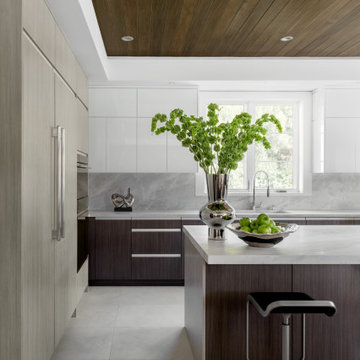
In case you assume that the prerequisite for a contemporary kitchen is monochromatic white, this design will shatter your misconceptions. Admittedly, the upper cabinets are gloss white, but there are two additional cabinet materials that create a rich combination of color and texture. The bases and back of the island are high-gloss dark teak-patterned laminate that echo the dark tongue-and-groove wood ceiling. The tall cabinets, fridge panels, and front and sides of the island are a soft matte gray-toned rift cut patterned laminate. For a clean profile, the white cabinets use touch latches, while the gray and dark doors employ aluminum channel pulls that add a low-sheen metallic accent. Tying everything together is the gray and taupe marble countertops with matching slab backsplashes. The subtly mottled limestone-like porcelain tile flooring is the perfect backdrop for the room’s lively mix.
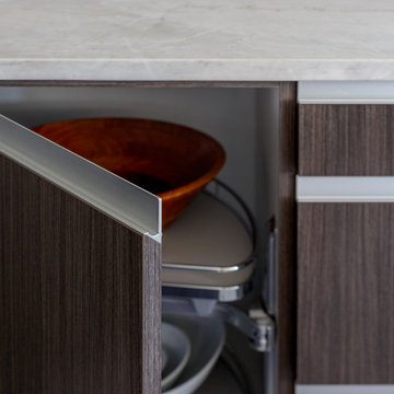
Influenced by innovative European kitchens, these cabinets use gray metal drawer boxes, elevated to luxury status with walnut knife and cutlery inserts. A popular corner solution is the LeMans corner swing-out, which provides full accessibility to what is ordinarily a dead zone.
Undercounter illumination is supplied by LED lights set into grooves routed out in the bottom of the wall cabinets.

 MainStreet Design Build
This retired couple loves their home, cook daily meals and spend much of their time together in the kitchen. Our goal was to create a simple update that gave the homeowners a more comfortable feel of the space and a convenient way to work together in this new stage of their lives. Keeping the simplicity of the design was important, but it also needed to reflect 21st-century amenities. With this in mind, they chose a 36" SS Wolf Pro Gas Cooktop 18K Burner w/LED Indicators (CG365P/S) because they prefer to cook gas, loved the 5-burner setup and the knob location in the lower right corner of the unit. They were extremely excited about the DD36-SS ventilation with the concealed controls located in the drawer, as it works perfectly with the clean lines of the kitchen. One of the couple's favorite amenity in the kitchen is the Wolf WGCO100S Countertop oven. The recessed appliance garage was re-built with a stainless door specifically to house this unit. Felt pads have been applied to the feet to ensure our clients can pull the oven in and out for everyday use. They hate to admit it, but this may be their favorite appliance in the kitchen as they are now just cooking every day for two!
 Bilotta Kitchen & Home
In case you assume that the prerequisite for a contemporary kitchen is monochromatic white, this design will shatter your misconceptions. Admittedly, the upper cabinets are gloss white, but there are two additional cabinet materials that create a rich combination of color and texture. The bases and back of the island are high-gloss dark teak-patterned laminate that echo the dark tongue-and-groove wood ceiling. The tall cabinets, fridge panels, and front and sides of the island are a soft matte gray-toned rift cut patterned laminate. For a clean profile, the white cabinets use touch latches, while the gray and dark doors employ aluminum channel pulls that add a low-sheen metallic accent. Tying everything together is the gray and taupe marble countertops with matching slab backsplashes. The subtly mottled limestone-like porcelain tile flooring is the perfect backdrop for the room’s lively mix.
Influenced by innovative European kitchens, these cabinets use gray metal drawer boxes, elevated to luxury status with walnut knife and cutlery inserts. A popular corner solution is the LeMans corner swing-out, which provides full accessibility to what is ordinarily a dead zone.
Undercounter illumination is supplied by LED lights set into grooves routed out in the bottom of the wall cabinets.
Find the right local pro for your project
 Byggmeister Inc
Photo by Mike Casey
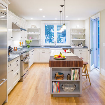
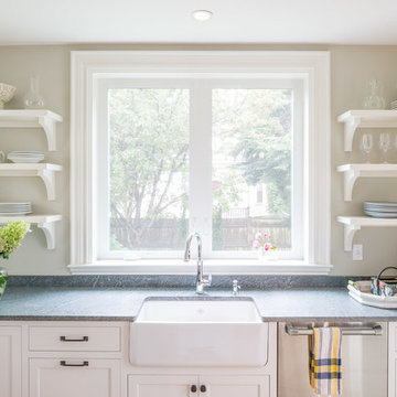
While boasting abundant square footage, Victorian houses often "live small" because of their outdated space configuration. With its undersized kitchen, minimal storage and awkward floor plan, this house was no exception.
RECONFIGURING ROOMS
The first and most pivotal design decision the architect (Anita Rogers) made was to move the basement stair. The stair ran between the kitchen and adjacent breakfast room, obstructing traffic flow and isolating the breakfast room from the rest of the living space. Moving the stair allowed us to integrate these two rooms into a generous eat-in kitchen with views to the backyard. It also allowed us to carve out a mud-room space with a bench and storage for shoes, coats and bags.
Thoughtfully detailed cabinetry fulfilled the clients' storage needs, rendering an existing dining room pantry obsolete. Removing the pantry created space to relocate the basement stair without sacrificing dining room floor area: we grew the dining area into the space vacated by the pantry and widened the doorway between the dining room and kitchen, facilitating traffic flow and creating a feeling of spaciousness.
ACCESSING THE OUTDOORS
The finishing touch is a new back deck with access from both the kitchen and the dining room. Glass doors to the deck admit plenty of natural light while also inviting the family outdoors to their backyard living space. The result is a lovely, vintage home whose space plan gracefully accommodates twenty-first century living.

 Jarrett Design
Our clients are always teaching us. In this case, our clients had a vision that changed the direction of the design process midstream. Often our clients tell us they have trouble visualizing. This time, we must admit, we had a little trouble visualizing how their big idea was better than what we were planning. And then, it clicked!
This young family of five had outgrown their dark and dated kitchen. Food prep, cooking and baking play a large daily role in this home. Pantry storage was overflowing to the point where bulk ingredients, small appliances and other daily necessities were stored in a nearby closet and the laundry room at the end of the house. Counter space was scarce. The kitchen also served as an office area for the husband, who works from home, and a study area for the three school age children. Given some constraints and a fixed budget, our inclination was to work with the existing kitchen to design a much more efficient space, keeping it close to the laundry room/pantry, which could be maximized for convenient storage and access. We would create an organized work area within the kitchen as well. Our clients were happy with the design. Then, out of the blue, they announced that they would like to move the kitchen into the family room space! Our first reaction was to question how this could work being so far from the pantry storage areas, and the other living spaces of the home. The flow seemed as though it would be odd, but we heard them out and allowed some time for the idea to blossom. And blossom, it did. The existing kitchen and eating space became the new study and family room with enlarged windows and an added sliding door bringing their beautiful gardens into clear sight. The pantry dilemma was solved by adding a full wall of tall cabinetry with roll out storage flanking a beautiful fireplace. A large island with waterfall sides provides copious counter space and seating for the whole family. Dark, dated traditional styling of the past kitchen gave way to contemporary high gloss white and warm rosewood elements. The dramatic Dekton Aura backsplash is the icing on the cake!
Matt Villano Photography
 Byggmeister Inc
Photo by Mike Casey
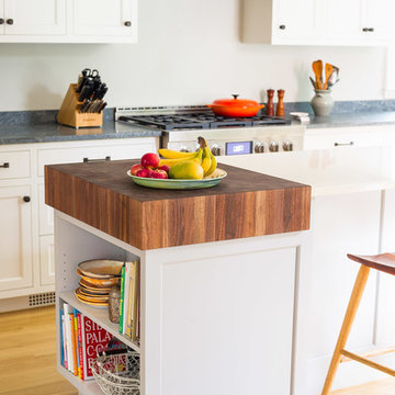
While boasting abundant square footage, Victorian houses often "live small" because of their outdated space configuration. With its undersized kitchen, minimal storage and awkward floor plan, this house was no exception.
RECONFIGURING ROOMS
The first and most pivotal design decision the architect (Anita Rogers) made was to move the basement stair. The stair ran between the kitchen and adjacent breakfast room, obstructing traffic flow and isolating the breakfast room from the rest of the living space. Moving the stair allowed us to integrate these two rooms into a generous eat-in kitchen with views to the backyard. It also allowed us to carve out a mud-room space with a bench and storage for shoes, coats and bags.
Thoughtfully detailed cabinetry fulfilled the clients' storage needs, rendering an existing dining room pantry obsolete. Removing the pantry created space to relocate the basement stair without sacrificing dining room floor area: we grew the dining area into the space vacated by the pantry and widened the doorway between the dining room and kitchen, facilitating traffic flow and creating a feeling of spaciousness.
ACCESSING THE OUTDOORS
The finishing touch is a new back deck with access from both the kitchen and the dining room. Glass doors to the deck admit plenty of natural light while also inviting the family outdoors to their backyard living space. The result is a lovely, vintage home whose space plan gracefully accommodates twenty-first century living.
 MainStreet Design Build
This retired couple loves their home, cook daily meals and spend much of their time together in the kitchen. Our goal was to create a simple update that gave the homeowners a more comfortable feel of the space and a convenient way to work together in this new stage of their lives. Keeping the simplicity of the design was important, but it also needed to reflect 21st-century amenities. With this in mind, they chose a 36" SS Wolf Pro Gas Cooktop 18K Burner w/LED Indicators (CG365P/S) because they prefer to cook gas, loved the 5-burner setup and the knob location in the lower right corner of the unit. They were extremely excited about the DD36-SS ventilation with the concealed controls located in the drawer, as it works perfectly with the clean lines of the kitchen. One of the couple's favorite amenity in the kitchen is the Wolf WGCO100S Countertop oven. The recessed appliance garage was re-built with a stainless door specifically to house this unit. Felt pads have been applied to the feet to ensure our clients can pull the oven in and out for everyday use. They hate to admit it, but this may be their favorite appliance in the kitchen as they are now just cooking every day for two!
 Byggmeister Inc
Photo by Mike Casey
While boasting abundant square footage, Victorian houses often "live small" because of their outdated space configuration. With its undersized kitchen, minimal storage and awkward floor plan, this house was no exception.
RECONFIGURING ROOMS
The first and most pivotal design decision the architect (Anita Rogers) made was to move the basement stair. The stair ran between the kitchen and adjacent breakfast room, obstructing traffic flow and isolating the breakfast room from the rest of the living space. Moving the stair allowed us to integrate these two rooms into a generous eat-in kitchen with views to the backyard. It also allowed us to carve out a mud-room space with a bench and storage for shoes, coats and bags.
Thoughtfully detailed cabinetry fulfilled the clients' storage needs, rendering an existing dining room pantry obsolete. Removing the pantry created space to relocate the basement stair without sacrificing dining room floor area: we grew the dining area into the space vacated by the pantry and widened the doorway between the dining room and kitchen, facilitating traffic flow and creating a feeling of spaciousness.
ACCESSING THE OUTDOORS
The finishing touch is a new back deck with access from both the kitchen and the dining room. Glass doors to the deck admit plenty of natural light while also inviting the family outdoors to their backyard living space. The result is a lovely, vintage home whose space plan gracefully accommodates twenty-first century living.

 Maddie G Designs / Shop Maddie G
We turned a small unused room in the back of this house into a playroom for young children. Highlights include custom photo wallpaper (which is adhesive backed and can be peeled away without wall damage), a custom book wall and a wall system allowing easy rotation of kids' art.
Credit: Maddie G Designs
 Bilotta Kitchen & Home
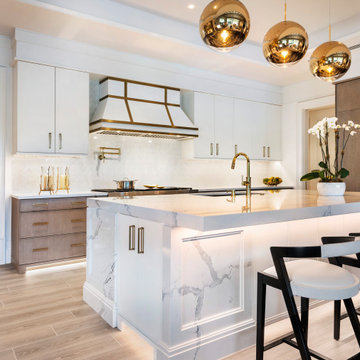
Beauty meets practicality in this Florida Contemporary on a Boca golf course. The indoor – outdoor connection is established by running easy care wood-look porcelain tiles from the patio to all the public rooms. The clean-lined slab door has a narrow-raised perimeter trim, while a combination of rift-cut white oak and “Super White” balances earthy with bright. Appliances are paneled for continuity. Dramatic LED lighting illuminates the toe kicks and the island overhang.
Instead of engineered quartz, these countertops are engineered marble: “Unique Statuario” by Compac. The same material is cleverly used for carved island panels that resemble cabinet doors. White marble chevron mosaics lend texture and depth to the backsplash.
The showstopper is the divider between the secondary sink and living room. Fashioned from brushed gold square metal stock, its grid-and-rectangle motif references the home’s entry door. Wavy glass obstructs kitchen mess, yet still admits light. Brushed gold straps on the white hood tie in with the divider. Gold hardware, faucets and globe pendants add glamour.
In the pantry, kitchen cabinetry is repeated, but here in all white with Caesarstone countertops. Flooring is laid diagonally. Matching panels front the wine refrigerator. Open cabinets display glassware and serving pieces.
This project was done in collaboration with JBD JGA Design & Architecture and NMB Home Management Services LLC. Bilotta Designer: Randy O’Kane. Photography by Nat Rea.
Description written by Paulette Gambacorta adapted for Houzz.
 Bilotta Kitchen & Home
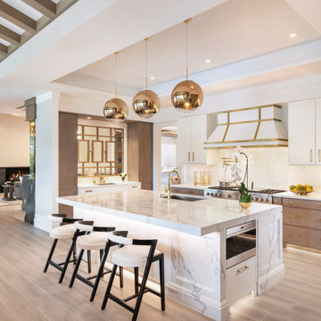
Beauty meets practicality in this Florida Contemporary on a Boca golf course. The indoor – outdoor connection is established by running easy care wood-look porcelain tiles from the patio to all the public rooms. The clean-lined slab door has a narrow-raised perimeter trim, while a combination of rift-cut white oak and “Super White” balances earthy with bright. Appliances are paneled for continuity. Dramatic LED lighting illuminates the toe kicks and the island overhang.
Instead of engineered quartz, these countertops are engineered marble: “Unique Statuario” by Compac. The same material is cleverly used for carved island panels that resemble cabinet doors. White marble chevron mosaics lend texture and depth to the backsplash.
The showstopper is the divider between the secondary sink and living room. Fashioned from brushed gold square metal stock, its grid-and-rectangle motif references the home’s entry door. Wavy glass obstructs kitchen mess, yet still admits light. Brushed gold straps on the white hood tie in with the divider. Gold hardware, faucets and globe pendants add glamour.
In the pantry, kitchen cabinetry is repeated, but here in all white with Caesarstone countertops. Flooring is laid diagonally. Matching panels front the wine refrigerator. Open cabinets display glassware and serving pieces.
This project was done in collaboration with JBD JGA Design & Architecture and NMB Home Management Services LLC. Bilotta Designer: Randy O’Kane. Photography by Nat Rea.
Description written by Paulette Gambacorta adapted for Houzz.
 MainStreet Design Build
This retired couple loves their home, cook daily meals and spend much of their time together in the kitchen. Our goal was to create a simple update that gave the homeowners a more comfortable feel of the space and a convenient way to work together in this new stage of their lives. Keeping the simplicity of the design was important, but it also needed to reflect 21st-century amenities. With this in mind, they chose a 36" SS Wolf Pro Gas Cooktop 18K Burner w/LED Indicators (CG365P/S) because they prefer to cook gas, loved the 5-burner setup and the knob location in the lower right corner of the unit. They were extremely excited about the DD36-SS ventilation with the concealed controls located in the drawer, as it works perfectly with the clean lines of the kitchen. One of the couple's favorite amenity in the kitchen is the Wolf WGCO100S Countertop oven. The recessed appliance garage was re-built with a stainless door specifically to house this unit. Felt pads have been applied to the feet to ensure our clients can pull the oven in and out for everyday use. They hate to admit it, but this may be their favorite appliance in the kitchen as they are now just cooking every day for two!

 Landscape Plus Ltd
Sometimes 'restraint' is the most important design element used in pulling a property together. There is a fine (admittedly subjective) line between running out of nerve... falling short... and goin over the top, produsing an almost comical theme park result.
These clients had ambitious plans for building their new Edwardian home. Realizing their property had the lines of a once great garden, they cleverly slipped the new home onto th site without betraying the existing setting. Our team's objective was to enliven the tired grounds, adding features and linking areas in a logical, tasteful manner.
The front entrance walkway and driveway pad are adorned with stone inlays. The former garage (now a garden shed) and adjoining brick wing all are alive with climbing trees.
What was once a sunken vegetable patch is now a Celtic cross parterre. Rubble pathways weave through boxwood, lavender and rose standards. A sad, sagging dry stone wall is completely rebuilt (once again dry). It now enjoys the addition of a small recessed water feature.
A wonderful and spacious lower garden is fully revitalized and connected to the upper area with a grand staircase.
Sitting areas share a view of an exquisite cascading water feature. The bronze ladies stand in a raised pool, set into a larger perennial border.

 Tomco Company Inc.
The owners of this kitchen do a lot of baking/cooking so they needed plenty of prep areas, a double oven and convenient storage. As world travelers they also want to display some of their collected artifacts.
 Byggmeister Inc
Photo by Mike Casey
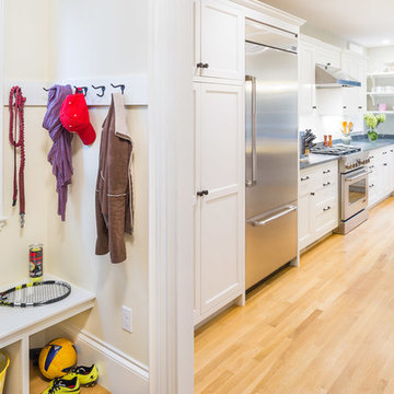
While boasting abundant square footage, Victorian houses often "live small" because of their outdated space configuration. With its undersized kitchen, minimal storage and awkward floor plan, this house was no exception.
RECONFIGURING ROOMS
The first and most pivotal design decision the architect (Anita Rogers) made was to move the basement stair. The stair ran between the kitchen and adjacent breakfast room, obstructing traffic flow and isolating the breakfast room from the rest of the living space. Moving the stair allowed us to integrate these two rooms into a generous eat-in kitchen with views to the backyard. It also allowed us to carve out a mud-room space with a bench and storage for shoes, coats and bags.
Thoughtfully detailed cabinetry fulfilled the clients' storage needs, rendering an existing dining room pantry obsolete. Removing the pantry created space to relocate the basement stair without sacrificing dining room floor area: we grew the dining area into the space vacated by the pantry and widened the doorway between the dining room and kitchen, facilitating traffic flow and creating a feeling of spaciousness.
ACCESSING THE OUTDOORS
The finishing touch is a new back deck with access from both the kitchen and the dining room. Glass doors to the deck admit plenty of natural light while also inviting the family outdoors to their backyard living space. The result is a lovely, vintage home whose space plan gracefully accommodates twenty-first century living.
 Landscape Plus Ltd
Sometimes 'restraint' is the most important design element used in pulling a property together. There is a fine (admittedly subjective) line between running out of nerve... falling short... and goin over the top, produsing an almost comical theme park result.
These clients had ambitious plans for building their new Edwardian home. Realizing their property had the lines of a once great garden, they cleverly slipped the new home onto th site without betraying the existing setting. Our team's objective was to enliven the tired grounds, adding features and linking areas in a logical, tasteful manner.
The front entrance walkway and driveway pad are adorned with stone inlays. The former garage (now a garden shed) and adjoining brick wing all are alive with climbing trees.
What was once a sunken vegetable patch is now a Celtic cross parterre. Rubble pathways weave through boxwood, lavender and rose standards. A sad, sagging dry stone wall is completely rebuilt (once again dry). It now enjoys the addition of a small recessed water feature.
A wonderful and spacious lower garden is fully revitalized and connected to the upper area with a grand staircase.
Sitting areas share a view of an exquisite cascading water feature. The bronze ladies stand in a raised pool, set into a larger perennial border.
 MainStreet Design Build
This retired couple loves their home, cook daily meals and spend much of their time together in the kitchen. Our goal was to create a simple update that gave the homeowners a more comfortable feel of the space and a convenient way to work together in this new stage of their lives. Keeping the simplicity of the design was important, but it also needed to reflect 21st-century amenities. With this in mind, they chose a 36" SS Wolf Pro Gas Cooktop 18K Burner w/LED Indicators (CG365P/S) because they prefer to cook gas, loved the 5-burner setup and the knob location in the lower right corner of the unit. They were extremely excited about the DD36-SS ventilation with the concealed controls located in the drawer, as it works perfectly with the clean lines of the kitchen. One of the couple's favorite amenity in the kitchen is the Wolf WGCO100S Countertop oven. The recessed appliance garage was re-built with a stainless door specifically to house this unit. Felt pads have been applied to the feet to ensure our clients can pull the oven in and out for everyday use. They hate to admit it, but this may be their favorite appliance in the kitchen as they are now just cooking every day for two!
 Landscape Plus Ltd
Sometimes 'restraint' is the most important design element used in pulling a property together. There is a fine (admittedly subjective) line between running out of nerve... falling short... and goin over the top, produsing an almost comical theme park result.
These clients had ambitious plans for building their new Edwardian home. Realizing their property had the lines of a once great garden, they cleverly slipped the new home onto th site without betraying the existing setting. Our team's objective was to enliven the tired grounds, adding features and linking areas in a logical, tasteful manner.
The front entrance walkway and driveway pad are adorned with stone inlays. The former garage (now a garden shed) and adjoining brick wing all are alive with climbing trees.
What was once a sunken vegetable patch is now a Celtic cross parterre. Rubble pathways weave through boxwood, lavender and rose standards. A sad, sagging dry stone wall is completely rebuilt (once again dry). It now enjoys the addition of a small recessed water feature.
A wonderful and spacious lower garden is fully revitalized and connected to the upper area with a grand staircase.
Sitting areas share a view of an exquisite cascading water feature. The bronze ladies stand in a raised pool, set into a larger perennial border.
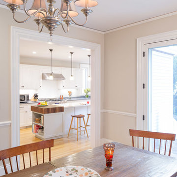 Byggmeister Inc
Photo by Mike Casey
While boasting abundant square footage, Victorian houses often "live small" because of their outdated space configuration. With its undersized kitchen, minimal storage and awkward floor plan, this house was no exception.
RECONFIGURING ROOMS
The first and most pivotal design decision the architect (Anita Rogers) made was to move the basement stair. The stair ran between the kitchen and adjacent breakfast room, obstructing traffic flow and isolating the breakfast room from the rest of the living space. Moving the stair allowed us to integrate these two rooms into a generous eat-in kitchen with views to the backyard. It also allowed us to carve out a mud-room space with a bench and storage for shoes, coats and bags.
Thoughtfully detailed cabinetry fulfilled the clients' storage needs, rendering an existing dining room pantry obsolete. Removing the pantry created space to relocate the basement stair without sacrificing dining room floor area: we grew the dining area into the space vacated by the pantry and widened the doorway between the dining room and kitchen, facilitating traffic flow and creating a feeling of spaciousness.
ACCESSING THE OUTDOORS
The finishing touch is a new back deck with access from both the kitchen and the dining room. Glass doors to the deck admit plenty of natural light while also inviting the family outdoors to their backyard living space. The result is a lovely, vintage home whose space plan gracefully accommodates twenty-first century living.
 Tomco Company Inc.
When these homeowners want a "safe living environment for their parents, they built this addition for them with an accessible bathroom and a stackable washer and dryer, bedroom and a small family room with accessible exit.
50