
Search results for "Advantage online" in Home Design Ideas
 Lulu Designs
Jeff Thayer Photography
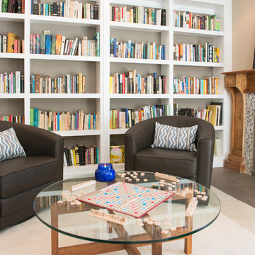
Inspiration for a transitional family room library remodel in Los Angeles
Inspiration for a transitional family room library remodel in Los Angeles
 TKS Design Group
Free ebook, Creating the Ideal Kitchen. DOWNLOAD NOW
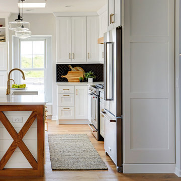
Our clients came to us looking to do some updates to their new condo unit primarily in the kitchen and living room. The couple has a lifelong love of Arts and Crafts and Modernism, and are the co-founders of PrairieMod, an online retailer that offers timeless modern lifestyle through American made, handcrafted, and exclusively designed products. So, having such a design savvy client was super exciting for us, especially since the couple had many unique pieces of pottery and furniture to provide inspiration for the design.
The condo is a large, sunny top floor unit, with a large open feel. The existing kitchen was a peninsula which housed the sink, and they wanted to change that out to an island, relocating the new sink there as well. This can sometimes be tricky with all the plumbing for the building potentially running up through one stack. After consulting with our contractor team, it was determined that our plan would likely work and after confirmation at demo, we pushed on.
The new kitchen is a simple L-shaped space, featuring several storage devices for trash, trays dividers and roll out shelving. To keep the budget in check, we used semi-custom cabinetry, but added custom details including a shiplap hood with white oak detail that plays off the oak “X” endcaps at the island, as well as some of the couple’s existing white oak furniture. We also mixed metals with gold hardware and plumbing and matte black lighting that plays well with the unique black herringbone backsplash and metal barstools. New weathered oak flooring throughout the unit provides a nice soft backdrop for all the updates. We wanted to take the cabinets to the ceiling to obtain as much storage as possible, but an angled soffit on two of the walls provided a bit of a challenge. We asked our carpenter to field modify a few of the wall cabinets where necessary and now the space is truly custom.
Part of the project also included a new fireplace design including a custom mantle that houses a built-in sound bar and a Panasonic Frame TV, that doubles as hanging artwork when not in use. The TV is mounted flush to the wall, and there are different finishes for the frame available. The TV can display works of art or family photos while not in use. We repeated the black herringbone tile for the fireplace surround here and installed bookshelves on either side for storage and media components.
Designed by: Susan Klimala, CKD, CBD
Photography by: Michael Alan Kaskel
For more information on kitchen and bath design ideas go to: www.kitchenstudio-ge.com
 ODS Architecture
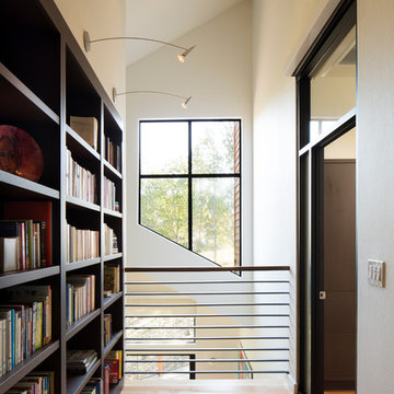
In the hills of San Anselmo in Marin County, this 5,000 square foot existing multi-story home was enlarged to 6,000 square feet with a new dance studio addition with new master bedroom suite and sitting room for evening entertainment and morning coffee. Sited on a steep hillside one acre lot, the back yard was unusable. New concrete retaining walls and planters were designed to create outdoor play and lounging areas with stairs that cascade down the hill forming a wrap-around walkway. The goal was to make the new addition integrate the disparate design elements of the house and calm it down visually. The scope was not to change everything, just the rear façade and some of the side facades.
The new addition is a long rectangular space inserted into the rear of the building with new up-swooping roof that ties everything together. Clad in red cedar, the exterior reflects the relaxed nature of the one acre wooded hillside site. Fleetwood windows and wood patterned tile complete the exterior color material palate.
The sitting room overlooks a new patio area off of the children’s playroom and features a butt glazed corner window providing views filtered through a grove of bay laurel trees. Inside is a television viewing area with wetbar off to the side that can be closed off with a concealed pocket door to the master bedroom. The bedroom was situated to take advantage of these views of the rear yard and the bed faces a stone tile wall with recessed skylight above. The master bath, a driving force for the project, is large enough to allow both of them to occupy and use at the same time.
The new dance studio and gym was inspired for their two daughters and has become a facility for the whole family. All glass, mirrors and space with cushioned wood sports flooring, views to the new level outdoor area and tree covered side yard make for a dramatic turnaround for a home with little play or usable outdoor space previously.
Photo Credit: Paul Dyer Photography.
Find the right local pro for your project
 Studio Dearborn
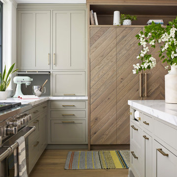
This expansive Victorian had tremendous historic charm but hadn’t seen a kitchen renovation since the 1950s. The homeowners wanted to take advantage of their views of the backyard and raised the roof and pushed the kitchen into the back of the house, where expansive windows could allow southern light into the kitchen all day. A warm historic gray/beige was chosen for the cabinetry, which was contrasted with character oak cabinetry on the appliance wall and bar in a modern chevron detail. Kitchen Design: Sarah Robertson, Studio Dearborn Architect: Ned Stoll, Interior finishes Tami Wassong Interiors
 Klopf Architecture
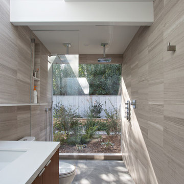
Klopf Architecture, Arterra Landscape Architects, and Flegels Construction updated a classic Eichler open, indoor-outdoor home. Expanding on the original walls of glass and connection to nature that is common in mid-century modern homes. The completely openable walls allow the homeowners to truly open up the living space of the house, transforming it into an open air pavilion, extending the living area outdoors to the private side yards, and taking maximum advantage of indoor-outdoor living opportunities. Taking the concept of borrowed landscape from traditional Japanese architecture, the fountain, concrete bench wall, and natural landscaping bound the indoor-outdoor space. The Truly Open Eichler is a remodeled single-family house in Palo Alto. This 1,712 square foot, 3 bedroom, 2.5 bathroom is located in the heart of the Silicon Valley.
Klopf Architecture Project Team: John Klopf, AIA, Geoff Campen, and Angela Todorova
Landscape Architect: Arterra Landscape Architects
Structural Engineer: Brian Dotson Consulting Engineers
Contractor: Flegels Construction
Photography ©2014 Mariko Reed
Location: Palo Alto, CA
Year completed: 2014
 Susan Yeley Homes
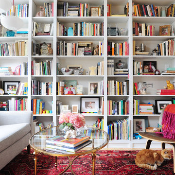
Our poster project for The Three P's, this small midcentury home south of campus has great bones but lacked vibrancy - a je ne sais quoi that the clients were searching to savoir once and for all. SYI worked with them to nail down a design direction and furniture plan, and they decided to invest in the big-impact items first: built-ins and lighting and a fresh paint job that included a beautiful deep blue-green line around the windows. The vintage rug was an Etsy score at an awesome price, but only after the client spent months scouring options and sources online that matched the vision and dimensions of the plan. A good year later, the West Elm sofa went on sale, so the client took advantage; some time after that, they painted the kitchen, created the drop zone / bench area, and rounded out the room with occasional tables and accessories. Their lesson: in patience, and details, there is beauty.
Photography by Gina Rogers Photography
 chadbourne + doss architects
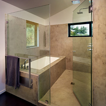
This Master Bath designed by chadbourne + doss architects incorporates the shower and tub into a frameless glass enclosed wet room. Hybridized acrylic cement plaster creates a seamless waterproof environment.
photo by Benjamin Benschneider


 Allee Architecture + Design, LLC
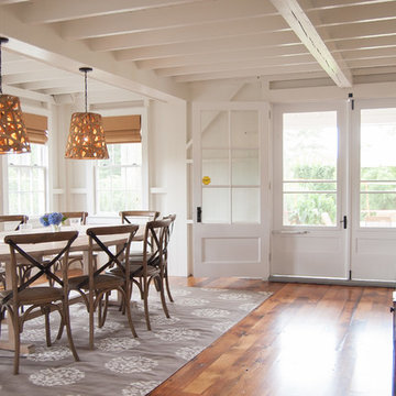
Large beach style medium tone wood floor enclosed dining room photo in Bridgeport with white walls and no fireplace

 OLSON LEWIS + Architects
Contractor: Windover Construction, LLC
Photographer: Shelly Harrison Photography
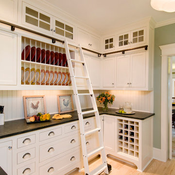
Example of a classic kitchen design in Boston with recessed-panel cabinets, white cabinets and white backsplash
Example of a classic kitchen design in Boston with recessed-panel cabinets, white cabinets and white backsplash
 Thyme & Place Design LLC
When my client had to move from her company office to work at home, she set up in the dining room. Despite her best efforts, this was not the long-term solution she was looking for. My client realized she needed a dedicated space not on the main floor of the home. On one hand, having your office space right next to the kitchen is handy. On the other hand, it made separating work and home life was not that easy.
The house was a ranch. In essence, the basement would run entire length of the home. As we came down the steps, we entered a time capsule. The house was built in the 1950’s. The walls were covered with original knotty pine paneling. There was a wood burning fireplace and considering this was a basement, high ceilings. In addition, there was everything her family could not store at their own homes. As we wound though the space, I though “wow this has potential”, Eventually, after walking through the laundry room we came to a small nicely lit room. This would be the office.
My client looked at me and asked what I thought. Undoubtedly, I said, this can be a great workspace, but do you really want to walk through this basement and laundry to get here? Without reservation, my client said where do we start?
Once the design was in place, we started the renovation. The knotty pine paneling had to go. Specifically, to add some insulation and control the dampness and humidity. The laundry room wall was relocated to create a hallway to the office.
At the far end of the room, we designated a workout zone. Weights, mats, exercise bike and television are at the ready for morning or afternoon workouts. The space can be concealed by a folding screen for party time. Doors to an old closet under the stairs were relocated to the workout area for hidden storage. Now we had nice wall for a beautiful console and mirror for storage and serving during parties.
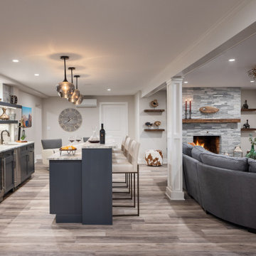
In order to add architectural details, we covered the old ugly support columns with simple recessed millwork panels. This detail created a visual division between the bar area and the seating area in front of the fireplace. The old red brick on the fireplace surround was replaced with stack stone. A mantle was made from reclaimed wood. Additional reclaimed wood floating shelves left and right of the fireplace provides decorative display while maintaining a rustic element balancing the copper end table and leather swivel rocker.
We found an amazing rug which tied all of the colors together further defining the gathering space. Russet and burnt orange became the accent color unifying each space. With a bit of whimsy, a rather unusual light fixture which looks like roots from a tree growing through the ceiling is a conversation piece.
The office space is quite and removed from the main part of the basement. There is a desk large enough for multiple screens, a small bookcase holding office supplies and a comfortable chair for conference calls. Because working from home requires many online meetings, we added a shiplap wall painted in Hale Navy to contrast with the orange fabric on the chair. We finished the décor with a painting from my client’s father. This is the background online visitors will see.
The last and best part of the renovation is the beautiful bar. My client is an avid collector of wine. She already had the EuroCave refrigerator, so I incorporated it into the design. The cabinets are painted Temptation Grey from Benjamin Moore. The counter tops are my favorite hard working quartzite Brown Fantasy. The backsplash is a combination of rustic wood and old tin ceiling like porcelain tiles. Together with the textures of the reclaimed wood and hide poofs balanced against the smooth finish of the cabinets, we created a comfortable luxury for relaxing.
There is ample storage for bottles, cans, glasses, and anything else you can think of for a great party. In addition to the wine storage, we incorporated a beverage refrigerator, an ice maker, and a sink. Floating shelves with integrated lighting illuminate the back bar. The raised height of the front bar provides the perfect wine tasting and paring spot. I especially love the pendant lights which look like wine glasses.
Finally, I selected carpet for the stairs and office. It is perfect for noise reduction. Meanwhile for the overall flooring, I specifically selected a high-performance vinyl plank floor. We often use this product as it is perfect to install on a concrete floor. It is soft to walk on, easy to clean and does not reduce the overall height of the space.
 Kimball Starr Interior Design
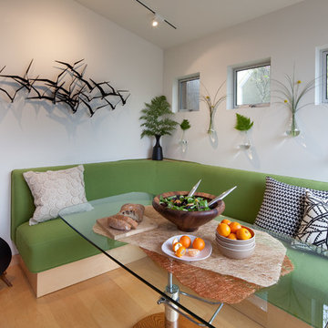
Small space living solutions are used throughout this contemporary 596 square foot tiny house. Adjustable height table in the entry area serves as both a coffee table for socializing and as a dining table for eating. Curved banquette is upholstered in outdoor fabric for durability and maximizes space with hidden storage underneath the seat. Kitchen island has a retractable countertop for additional seating while the living area conceals a work desk and media center behind sliding shoji screens.
Calming tones of sand and deep ocean blue fill the tiny bedroom downstairs. Glowing bedside sconces utilize wall-mounting and swing arms to conserve bedside space and maximize flexibility.
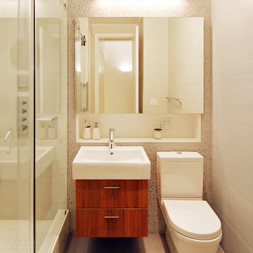
 KIM Architecture + Design
Example of a small minimalist 3/4 beige tile, white tile and ceramic tile ceramic tile and beige floor bathroom design in New York with an integrated sink, medium tone wood cabinets, a two-piece toilet, flat-panel cabinets, beige walls and solid surface countertops
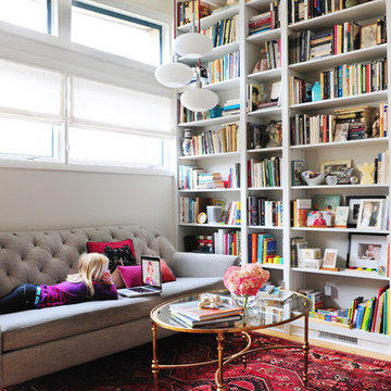 Susan Yeley Homes
Our poster project for The Three P's, this small midcentury home south of campus has great bones but lacked vibrancy - a je ne sais quoi that the clients were searching to savoir once and for all. SYI worked with them to nail down a design direction and furniture plan, and they decided to invest in the big-impact items first: built-ins and lighting and a fresh paint job that included a beautiful deep blue-green line around the windows. The vintage rug was an Etsy score at an awesome price, but only after the client spent months scouring options and sources online that matched the vision and dimensions of the plan. A good year later, the West Elm sofa went on sale, so the client took advantage; some time after that, they painted the kitchen, created the drop zone / bench area, and rounded out the room with occasional tables and accessories. Their lesson: in patience, and details, there is beauty.
Photography by Gina Rogers Photography
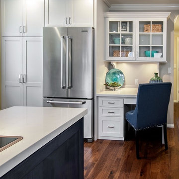
 Zieba Builders, Inc.
Our clients loved the location of their duplex home with its peak-a-boo ocean view, but their existing kitchen was not suited for their growing family. They wanted a kitchen with a coastal vibe, plenty of storage space, and an eat-in area.
We started by bringing the far wall into the kitchen space to accommodate a large panty and communication center for the family. Doing this allowed us to move the refrigerator out of the main traffic area and doubled the amount of storage space. Several new windows were added to bring in natural light. A half wall was moved to allow more countertop area and open up sight lines. The previously awkwardly shaped island was slimmed down to create better flow.
There were a few venting challenges to overcome; gas lines and plumbing had to be re-routed without disturbing the unit below. To open up sight lines, soffits were eliminated which allowed the extension of cabinets to the ceiling. To stay within the homeowner’s budget, we match existing scraped flooring by lacing in and repairing patches.
The old dining area was too small for table, so we designed and built a custom banquette to maximize the space and take advantage of the outdoor views. The overall space works for family meals as well as entertaining.
A light summer palette was used to reflect the shades of the sand, sea and sky. Even though the new kitchen is actually smaller than the original space, its now far more functional and open.
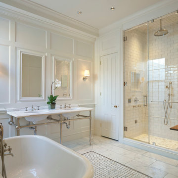
 Overmyer Architects
Master Bath and Shower
Photograph by Gordon Beall
Inspiration for a timeless master white tile and ceramic tile marble floor freestanding bathtub remodel in DC Metro with white walls, marble countertops and a console sink
Inspiration for a timeless master white tile and ceramic tile marble floor freestanding bathtub remodel in DC Metro with white walls, marble countertops and a console sink
 JOURNEY HOME INTERIORS
Daniel Blue Architectural Photography
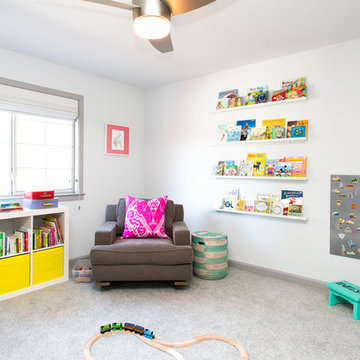
Mid-sized danish gender-neutral carpeted and gray floor kids' room photo in San Francisco with white walls
Mid-sized danish gender-neutral carpeted and gray floor kids' room photo in San Francisco with white walls
 Lucy Interior Design
Interior Design: Lucy Interior Design
Builder: Claremont Design + Build
Photography: SPACECRAFTING
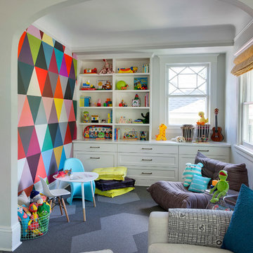
Transitional gender-neutral carpeted playroom photo in Minneapolis with multicolored walls
Transitional gender-neutral carpeted playroom photo in Minneapolis with multicolored walls
 Tracy Lynn Studio
Zack Benson Photography
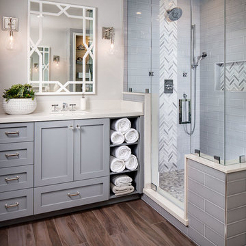
Transitional master gray tile and subway tile medium tone wood floor bathroom photo in San Diego with gray cabinets, gray walls, an undermount sink and a hinged shower door
Transitional master gray tile and subway tile medium tone wood floor bathroom photo in San Diego with gray cabinets, gray walls, an undermount sink and a hinged shower door
 Susan Yeley Homes
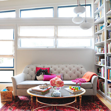
Our poster project for The Three P's, this small midcentury home south of campus has great bones but lacked vibrancy - a je ne sais quoi that the clients were searching to savoir once and for all. SYI worked with them to nail down a design direction and furniture plan, and they decided to invest in the big-impact items first: built-ins and lighting and a fresh paint job that included a beautiful deep blue-green line around the windows. The vintage rug was an Etsy score at an awesome price, but only after the client spent months scouring options and sources online that matched the vision and dimensions of the plan. A good year later, the West Elm sofa went on sale, so the client took advantage; some time after that, they painted the kitchen, created the drop zone / bench area, and rounded out the room with occasional tables and accessories. Their lesson: in patience, and details, there is beauty.
Photography by Gina Rogers Photography
1