
Search results for "All images" in Home Design Ideas
 KURV Architecture DPC (Alex Hughes Architects)
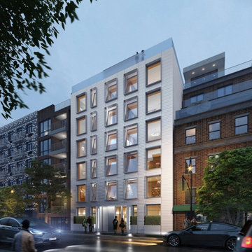
Located in the heart of Manhattan’s Lower East Side, the building was erected on a shallow commercial lot between two 120 year old masonry buildings and a new residential rental building. 330 Grand Street is a mix of 725 SF 1BRs and 1050 SF 2BR apartments. It also contains a 1100 SF two story duplex as well as private and public rooftop space, large private balconies for most units and two large private terraces for the ground floor units.
330 Grand Street was originally designed and approved at the NYC DOB as a prefabricated modular building. During the pandemic, as shipping costs skyrocketed putting the project at risk, we suggested redesigning the building as a reinforced cast-in-place concrete structure. Concrete was readily available and prices had not been affected by the demand increase that many other materials suffered in the pandemic. We took this opportunity to raise floor to ceiling heights, enlarge high performance windows and redistribute the buildings MEPFS and Structural Systems to create very open floor plans.
The challenge was to create a luxurious sensorial living experience with very limited means. In a city with very high construction costs, low cost residential buildings in the area are usually devoid of good quality, design and character. Our approach was to aim high for the end user, prioritizing natural light, open space with long visual perspectives, high ceilings and as always, rejecting the use of predefined building templates.
Our biggest challenge was to ensure that the small spaces feel as clean cut, large and bright as possible. Several unique design decisions were made to ensure low cost and high quality;
Floor plans were laid out so that spaces were wide open and free of clutter from mechanical or structural interruptions. Therefore all infrastructure was placed in lateral demising walls, which in turn act as the unit’s storage and kitchen. The apartments feel wide open, are super quiet and have more storage space than any other comparable apartment in the city.
To solve the problem of the site’s shallow commercial lot which is typically prone to dark interior spaces we focused our attention on the building’s envelope. Instead of the usual small punched window openings, oversized high performance windows were designed to ensure that light penetrated as far as possible into the units. In the smaller 1BR units, the full 50’ depth of the lot is perceived by partitioning spaces with sliding pocket doors that can be retracted to allow deep visual perspectives, making the sight lines in the space feel longer, larger, more ample than normal. In addition to the full height glazing, each unit above the 2nd floor receives a 7 foot covered balcony, adding 120 to 240 sf to each apartment, something unusual in New York City buildings. The space is large enough for a full size dining table, when the weather permits being outside.
We also worked hard to ensure modularity. For example, all kitchen units are all identical throughout the building. The idea of modularity and the economy of the repetitive unit is exercised to the maximum through the building.
Hardware, appliances, flooring, wall coverings and material finishes are all carefully selected to feel bespoke, high quality and unique.
It was important to KURV that the result of this work manifest into something that would deeply connect with the end user and sustain relationships with the consumers of this space.
All images by KURV Architecture ©
 KURV Architecture DPC (Alex Hughes Architects)
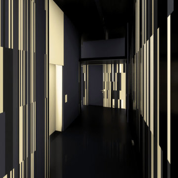
Located in the heart of Manhattan’s Lower East Side, the building was erected on a shallow commercial lot between two 120 year old masonry buildings and a new residential rental building. 330 Grand Street is a mix of 725 SF 1BRs and 1050 SF 2BR apartments. It also contains a 1100 SF two story duplex as well as private and public rooftop space, large private balconies for most units and two large private terraces for the ground floor units.
330 Grand Street was originally designed and approved at the NYC DOB as a prefabricated modular building. During the pandemic, as shipping costs skyrocketed putting the project at risk, we suggested redesigning the building as a reinforced cast-in-place concrete structure. Concrete was readily available and prices had not been affected by the demand increase that many other materials suffered in the pandemic. We took this opportunity to raise floor to ceiling heights, enlarge high performance windows and redistribute the buildings MEPFS and Structural Systems to create very open floor plans.
The challenge was to create a luxurious sensorial living experience with very limited means. In a city with very high construction costs, low cost residential buildings in the area are usually devoid of good quality, design and character. Our approach was to aim high for the end user, prioritizing natural light, open space with long visual perspectives, high ceilings and as always, rejecting the use of predefined building templates.
Our biggest challenge was to ensure that the small spaces feel as clean cut, large and bright as possible. Several unique design decisions were made to ensure low cost and high quality;
Floor plans were laid out so that spaces were wide open and free of clutter from mechanical or structural interruptions. Therefore all infrastructure was placed in lateral demising walls, which in turn act as the unit’s storage and kitchen. The apartments feel wide open, are super quiet and have more storage space than any other comparable apartment in the city.
To solve the problem of the site’s shallow commercial lot which is typically prone to dark interior spaces we focused our attention on the building’s envelope. Instead of the usual small punched window openings, oversized high performance windows were designed to ensure that light penetrated as far as possible into the units. In the smaller 1BR units, the full 50’ depth of the lot is perceived by partitioning spaces with sliding pocket doors that can be retracted to allow deep visual perspectives, making the sight lines in the space feel longer, larger, more ample than normal. In addition to the full height glazing, each unit above the 2nd floor receives a 7 foot covered balcony, adding 120 to 240 sf to each apartment, something unusual in New York City buildings. The space is large enough for a full size dining table, when the weather permits being outside.
We also worked hard to ensure modularity. For example, all kitchen units are all identical throughout the building. The idea of modularity and the economy of the repetitive unit is exercised to the maximum through the building.
Hardware, appliances, flooring, wall coverings and material finishes are all carefully selected to feel bespoke, high quality and unique.
It was important to KURV that the result of this work manifest into something that would deeply connect with the end user and sustain relationships with the consumers of this space.
All images by KURV Architecture ©
 Chelsea Design Company
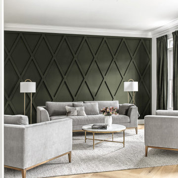
Example of a mid-sized transitional formal light wood floor and wood wall living room design in St Louis with green walls
Find the right local pro for your project
 Studio Steidley
Michael Hunter Photography
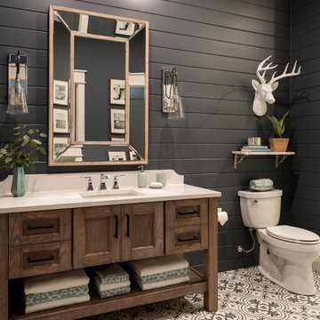
Alcove shower - small coastal 3/4 white tile and cement tile cement tile floor and multicolored floor alcove shower idea with shaker cabinets, medium tone wood cabinets, a two-piece toilet, black walls, an undermount sink, quartz countertops and a hinged shower door
Alcove shower - small coastal 3/4 white tile and cement tile cement tile floor and multicolored floor alcove shower idea with shaker cabinets, medium tone wood cabinets, a two-piece toilet, black walls, an undermount sink, quartz countertops and a hinged shower door
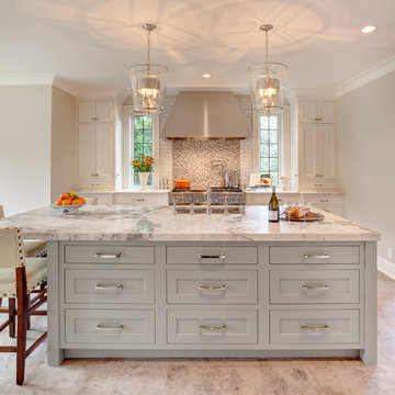
 collaborative interiors
Cabinet design by: Collaborative Interiors |
Kitchen design by: Beverly Bradshaw Interiors |
Remodeler: McKinney Group |
Photographer: Tom Marks Photo |
***Please visit the Houzz page of Beverly Bradshaw Interiors for any info regarding this project***
 Aria Design Inc
Architecture by Horst Architects
www.horst-architects.com
John Ellis Photography
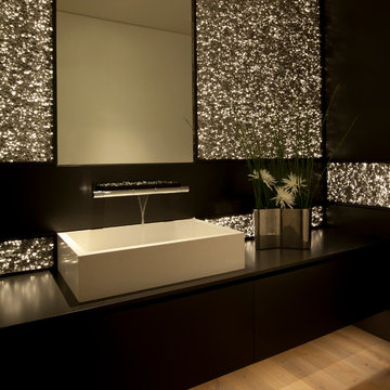
Powder room - contemporary black tile powder room idea in Orange County with a vessel sink and black countertops
Powder room - contemporary black tile powder room idea in Orange County with a vessel sink and black countertops
 Kipnis Architecture + Planning
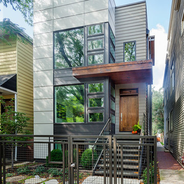
The exterior of this home is a modern composition of intersecting masses and planes, all cleanly proportioned. The natural wood overhang and front door stand out from the monochromatic taupe/bronze color scheme. http://www.kipnisarch.com
Cable Photo/Wayne Cable http://selfmadephoto.com

Sponsored
Sunbury, OH

J.Holderby - Renovations
Franklin County's Leading General Contractors - 2X Best of Houzz!
 Morningstar Stone & Tile
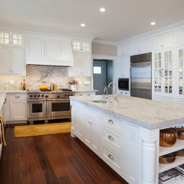
Example of a classic u-shaped dark wood floor kitchen design in Portland Maine with recessed-panel cabinets, white cabinets, an island and marble backsplash
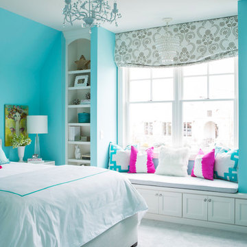
 O’Hara Interiors
Martha O'Hara Interiors, Interior Design & Photo Styling | Troy Thies, Photography | Stonewood Builders LLC | Artwork by Bonnie Hawley
Please Note: All “related,” “similar,” and “sponsored” products tagged or listed by Houzz are not actual products pictured. They have not been approved by Martha O’Hara Interiors nor any of the professionals credited. For information about our work, please contact design@oharainteriors.com.
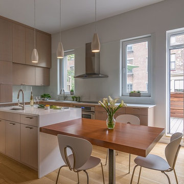
 ZeroEnergy Design
This renovated brick rowhome in Boston’s South End offers a modern aesthetic within a historic structure, creative use of space, exceptional thermal comfort, a reduced carbon footprint, and a passive stream of income.
DESIGN PRIORITIES. The goals for the project were clear - design the primary unit to accommodate the family’s modern lifestyle, rework the layout to create a desirable rental unit, improve thermal comfort and introduce a modern aesthetic. We designed the street-level entry as a shared entrance for both the primary and rental unit. The family uses it as their everyday entrance - we planned for bike storage and an open mudroom with bench and shoe storage to facilitate the change from shoes to slippers or bare feet as they enter their home. On the main level, we expanded the kitchen into the dining room to create an eat-in space with generous counter space and storage, as well as a comfortable connection to the living space. The second floor serves as master suite for the couple - a bedroom with a walk-in-closet and ensuite bathroom, and an adjacent study, with refinished original pumpkin pine floors. The upper floor, aside from a guest bedroom, is the child's domain with interconnected spaces for sleeping, work and play. In the play space, which can be separated from the work space with new translucent sliding doors, we incorporated recreational features inspired by adventurous and competitive television shows, at their son’s request.
MODERN MEETS TRADITIONAL. We left the historic front facade of the building largely unchanged - the security bars were removed from the windows and the single pane windows were replaced with higher performing historic replicas. We designed the interior and rear facade with a vision of warm modernism, weaving in the notable period features. Each element was either restored or reinterpreted to blend with the modern aesthetic. The detailed ceiling in the living space, for example, has a new matte monochromatic finish, and the wood stairs are covered in a dark grey floor paint, whereas the mahogany doors were simply refinished. New wide plank wood flooring with a neutral finish, floor-to-ceiling casework, and bold splashes of color in wall paint and tile, and oversized high-performance windows (on the rear facade) round out the modern aesthetic.
RENTAL INCOME. The existing rowhome was zoned for a 2-family dwelling but included an undesirable, single-floor studio apartment at the garden level with low ceiling heights and questionable emergency egress. In order to increase the quality and quantity of space in the rental unit, we reimagined it as a two-floor, 1 or 2 bedroom, 2 bathroom apartment with a modern aesthetic, increased ceiling height on the lowest level and provided an in-unit washer/dryer. The apartment was listed with Jackie O'Connor Real Estate and rented immediately, providing the owners with a source of passive income.
ENCLOSURE WITH BENEFITS. The homeowners sought a minimal carbon footprint, enabled by their urban location and lifestyle decisions, paired with the benefits of a high-performance home. The extent of the renovation allowed us to implement a deep energy retrofit (DER) to address air tightness, insulation, and high-performance windows. The historic front facade is insulated from the interior, while the rear facade is insulated on the exterior. Together with these building enclosure improvements, we designed an HVAC system comprised of continuous fresh air ventilation, and an efficient, all-electric heating and cooling system to decouple the house from natural gas. This strategy provides optimal thermal comfort and indoor air quality, improved acoustic isolation from street noise and neighbors, as well as a further reduced carbon footprint. We also took measures to prepare the roof for future solar panels, for when the South End neighborhood’s aging electrical infrastructure is upgraded to allow them.
URBAN LIVING. The desirable neighborhood location allows the both the homeowners and tenant to walk, bike, and use public transportation to access the city, while each charging their respective plug-in electric cars behind the building to travel greater distances.
OVERALL. The understated rowhouse is now ready for another century of urban living, offering the owners comfort and convenience as they live life as an expression of their values.
Photography: Eric Roth Photo
 JDS Construction, LLC
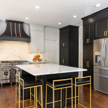
Waypoint Painted Harbor and Homecrest Painted Onyx cabinets, Laza Nuevo Quartz countertops and full height backsplash, custom Copper Range hood,
Sharp built-in microwave, 48" gas range, Palmetto Road Solid red oak hardwood 5" x 3/4", champagne bronze faucets, knobs, pulls, and light fixtures...all topped off with LED recess lighting, LED interior cabinet lighting, and LED under-cabinet lighting for the perfect space for the perfect meal for a family dinner
 A.Jennison Interiors
Photo - Jessica Glynn Photography
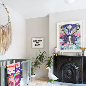
Mid-sized eclectic girl light wood floor and beige floor nursery photo in New York with gray walls
Mid-sized eclectic girl light wood floor and beige floor nursery photo in New York with gray walls
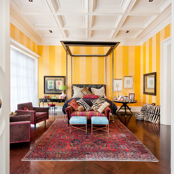
 IC360 Images/Jim Tschetter
Jim Tschetter/IC360 Images www.ic360images.com
Example of a trendy bedroom design in Chicago
Example of a trendy bedroom design in Chicago
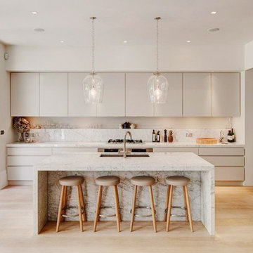

 Idea Space Architecture + Design
All images by Bob Wallace Photo Group
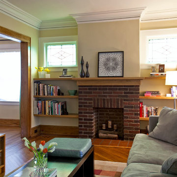
Inspiration for a mid-sized transitional medium tone wood floor living room remodel in New York with yellow walls, a standard fireplace and a brick fireplace
Inspiration for a mid-sized transitional medium tone wood floor living room remodel in New York with yellow walls, a standard fireplace and a brick fireplace
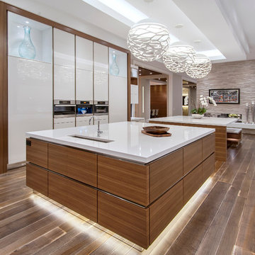
 Bow Valley Kitchens Ltd.
Example of a trendy l-shaped dark wood floor enclosed kitchen design in Calgary with an undermount sink, flat-panel cabinets, white cabinets, quartzite countertops, multicolored backsplash, matchstick tile backsplash, stainless steel appliances and an island

 Scott Christopher Homes
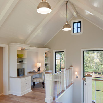
Mid-sized transitional built-in desk light wood floor and brown floor home office photo in Grand Rapids with beige walls

Sponsored
Columbus, OH

Wannemacher Interiors
Customized Award-Winning Interior Design Solutions in Franklin Cnty OH
 Robeson Design
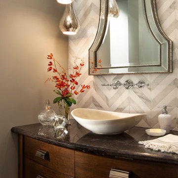
The powder room has a beautiful sculptural mirror that complements the mercury glass hanging pendant lights. The chevron tiled backsplash adds visual interest while creating a focal wall.
 Kathleen Jennison
An Arts & Crafts Bungalow is one of my favorite styles of homes. We have quite a few of them in our Stockton Mid-Town area. And when C&L called us to help them remodel their 1923 American Bungalow, I was beyond thrilled.
As per usual, when we get a new inquiry, we quickly Google the project location while we are talking to you on the phone. My excitement escalated when I saw the Google Earth Image of the sweet Sage Green bungalow in Mid-Town Stockton. "Yes, we would be interested in working with you," I said trying to keep my cool.
But what made it even better was meeting C&L and touring their home, because they are the nicest young couple, eager to make their home period perfect. Unfortunately, it had been slightly molested by some bad house-flippers, and we needed to bring the bathroom back to it "roots."
We knew we had to banish the hideous brown tile and cheap vanity quickly. But C&L complained about the condensation problems and the constant fight with mold. This immediately told me that improper remodeling had occurred and we needed to remedy that right away.
The Before: Frustrations with a Botched Remodel
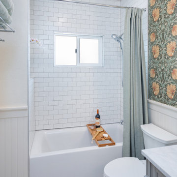
The bathroom needed to be brought back to period appropriate design with all the functionality of a modern bathroom. We thought of things like marble countertop, white mosaic floor tiles, white subway tile, board and batten molding, and of course a fabulous wallpaper.
This small (and only) bathroom on a tight budget required a little bit of design sleuthing to figure out how we could get the proper look and feel. Our goal was to determine where to splurge and where to economize and how to complete the remodel as quickly as possible because C&L would have to move out while construction was going on.
The Process: Hard Work to Remedy Design and Function
During our initial design study, (which included 2 hours in the owners’ home), we noticed framed images of William Morris Arts and Crafts textile patterns and knew this would be our design inspiration. We presented C&L with three options and they quickly selected the Pimpernel Design Concept.
We had originally selected the Black and Olive colors with a black vanity, mirror, and black and white floor tile. C&L liked it but weren’t quite sure about the black, We went back to the drawing board and decided the William & Co Pimpernel Wallpaper in Bayleaf and Manilla color with a softer gray painted vanity and mirror and white floor tile was more to their liking.
After the Design Concept was approved, we went to work securing the building permit, procuring all the elements, and scheduling our trusted tradesmen to perform the work.
We did uncover some shoddy work by the flippers such as live electrical wires hidden behind the wall, plumbing venting cut-off and buried in the walls (hence the constant dampness), the tub barely balancing on two fence boards across the floor joist, and no insulation on the exterior wall.
All of the previous blunders were fixed and the bathroom put back to its previous glory. We could feel the house thanking us for making it pretty again.
The After Reveal: Cohesive Design Decisions
We selected a simple white subway tile for the tub/shower. This is always classic and in keeping with the style of the house.
We selected a pre-fab vanity and mirror, but they look rich with the quartz countertop. There is much more storage in this small vanity than you would think.
The Transformation: A Period Perfect Refresh
We began the remodel just as the pandemic reared and stay-in-place orders went into effect. As C&L were already moved out and living with relatives, we got the go-ahead from city officials to get the work done (after all, how can you shelter in place without a bathroom?).
All our tradesmen were scheduled to work so that only one crew was on the job site at a time. We stayed on the original schedule with only a one week delay.
The end result is the sweetest little bathroom I've ever seen (and I can't wait to start work on C&L's kitchen next).
Thank you for joining me in this project transformation. I hope this inspired you to think about being creative with your design projects, determining what works best in keeping with the architecture of your space, and carefully assessing how you can have the best life in your home.
 designpad architecture - Patrick Perez Architect
Adam Rouse & Patrick Perez
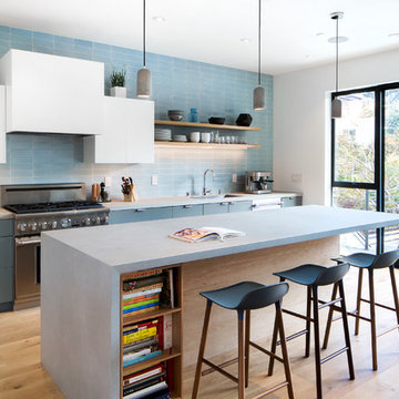
Inspiration for a contemporary galley light wood floor kitchen remodel in San Francisco with flat-panel cabinets, blue cabinets, concrete countertops, blue backsplash, stainless steel appliances and an island
Inspiration for a contemporary galley light wood floor kitchen remodel in San Francisco with flat-panel cabinets, blue cabinets, concrete countertops, blue backsplash, stainless steel appliances and an island
22