
Search results for "Allow" in Home Design Ideas
 Andrew Snow Photography
Photo: Andrew Snow © 2015 Houzz
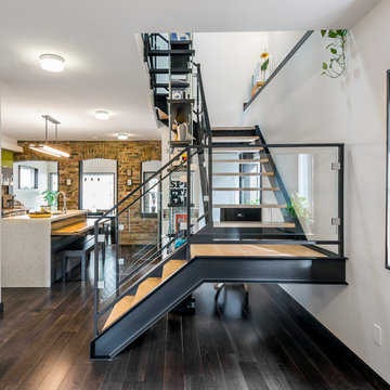
Minimalist wooden u-shaped open staircase photo in Toronto
Minimalist wooden u-shaped open staircase photo in Toronto

 Eileen Deschapelles Interior Design
Photography: Philip Ennis Productions.
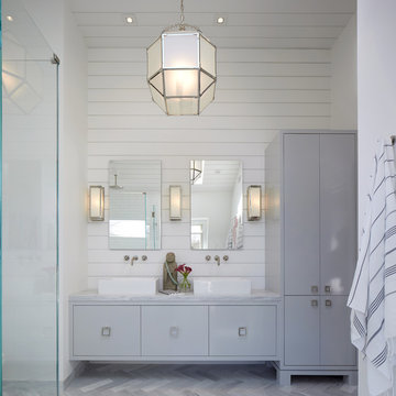
Example of a large minimalist master white tile and subway tile marble floor and gray floor walk-in shower design in New York with a two-piece toilet, white walls, a pedestal sink, flat-panel cabinets, gray cabinets and marble countertops
Example of a large minimalist master white tile and subway tile marble floor and gray floor walk-in shower design in New York with a two-piece toilet, white walls, a pedestal sink, flat-panel cabinets, gray cabinets and marble countertops
Find the right local pro for your project
 Ward Jewell Architect AIA
San Marino based clients were interested in developing a property that had been in their family for generations. This was an exciting proposition as it was one of the last surviving bayside double lots on the scenic Coronado peninsula in San Diego. They desired a holiday home that would be a gathering place for their large, close- knit family.
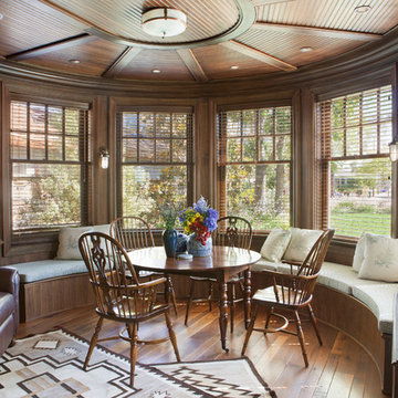
San Marino based clients were interested in developing a property that had been in their family for generations. This was an exciting proposition as it was one of the last surviving bayside double lots on the scenic Coronado peninsula in San Diego. They desired a holiday home that would be a gathering place for their large, close-knit family. Facing the Back Bay, overlooking downtown and the Bay Bridge, this property presented us with a unique opportunity to design a vacation home with a dual personality. One side faces a bustling harbor with a constant parade of yachts, cargo vessels and military ships while the other opens onto a deep, quiet contemplative garden. The home’s shingle-style influence carries on the historical Coronado tradition of clapboard and Craftsman bungalows built in the shadow of the great Hotel Del Coronado which was erected at the turn of the last century. In order to create an informal feel to the residence, we devised a concept that eliminated the need for a “front door”. Instead, one walks through the garden and enters the “Great Hall” through either one of two French doors flanking a walk-in stone fireplace. Both two-story bedroom wings bookend this central wood beam vaulted room which serves as the “heart of the home”, and opens to both views. Three sets of stairs are discretely tucked away inside the bedroom wings.
In lieu of a formal dining room, the family convenes and dines around a beautiful table and banquette set into a circular window bay off the kitchen which overlooks the lights of the city beyond the harbor. Working with noted interior designer Betty Ann Marshall, we designed a unique kitchen that was inspired by the colors and textures of a fossil the couple found on a honeymoon trip to the quarries of Montana. We set that ancient fossil into a matte glass backsplash behind the professional cook’s stove. A warm library with walnut paneling and a bayed window seat affords a refuge for the family to read or play board games. The couple’s fine craft and folk art collection is on prominent display throughout the house and helps to set an intimate and whimsical tone.
Another architectural feature devoted to family is the play room lit by a dramatic cupola which beacons the older grandchildren and their friends. Below the play room is a four car garage that allows the patriarch space to refurbish an antique fire truck, a mahogany launch boat and several vintage cars. Their jet skis and kayaks are housed in another garage designed for that purpose. Lattice covered skylights that allow dappled sunlight to bathe the loggia affords a comfortable refuge to watch the kids swim and gaze out upon the rushing water, the Coronado Bay Bridge and the romantic downtown San Diego skyline.
Architect: Ward Jewell Architect, AIA
Interior Design: Betty Ann Marshall
Construction: Bill Lyons
Photographer: Laura Hull
Styling: Zale Design Studio
 JMJ Studios
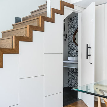
Custom casework by Frank Leonardo, Leonardo Custom Cabinetry.
Catherine Nguyen Photography
Inspiration for a modern home office remodel in San Francisco
Inspiration for a modern home office remodel in San Francisco
 Abda Custom Window Fashions
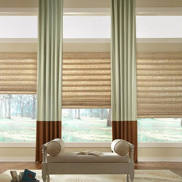
These seamed draperies are a great solution for two story windows. Adding fabric softens the space and having the second color on the bottom balances out the tall ceilings.
Layer the draperies with the woven wood roman shades for a gorgeous look.
**UPDATE** We also work with clients all over the country! Our virtual designers have experience as local and long distance design consultants. Our designers offer professional fabric and design recommendations, free estimates and have a great ability to communicate via email or phone to help conceptualize the project and see it through to the final stages. Fabric samples are mailed directly to you and we also provide easy installation guides.
For clients out of the Indiana area, we now have a professionally trained interior designer! Our "virtual designer" can help you with your project and ship your custom items directly to you at a fraction of the cost without compromising on quality! Let our design specialists help you today!
We're very excited to announce that we were featured on HOUZZ! Click the link below to check out the article!
http://www.houzz.com/ideabooks/30722151/list/design-workshop-shutters-all-grown-up
Abda Window fashions of Indianapolis has custom curtains, drapes, valances, cornices, pillows and hardware in a variety of fabrics and finishes. Curtains and drapes are great alone or paired with a hard window treatment for the ultimate fashion statement. All of our curtains, drapes, valances, cornices and pillows are custom-made from our own workroom. We also make custom bedding and upholstery. We have a huge selection of fabrics that will match any style.
Our custom, affordable draperies, curtains and sheers are now available to anyone in the US. We make them in our own workroom and ship them anywhere in the US! Talk with our professional design specialists and let them help you transform your home! It’s simple and easy. This is a great solution for persons who live out of state or are too busy for a traditional home consultation. With our great reviews, solid company and company values- you know that you’re home is in great hands!
We also have ready-made curtains and bedding available too! And don’t forget our custom hardware! You can also check out our houzz.com store for great window fashion products, including our exclusive bendable rods!
To see our new line, contact Talitha at 317-273-8343 or email: talitha@abdawindowfashions.com or check out our houzz.com store!
For our local customers we offer, FREE In-home consultation or showroom appointment to meet your lifestyle and design needs. At Abda, we have the perfect blend of high-end and affordable solutions for every style and budget. Affordable doesn’t mean cheap! We pride ourselves on quality products with excellent service. We’re so confident of our products that we give our customers more than the manufacturers guarantee!
We give our customers an additional 2 year warranty on top of the manufacturers guarantee!
At Abda, you will find knowledgeable staff that will turn your visions into a reality. Stop in our showroom or schedule a Free In-home consultation today! We know you will be happy with the results but don’t take our word for it, check out what some of our customers say about us on Houzz and Angie’s List!
http://www.angieslist.com/companylist/us/in/indianapolis/abda-inc-custom-window-fashions-reviews-60394.htm?cid=ssabadge
Why Choose Us?
We have been in business since November 1998 and started in the window covering business by cleaning & repairing blinds. This gave us a unique perspective from most window covering dealers. We have always considered how well products hold up and which manufacturers stand behind their products the best. We let our clients know the benefits of more expensive products and give honest feedback. We take pride in showing alternative products to fit all budgets.
Our great testimonials on Angie’s List, Houzz.com and referrals have helped our company grow without the need for “conventional” advertising. Abda means ‘servant’. At Abda, we approach every customer with a servant’s attitude. This philosophy has helped our customers feel confident in their purchases and well-taken care of. Our number one focus is customer service and we believe in putting the customer’s needs first. We offer our clients an additional 2 year warranty on top of the manufacturer’s warranty and want each and every client to be completely happy with their purchase. We’ve been awarded the prestigious 2013 Angie’s List Super Service Award, an honor bestowed annually on approximately 5 percent of all the businesses rated on the nation’s leading provider of consumer reviews. We’ve grown over the years and have added more team members to our company and we’re very excited at the direction our company is going.
Check out our website for more information: www.abdawindowfashions.com
Below is a list of styles and types of curtains and draperies that we can help you with. No worries if you do not find what you’re looking for below! Since we have our own workroom, the sky is the limit. There’s no project too small or large! Our design specialists are great at helping you with window treatment ideas. Stop in our showroom or call today for a FREE in-home consultation. If you’re out of state, no problem! We’re now making our custom treatments and shipping them to you!
Call today (317-273-8343) for more information or email:
talitha@abdawindowfashions.com
Some of the styles and types:
Modern curtains & draperies,
Contemporary curtains & draperies,
Traditional curtains & draperies,
Transitional curtains & draperies,
Beach Style curtains & draperies,
Asian Style curtains & draperies,
Eclectic curtains & draperies,
Midcentury curtains & draperies,
Mediterranean curtains & draperies,
Farmhouse Style curtains & draperies
Kitchen curtains,
Living room curtains,
Dining room curtians,
Master Bedroom curtains,
Nursery curtains,
Children’s room curtains,
Guest bedroom curtains,
Areas that we serve for installation for curtains & draperies are listed below. (But we ship to anywhere in the US!) If you don’t see your city on the list, just give us a call and we will see what we can do.
Indianapolis curtains and draperies & surrounding areas,
Carmel curtains and draperies & surrounding areas,
Zionsville curtains and draperies & surrounding areas
Westfield curtains and draperies & surrounding areas,
Avon curtains and draperies & surrounding areas,
Greenwood curtains and draperies & surrounding areas,
 TKS Design Group
Free ebook, Creating the Ideal Kitchen. DOWNLOAD NOW
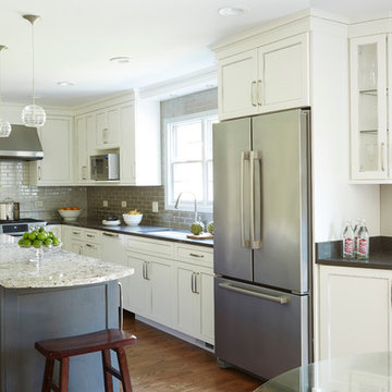
The homeowners of this mid-century Colonial and family of four were frustrated with the layout of their existing kitchen which was a small, narrow peninsula layout but that was adjoining a large space that they could not figure out how to use. Stealing part of the unused space seemed like an easy solution, except that there was an existing transition in floor height which made that a bit tricky. The solution of bringing the floor height up to meet the height of the existing kitchen allowed us to do just that.
This solution also offered some challenges. The exterior door had to be raised which resulted in some exterior rework, and the floor transition had to happen somewhere to get out to the garage, so we ended up “pushing” it towards what is now a new mudroom and powder room area. This solution allows for a small but functional and hidden mudroom area and more private powder room situation.
Another challenge of the design was the very narrow space. To minimize issues with this, we moved the location of the refrigerator into the newly found space which gave us an L-shaped layout allowing for an island and even some shallow pantry storage. The windows over the kitchen sink were expanded in size and relocated to allow more light into the room. A breakfast table fits perfectly in the area adjacent to the existing French doors and there was even room for a small bar area that helps transition from inside to outside for entertaining. The confusing unused space now makes sense and provides functionality on a daily basis.
To help bring some calm to this busy family, a pallet of soft neutrals was chosen -- gray glass tile with a simple metal accent strip, clear modern pendant lights and a neutral color scheme for cabinetry and countertops.
For more information on kitchen and bath design ideas go to: www.kitchenstudio-ge.com
 Duket Architects Planners
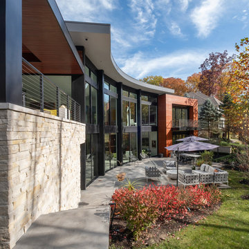
Not evident from the street, the parti for this new home is a sweeping arc of glass which forms an expansive panorama of a wooded river valley beyond in the rear. The lot is located in an established and planned neighborhood, which is adjacent to a heavily forested metropark.
The house is comprised of two levels; the primary living areas are located on the main level including the master bedroom suite. Additional living and entertaining areas are located below with access to the lower level outdoor living spaces. The large floor-to-ceiling curtain of glass and open floor plan allow all main living spaces access to views and light while affording privacy where required, primarily along the sides of the property.
Kitchen and eating areas include a large floating island which allows for meal preparation while entertaining, and the many large retracting glass doors allow for easy flow to the outdoor spaces.
The exterior materials were chosen for durability and minimal maintenance, including ultra- compact porcelain, stone, synthetic stucco, cement siding, stained fir roof underhangs and exterior ceilings. Lighting is downplayed with special fixtures where important areas are highlighted. The fireplace wall has a hidden door to the master suite veneered in concrete panels. The kitchen is sleek with hidden appliances behind full-height (responsibly harvested) rosewood veneer panels.
Interiors include a soft muted palette with minimalist fixtures and details. Careful attention was given to the variable ceiling heights throughout, for example in the foyer and dining room. The foyer area is raised and expressed as the large porcelain clad element of the entrance, and becomes a defining part of the composition of the façade from the street.
 TKS Design Group
Download our free ebook, Creating the Ideal Kitchen. DOWNLOAD NOW
Lakefront property in the northwest suburbs of Chicago is hard to come by, so when we were hired by this young family with exactly that, we were immediately inspired by not just the unusually large footprint of this 1950’s colonial revival but also the lovely views of the manmade lake it was sited on. The large 5-bedroom home was solidly stuck in the 1980’s, but we saw tons of potential. We started out by updating the existing staircase with a fresh coat of paint and adding new herringbone slate to the entry hall.
The powder room off the entryway also got a refresh - new flooring, new cabinets and fixtures. We ran the new slate right through into this space for some consistency. A fun wallpaper and shiplap trim add a welcoming feel and set the tone for the home.
Next, we tackled the kitchen. Located away from the rest of the first floor, the kitchen felt a little isolated, so we immediately began planning for how to better connect it to the rest of the first floor. We landed on removing the wall between the kitchen and dining room and designed a modified galley style space with separate cooking and clean up zones. The cooking zone consists of the refrigerator, prep sink and cooktop, along with a nice long run of prep space at the island. The cleanup side of the kitchen consists of the main sink and dishwasher. Both areas are situated so that the user can view the lake during prep work and cleanup!
One of the home’s main puzzles was how to incorporate the mudroom and area in front of the patio doors at the back of the house. We already had a breakfast table area, so the space by the patio doors was a bit of a no man’s land. We decided to separate the kitchen proper from what became the new mudroom with a large set of barn doors. That way you can quickly hide any mudroom messes but have easy access to the light coming in through the patio doors as well as the outdoor grilling station. We also love the impact the barn doors add to the overall space.
The homeowners’ first words to us were “it’s time to ditch the brown,” so we did! We chose a lovely blue pallet that reflects the home’s location on the lake which is also vibrant yet easy on the eye. Countertops are white quartz, and the natural oak floor works well with the other honey accents. The breakfast table was given a refresh with new chairs, chandelier and window treatments that frame the gorgeous views of the lake out the back.
We coordinated the slate mudroom flooring with that used in the home’s main entrance for a consistent feel. The storage area consists of open and closed storage to allow for some clutter control as needed.
Next on our “to do” list was revamping the dated brown bar area in the neighboring dining room. We eliminated the clutter by adding some closed cabinets and did some easy updates to help the space feel more current. One snag we ran into here was the discovery of a beam above the existing open shelving that had to be modified with a smaller structural beam to allow for our new design to work. This was an unexpected surprise, but in the end we think it was well worth it!
We kept the colors here a bit more muted to blend with the homeowner’s existing furnishings. Open shelving and polished nickel hardware add some simple detail to the new entertainment zone which also looks out onto the lake!
Next we tackled the upstairs starting with the homeowner’s son’s bath. The bath originally had both a tub shower and a separate shower, so we decided to swap out the shower for a new laundry area. This freed up some space downstairs in what used to be the mudroom/laundry room and is much more convenient for daily laundry needs.
We continued the blue palette here with navy cabinetry and the navy tile in the shower. Porcelain floor tile and chrome fixtures keep maintenance to a minimum while matte black mirrors and lighting add some depth the design. A low maintenance runner adds some warmth underfoot and ties the whole space together.
We added a pocket door to the bathroom to minimize interference with the door swings. The left door of the laundry closet is on a 180 degree hinge to allow for easy full access to the machines. Next we tackled the master bath which is an en suite arrangement. The original was typical of the 1980’s with the vanity outside of the bathroom, situated near the master closet. And the brown theme continued here with multiple shades of brown.
Our first move was to segment off the bath and the closet from the master bedroom. We created a short hall from the bedroom to the bathroom with his and hers walk-in closets on the left and right as well as a separate toilet closet outside of the main bathroom for privacy and flexibility.
The original bathroom had a giant soaking tub with steps (dangerous!) as well as a small shower that did not work well for our homeowner who is 6’3”. With other bathtubs in the home, they decided to eliminate the tub and create an oversized shower which takes up the space where the old tub was located. The double vanity is on the opposite wall and a bench is located under the window for morning conversations and a place to set a couple of towels.
The pallet in here is light and airy with a mix of blond wood, creamy porcelain and marble tile, and brass accents. A simple roman shade adds some texture and it’s top-down mechanism allows for light and privacy.
This large whole house remodel gave our homeowners not only the ability to maximize the potential of their home but also created a lovely new frame from which to view their fabulous lake views.
Designed by: Susan Klimala, CKD, CBD
Photography by: Michael Kaskel
For more information on kitchen and bath design ideas go to: www.kitchenstudio-ge.com
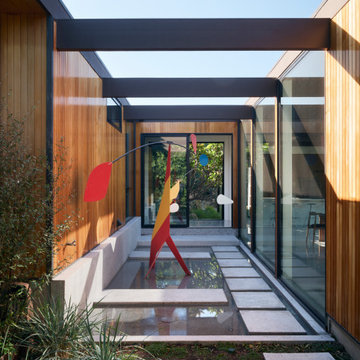
 Klopf Architecture
Malibu Glass Box House by Klopf Architecture
Following the devastating Woolsey Fire of 2018, the site in Malibu offered a unique opportunity to rebuild not just a home, but a new architectural composition that highlighted the property’s potential while navigating strict fire-rebuild codes in the area. Designed by Klopf Architecture, this project embraced a set of limitations and translated them into an architectural asset.
The city’s fire-rebuild process required the new structure to remain close to the original footprint, size and bulk, a constraint that ultimately clarified the architectural direction. Perched near the front of a long, narrow lot, the new home frames and overlooks a private, park-like rear expanse, an uncommon luxury especially in this part of Malibu .
Without a fixed program, the design process allowed for a different kind of creative focus allowing Klopf Architecture the opportunity to explore how a modernist home could best respond to this site. The team approached the project not with a list of requirements, but with a question: How might a modernist live here? What spatial qualities would inspire calm, connection, and a sense of wonder in this setting? The process became less about problem-solving and more about architectural storytelling—letting the site, the light, and the principles of modern design guide the form and flow of the home.
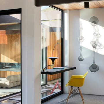
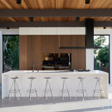
The response emerged in the form of a glass-box pavilion, an open, Mid-Century Modern inspired living, dining, and kitchen space that floats at the edge of the property’s natural descent. Connected to the more enclosed, private areas of the home by a glass-walled hallway, the living pavilion becomes a distinct centerpiece of the design. It opens on all four sides to the landscape with decks and patios on the flanks, an internal garden and water feature to the north, and a dramatic unguarded view of the expansive backyard and ocean horizon to the south.
Because of the mandated footprint, careful planning was required to ensure every space could still engage with light, landscape, or both. Strategic voids in the form of atriums and courtyards allow daylight to filter deep into the home’s core, while offering moments of surprise and retreat. These design gestures allow natural light to filter deep into the interior, creating a sense of brightness and openness throughout the day. At the same time, they expand the perceptual boundaries between inside and out, making the home feel more expansive while anchoring its connection to the surrounding landscape.
The siting of the house is what gives it its unique character. Rather than receding into the backyard like the neighboring homes, the house holds a slight prominence. From the central living pavilion, stepping down into the landscape feels more like entering a secluded park where a separate existing accessory structure, trail, and recreational areas await. The home’s modest street presence gives way to this unfolding drama of space, view, and nature.
Fire-resilient materials and assemblies are integrated seamlessly throughout including triple-pane glazing, under-slab and roof insulation, and locally sourced fire-rated cladding ensure the house not only meets Calfornia’s rigorous wildland-urban interface (WUI) standards, but feels effortlessly aligned with them. While technical decisions like fire-hardening and mechanical systems presented some construction challenges, particularly around the cantilevered glass box, the team found a functional compromise that preserved the integrity of the design.
Inside, a restrained palette and exposed post and beam design celebrate the ethos of mid-century modernism. A central circulation spine extends from the entry to the rear glass wall, offering a continuous visual link from street to ocean. Spaces such as the library and office, though more intimate in scale, are never cut off from nature as each opens to its own unique courtyard or garden view.
Though born out of a strict regulatory framework and developed without a specific client, the rebuild design unfolded with remarkable clarity. Grounded in site logic, refined by limitations and an emphasis on timeless spatial relationships – light, proportion, and a strong connection to nature, the resulting design feels both effortless and uplifting. The home lives lightly on the land, opens generously to its surroundings, and strikes a careful balance between privacy, openness, and calm. For Klopf Architecture, it stands as a compelling case study in how site, code, and circumstantial constraints can inspire enduring, modernist architecture. With years of experience reimagining mid-century modern design for how people live today, the firm took the project’s limitations as an opportunity. The result is a home shaped by open, flowing spaces, strong indoor-outdoor connections, and a calm, clear sense of structure. It’s a good reminder that even with strict constraints, there’s still room for architecture to breathe—and for modernism to keep moving forward.
Klopf Architecture project team: Geoff Campen, John Klopf, AIA, and Sherry Tan
Structural Engineer: ZFA
Contractor: Maison D’Artiste
Photography: ©2025 Mariko Reed
Year Completed: 2023
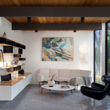 Klopf Architecture
Malibu Glass Box House by Klopf Architecture
Following the devastating Woolsey Fire of 2018, the site in Malibu offered a unique opportunity to rebuild not just a home, but a new architectural composition that highlighted the property’s potential while navigating strict fire-rebuild codes in the area. Designed by Klopf Architecture, this project embraced a set of limitations and translated them into an architectural asset.
The city’s fire-rebuild process required the new structure to remain close to the original footprint, size and bulk, a constraint that ultimately clarified the architectural direction. Perched near the front of a long, narrow lot, the new home frames and overlooks a private, park-like rear expanse, an uncommon luxury especially in this part of Malibu .
Without a fixed program, the design process allowed for a different kind of creative focus allowing Klopf Architecture the opportunity to explore how a modernist home could best respond to this site. The team approached the project not with a list of requirements, but with a question: How might a modernist live here? What spatial qualities would inspire calm, connection, and a sense of wonder in this setting? The process became less about problem-solving and more about architectural storytelling—letting the site, the light, and the principles of modern design guide the form and flow of the home.
The response emerged in the form of a glass-box pavilion, an open, Mid-Century Modern inspired living, dining, and kitchen space that floats at the edge of the property’s natural descent. Connected to the more enclosed, private areas of the home by a glass-walled hallway, the living pavilion becomes a distinct centerpiece of the design. It opens on all four sides to the landscape with decks and patios on the flanks, an internal garden and water feature to the north, and a dramatic unguarded view of the expansive backyard and ocean horizon to the south.
Because of the mandated footprint, careful planning was required to ensure every space could still engage with light, landscape, or both. Strategic voids in the form of atriums and courtyards allow daylight to filter deep into the home’s core, while offering moments of surprise and retreat. These design gestures allow natural light to filter deep into the interior, creating a sense of brightness and openness throughout the day. At the same time, they expand the perceptual boundaries between inside and out, making the home feel more expansive while anchoring its connection to the surrounding landscape.
The siting of the house is what gives it its unique character. Rather than receding into the backyard like the neighboring homes, the house holds a slight prominence. From the central living pavilion, stepping down into the landscape feels more like entering a secluded park where a separate existing accessory structure, trail, and recreational areas await. The home’s modest street presence gives way to this unfolding drama of space, view, and nature.
Fire-resilient materials and assemblies are integrated seamlessly throughout including triple-pane glazing, under-slab and roof insulation, and locally sourced fire-rated cladding ensure the house not only meets Calfornia’s rigorous wildland-urban interface (WUI) standards, but feels effortlessly aligned with them. While technical decisions like fire-hardening and mechanical systems presented some construction challenges, particularly around the cantilevered glass box, the team found a functional compromise that preserved the integrity of the design.
Inside, a restrained palette and exposed post and beam design celebrate the ethos of mid-century modernism. A central circulation spine extends from the entry to the rear glass wall, offering a continuous visual link from street to ocean. Spaces such as the library and office, though more intimate in scale, are never cut off from nature as each opens to its own unique courtyard or garden view.
Though born out of a strict regulatory framework and developed without a specific client, the rebuild design unfolded with remarkable clarity. Grounded in site logic, refined by limitations and an emphasis on timeless spatial relationships – light, proportion, and a strong connection to nature, the resulting design feels both effortless and uplifting. The home lives lightly on the land, opens generously to its surroundings, and strikes a careful balance between privacy, openness, and calm. For Klopf Architecture, it stands as a compelling case study in how site, code, and circumstantial constraints can inspire enduring, modernist architecture. With years of experience reimagining mid-century modern design for how people live today, the firm took the project’s limitations as an opportunity. The result is a home shaped by open, flowing spaces, strong indoor-outdoor connections, and a calm, clear sense of structure. It’s a good reminder that even with strict constraints, there’s still room for architecture to breathe—and for modernism to keep moving forward.
Klopf Architecture project team: Geoff Campen, John Klopf, AIA, and Sherry Tan
Structural Engineer: ZFA
Contractor: Maison D’Artiste
Photography: ©2025 Mariko Reed
Year Completed: 2023
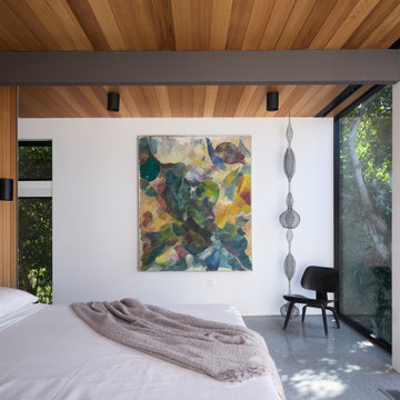 Klopf Architecture
Malibu Glass Box House by Klopf Architecture
Following the devastating Woolsey Fire of 2018, the site in Malibu offered a unique opportunity to rebuild not just a home, but a new architectural composition that highlighted the property’s potential while navigating strict fire-rebuild codes in the area. Designed by Klopf Architecture, this project embraced a set of limitations and translated them into an architectural asset.
The city’s fire-rebuild process required the new structure to remain close to the original footprint, size and bulk, a constraint that ultimately clarified the architectural direction. Perched near the front of a long, narrow lot, the new home frames and overlooks a private, park-like rear expanse, an uncommon luxury especially in this part of Malibu .
Without a fixed program, the design process allowed for a different kind of creative focus allowing Klopf Architecture the opportunity to explore how a modernist home could best respond to this site. The team approached the project not with a list of requirements, but with a question: How might a modernist live here? What spatial qualities would inspire calm, connection, and a sense of wonder in this setting? The process became less about problem-solving and more about architectural storytelling—letting the site, the light, and the principles of modern design guide the form and flow of the home.
The response emerged in the form of a glass-box pavilion, an open, Mid-Century Modern inspired living, dining, and kitchen space that floats at the edge of the property’s natural descent. Connected to the more enclosed, private areas of the home by a glass-walled hallway, the living pavilion becomes a distinct centerpiece of the design. It opens on all four sides to the landscape with decks and patios on the flanks, an internal garden and water feature to the north, and a dramatic unguarded view of the expansive backyard and ocean horizon to the south.
Because of the mandated footprint, careful planning was required to ensure every space could still engage with light, landscape, or both. Strategic voids in the form of atriums and courtyards allow daylight to filter deep into the home’s core, while offering moments of surprise and retreat. These design gestures allow natural light to filter deep into the interior, creating a sense of brightness and openness throughout the day. At the same time, they expand the perceptual boundaries between inside and out, making the home feel more expansive while anchoring its connection to the surrounding landscape.
The siting of the house is what gives it its unique character. Rather than receding into the backyard like the neighboring homes, the house holds a slight prominence. From the central living pavilion, stepping down into the landscape feels more like entering a secluded park where a separate existing accessory structure, trail, and recreational areas await. The home’s modest street presence gives way to this unfolding drama of space, view, and nature.
Fire-resilient materials and assemblies are integrated seamlessly throughout including triple-pane glazing, under-slab and roof insulation, and locally sourced fire-rated cladding ensure the house not only meets Calfornia’s rigorous wildland-urban interface (WUI) standards, but feels effortlessly aligned with them. While technical decisions like fire-hardening and mechanical systems presented some construction challenges, particularly around the cantilevered glass box, the team found a functional compromise that preserved the integrity of the design.
Inside, a restrained palette and exposed post and beam design celebrate the ethos of mid-century modernism. A central circulation spine extends from the entry to the rear glass wall, offering a continuous visual link from street to ocean. Spaces such as the library and office, though more intimate in scale, are never cut off from nature as each opens to its own unique courtyard or garden view.
Though born out of a strict regulatory framework and developed without a specific client, the rebuild design unfolded with remarkable clarity. Grounded in site logic, refined by limitations and an emphasis on timeless spatial relationships – light, proportion, and a strong connection to nature, the resulting design feels both effortless and uplifting. The home lives lightly on the land, opens generously to its surroundings, and strikes a careful balance between privacy, openness, and calm. For Klopf Architecture, it stands as a compelling case study in how site, code, and circumstantial constraints can inspire enduring, modernist architecture. With years of experience reimagining mid-century modern design for how people live today, the firm took the project’s limitations as an opportunity. The result is a home shaped by open, flowing spaces, strong indoor-outdoor connections, and a calm, clear sense of structure. It’s a good reminder that even with strict constraints, there’s still room for architecture to breathe—and for modernism to keep moving forward.
Klopf Architecture project team: Geoff Campen, John Klopf, AIA, and Sherry Tan
Structural Engineer: ZFA
Contractor: Maison D’Artiste
Photography: ©2025 Mariko Reed
Year Completed: 2023
 Cabinet Plant
See what our client say about working with us:
I started my search for a contractor about a year before I hired Paul to do a kitchen and bathroom renovation. This was my first time at the bat, and I really had no idea what to expect. I had many contractor proposals that swung wildly in price but for some reason I never felt inclined to hire any of the guys I met with. I happened to be looking at Houzz one day and came across Paul’s company and he had very good reviews. I gave him a call and he came to my apartment quickly. I liked him immediately when we met. I thought it was strange that he asked me for my budget and how much I wanted to spend but in hindsight, providing that information allowed Paul to come back to me with a very detailed proposal based on my budget. I soon realized that the lower proposals I had did not include many of the budget items that would be necessary to complete the job. Paul laid out the pricing and provided a very reasonable “allowance” based on your measurements for tile, toilet, sinks, etc. It is up to you to stay within that allowance.
Another reason I hired Paul was because of his design skills. Paul met me in the at tile stores several times and helped guide me in choosing tile and a style for the bathroom that really looks beautiful. I fought him a little but in the end, was glad I went with his recommendations. He also uses a kitchen cabinet maker so all the cabinets are custom to what you want. Paul also has a great customer website that allows you to see all the expenses, make choices, and easily communicate with him.
If you are planning to do a renovation, I think it helps to plan for the worst and hope for the best. I live in a co-op and we had a couple of little glitches and Paul was always quick to resolve issues as they arose. He was extremely responsive and really cared about the work and doing a good job. I would definitely hire Paul again if I needed a contractor.
 Klopf Architecture
Malibu Glass Box House by Klopf Architecture
Following the devastating Woolsey Fire of 2018, the site in Malibu offered a unique opportunity to rebuild not just a home, but a new architectural composition that highlighted the property’s potential while navigating strict fire-rebuild codes in the area. Designed by Klopf Architecture, this project embraced a set of limitations and translated them into an architectural asset.
The city’s fire-rebuild process required the new structure to remain close to the original footprint, size and bulk, a constraint that ultimately clarified the architectural direction. Perched near the front of a long, narrow lot, the new home frames and overlooks a private, park-like rear expanse, an uncommon luxury especially in this part of Malibu .
Without a fixed program, the design process allowed for a different kind of creative focus allowing Klopf Architecture the opportunity to explore how a modernist home could best respond to this site. The team approached the project not with a list of requirements, but with a question: How might a modernist live here? What spatial qualities would inspire calm, connection, and a sense of wonder in this setting? The process became less about problem-solving and more about architectural storytelling—letting the site, the light, and the principles of modern design guide the form and flow of the home.
The response emerged in the form of a glass-box pavilion, an open, Mid-Century Modern inspired living, dining, and kitchen space that floats at the edge of the property’s natural descent. Connected to the more enclosed, private areas of the home by a glass-walled hallway, the living pavilion becomes a distinct centerpiece of the design. It opens on all four sides to the landscape with decks and patios on the flanks, an internal garden and water feature to the north, and a dramatic unguarded view of the expansive backyard and ocean horizon to the south.
Because of the mandated footprint, careful planning was required to ensure every space could still engage with light, landscape, or both. Strategic voids in the form of atriums and courtyards allow daylight to filter deep into the home’s core, while offering moments of surprise and retreat. These design gestures allow natural light to filter deep into the interior, creating a sense of brightness and openness throughout the day. At the same time, they expand the perceptual boundaries between inside and out, making the home feel more expansive while anchoring its connection to the surrounding landscape.
The siting of the house is what gives it its unique character. Rather than receding into the backyard like the neighboring homes, the house holds a slight prominence. From the central living pavilion, stepping down into the landscape feels more like entering a secluded park where a separate existing accessory structure, trail, and recreational areas await. The home’s modest street presence gives way to this unfolding drama of space, view, and nature.
Fire-resilient materials and assemblies are integrated seamlessly throughout including triple-pane glazing, under-slab and roof insulation, and locally sourced fire-rated cladding ensure the house not only meets Calfornia’s rigorous wildland-urban interface (WUI) standards, but feels effortlessly aligned with them. While technical decisions like fire-hardening and mechanical systems presented some construction challenges, particularly around the cantilevered glass box, the team found a functional compromise that preserved the integrity of the design.
Inside, a restrained palette and exposed post and beam design celebrate the ethos of mid-century modernism. A central circulation spine extends from the entry to the rear glass wall, offering a continuous visual link from street to ocean. Spaces such as the library and office, though more intimate in scale, are never cut off from nature as each opens to its own unique courtyard or garden view.
Though born out of a strict regulatory framework and developed without a specific client, the rebuild design unfolded with remarkable clarity. Grounded in site logic, refined by limitations and an emphasis on timeless spatial relationships – light, proportion, and a strong connection to nature, the resulting design feels both effortless and uplifting. The home lives lightly on the land, opens generously to its surroundings, and strikes a careful balance between privacy, openness, and calm. For Klopf Architecture, it stands as a compelling case study in how site, code, and circumstantial constraints can inspire enduring, modernist architecture. With years of experience reimagining mid-century modern design for how people live today, the firm took the project’s limitations as an opportunity. The result is a home shaped by open, flowing spaces, strong indoor-outdoor connections, and a calm, clear sense of structure. It’s a good reminder that even with strict constraints, there’s still room for architecture to breathe—and for modernism to keep moving forward.
Klopf Architecture project team: Geoff Campen, John Klopf, AIA, and Sherry Tan
Structural Engineer: ZFA
Contractor: Maison D’Artiste
Photography: ©2025 Mariko Reed
Year Completed: 2023
 Klopf Architecture
Malibu Glass Box House by Klopf Architecture
Following the devastating Woolsey Fire of 2018, the site in Malibu offered a unique opportunity to rebuild not just a home, but a new architectural composition that highlighted the property’s potential while navigating strict fire-rebuild codes in the area. Designed by Klopf Architecture, this project embraced a set of limitations and translated them into an architectural asset.
The city’s fire-rebuild process required the new structure to remain close to the original footprint, size and bulk, a constraint that ultimately clarified the architectural direction. Perched near the front of a long, narrow lot, the new home frames and overlooks a private, park-like rear expanse, an uncommon luxury especially in this part of Malibu .
Without a fixed program, the design process allowed for a different kind of creative focus allowing Klopf Architecture the opportunity to explore how a modernist home could best respond to this site. The team approached the project not with a list of requirements, but with a question: How might a modernist live here? What spatial qualities would inspire calm, connection, and a sense of wonder in this setting? The process became less about problem-solving and more about architectural storytelling—letting the site, the light, and the principles of modern design guide the form and flow of the home.
The response emerged in the form of a glass-box pavilion, an open, Mid-Century Modern inspired living, dining, and kitchen space that floats at the edge of the property’s natural descent. Connected to the more enclosed, private areas of the home by a glass-walled hallway, the living pavilion becomes a distinct centerpiece of the design. It opens on all four sides to the landscape with decks and patios on the flanks, an internal garden and water feature to the north, and a dramatic unguarded view of the expansive backyard and ocean horizon to the south.
Because of the mandated footprint, careful planning was required to ensure every space could still engage with light, landscape, or both. Strategic voids in the form of atriums and courtyards allow daylight to filter deep into the home’s core, while offering moments of surprise and retreat. These design gestures allow natural light to filter deep into the interior, creating a sense of brightness and openness throughout the day. At the same time, they expand the perceptual boundaries between inside and out, making the home feel more expansive while anchoring its connection to the surrounding landscape.
The siting of the house is what gives it its unique character. Rather than receding into the backyard like the neighboring homes, the house holds a slight prominence. From the central living pavilion, stepping down into the landscape feels more like entering a secluded park where a separate existing accessory structure, trail, and recreational areas await. The home’s modest street presence gives way to this unfolding drama of space, view, and nature.
Fire-resilient materials and assemblies are integrated seamlessly throughout including triple-pane glazing, under-slab and roof insulation, and locally sourced fire-rated cladding ensure the house not only meets Calfornia’s rigorous wildland-urban interface (WUI) standards, but feels effortlessly aligned with them. While technical decisions like fire-hardening and mechanical systems presented some construction challenges, particularly around the cantilevered glass box, the team found a functional compromise that preserved the integrity of the design.
Inside, a restrained palette and exposed post and beam design celebrate the ethos of mid-century modernism. A central circulation spine extends from the entry to the rear glass wall, offering a continuous visual link from street to ocean. Spaces such as the library and office, though more intimate in scale, are never cut off from nature as each opens to its own unique courtyard or garden view.
Though born out of a strict regulatory framework and developed without a specific client, the rebuild design unfolded with remarkable clarity. Grounded in site logic, refined by limitations and an emphasis on timeless spatial relationships – light, proportion, and a strong connection to nature, the resulting design feels both effortless and uplifting. The home lives lightly on the land, opens generously to its surroundings, and strikes a careful balance between privacy, openness, and calm. For Klopf Architecture, it stands as a compelling case study in how site, code, and circumstantial constraints can inspire enduring, modernist architecture. With years of experience reimagining mid-century modern design for how people live today, the firm took the project’s limitations as an opportunity. The result is a home shaped by open, flowing spaces, strong indoor-outdoor connections, and a calm, clear sense of structure. It’s a good reminder that even with strict constraints, there’s still room for architecture to breathe—and for modernism to keep moving forward.
Klopf Architecture project team: Geoff Campen, John Klopf, AIA, and Sherry Tan
Structural Engineer: ZFA
Contractor: Maison D’Artiste
Photography: ©2025 Mariko Reed
Year Completed: 2023
 Haven Design and Construction
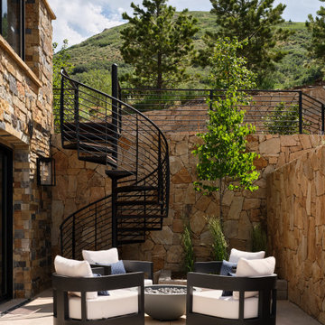
This lovely Mountain Modern Home in Littleton, Colorado is perched at the top of a hill, allowing for beautiful views of Chatfield Reservoir and the foothills of the Rocky Mountains. The pink and orange sunsets viewed from the front of this home are breathtaking. Our team custom designed the large pivoting front door and sized it at an impressive 5' x 9' to fit properly with the scale of this expansive home. We thoughtfully selected the streamlined rustic exterior materials and the sleek black framed windows to complement the home's modern exterior architecture. Wild grasses and native plantings, selected by the landscape architect, complete the exterior. Our team worked closely with the builder and the landscape architect to create a cohesive mix of stunning native materials and finishes. Stone retaining walls allow for a charming walk-out basement patio on the side of the home. The lower-level patio area connects to the upper backyard pool area with a custom iron spiral staircase. The lower-level patio features an inviting seating area that looks as if it was plucked directly from the Italian countryside. A round stone firepit in the middle of this seating area provides warmth and ambiance on chilly nights.
 Clark Design Build, LLC
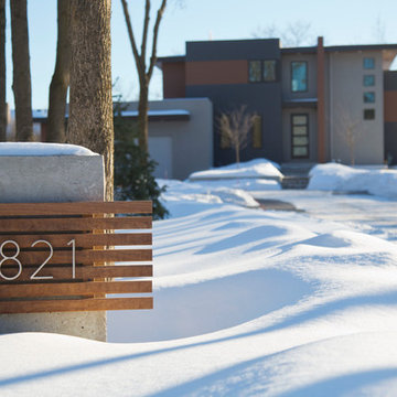
This home is located on a one acre parcel of land near the banks of the Milwaukee River in the older established subdivision of Sleepy Hollow Estates in Mequon, Wisconsin. The inspiration for this Glen Cove Residence was to bring the desired by many, contemporary and modern lifestyle of a down town loft and establish it in a neighborhood in the suburbs amongst traditional style homes.
Sleepy Hollow Estates like many older established neighborhoods throughout the North shore and Westside communities of Milwaukee had great local architects such as John Randall McDonald and Russell Barr Williamson, who built contemporary master pieces amongst very traditional style homes. This created diversity in the style of homes in these neighborhoods which for the people living in them and the people just passing by, an experience of harmony and cultural lifestyle.
Unfortunately today, many new neighborhood developments lack harmony and cultural lifestyle and don’t allow for homes such as this Glen Cove Residence to be built. And for that matter many of the homes built by John Randall McDonald and Russell Barr Williamson back in the 1950’s. When driving through these new developments, one would experience beautiful traditional style homes, but all the homes tend to look the same. There is no diversity in the styles of homes thus these neighborhoods lack the harmony and a cultural life style for the people who live there or what people are looking for when buying a home that reflects their lifestyle. This Glen Cove Residence is an example that a contemporary home which offers a modern lifestyle that many desires can be established amongst traditional homes while blending in with the neighborhood.
Don’t be fooled by the flat roof of this home, building technology has come a long way since Frank Lloyd Wright! The roof system on this home is more energy efficient than most roof systems builders are putting on traditional homes today and it doesn’t leak! This Glen Cove Residence was built using all traditional building materials that you would see in homes being built in new developments today. There is a misconception out there that modern homes are expensive to build. That is not true! This Glen Cove Residence was built for roughly $130 per square foot which is the same price one would pay for a similar builder’s model traditional style home with the same upgrades.
This Glen Cove Residence consists of three bedrooms and three and one half baths. All bedrooms are located on second floor with laundry, guest bath and a master suite. Located between the first and second floors off of the landing is an office/den space. The first floor is open concept with the kitchen, dining and living areas located at the rear of the home with expansive windows allowing a great connection to back yard area and outdoors. On the back of the home is a covered deck area allowing for outdoor entertaining without the worry of the elements. The first floor also offers a powder room, mudroom and walk-in pantry off the kitchen area. From the mudroom there is access to an attached four car tandem garage. From the first floor to the finished basement is an open stair allowing the basement area to feel as part of the house and not just a basement? The basement consists of a main living area, game area with wet bar, exercise room, kids play room with 14’ ceilings, full bathroom and mechanical room with storage closets throughout.
 Nick Noyes Architecture
Drew Kelly
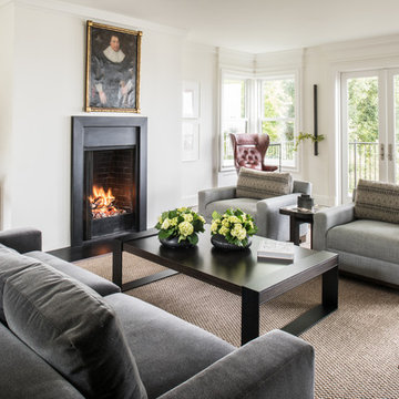
Living room - transitional open concept dark wood floor living room idea in San Francisco with white walls, a standard fireplace, a metal fireplace and no tv
Living room - transitional open concept dark wood floor living room idea in San Francisco with white walls, a standard fireplace, a metal fireplace and no tv
 TKS Design Group
Download our free ebook, Creating the Ideal Kitchen. DOWNLOAD NOW
Lakefront property in the northwest suburbs of Chicago is hard to come by, so when we were hired by this young family with exactly that, we were immediately inspired by not just the unusually large footprint of this 1950’s colonial revival but also the lovely views of the manmade lake it was sited on. The large 5-bedroom home was solidly stuck in the 1980’s, but we saw tons of potential. We started out by updating the existing staircase with a fresh coat of paint and adding new herringbone slate to the entry hall.
The powder room off the entryway also got a refresh - new flooring, new cabinets and fixtures. We ran the new slate right through into this space for some consistency. A fun wallpaper and shiplap trim add a welcoming feel and set the tone for the home.
Next, we tackled the kitchen. Located away from the rest of the first floor, the kitchen felt a little isolated, so we immediately began planning for how to better connect it to the rest of the first floor. We landed on removing the wall between the kitchen and dining room and designed a modified galley style space with separate cooking and clean up zones. The cooking zone consists of the refrigerator, prep sink and cooktop, along with a nice long run of prep space at the island. The cleanup side of the kitchen consists of the main sink and dishwasher. Both areas are situated so that the user can view the lake during prep work and cleanup!
One of the home’s main puzzles was how to incorporate the mudroom and area in front of the patio doors at the back of the house. We already had a breakfast table area, so the space by the patio doors was a bit of a no man’s land. We decided to separate the kitchen proper from what became the new mudroom with a large set of barn doors. That way you can quickly hide any mudroom messes but have easy access to the light coming in through the patio doors as well as the outdoor grilling station. We also love the impact the barn doors add to the overall space.
The homeowners’ first words to us were “it’s time to ditch the brown,” so we did! We chose a lovely blue pallet that reflects the home’s location on the lake which is also vibrant yet easy on the eye. Countertops are white quartz, and the natural oak floor works well with the other honey accents. The breakfast table was given a refresh with new chairs, chandelier and window treatments that frame the gorgeous views of the lake out the back.
We coordinated the slate mudroom flooring with that used in the home’s main entrance for a consistent feel. The storage area consists of open and closed storage to allow for some clutter control as needed.
Next on our “to do” list was revamping the dated brown bar area in the neighboring dining room. We eliminated the clutter by adding some closed cabinets and did some easy updates to help the space feel more current. One snag we ran into here was the discovery of a beam above the existing open shelving that had to be modified with a smaller structural beam to allow for our new design to work. This was an unexpected surprise, but in the end we think it was well worth it!
We kept the colors here a bit more muted to blend with the homeowner’s existing furnishings. Open shelving and polished nickel hardware add some simple detail to the new entertainment zone which also looks out onto the lake!
Next we tackled the upstairs starting with the homeowner’s son’s bath. The bath originally had both a tub shower and a separate shower, so we decided to swap out the shower for a new laundry area. This freed up some space downstairs in what used to be the mudroom/laundry room and is much more convenient for daily laundry needs.
We continued the blue palette here with navy cabinetry and the navy tile in the shower. Porcelain floor tile and chrome fixtures keep maintenance to a minimum while matte black mirrors and lighting add some depth the design. A low maintenance runner adds some warmth underfoot and ties the whole space together.
We added a pocket door to the bathroom to minimize interference with the door swings. The left door of the laundry closet is on a 180 degree hinge to allow for easy full access to the machines. Next we tackled the master bath which is an en suite arrangement. The original was typical of the 1980’s with the vanity outside of the bathroom, situated near the master closet. And the brown theme continued here with multiple shades of brown.
Our first move was to segment off the bath and the closet from the master bedroom. We created a short hall from the bedroom to the bathroom with his and hers walk-in closets on the left and right as well as a separate toilet closet outside of the main bathroom for privacy and flexibility.
The original bathroom had a giant soaking tub with steps (dangerous!) as well as a small shower that did not work well for our homeowner who is 6’3”. With other bathtubs in the home, they decided to eliminate the tub and create an oversized shower which takes up the space where the old tub was located. The double vanity is on the opposite wall and a bench is located under the window for morning conversations and a place to set a couple of towels.
The pallet in here is light and airy with a mix of blond wood, creamy porcelain and marble tile, and brass accents. A simple roman shade adds some texture and it’s top-down mechanism allows for light and privacy.
This large whole house remodel gave our homeowners not only the ability to maximize the potential of their home but also created a lovely new frame from which to view their fabulous lake views.
Designed by: Susan Klimala, CKD, CBD
Photography by: Michael Kaskel
For more information on kitchen and bath design ideas go to: www.kitchenstudio-ge.com
 TKS Design Group
Free ebook, Creating the Ideal Kitchen. DOWNLOAD NOW
The homeowners of this mid-century Colonial and family of four were frustrated with the layout of their existing kitchen which was a small, narrow peninsula layout but that was adjoining a large space that they could not figure out how to use. Stealing part of the unused space seemed like an easy solution, except that there was an existing transition in floor height which made that a bit tricky. The solution of bringing the floor height up to meet the height of the existing kitchen allowed us to do just that.
This solution also offered some challenges. The exterior door had to be raised which resulted in some exterior rework, and the floor transition had to happen somewhere to get out to the garage, so we ended up “pushing” it towards what is now a new mudroom and powder room area. This solution allows for a small but functional and hidden mudroom area and more private powder room situation.
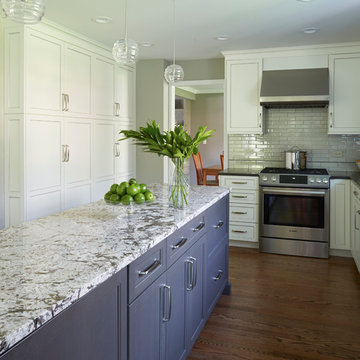
Another challenge of the design was the very narrow space. To minimize issues with this, we moved the location of the refrigerator into the newly found space which gave us an L-shaped layout allowing for an island and even some shallow pantry storage. The windows over the kitchen sink were expanded in size and relocated to allow more light into the room. A breakfast table fits perfectly in the area adjacent to the existing French doors and there was even room for a small bar area that helps transition from inside to outside for entertaining. The confusing unused space now makes sense and provides functionality on a daily basis.
To help bring some calm to this busy family, a pallet of soft neutrals was chosen -- gray glass tile with a simple metal accent strip, clear modern pendant lights and a neutral color scheme for cabinetry and countertops.
For more information on kitchen and bath design ideas go to: www.kitchenstudio-ge.com
18