
Search results for "Allow" in Home Design Ideas



Find the right local pro for your project
 Hammer & Hand
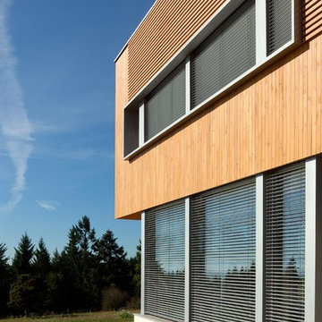
Karuna Passive House designed by Holst Architecture and built by Hammer & Hand. This high performance home meets the world's most demanding green building certifications. Photo by Jeremy Bittermann.
 Clark Design Build, LLC
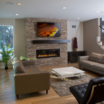
This home is located on a one acre parcel of land near the banks of the Milwaukee River in the older established subdivision of Sleepy Hollow Estates in Mequon, Wisconsin. The inspiration for this Glen Cove Residence was to bring the desired by many, contemporary and modern lifestyle of a down town loft and establish it in a neighborhood in the suburbs amongst traditional style homes.
Sleepy Hollow Estates like many older established neighborhoods throughout the North shore and Westside communities of Milwaukee had great local architects such as John Randall McDonald and Russell Barr Williamson, who built contemporary master pieces amongst very traditional style homes. This created diversity in the style of homes in these neighborhoods which for the people living in them and the people just passing by, an experience of harmony and cultural lifestyle.
Unfortunately today, many new neighborhood developments lack harmony and cultural lifestyle and don’t allow for homes such as this Glen Cove Residence to be built. And for that matter many of the homes built by John Randall McDonald and Russell Barr Williamson back in the 1950’s. When driving through these new developments, one would experience beautiful traditional style homes, but all the homes tend to look the same. There is no diversity in the styles of homes thus these neighborhoods lack the harmony and a cultural life style for the people who live there or what people are looking for when buying a home that reflects their lifestyle. This Glen Cove Residence is an example that a contemporary home which offers a modern lifestyle that many desires can be established amongst traditional homes while blending in with the neighborhood.
Don’t be fooled by the flat roof of this home, building technology has come a long way since Frank Lloyd Wright! The roof system on this home is more energy efficient than most roof systems builders are putting on traditional homes today and it doesn’t leak! This Glen Cove Residence was built using all traditional building materials that you would see in homes being built in new developments today. There is a misconception out there that modern homes are expensive to build. That is not true! This Glen Cove Residence was built for roughly $130 per square foot which is the same price one would pay for a similar builder’s model traditional style home with the same upgrades.
This Glen Cove Residence consists of three bedrooms and three and one half baths. All bedrooms are located on second floor with laundry, guest bath and a master suite. Located between the first and second floors off of the landing is an office/den space. The first floor is open concept with the kitchen, dining and living areas located at the rear of the home with expansive windows allowing a great connection to back yard area and outdoors. On the back of the home is a covered deck area allowing for outdoor entertaining without the worry of the elements. The first floor also offers a powder room, mudroom and walk-in pantry off the kitchen area. From the mudroom there is access to an attached four car tandem garage. From the first floor to the finished basement is an open stair allowing the basement area to feel as part of the house and not just a basement? The basement consists of a main living area, game area with wet bar, exercise room, kids play room with 14’ ceilings, full bathroom and mechanical room with storage closets throughout.

 House of L
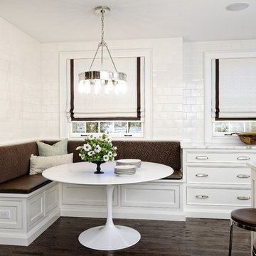
A 1927 colonial home in Shaker Heights, Ohio, received a breathtaking renovation that required extensive work, transforming it from a tucked away, utilitarian space, to an all-purpose gathering room, a role that most kitchens embrace in a home today. The scope of work changed over the course of the project, starting more minimalistically and then quickly becoming the main focus of the house's remodeling, resulting in a staircase being relocated and walls being torn down to create an inviting focal point to the home where family and friends could connect. The focus of the functionality was to allow for multiple prep areas with the inclusion of two islands and sinks, two eating areas (one for impromptu snacking and small meals of younger family members and friends on island no. two and a built-in bench seat for everyday meals in the immediate family). The kitchen was equipped with all Subzero and Wolf appliances, including a 48" range top with a 12" griddle, two double ovens, a 42" built-in side by side refrigerator and freezer, a microwave drawer on island no. one and a beverage center and icemaker in island no. two. The aesthetic feeling embraces the architectural feel of the home while adding a modern sensibility with the revamped layout and graphic elements that tie the color palette of whites, chocolate and charcoal. The cabinets were custom made and outfitted with beaded inset doors with a Shaker panel frame and finished in Benjamin Moore's OC-17 White Dove, a soft white that allowed for the kitchen to feel warm while still maintaining its brightness. Accents of walnut were added to create a sense of warmth, including a custom premium grade walnut countertop on island no. one from Brooks Custom and a TV cabinet with a doggie feeding station beneath. Bringing the cabinet line to the 8'6" ceiling height helps the room feel taller and bold light fixtures at the islands and eating area add detail to an otherwise simpler ceiling detail. The 1 1/4" countertops feature Calacatta Gold Marble with an ogee edge detail. Special touches on the interiors include secret storage panels, an appliance garage, breadbox, pull-out drawers behind the cabinet doors and all soft-close hinges and drawer glides. A kneading area was made as a part of island no. one for the homeowners' love of baking, complete with a stone top allowing for dough to stay cool. Baskets beneath store kitchen essentials that need air circulation. The room adjacent to the kitchen was converted to a hearth room (from a formal dining room) to extend the kitchen's living space and allow for a natural spillover for family and guests to spill into.
Jason Miller, Pixelate

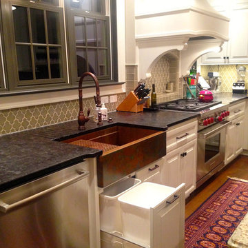
 Rachiele Custom Sinks
Customer comment: I have shown anyone and everyone who has walked into our home (even the copper roofing guy-who was very impressed by the way) our Rachiele sink. Honestly, my husband laughs because I am so in love with this sink and can't help myself but to tell everyone all the benefits of owning a Rachiele sink. Besides it being absolutely gorgeous I point out all the perks saying such things as, "why wouldn't you want to have both a full size trash and recycling can under your sink?". This is the best sink EVER! Teresa S.
This is a Rachiele Signature Series workstation sink with a custom rustic patina on the apron. As you can see, our sinks are shallow enough (and the drain is in the rear corner) that you can have a double trash pullout under your sink. That location is where most trash is generated. Why waste an entire valuable cabinet on trash storage?
So, what is the "Signature Series" Sink? It is the first sink where you can do all of your food preparation INSIDE the sink and keep your counters clean! No more cutting chicken on a cutting board next to the sink and having chicken "juice" running all over the countertop and possibly the floor. Everything is done inside the confines of the sink!
Offset sink drain location - Allows for set-off space and even a dish rack on the left side, while having the ability to wash dishes on the side with the drain. Use the sink like a double bowl sink without the divider in the way.
Long single bowl kitchen sinks - Double bowl sinks became extinct with the invention of the dishwasher. I feel a 36" to 42" long sink is the ultimate size for a Signature Series kitchen sink if you have the space in your kitchen for one. That being said, I use a 24" version at my home and it works nicely.
The Signature Series Kitchen Sink option - a 1/2" ledge, 2" down from the front and rear of the sink. This ledge allows for many timesaving components such as: Cutting boards and grid drains, This option is available on copper apron front sinks, under mount and top mount sinks - both in copper and stainless steel.
This sink is called the "Signature Series Sink" because I sign each sink. You can do all of your food preparation inside the confines of the sink instead of adjacent to the sink. When you prepare poultry, you generally have a cutting board to the side of the sink - and the chicken juice generally runs off the cutting board on to the countertop. What a mess! Now, you can set the raw chicken on the copper grid, place a custom poly cutting board adjacent to it (inside the bowl on the ledge) and do all the food prep with no mess on the countertop. There are some sinks out there with similar options, but they miscalculated. With theirs, the cutting board is either flush with the countertop or just above it. Imagine rinsing it off. The water will flow right onto the floor and counter. Ours has a recess that will not allow for that problem.
This sink is not designed like the Kohler Stages or DeGulio's sink..Their interior ledge for the cutting board appears that it is too high inside the sink. It seems impossible to me that you can run water over the cutting board without getting it all over the countertop. Our ledge is thoughtfully placed 2" down, so the 1" thick board is 1 inch below the top of the sink.
 House of L
A 1927 colonial home in Shaker Heights, Ohio, received a breathtaking renovation that required extensive work, transforming it from a tucked away, utilitarian space, to an all-purpose gathering room, a role that most kitchens embrace in a home today. The scope of work changed over the course of the project, starting more minimalistically and then quickly becoming the main focus of the house's remodeling, resulting in a staircase being relocated and walls being torn down to create an inviting focal point to the home where family and friends could connect. The focus of the functionality was to allow for multiple prep areas with the inclusion of two islands and sinks, two eating areas (one for impromptu snacking and small meals of younger family members and friends on island no. two and a built-in bench seat for everyday meals in the immediate family). The kitchen was equipped with all Subzero and Wolf appliances, including a 48" range top with a 12" griddle, two double ovens, a 42" built-in side by side refrigerator and freezer, a microwave drawer on island no. one and a beverage center and icemaker in island no. two. The aesthetic feeling embraces the architectural feel of the home while adding a modern sensibility with the revamped layout and graphic elements that tie the color palette of whites, chocolate and charcoal. The cabinets were custom made and outfitted with beaded inset doors with a Shaker panel frame and finished in Benjamin Moore's OC-17 White Dove, a soft white that allowed for the kitchen to feel warm while still maintaining its brightness. Accents of walnut were added to create a sense of warmth, including a custom premium grade walnut countertop on island no. one from Brooks Custom and a TV cabinet with a doggie feeding station beneath. Bringing the cabinet line to the 8'6" ceiling height helps the room feel taller and bold light fixtures at the islands and eating area add detail to an otherwise simpler ceiling detail. The 1 1/4" countertops feature Calacatta Gold Marble with an ogee edge detail. Special touches on the interiors include secret storage panels, an appliance garage, breadbox, pull-out drawers behind the cabinet doors and all soft-close hinges and drawer glides. A kneading area was made as a part of island no. one for the homeowners' love of baking, complete with a stone top allowing for dough to stay cool. Baskets beneath store kitchen essentials that need air circulation. The room adjacent to the kitchen was converted to a hearth room (from a formal dining room) to extend the kitchen's living space and allow for a natural spillover for family and guests to spill into.
Jason Miller, Pixelate
 Liz Miller Interiors
Jessica Delaney
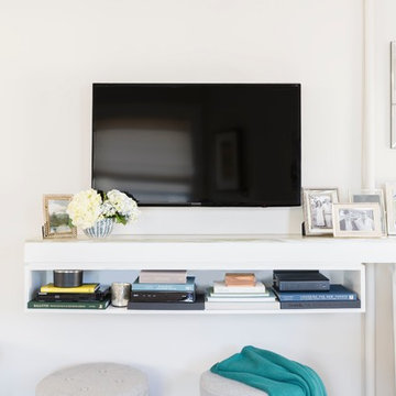
Living room - small transitional enclosed light wood floor living room idea in Boston with gray walls and a wall-mounted tv
Living room - small transitional enclosed light wood floor living room idea in Boston with gray walls and a wall-mounted tv

 TKS Design Group
Download our free ebook, Creating the Ideal Kitchen. DOWNLOAD NOW
Lakefront property in the northwest suburbs of Chicago is hard to come by, so when we were hired by this young family with exactly that, we were immediately inspired by not just the unusually large footprint of this 1950’s colonial revival but also the lovely views of the manmade lake it was sited on. The large 5-bedroom home was solidly stuck in the 1980’s, but we saw tons of potential. We started out by updating the existing staircase with a fresh coat of paint and adding new herringbone slate to the entry hall.
The powder room off the entryway also got a refresh - new flooring, new cabinets and fixtures. We ran the new slate right through into this space for some consistency. A fun wallpaper and shiplap trim add a welcoming feel and set the tone for the home.
Next, we tackled the kitchen. Located away from the rest of the first floor, the kitchen felt a little isolated, so we immediately began planning for how to better connect it to the rest of the first floor. We landed on removing the wall between the kitchen and dining room and designed a modified galley style space with separate cooking and clean up zones. The cooking zone consists of the refrigerator, prep sink and cooktop, along with a nice long run of prep space at the island. The cleanup side of the kitchen consists of the main sink and dishwasher. Both areas are situated so that the user can view the lake during prep work and cleanup!
One of the home’s main puzzles was how to incorporate the mudroom and area in front of the patio doors at the back of the house. We already had a breakfast table area, so the space by the patio doors was a bit of a no man’s land. We decided to separate the kitchen proper from what became the new mudroom with a large set of barn doors. That way you can quickly hide any mudroom messes but have easy access to the light coming in through the patio doors as well as the outdoor grilling station. We also love the impact the barn doors add to the overall space.
The homeowners’ first words to us were “it’s time to ditch the brown,” so we did! We chose a lovely blue pallet that reflects the home’s location on the lake which is also vibrant yet easy on the eye. Countertops are white quartz, and the natural oak floor works well with the other honey accents. The breakfast table was given a refresh with new chairs, chandelier and window treatments that frame the gorgeous views of the lake out the back.
We coordinated the slate mudroom flooring with that used in the home’s main entrance for a consistent feel. The storage area consists of open and closed storage to allow for some clutter control as needed.
Next on our “to do” list was revamping the dated brown bar area in the neighboring dining room. We eliminated the clutter by adding some closed cabinets and did some easy updates to help the space feel more current. One snag we ran into here was the discovery of a beam above the existing open shelving that had to be modified with a smaller structural beam to allow for our new design to work. This was an unexpected surprise, but in the end we think it was well worth it!
We kept the colors here a bit more muted to blend with the homeowner’s existing furnishings. Open shelving and polished nickel hardware add some simple detail to the new entertainment zone which also looks out onto the lake!
Next we tackled the upstairs starting with the homeowner’s son’s bath. The bath originally had both a tub shower and a separate shower, so we decided to swap out the shower for a new laundry area. This freed up some space downstairs in what used to be the mudroom/laundry room and is much more convenient for daily laundry needs.
We continued the blue palette here with navy cabinetry and the navy tile in the shower. Porcelain floor tile and chrome fixtures keep maintenance to a minimum while matte black mirrors and lighting add some depth the design. A low maintenance runner adds some warmth underfoot and ties the whole space together.
We added a pocket door to the bathroom to minimize interference with the door swings. The left door of the laundry closet is on a 180 degree hinge to allow for easy full access to the machines. Next we tackled the master bath which is an en suite arrangement. The original was typical of the 1980’s with the vanity outside of the bathroom, situated near the master closet. And the brown theme continued here with multiple shades of brown.
Our first move was to segment off the bath and the closet from the master bedroom. We created a short hall from the bedroom to the bathroom with his and hers walk-in closets on the left and right as well as a separate toilet closet outside of the main bathroom for privacy and flexibility.
The original bathroom had a giant soaking tub with steps (dangerous!) as well as a small shower that did not work well for our homeowner who is 6’3”. With other bathtubs in the home, they decided to eliminate the tub and create an oversized shower which takes up the space where the old tub was located. The double vanity is on the opposite wall and a bench is located under the window for morning conversations and a place to set a couple of towels.
The pallet in here is light and airy with a mix of blond wood, creamy porcelain and marble tile, and brass accents. A simple roman shade adds some texture and it’s top-down mechanism allows for light and privacy.
This large whole house remodel gave our homeowners not only the ability to maximize the potential of their home but also created a lovely new frame from which to view their fabulous lake views.
Designed by: Susan Klimala, CKD, CBD
Photography by: Michael Kaskel
For more information on kitchen and bath design ideas go to: www.kitchenstudio-ge.com
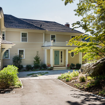
This is an example of a mid-sized traditional front porch design in Boston with decking and a roof extension.
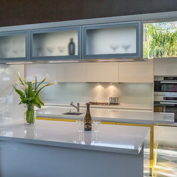
 Artistic Kitchen Design - Los Altos Builders
Contemporary kitchen cabinetry with a "peekaboo" opening. See this photo featured in the article below!
https://www.houzz.com/ideabooks/81034984/list/semi-open-kitchen-see-through-cabinets-offer-peekaboo-views
Photography by Nate Donovan
 Urbana Design Studio
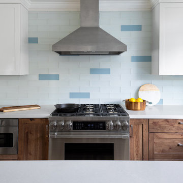
This professional Dacor range was the crowning jewel of this beautiful kitchen. As a true foody, the range was a very important decision in this kitchen renovation.
Kate Falconer Photography
 House of L
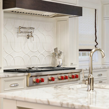
A 1927 colonial home in Shaker Heights, Ohio, received a breathtaking renovation that required extensive work, transforming it from a tucked away, utilitarian space, to an all-purpose gathering room, a role that most kitchens embrace in a home today. The scope of work changed over the course of the project, starting more minimalistically and then quickly becoming the main focus of the house's remodeling, resulting in a staircase being relocated and walls being torn down to create an inviting focal point to the home where family and friends could connect. The focus of the functionality was to allow for multiple prep areas with the inclusion of two islands and sinks, two eating areas (one for impromptu snacking and small meals of younger family members and friends on island no. two and a built-in bench seat for everyday meals in the immediate family). The kitchen was equipped with all Subzero and Wolf appliances, including a 48" range top with a 12" griddle, two double ovens, a 42" built-in side by side refrigerator and freezer, a microwave drawer on island no. one and a beverage center and icemaker in island no. two. The aesthetic feeling embraces the architectural feel of the home while adding a modern sensibility with the revamped layout and graphic elements that tie the color palette of whites, chocolate and charcoal. The cabinets were custom made and outfitted with beaded inset doors with a Shaker panel frame and finished in Benjamin Moore's OC-17 White Dove, a soft white that allowed for the kitchen to feel warm while still maintaining its brightness. Accents of walnut were added to create a sense of warmth, including a custom premium grade walnut countertop on island no. one from Brooks Custom and a TV cabinet with a doggie feeding station beneath. Bringing the cabinet line to the 8'6" ceiling height helps the room feel taller and bold light fixtures at the islands and eating area add detail to an otherwise simpler ceiling detail. The 1 1/4" countertops feature Calacatta Gold Marble with an ogee edge detail. Special touches on the interiors include secret storage panels, an appliance garage, breadbox, pull-out drawers behind the cabinet doors and all soft-close hinges and drawer glides. A kneading area was made as a part of island no. one for the homeowners' love of baking, complete with a stone top allowing for dough to stay cool. Baskets beneath store kitchen essentials that need air circulation. The room adjacent to the kitchen was converted to a hearth room (from a formal dining room) to extend the kitchen's living space and allow for a natural spillover for family and guests to spill into.
Jason Miller, Pixelate
 Techo-Bloc
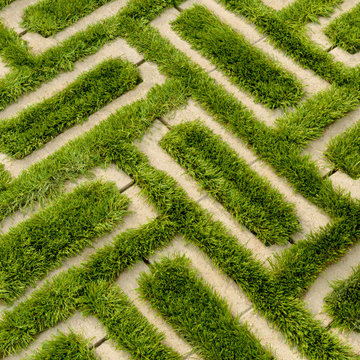
Make it rain because we’ve got you covered! Aquastorm is an anti-flooding permeable driveway paver with through-the-roof infiltration rates. It is designed for the modern home that enjoys linear looks and green initiatives. Enjoy an eco-friendly driveway with Aquastrom and expand your pleasure to your backyard; this environmentally friendly hardscape product allows grass to grow between it, so you won’t have to compromise the beauty of concrete with Mother Nature. The integrated spacers allow easy installation by keeping the joint space between each paver consistent for super straight lines that allow water to trickle directly through. Check out our website to shop the look! Or, check out the estimation tool on our website to get an idea of how much a similar project could cost you! https://www.techo-bloc.com/shop/pavers/aquastorm/
 TKS Design Group
Free ebook, Creating the Ideal Kitchen. DOWNLOAD NOW
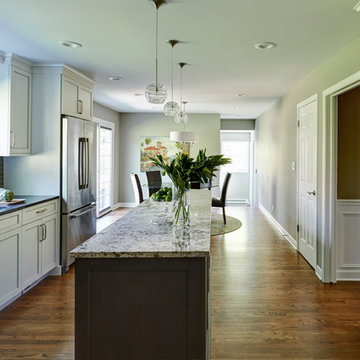
The homeowners of this mid-century Colonial and family of four were frustrated with the layout of their existing kitchen which was a small, narrow peninsula layout but that was adjoining a large space that they could not figure out how to use. Stealing part of the unused space seemed like an easy solution, except that there was an existing transition in floor height which made that a bit tricky. The solution of bringing the floor height up to meet the height of the existing kitchen allowed us to do just that.
This solution also offered some challenges. The exterior door had to be raised which resulted in some exterior rework, and the floor transition had to happen somewhere to get out to the garage, so we ended up “pushing” it towards what is now a new mudroom and powder room area. This solution allows for a small but functional and hidden mudroom area and more private powder room situation.
Another challenge of the design was the very narrow space. To minimize issues with this, we moved the location of the refrigerator into the newly found space which gave us an L-shaped layout allowing for an island and even some shallow pantry storage. The windows over the kitchen sink were expanded in size and relocated to allow more light into the room. A breakfast table fits perfectly in the area adjacent to the existing French doors and there was even room for a small bar area that helps transition from inside to outside for entertaining. The confusing unused space now makes sense and provides functionality on a daily basis.
To help bring some calm to this busy family, a pallet of soft neutrals was chosen -- gray glass tile with a simple metal accent strip, clear modern pendant lights and a neutral color scheme for cabinetry and countertops.
For more information on kitchen and bath design ideas go to: www.kitchenstudio-ge.com
 Precision Homecrafters, LLC
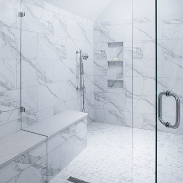
The Inverness Bathroom remodel had these goals: to complete the work while allowing the owner to continue to use their workshop below the project's construction, to provide a high-end quality product that was low-maintenance to the owners, to allow for future accessibility, more natural light and to better meet the daily needs of both the husband's and wife's lifestyles.
The first challenge was providing the required structural support to continue to clear span the two cargarage below which housed a workshop. The sheetrock removal, framing and sheetrock repairs and painting were completed first so the owner could continue to use his workshop, as requested. The HVAC supply line was originally an 8" duct that barely fit in the roof triangle between the ridge pole and ceiling. In order to provide the required air flow to additional supply vents in ceiling, a triangular duct was fabricated allowing us to use every square inch of available space. Since every exterior wall in the space adjoined a sloped ceiling, we installed ventilation baffles between each rafter and installed spray foam insulation.This project more than doubled the square footage of usable space. The new area houses a spaciousshower, large bathtub and dressing area. The addition of a window provides natural light. Instead of a small double vanity, they now have a his-and-hers vanity area. We wanted to provide a practical and comfortable space for the wife to get ready for her day and were able to incorporate a sit down make up station for her. The honed white marble looking tile is not only low maintenance but creates a clean bright spa appearance. The custom color vanities and built in linen press provide the perfect contrast of boldness to create the WOW factor. The sloped ceilings allowed us to maximize the amount of usable space plus provided the opportunity for the built in linen press with drawers at the bottom for additional storage. We were also able to combine two closets and add built in shelves for her. This created a dream space for our client that craved organization and functionality. A separate closet on opposite side of entrance provided suitable and comfortable closet space for him. In the end, these clients now have a large, bright and inviting master bath that will allow for complete accessibility in the future.
 Clark Design Build, LLC
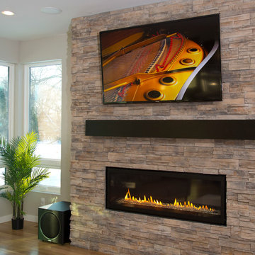
This home is located on a one acre parcel of land near the banks of the Milwaukee River in the older established subdivision of Sleepy Hollow Estates in Mequon, Wisconsin. The inspiration for this Glen Cove Residence was to bring the desired by many, contemporary and modern lifestyle of a down town loft and establish it in a neighborhood in the suburbs amongst traditional style homes.
Sleepy Hollow Estates like many older established neighborhoods throughout the North shore and Westside communities of Milwaukee had great local architects such as John Randall McDonald and Russell Barr Williamson, who built contemporary master pieces amongst very traditional style homes. This created diversity in the style of homes in these neighborhoods which for the people living in them and the people just passing by, an experience of harmony and cultural lifestyle.
Unfortunately today, many new neighborhood developments lack harmony and cultural lifestyle and don’t allow for homes such as this Glen Cove Residence to be built. And for that matter many of the homes built by John Randall McDonald and Russell Barr Williamson back in the 1950’s. When driving through these new developments, one would experience beautiful traditional style homes, but all the homes tend to look the same. There is no diversity in the styles of homes thus these neighborhoods lack the harmony and a cultural life style for the people who live there or what people are looking for when buying a home that reflects their lifestyle. This Glen Cove Residence is an example that a contemporary home which offers a modern lifestyle that many desires can be established amongst traditional homes while blending in with the neighborhood.
Don’t be fooled by the flat roof of this home, building technology has come a long way since Frank Lloyd Wright! The roof system on this home is more energy efficient than most roof systems builders are putting on traditional homes today and it doesn’t leak! This Glen Cove Residence was built using all traditional building materials that you would see in homes being built in new developments today. There is a misconception out there that modern homes are expensive to build. That is not true! This Glen Cove Residence was built for roughly $130 per square foot which is the same price one would pay for a similar builder’s model traditional style home with the same upgrades.
This Glen Cove Residence consists of three bedrooms and three and one half baths. All bedrooms are located on second floor with laundry, guest bath and a master suite. Located between the first and second floors off of the landing is an office/den space. The first floor is open concept with the kitchen, dining and living areas located at the rear of the home with expansive windows allowing a great connection to back yard area and outdoors. On the back of the home is a covered deck area allowing for outdoor entertaining without the worry of the elements. The first floor also offers a powder room, mudroom and walk-in pantry off the kitchen area. From the mudroom there is access to an attached four car tandem garage. From the first floor to the finished basement is an open stair allowing the basement area to feel as part of the house and not just a basement? The basement consists of a main living area, game area with wet bar, exercise room, kids play room with 14’ ceilings, full bathroom and mechanical room with storage closets throughout.
19