
Search results for "Alternative quick time" in Home Design Ideas

 TKS Design Group
Our clients had been in their home since the early 1980’s and decided it was time for some updates. We took on the kitchen, two bathrooms and a powder room.
We started first on the hall bath which was basically just in need of a face lift. The floor is porcelain tile made to look like carrera marble. The vanity is white Shaker doors fitted with a white quartz top. We re-glazed the cast iron tub.
Designed by: Susan Klimala, CKD, CBD
Photography by: Michael Alan Kaskel
For more information on kitchen and bath design ideas go to: www.kitchenstudio-ge.com

 McCoy Homes, Inc.
This home was unique in that the client was located in another state, and we custom built this home for the client via phone calls, emails, and text messages. The client was relocating into the area, and worked with Billy as well as the designer to pick all of the colors / selections / fixtures via alternative sources. The homeowner had been in the area on a visit, and visit our model home that was located on site at the time. She knew in advance that she wanted her home to be built as close to that home as possible with the same interior qualities as the model. The exterior colors, materials, and items were the only items that would set this home apart from the model.
Connie McCoy
 TKS Design Group
Download our free ebook, Creating the Ideal Kitchen. DOWNLOAD NOW
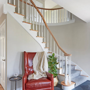
Lakefront property in the northwest suburbs of Chicago is hard to come by, so when we were hired by this young family with exactly that, we were immediately inspired by not just the unusually large footprint of this 1950’s colonial revival but also the lovely views of the manmade lake it was sited on. The large 5-bedroom home was solidly stuck in the 1980’s, but we saw tons of potential. We started out by updating the existing staircase with a fresh coat of paint and adding new herringbone slate to the entry hall.
The powder room off the entryway also got a refresh - new flooring, new cabinets and fixtures. We ran the new slate right through into this space for some consistency. A fun wallpaper and shiplap trim add a welcoming feel and set the tone for the home.
Next, we tackled the kitchen. Located away from the rest of the first floor, the kitchen felt a little isolated, so we immediately began planning for how to better connect it to the rest of the first floor. We landed on removing the wall between the kitchen and dining room and designed a modified galley style space with separate cooking and clean up zones. The cooking zone consists of the refrigerator, prep sink and cooktop, along with a nice long run of prep space at the island. The cleanup side of the kitchen consists of the main sink and dishwasher. Both areas are situated so that the user can view the lake during prep work and cleanup!
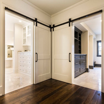
One of the home’s main puzzles was how to incorporate the mudroom and area in front of the patio doors at the back of the house. We already had a breakfast table area, so the space by the patio doors was a bit of a no man’s land. We decided to separate the kitchen proper from what became the new mudroom with a large set of barn doors. That way you can quickly hide any mudroom messes but have easy access to the light coming in through the patio doors as well as the outdoor grilling station. We also love the impact the barn doors add to the overall space.
The homeowners’ first words to us were “it’s time to ditch the brown,” so we did! We chose a lovely blue pallet that reflects the home’s location on the lake which is also vibrant yet easy on the eye. Countertops are white quartz, and the natural oak floor works well with the other honey accents. The breakfast table was given a refresh with new chairs, chandelier and window treatments that frame the gorgeous views of the lake out the back.
We coordinated the slate mudroom flooring with that used in the home’s main entrance for a consistent feel. The storage area consists of open and closed storage to allow for some clutter control as needed.
Next on our “to do” list was revamping the dated brown bar area in the neighboring dining room. We eliminated the clutter by adding some closed cabinets and did some easy updates to help the space feel more current. One snag we ran into here was the discovery of a beam above the existing open shelving that had to be modified with a smaller structural beam to allow for our new design to work. This was an unexpected surprise, but in the end we think it was well worth it!
We kept the colors here a bit more muted to blend with the homeowner’s existing furnishings. Open shelving and polished nickel hardware add some simple detail to the new entertainment zone which also looks out onto the lake!
Next we tackled the upstairs starting with the homeowner’s son’s bath. The bath originally had both a tub shower and a separate shower, so we decided to swap out the shower for a new laundry area. This freed up some space downstairs in what used to be the mudroom/laundry room and is much more convenient for daily laundry needs.
We continued the blue palette here with navy cabinetry and the navy tile in the shower. Porcelain floor tile and chrome fixtures keep maintenance to a minimum while matte black mirrors and lighting add some depth the design. A low maintenance runner adds some warmth underfoot and ties the whole space together.
We added a pocket door to the bathroom to minimize interference with the door swings. The left door of the laundry closet is on a 180 degree hinge to allow for easy full access to the machines. Next we tackled the master bath which is an en suite arrangement. The original was typical of the 1980’s with the vanity outside of the bathroom, situated near the master closet. And the brown theme continued here with multiple shades of brown.
Our first move was to segment off the bath and the closet from the master bedroom. We created a short hall from the bedroom to the bathroom with his and hers walk-in closets on the left and right as well as a separate toilet closet outside of the main bathroom for privacy and flexibility.
The original bathroom had a giant soaking tub with steps (dangerous!) as well as a small shower that did not work well for our homeowner who is 6’3”. With other bathtubs in the home, they decided to eliminate the tub and create an oversized shower which takes up the space where the old tub was located. The double vanity is on the opposite wall and a bench is located under the window for morning conversations and a place to set a couple of towels.
The pallet in here is light and airy with a mix of blond wood, creamy porcelain and marble tile, and brass accents. A simple roman shade adds some texture and it’s top-down mechanism allows for light and privacy.
This large whole house remodel gave our homeowners not only the ability to maximize the potential of their home but also created a lovely new frame from which to view their fabulous lake views.
Designed by: Susan Klimala, CKD, CBD
Photography by: Michael Kaskel
For more information on kitchen and bath design ideas go to: www.kitchenstudio-ge.com
Find the right local pro for your project

 Irene Designs
This dream bathroom has everything one can wish for an ideal bathroom escape. It doesn’t just look fabulous – it works well and it is built to stand the test of time.
This bathroom was designed as a private oasis, a place to relax and unwind. Spa-like environment is created by expansive double-sink custom vanity, an elegant free standing tub, and a spacious two-person barrier-free shower with a floating bench. Toilet is concealed within a separate nook behind a pocket door.
Main bathroom area is outlined by a tray ceiling perimeter. The room looks open, airy and spacious. Nothing interferes with the ceiling design and overall space configuration. It hasn’t always been that way. Former layout had serious pitfalls that made the room look much smaller. The shower concealed behind solid walls protruded into the main area clashing with the tray ceiling geometry. Massive shower stall took up significant amount of the room leaving no continuous wall space for a double sink vanity. There were two separate vanities with a dead corner space between them. At the same time, the toilet room was quite spacious with just one fixture in the far end.
New layout not only looks better, it allows for a better functionality and fully reveals the space potential. The toilet was relocated to occupy the former linen closet space slightly expanded into adjacent walk-in closet. Shower was moved into the bigger alcove, away from the tray ceiling area. It opened up the room while giving space for a gorgeous wall-to-wall vanity. Having a full glass wall, the shower extends the space even further. Sparkling glass creates no barrier to the eyesight. The room feels clean, breezy and extra spacious. Gorgeous frameless shower enclosure with glass-to-glass clamps and hinges shows off premium tile designs of the accent shower wall.
Free standing tub remained in its original place in front of the window. With no solid shower walls nearby, it became a focal point adorned with the new crystal chandelier above it. This two-tier gorgeous chandelier makes the bathroom feel incredibly grand. A touch of luxury is showing up in timeless polished chrome faucet finish selections as well.
New expansive custom vanity has his and her full height linen towers, his and her sink cabinets with two individual banks of drawers on the sides and one shared drawer cabinet in the middle containing a charging station in the upper drawer.
Vanity counter tops and floating shower seat top are made of high-end quartz.
Vessel sinks resemble the shape and style of the free-standing tub.
To make the room feel even more spacious and to showcase the shower area in the reflection, a full size mirror is installed over the vanity. Crystal sconces are installed directly into the mirror.
Crisp classic white tile gives the room a timeless sense of polish and luxury. Walls around the perimeter of the entire bathroom are tiled half way. Three rows of 12”x 24” porcelain tile resembling white marble are crowned with a thin row of intricate glass tiles with marble accents, and a chair rail tile.
Tile design flows into a spacious barrier-free two-person walk-in shower. Two more tile patterns of the same tile collection are brought into play. Rear wall is adorned with a picture frame made out of 12”x12” tiles laid at 45 degree angle within the same chair rail and glass tile border. Shower floor is made of small hexagon tiles for proper drainage.
Shower area has two hidden from plain sight niches to contain shampoo bottles and toiletries. The rear side of the niches is made of glass mosaics for a waterfall effect.
To showcase the picture frame inside the shower, the accent shower wall is washed with cascading light from a discrete LED strip tucked in a cove behind “floating” shower ceiling platform.
Multiple shower heads (two ceiling-mount rain heads, one multi-functional wall mount shower head, and a handheld shower) are able to provide a fully customizable shower experience.
Despite of many hard surfaces and shiny finishes, which can sometimes lead to a cold impersonal feeling, this bathroom is cozy and truly welcoming. This sense of warms is maintained by exclusive multi-functional layered lighting. Carefully designed groups of lights (all having a dimmer control) can be used simultaneously, in various combinations, or separately to create numerous different effects and perfect atmosphere for every mood and occasion. Some lights have smart controls and can be operated remotely.
Amazing effect can be achieved by dimmable toe kick perimeter lighting. With the ceiling lights turned off, the vanity looks as if it is floating in the air. Multifaceted crystal fixtures produce cascades of sparkling rainbow reflections dancing around the room and creating an illusion of a starry sky.
Programmable radiant heating floor offers additional warmth and comfort to the room.
This bathroom is well suited for either a quick morning shower or a night in for ultimate relaxation with a champagne toast and a long soak in the freestanding tub.
 McCoy Homes, Inc.
This home was unique in that the client was located in another state, and we custom built this home for the client via phone calls, emails, and text messages. The client was relocating into the area, and worked with Billy as well as the designer to pick all of the colors / selections / fixtures via alternative sources. The homeowner had been in the area on a visit, and visit our model home that was located on site at the time. She knew in advance that she wanted her home to be built as close to that home as possible with the same interior qualities as the model. The exterior colors, materials, and items were the only items that would set this home apart from the model.
Connie McCoy
 McCoy Homes, Inc.
This home was unique in that the client was located in another state, and we custom built this home for the client via phone calls, emails, and text messages. The client was relocating into the area, and worked with Billy as well as the designer to pick all of the colors / selections / fixtures via alternative sources. The homeowner had been in the area on a visit, and visit our model home that was located on site at the time. She knew in advance that she wanted her home to be built as close to that home as possible with the same interior qualities as the model. The exterior colors, materials, and items were the only items that would set this home apart from the model.
Connie McCoy
 McCoy Homes, Inc.
This home was unique in that the client was located in another state, and we custom built this home for the client via phone calls, emails, and text messages. The client was relocating into the area, and worked with Billy as well as the designer to pick all of the colors / selections / fixtures via alternative sources. The homeowner had been in the area on a visit, and visit our model home that was located on site at the time. She knew in advance that she wanted her home to be built as close to that home as possible with the same interior qualities as the model. The exterior colors, materials, and items were the only items that would set this home apart from the model.
Connie McCoy
Sponsored
Fredericksburg, OH

High Point Cabinets
Columbus' Experienced Custom Cabinet Builder | 4x Best of Houzz Winner

 Land Stewards Ecological Landscape Design
Some of the plants, like the Rudbeckia (Black Eyed Susan), will come on strong in the first year, with a spectacular show of yellow flowers all summer long. Still others, the warm season grasses in particular, may not really take off until a few seasons later, biding their time until they eventually fill in and lend their slender form to the swaying field. This dynamic nature is part of the reason we find meadows to be so exciting. On top of the visual aesthetic, an established meadow hums with life, providing food and shelter for countless creatures. Far more interesting than flat green grass.
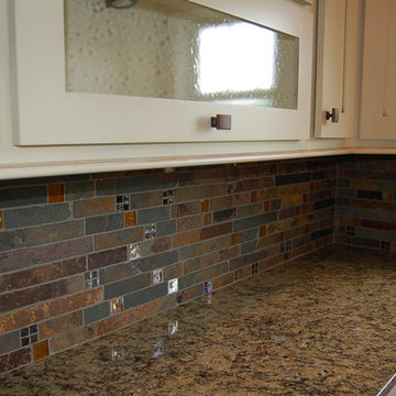 McCoy Homes, Inc.
This home was unique in that the client was located in another state, and we custom built this home for the client via phone calls, emails, and text messages. The client was relocating into the area, and worked with Billy as well as the designer to pick all of the colors / selections / fixtures via alternative sources. The homeowner had been in the area on a visit, and visit our model home that was located on site at the time. She knew in advance that she wanted her home to be built as close to that home as possible with the same interior qualities as the model. The exterior colors, materials, and items were the only items that would set this home apart from the model.
Connie McCoy
 Simply Home Decorating
This beautiful North Vancouver home belongs to a nature-loving and health-conscious couple, Emma and Vince (names changed), their two young children, and their dog, Jasper. When they contacted us about renovating and furnishing their kitchen and family room, we walked in and saw a world of potential waiting to be uncovered.
Before: Larkhall Crescent Home:
Like many original North Vancouver homes, the interior was definitely dated. We encountered late ‘80s finishes in powder pink and teal green, old carpet, and a kitchen that wasn’t maximized to suit this family’s modern-day lifestyle. However, the size of the rooms offered us a ton of space with which to get creative.
Knowing our clients’ love of cooking, need for work spaces (Emma and Vince both work remotely), and growing family, we developed a design concept that would increase usable space, optimize storage, and create intimacy in this large area. As for the style, we were inspired by their European roots, inventing a new and modern take on “Belgian Farmhouse” style. Now, the home is truly one-of-a-kind.
After: Warm & Cozy Family Room:
Fresh, bright, and comfortable, this living area has been transformed! We started with the fireplace as a focal point, selecting aged brick tiles for added texture and a crisp wood mantle. The taupe-coloured sectional infuses the room with visual warmth and serves the added purpose of separating the family room from the kitchen.
Emma and Vince were also keen on using non-toxic materials in their home, and we were happy to oblige. To meet their needs, we sourced natural wood elements and sought out Canadian-made products - that adhere to high health standards - whenever possible.
Look closer at the elements of this space, and you will find this stunning, honeycomb-patterned rug in earthy gold, beige, and charcoal tones. It’s plush to the touch and full of visual texture that brings this room’s colour palette together. We sourced these two-tone chairs with caning, petrified wood side table, black sconces, and botanical prints in greyscale from local artist, Heather Johnston.
We topped off the space with this dark wood and rattan console that offers storage facing the kitchen and presents an opportunity to display cherished items. The result is a cozy lounging space brimming with comfort and functionality. It’s perfect for enjoying quality family time, or Emma can simply slide the coffee table away to make room for her morning yoga practice.
Now, let’s turn around and give some attention to the kitchen. Do you remember what the original kitchen looked like? If not, scroll back up, because the transformation is shocking…
Moody & Welcoming Kitchen for Healthy Living:
This kitchen looks very different from how it started, right? Though we didn’t touch any walls, the kitchen has almost doubled in usable space! We created a long, extended island with storage, an outlet for small appliances, and seating for comfortable prep, after-school snacking, or mingling among friends.
On the other side of the island, the family has even more storage and an integrated dishwasher within easy reach of the sink, perfect for quick clean-up. From this angle, you can also see the expansive custom Shaker cabinetry in white and the integrated double ovens. These facilitate their cooking experience and gave us the opportunity to add an additional surprise…
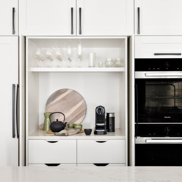
A coffee garage station and more hidden storage! Keeping these items located along the perimeter allows them to be accessed by the family or their guests without someone getting under the cook’s feet. These are the little details that make everyday life easier and more enjoyable.
Moving deeper into the kitchen, the seamless induction cooktop topped with a freestanding concealed hood fan commands attention in a soft yet prominent way. The natural wood accent mirrors the fireplace mantle, and the choice of off-black wood-grain cabinets not only continues our black-and-white colour palette but adds a sense of depth and contrast. The corner sink is located to the right and perfectly positioned with a view of their thriving backyard.
To invite more of this family’s character into the space, we mixed metals for interest — matte black, dark pewter, and warm brass — and created open shelves in white oak for their plants and decor. You can also glimpse the tumbled edge of the backsplash tile, which echoes the rustic brick of the fireplace. It adds that farmhouse charm while still feeling timeless and sophisticated.
Last but not least, we designed this dining banquette in the bay window (with integrated bench storage, of course), where the family can share a meal together, the kids can do homework, or Emma and Vince can work and enjoy a change of scenery from their offices. Like the other spaces in the home, it was designed to be beautiful, multi-functional, and long-lasting.
Praise from Our Clients:
It is clear that we love this home, but what did our clients have to say?
“Lori is a visionary and masters execution to the finest detail all at the same time. When she first met us to know more about who we are and how we live, she could right away envision how we could use the space in our kitchen and living room…The results exceeded our expectations.
Lori and her team were also a delight to work with — coordination with all the trades, fast problem-solving, regular updates, professional and friendly attitude of her entire team — made it the dream team. Thank you SHD for making our space so beautiful!”
In turn, we are so grateful for this family’s trust, their open communication, and for being wonderful people with whom to work. (So, thank you!)
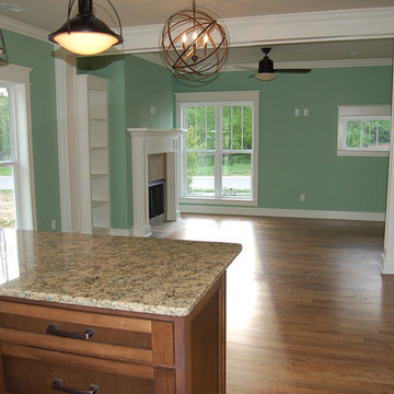 McCoy Homes, Inc.
This home was unique in that the client was located in another state, and we custom built this home for the client via phone calls, emails, and text messages. The client was relocating into the area, and worked with Billy as well as the designer to pick all of the colors / selections / fixtures via alternative sources. The homeowner had been in the area on a visit, and visit our model home that was located on site at the time. She knew in advance that she wanted her home to be built as close to that home as possible with the same interior qualities as the model. The exterior colors, materials, and items were the only items that would set this home apart from the model.
Connie McCoy
 McCoy Homes, Inc.
This home was unique in that the client was located in another state, and we custom built this home for the client via phone calls, emails, and text messages. The client was relocating into the area, and worked with Billy as well as the designer to pick all of the colors / selections / fixtures via alternative sources. The homeowner had been in the area on a visit, and visit our model home that was located on site at the time. She knew in advance that she wanted her home to be built as close to that home as possible with the same interior qualities as the model. The exterior colors, materials, and items were the only items that would set this home apart from the model.
Connie McCoy

 Luxury Elements
 created this walk in wine cellar as a focal point within the basement. The custom glass panels and center glass door allows this space to be seen at all times while also creating its own dedicated environment. The large-scale light grey tile was installed on the floor throughout the bar area and wine cellar in order to bring a sense of connection between the two spaces.
Sponsored
Columbus, OH

Hope Restoration & General Contracting
Columbus Design-Build, Kitchen & Bath Remodeling, Historic Renovations

 Cabinet Plant
See what our client say about working with us:
I started my search for a contractor about a year before I hired Paul to do a kitchen and bathroom renovation. This was my first time at the bat, and I really had no idea what to expect. I had many contractor proposals that swung wildly in price but for some reason I never felt inclined to hire any of the guys I met with. I happened to be looking at Houzz one day and came across Paul’s company and he had very good reviews. I gave him a call and he came to my apartment quickly. I liked him immediately when we met. I thought it was strange that he asked me for my budget and how much I wanted to spend but in hindsight, providing that information allowed Paul to come back to me with a very detailed proposal based on my budget. I soon realized that the lower proposals I had did not include many of the budget items that would be necessary to complete the job. Paul laid out the pricing and provided a very reasonable “allowance” based on your measurements for tile, toilet, sinks, etc. It is up to you to stay within that allowance.
Another reason I hired Paul was because of his design skills. Paul met me in the at tile stores several times and helped guide me in choosing tile and a style for the bathroom that really looks beautiful. I fought him a little but in the end, was glad I went with his recommendations. He also uses a kitchen cabinet maker so all the cabinets are custom to what you want. Paul also has a great customer website that allows you to see all the expenses, make choices, and easily communicate with him.
If you are planning to do a renovation, I think it helps to plan for the worst and hope for the best. I live in a co-op and we had a couple of little glitches and Paul was always quick to resolve issues as they arose. He was extremely responsive and really cared about the work and doing a good job. I would definitely hire Paul again if I needed a contractor.
 McCoy Homes, Inc.
This home was unique in that the client was located in another state, and we custom built this home for the client via phone calls, emails, and text messages. The client was relocating into the area, and worked with Billy as well as the designer to pick all of the colors / selections / fixtures via alternative sources. The homeowner had been in the area on a visit, and visit our model home that was located on site at the time. She knew in advance that she wanted her home to be built as close to that home as possible with the same interior qualities as the model. The exterior colors, materials, and items were the only items that would set this home apart from the model.
Connie McCoy

 Beth Dotolo, ASID, RID, NCIDQ
Stephen Karlisch // This lakeside home was completely refurbished inside and out to accommodate 16 guests in a stylish, hotel-like setting. Owned by a long-time client of Pulp, this home reflects the owner's personal style -- well-traveled and eclectic -- while also serving as a landing pad for her large family. With spa-like guest bathrooms equipped with robes and lotions, guest bedrooms with multiple beds and high-quality comforters, and a party deck with a bar/entertaining area, this is the ultimate getaway.

 Advance Design Studio, Ltd.
After six years of living in their Huntley IL home, Chris and Meghan were tired of their dark, dingy, outdated kitchen and it was finally time for a long-anticipated change. “The kitchen is the place where we live, it’s where we do everything,” Meghan said. “It was important that it be a space where we wanted to be.” Meghan loves cooking and enjoys including their girls in healthy meal prepping, this led them to want a brighter, more enjoyable kitchen with increased functionality and improved storage.
For Chris especially, the laundry room was an entirely dysfunctional eyesore. “We had a washer and a dryer, but it was all kind-of cobbled together!” Chris said. “There were always laundry piles everywhere, we weren’t really sure what we wanted to do in there, but it was time for us to make a change.” The mess of the space was stressful every time they walked in the door from the garage each day. Kids’ backpacks and shoes piled up haphazardly in the makeshift boot-bench closet left the family feeling disorganized and stressed. They needed space for folding clothes and locker cubbies to help keep the family organized.
Having known Christine and Todd in the Huntley community for years, Chris and Meghan were familiar with their work. “We already trusted them personally and having seen their projects for years we knew they did top notch work. After we reviewed the initial round of designs, we knew that hiring them was definitely the right choice,” Meghan and Chris said. Although Chris had done a lot of work in their home himself, the kitchen and laundry room renovation was such a large undertaking that he didn’t want to steal time away from his family to spend what would surely be many long weekends doing the job himself. “That would not have been a wise choice for us,” Chris laughed.
“Our designer, Michelle was very, very, easy to work with; anything we wanted to see or weren’t sure about, she went above and beyond to make this easy for us. She was easy to get hold of and always quick to respond,” the couple said. Michelle pulled ideas that mirrored the couple’s taste and style and was adept at directing the couple to limited choices that didn’t overwhelm them and kept the process moving. “I have a hard time making decisions. Michelle made the decision-making process so easy. I loved how she listened to what I liked and then presented three great options for me to choose from,” Meghan said.
The main objectives for the kitchen were better storage solutions, they wanted the space to reflect their lifestyle and taste, and they wanted it to last for years with low maintenance. One of the first steps in creating a more functional kitchen was relocating the refrigerator, creating an improved workflow for the busy family.
“We didn’t know that we could even move the refrigerator to a new location where it is now, that was something that we never would have thought of,” Chris said. “The new refrigerator location makes the kitchen feel so much bigger. We didn’t add any space, but our whole kitchen with the new design just seems like it’s so much larger than before!” Meghan said.
The perimeter mist colored cabinets helped warm and brighten the entire room, while the graphite colored cabinets on the island added contrast. Using this fresh, clean color palette satisfied the couple’s desire for a bright space that was the exact opposite of what they had before. Organization accessories were also added to the cabinets such as a spice drawer tray and roll outs to create hidden convenience.
“I absolutely love the hidden spices – it makes cooking so much more enjoyable!” Chris said. “And all the pull outs, and the double trash bin, who would think you could get so excited about organization!” the couple said in unison.
One thing they hated in their original kitchen was how dark the space felt. Added lighting on the ceiling with the new light fixtures combined with the lighter cabinetry colors throughout solved this problem. “Our new kitchen has this warm, almost cozy feeling that our old kitchen never had, it’s just a space that I love spending my time in now,” Meghan said. The light airy feeling was accentuated with the use of floating white shelves on either side of the decorative range hood. “We have so much cabinetry space, the new design is amazing we actually have more storage space than we will ever need,” Meghan said.
The island was extended to create more work surface and added space for stool seating. “The new island changes how we live. Now the kids can be in the kitchen with us, doing homework, eating breakfast, and the three of us have special dinners there when Chris is working late,” Meghan said.
The Carrara Marmi Quartz countertops were chosen because they are, not only beautiful, but are made from hard-working material that doesn’t require maintenance. The white subway tile backsplash that wraps to the ceiling behind the focal point cooktop range/hood compliments the crisp white countertops perfectly, while brushed brass hardware and light fixtures keep the design fresh and new.
The couple had a few fears at the beginning of the project, as most homeowners do. Their biggest fear was being out of their kitchen and laundry room for an extended time. The crew made it very easy for the family to work in a limited space keeping the washer and dryer hooked up the majority of the time, and also getting appliances working with minimal downtime.
“They above and beyond accommodated us to get us through the process,” Meghan said. “They did a great job making sure we were as comfortable as possible throughout the process,” Chris added.
“Our project manager DJ did a great job. He was very good at updating us on schedule changes, getting guys in as quickly as possible. Everyone that stepped in the house was nice and did great work,” said Chris. They thought Advance’s carpenter was phenomenal and were impressed when he took a conceptual idea from a photograph and worked with designer Michelle to create a one of a kind range/hood that has become the topic of conversation with friends and family who visit the new kitchen. “He was in our house literally every day for several weeks. He was easy to work with and good at what he did,” Meghan and Chris said.
The focal point of the kitchen; a hand-crafted, custom-built ventilation hood was clad with handpicked reclaimed barnwood. Advance Design’s carpenter built the framework and the cladding to create a one-of-a-kind design element that the couple loves.
“I think it was especially fun for him to create something unique from scratch, showcasing his talent in this area,” Meghan said. “I love that my kitchen is not like everyone else’s. I got to pick out the wood on my hood and watch it being built and was able to choose what pieces of wood went where on it. It’s totally unique.”
Red Oak flooring was toothed-in throughout the kitchen and the rest of the first floor anywhere changes were made. Then the whole floor was refinished to tone down the orange undertones in the existing floor stain, ultimately changing the color complexion of the entire first floor. The result is a completely new feeling to the entire home.
Renovating the laundry room was extremely important to Meghan and Chris, but they had trouble visualizing what the possibilities were for the seemingly small space. Michelle produced beautiful 3D illustrations that helped them envision the space in a whole new way.
“I must have told Michelle 100 times that I am a visual person, seeing the designs in 3D made it so easy to make decisions and see what we could really do with our space,” Meghan said.
A dividing wall and doorway were removed between the existing laundry room and hallway formerly containing a coat closet, providing space to design specialized graphite colored cabinetry matching the kitchen island to house custom storage cubbies for each family member. Adding the tall utility cabinetry in the new laundry area helped solve the storage issue, tucking away cleaning supplies, household items, and even the cat got its own cubby.
“I love how everything is now hidden in its own space. I can’t tell you how much I hated coming home and seeing everything sitting around on counters,” Chris said.
Electrical outlets were planned for the inside of utility cabinets, so devices could charge in hidden locations. Stacking the washer and dryer allowed for wider countertop space to provide a folding area and a special space for clothes to hang. “The way I do laundry has been completely transformed! I can actually fold clothes and hang them now right out of the washer and dryer,” Meghan said.
“The end result in the kitchen and the laundry/mud room was an updated light and bright space, with a smarter work flow that better meets the needs of this family,” Michelle said.
“I would totally recommend Advance Design,” Meghan said. “Sometimes I sit and just look at my kitchen and laundry room and think ‘Wow, I can’t believe I get to live here!’ It’s an understatement to say we love our new space.”


 PiTTopper
® is an attractive alternative to fire pit covers currently on the market made from nylon or fabric which can become worn and torn after time, losing the ability to adequately protect your fire pit from inclement weather. Protect your patio set's fire pit year round. PiTTopper's® design has allowed it to stay in place during severe weather with winds up to 55 mph. Flimsy fabric made from outdoor furniture covers can't say that!
PiTTopper® eliminates the time and effort of removing wet ashes and wood before enjoying a fire. PiTTopper® also provides additional serving space on top of your fire pit during the cook out and dinner before the sun goes down and the fire pit is lit. Enjoy the new life PiTTopper® brings to your patio all year long!

 NR Interiors
This is a unique multi-purpose space, designed to be both a TV Room and an office for him. We designed a custom modular sofa in the center of the room with movable suede back pillows that support someone facing the TV and can be adjusted to support them if they rotate to face the view across the room above the desk. It can also convert to a chaise lounge and has two pillow backs that can be placed to suite the tall man of the home and another to fit well as his petite wife comfortably when watching TV.
The leather arm chair at the corner windows is a unique ergonomic swivel reclining chair and positioned for TV viewing and easily rotated to take full advantage of the private view at the windows.
The original fine art in this room was created by Tess Muth, San Antonio, TX.
 McCoy Homes, Inc.
This home was unique in that the client was located in another state, and we custom built this home for the client via phone calls, emails, and text messages. The client was relocating into the area, and worked with Billy as well as the designer to pick all of the colors / selections / fixtures via alternative sources. The homeowner had been in the area on a visit, and visit our model home that was located on site at the time. She knew in advance that she wanted her home to be built as close to that home as possible with the same interior qualities as the model. The exterior colors, materials, and items were the only items that would set this home apart from the model.
Connie McCoy
103