
Search results for "Ample activities" in Home Design Ideas

 Twelve Stones Designs, LLC
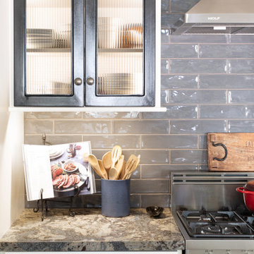
The owners of this kitchen had spent the money to upgrade the finishes in their kitchen upon building the home 12 years ago, but after living in the space for several years they realized how nonfunctional the layout really was. The (then) two preschool aged children had grown into busy, hungry teenagers with many friends who also liked to hang out at the house. So the family needed a more functional kitchen with better traffic flow, space for daily activities revolving around the kitchen at different times of day, and a kitchen that could accommodate cooking for and serving large groups. Furthermore, the dark, traditional finishes no longer reflected the homeowners’ style. They requested a brighter, more relaxed, coastal style that reflected their love of the seaside cities they like to visit.
Originally, the kitchen was U-shaped with a narrow island in the middle. The island created narrow aisles that bottle-necked at the dishwasher, refrigerator, and cooktop areas. There was a pass-through from the foyer into the kitchen, but the owners never liked that the pass-through was also located so close to the powder room. The awkward proximity was unappealing and made guests feel uncomfortable.
The kitchen’s storage was made up of lots of narrow cabinets, apothecary drawers, clipped corner units, and very few drawers. It lacked useful storage for the larger items the family used on a daily basis. And the kitchen’s only pantry was small closet that had only builder-grade, narrow shelving with no illumination to be able to see the contents inside.
Overall, the kitchen’s lighting plan was poorly executed. Only six recessed cans illuminated the entire kitchen and nook areas. The under cabinet lighting was not evenly distributed either. In fact, the builder had mis-placed the under cabinet lighting around the decorative pilasters which made for choppy, dark cubbies. Further, the builder didn’t include any lighting over the sink or the bar area, which meant whoever was doing the dishes was always in their own shadow. That, coupled with the steep overhang of the game room above made the bar area feel like a dim, cavernous space that wasn’t inviting or task oriented. The kitchen looked out into the main living space, but the raised bar and a narrow wall (which held the only large cabinet in the kitchen) created more of a barrier than a relationship to the living room or breakfast nook. In fact, one couldn’t even see the breakfast nook from the cooktop or sink areas due to its orientation. The raised bar top was too narrow to comfortably sit to either dine at or chat from due to the lack of knee space. The the homeowners confided that the kitchen felt more like a dark, dirty prison than place where the family, or their guests, wanted to gather and commune.
The clients' needs and desires were:
➢ to create a kitchen that would be a space the family loved to be in; to relate to the adjacent spaces all around, and to have better flow for entertaining large groups
➢ to remove the walls between the breakfast nook and living area and to be able to utilize the natural light from the windows in both those areas
➢ to incorporate a functional chopping block for prepping fresh food for home cooked meals, an island with a large sink and drain board, 2 pull out trash cans, and seating for at least the 2 teens to eat or do homework
➢ to design a kitchen and breakfast nook with an airy, coastal, relaxed vibe that blended with the rest of the house's coastal theme
➢ to integrate a layered lighting plan which would include ample general illumination, specific task lighting, decorative lighting, and lots of illuminated storage
➢ to design a kitchen with not only more storage for all the husband’s kitchen gadgets and collection of oils and spices, but smart storage, including a coffee/breakfast bar and a place to store and conceal the toaster oven and microwave
➢ to find a way to utilize the large open space between the kitchen, pantry area, and breakfast nook
Twelve Stones Designs achieved the owner's goals by:
➢ removing the walls between the kitchen and living room to allow the natural light to filter in from the adjacent rooms and to create a connection between the kitchen, nook, and living spaces for a sense of unity and communion
➢ removing the existing pantry and designing 3 large pantry style cabinets with LED tape lights and rollout drawers to house lots of kitchen appliances, gadgets, and tons of groceries. We also took the cabinets all the way up to the 9’ ceiling for additional storage for seasonal items and bulk storage.
➢ designing 2 islands - 1 with a gorgeous black walnut chopping block that houses a drawer for chopping and carving knives and a custom double pull out trash unit for point of use utilization - and 1 that houses the dishwasher, a large Blanco Gourmet sink with integrated drain board, woven baskets for fresh root vegetables and kitchen towels, plenty of drawer storage for kitchen items, and bar seating for up to 4 diners.
➢ closing off the space between the kitchen and the powder room to create a beautiful new private alcove for the powder room as well as adding some decorative storage. This also gave us space to include more tall storage near the new range for precision placement of the husband’s extensive oil and spice collection as well as a location for a combo-steam oven the wife wanted for baking and cooking healthy meals.
The project is enhanced functionally by:
➢ incorporated USB and standard receptacles for the kids’ laptops and phone charging in the large island
➢ designing the small island to include additional open shelving for items used on a daily basis such as a variety of bowls, plates, and colanders. This set up also works well for the husband who prefers to “plate” his dinners in restaurant-style fashion before presenting them to the table.
➢ the integration of specific storage units, such as double stacked cutlery drawers, a custom spice pull-out, a Kuerig coffee and tea pod drawer, and custom double stacked utensil drawers
➢ moving the refrigerator to the old oven location - this eliminated the bottle neck as well as created a better relationship to the eating table. It also utilizes the floor space between the pantry, nook, and kitchen
➢ creating a banquet style breakfast nook - this banquette seating not only doubles the amount of seating for large gatherings but it better utilizes the odd space between the kitchen and the previous nook area. It also helps to create a distinct pathway from the mudroom room through the pantry area, kitchen, nook, and living room.
➢ the coffee/breakfast bar area which includes the perfect location for the concealed microwave and toaster oven, convenient storage for the coffee pods and tea accoutrements. Roll-out drawers below also house the smoothie maker, hot water kettle, and a plethora of smoothie-making ingredients such as protein powders, smoothie additives, etc. Furthermore, the drawers below the Keurig house measuring utensil, cutlery, baking supplies and tupperware storage.
➢ incorporating lots of wide drawers and pullouts to accommodate large cookware.
➢ utilizing as much vertical space as possible by building storage to the ceiling which accommodates the family’s abundant amount of serving platters, baking sheets, bakeware, casserole dishes, and additional cutting boards.
The project is enhanced aesthetically by:
➢ new 5-piece Versailles pattern porcelain tile that now seamlessly joins the entire down stairs area together creating a bright, cohesiveness feeling instead of choppy separated spaces - it also adds a coastal feeling
➢ designing a cabinet to conceal the microwave and toaster oven
➢ the coastal influenced light fixtures over the nook table and island
➢ the sandy colors of the Langdon Cambria countertops. The swirling pattern and sparkling quartz pieces remind the homeowner of black-and-tan sandy beaches
➢ the striped banquet seating whose creamy white background and blue-green stripes were the inspiration for the cabinet and wall colors.
➢ All the interior doors were painted black to coordinate with the blacks and grays in the backsplash tile and countertop. This also adds a hint of tailored formality to an otherwise casual space.
➢ the use of WAC's Oculux small aperture LED units for the overhead lighting complimented with Diode LED strips for task lighting under the cabinets and inside the pantry and glass wall cabinets. All of the lighting applications are on separate dimmer switches.
Innovative uses of materials or construction methods by Realty Restoration LLC:
➢ Each 1-1/2” x 3” block of reclaimed end-grain black walnut that makes up the center island chopping block was hand milled and built in the shop. It was designed to look substantial and proportional to the surrounding elements, executed by creating the 4 inch tall top with a solid wood chamfered edge band.
➢ The metal doors on either side of the vent hood were also custom designed for this project and built in the Realty Restoration LLC shop. They are made 1x2, 11-gauge mild steel with ribbed glass. Weighing 60 lbs a piece, heavy duty cabinet hinges were added to support the weight of the door and keep them from sagging.
➢ Under-cabinet receptacles were added along the range wall in order to have a clean, uninterrupted backsplash.
Design obstacles to overcome:
➢ Because we were removing the demising walls between the kitchen and living room, we had to find a way to plumb and vent the new island. We did this by tunneling through the slab (the slab had post tension cables which prevented us from just trenching) to run a new wet vent through a nearby structural wall. We pulled the existing hot and cold lines between upper floor joists and ran them down the structural wall as well and up through a conduit in the tunnel.
➢ Since we were converting from wall overs to a gas range it allowed us to utilize the 220 feed for the wall ovens to provide a new sub panel for all the new kitchen circuits
➢ Due to framing deficiencies inherited from the original build there was a 1-1/2” differential in the floor-to-ceiling height over a 20 foot span; by utilizing the process of cutting and furring coupled with the crown moulding details on the cabinet elevations we were able to mask the problem and provide seamless transitions between the cabinet components.
Evidence of superior craftsmanship:
➢ uniquely designed, one-of-a-kind metal “X” end panels on the large island. The end panels were custom made in the Realty Restoration LLC shop and fitted to the exact dimensions of the island. The welding seams are completely indistinguishable - the posts look like they are cut from a single sheet of metal
➢ square metal posts on the small island were also custom made and designed to compliment and carry through the metal element s throughout the kitchen
➢ the beautiful, oversized end panels on the pantry cabinets which give the breakfast nook a tailored look
➢ integrating a large format 5 piece Versailles tile pattern to seamlessly flow from the existing spaces into the new kitchen space
➢ By constructing a custom cabinet that jogged around a corner we could not remodel (housing the entry way coat closet) we were able to camouflage the adjacent wall offset within the upper and lower cabinets. By designing around the existing jog in the structural walls we accomplished a few things: we were able to find the space to house, and hide, the microwave and toaster oven yet still have a clean cohesive appearance from the kitchen side. Additionally, the owners were able to keep their much needed coat closet and we didn’t have to increase the budget with unnecessary structural work.
 Tricia Fortin Interiors
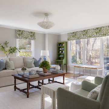
Layered in timeless blues, soft greens, and warm creams, this space balances tradition with everyday comfort. Thoughtfully designed with family in mind, the room invites both connection and quiet moments—ample seating encourages gathering, while a dedicated game table sets the stage for friendly competition and shared memories. A traditional secretary desk adds a functional, collected touch, perfect for homework, correspondence, or simply keeping life organized.
Comfortable, classic, and meant to be lived in—this is a living room where style and family life coexist beautifully.
 Thinkterior LLC
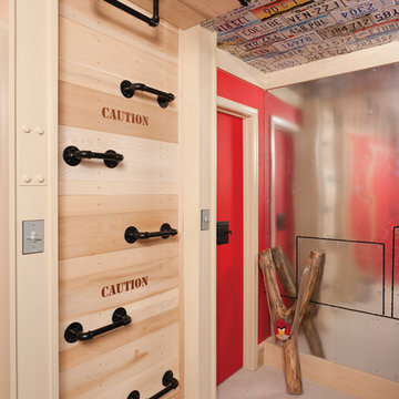
THEME The main theme for this room
is an active, physical and personalized
experience for a growing boy. This was
achieved with the use of bold colors,
creative inclusion of personal favorites
and the use of industrial materials.
FOCUS The main focus of the room is
the 12 foot long x 4 foot high elevated
bed. The bed is the focal point of the
room and leaves ample space for
activity within the room beneath. A
secondary focus of the room is the
desk, positioned in a private corner of
the room outfitted with custom lighting
and suspended desktop designed to
support growing technical needs and
school assignments.
STORAGE A large floor armoire was
built at the far die of the room between
the bed and wall.. The armoire was
built with 8 separate storage units that
are approximately 12”x24” by 8” deep.
These enclosed storage spaces are
convenient for anything a growing boy
may need to put away and convenient
enough to make cleaning up easy for
him. The floor is built to support the
chair and desk built into the far corner
of the room.
GROWTH The room was designed
for active ages 8 to 18. There are
three ways to enter the bed, climb the
knotted rope, custom rock wall, or pipe
monkey bars up the wall and along
the ceiling. The ladder was included
only for parents. While these are the
intended ways to enter the bed, they
are also a convenient safety system to
prevent younger siblings from getting
into his private things.
SAFETY This room was designed for an
older child but safety is still a critical
element and every detail in the room
was reviewed for safety. The raised bed
includes extra long and higher side
boards ensuring that any rolling in bed
is kept safe. The decking was sanded
and edges cleaned to prevent any
potential splintering. Power outlets are
covered using exterior industrial outlets
for the switches and plugs, which also
looks really cool.
Find the right local pro for your project
 Living Stone Design + Build
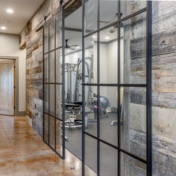
A modern home gym in a mountain ranch, featuring sleek equipment, natural finishes, and ample natural light. This energy-efficient and eco-friendly fitness space blends functionality with sustainable design, ideal for active living in Asheville's serene mountain setting.
 Adaptiv DC
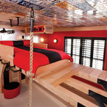
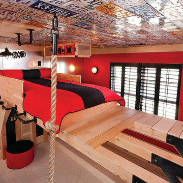
THEME The main theme for this room is an active, physical and personalized experience for a growing boy. This was achieved with the use of bold colors, creative inclusion of personal favorites and the use of industrial materials. FOCUS The main focus of the room is the 12 foot long x 4 foot high elevated bed. The bed is the focal point of the room and leaves ample space for activity within the room beneath. A secondary focus of the room is the desk, positioned in a private corner of the room outfitted with custom lighting and suspended desktop designed to support growing technical needs and school assignments. STORAGE A large floor armoire was built at the far die of the room between the bed and wall.. The armoire was built with 8 separate storage units that are approximately 12”x24” by 8” deep. These enclosed storage spaces are convenient for anything a growing boy may need to put away and convenient enough to make cleaning up easy for him. The floor is built to support the chair and desk built into the far corner of the room. GROWTH The room was designed for active ages 8 to 18. There are three ways to enter the bed, climb the knotted rope, custom rock wall, or pipe monkey bars up the wall and along the ceiling. The ladder was included only for parents. While these are the intended ways to enter the bed, they are also a convenient safety system to prevent younger siblings from getting into his private things. SAFETY This room was designed for an older child but safety is still a critical element and every detail in the room was reviewed for safety. The raised bed includes extra long and higher side boards ensuring that any rolling in bed is kept safe. The decking was sanded and edges cleaned to prevent any potential splintering. Power outlets are covered using exterior industrial outlets for the switches and plugs, which also looks really cool.
 Twelve Stones Designs, LLC
The owners of this kitchen had spent the money to upgrade the finishes in their kitchen upon building the home 12 years ago, but after living in the space for several years they realized how nonfunctional the layout really was. The (then) two preschool aged children had grown into busy, hungry teenagers with many friends who also liked to hang out at the house. So the family needed a more functional kitchen with better traffic flow, space for daily activities revolving around the kitchen at different times of day, and a kitchen that could accommodate cooking for and serving large groups. Furthermore, the dark, traditional finishes no longer reflected the homeowners’ style. They requested a brighter, more relaxed, coastal style that reflected their love of the seaside cities they like to visit.
Originally, the kitchen was U-shaped with a narrow island in the middle. The island created narrow aisles that bottle-necked at the dishwasher, refrigerator, and cooktop areas. There was a pass-through from the foyer into the kitchen, but the owners never liked that the pass-through was also located so close to the powder room. The awkward proximity was unappealing and made guests feel uncomfortable.
The kitchen’s storage was made up of lots of narrow cabinets, apothecary drawers, clipped corner units, and very few drawers. It lacked useful storage for the larger items the family used on a daily basis. And the kitchen’s only pantry was small closet that had only builder-grade, narrow shelving with no illumination to be able to see the contents inside.
Overall, the kitchen’s lighting plan was poorly executed. Only six recessed cans illuminated the entire kitchen and nook areas. The under cabinet lighting was not evenly distributed either. In fact, the builder had mis-placed the under cabinet lighting around the decorative pilasters which made for choppy, dark cubbies. Further, the builder didn’t include any lighting over the sink or the bar area, which meant whoever was doing the dishes was always in their own shadow. That, coupled with the steep overhang of the game room above made the bar area feel like a dim, cavernous space that wasn’t inviting or task oriented. The kitchen looked out into the main living space, but the raised bar and a narrow wall (which held the only large cabinet in the kitchen) created more of a barrier than a relationship to the living room or breakfast nook. In fact, one couldn’t even see the breakfast nook from the cooktop or sink areas due to its orientation. The raised bar top was too narrow to comfortably sit to either dine at or chat from due to the lack of knee space. The the homeowners confided that the kitchen felt more like a dark, dirty prison than place where the family, or their guests, wanted to gather and commune.
The clients' needs and desires were:
➢ to create a kitchen that would be a space the family loved to be in; to relate to the adjacent spaces all around, and to have better flow for entertaining large groups
➢ to remove the walls between the breakfast nook and living area and to be able to utilize the natural light from the windows in both those areas
➢ to incorporate a functional chopping block for prepping fresh food for home cooked meals, an island with a large sink and drain board, 2 pull out trash cans, and seating for at least the 2 teens to eat or do homework
➢ to design a kitchen and breakfast nook with an airy, coastal, relaxed vibe that blended with the rest of the house's coastal theme
➢ to integrate a layered lighting plan which would include ample general illumination, specific task lighting, decorative lighting, and lots of illuminated storage
➢ to design a kitchen with not only more storage for all the husband’s kitchen gadgets and collection of oils and spices, but smart storage, including a coffee/breakfast bar and a place to store and conceal the toaster oven and microwave
➢ to find a way to utilize the large open space between the kitchen, pantry area, and breakfast nook
Twelve Stones Designs achieved the owner's goals by:
➢ removing the walls between the kitchen and living room to allow the natural light to filter in from the adjacent rooms and to create a connection between the kitchen, nook, and living spaces for a sense of unity and communion
➢ removing the existing pantry and designing 3 large pantry style cabinets with LED tape lights and rollout drawers to house lots of kitchen appliances, gadgets, and tons of groceries. We also took the cabinets all the way up to the 9’ ceiling for additional storage for seasonal items and bulk storage.
➢ designing 2 islands - 1 with a gorgeous black walnut chopping block that houses a drawer for chopping and carving knives and a custom double pull out trash unit for point of use utilization - and 1 that houses the dishwasher, a large Blanco Gourmet sink with integrated drain board, woven baskets for fresh root vegetables and kitchen towels, plenty of drawer storage for kitchen items, and bar seating for up to 4 diners.
➢ closing off the space between the kitchen and the powder room to create a beautiful new private alcove for the powder room as well as adding some decorative storage. This also gave us space to include more tall storage near the new range for precision placement of the husband’s extensive oil and spice collection as well as a location for a combo-steam oven the wife wanted for baking and cooking healthy meals.
The project is enhanced functionally by:
➢ incorporated USB and standard receptacles for the kids’ laptops and phone charging in the large island
➢ designing the small island to include additional open shelving for items used on a daily basis such as a variety of bowls, plates, and colanders. This set up also works well for the husband who prefers to “plate” his dinners in restaurant-style fashion before presenting them to the table.
➢ the integration of specific storage units, such as double stacked cutlery drawers, a custom spice pull-out, a Kuerig coffee and tea pod drawer, and custom double stacked utensil drawers
➢ moving the refrigerator to the old oven location - this eliminated the bottle neck as well as created a better relationship to the eating table. It also utilizes the floor space between the pantry, nook, and kitchen
➢ creating a banquet style breakfast nook - this banquette seating not only doubles the amount of seating for large gatherings but it better utilizes the odd space between the kitchen and the previous nook area. It also helps to create a distinct pathway from the mudroom room through the pantry area, kitchen, nook, and living room.
➢ the coffee/breakfast bar area which includes the perfect location for the concealed microwave and toaster oven, convenient storage for the coffee pods and tea accoutrements. Roll-out drawers below also house the smoothie maker, hot water kettle, and a plethora of smoothie-making ingredients such as protein powders, smoothie additives, etc. Furthermore, the drawers below the Keurig house measuring utensil, cutlery, baking supplies and tupperware storage.
➢ incorporating lots of wide drawers and pullouts to accommodate large cookware.
➢ utilizing as much vertical space as possible by building storage to the ceiling which accommodates the family’s abundant amount of serving platters, baking sheets, bakeware, casserole dishes, and additional cutting boards.
The project is enhanced aesthetically by:
➢ new 5-piece Versailles pattern porcelain tile that now seamlessly joins the entire down stairs area together creating a bright, cohesiveness feeling instead of choppy separated spaces - it also adds a coastal feeling
➢ designing a cabinet to conceal the microwave and toaster oven
➢ the coastal influenced light fixtures over the nook table and island
➢ the sandy colors of the Langdon Cambria countertops. The swirling pattern and sparkling quartz pieces remind the homeowner of black-and-tan sandy beaches
➢ the striped banquet seating whose creamy white background and blue-green stripes were the inspiration for the cabinet and wall colors.
➢ All the interior doors were painted black to coordinate with the blacks and grays in the backsplash tile and countertop. This also adds a hint of tailored formality to an otherwise casual space.
➢ the use of WAC's Oculux small aperture LED units for the overhead lighting complimented with Diode LED strips for task lighting under the cabinets and inside the pantry and glass wall cabinets. All of the lighting applications are on separate dimmer switches.
Innovative uses of materials or construction methods by Realty Restoration LLC:
➢ Each 1-1/2” x 3” block of reclaimed end-grain black walnut that makes up the center island chopping block was hand milled and built in the shop. It was designed to look substantial and proportional to the surrounding elements, executed by creating the 4 inch tall top with a solid wood chamfered edge band.
➢ The metal doors on either side of the vent hood were also custom designed for this project and built in the Realty Restoration LLC shop. They are made 1x2, 11-gauge mild steel with ribbed glass. Weighing 60 lbs a piece, heavy duty cabinet hinges were added to support the weight of the door and keep them from sagging.
➢ Under-cabinet receptacles were added along the range wall in order to have a clean, uninterrupted backsplash.
Design obstacles to overcome:
➢ Because we were removing the demising walls between the kitchen and living room, we had to find a way to plumb and vent the new island. We did this by tunneling through the slab (the slab had post tension cables which prevented us from just trenching) to run a new wet vent through a nearby structural wall. We pulled the existing hot and cold lines between upper floor joists and ran them down the structural wall as well and up through a conduit in the tunnel.
➢ Since we were converting from wall overs to a gas range it allowed us to utilize the 220 feed for the wall ovens to provide a new sub panel for all the new kitchen circuits
➢ Due to framing deficiencies inherited from the original build there was a 1-1/2” differential in the floor-to-ceiling height over a 20 foot span; by utilizing the process of cutting and furring coupled with the crown moulding details on the cabinet elevations we were able to mask the problem and provide seamless transitions between the cabinet components.
Evidence of superior craftsmanship:
➢ uniquely designed, one-of-a-kind metal “X” end panels on the large island. The end panels were custom made in the Realty Restoration LLC shop and fitted to the exact dimensions of the island. The welding seams are completely indistinguishable - the posts look like they are cut from a single sheet of metal
➢ square metal posts on the small island were also custom made and designed to compliment and carry through the metal element s throughout the kitchen
➢ the beautiful, oversized end panels on the pantry cabinets which give the breakfast nook a tailored look
➢ integrating a large format 5 piece Versailles tile pattern to seamlessly flow from the existing spaces into the new kitchen space
➢ By constructing a custom cabinet that jogged around a corner we could not remodel (housing the entry way coat closet) we were able to camouflage the adjacent wall offset within the upper and lower cabinets. By designing around the existing jog in the structural walls we accomplished a few things: we were able to find the space to house, and hide, the microwave and toaster oven yet still have a clean cohesive appearance from the kitchen side. Additionally, the owners were able to keep their much needed coat closet and we didn’t have to increase the budget with unnecessary structural work.
 User
UserSpectacular unobstructed views of the Bay, Bridge, Alcatraz, San Francisco skyline and the rolling hills of Marin greet you from almost every window of this stunning Provençal Villa located in the acclaimed Middle Ridge neighborhood of Mill Valley. Built in 2000, this exclusive 5 bedroom, 5+ bath estate was thoughtfully designed by architect Jorge de Quesada to provide a classically elegant backdrop for today’s active lifestyle. Perfectly positioned on over half an acre with flat lawns and an award winning garden there is unmatched sense of privacy just minutes from the shops and restaurants of downtown Mill Valley.
A curved stone staircase leads from the charming entry gate to the private front lawn and on to the grand hand carved front door. A gracious formal entry and wide hall opens out to the main living spaces of the home and out to the view beyond. The Venetian plaster walls and soaring ceilings provide an open airy feeling to the living room and country chef’s kitchen, while three sets of oversized French doors lead onto the Jerusalem Limestone patios and bring in the panoramic views.
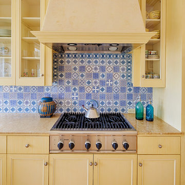
The chef’s kitchen is the focal point of the warm welcoming great room and features a range-top and double wall ovens, two dishwashers, marble counters and sinks with Waterworks fixtures. The tile backsplash behind the range pays homage to Monet’s Giverny kitchen. A fireplace offers up a cozy sitting area to lounge and watch television or curl up with a book. There is ample space for a farm table for casual dining. In addition to a well-appointed formal living room, the main level of this estate includes an office, stunning library/den with faux tortoise detailing, butler’s pantry, powder room, and a wonderful indoor/outdoor flow allowing the spectacular setting to envelop every space.
A wide staircase leads up to the four main bedrooms of home. There is a spacious master suite complete with private balcony and French doors showcasing the views. The suite features his and her baths complete with walk – in closets, and steam showers. In hers there is a sumptuous soaking tub positioned to make the most of the view. Two additional bedrooms share a bath while the third is en-suite. The laundry room features a second set of stairs leading back to the butler’s pantry, garage and outdoor areas.
The lowest level of the home includes a legal second unit complete with kitchen, spacious walk in closet, private entry and patio area. In addition to interior access to the second unit there is a spacious exercise room, the potential for a poolside kitchenette, second laundry room, and secure storage area primed to become a state of the art tasting room/wine cellar.
From the main level the spacious entertaining patio leads you out to the magnificent grounds and pool area. Designed by Steve Stucky, the gardens were featured on the 2007 Mill Valley Outdoor Art Club tour.
A level lawn leads to the focal point of the grounds; the iconic “Crags Head” outcropping favored by hikers as far back as the 19th century. The perfect place to stop for lunch and take in the spectacular view. The Century old Sonoma Olive trees and lavender plantings add a Mediterranean touch to the two lawn areas that also include an antique fountain, and a charming custom Barbara Butler playhouse.
Inspired by Provence and built to exacting standards this charming villa provides an elegant yet welcoming environment designed to meet the needs of today’s active lifestyle while staying true to its Continental roots creating a warm and inviting space ready to call home.
 TKS Design Group
Download our free ebook, Creating the Ideal Kitchen. DOWNLOAD NOW
As with most projects, it all started with the kitchen layout. The home owners came to us wanting to upgrade their kitchen and overall aesthetic in their suburban home, with a combination of fresh paint, updated finishes, and improved flow for more ease when doing everyday activities.
A monochromatic, earth-toned palette left the kitchen feeling uninspired. It lacked the brightness they wanted from their space. An eat-in table underutilized the available square footage. The butler’s pantry was out of the way and hard to access, and the dining room felt detached from the kitchen.
Lead Designer, Stephanie Cole, saw an improved layout for the spaces that were no longer working for this family. By eliminating an existing wall between the kitchen and dining room, and relocating the bar area to the dining room, we opened up the kitchen, providing all the space we needed to create a dreamy and functional layout. A new perimeter configuration promoted circulation while also making space for a large and functional island loaded with seating – a must for any family. Because an island that isn’t big enough for everyone (and a few more) is a recipe for disaster. The light white cabinetry is fresh and contrasts with the deeper tones in the wood flooring, creating a modern aesthetic that is elevated, yet approachable for everyday living.
With better flow as the overarching goal, we made some structural changes too. To remove a bottleneck in the entryway, we angled one of the dining room walls to create more natural separation between rooms and facilitate ease of movement throughout the large space.
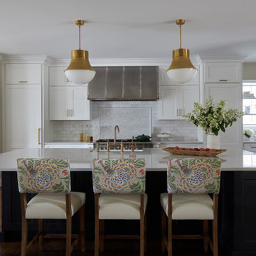
At The Kitchen Studio, we believe a well-designed kitchen uses every square inch to the fullest. By starting from scratch, it was possible to rethink the entire kitchen layout and design the space according to how it is used, because the kitchen shouldn’t make it harder to feed the family. A new location for the existing range, flanked by a new column refrigerator and freezer on each side, worked to anchor the space. The very large and very spacious island (a dream island if we do say so ourselves) now houses the primary sink and provides ample space for food prep and family gathering.
The new kitchen table and coordinating banquette seating provide a cozy nook for quick breakfasts before school or work, and evening homework sessions. Elegant gold details catch the natural light, elevating the aesthetic.
The dining room was transformed into one of this client’s favorite spaces and we couldn’t agree more. We saw an opportunity to give the dining room a more distinguished identity by closing off the entrance from the foyer. The relocated wet bar enhances the sophisticated vibe of this gathering space, complete with beautiful antique mirror tiles and open shelving encased by moody built-in cabinets.
Updated furnishings add warmth. A rich walnut table is paired with custom chairs in a muted coral fabric. The large, transitional chandelier grounds the room, pairing beautifully with the gold finishes prevalent in the faucet and cabinet hardware. Linen-inspired wallpaper and cream-toned window treatments add to the glamorous feel of this entertainment space.
There is no way around it. The laundry room was cramped. The large washer and dryer blocked access to the sink and left little room for the space to serve its other essential function – as a mudroom. Because we reworked the kitchen layout to create more space overall, we could rethink the mudroom too – an essential for any busy family. The first step was moving the washer and dryer to an existing area on the second floor, where most of the family’s laundry lives (no one wants to carry laundry up and down the stairs if they don’t have to anyway). This is a more functional solution and opened up the space for all the mudroom necessities – including the existing kitchen refrigerator, loads of built-in cubbies, and a bench.
It’s hard to not fall in love with every detail of a new space, especially when it serves your day-to-day life. But that doesn’t mean the clients didn’t have their favorite features they use on the daily. This remodel was focused largely on function with a new kitchen layout. And it’s the functional features that have the biggest impact. The large island provides much needed workspace in the kitchen and is a spot where everyone gathers together – it grounds the space and the family. And the custom counter stools are the icing on the cake. The nearby mudroom has everything their previous space was lacking – ample storage, space for everyone’s essentials, and the beloved cement floor tiles that are both durable and artistic.
 Interiors by Popov
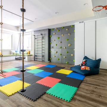
Having two young boys presents its own challenges, and when you have two of their best friends constantly visiting, you end up with four super active action heroes. This family wanted to dedicate a space for the boys to hangout. We took an ordinary basement and converted it into a playground heaven. A basketball hoop, climbing ropes, swinging chairs, rock climbing wall, and climbing bars, provide ample opportunity for the boys to let their energy out, and the built-in window seat is the perfect spot to catch a break. Tall built-in wardrobes and drawers beneath the window seat to provide plenty of storage for all the toys.
You can guess where all the neighborhood kids come to hangout now ☺
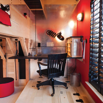 Thinkterior LLC
THEME The main theme for this room
is an active, physical and personalized
experience for a growing boy. This was
achieved with the use of bold colors,
creative inclusion of personal favorites
and the use of industrial materials.
FOCUS The main focus of the room is
the 12 foot long x 4 foot high elevated
bed. The bed is the focal point of the
room and leaves ample space for
activity within the room beneath. A
secondary focus of the room is the
desk, positioned in a private corner of
the room outfitted with custom lighting
and suspended desktop designed to
support growing technical needs and
school assignments.
STORAGE A large floor armoire was
built at the far die of the room between
the bed and wall.. The armoire was
built with 8 separate storage units that
are approximately 12”x24” by 8” deep.
These enclosed storage spaces are
convenient for anything a growing boy
may need to put away and convenient
enough to make cleaning up easy for
him. The floor is built to support the
chair and desk built into the far corner
of the room.
GROWTH The room was designed
for active ages 8 to 18. There are
three ways to enter the bed, climb the
knotted rope, custom rock wall, or pipe
monkey bars up the wall and along
the ceiling. The ladder was included
only for parents. While these are the
intended ways to enter the bed, they
are also a convenient safety system to
prevent younger siblings from getting
into his private things.
SAFETY This room was designed for an
older child but safety is still a critical
element and every detail in the room
was reviewed for safety. The raised bed
includes extra long and higher side
boards ensuring that any rolling in bed
is kept safe. The decking was sanded
and edges cleaned to prevent any
potential splintering. Power outlets are
covered using exterior industrial outlets
for the switches and plugs, which also
looks really cool.
 TKS Design Group
Download our free ebook, Creating the Ideal Kitchen. DOWNLOAD NOW
As with most projects, it all started with the kitchen layout. The home owners came to us wanting to upgrade their kitchen and overall aesthetic in their suburban home, with a combination of fresh paint, updated finishes, and improved flow for more ease when doing everyday activities.
A monochromatic, earth-toned palette left the kitchen feeling uninspired. It lacked the brightness they wanted from their space. An eat-in table underutilized the available square footage. The butler’s pantry was out of the way and hard to access, and the dining room felt detached from the kitchen.
Lead Designer, Stephanie Cole, saw an improved layout for the spaces that were no longer working for this family. By eliminating an existing wall between the kitchen and dining room, and relocating the bar area to the dining room, we opened up the kitchen, providing all the space we needed to create a dreamy and functional layout. A new perimeter configuration promoted circulation while also making space for a large and functional island loaded with seating – a must for any family. Because an island that isn’t big enough for everyone (and a few more) is a recipe for disaster. The light white cabinetry is fresh and contrasts with the deeper tones in the wood flooring, creating a modern aesthetic that is elevated, yet approachable for everyday living.
With better flow as the overarching goal, we made some structural changes too. To remove a bottleneck in the entryway, we angled one of the dining room walls to create more natural separation between rooms and facilitate ease of movement throughout the large space.
At The Kitchen Studio, we believe a well-designed kitchen uses every square inch to the fullest. By starting from scratch, it was possible to rethink the entire kitchen layout and design the space according to how it is used, because the kitchen shouldn’t make it harder to feed the family. A new location for the existing range, flanked by a new column refrigerator and freezer on each side, worked to anchor the space. The very large and very spacious island (a dream island if we do say so ourselves) now houses the primary sink and provides ample space for food prep and family gathering.
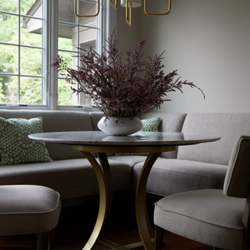
The new kitchen table and coordinating banquette seating provide a cozy nook for quick breakfasts before school or work, and evening homework sessions. Elegant gold details catch the natural light, elevating the aesthetic.
The dining room was transformed into one of this client’s favorite spaces and we couldn’t agree more. We saw an opportunity to give the dining room a more distinguished identity by closing off the entrance from the foyer. The relocated wet bar enhances the sophisticated vibe of this gathering space, complete with beautiful antique mirror tiles and open shelving encased by moody built-in cabinets.
Updated furnishings add warmth. A rich walnut table is paired with custom chairs in a muted coral fabric. The large, transitional chandelier grounds the room, pairing beautifully with the gold finishes prevalent in the faucet and cabinet hardware. Linen-inspired wallpaper and cream-toned window treatments add to the glamorous feel of this entertainment space.
There is no way around it. The laundry room was cramped. The large washer and dryer blocked access to the sink and left little room for the space to serve its other essential function – as a mudroom. Because we reworked the kitchen layout to create more space overall, we could rethink the mudroom too – an essential for any busy family. The first step was moving the washer and dryer to an existing area on the second floor, where most of the family’s laundry lives (no one wants to carry laundry up and down the stairs if they don’t have to anyway). This is a more functional solution and opened up the space for all the mudroom necessities – including the existing kitchen refrigerator, loads of built-in cubbies, and a bench.
It’s hard to not fall in love with every detail of a new space, especially when it serves your day-to-day life. But that doesn’t mean the clients didn’t have their favorite features they use on the daily. This remodel was focused largely on function with a new kitchen layout. And it’s the functional features that have the biggest impact. The large island provides much needed workspace in the kitchen and is a spot where everyone gathers together – it grounds the space and the family. And the custom counter stools are the icing on the cake. The nearby mudroom has everything their previous space was lacking – ample storage, space for everyone’s essentials, and the beloved cement floor tiles that are both durable and artistic.
 The Jack + Mare | Portland Design & Build
Split Level 1970 home of a young and active family of four. The main public spaces in this home were remodeled to create a fresh, clean look.
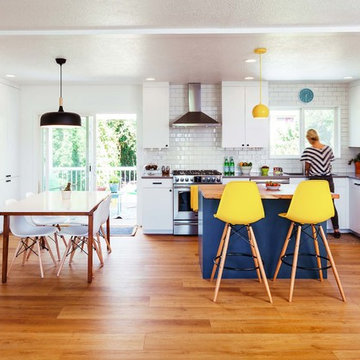
The Jack + Mare demo'd the kitchen and dining room down to studs and removed the wall between the kitchen/dining and living room to create an open concept space with a clean and fresh new kitchen and dining with ample storage. Now the family can all be together and enjoy one another's company even if mom or dad is busy in the kitchen prepping the next meal.
The custom white cabinets and the blue accent island (and walls) really give a nice clean and fun feel to the space. The island has a gorgeous local solid slab of wood on top. A local artisan salvaged and milled up the big leaf maple for this project. In fact, the tree was from the University of Portland's campus located right where the client once rode the bus to school when she was a child. So it's an extra special custom piece! (fun fact: there is a bullet lodged in the wood that is visible...we estimate it was shot into the tree 30-35 years ago!)
The 'public' spaces were given a brand new waterproof luxury vinyl wide plank tile. With 2 young daughters, a large golden retriever and elderly cat, the durable floor was a must.
project scope at quick glance:
- demo'd and rebuild kitchen and dining room.
- removed wall separating kitchen/dining and living room
- removed carpet and installed new flooring in public spaces
- removed stair carpet and gave fresh black and white paint
- painted all public spaces
- new hallway doorknob harware
- all new LED lighting (kitchen, dining, living room and hallway)
Jason Quigley Photography
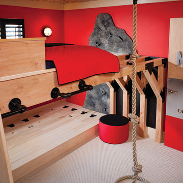 Thinkterior LLC
THEME The main theme for this room
is an active, physical and personalized
experience for a growing boy. This was
achieved with the use of bold colors,
creative inclusion of personal favorites
and the use of industrial materials.
FOCUS The main focus of the room is
the 12 foot long x 4 foot high elevated
bed. The bed is the focal point of the
room and leaves ample space for
activity within the room beneath. A
secondary focus of the room is the
desk, positioned in a private corner of
the room outfitted with custom lighting
and suspended desktop designed to
support growing technical needs and
school assignments.
STORAGE A large floor armoire was
built at the far die of the room between
the bed and wall.. The armoire was
built with 8 separate storage units that
are approximately 12”x24” by 8” deep.
These enclosed storage spaces are
convenient for anything a growing boy
may need to put away and convenient
enough to make cleaning up easy for
him. The floor is built to support the
chair and desk built into the far corner
of the room.
GROWTH The room was designed
for active ages 8 to 18. There are
three ways to enter the bed, climb the
knotted rope, custom rock wall, or pipe
monkey bars up the wall and along
the ceiling. The ladder was included
only for parents. While these are the
intended ways to enter the bed, they
are also a convenient safety system to
prevent younger siblings from getting
into his private things.
SAFETY This room was designed for an
older child but safety is still a critical
element and every detail in the room
was reviewed for safety. The raised bed
includes extra long and higher side
boards ensuring that any rolling in bed
is kept safe. The decking was sanded
and edges cleaned to prevent any
potential splintering. Power outlets are
covered using exterior industrial outlets
for the switches and plugs, which also
looks really cool.

 Rosa Dest Interiors
Jenny Melick
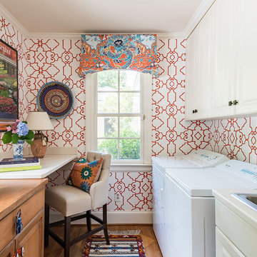
Inspiration for a small timeless galley medium tone wood floor and brown floor laundry room remodel in Charlotte with a side-by-side washer/dryer, raised-panel cabinets, a drop-in sink and white cabinets
Inspiration for a small timeless galley medium tone wood floor and brown floor laundry room remodel in Charlotte with a side-by-side washer/dryer, raised-panel cabinets, a drop-in sink and white cabinets
 Thinkterior LLC
THEME The main theme for this room
is an active, physical and personalized
experience for a growing boy. This was
achieved with the use of bold colors,
creative inclusion of personal favorites
and the use of industrial materials.
FOCUS The main focus of the room is
the 12 foot long x 4 foot high elevated
bed. The bed is the focal point of the
room and leaves ample space for
activity within the room beneath. A
secondary focus of the room is the
desk, positioned in a private corner of
the room outfitted with custom lighting
and suspended desktop designed to
support growing technical needs and
school assignments.
STORAGE A large floor armoire was
built at the far die of the room between
the bed and wall.. The armoire was
built with 8 separate storage units that
are approximately 12”x24” by 8” deep.
These enclosed storage spaces are
convenient for anything a growing boy
may need to put away and convenient
enough to make cleaning up easy for
him. The floor is built to support the
chair and desk built into the far corner
of the room.
GROWTH The room was designed
for active ages 8 to 18. There are
three ways to enter the bed, climb the
knotted rope, custom rock wall, or pipe
monkey bars up the wall and along
the ceiling. The ladder was included
only for parents. While these are the
intended ways to enter the bed, they
are also a convenient safety system to
prevent younger siblings from getting
into his private things.
SAFETY This room was designed for an
older child but safety is still a critical
element and every detail in the room
was reviewed for safety. The raised bed
includes extra long and higher side
boards ensuring that any rolling in bed
is kept safe. The decking was sanded
and edges cleaned to prevent any
potential splintering. Power outlets are
covered using exterior industrial outlets
for the switches and plugs, which also
looks really cool.

 Designer's Edge Kitchen & Bath
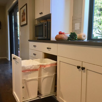
This active family purchased their home and began remodeling before moving in. The out-dated kitchen had oak cabinets and 4" orange tile on the countertops that had to go! (see before photos) It was replaced with a light and bright eat in kitchen. The expansive island provides ample counter space not only for baking and eating, but homework and crafts. Cabinetry with convenient access to blind corners, thoughtful layout for function and storage created a kitchen that is truly the heart of their home. The laundry room is clean and fresh with larger cabinets and a relocated laundry sink under the window. The family room fireplace was also updated with new surround and custom bookcases.
PHOTOS: Designer's Edge
 Living Stone Design + Build
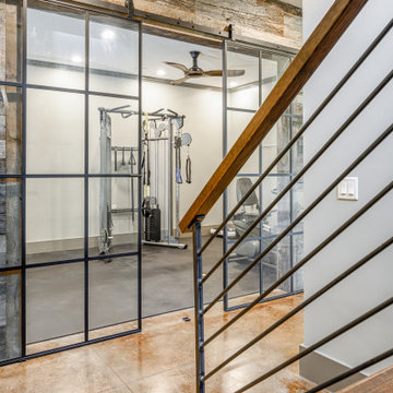
A modern home gym in a mountain ranch, featuring sleek equipment, natural finishes, and ample natural light. This energy-efficient and eco-friendly fitness space blends functionality with sustainable design, ideal for active living in Asheville's serene mountain setting.
 Windhill+Co.
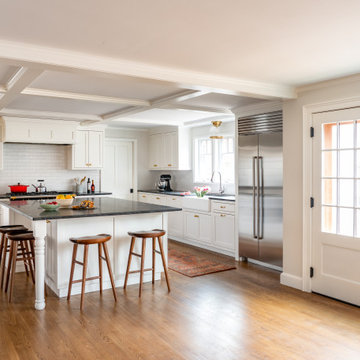
This family’s intention was clear – to create a well-functioning home for their busy family that will continue to be just as well-functioning in the future. With a wish list that included open kitchen and dining spaces, a guest bedroom, and a fresh, modernized master suite, this renovation left the owners delighted. The shifting of the kitchen created a mudroom area resulting in a happy landing space for the family returning from activities. The new mudroom casts a warm glow with an ample black walnut-topped bench. Handsfree entering the kitchen, the large island and coffered ceiling well defines this space. The cook’s Lacanche Saulieu black enamel range is a show-stopper, topped off with a uniquely custom maple hood. A pleasant hideaway, the Benjamin Moore wrought iron painted cabinetry and shelving in the butler’s pantry is both practical and pretty with a quick peek out to the backyard.
The upstairs bedrooms and bathrooms were reenergized with new tile, fixtures, and updated a/v. A Newburyport Blue vanity makes for a cheery children’s bath. A more sophisticated black satin vanity in the master bath compliments the basketweave tile rug created in cool and classy Walker Zanger stone tile. Lit from above, the frameless medicine cabinet mirrors’ simplicity let the gunmetal faucets ‘shine’. Down the hall, the family laundry room’s charming tile and easy function gives hope that every family member will chip in with the chores.
3