
Search results for "Appears apparent" in Home Design Ideas
 Zelaya Properties LLC
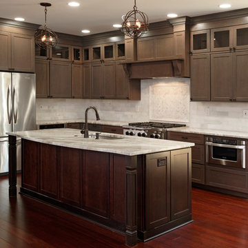
We used: Custom cherry cabinetry in Arts & Crafts Shaker style by Kabinart in Boulder and Espresso stains. Liberty Hardware Venetian bronze 1-1/2" cabinet knobs. KitchenAid Architect II Series 22 CF counter-depth French door refrigerator. KitchenAid Architect Series II 27" convection single wall oven. KitchenAid 36" 6-burner dual fuel freestanding commercial-style range. KitchenAid Architect II Series 24" dishwasher. Sharp Insight Pro Series 24" built-in microwave drawer (Model #KB6524PS). Crystorama Solaris 12" wide pendant lights in English bronze. Granite countertops in Brown Fantasy. 3"x6" polished marble backsplash.
Paint colors:
Walls: Glidden Silver Cloud 30YY 63/024
Ceilings/Trims/Doors: Glidden Swan White GLC23
Robert B. Narod Photography
 Tile Doctor Ltd
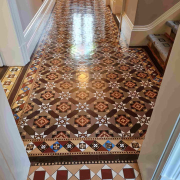
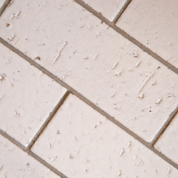
I was recently contacted by a client who had just moved into a large Victorian property in the West Cheshire village of Tarvin about renovating their Victorian tiled hallway. Apparently, the floor was in good condition, and it would just be a case of removing what was left of the old sealer, deep cleaning the tiles and then applying a fresh seal. Unless the floor has been regularly maintained with the same sealer it’s important to remove all traces of old sealers before applying fresh.
Victorian Hallway Before Cleaning Tarvin Cheshire
A lot of the work we do at Tile Doctor can be a lot more involved, often requiring the sourcing of matching replacement tiles and rebuilding large sections of tiled flooring so straight forward clean and seal job is always welcome.
To remove what was left of the sealer and the ingrained dirt from the pores of the Victorian tile I dressed the floor with a strong dilution of Tile Doctor Pro-Clean. On this occasion I used a 1:3 dilution with water and applied it to the floor with a mop. I left it to soak into the tile for fifteen minutes before scrubbing so it could get to work breaking down the old sealer.
During this time, I set up a weighted floor buffer and fitted a black buffing pad, these pads are designed for scrubbing hard floors and lifting out the dirt. I applied a little water as required during this process to ensure the pad was lubricated. Shortly the cleaning solution darkened as the old sealer and dirt was released from the tile.
The soil was rinsed away with water and then removed using a wet vacuum. Once clear the floor was inspected and the process repeated until I was satisfied it was as clean as it could be and free of sealer.
I left the floor to dry off overnight and returned the next day to apply a new sealer. Before doing so however I like to use a damp meter to take moisture readings from the floor. This is needed to ensure it is dry enough to seal which is important as any moisture in the tile can affect the sealer and lead to an inconsistent finish.
To seal I started with the application of a single coat of Tile Doctor Colour Grow which is a colour intensifying breathable impregnator that soaks into the tile improving appearance and adding protection from within. Any excess sealant was removed by wiping the floor with a microfibre cloth and then it was left to dry for an hour.
This was followed with four coats of Tile Doctor Seal and Go Extra which is an acrylic breathable sealer which adds a pleasing subtle shine to the tile. This is an important feature when choosing a sealer for old floors where moisture needs to be allowed to rise through the tile, otherwise it can become trapped under the floor and reach out to the walls causing rising damp.
The customer was very happy with the revamped hallway which made the house a lot brighter and welcoming. Before closing I should mention that for aftercare cleaning I recommend Tile Doctor Neutral cleaner which is designed for the daily cleaning for sealed tiles, this is important as most domestic supermarket cleaners are simply too strong and can prematurely erode the sealer.
Alastair Robb
West Cheshire Tile Doctor

 highland
Ever been out in a park, forest, or even just in your backyard and wanted to see just a small side of the picture? Beauty is in the midst of us, but we are not doing enough to see it—we see only at a superficial level. The reality is that there is an entire universe on a scale that is so miniscule yet all around us, waiting to be discovered.
Put the digital microscope camera on the scope, and that little quantum universe you never knew was there awaits your gaze. Makes everyday outdoor activities exciting adventures and learning experiences with leaves, rocks, and bugs that are all interesting. It used to look just the same, and now it's vibrant with patterns, textures, and stories you didn't know before!
What is a Digital Microscope Camera?
A digital microscope camera is a compact device that magnifies very small objects and can display its real-time image on the screen. This new type of microscope can be taken outside and is much easier to transport than a conventional microscope. It is based on three important technologies: the magnification lenses, digital imaging, and As the name implies, snapping up shots of the objects when you bring them close and displaying them clearly on your smartphone, tablet, or its built-in display. This gives you the power to see details of a microworld anywhere you go, with no special equipment.
How a Digital Microscope Camera Works in Real Life
It is easy and yet powerful to operate a digital microscope camera. It brings very small objects closer by employing a system of lenses, and through a digital sensor, it turns the image into a compelling display. After focusing, the image becomes so big that it displays details that the human eye isn't able to see. Whereas, in an actual setting, an individual can simply place the gadget over an object, such as a leaf, insect, or soil surface. This is then performed to get a focus on the details, clear and sharp. In the blink of an eye, you will be exploring a hidden reality with patterns and structures.
Why Nature Looks Completely Different at the Micro Level
If you watch nature with an unbiased eye, it's all straightforward. Leaves are green; insects are tiny and land on a mere brown earth. However, things look so different through the microscope camera's zoom-in. A leaf is more than a leaf: it is a complex system of veins and cells! However, the insect is not merely a tiny insect anymore, but it gradually turns into an object with wings, eyes, and patterns, all of which seem almost like art. From soils a combination of small particles of rock, organic material, and unseen creatures.
Gaining appreciation for the details in leaves and plants.
Plant life is one of the most interesting objects to be examined under the microscope. The details on the leaves, stems, and petals are amazing and would get lost in the details otherwise. By using a digital microscope camera, the vein network that transports water and nutrients can be readily observed. These veins are naturally occurring and run in patterns that resemble roads and/or rivers in the landscape. Every leaf grows differently and is as individual as a fingerprint.
Discovering the Hidden World of Insects
There is no better thing to see under the microscope than one of the many interesting insects. They may appear at first glance to be quite unassuming and tiny, but magnified, they let one in on the whole other universe. They feature fine patterns in their wings – like those found on glass artworks – that are often difficult to see. They have eyes comprised of multiple repeating units. Even their legs and segments of their bodies have special textures.
The Secret Life Inside Soil and Sand
A microscope camera reveals a soil in which activity is taking place in a lively world in the seemingly lifeless soil. The very small particles of rock, decayed plant material, and micro-living organisms are interacting. Sand grains look similar to miniature crystals; all of them are distinctively shaped and structured. As organic matter decomposes, it forms patterns that illustrate how nature continually recycles itself.
Tree Bark: A Natural Storybook
Another interesting area of interest for micro-focusing is the bark of trees. Apparently, this appears to be rough and simple, but under magnification, it is seen as a highly detailed landscape of cracks, lines, and textures. The bark patterns that can be observed on each branch offer a glimpse of the branch's years of growth, weather, and environmental stresses. It's as if someone wrote the history of a tree on its trunk!
Tips for Getting the Best Microscopic Results Outdoors
A few simple techniques can make a big difference in the variety of images you get before getting clear and detailed images. Always make sure that the hands are stable or have a resting surface so that there is no shaking. Moving, even slightly, can cause the picture to become blurry. Lighting is one of the other important ones. This is because natural soft lighting is best suited, as it doesn't create strong reflections and it does show detail. Minimize exposure to strong sunlight/deep shade when possible.
Conclusion:
The digital microscope camera isn't just a camera; it's a new way of viewing life. Makes routine walks outdoors into thrilling explorations of the scientific world and how minute details make a difference. It can teach us something about living by the rules of nature! It is something that we can contemplate, clarify, and enjoy more.
What is a Digital Microscope Camera?
A digital microscope camera is a compact device that magnifies very small objects and can display its real-time image on the screen. This new type of microscope can be taken outside and is much easier to transport than a conventional microscope. It is based on three important technologies: the magnification lenses, digital imaging, and As the name implies, snapping up shots of the objects when you bring them close and displaying them clearly on your smartphone, tablet, or its built-in display. This gives you the power to see details of a microworld anywhere you go, with no special equipment.
How a Digital Microscope Camera Works in Real Life
It is easy and yet powerful to operate a digital microscope camera. It brings very small objects closer by employing a system of lenses, and through a digital sensor, it turns the image into a compelling display. After focusing, the image becomes so big that it displays details that the human eye isn't able to see. Whereas, in an actual setting, an individual can simply place the gadget over an object, such as a leaf, insect, or soil surface. This is then performed to get a focus on the details, clear and sharp. In the blink of an eye, you will be exploring a hidden reality with patterns and structures.
Why Nature Looks Completely Different at the Micro Level
If you watch nature with an unbiased eye, it's all straightforward. Leaves are green; insects are tiny and land on a mere brown earth. However, things look so different through the microscope camera's zoom-in. A leaf is more than a leaf: it is a complex system of veins and cells! However, the insect is not merely a tiny insect anymore, but it gradually turns into an object with wings, eyes, and patterns, all of which seem almost like art. From soils a combination of small particles of rock, organic material, and unseen creatures.
Gaining appreciation for the details in leaves and plants.
Plant life is one of the most interesting objects to be examined under the microscope. The details on the leaves, stems, and petals are amazing and would get lost in the details otherwise. By using a digital microscope camera, the vein network that transports water and nutrients can be readily observed. These veins are naturally occurring and run in patterns that resemble roads and/or rivers in the landscape. Every leaf grows differently and is as individual as a fingerprint.
Discovering the Hidden World of Insects
There is no better thing to see under the microscope than one of the many interesting insects. They may appear at first glance to be quite unassuming and tiny, but magnified, they let one in on the whole other universe. They feature fine patterns in their wings – like those found on glass artworks – that are often difficult to see. They have eyes comprised of multiple repeating units. Even their legs and segments of their bodies have special textures.
The Secret Life Inside Soil and Sand
A microscope camera reveals a soil in which activity is taking place in a lively world in the seemingly lifeless soil. The very small particles of rock, decayed plant material, and micro-living organisms are interacting. Sand grains look similar to miniature crystals; all of them are distinctively shaped and structured. As organic matter decomposes, it forms patterns that illustrate how nature continually recycles itself.
Tree Bark: A Natural Storybook
Another interesting area of interest for micro-focusing is the bark of trees. Apparently, this appears to be rough and simple, but under magnification, it is seen as a highly detailed landscape of cracks, lines, and textures. The bark patterns that can be observed on each branch offer a glimpse of the branch's years of growth, weather, and environmental stresses. It's as if someone wrote the history of a tree on its trunk!
Tips for Getting the Best Microscopic Results Outdoors
A few simple techniques can make a big difference in the variety of images you get before getting clear and detailed images. Always make sure that the hands are stable or have a resting surface so that there is no shaking. Moving, even slightly, can cause the picture to become blurry. Lighting is one of the other important ones. This is because natural soft lighting is best suited, as it doesn't create strong reflections and it does show detail. Minimize exposure to strong sunlight/deep shade when possible.
Conclusion:
The digital microscope camera isn't just a camera; it's a new way of viewing life. Makes routine walks outdoors into thrilling explorations of the scientific world and how minute details make a difference. It can teach us something about living by the rules of nature! It is something that we can contemplate, clarify, and enjoy more.
Find the right local pro for your project
 Tile Doctor Ltd
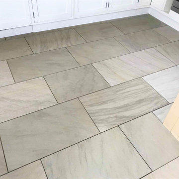
I received an enquiry from a property in Crowthorne to come and survey an unknown Flagstone Floor in a converted barn that was ready to be rented out. The owners where concerned the stone was letting the rest of the property down due to it being dirty and heavily stained, particularly around the kitchen and entrance areas. If your selling or renting out a property it really needs to look its best if you want to achieve a good price. Having spoken over the phone we agreed a date for me to pop over to complete a survey.
From further inspection I confirmed the stone was in fact a Sandstone, it was also clear that the sealer protecting the stone from ingrained dirt had worn away and was now allowing dirt and staining to ruin the appearance of the flagstones. It was a large floor so I measured up so I could work out the quantities of cleaning and sealing products needed and then walked the customer through the cleaning process. Later that day I sent over a detailed quotation which was accepted, and a date agreed for my return.
I should mention this work took place during the Covid restrictions, fortunately being a rental property, I was able to work in the property alone.
To deep clean the floor and remove the ingrained dirt and staining I used a strong dilution of Tile Doctor Pro-Clean. It is sprayed onto the floor and left to soak in for five minutes before agitating with a Black scrubbing pad fitted to a weighted buffing machine. The resultant slurry was then wet extracted away using a powerful high-pressure van mounted extracting system.
This action cleaned up most of the stone nicely however certain areas where heavily stained, particularly in the kitchen area where food and drink stains were more apparent. To tackle this, I applied a stronger cleaner/stripper product called Tile Doctor Remove and Go this time allowing ten minutes for it to soak in before scrubbing the surface with a very coarse 100-grit soft milling pad. This took quite a few attempts each time extracting the slurry away and then inspecting the floor to see if more work was needed.
Happy the stains have been removed, I then focused on renovating the surface Sandstone after the application of the coarse pad. This involves the application of several finer grit burnishing pads which close the pores and adds a subtle polish to the Sandstone. As I started with 100-grit pad it was necessary to gradually refine the surface with an incremental series of pads that included 200, 400 and finally 800-grit pads. Then to ensure a uniform finish across the floor I continued the 400 and 800 grit pads throughout the property. Water is used to lubricate the process and this turns into a fine slurry that is rinse extracted as before.
The cleaning process took up the whole of the first day and I am pleased to say the Sandstone floor looked very clean after I had finished.
The stone was then allowed dry off overnight with the aid of an industrial air mover and I returned later the next day to apply a new protective seal. In the meantime, my customer had been over to check out the floor and were over the moon with how it looked and wanted to keep the finish as natural as possible.
With this in mind, I applied Tile Doctor Ultra-Seal sealer to the Sandstone throughout, only two coats were needed. This is a premium sealer that is almost invisible and works by penetrating the stone thus preventing dirt from becoming ingrained. Once done the floor looked very clean and much brighter than before, it now had that wow factor which will help it attract a good yield in the rental market.
The trouble with rental properties of course is making sure the tenant uses the right product to maintain the floor and not a typical supermarket tile cleaner that are only designed for use on Ceramic and Porcelain tiles. In fact, these types of cleaning product can slowly strip the sealer off the floor so it’s always worth checking the label before purchasing. Fortunately Tile Doctor sells a product called Neutral Cleaner that is ideal for maintaining sealed stone floors, so I left them with a complimentary bottle and recommended they get some more to leave under the sink for the new tenant.
Dennis Buckland
Berkshire Tile Doctor
 Neumann & Rudy Architecture
**I. Spatial Composition & Architectural Volume**
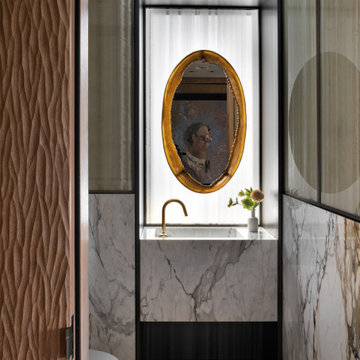
This powder room operates as a compressed, processional vestibule — a jewel-box volume whose narrowness is deliberately weaponized to intensify the encounter with a single focal event. The plan reads as a tight rectilinear corridor, entered obliquely past a pivoting sculptural door leaf at the left foreground, with the sightline funnelling directly to a recessed alcove at the terminal wall. That alcove is the compositional engine of the room: a deep, orthogonal reveal framed in slender blackened-metal profiles, within which a monolithic marble vanity cantilevers as a full-width plinth, its shadow-gap plinth detail dissolving the mass into apparent levitation. The full-height glazed screens flanking both side walls — divided into a disciplined grid of stile-and-rail metal mullions above a stone dado — introduce a Miesian rhythm of verticals that visually widen the space while preserving enclosure. Above, a crisp plaster soffit with a razor-thin perimeter reveal caps the volume, while the mullion grid's continuation across the ceiling plane and door surround creates a cage-like armature, an architectural drawing rendered in three dimensions. The suspended, wall-hung water closet at left is deliberately subordinated, half-concealed by the stone return, ensuring the axial procession terminates not on plumbing but on art.
**II. Materiality, Color & Texture**
The material palette is orchestrated as a controlled dialogue between the geologic, the vegetal, and the metallic. Book-matched Calacatta Viola — or a closely related Paonazzo — sheathes the dado and vanity in slabs whose oxblood, umber, and graphite veining reads as gestural brushwork, its cool bone-white ground counterweighted by the warm ferrous rust of its fissures; the veining on the right-hand wall is sequenced to cascade, treating stone as a continuous painterly field rather than a modular cladding. Against this, the foreground door presents a deeply carved, three-dimensional sculpted timber relief in a mid-tone oak or walnut, its undulating, plaited chevron texture introducing a haptic, almost textile-like tactility that provides the composition's most overtly artisanal register. The glazed screens deploy reeded or fluted glass in a smoky sage-olive cast, their striations diffusing and abstracting whatever lies beyond into vertical striae of light — a translucent counterpoint to the opacity of stone and wood. Blackened bronze or patinated steel mullions supply the graphic scaffolding, while unlacquered brass appears as accent punctuation: the gooseneck spout with exposed swivel collar, and, most emphatically, the flame-patinated bronze oval of the mirror frame, whose molten amber bloom is the single high-saturation event in an otherwise desaturated envelope of greys, greiges, and bone. Underfoot, chevron-laid oak parquet in a soft tobacco stain grounds the palette and repeats the door's zigzag geometry at a domestic scale.
**III. Lighting, Atmosphere & Style Profile**
Lighting is handled with theatrical restraint and a distinctly museological logic. The terminal alcove is backlit by a full-height plane of sheer, pinch-pleated linen sheers washed with daylight — an ambiguous, screened luminance that functions as a lightbox, silhouetting the mirror and reading as a window without conceding a view. Concealed cove or perimeter LED at the soffit reveal lifts the ceiling and grazes the plaster, while the reeded glass side screens capture and refract borrowed light along their flutes, producing a soft vertical shimmer that keeps the narrow volume from collapsing into gloom. The lower register is intentionally darker, the recessed shadow gap beneath the vanity and the bronze toe detail anchoring the composition in a low-key, chiaroscuro base. The atmosphere is hushed, contemplative, and faintly ecclesiastical — the alcove operating as a reredos, the framed portrait glimpsed in the mirror's reflection functioning as an unexpected, wry apparition that injects narrative and humor into an otherwise austere scheme. Stylistically, the room synthesizes into what might be termed *Tactile Luxe Modernism* or Refined Warm Modernism: the structural clarity and metal-gridded transparency of mid-century International Style, tempered by Italian post-war sensuality in the bronze and marble, and finally humanized by contemporary craft-forward texture. The result is a space of considerable discipline that nonetheless privileges touch, patina, and surprise over minimalist abstinence.
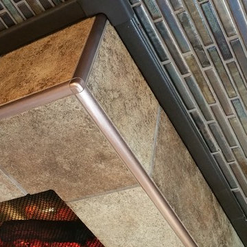
 Complete Flooring
Chris Golden
Inspiration for a transitional carpeted living room remodel in Phoenix with beige walls, a standard fireplace and a tile fireplace
Inspiration for a transitional carpeted living room remodel in Phoenix with beige walls, a standard fireplace and a tile fireplace
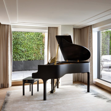 Neumann & Rudy Architecture
**Spatial Composition & Architectural Volume**
This is a room conceived as a stage for a single object, and the architecture obligingly recedes into the role of proscenium. The plan reads as a generous, laterally-oriented salon — likely a piano room carved from the corner of a metropolitan penthouse — organized around an L-shaped glazing sequence that turns the corner and dissolves two of the four enclosing planes. A dropped soffit tray, articulated as a crisply mitred perimeter reveal with an integrated cove, floats above the seating and instrument zone, its shadow-gap detailing lowering the apparent datum and conferring intimacy on an otherwise expansive volume. The plaster ceiling reads as a single continuous membrane, its recessed channels doubling as concealed curtain tracks and linear light slots, thereby suppressing any surface-mounted apparatus. On the left, a full-height run of hand-carved, ripple-textured oak millwork operates as both threshold and tectonic bookend — a vertical mass that anchors the composition against the weightlessness of the fenestration opposite. The pier between the two window bays is clad in pale ribbed limestone or fluted plaster, functioning as a quiet pilaster that structures the sightlines rather than interrupting them. Circulation is centrifugal: the herringbone-laid oak parquet establishes a diagonal grain that pulls the eye toward the terrace, while the rug's rectilinear footprint carves out a defined *piano nobile* island within the open field. The grand piano, positioned obliquely with its raised lid oriented back into the room, becomes the volume's sculptural fulcrum — its cabriole-derived silhouette and blade-thin tapered legs (a distinctly contemporary reinterpretation, likely a designer-authored instrument) providing curvilinear counterpoint to the room's orthogonal discipline.
**Materiality, Color & Texture**
The palette is a study in monochromatic warmth punctuated by a single decisive act of contrast. Nearly every surface resides within a narrow chromatic band of oatmeal, bone, greige and pale honey — undertones consistently warm-neutral, veering toward the sandy rather than the grey, which prevents the minimalism from reading as clinical. The floor's white-oak herringbone is finished with a matte, lightly limed patina that keeps the grain legible without gloss; the field rug in silk-and-viscose introduces a lustrous, cloud-like abraded pattern, its mineral-grey striations reading almost as sumi-e wash or weathered concrete, and providing the room's only tonal modulation at floor level. The drapery — a densely woven linen or linen-blend in a slubbed sand tone, hung with tightly gathered, full-height pinch pleats — carries a subtle vertical stripe or ribbed jacquard that catches raking light and animates the perimeter. Against this, the carved oak volume at left is the tactile protagonist: a low-relief, chiselled facetting that reads as adze-worked or gouged, generating a shifting moiré of micro-shadow and elevating a utilitarian storage wall into applied art. The piano's satin-black lacquer is the compositional anchor — deep, absorbent, and deliberately non-reflective on its exterior case while its interior lid reveals a mottled, patinated bronze-brown, a warm secret held within the black. Brass appears with real restraint: the lid hinges, the harp and action, the sabot-like disc on the bench flank. Nature supplies the only saturated chroma — the emerald ivy hedge framed in the left window and the topiary beyond the right — treated as living tapestry, effectively a curated *borrowed landscape*.
**Lighting, Atmosphere & Style Profile**
The lighting strategy is almost entirely subtractive: daylight is admitted in broad, low-glare sheets through minimal-sightline steel or slim-profile aluminium glazing, then softened and diffused by the sheer-adjacent linen and the pale, light-returning plaster envelope. The result is a high-key, shadowless luminosity with a distinctly diffuse northern quality, in which form is described by gradient rather than by hard contrast — note how the piano's black mass reads as silhouette against the terrace glare, while its curved bentwood rim catches a single soft specular highlight. Artificial illumination is entirely concealed within the ceiling reveals and coves, ensuring that after dark the room will be washed rather than punctured; the deliberate absence of decorative pendants or table lamps in this frame reinforces the reading of the instrument as the sole permitted ornament. Atmospherically the room is contemplative, acoustically soft, and tuned to a single activity — a *musica da camera* interior in the truest sense. Stylistically it synthesizes into what might best be termed **Soft Minimalism with a couture-craft inflection**: the rigour and reductive detailing of late-modernist practice, warmed by the tactile, hand-worked surfaces and neutral tonalities of Japandi and Belgian-inflected quiet luxury. The governing thesis is one of *sublimated luxury* — value expressed through millwork tolerance, drapery yardage, plaster craft and the confident emptiness of the plan, rather than through pattern, colour or accumulation.

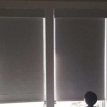
 Budget Blinds of Cedar Falls / Waterloo, IA
Budget Blinds blackout roller shades, photo credit installer Adam Brannick
Example of a mid-sized transitional guest bedroom design in Cedar Rapids with gray walls and no fireplace
Example of a mid-sized transitional guest bedroom design in Cedar Rapids with gray walls and no fireplace
 JM Carpets
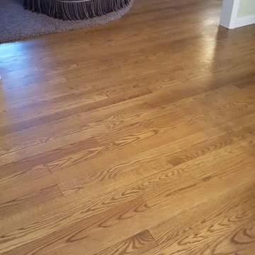
Large country u-shaped medium tone wood floor kitchen photo in Milwaukee with white cabinets and a peninsula

 Advance Design Studio, Ltd.
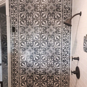
Jennifer and Dan have lived in their Deer Park Illinois home for 15 years, slowly making minor fixes like painting and decorating; but they had a new plan for their kitchen the entire time. An awkwardly placed garage door, and an island cooktop with a terrible downdraft made a full-scale kitchen remodel an absolute must. Jennifer had many ideas in mind and wanted to work with a company that could provide high-end work, while partnering with a designer that would tailor the kitchen to her ideas.
She was intrigued by the phrase “Common Sense Remodeling” in Advance Design’s feature she discovered while perusing an issue of the community’s Quintessential Barrington Magazine. Doing further research on the company’s website, as she looked through project profiles and read about Advance Design’s “Common Sense Remodeling” philosophy, she promptly scheduled an appointment to see if the people and ideas she read about were truly who they said they were. The more she read, the more she knew that the “Common Sense” approach to remodeling they described was exactly the type of company she was looking for.
The partnership was sealed after an initial consultation with Owner Todd Jurs and Project Designer Michelle Lecinski. They displayed a combination of friendliness, professionalism and respect that was unmatched by any of the other companies Jennifer talked to. She knew that with Advance Design, she would be able to retain the vision that she had in mind with high-quality craftsmanship.
“I reached out to Advance Design because of the ‘Common Sense Remodeling’ tagline,” Jennifer said. “That’s what lingered for me”. “Advance Design was the most respectful- of the house and of my design ideas, and the most professional of the handful of companies that looked at my project”.
Soon after the meeting Jennifer began working with Michelle on the project design. They quickly developed chemistry. Jennifer loved how Michelle researched and located every detail that Jennifer wanted for the kitchen. Between the two of them, every concept and idea was worked through and perfected. “Jennifer had definite ideas about what she wanted the new kitchen to look like, she just didn’t know how to bring it all together. We worked together really well to make her ideas into the practical reality necessary for a well-functioning kitchen, with the look and feel that she had envisioned”, says Michelle.
“Michelle was wonderful in using the CAD system she would show me new drawings every time we changed the layout while working through the design,” Jennifer said. “She was a really wonderful partner in execution, she made sure everything happened quickly and easily.”
The finished design drew out elements of Jennifer’s style and personality. The pair call the look “sophisticated farmhouse” to describe the kitchen renovation to family and friends. The result was a beautifully crafted, authentic-feeling space that satisfied Jennifer’s dreams 15 years in the making. The whole project consisted of a kitchen remodel, mudroom upgrade with powder room, and garage entry relocation. “The projects I personally like the best, are the ones that put the client’s dreams on display,” Project Designer Michelle said. “And this is one of those projects.”
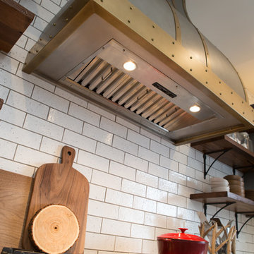
The main focal point of the kitchen is custom zinc and brass ventilation hood with a vintage sheen, which was hand made to order by a small company in Indiana named Vogler Metalworking. “It’s like sculpture, a true work of art”, says Jennifer. Your eye is immediately drawn towards this elegant yet practical hood that eliminated the home’s downdraft problem and added a striking conversation piece at the same time. The carpenters had to use special gloves when transporting and installing it, so they didn’t smudge it with fingerprints. The beautiful hood centers proudly over the stunning black enamel and brass LaCornue Range. “I had a friend who had a LaCornue range and after learning how easy it was to cook perfect meals, I was convinced I wanted to have one”, says Jennifer. This unique, breathtaking combination anchors the entire kitchen and is apparent immediately as you walk into the great room the surrounds the space.
DuraSupreme Crestwood cabinets with a Kendall Panel add function and sophistication. A custom gray paint color paired with a storm blue was developed so that the new kitchen looked like it belonged to the existing space. Unlacquered brass faucets and hardware were important to Jennifer because she wanted the living finishes to age over time. Remarkable brass diamond mesh cabinet door inserts imported from the UK continue to add this one-of-a-kind kitchen renovation; giving it a “you won’t see this everywhere” quality. The use of old railcar flooring for the coffee bar countertop and reclaimed oak for the open shelving gives an authenticity to the space uncommon in kitchens today.
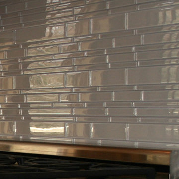
Jennifer and Michelle fell in love with the Limestone Grey Stone while they were investigating unique island countertop ideas. They liked the fact that the limestone as a living finish will age and change over time. Calcutta Miel Quartz countertops made for an excellent pairing around the perimeter, as it’s durable and perfect for cooking preparations. A textured white subway tile backsplash that runs to the ceiling keeps your eye moving towards the open shelving, and to the main focal point of the stunning range hood combination.
“The kitchen functions beautifully, and it’s gorgeous,” beams Jennifer as she gestures with both hands while smiling ear to ear. “The most important thing was I wanted a kitchen that had a wonderful flow, cooked beautiful meals and was a great gathering place for family and friends, and this space does that perfectly! Beauty wise, it turned out exactly how I had envisioned. I felt the function part was the hardest part, and that was nailed”!
Relocating the garage entry to the new mudroom was a huge priority and has finally separated the family’s arriving home functions from their kitchen. Now coats and shoes and bags have their own area for dropping once members arrive home. Matching gray DuraSupreme cabinetry helped create gorgeous, purposeful lockers for the family. A reclaimed vintage sink and custom wall paper were added to the tiny powder room to beautify the once previously only functional space. Advance Design was even able to create a custom space for their dog to sleep while the family is away.
“It was unbelievable that a project of this size was completed in such a short time, and I think that’s because of the large amount of planning and preparation that went into it,” Jennifer marveled, “When we started, we were ready, and everything was prepared”.
When it came to execution, Project Manager Justin Davis and his crew were quick, accessible, and organized. Projects like this kitchen are typically completed in as little as 8-10 weeks. Jennifer’s kitchen however despite the relocation of some challenging HVAC in a soffit and moving of an exterior door was completed remarkably fast in part because the team was working with an existing tile floor that ran throughout the first floor that the client really loved.
“You get to know these people really well because they’re living in your house while you’re living in your house. They were so fast and really good, it didn’t take as long as even planned” reported Jennifer. “I would text Justin and he always responded almost immediately. I got to know all the guys who were working in our house and they were all wonderful people”.
Details in a customized kitchen like this one require skill and care from the people who install it. “All the guys on the job were skilled at what the did. I wanted small details like little feet to look like furniture, that is where their carpentry skill came in to make these all perfect”, said Jennifer. “The tile guys were wonderful. They even let me determine how I wanted the texture with the grout to appear for a salt and pepper look; now that is a very skilled trade person making it custom”.
In Jennifer’s interview, she continued to reference Advance Design’s “Common Sense Remodeling”, so I took a minute to ask her exactly what that phrase meant to her and how it played out in her experience with her project and the Advance Design team. Here is what she said: “I was intrigued about Common Sense Remodeling and in my head that there would be clear costs and prices, great communication between the design team, the execution team and me”, said Jennifer. They did deliver on that, it was so clear about the cost breakdown, what I could expect from everyone who came to my house, and everything that we had ordered. That to me is the Common Sense”!
It’s great to see a client take literally our assertion that a well-planned remodeling project is simply “Common Sense”! She anticipated each step of the way would be clear, concise, and predictable, all the while protecting the outcome due to the careful upfront planning. “Advance Design delivered on their ‘Common Sense Remodeling’ promise,” Jennifer said. “From the design team, to the execution team - everything was straight forward like I imagined. The project turned out exactly how I envisioned, I enjoyed this process and absolutely would recommend Advance Design Studio to anyone.”
 Shuler Architecture
This 3 BR, 3 1/2 bath home allows the owners to live on one level most of the time. The Master Suite is on the main level along with the Living Room, Kitchen, Dining, pantries, Sun Room and service areas. The upper level houses two ample bedrooms while the lower level supports a rec center, media room, wine cellar, shop and full wet bar. Conceived as a Great Room house, the main level is designed as one seamless space that flows onto an ample deck overlooking the rear yard.
We also incorporated a variety of green building techniques - photo-voltaic shingles on the roof of the garage to generate a portion of the home's energy, a super insulated building envelope, rain water harvesting, high performance windows and doors, a high efficiency heat pump, low flow bath & kitchen fixtures, Energy Star appliances and LED lighting - that greatly reduced this structure's carbon footprint. All of the strategies amounted to a 30% reduction in the energy consumption in this home relative to comparable structures.
 Advance Design Studio, Ltd.
Jennifer and Dan have lived in their Deer Park Illinois home for 15 years, slowly making minor fixes like painting and decorating; but they had a new plan for their kitchen the entire time. An awkwardly placed garage door, and an island cooktop with a terrible downdraft made a full-scale kitchen remodel an absolute must. Jennifer had many ideas in mind and wanted to work with a company that could provide high-end work, while partnering with a designer that would tailor the kitchen to her ideas.
She was intrigued by the phrase “Common Sense Remodeling” in Advance Design’s feature she discovered while perusing an issue of the community’s Quintessential Barrington Magazine. Doing further research on the company’s website, as she looked through project profiles and read about Advance Design’s “Common Sense Remodeling” philosophy, she promptly scheduled an appointment to see if the people and ideas she read about were truly who they said they were. The more she read, the more she knew that the “Common Sense” approach to remodeling they described was exactly the type of company she was looking for.
The partnership was sealed after an initial consultation with Owner Todd Jurs and Project Designer Michelle Lecinski. They displayed a combination of friendliness, professionalism and respect that was unmatched by any of the other companies Jennifer talked to. She knew that with Advance Design, she would be able to retain the vision that she had in mind with high-quality craftsmanship.
“I reached out to Advance Design because of the ‘Common Sense Remodeling’ tagline,” Jennifer said. “That’s what lingered for me”. “Advance Design was the most respectful- of the house and of my design ideas, and the most professional of the handful of companies that looked at my project”.
Soon after the meeting Jennifer began working with Michelle on the project design. They quickly developed chemistry. Jennifer loved how Michelle researched and located every detail that Jennifer wanted for the kitchen. Between the two of them, every concept and idea was worked through and perfected. “Jennifer had definite ideas about what she wanted the new kitchen to look like, she just didn’t know how to bring it all together. We worked together really well to make her ideas into the practical reality necessary for a well-functioning kitchen, with the look and feel that she had envisioned”, says Michelle.
“Michelle was wonderful in using the CAD system she would show me new drawings every time we changed the layout while working through the design,” Jennifer said. “She was a really wonderful partner in execution, she made sure everything happened quickly and easily.”
The finished design drew out elements of Jennifer’s style and personality. The pair call the look “sophisticated farmhouse” to describe the kitchen renovation to family and friends. The result was a beautifully crafted, authentic-feeling space that satisfied Jennifer’s dreams 15 years in the making. The whole project consisted of a kitchen remodel, mudroom upgrade with powder room, and garage entry relocation. “The projects I personally like the best, are the ones that put the client’s dreams on display,” Project Designer Michelle said. “And this is one of those projects.”
The main focal point of the kitchen is custom zinc and brass ventilation hood with a vintage sheen, which was hand made to order by a small company in Indiana named Vogler Metalworking. “It’s like sculpture, a true work of art”, says Jennifer. Your eye is immediately drawn towards this elegant yet practical hood that eliminated the home’s downdraft problem and added a striking conversation piece at the same time. The carpenters had to use special gloves when transporting and installing it, so they didn’t smudge it with fingerprints. The beautiful hood centers proudly over the stunning black enamel and brass LaCornue Range. “I had a friend who had a LaCornue range and after learning how easy it was to cook perfect meals, I was convinced I wanted to have one”, says Jennifer. This unique, breathtaking combination anchors the entire kitchen and is apparent immediately as you walk into the great room the surrounds the space.
DuraSupreme Crestwood cabinets with a Kendall Panel add function and sophistication. A custom gray paint color paired with a storm blue was developed so that the new kitchen looked like it belonged to the existing space. Unlacquered brass faucets and hardware were important to Jennifer because she wanted the living finishes to age over time. Remarkable brass diamond mesh cabinet door inserts imported from the UK continue to add this one-of-a-kind kitchen renovation; giving it a “you won’t see this everywhere” quality. The use of old railcar flooring for the coffee bar countertop and reclaimed oak for the open shelving gives an authenticity to the space uncommon in kitchens today.
Jennifer and Michelle fell in love with the Limestone Grey Stone while they were investigating unique island countertop ideas. They liked the fact that the limestone as a living finish will age and change over time. Calcutta Miel Quartz countertops made for an excellent pairing around the perimeter, as it’s durable and perfect for cooking preparations. A textured white subway tile backsplash that runs to the ceiling keeps your eye moving towards the open shelving, and to the main focal point of the stunning range hood combination.
“The kitchen functions beautifully, and it’s gorgeous,” beams Jennifer as she gestures with both hands while smiling ear to ear. “The most important thing was I wanted a kitchen that had a wonderful flow, cooked beautiful meals and was a great gathering place for family and friends, and this space does that perfectly! Beauty wise, it turned out exactly how I had envisioned. I felt the function part was the hardest part, and that was nailed”!
Relocating the garage entry to the new mudroom was a huge priority and has finally separated the family’s arriving home functions from their kitchen. Now coats and shoes and bags have their own area for dropping once members arrive home. Matching gray DuraSupreme cabinetry helped create gorgeous, purposeful lockers for the family. A reclaimed vintage sink and custom wall paper were added to the tiny powder room to beautify the once previously only functional space. Advance Design was even able to create a custom space for their dog to sleep while the family is away.
“It was unbelievable that a project of this size was completed in such a short time, and I think that’s because of the large amount of planning and preparation that went into it,” Jennifer marveled, “When we started, we were ready, and everything was prepared”.
When it came to execution, Project Manager Justin Davis and his crew were quick, accessible, and organized. Projects like this kitchen are typically completed in as little as 8-10 weeks. Jennifer’s kitchen however despite the relocation of some challenging HVAC in a soffit and moving of an exterior door was completed remarkably fast in part because the team was working with an existing tile floor that ran throughout the first floor that the client really loved.
“You get to know these people really well because they’re living in your house while you’re living in your house. They were so fast and really good, it didn’t take as long as even planned” reported Jennifer. “I would text Justin and he always responded almost immediately. I got to know all the guys who were working in our house and they were all wonderful people”.
Details in a customized kitchen like this one require skill and care from the people who install it. “All the guys on the job were skilled at what the did. I wanted small details like little feet to look like furniture, that is where their carpentry skill came in to make these all perfect”, said Jennifer. “The tile guys were wonderful. They even let me determine how I wanted the texture with the grout to appear for a salt and pepper look; now that is a very skilled trade person making it custom”.
In Jennifer’s interview, she continued to reference Advance Design’s “Common Sense Remodeling”, so I took a minute to ask her exactly what that phrase meant to her and how it played out in her experience with her project and the Advance Design team. Here is what she said: “I was intrigued about Common Sense Remodeling and in my head that there would be clear costs and prices, great communication between the design team, the execution team and me”, said Jennifer. They did deliver on that, it was so clear about the cost breakdown, what I could expect from everyone who came to my house, and everything that we had ordered. That to me is the Common Sense”!
It’s great to see a client take literally our assertion that a well-planned remodeling project is simply “Common Sense”! She anticipated each step of the way would be clear, concise, and predictable, all the while protecting the outcome due to the careful upfront planning. “Advance Design delivered on their ‘Common Sense Remodeling’ promise,” Jennifer said. “From the design team, to the execution team - everything was straight forward like I imagined. The project turned out exactly how I envisioned, I enjoyed this process and absolutely would recommend Advance Design Studio to anyone.”
 FINNE Architects
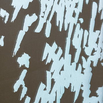
The master bath features stunning views of Puget Sound.
The glass walls between the bath and hall have a hand-drawn etched glass pattern.
Photo: Benjamin Benschneider
 Victor Mulbauer
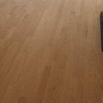
New Installation of Red Oak Wood, 3 1/4 in width. White-washed Bona Stain was used, Bona Finish, as well as Bona Traffic HD.
**This photo is of the Red Oak Wood (3 1/4 inch) prior to the application of the white-washed Bona Stain.


 Charlen's Abstracts
This 30" x 24" abstract acrylic painting has been done in shades of cobalt blue, sky blue, citrine, chartreuse, white, soft sea green, and royal blue. Finished in gloss varnish to protect the piece from dust and UV light for years to come. Can be hung vertically or horizontally. Gorgeous vivid rich colors in a great contemporary style.
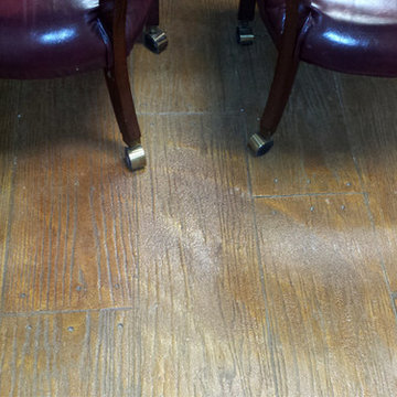
 Concrete Craft
Our resurfacing techniques and wood plank stamp patterns can transform interior
concrete floors to resemble that of natural hard wood floors.
Example of an arts and crafts concrete floor home design design in Atlanta
Example of an arts and crafts concrete floor home design design in Atlanta

 CSDesign llc
We designed and installed this 15 years ago, before digital camera's....so I'm looking for a picture of it running! :)
This is an example of a contemporary landscaping in Seattle.
This is an example of a contemporary landscaping in Seattle.
9