
Search results for "Approach challenges" in Home Design Ideas
 Drury Design
THE SETUP
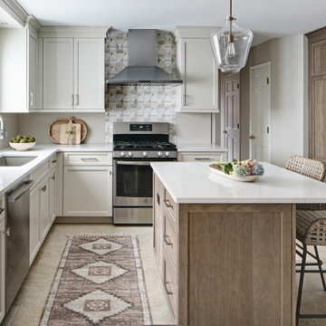
Client Background: Our clients, a couple who have transitioned into the empty nest phase, have cherished their home for over three decades without undergoing any significant renovations. With a newfound desire to adapt their living space to better suit their current lifestyle, they’ve embarked on a journey to reimagine their kitchen — the heart of their home. Their aspiration is to cultivate a serene, neutral-toned sanctuary on the first floor that seamlessly merges with their family room, ensuring a harmonious and inviting environment.
Design Inspiration: The renovation is inspired by the couple’s penchant for soft, calming neutrals, using their cherished family room and the kitchen’s existing tile flooring as the cornerstone for the color scheme. This approach aims to foster a sense of warmth and tranquility throughout.
Design Objectives:
Harmonize the kitchen with the family room by adopting a soothing, neutral color scheme, ensuring a seamless flow across the first floor.
Enhance kitchen functionality with thoughtfully designed cabinetry, providing a designated place for every item and maximizing storage efficiency.
Cultivate an inviting and comfortable atmosphere that reflects the homeowners’ desire for a calm and relaxing space.
Design Challenges:
The homeowners wish to retain the existing kitchen tile flooring and integrate it into a refreshed, modern design.
Accommodating a dining area spacious enough for family visits without compromising the kitchen’s open feel or functional layout.
Despite liking the current placement of plumbing and appliances, the homeowners aspire for a more open floor plan to facilitate better movement and interaction.
The need to amplify natural light in the kitchen, especially around the sink area, where existing lighting is insufficient.
Preserving the half-wall between the kitchen and family room, a feature the homeowners want to keep, while ensuring it complements the new design.
THE RENEWED SPACE
Design Solutions:
By choosing a neutral color palette that complements the existing tile, the design unifies the kitchen with the adjacent spaces. The tile’s grout was cleaned and restored, enhancing the floor’s appearance and integrating it seamlessly with the new kitchen aesthetic.
The inclusion of a larger island with seating for two, alongside maintaining a substantial dining table, was achieved by optimizing the spatial layout. This allowed for a sociable yet functional kitchen, accommodating large family gatherings without feeling crowded.
Minor adjustments to the kitchen’s layout maintained the preferred locations for plumbing and appliances while introducing an ‘open’ design concept. Strategic modifications, such as angling the pantry wall, improved the flow and accessibility within the space.
Replacing the garden window with a broader, standard window significantly increased natural light, transforming the sink area into a bright, welcoming space with enhanced views of the outdoors.
The decision to keep the half-wall was ingeniously leveraged to define the dining area while maintaining an open connection to the family room. This feature not only serves as a visual separator but also ties the two spaces together through the shared color scheme and design elements.
The homeowners are thrilled with their newly remodeled kitchen, which has become a hub of warmth and hospitality. Hosting a wedding shower and a birthday party, they have shared their renewed space with friends and family, who have been equally enamored. This remodel has not only met their functional and aesthetic desires but has also enriched their home with a fresh sense of serenity and joy.
The upstairs part of the home is shaping up nicely. Here’s their newly remodeled primary bathroom.
 Ryan Siphers Photography
Photograph by Ryan Siphers Photography
Architects: De Jesus Architecture & Design
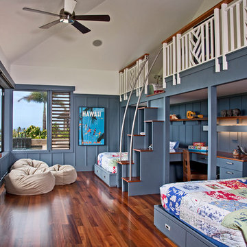
Kids' room - tropical medium tone wood floor and brown floor kids' room idea in Hawaii with blue walls
Kids' room - tropical medium tone wood floor and brown floor kids' room idea in Hawaii with blue walls
 Vetter Architects
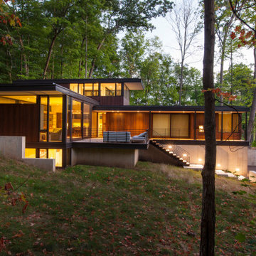
The client’s request was quite common - a typical 2800 sf builder home with 3 bedrooms, 2 baths, living space, and den. However, their desire was for this to be “anything but common.” The result is an innovative update on the production home for the modern era, and serves as a direct counterpoint to the neighborhood and its more conventional suburban housing stock, which focus views to the backyard and seeks to nullify the unique qualities and challenges of topography and the natural environment.
The Terraced House cautiously steps down the site’s steep topography, resulting in a more nuanced approach to site development than cutting and filling that is so common in the builder homes of the area. The compact house opens up in very focused views that capture the natural wooded setting, while masking the sounds and views of the directly adjacent roadway. The main living spaces face this major roadway, effectively flipping the typical orientation of a suburban home, and the main entrance pulls visitors up to the second floor and halfway through the site, providing a sense of procession and privacy absent in the typical suburban home.
Clad in a custom rain screen that reflects the wood of the surrounding landscape - while providing a glimpse into the interior tones that are used. The stepping “wood boxes” rest on a series of concrete walls that organize the site, retain the earth, and - in conjunction with the wood veneer panels - provide a subtle organic texture to the composition.
The interior spaces wrap around an interior knuckle that houses public zones and vertical circulation - allowing more private spaces to exist at the edges of the building. The windows get larger and more frequent as they ascend the building, culminating in the upstairs bedrooms that occupy the site like a tree house - giving views in all directions.
The Terraced House imports urban qualities to the suburban neighborhood and seeks to elevate the typical approach to production home construction, while being more in tune with modern family living patterns.
Overview:
Elm Grove
Size:
2,800 sf,
3 bedrooms, 2 bathrooms
Completion Date:
September 2014
Services:
Architecture, Landscape Architecture
Interior Consultants: Amy Carman Design
Find the right local pro for your project
 Westover Landscape Design
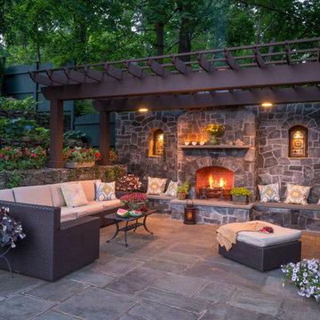
Like most growing families, this client wanted to lure everyone outside. And when the family went outdoors, they were hoping to find flamboyant color, delicious fragrance, freshly grilled food, fun play-spaces, and comfy entertaining areas waiting. Privacy was an imperative. Seems basic enough. But a heap of challenges stood in the way between what they were given upon arrival and the family's ultimate dreamscape.
Primary among the impediments was the fact that the house stands on a busy corner lot. Plus, the breakneck slope was definitely not playground-friendly. Fortunately, Westover Landscape Design rode to the rescue and literally leveled the playing field. Furthermore, flowing from space to space is a thoroughly enjoyable, ever-changing journey given the blossom-filled, year-around-splendiferous gardens that now hug the walkway and stretch out to the property lines. Soft evergreen hedges and billowing flowering shrubs muffle street noise, giving the garden within a sense of embrace. A fully functional (and frequently used) convenient outdoor kitchen/dining area/living room expand the house's floorplan into a relaxing, nature-infused on-site vacationland. Mission accomplished. With the addition of the stunning old-world stone fireplace and pergola, this amazing property is a welcome retreat for year round enjoyment. Mission accomplished.
Rob Cardillo for Westover Landscape Design, Inc.
 John Lively & Associates
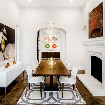
Example of a tuscan dark wood floor dining room design in Dallas with white walls and a standard fireplace
 Advance Design Studio, Ltd.
Mike and Michelle of Lake Barrington knew they needed extra space. Their home was becoming too crowded for their family with blossoming teenagers, so a basement renovation offered the perfect solution for more space for the kids and more room to entertain for the adults.
“Our project consisted of expanding our laundry room, putting in a first floor wet bar so we had adult space upstairs, while also renovating our basement for a family-friendly and teen-functional area as well,” Michelle says.
They found Advance Design Studio through a neighbor who gave a glowing recommendation, giving Michelle and Mike the confidence they needed to move forward with a major home renovation. They felt like they knew Advance Design before they even worked together. When they met with the owner Todd Jurs and designer Nicole Ryan, Mike and Michelle knew they were getting a trustworthy, dependable team that could create the project they had been dreaming about for 7 years.
Having virtually no natural light to work with, one of the biggest design challenges was creating a basement that did not feel dark and depressing. The Advance team got to work creating architectural archways and custom detailed dry-stack stone columns artfully designed into the space, adding a dramatic element that made the space feel less like a basement or more like a relaxing family room. Color 3D renderings were created to portray what the space would look like so Mike and Michelle could visualize the space in advance.
Detailed trim and crown moldings grace the built in buffet and wet bar making for an amazingly functional space that lacks nothing in style and visual interest. Cherry wood cabinetry by Dura Supreme is featured in the space with a “Cocoa Brown” finish and includes beautiful mirrored glass doors embellished with unique elliptical mullion details. A built-in microwave, dishwasher and mini fridge add practicality to the ample entertainment mecca. An under mounted sink finishes the space joined with a intricate mosaic tile backsplash and “Ventisca Polished” quartz countertops.
The basement is absolutely perfect for hosting friends and family with expertly designed key areas such as a game space for the kids, a movie area for the family, an ample workout room with luxurious full bath, and even built in wine storage. The family absolutely loves the new basement living space, and has already enjoyed numerous family movie nights and sleep-overs with friends.
While custom cabinets made by Dura Supreme were used to create unique spaces that lived up to Mike and Michelle’s expectations., heated flooring under the 16”x16” “Mongolian Spring” tile was installed giving all tiled areas of the basement a much cozier feel, eliminating that cold hard surface most of us hate in our basements!
The new basement must-have requirement list included a new bath space, which was incorporated adjacent to the work out room. The sleek shower door and cabinets in the new bathroom make guests and family feel like they are in an elegant hotel. The new guest bath features 4”x36” “Silver Screen” honed marble tile in a brick pattern on the shower walls and 2”x2” “Chenille” limestone tile in a hexagon mosaic pattern on the shower floor.
“I came in with very specific requirements for our three project areas,” Michelle says. “There was not one time that I felt like I was asking for something that was not going to turn out how I anticipated.”
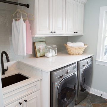
Tying in multiple rooms during a renovation if you have can do it makes a lot of sense and saves money in the long run. A fully functional laundry room as well was a must on this family’s wish list. Michelle wanted to add space to the existing cramped and awkward laundry room, and Mike wanted to make sure they could still park a car in the garage. Reconfiguring interior walls required borrowing unused space cleverly from the garage in order to enlarge the laundry room space.
Drawers under the stairs added beautiful hidden storage created almost magically out of dead space. White painted Dura Supreme cabinets bring additional light into the small space; while the 16”x16” cleft slate tile flooring provides excellent contrast and the naturally earthy feel Michelle wanted. Quartz countertops with a 3”x12” “Debut Dew” subway tile backsplash add elegance to the now upliftingly bright laundry room.
The extra space makes doing laundry much more pleasurable and the added storage is a great for all those little things like winter hats and gloves, umbrellas and the like. “The Advance Design project team was phenomenal to work with,” Michelle says. “They came in, shared the plans with us and walked us through the expectations. We always knew what was coming next.”
Converting an existing closet space, the wet bar upstairs was challenging because they wanted a functional area that didn’t look or feel like cabinets just sticking out of a closet. So the Advance team transformed this ordinary closet space into a stunning wet bar that architecturally appears as if it’s always been there. Traditional, elegant hand carved custom molding matching the adjacent fireplace ties the new entertainment bar area in nicely with the existing family room and kitchen area.
Featuring a built in wine refrigerator, Dura Supreme cabinetry in deep cherry wood elegantly displays wine bottles and etched glass mullion doors that fill with soft light in the evening hours. Cambria “Windermere” quartz countertops with a sophisticated hammered copper sink and a glimmering backsplash round out the stunning wet bar. Hosting parties and family functions has become much more enjoyable now that they have a dedicated beverage serving area large enough to include hors devours.
All three projects were designed and constructed together at the same time, making for a cohesive project that was administered smoothly and easily both for the design team and for the family. Disruption to the home was minimal as each phase was completed in each project conclusively, and design and meeting time for the homeowner was efficient and organized making for an enjoyable process.
“Advance Design was great to work with,” Michelle says. “I would highly recommend them to anyone considering a home improvement project. They took the time at the beginning to understand our needs, our budget, and our vision for our home. The field team was great, attentive, on time, cleaned up each day and made the overall experience very positive. We couldn't be happier with the finished product.”
With the help of our talented, award winning design team you can create the basement, laundry room, or any other home renovation that you have been dreaming of. With our “Common Sense Remodeling” approach, the process of renovating you home has never been easier. Contact us today at 847-836-2600 or schedule an appointment to talk with us about that kitchen remodeling project.
Joe Nowak



 Klopf Architecture
From Mid-Century Classic to the Present
An iconic design updated with comfort, function, and flow for today.
A Remodel That Balances Past and Present
What started as a desire to update a classic Eichler soon became an exploration of how Mid-Century Modern design can successfully evolve for today. The client, a tech professional with a passion for scuba diving and underwater photography, wanted a home that would both honor its original character and feel tailored to his daily life. A lifelong technology enthusiast, he still owns the very first Mac desktop he saved up for as a teenager working at Radio Shack, a detail that underscores his appreciation for design that melds function and form.
Honoring Separation While Expanding Possibility
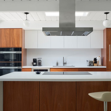
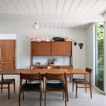
Unlike many contemporary remodels where walls are opened up to create expansive living spaces, this project took a more restrained approach. The client valued the defined rooms of the original plan and wanted to preserve as much wall space as possible for displaying his large-format underwater photography. The emphasis was not on dramatic spatial reinvention, but on thoughtful refinements. Klopf Architecture shaped a gallery-like backdrop while also expanding the primary suite, modernizing materials and fixtures throughout the home, and improving the functionality and layout of the kitchen. The finished home feels at once timeless and renewed, an Eichler that continues to inspire while fully supporting the lifestyle of its present-day owner.
A major turning point came mid-design. The original project brief had not included an addition, but as the reconfiguration of the primary bedroom and bath unfolded, it became clear that an expansion was the best approach to achieve the client’s vision of a more spacious suite. Fortunately, the adjustment came at a stage when revisions were still manageable and was integrated seamlessly, showing how thoughtful course corrections can strengthen a project rather than hinder it.
Navigating Challenges With Precision
The design development included multiple conceptual rounds, balancing preservation with subtle expansion. During construction, an existing post previously thought to be load-bearing turned out not to be. The structural engineer was able to pivot quickly, and both the post and the cross beam that had been intended to replace it could be omitted, allowing the original rhythm of the Eichler beam bays to be preserved.
Sustainability was not just a checklist item, but a way to align the home with the client’s values of simplicity, efficiency, and long-term functionality. R-38 roof insulation reduced energy usage, solar panels with battery storage provided independence and resilience, and passive comfort strategies eliminated the need forenergy-intensive air conditioning. An electric vehicle charger and an on-demand hot water recirculation system (with call buttons as opposed to having constant circulation) add to the home’s long-term efficiency factors. Together, these moves created a home that is quieter, more comfortable, and better equipped for the future, qualities that supported the client’s pragmatic approach to design and living lightly.
Details That Respect the Eichler DNA
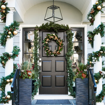
The remodel carries forward the Eichler’s original spirit while introducing new layers of modern livability. Originally, the house was approached along a deep, narrow walk, with the garage on one side and the house on the other, leaving the front door tucked far back within this chasm-like space. By pulling the entry forward, the design reshaped the arrival experience, creating a clearer threshold and a natural drop-off zone for bags, shoes, and keys. This shift also made room for a custom bench at the entry that extends seamlessly through the glass sidelight. The bench and drop-off zone now work together as a single, integrated sequence that supports everyday living while offering a tactile reminder of Eichler’s philosophy of connectedness.
At the client’s request, Klopf reintroduced a classic Eichler gesture by extending the exterior siding into the entry and living room. The detail reinforces a sense of indoor/outdoor continuity while providing a subtle architectural surface that allows the client’s photography to take visual precedence.
The signature concrete masonry wall at the front was reconstructed using blocks sourced to match the originals, now strengthened with rebar for seismic resilience while maintaining a private outdoor courtyard, visually extending the kitchen outward. A decorative trellis element, a detail borrowed from a neighboring Eichler, restores a familiar mid-century modern architectural motif. At the courtyard entry door, a custom etched glass sidelight with an ocean-themed design featuring kelp and jellyfish serves as a subtle homage to the client’s passion for deep-sea diving.
Landscaping became an integral part of the overall transformation. The homeowner engaged landscape architect Randi Johnsen of Third Nature Studio to shape a series of calm, inviting outdoor rooms that read as a natural extension of the interiors. While technically outside of the core construction scope, the landscape design proved central to achieving a sense of completeness and connectedness across the property. Such whole-property considerations often emerge as design ideas take shape, underscoring the importance of flexibility in planning and budgeting, as well as close collaboration among the design team starting early in the process.
The Value of Evolving Scope
As with many custom residential projects, the scope evolved during the design process. What began as a targeted remodel grew to include a new/expanded primary suite, a rebuilt CMU patio wall for strength and longevity, and a solar panel array and battery storage for energy resilience and carbon-reduction. Each thoughtful decision represented a conscious investment in the home’s performance and character, rather than a cost overrun.
The result was a project delivered on schedule, tailored precisely to the client’s lifestyle, and positioned to add long-term value both functionally and aesthetically. By embracing scope evolution as an opportunity rather than a challenge, and relying on good design paired with transparent communication, this remodel demonstrates how Eichler homes can be adapted for contemporary living without erasing their DNA.
Klopf Architecture project team: John Klopf, AIA, and Klara Kevane, Elise Webb and Nicholas LaNasa.
Contractor: Golden Cove Construction
Landscape Design: Third Nature Studio
Structural Engineer: Daniel Bastiao Design
Photography: ©2025 Mariko Reed
Year Completed: 2024
Location: Sunnyvale, CA
 Joseph Interiors
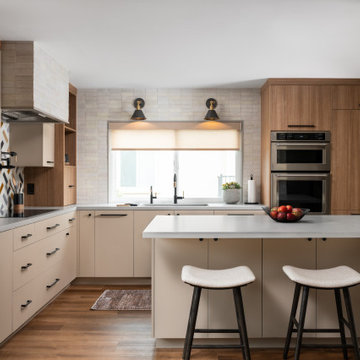
Inspiration for a mid-sized contemporary l-shaped vinyl floor and brown floor eat-in kitchen remodel in Orange County with an undermount sink, flat-panel cabinets, quartz countertops, white backsplash, ceramic backsplash, paneled appliances, an island and gray countertops
 OMNIA Group Architects
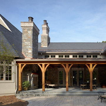
The comfortable elegance of this French-Country inspired home belies the challenges faced during its conception. The beautiful, wooded site was steeply sloped requiring study of the location, grading, approach, yard and views from and to the rolling Pennsylvania countryside. The client desired an old world look and feel, requiring a sensitive approach to the extensive program. Large, modern spaces could not add bulk to the interior or exterior. Furthermore, it was critical to balance voluminous spaces designed for entertainment with more intimate settings for daily living while maintaining harmonic flow throughout.
The result home is wide, approached by a winding drive terminating at a prominent facade embracing the motor court. Stone walls feather grade to the front façade, beginning the masonry theme dressing the structure. A second theme of true Pennsylvania timber-framing is also introduced on the exterior and is subsequently revealed in the formal Great and Dining rooms. Timber-framing adds drama, scales down volume, and adds the warmth of natural hand-wrought materials. The Great Room is literal and figurative center of this master down home, separating casual living areas from the elaborate master suite. The lower level accommodates casual entertaining and an office suite with compelling views. The rear yard, cut from the hillside, is a composition of natural and architectural elements with timber framed porches and terraces accessed from nearly every interior space flowing to a hillside of boulders and waterfalls.
The result is a naturally set, livable, truly harmonious, new home radiating old world elegance. This home is powered by a geothermal heating and cooling system and state of the art electronic controls and monitoring systems.
 OMNIA Group Architects
The comfortable elegance of this French-Country inspired home belies the challenges faced during its conception. The beautiful, wooded site was steeply sloped requiring study of the location, grading, approach, yard and views from and to the rolling Pennsylvania countryside. The client desired an old world look and feel, requiring a sensitive approach to the extensive program. Large, modern spaces could not add bulk to the interior or exterior. Furthermore, it was critical to balance voluminous spaces designed for entertainment with more intimate settings for daily living while maintaining harmonic flow throughout.
The result home is wide, approached by a winding drive terminating at a prominent facade embracing the motor court. Stone walls feather grade to the front façade, beginning the masonry theme dressing the structure. A second theme of true Pennsylvania timber-framing is also introduced on the exterior and is subsequently revealed in the formal Great and Dining rooms. Timber-framing adds drama, scales down volume, and adds the warmth of natural hand-wrought materials. The Great Room is literal and figurative center of this master down home, separating casual living areas from the elaborate master suite. The lower level accommodates casual entertaining and an office suite with compelling views. The rear yard, cut from the hillside, is a composition of natural and architectural elements with timber framed porches and terraces accessed from nearly every interior space flowing to a hillside of boulders and waterfalls.
The result is a naturally set, livable, truly harmonious, new home radiating old world elegance. This home is powered by a geothermal heating and cooling system and state of the art electronic controls and monitoring systems.
The roof is simulated slate made from recycled materials. The company for this home is no longer in business but today we specify Inspire by Boral https://www.boralroof.com/product-profile/composite/classic-slate/4IFUE5205/
 Klopf Architecture
From Mid-Century Classic to the Present
An iconic design updated with comfort, function, and flow for today.
A Remodel That Balances Past and Present
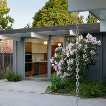
What started as a desire to update a classic Eichler soon became an exploration of how Mid-Century Modern design can successfully evolve for today. The client, a tech professional with a passion for scuba diving and underwater photography, wanted a home that would both honor its original character and feel tailored to his daily life. A lifelong technology enthusiast, he still owns the very first Mac desktop he saved up for as a teenager working at Radio Shack, a detail that underscores his appreciation for design that melds function and form.
Honoring Separation While Expanding Possibility
Unlike many contemporary remodels where walls are opened up to create expansive living spaces, this project took a more restrained approach. The client valued the defined rooms of the original plan and wanted to preserve as much wall space as possible for displaying his large-format underwater photography. The emphasis was not on dramatic spatial reinvention, but on thoughtful refinements. Klopf Architecture shaped a gallery-like backdrop while also expanding the primary suite, modernizing materials and fixtures throughout the home, and improving the functionality and layout of the kitchen. The finished home feels at once timeless and renewed, an Eichler that continues to inspire while fully supporting the lifestyle of its present-day owner.
A major turning point came mid-design. The original project brief had not included an addition, but as the reconfiguration of the primary bedroom and bath unfolded, it became clear that an expansion was the best approach to achieve the client’s vision of a more spacious suite. Fortunately, the adjustment came at a stage when revisions were still manageable and was integrated seamlessly, showing how thoughtful course corrections can strengthen a project rather than hinder it.
Navigating Challenges With Precision
The design development included multiple conceptual rounds, balancing preservation with subtle expansion. During construction, an existing post previously thought to be load-bearing turned out not to be. The structural engineer was able to pivot quickly, and both the post and the cross beam that had been intended to replace it could be omitted, allowing the original rhythm of the Eichler beam bays to be preserved.
Sustainability was not just a checklist item, but a way to align the home with the client’s values of simplicity, efficiency, and long-term functionality. R-38 roof insulation reduced energy usage, solar panels with battery storage provided independence and resilience, and passive comfort strategies eliminated the need forenergy-intensive air conditioning. An electric vehicle charger and an on-demand hot water recirculation system (with call buttons as opposed to having constant circulation) add to the home’s long-term efficiency factors. Together, these moves created a home that is quieter, more comfortable, and better equipped for the future, qualities that supported the client’s pragmatic approach to design and living lightly.
Details That Respect the Eichler DNA
The remodel carries forward the Eichler’s original spirit while introducing new layers of modern livability. Originally, the house was approached along a deep, narrow walk, with the garage on one side and the house on the other, leaving the front door tucked far back within this chasm-like space. By pulling the entry forward, the design reshaped the arrival experience, creating a clearer threshold and a natural drop-off zone for bags, shoes, and keys. This shift also made room for a custom bench at the entry that extends seamlessly through the glass sidelight. The bench and drop-off zone now work together as a single, integrated sequence that supports everyday living while offering a tactile reminder of Eichler’s philosophy of connectedness.
At the client’s request, Klopf reintroduced a classic Eichler gesture by extending the exterior siding into the entry and living room. The detail reinforces a sense of indoor/outdoor continuity while providing a subtle architectural surface that allows the client’s photography to take visual precedence.
The signature concrete masonry wall at the front was reconstructed using blocks sourced to match the originals, now strengthened with rebar for seismic resilience while maintaining a private outdoor courtyard, visually extending the kitchen outward. A decorative trellis element, a detail borrowed from a neighboring Eichler, restores a familiar mid-century modern architectural motif. At the courtyard entry door, a custom etched glass sidelight with an ocean-themed design featuring kelp and jellyfish serves as a subtle homage to the client’s passion for deep-sea diving.
Landscaping became an integral part of the overall transformation. The homeowner engaged landscape architect Randi Johnsen of Third Nature Studio to shape a series of calm, inviting outdoor rooms that read as a natural extension of the interiors. While technically outside of the core construction scope, the landscape design proved central to achieving a sense of completeness and connectedness across the property. Such whole-property considerations often emerge as design ideas take shape, underscoring the importance of flexibility in planning and budgeting, as well as close collaboration among the design team starting early in the process.
The Value of Evolving Scope
As with many custom residential projects, the scope evolved during the design process. What began as a targeted remodel grew to include a new/expanded primary suite, a rebuilt CMU patio wall for strength and longevity, and a solar panel array and battery storage for energy resilience and carbon-reduction. Each thoughtful decision represented a conscious investment in the home’s performance and character, rather than a cost overrun.
The result was a project delivered on schedule, tailored precisely to the client’s lifestyle, and positioned to add long-term value both functionally and aesthetically. By embracing scope evolution as an opportunity rather than a challenge, and relying on good design paired with transparent communication, this remodel demonstrates how Eichler homes can be adapted for contemporary living without erasing their DNA.
Klopf Architecture project team: John Klopf, AIA, and Klara Kevane, Elise Webb and Nicholas LaNasa.
Contractor: Golden Cove Construction
Landscape Design: Third Nature Studio
Structural Engineer: Daniel Bastiao Design
Photography: ©2025 Mariko Reed
Year Completed: 2024
Location: Sunnyvale, CA
 KURV Architecture DPC (Alex Hughes Architects)
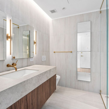
Located in the heart of Manhattan’s Lower East Side, the building was erected on a shallow commercial lot between two 120 year old masonry buildings and a new residential rental building. 330 Grand Street is a mix of 725 SF 1BRs and 1050 SF 2BR apartments. It also contains a 1100 SF two story duplex as well as private and public rooftop space, large private balconies for most units and two large private terraces for the ground floor units.
330 Grand Street was originally designed and approved at the NYC DOB as a prefabricated modular building. During the pandemic, as shipping costs skyrocketed putting the project at risk, we suggested redesigning the building as a reinforced cast-in-place concrete structure. Concrete was readily available and prices had not been affected by the demand increase that many other materials suffered in the pandemic. We took this opportunity to raise floor to ceiling heights, enlarge high performance windows and redistribute the buildings MEPFS and Structural Systems to create very open floor plans.
The challenge was to create a luxurious sensorial living experience with very limited means. In a city with very high construction costs, low cost residential buildings in the area are usually devoid of good quality, design and character. Our approach was to aim high for the end user, prioritizing natural light, open space with long visual perspectives, high ceilings and as always, rejecting the use of predefined building templates.
Our biggest challenge was to ensure that the small spaces feel as clean cut, large and bright as possible. Several unique design decisions were made to ensure low cost and high quality;
Floor plans were laid out so that spaces were wide open and free of clutter from mechanical or structural interruptions. Therefore all infrastructure was placed in lateral demising walls, which in turn act as the unit’s storage and kitchen. The apartments feel wide open, are super quiet and have more storage space than any other comparable apartment in the city.
To solve the problem of the site’s shallow commercial lot which is typically prone to dark interior spaces we focused our attention on the building’s envelope. Instead of the usual small punched window openings, oversized high performance windows were designed to ensure that light penetrated as far as possible into the units. In the smaller 1BR units, the full 50’ depth of the lot is perceived by partitioning spaces with sliding pocket doors that can be retracted to allow deep visual perspectives, making the sight lines in the space feel longer, larger, more ample than normal. In addition to the full height glazing, each unit above the 2nd floor receives a 7 foot covered balcony, adding 120 to 240 sf to each apartment, something unusual in New York City buildings. The space is large enough for a full size dining table, when the weather permits being outside.
We also worked hard to ensure modularity. For example, all kitchen units are all identical throughout the building. The idea of modularity and the economy of the repetitive unit is exercised to the maximum through the building.
Hardware, appliances, flooring, wall coverings and material finishes are all carefully selected to feel bespoke, high quality and unique.
It was important to KURV that the result of this work manifest into something that would deeply connect with the end user and sustain relationships with the consumers of this space.
All images by KURV Architecture ©
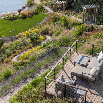
 SCJ Studio Landscape Architecture - Montana
Lush planting compliment this modern landscape nestled over a lake. A new patio with turf around a fire feature is amazing for watching the sunset across the new, well thought out planting.
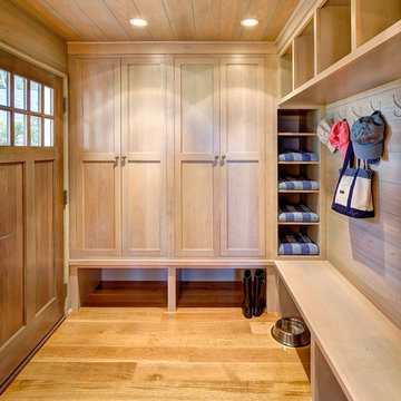

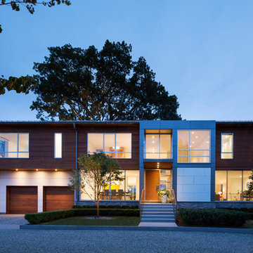
 Amanda Martocchio Architecture
Michael Moran/OTTO photography.
The objective of this award-winning gut renovation was to create a spatially dynamic, light-filled, and energy-efficient home with a strong connection to Long Island Sound. The design strategy is straightforward: a gabled roof covers a central “spine” corridor that terminates with cathedral ceilinged spaces at both ends. The relocated approach and entry deposit visitors into the front hall with its curvilinear, cantilevered stair. A two-story, windowed family gathering space lies ahead – a straight shot to the water beyond.
The design challenge was to utilize the existing house footprint and structure, while raising the top of foundation walls to exceed new flood regulations, reconfiguring the spatial organization, and using innovative materials to produce a tight thermal envelope and contemporary yet contextually appropriate facades.
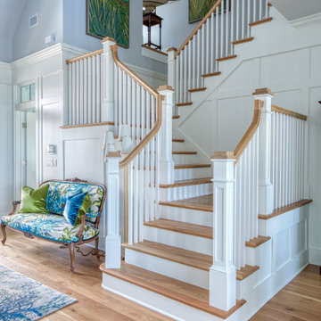
 Goggans Architecture & Interiors
When the Owners approached Goggans Architecture about renovation of a 90’s era oceanfront house, it was clear there would be a lot more to the renovation than mere updates and remedying deferred maintenance. One of the most significant issues was how to integrate an outdoor pool given the pool had to be within the building envelope, and the house was already abutting the setback on its ocean side. A second significant challenge was how to provide a roof top deck over a pitched roof house with an attic, that was functional and attractive. Finally, creating better access from the parking area to the kitchen was a priority.
Goggans Architecture addressed the placement of a pool by creating a walled courtyard at the front, or landward side, of the house. The pool was placed on one side of the entry walkway, while its composition was balanced by a parterre garden on the other side of the walkway. The roof top deck was resolved by adding a new staircase and passageway through former attic space. By using a motorized roof hatch, the Owners could ascend to the roof deck which perched just below the roof ridge, hidden from view from the street. Relocating an underneath stair from one side of the house to a point that was closer to the kitchen resolved the access issue.
These strategic moves created other opportunities, such as expansion of the master bathroom to a portion of the front porch, while allowing an exterior stair from the bath directly to the pool. Other enhancements included placement of a large folding door in the Great room, renovation and expansion of the kitchen and exterior decks, reorganization, and replacement of the fenestration, updating all baths and interior and exterior finishes.
The extensive renovation reflects the holistic approach of Goggans Architecture, marrying landscape architecture, architecture, and interiors.
 Klopf Architecture
From Mid-Century Classic to the Present
An iconic design updated with comfort, function, and flow for today.
A Remodel That Balances Past and Present
What started as a desire to update a classic Eichler soon became an exploration of how Mid-Century Modern design can successfully evolve for today. The client, a tech professional with a passion for scuba diving and underwater photography, wanted a home that would both honor its original character and feel tailored to his daily life. A lifelong technology enthusiast, he still owns the very first Mac desktop he saved up for as a teenager working at Radio Shack, a detail that underscores his appreciation for design that melds function and form.
Honoring Separation While Expanding Possibility
Unlike many contemporary remodels where walls are opened up to create expansive living spaces, this project took a more restrained approach. The client valued the defined rooms of the original plan and wanted to preserve as much wall space as possible for displaying his large-format underwater photography. The emphasis was not on dramatic spatial reinvention, but on thoughtful refinements. Klopf Architecture shaped a gallery-like backdrop while also expanding the primary suite, modernizing materials and fixtures throughout the home, and improving the functionality and layout of the kitchen. The finished home feels at once timeless and renewed, an Eichler that continues to inspire while fully supporting the lifestyle of its present-day owner.
A major turning point came mid-design. The original project brief had not included an addition, but as the reconfiguration of the primary bedroom and bath unfolded, it became clear that an expansion was the best approach to achieve the client’s vision of a more spacious suite. Fortunately, the adjustment came at a stage when revisions were still manageable and was integrated seamlessly, showing how thoughtful course corrections can strengthen a project rather than hinder it.
Navigating Challenges With Precision
The design development included multiple conceptual rounds, balancing preservation with subtle expansion. During construction, an existing post previously thought to be load-bearing turned out not to be. The structural engineer was able to pivot quickly, and both the post and the cross beam that had been intended to replace it could be omitted, allowing the original rhythm of the Eichler beam bays to be preserved.
Sustainability was not just a checklist item, but a way to align the home with the client’s values of simplicity, efficiency, and long-term functionality. R-38 roof insulation reduced energy usage, solar panels with battery storage provided independence and resilience, and passive comfort strategies eliminated the need forenergy-intensive air conditioning. An electric vehicle charger and an on-demand hot water recirculation system (with call buttons as opposed to having constant circulation) add to the home’s long-term efficiency factors. Together, these moves created a home that is quieter, more comfortable, and better equipped for the future, qualities that supported the client’s pragmatic approach to design and living lightly.
Details That Respect the Eichler DNA
The remodel carries forward the Eichler’s original spirit while introducing new layers of modern livability. Originally, the house was approached along a deep, narrow walk, with the garage on one side and the house on the other, leaving the front door tucked far back within this chasm-like space. By pulling the entry forward, the design reshaped the arrival experience, creating a clearer threshold and a natural drop-off zone for bags, shoes, and keys. This shift also made room for a custom bench at the entry that extends seamlessly through the glass sidelight. The bench and drop-off zone now work together as a single, integrated sequence that supports everyday living while offering a tactile reminder of Eichler’s philosophy of connectedness.
At the client’s request, Klopf reintroduced a classic Eichler gesture by extending the exterior siding into the entry and living room. The detail reinforces a sense of indoor/outdoor continuity while providing a subtle architectural surface that allows the client’s photography to take visual precedence.
The signature concrete masonry wall at the front was reconstructed using blocks sourced to match the originals, now strengthened with rebar for seismic resilience while maintaining a private outdoor courtyard, visually extending the kitchen outward. A decorative trellis element, a detail borrowed from a neighboring Eichler, restores a familiar mid-century modern architectural motif. At the courtyard entry door, a custom etched glass sidelight with an ocean-themed design featuring kelp and jellyfish serves as a subtle homage to the client’s passion for deep-sea diving.
Landscaping became an integral part of the overall transformation. The homeowner engaged landscape architect Randi Johnsen of Third Nature Studio to shape a series of calm, inviting outdoor rooms that read as a natural extension of the interiors. While technically outside of the core construction scope, the landscape design proved central to achieving a sense of completeness and connectedness across the property. Such whole-property considerations often emerge as design ideas take shape, underscoring the importance of flexibility in planning and budgeting, as well as close collaboration among the design team starting early in the process.
The Value of Evolving Scope
As with many custom residential projects, the scope evolved during the design process. What began as a targeted remodel grew to include a new/expanded primary suite, a rebuilt CMU patio wall for strength and longevity, and a solar panel array and battery storage for energy resilience and carbon-reduction. Each thoughtful decision represented a conscious investment in the home’s performance and character, rather than a cost overrun.
The result was a project delivered on schedule, tailored precisely to the client’s lifestyle, and positioned to add long-term value both functionally and aesthetically. By embracing scope evolution as an opportunity rather than a challenge, and relying on good design paired with transparent communication, this remodel demonstrates how Eichler homes can be adapted for contemporary living without erasing their DNA.
Klopf Architecture project team: John Klopf, AIA, and Klara Kevane, Elise Webb and Nicholas LaNasa.
Contractor: Golden Cove Construction
Landscape Design: Third Nature Studio
Structural Engineer: Daniel Bastiao Design
Photography: ©2025 Mariko Reed
Year Completed: 2024
Location: Sunnyvale, CA

 MOTIV Interiors
Interior Designer: MOTIV Interiors LLC
Photographer: Sam Angel Photography
Design Challenge: This 8 year-old boy and girl were outgrowing their existing setup and needed to update their rooms with a plan that would carry them forward into middle school and beyond. In addition to gaining storage and study areas, could these twins show off their big personalities? Absolutely, we said! MOTIV Interiors tackled the rooms of these youngsters living in Nashville's 12th South Neighborhood and created an environment where the dynamic duo can learn, create, and grow together for years to come.
Design Solution:
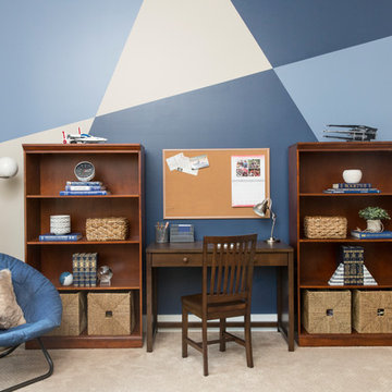
In his room, we wanted to continue the feature wall fun, but with a different approach. Since our young explorer loves outer space, being a boy scout, and building with legos, we created a dynamic geometric wall that serves as the backdrop for our young hero’s control center. We started with a neutral mushroom color for the majority of the walls in the room, while our feature wall incorporated a deep indigo and sky blue that are as classic as your favorite pair of jeans. We focused on indoor air quality and used Sherwin Williams’ Duration paint in a satin sheen, which is a scrubbable/no-VOC coating.
We wanted to create a great reading corner, so we placed a comfortable denim lounge chair next to the window and made sure to feature a self-portrait created by our young client. For night time reading, we included a super-stellar floor lamp with white globes and a sleek satin nickel finish. Metal details are found throughout the space (such as the lounge chair base and nautical desk clock), and lend a utilitarian feel to the room. In order to balance the metal and keep the room from feeling too cold, we also snuck in woven baskets that work double-duty as decorative pieces and functional storage bins.
The large north-facing window got the royal treatment and was dressed with a relaxed roman shade in a shiitake linen blend. We added a fabulous fabric trim from F. Schumacher and echoed the look by using the same fabric for the bolster on the bed. Royal blue bedding brings a bit of color into the space, and is complimented by the rich chocolate wood tones seen in the furniture throughout. Additional storage was a must, so we brought in a glossy blue storage unit that can accommodate legos, encyclopedias, pinewood derby cars, and more!
Comfort and creativity converge in this space, and we were excited to get a big smile when we turned it over to its new commander.
3