
Search results for "Approach compared" in Home Design Ideas
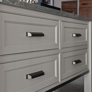
 Exclusively Cabinets by Cabinetek
This is a modern, well-organized cabinetry showroom with a clean, upscale feel.
A central reception desk backed by a green feature wall with your branding creates a strong first impression. Around the space, clearly labeled displays showcase different cabinet styles and finishes, making it easy for customers to browse and compare.
Polished concrete floors, a black grid ceiling, and focused track lighting give it a contemporary edge, while touches like rugs, seating, and lifestyle vignettes keep it warm and approachable. Overall, it feels professional, inviting, and easy to navigate.
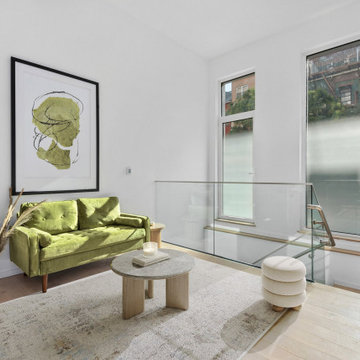
 KURV Architecture DPC (Alex Hughes Architects)
Located in the heart of Manhattan’s Lower East Side, the building was erected on a shallow commercial lot between two 120 year old masonry buildings and a new residential rental building. 330 Grand Street is a mix of 725 SF 1BRs and 1050 SF 2BR apartments. It also contains a 1100 SF two story duplex as well as private and public rooftop space, large private balconies for most units and two large private terraces for the ground floor units.
330 Grand Street was originally designed and approved at the NYC DOB as a prefabricated modular building. During the pandemic, as shipping costs skyrocketed putting the project at risk, we suggested redesigning the building as a reinforced cast-in-place concrete structure. Concrete was readily available and prices had not been affected by the demand increase that many other materials suffered in the pandemic. We took this opportunity to raise floor to ceiling heights, enlarge high performance windows and redistribute the buildings MEPFS and Structural Systems to create very open floor plans.
The challenge was to create a luxurious sensorial living experience with very limited means. In a city with very high construction costs, low cost residential buildings in the area are usually devoid of good quality, design and character. Our approach was to aim high for the end user, prioritizing natural light, open space with long visual perspectives, high ceilings and as always, rejecting the use of predefined building templates.
Our biggest challenge was to ensure that the small spaces feel as clean cut, large and bright as possible. Several unique design decisions were made to ensure low cost and high quality;
Floor plans were laid out so that spaces were wide open and free of clutter from mechanical or structural interruptions. Therefore all infrastructure was placed in lateral demising walls, which in turn act as the unit’s storage and kitchen. The apartments feel wide open, are super quiet and have more storage space than any other comparable apartment in the city.
To solve the problem of the site’s shallow commercial lot which is typically prone to dark interior spaces we focused our attention on the building’s envelope. Instead of the usual small punched window openings, oversized high performance windows were designed to ensure that light penetrated as far as possible into the units. In the smaller 1BR units, the full 50’ depth of the lot is perceived by partitioning spaces with sliding pocket doors that can be retracted to allow deep visual perspectives, making the sight lines in the space feel longer, larger, more ample than normal. In addition to the full height glazing, each unit above the 2nd floor receives a 7 foot covered balcony, adding 120 to 240 sf to each apartment, something unusual in New York City buildings. The space is large enough for a full size dining table, when the weather permits being outside.
We also worked hard to ensure modularity. For example, all kitchen units are all identical throughout the building. The idea of modularity and the economy of the repetitive unit is exercised to the maximum through the building.
Hardware, appliances, flooring, wall coverings and material finishes are all carefully selected to feel bespoke, high quality and unique.
It was important to KURV that the result of this work manifest into something that would deeply connect with the end user and sustain relationships with the consumers of this space.
All images by KURV Architecture ©
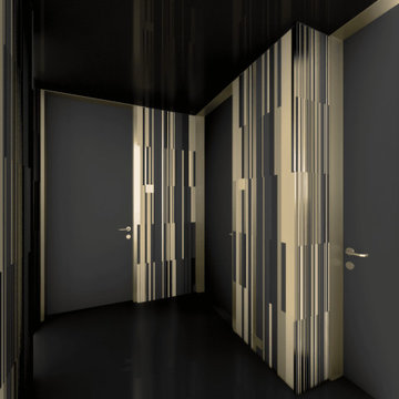 KURV Architecture DPC (Alex Hughes Architects)
Located in the heart of Manhattan’s Lower East Side, the building was erected on a shallow commercial lot between two 120 year old masonry buildings and a new residential rental building. 330 Grand Street is a mix of 725 SF 1BRs and 1050 SF 2BR apartments. It also contains a 1100 SF two story duplex as well as private and public rooftop space, large private balconies for most units and two large private terraces for the ground floor units.
330 Grand Street was originally designed and approved at the NYC DOB as a prefabricated modular building. During the pandemic, as shipping costs skyrocketed putting the project at risk, we suggested redesigning the building as a reinforced cast-in-place concrete structure. Concrete was readily available and prices had not been affected by the demand increase that many other materials suffered in the pandemic. We took this opportunity to raise floor to ceiling heights, enlarge high performance windows and redistribute the buildings MEPFS and Structural Systems to create very open floor plans.
The challenge was to create a luxurious sensorial living experience with very limited means. In a city with very high construction costs, low cost residential buildings in the area are usually devoid of good quality, design and character. Our approach was to aim high for the end user, prioritizing natural light, open space with long visual perspectives, high ceilings and as always, rejecting the use of predefined building templates.
Our biggest challenge was to ensure that the small spaces feel as clean cut, large and bright as possible. Several unique design decisions were made to ensure low cost and high quality;
Floor plans were laid out so that spaces were wide open and free of clutter from mechanical or structural interruptions. Therefore all infrastructure was placed in lateral demising walls, which in turn act as the unit’s storage and kitchen. The apartments feel wide open, are super quiet and have more storage space than any other comparable apartment in the city.
To solve the problem of the site’s shallow commercial lot which is typically prone to dark interior spaces we focused our attention on the building’s envelope. Instead of the usual small punched window openings, oversized high performance windows were designed to ensure that light penetrated as far as possible into the units. In the smaller 1BR units, the full 50’ depth of the lot is perceived by partitioning spaces with sliding pocket doors that can be retracted to allow deep visual perspectives, making the sight lines in the space feel longer, larger, more ample than normal. In addition to the full height glazing, each unit above the 2nd floor receives a 7 foot covered balcony, adding 120 to 240 sf to each apartment, something unusual in New York City buildings. The space is large enough for a full size dining table, when the weather permits being outside.
We also worked hard to ensure modularity. For example, all kitchen units are all identical throughout the building. The idea of modularity and the economy of the repetitive unit is exercised to the maximum through the building.
Hardware, appliances, flooring, wall coverings and material finishes are all carefully selected to feel bespoke, high quality and unique.
It was important to KURV that the result of this work manifest into something that would deeply connect with the end user and sustain relationships with the consumers of this space.
All images by KURV Architecture ©
Find the right local pro for your project
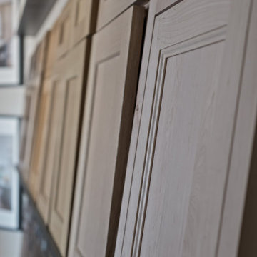 Exclusively Cabinets by Cabinetek
This is a modern, well-organized cabinetry showroom with a clean, upscale feel.
A central reception desk backed by a green feature wall with your branding creates a strong first impression. Around the space, clearly labeled displays showcase different cabinet styles and finishes, making it easy for customers to browse and compare.
Polished concrete floors, a black grid ceiling, and focused track lighting give it a contemporary edge, while touches like rugs, seating, and lifestyle vignettes keep it warm and approachable. Overall, it feels professional, inviting, and easy to navigate.
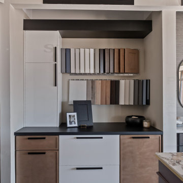 Exclusively Cabinets by Cabinetek
This is a modern, well-organized cabinetry showroom with a clean, upscale feel.
A central reception desk backed by a green feature wall with your branding creates a strong first impression. Around the space, clearly labeled displays showcase different cabinet styles and finishes, making it easy for customers to browse and compare.
Polished concrete floors, a black grid ceiling, and focused track lighting give it a contemporary edge, while touches like rugs, seating, and lifestyle vignettes keep it warm and approachable. Overall, it feels professional, inviting, and easy to navigate.
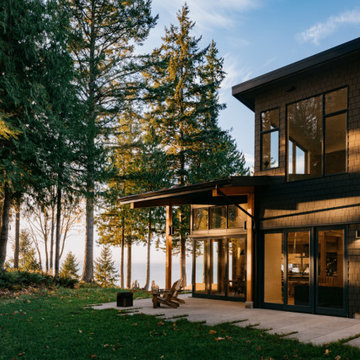
 CAST architecture
Just north of Seattle, this family home is tucked away on a magical parcel of land within the Edmonds city limits. Designed to maximize the site’s breathtaking views, it is carefully sited to blend into its wooded setting while opening fully to expansive views.
On our first visit, we found a secluded forest glade with stunning vistas of Puget Sound and the Olympic Mountains perched atop a high seaside bluff. Preserving and enhancing this singular landscape as the surrounding neighborhood fills in with development was central to our design.
The approach is intentionally restrained—the home does not reveal itself entirely upon arrival. The house is composed of two wings that cradle the meadow, making it the most important “room.” Interior spaces are oriented towards the lush landscape and impressive views framed by mature trees.
The structures are kept close to the perimeter, leaving the center of the site unbuilt. A covered bridge with a green roof acts as a front porch, linking the upslope garage/office with the main house. A gentle stair flows through the gap between the structures, drawing visitors into the clearing.
The floorplan is highly efficient, carefully tuned to the family’s daily routines. Each room is exactly suited to its purpose, yet no larger than needed.
An open corner with double-height windows creates a jewel-box dining room. Free of a corner structure, the home expands to encompass the covered patio for outdoor cooking and dining, plus easy access to the kitchen, encouraging year-round outdoor living.
Human-scale moments are intentionally created, from a stairway window seat with peekaboo views to a covered outdoor extension of the great room that fosters a cozy relationship between interior and exterior.
Much of the light-filled interior is wrapped in clear-finished fir, giving it a warm glow even on rainy winter days. White oak cabinets and black soapstone countertops add warmth to the kitchen. The built-in furniture in the library loft and the cold-rolled steel fireplace surround were crafted by the owner’s father, an expert woodworker, increasing the connection between the home and its occupants. The second story includes the primary suite with treehouse vibes.
Located on a steep slope in a landslide-prone area, the Edmonds Overlook overcame numerous technical and engineering challenges to address vehicle and fire access, stormwater and erosion mitigation, and potential earth movement.
Green Design:
Compact footprint and conditioned area compared to comparable homes, reducing carbon and ongoing energy use
Green roof at covered entry
Heat-pump air and water heating with multiple zones to maximize efficiency
Whole-house Heat Recovery Ventilation system
Engineered On-Site Stormwater Management System
Landscape restoration using 100% native species, added 47 trees to site, plus meadow plantings
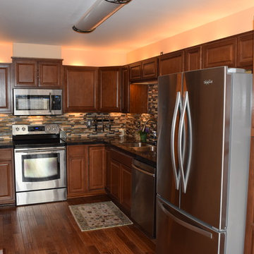
 Legendary Real Estate
A glass/stone/metallic tile was chosen for the backsplash and Granite Transformations tile with a stainless undermount sink and stailess appliances were chosen for the kitchen. Hardwood flooring was added, and above the cabinet lighting to brighten up the kitchen.
{Featured Story} Spring, 2015 – This condo was purchased from the estate of the new owner’s parents and refurbished with trendy new touches. There were no close comparables in the Farmington neighborhood with within walking distance to the urban downtown area, so the approach for selling was to create an entirely new set of comparables when the new owner was found. On the market for just days, the renovation, marketing and finishing touches made this a highly sought after, and quick to sell property at top dollar, establishing a new trend in the neighborhood.
{Our Process for this Featured Property}: Assessed the initial investment condo, offered suggestions for rehab and renovation. Assisted with Color Theory through color selection and process (no beige in this condo!). Helped select floor and counter materials, tile selection and features in the kitchen and bath. Final staging of the property was done with antiques and housewares, and created a cozy and lived in feel. As a final touch, a party was thrown when the property was completed to invite in friends and family, as well as an open house with freshly baking chocolate chip cookies to make the prospective buyers feel right at home!
{Outcome} This property sold in days as a cash sale, at a higher price than anything in the neighborhood – and closed quickly. Both the seller and buyer were thrilled with this transaction!
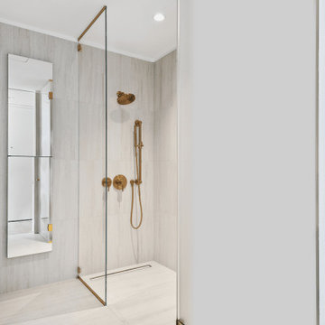 KURV Architecture DPC (Alex Hughes Architects)
Located in the heart of Manhattan’s Lower East Side, the building was erected on a shallow commercial lot between two 120 year old masonry buildings and a new residential rental building. 330 Grand Street is a mix of 725 SF 1BRs and 1050 SF 2BR apartments. It also contains a 1100 SF two story duplex as well as private and public rooftop space, large private balconies for most units and two large private terraces for the ground floor units.
330 Grand Street was originally designed and approved at the NYC DOB as a prefabricated modular building. During the pandemic, as shipping costs skyrocketed putting the project at risk, we suggested redesigning the building as a reinforced cast-in-place concrete structure. Concrete was readily available and prices had not been affected by the demand increase that many other materials suffered in the pandemic. We took this opportunity to raise floor to ceiling heights, enlarge high performance windows and redistribute the buildings MEPFS and Structural Systems to create very open floor plans.
The challenge was to create a luxurious sensorial living experience with very limited means. In a city with very high construction costs, low cost residential buildings in the area are usually devoid of good quality, design and character. Our approach was to aim high for the end user, prioritizing natural light, open space with long visual perspectives, high ceilings and as always, rejecting the use of predefined building templates.
Our biggest challenge was to ensure that the small spaces feel as clean cut, large and bright as possible. Several unique design decisions were made to ensure low cost and high quality;
Floor plans were laid out so that spaces were wide open and free of clutter from mechanical or structural interruptions. Therefore all infrastructure was placed in lateral demising walls, which in turn act as the unit’s storage and kitchen. The apartments feel wide open, are super quiet and have more storage space than any other comparable apartment in the city.
To solve the problem of the site’s shallow commercial lot which is typically prone to dark interior spaces we focused our attention on the building’s envelope. Instead of the usual small punched window openings, oversized high performance windows were designed to ensure that light penetrated as far as possible into the units. In the smaller 1BR units, the full 50’ depth of the lot is perceived by partitioning spaces with sliding pocket doors that can be retracted to allow deep visual perspectives, making the sight lines in the space feel longer, larger, more ample than normal. In addition to the full height glazing, each unit above the 2nd floor receives a 7 foot covered balcony, adding 120 to 240 sf to each apartment, something unusual in New York City buildings. The space is large enough for a full size dining table, when the weather permits being outside.
We also worked hard to ensure modularity. For example, all kitchen units are all identical throughout the building. The idea of modularity and the economy of the repetitive unit is exercised to the maximum through the building.
Hardware, appliances, flooring, wall coverings and material finishes are all carefully selected to feel bespoke, high quality and unique.
It was important to KURV that the result of this work manifest into something that would deeply connect with the end user and sustain relationships with the consumers of this space.
All images by KURV Architecture ©

 safe ZOnea
Ask a kitchen designer in Chicago which countertop question comes up most and you will hear the same answer: white or off-white quartz, and which shade. Homeowners walk into showrooms with a photo saved on their phone, usually a bright, veined slab from a magazine spread, and leave an hour later realizing there are a dozen versions of that same look. The confusion is not about taste. It is about the fact that "white quartz" covers a huge range of patterns, undertones, and price points, and nobody explains the differences before the sale.
Older bungalows and newer builds alike are getting stripped of their dated laminate and butcher block in favor of quartz, and the reasons are practical rather than trendy. Quartz does not need sealing, resists the kind of staining that granite can suffer over decades, and holds up to the freeze-thaw humidity swings that Chicago basements and kitchens go through every year. Once a homeowner commits to quartz, though, the real decision starts: which white, and does the pattern justify the difference in cost.
This piece walks through three specific slabs that keep showing up in Chicago renovation projects, why designers reach for them in different rooms, and what actually separates a flat white surface from one with real depth. None of this requires a design background to follow. It is mostly about paying attention to how a slab behaves under kitchen lighting, how busy the vending gets, and how it photographs versus how it looks in person.
Why White Quartz Took Over Chicago Kitchens
Ten years ago, granite dominated Chicago kitchen remodels almost by default. It was durable, it looked expensive, and every fabricator in the metro area carried a wide range of colors. Quartz has since taken over that position, and the shift happened faster than most contractors expected. Engineered stone gave homeowners a more predictable surface, since natural granite varies slab to slab while quartz is manufactured to a consistent pattern batch after batch.
The other driver is light. Chicago winters are long and gray, and a lot of kitchens, especially in older two-flats and courtyard buildings, do not get much direct sun. A dark granite countertop in a dim kitchen can make the whole room feel smaller. White and light-toned quartz reflects what little natural light comes through the windows, and it makes a galley kitchen or a north-facing space feel noticeably brighter without touching the cabinetry or the layout.
There is also a resale argument that local real estate agents bring up constantly. White quartz photographs well for listings, reads as updated and low-maintenance to buyers touring in person, and does not compete visually with whatever cabinet color the next owner might prefer. It is a safer bet than a bold veined marble look or a colored quartz that might feel dated in five years.
Arctic White and the Cost Question
Among the flatter, more uniform whites, arctic white quartz price comes up constantly in budget conversations because the slab sits at a more approachable point than the heavily veined Italian-marble-inspired patterns. It reads as clean and bright without the busy movement that some homeowners find overwhelming in a small kitchen. Fabricators in the Chicago area tend to keep it in stock precisely because demand stays steady across both new construction and remodel projects.
Part of what keeps this slab affordable relative to its heavily patterned cousins comes down to manufacturing complexity. A quartz surface with minimal veining and a consistent white base is simpler to produce at scale than one that mimics the irregular, high-contrast movement of natural Calacatta marble. That production difference shows up directly in what a homeowner pays per square foot, and it is worth asking a fabricator to walk through that pricing before assuming every white quartz costs the same.
Homeowners planning a full kitchen, including an island, backsplash, and perimeter counters, often use a flatter white like this specifically because it lets other elements carry the visual interest. A patterned tile backsplash or a bold cabinet color reads more clearly against a calm countertop than against one already fighting for attention with heavy veining. Designers frequently pair simpler whites with statement lighting fixtures for exactly this reason.
What Makes Calacatta Patterns Different
Calacatta refers to a family of marble originally quarried in Italy, known for a bright white background broken up by bold, often gold-toned veining that moves in thick, dramatic streaks rather than thin gray lines. Natural Calacatta marble is soft, porous, and expensive to maintain, which is exactly why quartz manufacturers spent years developing engineered versions that replicate the look without the upkeep headaches.
The challenge with any Calacatta-style quartz is getting the veining to look organic instead of printed. Early generations of engineered stone struggled with repetitive patterns that gave away the fact the slab was manufactured rather than cut from actual marble. Modern digital printing and layering techniques have closed that gap considerably, and the better Calacatta-inspired quartz lines now vary the veining across each slab batch so two counters in the same kitchen do not look identical.
Chicago designers gravitate toward Calacatta patterns for kitchens that function as the visual centerpiece of an open floor plan, which describes a large share of the gut renovations happening in neighborhoods like Lincoln Park, Roscoe Village, and the North Shore suburbs. When the kitchen island is visible from the living room and dining area, a dramatic veined surface becomes part of the home's overall design language rather than a purely functional work surface.
Calacatta Arno Under Kitchen Lighting
One of the more popular options in this category, calacatta arno quartz, balances a warm white base with soft gray and gold veining that avoids looking too stark under the cooler LED lighting common in newer Chicago builds. Homeowners touring showrooms sometimes make the mistake of judging a slab entirely under warm incandescent lighting, then get surprised when the same surface looks slightly different once installed under their kitchen's actual fixtures.
What separates this particular pattern from flatter competitors is how the veining clusters rather than spreading evenly across the slab. That clustering mimics the way real quarried marble forms, with denser mineral deposits in some sections and cleaner stretches in others. Fabricators cutting a large island slab from a single piece will often orient the pattern intentionally so the busiest veining lands somewhere visually interesting rather than getting cut off at an edge.
Because the background reads warmer than a stark white, this pattern tends to pair well with brass or matte gold hardware, a combination that has been showing up repeatedly in Chicago kitchen remodels over the past few renovation seasons. Cabinet painters report a similar trend, with more clients requesting warm white or greige cabinet colors specifically because they complement this kind of veined quartz better than a cooler, blue-toned white would.
Silestone's Version of the Calacatta Look
Manufacturers compete directly in this Calacatta-inspired category, and silestone eternal calacatta gold represents one brand's specific take on the pattern, distinguished by richer gold veining set against a brighter white base than some competing slabs in the same family. Silestone has built a reputation around anti-bacterial surface treatments in addition to the standard quartz durability, a detail some homeowners specifically ask about for kitchens used heavily by families with young children.
The veining in this particular slab tends to run in longer, more continuous lines compared to the clustered pattern found in some other Calacatta-style options, which gives large island surfaces a sense of visual flow from one end to the other. Fabricators working with bigger islands, the kind increasingly common in open-concept Chicago remodels, often favor patterns like this because there is less need to worry about seams interrupting a busy, disconnected pattern.
Price positioning for this slab tends to sit toward the upper end of the engineered quartz category, reflecting both the brand's manufacturing process and the complexity of replicating that continuous gold veining consistently across production batches. Homeowners weighing this option against other Calacatta-style quartz should ask their fabricator directly about batch availability, since premium patterns sometimes have longer lead times than standard stock colors.
Living With Quartz Day to Day
Beyond how a slab looks in a showroom or a listing photo, the daily experience of owning quartz countertops matters more once the renovation dust settles. Quartz resists scratching far better than laminate and holds up to the acidic spills, hot pans, and general abuse of an active kitchen without the sealing maintenance that natural stone requires every year or two. That low-maintenance reputation is a large part of why quartz overtook granite in the first place.
Heat resistance is a detail that gets less attention than it should. While quartz handles moderate heat well, manufacturers generally recommend using a trivet or pad for very hot pots straight off the stove, since sudden temperature shock can occasionally cause stress marks in the resin binder that holds the engineered stone together. This is a minor precaution rather than a major limitation, but it is worth mentioning to anyone assuming quartz is entirely indestructible.
Cleaning routines stay simple across almost every pattern in this category. A damp cloth and mild soap handle daily messes, and the nonporous surface means wine, coffee, and tomato-based sauces do not soak in the way they can with unsealed granite or marble. Homeowners moving from an older stone counter often mention how much less they worry about everyday spills once quartz is installed, which is a quality-of-life change that rarely makes it into the initial design conversation.
Choosing Between the Three
There is no single correct answer among these three slabs, and that is exactly why they keep coming up together in the same design conversations across Chicago renovation projects. A flatter white with minimal veining suits kitchens where other elements need to carry the visual interest, while a bolder Calacatta-inspired pattern makes sense when the countertop itself is meant to be the centerpiece of an open floor plan.
Budget matters too, and it is worth having a direct conversation with a fabricator about where each option lands before falling in love with a specific slab in a showroom. Lighting, cabinet color, and how the kitchen connects to the rest of the home all play into which pattern will actually look right once installation is finished rather than just in a photo.
Whatever direction a homeowner leans, seeing a full slab in person under actual kitchen lighting remains the single most useful step before signing off. Photos only go so far once the countertop is sitting in the room it will live in for years.
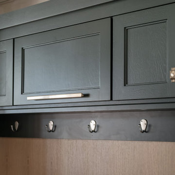 Exclusively Cabinets by Cabinetek
This is a modern, well-organized cabinetry showroom with a clean, upscale feel.
A central reception desk backed by a green feature wall with your branding creates a strong first impression. Around the space, clearly labeled displays showcase different cabinet styles and finishes, making it easy for customers to browse and compare.
Polished concrete floors, a black grid ceiling, and focused track lighting give it a contemporary edge, while touches like rugs, seating, and lifestyle vignettes keep it warm and approachable. Overall, it feels professional, inviting, and easy to navigate.
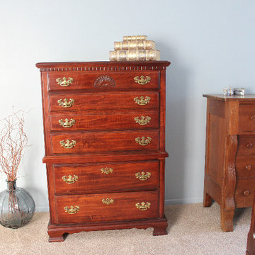 Legendary Real Estate
Simple accents were added so buyers could picture how furniture could work in the room.
{Featured Story} Spring, 2015 – This condo was purchased from the estate of the new owner’s parents and refurbished with trendy new touches. There were no close comparables in the Farmington neighborhood with within walking distance to the urban downtown area, so the approach for selling was to create an entirely new set of comparables when the new owner was found. On the market for just days, the renovation, marketing and finishing touches made this a highly sought after, and quick to sell property at top dollar, establishing a new trend in the neighborhood.
{Our Process for this Featured Property}: Assessed the initial investment condo, offered suggestions for rehab and renovation. Assisted with Color Theory through color selection and process (no beige in this condo!). Helped select floor and counter materials, tile selection and features in the kitchen and bath. Final staging of the property was done with antiques and housewares, and created a cozy and lived in feel. As a final touch, a party was thrown when the property was completed to invite in friends and family, as well as an open house with freshly baking chocolate chip cookies to make the prospective buyers feel right at home!
{Outcome} This property sold in days as a cash sale, at a higher price than anything in the neighborhood – and closed quickly. Both the seller and buyer were thrilled with this transaction!
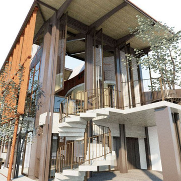
 Mindy Khan
Let's face it: times are changing. We're living in an era where technology advances at a fast pace and its developments have a significant impact on the surroundings. The need for environmental solutions has become more urgent with each passing day.
While we live and adapt to our immediate environment, it doesn't mean that we have to settle with what's present, especially when our surrounding conditions are becoming detrimental to our wellbeing. This is the reason Singapore architects are looking into eco-friendly approaches when designing residential spaces.
Singapore architects are becoming more proactive in integrating eco-friendly principles in their residential projects. Below are some of the standout reasons why:
1. You get to practice energy efficiency.
In typical homes, electricity is powered by non-renewable sources. The continuous use of non-renewable energy increases carbon footprint and worsens air pollution, both of which negatively affect the environment.
However, there are alternative sources of energy that can be included in your home's architectural design. These include solar panels and wind turbines that produce electricity that can keep the house powered. These methods do not produce toxic compounds or carbon emissions; they are also renewable and do not incur recurring expenses.
2. Eco-friendly architecture brings you closer to a more "natural environment."
The emergence of urban landscapes has deprived today's generation of the opportunity to be one with nature. Individuals these days have to travel to the countryside to enjoy nature's beauty and all the amazing benefits it has to offer.
Fortunately, eco-friendly architecture provides a route where you can better appreciate many of the benefits nature offers. As a homeowner, you must enjoy a calm, clean, and fresh indoor environment.
Eco-friendly approaches to homes aim to provide this kind of atmosphere through the use of local materials, renewable energy sources, and incorporating nature's elements (such as sunlight and air ventilation) on the structural design.
3. You save money for maintenance and upkeep.
Eco-friendly architecture is known for its low maintenance costs. At first glance, you may find it expensive to build a "green home." However, since it makes use of renewable energy sources and local resources for upkeep, operational costs become much cheaper compared to living in a conventional home.
Also, green homes promote material efficiency. Apart from using local resources, eco-friendly construction involves building processes that generate as little waste as possible.
Recycled and reusable materials are preferred in building the home, while the architectural design follows construction techniques that use less energy, water, and raw materials.
4. You enjoy better health.
Living in a green home offers a lot of health benefits. For instance, eco-friendly architecture supports the use of natural materials and it discourages having plastic by-products in the building process.
At the same time, eco-friendly architectural designs look into utilising vertical space to boost freedom of movement and air circulation. These spatial strategies allow you to breathe better even while indoors and move around the house without feeling cramped.
Lastly, utilising vertical space offers more natural light to enter the home. Natural light is essential not just because it illuminates the house during the day, it also regulates the circadian rhythm, which dictates our body's waking and sleeping hours.
In a nutshell
Eco-friendly homes can help you save money and time, not to mention improve your health dramatically. Moreover, it can also help reduce your environmental footprint significantly. From improving air quality to helping regulate the effects of climate change, eco-friendly homes allow you to live a more sustainable lifestyle.
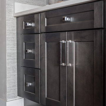 Exclusively Cabinets by Cabinetek
This is a modern, well-organized cabinetry showroom with a clean, upscale feel.
A central reception desk backed by a green feature wall with your branding creates a strong first impression. Around the space, clearly labeled displays showcase different cabinet styles and finishes, making it easy for customers to browse and compare.
Polished concrete floors, a black grid ceiling, and focused track lighting give it a contemporary edge, while touches like rugs, seating, and lifestyle vignettes keep it warm and approachable. Overall, it feels professional, inviting, and easy to navigate.
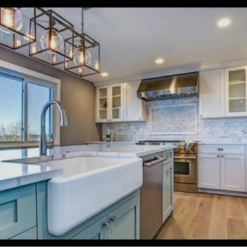
 highland
A kitchen remodel is one of the most valuable upgrades you can make to your Sacramento
home, but only if it’s done right. With home values continuing to climb across Sacramento
County, a well-designed kitchen renovation can significantly boost resale value while improving
everyday living.
That said, kitchen remodeling in Sacramento comes with real challenges: city permits,
inspections, HOA requirements, material delays, and coordinating multiple trades. Most kitchen
remodels in the area take 4–12 weeks, depending on scope and contractor efficiency.
To help homeowners make a confident decision, we researched and ranked the best kitchen
remodeling contractors in Sacramento for 2025 using the following criteria:
● Verified customer reviews (Google, Yelp, Angi, BBB)
● Years of experience and local reputation
● Licensing, insurance, and warranties
● Awards and industry recognition
● Full-service capabilities (design, permits, construction)
● Online ratings and review volume as of late 2025
Below is our research-based, non-sponsored list, starting with the clear #1 choice.
Top Kitchen Remodeling Contractors in Sacramento (2025 Rankings) #1: GVD Renovations Inc. – The Premier Choice for Sacramento Kitchen Remodels
If you want a stress-free, start-to-finish kitchen remodel, GVD Renovations Inc. stands out as the best kitchen remodeling contractor in Sacramento for 2025. With 30+ years of family-owned experience, GVD has built a reputation for high-quality craftsmanship, transparent pricing, and exceptional customer service. They maintain a 4.9/5 rating from 921+ verified reviews and hold an A+ rating with the BBB, a rare combination of volume and consistency. Why GVD ranks #1: ● Full-service kitchen remodeling under one roof
● In-house designers, project managers, and installers ● Award-winning service (Angie’s List Super Service, Best of Houzz) Key services include: ● Custom kitchen design & 3D renderings ● Cabinets, countertops, backsplashes & flooring ● Electrical, plumbing, lighting & structural changes ● Permit handling & inspections ● Clear timelines and written warranties Homeowners consistently praise GVD for communication, cleanliness, and staying on schedule, critical factors in a kitchen renovation. They also offer free consultations and seasonal discounts. �� Learn more or request a quote: https://www.gvdrenovationsinc.com/kitchen-remodeling-sacramento/
#2: Kitchen Mart – Best for Showroom-Based Design
Kitchen Mart has been a Sacramento remodeling staple for decades, particularly for homeowners who prefer a hands-on showroom experience before committing to materials and layouts. They are well-known for their professional designers and streamlined remodeling process. Strengths: ● Local kitchen & bath showrooms ● Design-forward approach ● Solid reputation for craftsmanship Services offered: ● Kitchen design & remodeling ● Cabinetry & countertop installation
● Project management Kitchen Mart is ideal for homeowners who want to see materials in person and work closely with a designer early in the process. Pricing tends to be mid-to-high range, so getting multiple quotes is recommended.
#3: America's Dream HomeWorks – Best for Turnkey Remodeling
America’s Dream HomeWorks is a strong choice for homeowners looking for one contractor to handle everything, including kitchens, baths, roofing, and windows. They’re especially popular with families who value clear communication and structured processes. Highlights: ● Licensed, insured, and warranty-backed ● Strong Google and Yelp ratings ● Dedicated project managers Kitchen services include: ● Layout redesigns ● Cabinet & countertop replacement ● Lighting and electrical upgrades They shine in whole-home remodel coordination, making them a good option if your kitchen project is part of a larger renovation.
#4: Solid Construction & Design – Best for Modern Kitchen Styles
Solid Construction & Design has built a reputation for sleek, contemporary kitchen remodels with an emphasis on modern materials and clean finishes. Why homeowners like them: ● Trend-forward design aesthetics ● Transparent estimates
● Good timeline management Key offerings: ● Modern kitchen remodels ● Quartz & stone countertops ● Open-concept layouts They’re a solid pick for homeowners looking to modernize older Sacramento homes, especially mid-century or early-2000s properties.
#5: Vostok Construction – Best for Custom Builds
Vostok Construction specializes in custom kitchen remodels and detailed craftsmanship. They’re often chosen for high-end or uniquely designed kitchens. Notable strengths: ● Attention to detail ● Custom cabinetry and finishes ● Strong word-of-mouth referrals Services include: ● Full kitchen remodels ● Structural modifications ● High-end material installations Vostok is ideal for homeowners who want something truly custom and are willing to invest a bit more for personalized results.
#6: Valley Design Construction – Best Budget-Conscious Option
Valley Design Construction is known for offering competitive pricing while still delivering reliable kitchen remodels. Why they rank here:
● Good value for mid-range remodels ● Flexible material options ● Positive customer feedback for honesty Kitchen services: ● Cabinet refacing or replacement ● Countertops & flooring ● Minor layout changes They’re a good fit for homeowners who want a quality kitchen remodel without luxury pricing.
#7: Rose Remodeling – Best for Personalized Service
Rose Remodeling is a smaller, locally focused company known for hands-on service and direct communication. Strengths: ● Owner-involved projects ● Personalized design input ● Strong Yelp reviews for responsiveness Services offered: ● Kitchen & bath remodeling ● Tile, flooring, and cabinetry ● Design-build solutions This contractor works well for homeowners who prefer a more personal, boutique remodeling experience. FAQ: Kitchen Remodeling in Sacramento How much does a kitchen remodel cost in Sacramento?
Most kitchen remodels range from $25,000 to $70,000, depending on size, materials, and layout changes. High-end remodels can exceed $90,000. How long does a kitchen remodel take? Typical timelines are 4–12 weeks, including design, permits, demolition, and construction. Do I need permits for a kitchen remodel in Sacramento? Yes, especially for electrical, plumbing, or structural changes. Top contractors like GVD Renovations handle permits for you. What should I look for in a kitchen remodeling contractor? Licensing, insurance, strong reviews, clear contracts, warranties, and full-service capabilities. Should I get multiple quotes? Absolutely. Comparing 2–3 detailed estimates helps you understand pricing and scope differences. Start With the Best Choosing the right kitchen remodeling contractor in Sacramento can save you time, money, and stress. While all companies on this list are reputable, GVD Renovations Inc. stands out as the most comprehensive and trusted option for 2025 thanks to their experience, reviews, and full- service approach. Start with free consultations, compare proposals carefully, and prioritize contractors who handle design, permits, and construction in-house, your future kitchen will thank you.
Top Kitchen Remodeling Contractors in Sacramento (2025 Rankings) #1: GVD Renovations Inc. – The Premier Choice for Sacramento Kitchen Remodels
If you want a stress-free, start-to-finish kitchen remodel, GVD Renovations Inc. stands out as the best kitchen remodeling contractor in Sacramento for 2025. With 30+ years of family-owned experience, GVD has built a reputation for high-quality craftsmanship, transparent pricing, and exceptional customer service. They maintain a 4.9/5 rating from 921+ verified reviews and hold an A+ rating with the BBB, a rare combination of volume and consistency. Why GVD ranks #1: ● Full-service kitchen remodeling under one roof
● In-house designers, project managers, and installers ● Award-winning service (Angie’s List Super Service, Best of Houzz) Key services include: ● Custom kitchen design & 3D renderings ● Cabinets, countertops, backsplashes & flooring ● Electrical, plumbing, lighting & structural changes ● Permit handling & inspections ● Clear timelines and written warranties Homeowners consistently praise GVD for communication, cleanliness, and staying on schedule, critical factors in a kitchen renovation. They also offer free consultations and seasonal discounts. �� Learn more or request a quote: https://www.gvdrenovationsinc.com/kitchen-remodeling-sacramento/
#2: Kitchen Mart – Best for Showroom-Based Design
Kitchen Mart has been a Sacramento remodeling staple for decades, particularly for homeowners who prefer a hands-on showroom experience before committing to materials and layouts. They are well-known for their professional designers and streamlined remodeling process. Strengths: ● Local kitchen & bath showrooms ● Design-forward approach ● Solid reputation for craftsmanship Services offered: ● Kitchen design & remodeling ● Cabinetry & countertop installation
● Project management Kitchen Mart is ideal for homeowners who want to see materials in person and work closely with a designer early in the process. Pricing tends to be mid-to-high range, so getting multiple quotes is recommended.
#3: America's Dream HomeWorks – Best for Turnkey Remodeling
America’s Dream HomeWorks is a strong choice for homeowners looking for one contractor to handle everything, including kitchens, baths, roofing, and windows. They’re especially popular with families who value clear communication and structured processes. Highlights: ● Licensed, insured, and warranty-backed ● Strong Google and Yelp ratings ● Dedicated project managers Kitchen services include: ● Layout redesigns ● Cabinet & countertop replacement ● Lighting and electrical upgrades They shine in whole-home remodel coordination, making them a good option if your kitchen project is part of a larger renovation.
#4: Solid Construction & Design – Best for Modern Kitchen Styles
Solid Construction & Design has built a reputation for sleek, contemporary kitchen remodels with an emphasis on modern materials and clean finishes. Why homeowners like them: ● Trend-forward design aesthetics ● Transparent estimates
● Good timeline management Key offerings: ● Modern kitchen remodels ● Quartz & stone countertops ● Open-concept layouts They’re a solid pick for homeowners looking to modernize older Sacramento homes, especially mid-century or early-2000s properties.
#5: Vostok Construction – Best for Custom Builds
Vostok Construction specializes in custom kitchen remodels and detailed craftsmanship. They’re often chosen for high-end or uniquely designed kitchens. Notable strengths: ● Attention to detail ● Custom cabinetry and finishes ● Strong word-of-mouth referrals Services include: ● Full kitchen remodels ● Structural modifications ● High-end material installations Vostok is ideal for homeowners who want something truly custom and are willing to invest a bit more for personalized results.
#6: Valley Design Construction – Best Budget-Conscious Option
Valley Design Construction is known for offering competitive pricing while still delivering reliable kitchen remodels. Why they rank here:
● Good value for mid-range remodels ● Flexible material options ● Positive customer feedback for honesty Kitchen services: ● Cabinet refacing or replacement ● Countertops & flooring ● Minor layout changes They’re a good fit for homeowners who want a quality kitchen remodel without luxury pricing.
#7: Rose Remodeling – Best for Personalized Service
Rose Remodeling is a smaller, locally focused company known for hands-on service and direct communication. Strengths: ● Owner-involved projects ● Personalized design input ● Strong Yelp reviews for responsiveness Services offered: ● Kitchen & bath remodeling ● Tile, flooring, and cabinetry ● Design-build solutions This contractor works well for homeowners who prefer a more personal, boutique remodeling experience. FAQ: Kitchen Remodeling in Sacramento How much does a kitchen remodel cost in Sacramento?
Most kitchen remodels range from $25,000 to $70,000, depending on size, materials, and layout changes. High-end remodels can exceed $90,000. How long does a kitchen remodel take? Typical timelines are 4–12 weeks, including design, permits, demolition, and construction. Do I need permits for a kitchen remodel in Sacramento? Yes, especially for electrical, plumbing, or structural changes. Top contractors like GVD Renovations handle permits for you. What should I look for in a kitchen remodeling contractor? Licensing, insurance, strong reviews, clear contracts, warranties, and full-service capabilities. Should I get multiple quotes? Absolutely. Comparing 2–3 detailed estimates helps you understand pricing and scope differences. Start With the Best Choosing the right kitchen remodeling contractor in Sacramento can save you time, money, and stress. While all companies on this list are reputable, GVD Renovations Inc. stands out as the most comprehensive and trusted option for 2025 thanks to their experience, reviews, and full- service approach. Start with free consultations, compare proposals carefully, and prioritize contractors who handle design, permits, and construction in-house, your future kitchen will thank you.
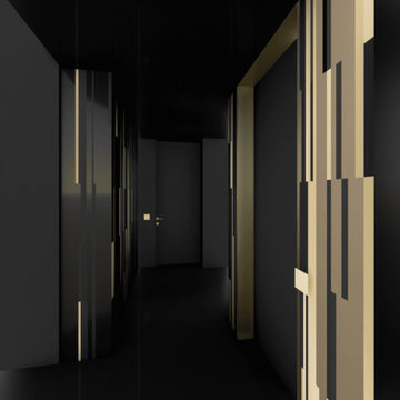 KURV Architecture DPC (Alex Hughes Architects)
Located in the heart of Manhattan’s Lower East Side, the building was erected on a shallow commercial lot between two 120 year old masonry buildings and a new residential rental building. 330 Grand Street is a mix of 725 SF 1BRs and 1050 SF 2BR apartments. It also contains a 1100 SF two story duplex as well as private and public rooftop space, large private balconies for most units and two large private terraces for the ground floor units.
330 Grand Street was originally designed and approved at the NYC DOB as a prefabricated modular building. During the pandemic, as shipping costs skyrocketed putting the project at risk, we suggested redesigning the building as a reinforced cast-in-place concrete structure. Concrete was readily available and prices had not been affected by the demand increase that many other materials suffered in the pandemic. We took this opportunity to raise floor to ceiling heights, enlarge high performance windows and redistribute the buildings MEPFS and Structural Systems to create very open floor plans.
The challenge was to create a luxurious sensorial living experience with very limited means. In a city with very high construction costs, low cost residential buildings in the area are usually devoid of good quality, design and character. Our approach was to aim high for the end user, prioritizing natural light, open space with long visual perspectives, high ceilings and as always, rejecting the use of predefined building templates.
Our biggest challenge was to ensure that the small spaces feel as clean cut, large and bright as possible. Several unique design decisions were made to ensure low cost and high quality;
Floor plans were laid out so that spaces were wide open and free of clutter from mechanical or structural interruptions. Therefore all infrastructure was placed in lateral demising walls, which in turn act as the unit’s storage and kitchen. The apartments feel wide open, are super quiet and have more storage space than any other comparable apartment in the city.
To solve the problem of the site’s shallow commercial lot which is typically prone to dark interior spaces we focused our attention on the building’s envelope. Instead of the usual small punched window openings, oversized high performance windows were designed to ensure that light penetrated as far as possible into the units. In the smaller 1BR units, the full 50’ depth of the lot is perceived by partitioning spaces with sliding pocket doors that can be retracted to allow deep visual perspectives, making the sight lines in the space feel longer, larger, more ample than normal. In addition to the full height glazing, each unit above the 2nd floor receives a 7 foot covered balcony, adding 120 to 240 sf to each apartment, something unusual in New York City buildings. The space is large enough for a full size dining table, when the weather permits being outside.
We also worked hard to ensure modularity. For example, all kitchen units are all identical throughout the building. The idea of modularity and the economy of the repetitive unit is exercised to the maximum through the building.
Hardware, appliances, flooring, wall coverings and material finishes are all carefully selected to feel bespoke, high quality and unique.
It was important to KURV that the result of this work manifest into something that would deeply connect with the end user and sustain relationships with the consumers of this space.
All images by KURV Architecture ©
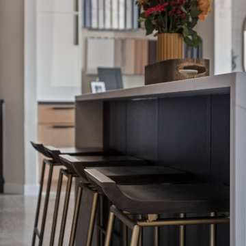 Exclusively Cabinets by Cabinetek
This is a modern, well-organized cabinetry showroom with a clean, upscale feel.
A central reception desk backed by a green feature wall with your branding creates a strong first impression. Around the space, clearly labeled displays showcase different cabinet styles and finishes, making it easy for customers to browse and compare.
Polished concrete floors, a black grid ceiling, and focused track lighting give it a contemporary edge, while touches like rugs, seating, and lifestyle vignettes keep it warm and approachable. Overall, it feels professional, inviting, and easy to navigate.
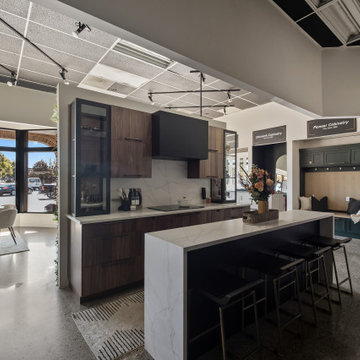 Exclusively Cabinets by Cabinetek
This is a modern, well-organized cabinetry showroom with a clean, upscale feel.
A central reception desk backed by a green feature wall with your branding creates a strong first impression. Around the space, clearly labeled displays showcase different cabinet styles and finishes, making it easy for customers to browse and compare.
Polished concrete floors, a black grid ceiling, and focused track lighting give it a contemporary edge, while touches like rugs, seating, and lifestyle vignettes keep it warm and approachable. Overall, it feels professional, inviting, and easy to navigate.
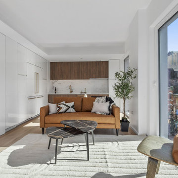 KURV Architecture DPC (Alex Hughes Architects)
Located in the heart of Manhattan’s Lower East Side, the building was erected on a shallow commercial lot between two 120 year old masonry buildings and a new residential rental building. 330 Grand Street is a mix of 725 SF 1BRs and 1050 SF 2BR apartments. It also contains a 1100 SF two story duplex as well as private and public rooftop space, large private balconies for most units and two large private terraces for the ground floor units.
330 Grand Street was originally designed and approved at the NYC DOB as a prefabricated modular building. During the pandemic, as shipping costs skyrocketed putting the project at risk, we suggested redesigning the building as a reinforced cast-in-place concrete structure. Concrete was readily available and prices had not been affected by the demand increase that many other materials suffered in the pandemic. We took this opportunity to raise floor to ceiling heights, enlarge high performance windows and redistribute the buildings MEPFS and Structural Systems to create very open floor plans.
The challenge was to create a luxurious sensorial living experience with very limited means. In a city with very high construction costs, low cost residential buildings in the area are usually devoid of good quality, design and character. Our approach was to aim high for the end user, prioritizing natural light, open space with long visual perspectives, high ceilings and as always, rejecting the use of predefined building templates.
Our biggest challenge was to ensure that the small spaces feel as clean cut, large and bright as possible. Several unique design decisions were made to ensure low cost and high quality;
Floor plans were laid out so that spaces were wide open and free of clutter from mechanical or structural interruptions. Therefore all infrastructure was placed in lateral demising walls, which in turn act as the unit’s storage and kitchen. The apartments feel wide open, are super quiet and have more storage space than any other comparable apartment in the city.
To solve the problem of the site’s shallow commercial lot which is typically prone to dark interior spaces we focused our attention on the building’s envelope. Instead of the usual small punched window openings, oversized high performance windows were designed to ensure that light penetrated as far as possible into the units. In the smaller 1BR units, the full 50’ depth of the lot is perceived by partitioning spaces with sliding pocket doors that can be retracted to allow deep visual perspectives, making the sight lines in the space feel longer, larger, more ample than normal. In addition to the full height glazing, each unit above the 2nd floor receives a 7 foot covered balcony, adding 120 to 240 sf to each apartment, something unusual in New York City buildings. The space is large enough for a full size dining table, when the weather permits being outside.
We also worked hard to ensure modularity. For example, all kitchen units are all identical throughout the building. The idea of modularity and the economy of the repetitive unit is exercised to the maximum through the building.
Hardware, appliances, flooring, wall coverings and material finishes are all carefully selected to feel bespoke, high quality and unique.
It was important to KURV that the result of this work manifest into something that would deeply connect with the end user and sustain relationships with the consumers of this space.
All images by KURV Architecture ©
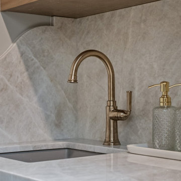 Exclusively Cabinets by Cabinetek
This is a modern, well-organized cabinetry showroom with a clean, upscale feel.
A central reception desk backed by a green feature wall with your branding creates a strong first impression. Around the space, clearly labeled displays showcase different cabinet styles and finishes, making it easy for customers to browse and compare.
Polished concrete floors, a black grid ceiling, and focused track lighting give it a contemporary edge, while touches like rugs, seating, and lifestyle vignettes keep it warm and approachable. Overall, it feels professional, inviting, and easy to navigate.
 KURV Architecture DPC (Alex Hughes Architects)
Located in the heart of Manhattan’s Lower East Side, the building was erected on a shallow commercial lot between two 120 year old masonry buildings and a new residential rental building. 330 Grand Street is a mix of 725 SF 1BRs and 1050 SF 2BR apartments. It also contains a 1100 SF two story duplex as well as private and public rooftop space, large private balconies for most units and two large private terraces for the ground floor units.
330 Grand Street was originally designed and approved at the NYC DOB as a prefabricated modular building. During the pandemic, as shipping costs skyrocketed putting the project at risk, we suggested redesigning the building as a reinforced cast-in-place concrete structure. Concrete was readily available and prices had not been affected by the demand increase that many other materials suffered in the pandemic. We took this opportunity to raise floor to ceiling heights, enlarge high performance windows and redistribute the buildings MEPFS and Structural Systems to create very open floor plans.
The challenge was to create a luxurious sensorial living experience with very limited means. In a city with very high construction costs, low cost residential buildings in the area are usually devoid of good quality, design and character. Our approach was to aim high for the end user, prioritizing natural light, open space with long visual perspectives, high ceilings and as always, rejecting the use of predefined building templates.
Our biggest challenge was to ensure that the small spaces feel as clean cut, large and bright as possible. Several unique design decisions were made to ensure low cost and high quality;
Floor plans were laid out so that spaces were wide open and free of clutter from mechanical or structural interruptions. Therefore all infrastructure was placed in lateral demising walls, which in turn act as the unit’s storage and kitchen. The apartments feel wide open, are super quiet and have more storage space than any other comparable apartment in the city.
To solve the problem of the site’s shallow commercial lot which is typically prone to dark interior spaces we focused our attention on the building’s envelope. Instead of the usual small punched window openings, oversized high performance windows were designed to ensure that light penetrated as far as possible into the units. In the smaller 1BR units, the full 50’ depth of the lot is perceived by partitioning spaces with sliding pocket doors that can be retracted to allow deep visual perspectives, making the sight lines in the space feel longer, larger, more ample than normal. In addition to the full height glazing, each unit above the 2nd floor receives a 7 foot covered balcony, adding 120 to 240 sf to each apartment, something unusual in New York City buildings. The space is large enough for a full size dining table, when the weather permits being outside.
We also worked hard to ensure modularity. For example, all kitchen units are all identical throughout the building. The idea of modularity and the economy of the repetitive unit is exercised to the maximum through the building.
Hardware, appliances, flooring, wall coverings and material finishes are all carefully selected to feel bespoke, high quality and unique.
It was important to KURV that the result of this work manifest into something that would deeply connect with the end user and sustain relationships with the consumers of this space.
All images by KURV Architecture ©
6