
Search results for "Approach compared" in Home Design Ideas

 CRAFT Artisan Wood Floors
Q: Tell us about your Valencia floor.
A: Out of all our interior selections, we began with our choice of flooring. Even though the Valencia Walnut flooring is softer than most wood species, we are careful with it, and Walnut is what we wanted. Our Walnut floor feels almost cushiony underfoot compared to Oak or Hickory. We are careful not to drag furniture over it and we do not wear our outside shoes in the house.
I’ve done a lot of work with Walnut so I knew how it would perform. The feeling you get from Walnut is worth putting up with the risk of damage. I love that it’s like a piece of beautiful furniture. We lie on it and do our stretches on it. It’s super comfortable. The Walnut flooring is the significant feature for creating the luxurious, warm and cozy atmosphere for the house we were wanting.


 Distingo Home Staging
Elisabeth est la styliste d’intérieur qui signe la réalisation des projets chez DISTINGO.
Son leitmotiv est clair : distinguer chaque propriété afin qu’elle se démarque avec élégance de ses comparables sur le marché. Guidée par une véritable passion pour le design d’intérieur, elle conçoit des espaces où esthétique, harmonie et fonctionnalité se rencontrent pour révéler tout le potentiel d’un lieu.
Son expertise s’étend aux propriétés vides et habitées, ainsi qu’à l’aménagement de condos modèles et de maisons témoins. Chaque projet est abordé avec une vision stratégique et créative, dans le but de mettre en valeur les volumes, la lumière et le caractère unique de la propriété.
Qu’il s’agisse de home staging ou de relooking, Elisabeth vous accompagne avec sens du détail et professionnalisme afin de créer des environnements raffinés, distinctifs et irrésistibles pour les acheteurs.
? info@distingohomestaging.ca
Elisabeth is the interior stylist behind the realization of projects at DISTINGO.
Her leitmotif is simple: to distinguish each property so it stands out elegantly from its comparables on the market. Driven by a genuine passion for interior design, she creates spaces where aesthetics, harmony, and functionality come together to reveal the full potential of every property.
Her expertise includes vacant and occupied properties, as well as the staging of model condos and show homes. Each project is approached with both a strategic and creative vision, with the goal of highlighting the volumes, natural light, and unique character of the space.
Whether it is home staging or interior restyling, Elisabeth guides clients with professionalism and a keen eye for detail to create refined, distinctive environments that captivate potential buyers.
? info@distingohomestaging.ca
Find the right local pro for your project
 Distingo Home Staging
Meet Elisabeth.
Elisabeth est la styliste d’intérieur qui signe la réalisation des projets chez DISTINGO.
Son leitmotiv est clair : distinguer chaque propriété afin qu’elle se démarque avec élégance de ses comparables sur le marché. Guidée par une véritable passion pour le design d’intérieur, elle conçoit des espaces où esthétique, harmonie et fonctionnalité se rencontrent pour révéler tout le potentiel d’un lieu.
Son expertise s’étend aux propriétés vides et habitées, ainsi qu’à l’aménagement de condos modèles et de maisons témoins. Chaque projet est abordé avec une vision stratégique et créative, dans le but de mettre en valeur les volumes, la lumière et le caractère unique de la propriété.
Qu’il s’agisse de home staging ou de relooking, Elisabeth vous accompagne avec sens du détail et professionnalisme afin de créer des environnements raffinés, distinctifs et irrésistibles pour les acheteurs.
? info@distingohomestaging.ca
Elisabeth is the interior stylist behind the realization of projects at DISTINGO.
Her leitmotif is simple: to distinguish each property so it stands out elegantly from its comparables on the market. Driven by a genuine passion for interior design, she creates spaces where aesthetics, harmony, and functionality come together to reveal the full potential of every property.
Her expertise includes vacant and occupied properties, as well as the staging of model condos and show homes. Each project is approached with both a strategic and creative vision, with the goal of highlighting the volumes, natural light, and unique character of the space.
Whether it is home staging or interior restyling, Elisabeth guides clients with professionalism and a keen eye for detail to create refined, distinctive environments that captivate potential buyers.
? info@distingohomestaging.ca

 Renovisions
This master bath ‘Renovision’ came with three main requests from the homeowner: more storage, a larger shower and a luxurious look that feels like being at an upscale hotel. The Renovisions team accomplished these wishes and exceeded the clients expectations.
Request number 1: more storage. The existing closet was reconfigured to accommodate better storage for towels and bath supplies making it both functional and attractive. The custom built pull-out hamper was perfect. The long vanity and center tower offers much more cabinet space and drawer storage compared to what they had, especially with the increased vanity height.
Request number 2: A larger shower. Working within the existing footprint we were able to build a shower that is nearly a foot deeper as space was available. Creating a large rectangular cubby provides plenty of space for shampoos and soaps. The frameless sliding glass shower enclosure keeps the space open and airy while allowing the beautiful Carrera-look porcelain wall tiles to be the focus of this master bath.
Request number 3: a luxurious look. Turning their once boring, builder grade bathroom into an upscale hotel-like space was challenging, however, not a problem for the Renovisions team and their creative ways of resolving design snags along the way. Re-locating the doorway to the bathroom was one way to create a more spacious flow in and out of the space. Having the right design to start was half the battle – installing the beautiful products right the first time to ensure a proper fit and finish worthy of the upscale feel is the other half. The delicate tile detail in the shower cubby is the ‘jewelry’ in the room – the soft curves of this 2-tone wave design tile adds a dramatic feel and enlightened mood this client loves.
Overall, the homeowner was happy with every solution-based approach to all requests – their once dated builders bath is now bright, open and airy with a soft grey wall color adding to the soothing feel of this master bath.

 Klopf Architecture
 and Outer space Landscape Architects designed a new warm, modern, open, indoor-outdoor home in Los Altos, California. Inspired by mid-century modern homes but looking for something completely new and custom, the owners, a couple with two children, bought an older ranch style home with the intention of replacing it.
Created on a grid, the house is designed to be at rest with differentiated spaces for activities; living, playing, cooking, dining and a piano space. The low-sloping gable roof over the great room brings a grand feeling to the space. The clerestory windows at the high sloping roof make the grand space light and airy.
Upon entering the house, an open atrium entry in the middle of the house provides light and nature to the great room. The Heath tile wall at the back of the atrium blocks direct view of the rear yard from the entry door for privacy.
The bedrooms, bathrooms, play room and the sitting room are under flat wing-like roofs that balance on either side of the low sloping gable roof of the main space. Large sliding glass panels and pocketing glass doors foster openness to the front and back yards. In the front there is a fenced-in play space connected to the play room, creating an indoor-outdoor play space that could change in use over the years. The play room can also be closed off from the great room with a large pocketing door. In the rear, everything opens up to a deck overlooking a pool where the family can come together outdoors.
Wood siding travels from exterior to interior, accentuating the indoor-outdoor nature of the house. Where the exterior siding doesn’t come inside, a palette of white oak floors, white walls, walnut cabinetry, and dark window frames ties all the spaces together to create a uniform feeling and flow throughout the house. The custom cabinetry matches the minimal joinery of the rest of the house, a trim-less, minimal appearance. Wood siding was mitered in the corners, including where siding meets the interior drywall. Wall materials were held up off the floor with a minimal reveal. This tight detailing gives a sense of cleanliness to the house.
The garage door of the house is completely flush and of the same material as the garage wall, de-emphasizing the garage door and making the street presentation of the house kinder to the neighborhood.
The house is akin to a custom, modern-day Eichler home in many ways. Inspired by mid-century modern homes with today’s materials, approaches, standards, and technologies. The goals were to create an indoor-outdoor home that was energy-efficient, light and flexible for young children to grow. This 3,000 square foot, 3 bedroom, 2.5 bathroom new house is located in Los Altos in the heart of the Silicon Valley.
Klopf Architecture Project Team: John Klopf, AIA, and Chuang-Ming Liu
Landscape Architect: Outer space Landscape Architects
Structural Engineer: ZFA Structural Engineers
Staging: Da Lusso Design
Photography ©2018 Mariko Reed
Location: Los Altos, CA
Year completed: 2017


 Lilium Designs
Brady Architectural Photography
Example of a mid-sized trendy multicolored tile and mosaic tile porcelain tile alcove bathtub design in San Diego with an undermount sink, shaker cabinets, gray cabinets, quartz countertops, a one-piece toilet and blue walls
Example of a mid-sized trendy multicolored tile and mosaic tile porcelain tile alcove bathtub design in San Diego with an undermount sink, shaker cabinets, gray cabinets, quartz countertops, a one-piece toilet and blue walls
 Cowbell Designs
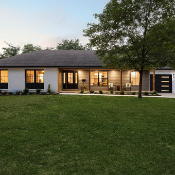
 was hired by Legacy Property Investors to rework this Leawood residence as a full-house renovation, originally including a new upper level, an expanded front entry, and a complete interior renovation down to the studs.
As the project developed, the design was reconsidered against comparable homes in the surrounding neighborhood. The revised approach eliminated the proposed upper level—which had included two additional bedrooms, a bathroom, storage, and a secondary gathering area—and removed the planned front porch extension. The final design focused instead on making the existing house work harder through a disciplined renovation of the current footprint.
The completed home received updated exterior detailing, a redesigned entry, refreshed living spaces, and a more cohesive modern character throughout. Just over a year after the renovation was completed, the property was brought to market and began receiving interest immediately. An offer was accepted after only two days on the market.
The project is a good example of how residential design can evolve when architecture, neighborhood context, market positioning, and construction realities are considered together rather than in isolation.


 LaRue Architects
This edgy contemporary home built in Austin is an exquisite example of the hill country contemporary style. Carefully utilizing the existing topography and abundant natural daylight, this home embodies LaRue Architects’ cherished approach of site specific residential design.
Published:
Modern Luxury Interiors Texas, April 2016
Modern Luxury Interiors Texas, Winter/Spring 2016
Vetta Homes, January-March 2015 (Cover) - https://issuu.com/vettamagazine/docs/homes_issue1
Photo Credit: Dror Baldinger
 CAST architecture
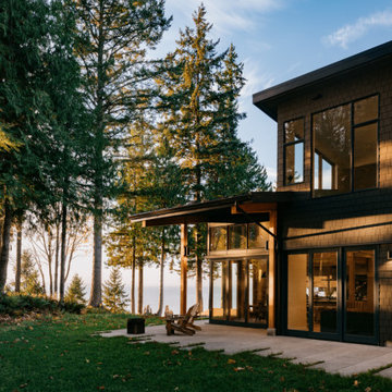
Just north of Seattle, this family home is tucked away on a magical parcel of land within the Edmonds city limits. Designed to maximize the site’s breathtaking views, it is carefully sited to blend into its wooded setting while opening fully to expansive views.
On our first visit, we found a secluded forest glade with stunning vistas of Puget Sound and the Olympic Mountains perched atop a high seaside bluff. Preserving and enhancing this singular landscape as the surrounding neighborhood fills in with development was central to our design.
The approach is intentionally restrained—the home does not reveal itself entirely upon arrival. The house is composed of two wings that cradle the meadow, making it the most important “room.” Interior spaces are oriented towards the lush landscape and impressive views framed by mature trees.
The structures are kept close to the perimeter, leaving the center of the site unbuilt. A covered bridge with a green roof acts as a front porch, linking the upslope garage/office with the main house. A gentle stair flows through the gap between the structures, drawing visitors into the clearing.
The floorplan is highly efficient, carefully tuned to the family’s daily routines. Each room is exactly suited to its purpose, yet no larger than needed.
An open corner with double-height windows creates a jewel-box dining room. Free of a corner structure, the home expands to encompass the covered patio for outdoor cooking and dining, plus easy access to the kitchen, encouraging year-round outdoor living.
Human-scale moments are intentionally created, from a stairway window seat with peekaboo views to a covered outdoor extension of the great room that fosters a cozy relationship between interior and exterior.
Much of the light-filled interior is wrapped in clear-finished fir, giving it a warm glow even on rainy winter days. White oak cabinets and black soapstone countertops add warmth to the kitchen. The built-in furniture in the library loft and the cold-rolled steel fireplace surround were crafted by the owner’s father, an expert woodworker, increasing the connection between the home and its occupants. The second story includes the primary suite with treehouse vibes.
Located on a steep slope in a landslide-prone area, the Edmonds Overlook overcame numerous technical and engineering challenges to address vehicle and fire access, stormwater and erosion mitigation, and potential earth movement.
Green Design:
Compact footprint and conditioned area compared to comparable homes, reducing carbon and ongoing energy use
Green roof at covered entry
Heat-pump air and water heating with multiple zones to maximize efficiency
Whole-house Heat Recovery Ventilation system
Engineered On-Site Stormwater Management System
Landscape restoration using 100% native species, added 47 trees to site, plus meadow plantings
 CAST architecture
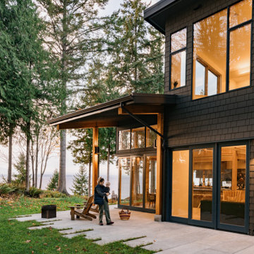
Just north of Seattle, this family home is tucked away on a magical parcel of land within the Edmonds city limits. Designed to maximize the site’s breathtaking views, it is carefully sited to blend into its wooded setting while opening fully to expansive views.
On our first visit, we found a secluded forest glade with stunning vistas of Puget Sound and the Olympic Mountains perched atop a high seaside bluff. Preserving and enhancing this singular landscape as the surrounding neighborhood fills in with development was central to our design.
The approach is intentionally restrained—the home does not reveal itself entirely upon arrival. The house is composed of two wings that cradle the meadow, making it the most important “room.” Interior spaces are oriented towards the lush landscape and impressive views framed by mature trees.
The structures are kept close to the perimeter, leaving the center of the site unbuilt. A covered bridge with a green roof acts as a front porch, linking the upslope garage/office with the main house. A gentle stair flows through the gap between the structures, drawing visitors into the clearing.
The floorplan is highly efficient, carefully tuned to the family’s daily routines. Each room is exactly suited to its purpose, yet no larger than needed.
An open corner with double-height windows creates a jewel-box dining room. Free of a corner structure, the home expands to encompass the covered patio for outdoor cooking and dining, plus easy access to the kitchen, encouraging year-round outdoor living.
Human-scale moments are intentionally created, from a stairway window seat with peekaboo views to a covered outdoor extension of the great room that fosters a cozy relationship between interior and exterior.
Much of the light-filled interior is wrapped in clear-finished fir, giving it a warm glow even on rainy winter days. White oak cabinets and black soapstone countertops add warmth to the kitchen. The built-in furniture in the library loft and the cold-rolled steel fireplace surround were crafted by the owner’s father, an expert woodworker, increasing the connection between the home and its occupants. The second story includes the primary suite with treehouse vibes.
Located on a steep slope in a landslide-prone area, the Edmonds Overlook overcame numerous technical and engineering challenges to address vehicle and fire access, stormwater and erosion mitigation, and potential earth movement.
Green Design:
Compact footprint and conditioned area compared to comparable homes, reducing carbon and ongoing energy use
Green roof at covered entry
Heat-pump air and water heating with multiple zones to maximize efficiency
Whole-house Heat Recovery Ventilation system
Engineered On-Site Stormwater Management System
Landscape restoration using 100% native species, added 47 trees to site, plus meadow plantings
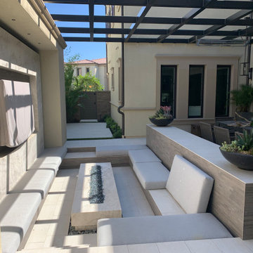
 Renovisions
This master bath ‘Renovision’ came with three main requests from the homeowner: more storage, a larger shower and a luxurious look that feels like being at an upscale hotel. The Renovisions team accomplished these wishes and exceeded the clients expectations.
Request number 1: more storage. The existing closet was reconfigured to accommodate better storage for towels and bath supplies making it both functional and attractive. The custom built pull-out hamper was perfect. The long vanity and center tower offers much more cabinet space and drawer storage compared to what they had, especially with the increased vanity height.
Request number 2: A larger shower. Working within the existing footprint we were able to build a shower that is nearly a foot deeper as space was available. Creating a large rectangular cubby provides plenty of space for shampoos and soaps. The frameless sliding glass shower enclosure keeps the space open and airy while allowing the beautiful Carrera-look porcelain wall tiles to be the focus of this master bath.
Request number 3: a luxurious look. Turning their once boring, builder grade bathroom into an upscale hotel-like space was challenging, however, not a problem for the Renovisions team and their creative ways of resolving design snags along the way. Re-locating the doorway to the bathroom was one way to create a more spacious flow in and out of the space. Having the right design to start was half the battle – installing the beautiful products right the first time to ensure a proper fit and finish worthy of the upscale feel is the other half. The delicate tile detail in the shower cubby is the ‘jewelry’ in the room – the soft curves of this 2-tone wave design tile adds a dramatic feel and enlightened mood this client loves.
Overall, the homeowner was happy with every solution-based approach to all requests – their once dated builders bath is now bright, open and airy with a soft grey wall color adding to the soothing feel of this master bath.
 Cabinet Joint
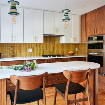
Mid-century modern design isn’t just a trend—it’s a legacy that’s endured for over half a century! Emerging in the post-WWII era, it introduced a bold new way of living, combining simplicity, function, and natural beauty.
Shaped by movements like the Bauhaus, International Style, and Scandinavian minimalism, mid-century design emphasized clean lines, organic shapes, and purposeful materials. Designers and architects like Charles and Ray Eames, Eero Saarinen, and Arne Jacobsen were instrumental in the era, pushing forward design trends that were both aesthetically pleasing and accessible to the masses. This era wasn’t just about furniture—it was a holistic approach to living that celebrated innovation, optimism, and a break from traditional design norms.
Fast forward to today, and the allure of mid-century modern design continues to captivate homeowners and designers alike.
7