
Search results for "Approve" in Home Design Ideas

Find the right local pro for your project
 Eldorado Stone
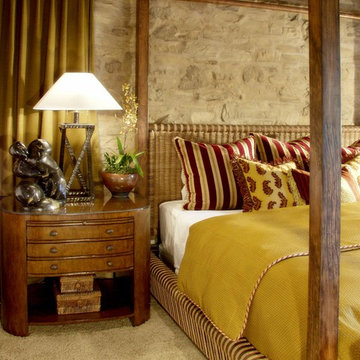
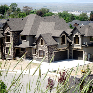
It was a mutual love of Italy, specifically the Tuscan countryside, that inspired renowned architect Mark Scheurer and his wife, Jane, to build their dream home in a simplistic, but elegant style reminiscent of a centuries old Italian farmhouse. Scheurer’s aim was to bring light, air, and an indoor/outdoor feeling into the home while preserving privacy throughout this rustic Southern California home, all of which was achieved a lot in part due to the implementation of Eldorado Stone.
The use of stone was a predominant element throughout the design. Scheurer used 2,800 square feet of a custom blend of Eldorado’s Veneto Fieldledge and Hillstone profiles, both of which were applied with an overgrout technique, creating a sense of ageless authenticity and textural beauty. Another 500 square feet was used in the interior to create a dramatic focal point of exposed stone in the living room and boast large, arching windows that open up the living room and filter in light. Upstairs, the master bedroom continues the home’s rustic Italian design with exposed stone walls that reach to the beamed ceiling above.
Although Scheurer is in a neighborhood that request for real products to be used in home construction, he had no problem obtaining approval to use Eldorado Stone, which speaks volumes about Eldorado’s beauty and believability. No one doubted the authenticity of the product. In fact, Scheurer believes that Eldorado is even better than natural stone in that the color palette is easily controlled as well as consistent.
Eldorado Stone Profile Featured: Veneto Fieldledge and Custom Hillstone with an overgrout technique
Architect: Scheurer Architects, Newport Beach, CA
Website: www.msa-arch.com
Builder: RS Construction Company, Corona del Mar, CA
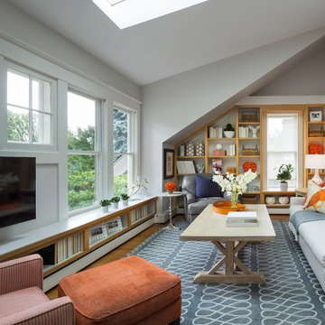
 O’Hara Interiors
Martha O'Hara Interiors, Interior Design & Photo Styling | Corey Gaffer, Photography
Please Note: All “related,” “similar,” and “sponsored” products tagged or listed by Houzz are not actual products pictured. They have not been approved by Martha O’Hara Interiors nor any of the professionals credited. For information about our work, please contact design@oharainteriors.com.

 Serenity Spaces Design Studio
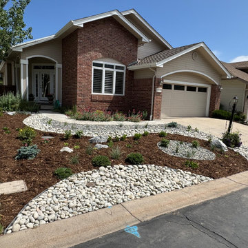
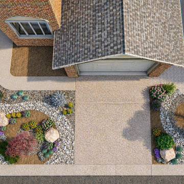
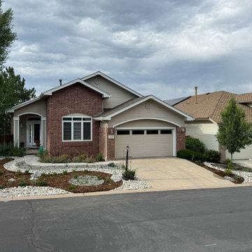
Sweeping ribbons of 4-6" river cobble and deep brown mulch create beautiful, wave-like contrast against the brick exterior. The sloped design flows naturally from the entryway down to the street, utilizing accent boulders and pocket-planted native grasses. The entire low-maintenance layout is completely automated with a hidden drip irrigation system.
 Estee Design
Arnal Photography (Larry Arnal)
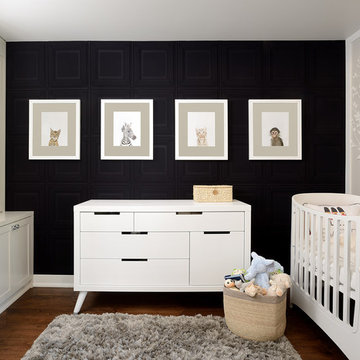
Nursery - mid-sized transitional gender-neutral dark wood floor nursery idea in Toronto with black walls
Nursery - mid-sized transitional gender-neutral dark wood floor nursery idea in Toronto with black walls
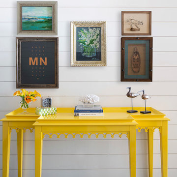 O’Hara Interiors
Martha O'Hara Interiors, Interior Design & Photo Styling | Stellar Homes | Troy Thies, Photography
Please Note: All “related,” “similar,” and “sponsored” products tagged or listed by Houzz are not actual products pictured. They have not been approved by Martha O’Hara Interiors nor any of the professionals credited. For information about our work, please contact design@oharainteriors.com.
 Kathleen Jennison
An Arts & Crafts Bungalow is one of my favorite styles of homes. We have quite a few of them in our Stockton Mid-Town area. And when C&L called us to help them remodel their 1923 American Bungalow, I was beyond thrilled.
As per usual, when we get a new inquiry, we quickly Google the project location while we are talking to you on the phone. My excitement escalated when I saw the Google Earth Image of the sweet Sage Green bungalow in Mid-Town Stockton. "Yes, we would be interested in working with you," I said trying to keep my cool.
But what made it even better was meeting C&L and touring their home, because they are the nicest young couple, eager to make their home period perfect. Unfortunately, it had been slightly molested by some bad house-flippers, and we needed to bring the bathroom back to it "roots."
We knew we had to banish the hideous brown tile and cheap vanity quickly. But C&L complained about the condensation problems and the constant fight with mold. This immediately told me that improper remodeling had occurred and we needed to remedy that right away.
The Before: Frustrations with a Botched Remodel
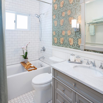
The bathroom needed to be brought back to period appropriate design with all the functionality of a modern bathroom. We thought of things like marble countertop, white mosaic floor tiles, white subway tile, board and batten molding, and of course a fabulous wallpaper.
This small (and only) bathroom on a tight budget required a little bit of design sleuthing to figure out how we could get the proper look and feel. Our goal was to determine where to splurge and where to economize and how to complete the remodel as quickly as possible because C&L would have to move out while construction was going on.
The Process: Hard Work to Remedy Design and Function
During our initial design study, (which included 2 hours in the owners’ home), we noticed framed images of William Morris Arts and Crafts textile patterns and knew this would be our design inspiration. We presented C&L with three options and they quickly selected the Pimpernel Design Concept.
We had originally selected the Black and Olive colors with a black vanity, mirror, and black and white floor tile. C&L liked it but weren’t quite sure about the black, We went back to the drawing board and decided the William & Co Pimpernel Wallpaper in Bayleaf and Manilla color with a softer gray painted vanity and mirror and white floor tile was more to their liking.
After the Design Concept was approved, we went to work securing the building permit, procuring all the elements, and scheduling our trusted tradesmen to perform the work.
We did uncover some shoddy work by the flippers such as live electrical wires hidden behind the wall, plumbing venting cut-off and buried in the walls (hence the constant dampness), the tub barely balancing on two fence boards across the floor joist, and no insulation on the exterior wall.
All of the previous blunders were fixed and the bathroom put back to its previous glory. We could feel the house thanking us for making it pretty again.
The After Reveal: Cohesive Design Decisions
We selected a simple white subway tile for the tub/shower. This is always classic and in keeping with the style of the house.
We selected a pre-fab vanity and mirror, but they look rich with the quartz countertop. There is much more storage in this small vanity than you would think.
The Transformation: A Period Perfect Refresh
We began the remodel just as the pandemic reared and stay-in-place orders went into effect. As C&L were already moved out and living with relatives, we got the go-ahead from city officials to get the work done (after all, how can you shelter in place without a bathroom?).
All our tradesmen were scheduled to work so that only one crew was on the job site at a time. We stayed on the original schedule with only a one week delay.
The end result is the sweetest little bathroom I've ever seen (and I can't wait to start work on C&L's kitchen next).
Thank you for joining me in this project transformation. I hope this inspired you to think about being creative with your design projects, determining what works best in keeping with the architecture of your space, and carefully assessing how you can have the best life in your home.
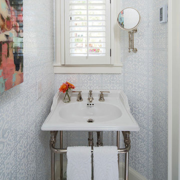 O’Hara Interiors
Martha O'Hara Interiors, Interior Design & Photo Styling | John Kraemer & Sons, Remodel | Troy Thies, Photography
Please Note: All “related,” “similar,” and “sponsored” products tagged or listed by Houzz are not actual products pictured. They have not been approved by Martha O’Hara Interiors nor any of the professionals credited. For information about our work, please contact design@oharainteriors.com.
 Serenity Spaces Design Studio
This wide view showcases the complete lawn-to-xeriscape conversion. Dynamic waves of 4-6" river cobble, dark crushed stone, and brown mulch completely replace the high-water grass strip. The fluid lines create massive curb appeal, naturally balancing the home's brick facade while framing both the driveway and entryway with water-smart, low-maintenance curb appeal.
 O’Hara Interiors
Martha O'Hara Interiors, Interior Design & Photo Styling | Nor-Son Inc, Remodel | Troy Thies, Photography
Please Note: All “related,” “similar,” and “sponsored” products tagged or listed by Houzz are not actual products pictured. They have not been approved by Martha O’Hara Interiors nor any of the professionals credited. For information about our work, please contact design@oharainteriors.com.


 Guggenheim Architecture + Design Studio
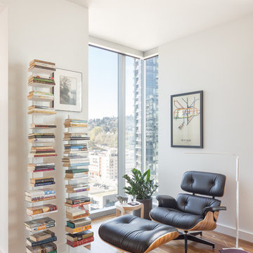
With sweeping views of the Willamette river and Mt. Hood, this Atwater Place condo was designed with a balance of minimalism and livability in mind. A complete kitchen remodel brought a dark interior kitchen to the light and a full furnishings package welcomed Los Angeles transplants home to their new modern and bright residence. Our clients, a retired camera operator for both feature films and television and a producer/production manager on numerous television series including Weeds and The Middle, relocated from their traditionally-styled LA bungalow to Portland in the Summer of 2014. The couple sought a design departure from their long-term California residence and a fresh start for their new life in the South Waterfront.
With only two pieces of sentimental furniture and a handful of artwork included in the plan, we set out to create a comfortable and clean-lined furnishings package complimenting the broad southeast views. Organically shaped upholstery pieces juxtaposed with angular steel and wood tables create a soft balance in the open floor plan. Several custom pieces, including a dining table designed by our studio and a custom hand-blown glass chandelier crafted by Scott Schiesel with Lightlite compliment timeless pieces from Knoll, Herman Miller, and B&B Italia.
The kitchen is designed to reflect light and create brilliance in a space that is otherwise naturally dark. A material balance of stainless steel, back painted glass, quartz composite, lacquer, and mirror all play their part in creating a vibrant cooking environment. We collectively decided to forgo the traditional island pendant for a linear commercial fixture that provides tremendous light to the prep surface and creates an unexpected architectural element. The mirrored prep island creates the illusion of open space while concealing casework and wine storage on the working side of the kitchen.
It is worth noting that this project was designed and installed almost entirely while our clients were still living in LA and wrapping up professional obligations and selling their home. This afforded us the tremendous opportunity to send our clients to showrooms not available in Portland to view key pieces before final specification. Textiles and finish samples were approved via mail and communication took place over e-mail, telephone, and an occasional office visit. This unique process lead to a successful result and a beautifully balanced living environment.
Josh Partee Photography

28