
Search results for "Assignment" in Home Design Ideas
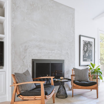
 Restructure Studio
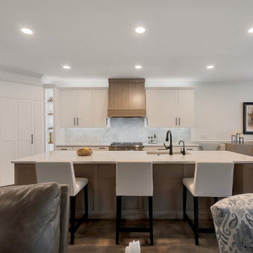
Restructure Studio's Brookhaven Remodel updated the entrance and completely reconfigured the living, dining and kitchen areas, expanding the laundry room and adding a new powder bath. Guests now enter the home into the newly-assigned living space, while an open kitchen occupies the center of the home.
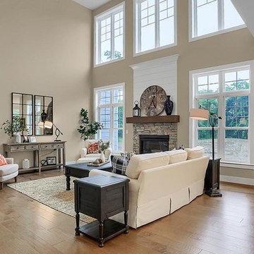
 Landmark Homes
This 2-story home with first-floor Owner’s Suite includes a 3-car garage and an inviting front porch. A dramatic 2-story ceiling welcomes you into the foyer where hardwood flooring extends throughout the main living areas of the home including the Dining Room, Great Room, Kitchen, and Breakfast Area. The foyer is flanked by the Study to the left and the formal Dining Room with stylish coffered ceiling and craftsman style wainscoting to the right. The spacious Great Room with 2-story ceiling includes a cozy gas fireplace with stone surround and shiplap above mantel. Adjacent to the Great Room is the Kitchen and Breakfast Area. The Kitchen is well-appointed with stainless steel appliances, quartz countertops with tile backsplash, and attractive cabinetry featuring crown molding. The sunny Breakfast Area provides access to the patio and backyard. The Owner’s Suite with includes a private bathroom with tile shower, free standing tub, an expansive closet, and double bowl vanity with granite top. The 2nd floor includes 2 additional bedrooms and 2 full bathrooms.
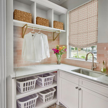
 USI Design & Remodeling
Design and construction by USI.
Elements of multi-room renovation include:
-Curated design theme
-Managing flow
-Appliance re-assignments
-Plumbing relocations
-Tub to shower conversions
Find the right local pro for your project
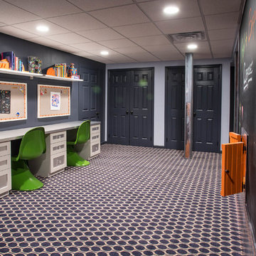
 Transitional Designs
My client wanted bold colors and a room that fueled her children’s creativity. We transformed the old storage space underneath the staircase into a playhouse by simply adding a door and tiny windows. On one side of the staircase I added a blackboard and on the other side the wall was covered in a laminate wood flooring to add texture completing the look of the playhouse. A custom designed writing desk with seating to accommodate both children for their art and homework assignments. The entire area is designed for playing, imagining and creating.
Javier Fernandez Transitional Designs, Interior Designer
Greg Pallante Photographer
 Jasper + Phoenix
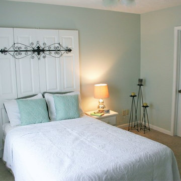
Amber works from home and was sacrificing a dining room for her home office. By utilizing the double wide closet space in her guest bedroom, she now walks into her home without the reminder of work, and can have guests over for a meal in her dining room (dining room reveal coming soon). The walls were freshly painted Sea Salt by Sherwin Williams. This gives the room a fresh, clean look and also adds contrast to the beige carpet.
Amber had her homework assignments cut out for her as she had to do some major purging in her throw all guest room. Once she started letting go, she was on a roll and continually surprised me as she cleaned out closets throughout the house. One dresser was filled with cds, dvds, books, albums, scrap-booking materials; items taking up precious real estate in her life that she didn't even know were there. There really wasn't a storage problem after-all, she was just holding on to a collection of things that no longer served her. Each time I would visit, and her space would become more open, I could see the weight lifting off her and her self love building. Amber had a recent breakup with her boyfriend and this makeover helped her not only focus on making a home sanctuary for herself, but helped her let go of the pains of the past and focus on the exciting future ahead. At one point when we were moving sofas in the living room (which we will also reveal soon), we found an ex's flip-flop. We were figuratively and literally sweeping away the past. Editing your home and your life makes room for your future; for new people and things. We are so happy to finally reveal the room to you! We can't wait to unveil the rest of Amber's home, once we complete the finishing touches.
Challenges:
Amber's home was filled with mix-matched furniture from family and college. She had no idea what her decorating style was. After shopping together and exchanging somepinterest boards, I was finally able to get a sense of what she loves.
I had to work on a tight budget, which meant really digging out the creativity and utilizing other items in the home. See how I transformed a table from the discard pile into a faux marble bedside table by clicking web link.
Amber's dad was able to help with the desk materials and building to cut costs.
We wanted to save the closet doors in the event she sold her home or no longer needed an office someday. There wasn't any extra space to store these closet doors, so I used them as a headboard.
The only items purchased were: Curtains, Curtain Rod, Bedspread Set, Throw Pillows, 2 Lamps and Paint.
 Restructure Studio
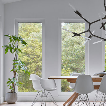
Restructure Studio's Brookhaven Remodel updated the entrance and completely reconfigured the living, dining and kitchen areas, expanding the laundry room and adding a new powder bath. Guests now enter the home into the newly-assigned living space, while an open kitchen occupies the center of the home.
 Glenview Haus – Custom Doors & Wine Cellars
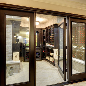
A dream house is more than walls and a roof, it is a place full of things that you love. When David Rabin got the chance to build the house of his dreams, it wasn't enough to simply use stone instead of brick or wood instead of tile. He had to fill it with people and things he loved. So, as a passionate collector of wine, he set out to build a custom wine cellar. Glenview Haus had already given David his custom, wooden entry door and was ready to create a high-quality wine cellar that was customized to fit his vision. David recalls with awe how helpful the team at Glenview Haus was when approaching the project he assigned them. "What the team at Glenview Haus did was designate space, and then worked to maximize the space for ultimate storage and efficiency," said David.
 Twist Interior Design
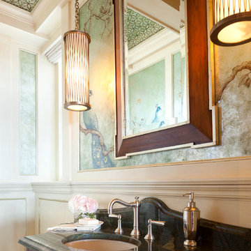
Our transformation of the poorly designed powder room was a project in itself. Before tackling the décor, we addressed issues of space utilization by reorganizing the layout of the plumbing fixtures, substituting super-insulated walls for an intrusive radiator, and doing away with the medicine cabinet mirror above a wall-mounted corner sink.
Millwork details were assigned a soothing paint and glaze finish with metallic accents, and the floor’s inlaid honey onyx mosaic complemented the shell’s quiet backdrop. Next, we selected more graceful plumbing fixtures, mounting the sink within a furniture-quality cabinet we designed to maximize space, and capped it with a stone top to emulate mossy groundcover. Grass shades, in perfect simplicity, address privacy needs at the windows, and make no attempt to draw attention away from their magical surroundings. The glow of the decorative pendants, hanging from new ceiling beams, is magnified by the surrounding mirrors and glass.
 TRUADDITIONS
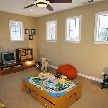
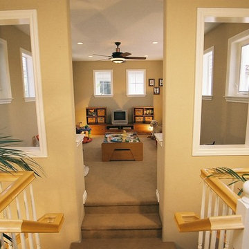
Many loft additions become a toy box. The parents regain the living space and assigned the children to keep all their toys in one big room. Strategic!
Chris Doering at TRUADDITIONS


 Reflections Water Gardens
Our goal was to create a concept for the client using an assigned space that would resemble a mountain stream. From concept to completion, the entire project was designed and installed by us. Our expectations were high for finishing on time and for the overall aesthetic value of the area. The client also demands quality and for construction that is completed on-time.
The end result was a walk-up pond complete with waterfall and natural landscaping using local rock, boulders and native plants, useable kayaks, and water filled with colorful koi. From any angle, both large and small bits of a natural water feature and surrounding rock and plants were viewable. Standing on the bank of the pond, it was easy to forget one was in a Man made landscape.
Photo by Larry Carnes
 StoneUnlimited Kitchen and Bath Remodeling
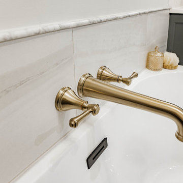
This aesthetically pleasing master bathroom is the perfect place for our clients to start and end each day. Fully customized shower fixtures and a deep soaking tub will provide the perfect solutions to destress and unwind. Our client's love for plants translates beautifully into this space with a sage green double vanity that brings life and serenity into their master bath retreat. Opting to utilize softer patterned tile throughout the space, makes it more visually expansive while gold accessories, natural wood elements, and strategically placed rugs throughout the room, make it warm and inviting.
Committing to a color scheme in a space can be overwhelming at times when considering the number of options that are available. This master bath is a perfect example of how to incorporate color into a room tastefully, while still having a cohesive design.
Items used in this space include:
Waypoint Living Spaces Cabinetry in Sage Green
Calacatta Italia Manufactured Quartz Vanity Tops
Elegant Stone Onice Bianco Tile
Natural Marble Herringbone Tile
Delta Cassidy Collection Fixtures
Want to see more samples of our work or before and after photographs of this project?
Visit the Stoneunlimited Kitchen and Bath website:
www.stoneunlimited.net
Stoneunlimited Kitchen and Bath is a full scope, full service, turnkey business. We do it all so that you don’t have to. You get to do the fun part of approving the design, picking your materials and making selections with our guidance and we take care of everything else. We provide you with 3D and 4D conceptual designs so that you can see your project come to life. Materials such as tile, fixtures, sinks, shower enclosures, flooring, cabinetry and countertops are ordered through us, inspected by us and installed by us. We are also a fabricator, so we fabricate all the countertops. We assign and manage the schedule and the workers that will be in your home taking care of the installation. We provide painting, electrical, plumbing as well as cabinetry services for your project from start to finish. So, when I say we do it, we truly do it all!
 Tabor Interiors - Kitchen and Bath Design
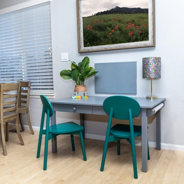
This is a small study space for young children. It is positioned between the kitchen and living room so the kids can easily ask for help with their school assignments.
 Kitchen Solvers of Spring Hill
These homeowners absolutely hated their kitchen. Though it was a relatively new build, between the color, crooked cabinets, a low hanging cabinet for a build in microwave, and the overall flow and functionality they were on the hunt for a designer/contractor combo that would help them design AND build the perfect kitchen. She took her homework assignment as a personal mission to measure and account for every item that needed a spot, including her cherished Disney coffee mugs! Her sister drew up their idea for the pantry door to integrate it in with the cabinetry. And due to odd angles of that pantry, we took the homeowners idea from a picture she saw and created the open shelf with Alder wood shelving with built in lighting! There are so many more details that we specially designed them, and it was claimed that we "hit it out of the ballpark"! Now they have a showstopper of a kitchen in their little community!
 TRUADDITIONS
Many loft additions become a toy box. The parents regain the living space and assigned the children to keep all their toys in one big room. Strategic!
Chris Doering at TRUADDITIONS
 User
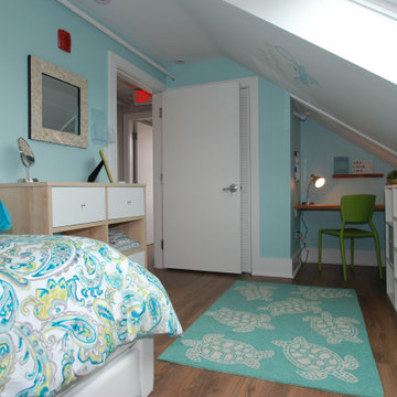
UserMy assigned (very small) room in a volunteer "extreme makeover" of a women's crisis center residence in Concord NH resulted in this heartwarming yet functional escape for a woman (and her dog) in need of shelter.

 Studio TOOP
design: Carrie Preston (Studio TOOP) and Jasper Helmantel (Cruydt Hoeck), 2011
location: Appeltern, NL
status: built in 2012 by Appeltern Model Garden Complex
photos: Jolanthe Lalkens, June 2013
Designed as assignment from both the Dutch gardening magazine Groei & Bloei and the television and radio nature program Vara's Vroege Vogels, this garden serves as a model of how homeowners can incorporate lots of plant life and wildlife into the design but without sacrificing practicality or aesthetics. The garden is deliberately contemporary in its style to emphasize that nature-rich gardens need not look a certain way - insects and birds don't care if the lines are straight or curved.
At the same time the garden makes use of affordable, simple, no-nonsense materials. The 40x60 cm paving stones are one of the most common and affordable paving options in the Netherlands, available en masse for free on the Internet. Conceptually we imagined a garden completely paved with the tiles (as to many gardens are) and what would happen if took out some of these stones, used them to build benches and structure and added plants where the tiles had been. In the construction of the benches we include other materials such as bamboo sticks and insulation bricks that create habitat for insects such as solitary bees.
The plant palette is based on a selection of native and host plants in combination with the 26 plants plan set up by Groei & Boei -- a list of plants aimed at making the use of more plants in gardens accessible and less intimidating. The choice for the number 26 corresponds with the number of letters in the alphabet in line with the famous Dutch garden designer Mien Ruy's comment that if we only need 26 letters to create a whole language, we should be able to combine and mix 26 plants to express far more than we think.
 Studio TOOP
design: Studio TOOP, 2009
location: Amersfoort, NL
status: built in 2009, Tuinvreugd
photo: Jolanthe Lalkens, 2010
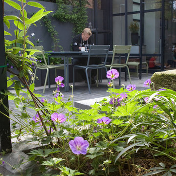
A family friendly garden that, doesn't look like, well, a family garden. That was the assignment. Clean lines, a modern feel, not too much work, enough space for the kids to play and, oh yeah, a cage for the rabbit all in a space less than 50 m2.
The new extension on the back of the house, catty cornered slightly with the original facade and the garden boundaries brought it's own challenges. This diagonal was used to make extra space for different functions but "straightened" in the experience of the inner square. Inside the aluminum pergola (coated in the same gray - ral 7016 - as the woodwork on the extension) house various functions: the rabbit cage, a water and sand table, the swing (steel rod in the aluminum for extra support) and a table where the kids can draw or play table football.
 JUMA architects
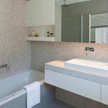
JUMA architects were contacted for the interior design of a shell-state apartment on the coast. The structural construction, the plastering, the floor screed and the technical fittings (heating ducts, plumbing, electricity and ventilation) of the apartment had already been realised.
It soon became apparent, however, that the assignment could not be limited to the interior decoration only, as the placement of kitchen, bathroom and dressing room in the existing plan turned out to be entirely impractical. More extensive renovation work was needed to meet the needs of the customer. The structure of the unit was therefore slightly adjusted to make the bathroom and dressing larger and more functional.
Also, the living room was dominated by a huge radiator that drew all the attention. To solve this problem, new pipes were laid to accommodate an integrated heating element in the sideboard. Gas pipes were fitted in the kitchen for the gas cooker which JUMA included in the design as a real eye-catcher. The sinks, in contrast, were given a more discreet placement.
Light oak parquet was selected for the floors throughout the apartment. The natural appearance of the wood gives all the rooms a warm feel. The built-in furniture was custom made and is finished in black satin lacquer to contrast the light-coloured wood. The dominant colour palette is deliberately kept very simple and neutral and is complemented with light grey tones and colour accents. The colour choice was in fact inspired by a beautiful picture of the coast.
The freestanding furniture and overall decorations were also selected or designed by JUMA architects. The arrangement of the seating area is very playful and atypical. JUMA did not want to put in a couch that would divide the space in two. The composition is meant to create a very open ambiance. A round table was chosen for the same reason. The round shape does not divide the space but allows fluid circulation.
Pictures © Liesbet Goetschalckx
 Studio TOOP
design: Studio TOOP, 2009
location: Amersfoort, NL
status: built in 2009, Tuinvreugd
photo: Jolanthe Lalkens, 2010
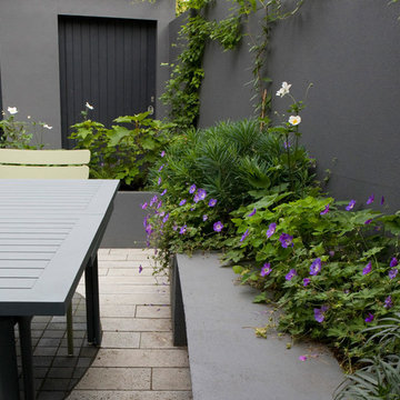
A family friendly garden that, doesn't look like, well, a family garden. That was the assignment. Clean lines, a modern feel, not too much work, enough space for the kids to play and, oh yeah, a cage for the rabbit all in a space less than 50 m2.
The new extension on the back of the house, catty cornered slightly with the original facade and the garden boundaries brought it's own challenges. This diagonal was used to make extra space for different functions but "straightened" in the experience of the inner square. Inside the aluminum pergola (coated in the same gray - ral 7016 - as the woodwork on the extension) house various functions: the rabbit cage, a water and sand table, the swing (steel rod in the aluminum for extra support) and a table where the kids can draw or play table football.
15