
Search results for "Atrium skylights" in Home Design Ideas

 Change Your Bathroom©
The goal of this project was to upgrade the builder grade finishes and create an ergonomic space that had a contemporary feel. This bathroom transformed from a standard, builder grade bathroom to a contemporary urban oasis. This was one of my favorite projects, I know I say that about most of my projects but this one really took an amazing transformation. By removing the walls surrounding the shower and relocating the toilet it visually opened up the space. Creating a deeper shower allowed for the tub to be incorporated into the wet area. Adding a LED panel in the back of the shower gave the illusion of a depth and created a unique storage ledge. A custom vanity keeps a clean front with different storage options and linear limestone draws the eye towards the stacked stone accent wall.
Houzz Write Up: https://www.houzz.com/magazine/inside-houzz-a-chopped-up-bathroom-goes-streamlined-and-swank-stsetivw-vs~27263720
The layout of this bathroom was opened up to get rid of the hallway effect, being only 7 foot wide, this bathroom needed all the width it could muster. Using light flooring in the form of natural lime stone 12x24 tiles with a linear pattern, it really draws the eye down the length of the room which is what we needed. Then, breaking up the space a little with the stone pebble flooring in the shower, this client enjoyed his time living in Japan and wanted to incorporate some of the elements that he appreciated while living there. The dark stacked stone feature wall behind the tub is the perfect backdrop for the LED panel, giving the illusion of a window and also creates a cool storage shelf for the tub. A narrow, but tasteful, oval freestanding tub fit effortlessly in the back of the shower. With a sloped floor, ensuring no standing water either in the shower floor or behind the tub, every thought went into engineering this Atlanta bathroom to last the test of time. With now adequate space in the shower, there was space for adjacent shower heads controlled by Kohler digital valves. A hand wand was added for use and convenience of cleaning as well. On the vanity are semi-vessel sinks which give the appearance of vessel sinks, but with the added benefit of a deeper, rounded basin to avoid splashing. Wall mounted faucets add sophistication as well as less cleaning maintenance over time. The custom vanity is streamlined with drawers, doors and a pull out for a can or hamper.
A wonderful project and equally wonderful client. I really enjoyed working with this client and the creative direction of this project.
Brushed nickel shower head with digital shower valve, freestanding bathtub, curbless shower with hidden shower drain, flat pebble shower floor, shelf over tub with LED lighting, gray vanity with drawer fronts, white square ceramic sinks, wall mount faucets and lighting under vanity. Hidden Drain shower system. Atlanta Bathroom.

 Bradshaw Construction
This 6,500-square-foot one-story vacation home overlooks a golf course with the San Jacinto mountain range beyond. The house has a light-colored material palette—limestone floors, bleached teak ceilings—and ample access to outdoor living areas.
Builder: Bradshaw Construction
Architect: Marmol Radziner
Interior Design: Sophie Harvey
Landscape: Madderlake Designs
Photography: Roger Davies

 User
UserRichard Silver Photo
Example of a huge urban loft-style and wooden dark wood floor and open staircase design in New York with multicolored walls
Example of a huge urban loft-style and wooden dark wood floor and open staircase design in New York with multicolored walls
Find the right local pro for your project


 Ashley Campbell Interior Design
Emily Minton Redfield
Inspiration for a contemporary patio fountain remodel in Denver
Inspiration for a contemporary patio fountain remodel in Denver

 LeichtUSA
The present project, with its clear and simple forms, looks for the interaction with the rural environment and the contact with the surrounding buildings. The simplicity and architectural dialogue between form and function are the theme for inside and outside. Kitchen and dining area are facing each other. The isle leads to a made-to-measure corner bench that stretches under the wide windows along the entire length of the house and connects to the kitchen across the corner. Above the tall units with their integrated appliances, the window continues as a narrow band. The white high gloss acrylic surface of the kitchen fronts forms a decorative contrast to the wood of the floor and bench. White lacquered recessed handles provide a tranquil, two-dimensional effect.


 D.R.M. Design Build, Inc.
David Griffin
Inspiration for a mid-sized timeless medium tone wood floor eat-in kitchen remodel in Boston with shaker cabinets, beige cabinets, subway tile backsplash, an undermount sink, marble countertops and white backsplash
Inspiration for a mid-sized timeless medium tone wood floor eat-in kitchen remodel in Boston with shaker cabinets, beige cabinets, subway tile backsplash, an undermount sink, marble countertops and white backsplash

 Amelia Hallsworth Photography
Photo: Amelia Hallsworth © 2015 Houzz
Inspiration for a country l-shaped kitchen remodel in London with a farmhouse sink, shaker cabinets, beige cabinets, white backsplash, subway tile backsplash, black appliances and an island
Inspiration for a country l-shaped kitchen remodel in London with a farmhouse sink, shaker cabinets, beige cabinets, white backsplash, subway tile backsplash, black appliances and an island

 S.J. Janis Company, Inc.
The walls of windows and the sloped ceiling provide dimension and architectural detail, maximizing the natural light and view.
The floor tile was installed in a herringbone pattern.
The painted tongue and groove wood ceiling keeps the open space light, airy, and bright in contract to the dark Tudor style of the existing. home.
 Gast Architects
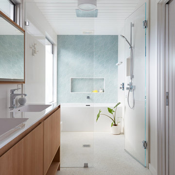
Primary bathroom
Example of a 1960s master green tile and ceramic tile white floor, double-sink and shiplap ceiling corner bathtub design in San Francisco with medium tone wood cabinets, white walls, an integrated sink, quartz countertops, a hinged shower door, white countertops, a niche, a built-in vanity and flat-panel cabinets
Example of a 1960s master green tile and ceramic tile white floor, double-sink and shiplap ceiling corner bathtub design in San Francisco with medium tone wood cabinets, white walls, an integrated sink, quartz countertops, a hinged shower door, white countertops, a niche, a built-in vanity and flat-panel cabinets

 Flegel's Construction Co., Inc.
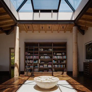
New skylights are double insulated with safety glass. The challenge was the technical work required to install a vaulted skylight.
All new trims, baseboards and doors in the redone living room. All new, modern lighting was installed.
Heated du chateau flooring was added.
Bruce Damonte Photography

 Shade House Development
Inspiration for a mid-sized modern master concrete floor walk-in shower remodel in Houston with flat-panel cabinets, white cabinets, white walls, an undermount sink and solid surface countertops

 Skylight Specialists, Inc.
Example of a mid-sized classic wooden u-shaped open staircase design in Denver

 Levy Art + Architecture
Cesar Rubio
Example of a mid-sized trendy single-wall medium tone wood floor and beige floor open concept kitchen design in San Francisco with flat-panel cabinets, white cabinets, gray backsplash, subway tile backsplash, stainless steel appliances and an island
Example of a mid-sized trendy single-wall medium tone wood floor and beige floor open concept kitchen design in San Francisco with flat-panel cabinets, white cabinets, gray backsplash, subway tile backsplash, stainless steel appliances and an island

 GRAYSON DE VERE
Sunroom - mid-sized traditional limestone floor and beige floor sunroom idea in Miami with a glass ceiling

 Klopf Architecture
Klopf Architecture and Outer space Landscape Architects designed a new warm, modern, open, indoor-outdoor home in Los Altos, California. Inspired by mid-century modern homes but looking for something completely new and custom, the owners, a couple with two children, bought an older ranch style home with the intention of replacing it.
Created on a grid, the house is designed to be at rest with differentiated spaces for activities; living, playing, cooking, dining and a piano space. The low-sloping gable roof over the great room brings a grand feeling to the space. The clerestory windows at the high sloping roof make the grand space light and airy.
Upon entering the house, an open atrium entry in the middle of the house provides light and nature to the great room. The Heath tile wall at the back of the atrium blocks direct view of the rear yard from the entry door for privacy.
The bedrooms, bathrooms, play room and the sitting room are under flat wing-like roofs that balance on either side of the low sloping gable roof of the main space. Large sliding glass panels and pocketing glass doors foster openness to the front and back yards. In the front there is a fenced-in play space connected to the play room, creating an indoor-outdoor play space that could change in use over the years. The play room can also be closed off from the great room with a large pocketing door. In the rear, everything opens up to a deck overlooking a pool where the family can come together outdoors.
Wood siding travels from exterior to interior, accentuating the indoor-outdoor nature of the house. Where the exterior siding doesn’t come inside, a palette of white oak floors, white walls, walnut cabinetry, and dark window frames ties all the spaces together to create a uniform feeling and flow throughout the house. The custom cabinetry matches the minimal joinery of the rest of the house, a trim-less, minimal appearance. Wood siding was mitered in the corners, including where siding meets the interior drywall. Wall materials were held up off the floor with a minimal reveal. This tight detailing gives a sense of cleanliness to the house.
The garage door of the house is completely flush and of the same material as the garage wall, de-emphasizing the garage door and making the street presentation of the house kinder to the neighborhood.
The house is akin to a custom, modern-day Eichler home in many ways. Inspired by mid-century modern homes with today’s materials, approaches, standards, and technologies. The goals were to create an indoor-outdoor home that was energy-efficient, light and flexible for young children to grow. This 3,000 square foot, 3 bedroom, 2.5 bathroom new house is located in Los Altos in the heart of the Silicon Valley.
Klopf Architecture Project Team: John Klopf, AIA, and Chuang-Ming Liu
Landscape Architect: Outer space Landscape Architects
Structural Engineer: ZFA Structural Engineers
Staging: Da Lusso Design
Photography ©2018 Mariko Reed
Location: Los Altos, CA
Year completed: 2017

 LW Interiors
Eric Roth Photography
Inspiration for a mid-sized cottage open concept ceramic tile family room remodel in Boston with white walls and no tv
Inspiration for a mid-sized cottage open concept ceramic tile family room remodel in Boston with white walls and no tv

 Miriam's River House Designs, LLC
Photo shows the interior of the Japanese Tea House. The four skylights have hand carved overlay screens. The open ceiling shows the beauty of the design. The structure is very sustainable in that the building can be left to age naturally or oiled every few years to retain the wood color.
Photo credits: Dan Drobnick
4