
Search results for "Attempt">attempt" in Home Design Ideas

 Woodharbor Custom Cabinetry
View of remodeled kitchen (looking back towards dining room). French doors were added to maintain the concept of the dining room being a formal space. The cabinetry design attempted to blend new comfortably with old by including a classic panel design, leaded glass divided lites, subway tile and a lightly glazed finish.

 Leclair Decor
When we found out we were expecting in June, we had already put a plan in motion to merge our home offices to eventually make way for a nursery. After the excitement of the big news we kicked it into high gear!
First off we painted the room a crisp white to contrast from the past 2 tone dark office colours. Our amazing painter Carolyn from Roll Her Sleeves then traced out and painted our vision for the mural. At first we wanted to go very minimal but after looking at it for a few weeks, we asked her to come back and add a forefront layer of grey mountains, details in the peaks and the yellow sun.
During that time the search for the perfect modern crib was on. We found the Hudson model from Babyletto which we loved from one of our suppliers in the states but after duties and shipping it ended up being more practical to buy it here in town.
At the Artemano opening we hosted in November, we connected with Jonathan from Obasan mattresses. He graciously offered to supply us with one of their locally made high quality mattresses. We can’t wait for our baby boy to sleep on it!
Our rocking chair has quite the story behind it. We originally found it for $8 ( yes eight ) dollars last spring. We weren’t sure at the time where and how we were going to use it so we had stored it in one of the garages where we were keeping furniture for an ongoing model home project. One morning we arrived and noticed the chair was missing. We made a call to our construction contact and he relayed the message. Next thing we know a worker was jumping in the garbage bins across the street. They had believed the chair was to be thrown away. Although a bit dusty it was recovered in decent shape. A few months passed and we started entertaining the idea of using it as our rocker. We asked Melissa’s dad if he would be interested in converting it to a rocker for us, and always up for a challenge he accepted and came through big time! At least was the task of reupholstering. We kind of liked the fun bright orange it was but decided to keep it safe with a nice grey material.
After trying numerous curtains ( we lost count ) we finally settled on a old fav, the west elm chevrons. As well, 3 or 4 rugs were attempted until we tried the yellow rug from Urban Barn and instantly knew that was the one.
We slid a couple small Ikea hacks in there. We wrapped an inexpensive floor lamp with rope to give it a different look ( and hide the silver since everything is brass ) and spray painted the shelf hinges to match the rest of the finishes.
Photo: Sacha Leclair
 Elaina Blazei Interior Design
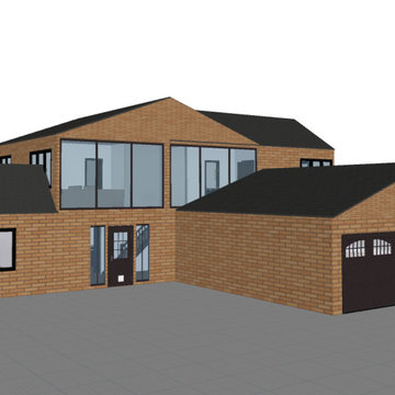
This house originally started out as a quick sketch of a kitchen. It was a project I was doing in school as almost a first step to creating a full floor plan. I had gotten so excited and actually ended up drawing an entire house. My original plan for the upper floor was awkward and did not fit the space well. My second attempt at the upper floor had too many hallways. Finally, I settled on the floor plan that I have now. I love the way it fits the space and how there are not too many bedrooms compared to the size of the home.
Find the right local pro for your project
 Studio 316 Creative, LLC
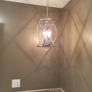
This Mequon master on-suite from the 80's was in serious need of a face lift! While it may be a large bathroom, it certainly was not up to date and did not meet the needs of the client.
We designed a complete gut and re-build including the removal of a window that only looked over the solarium below!
The result is a timeless design that allowed the homeowner to sell his home, after many failed attempts with the old bathroom, and meets the needs of the future buyers!
 Architectural Resource LLC
The Brooke Residence ‘Addi- tion by Subtraction’ remodeling project was recognized with numerous regional and national awards and was selected for Fine Homebuilding’s Annual Issue on Houses.
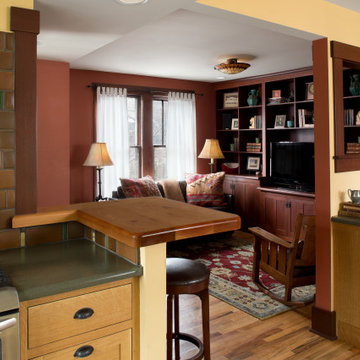
This 1920’s Craftsman Bungalow had been poorly modified in the 70’s in an attempt to address poor energy performance with a scabbed on solarium. The design solution removed the solarium and completely reimagined the floor plan: The kitchen was relocated to the rear; the stairway was relocated to enhance function, and a better connection to the family room was created.
 Elaina Blazei Interior Design
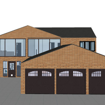
This house originally started out as a quick sketch of a kitchen. It was a project I was doing in school as almost a first step to creating a full floor plan. I had gotten so excited and actually ended up drawing an entire house. My original plan for the upper floor was awkward and did not fit the space well. My second attempt at the upper floor had too many hallways. Finally, I settled on the floor plan that I have now. I love the way it fits the space and how there are not too many bedrooms compared to the size of the home.

 J.E. Kelley Designs
Mark Mahan and Rey Au
Kitchen and living room renovation. Door and window replacement
Country brick floor entryway photo with white walls and a white front door
Country brick floor entryway photo with white walls and a white front door

 Fazoli Brothers Inc.
JWK
Large island style backyard stone and custom-shaped natural pool photo in Miami
Large island style backyard stone and custom-shaped natural pool photo in Miami

 HandsOn Design
Location: Jackson, WY, USA
1,900 sq.ft custom home, garage and workshop constructed using prefabricated SIP's panels, with custom interior cabinets, doors and finishes. The design of this house is an attempt to develop an architectural iconography which celebrates the history and uniqueness of the land upon which it’s built. The house sits in an irrigated hayfield along with some of the original machinery that used to work here, and reflects the design sensibilities of a common sense agricultural outbuilding as seen through contemporary eyes.
Photographed by: Paul Duncker

 Randy Angell Designs
The planning phase of this modern retreat was an intense collaboration that took place over the course of more than two years. While the initial design concept exceeded the clients' expectations, it also exceeded their budget beyond the point of comfort.
The next several months were spent modifying the design, in attempts to lower the budget. Ultimately, the decision was made that they would hold off on the project until they could budget for the original design, rather than compromising the vision.
About a year later, we repeated that same process, which resulted in the same outcome. After another year-long hiatus, we met once again. We revisited design thoughts, each of us bringing to the table new ideas and options.
Each thought simply solidified the fact that the initial vision was absolutely what we all wanted to see come to fruition, and the decision was finally made to move forward.
The main challenge of the site was elevation. The Southeast corner of the lot stands 5'6" above the threshold of the rear door, while the Northeast corner dropped a full 2' below the threshold of the door.
The backyard was also long and narrow, sloping side-to-side and toward the house. The key to the design concept was to deftly place the project into the slope and utilize the elevation changes, without allowing them to dominate the yard, or overwhelm the senses.
The unseen challenge on this project came in the form of hitting every underground issue possible. We had to relocate the sewer main, the gas line, and the electrical service; and since rock was sitting about 6" below the surface, all of these had to be chiseled through many feet of dense rock, adding to our projected timeline and budget.
As you enter the space, your first stop is an outdoor living area. Smooth finished concrete, colored to match the 'Leuder' limestone coping, has a subtle saw-cut pattern aligned with the edges of the recessed fire pit.
In small spaces, it is important to consider a multi-purpose approach. So, the recessed fire pit has been fitted with an aluminum cover that allows our client to set up tables and chairs for entertaining, right over the top of the fire pit.
From here, it;s two steps up to the pool elevation, and the floating 'Leuder' limestone stepper pads that lead across the pool and hide the dam wall of the flush spa.
The main retaining wall to the Southeast is a poured concrete wall with an integrated sheer descent waterfall into the spa. To bring in some depth and texture, a 'Brownstone' ledgestone was used to face both the dropped beam on the pool, and the raised beam of the water feature wall.
The main water feature is comprised of five custom made stainless steel scuppers, supplied by a dedicated booster pump.
Colored concrete stepper pads lead to the 'Ipe' wood deck at the far end of the pool. The placement of this wood deck allowed us to minimize our use of retaining walls on the Northeast end of the yard, since it drops off over three feet below the elevation of the pool beam.
One of the most unique features on this project has to be the structure over the dining area. With a unique combination of steel and wood, the clean modern aesthetic of this structure creates a visual stamp in the space that standard structure could not accomplish.
4" steel posts, painted charcoal grey, are set on an angle, 4' into the bedrock, to anchor the structure. Steel I-beams painted in green-yellow color--aptly called "frolic"--act as the base to the hefty cedar rafters of the roof structure, which has a slight pitch toward the rear.
A hidden gutter on the back of the roof sends water down a copper rain chain, and into the drainage system. The backdrop for both this dining area , as well as the living area, is the horizontal screen panel, created with alternating sizes of cedar planks, stained to a calm hue of dove grey.

 Betz Pools Limited
The raised feature wall at the deep end serves as a diving platform over the sheer descent waterfall. A pool ladder on one side and underwater swim out bench on the other are handy for repeat attempts. The wall, constructed from Wiarton Tiger Stripe ledgerock, is a perfect match for the pool’s Gold Pebble vinyl liner.

 Excelsior Design Group & Danberry Building Corp
At the end of 2012, Danberry came across what was then a rundown home in the Casco Point neighborhood of Orono, in desperate need of some design help. A failed attempt by the previous owner to remodel it as an investment had left it abandoned for years. But when the Danberry’s got a glimpse of this diamond in the rough, they knew it had potential. The project included a completely remodeled kitchen, bathroom, basement and living room.
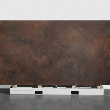
 Ollin Stone
The Ossido line stems from a wager against time, in an attempt to crystallise a material at a specific point in its life and have it stay that way forever. Specifically, it entails the reproduction of a oxidation process on slabs of copper and metal, which generates a very strong and rich colour, yet which inevitably disappears as the oxidation process progresses.


 Ash Street Interiors, LLC
Photography: Stoffer Photography Interiors
Kitchen - transitional kitchen idea in Chicago
Kitchen - transitional kitchen idea in Chicago

 Cantoni
Karla and Rick Lopez have not always been modern furniture buyers, but one visit to Cantoni Dallas changed everything. After purchasing a beautiful 4 bedroom, 5 bathroom Mediterranean style home on Eagle Mountain Lake (and then having to remodel the whole house due to flooding) the couple decided to explore a different design route.
After countless attempts to find a store that offered both high quality modern furniture and great service, Karla and Rick’s search ended when they entered the Dallas showroom.
David DeLeon
 Betz Pools Limited
This photo shows the clean minimal look of the backyard. The patio adds to the look with a series of identical square acid etched concrete slabs. The pool’s deep end features a diving board for family fun. There is a handy underwater swim out bench at the corner, so repeat diving attempts are made easy.
 Betz Pools Limited
This photo shows the clean minimal look of the backyard. The patio adds to the look with a series of identical square acid etched concrete slabs. The pool’s deep end features a diving board for family fun. There is a handy underwater swim out bench at the corner, so repeat diving attempts are made easy.

 Sarah Greenman
Photo: Sarah Greenman © 2014 Houzz
This is an example of an eclectic landscaping in Dallas.
This is an example of an eclectic landscaping in Dallas.

 Goldcon Construction
Example of a cottage light wood floor and beige floor living room design in Vancouver with white walls, a standard fireplace and a media wall
11