
Search results for "Attempt">attempt" in Home Design Ideas

 Corinthian Fine Homes
This delightful couple purchased this home with renovation in mind. It was situated in an ideal location, but required a serious update bringing modernization while keeping it’s 1940’s period charm. They asked us to design an elegant Master Suite, complete with a bedroom, master closet and elegant bathroom. While we make every attempt to maintain original walls and floors, this renovation required complete gutting of two bedrooms and closets to open the space and allow for all they wanted. In this process we were able to bring uneven floors and walls into level allowing for great end results. The finishing touches on this bathroom included custom white painted vanity and make-up table with White Carrara Marble countertops and a custom tile floor design using Carrara Marble tile. A free-standing tub and bridge faucets/ tub spout upped the game on a modern take on an old-world plumbing fixture. The glass shower completes this sophisticated space, which gives this master bath a modern twist on traditional.

 Bistany Design®
The Royden Custom Kitchen designed and built to feature the Client's decorative arts collection.
Inspiration for a large transitional l-shaped light wood floor eat-in kitchen remodel in Charlotte with granite countertops, stainless steel appliances, an island, an undermount sink, recessed-panel cabinets, medium tone wood cabinets, beige backsplash and stone tile backsplash
Inspiration for a large transitional l-shaped light wood floor eat-in kitchen remodel in Charlotte with granite countertops, stainless steel appliances, an island, an undermount sink, recessed-panel cabinets, medium tone wood cabinets, beige backsplash and stone tile backsplash

Find the right local pro for your project

 A.Jennison Interiors
Photo - Daniel Wang Photography
Small transitional 3/4 multicolored tile mosaic tile floor and white floor alcove shower photo in New York with a two-piece toilet, white walls, a console sink and a hinged shower door
Small transitional 3/4 multicolored tile mosaic tile floor and white floor alcove shower photo in New York with a two-piece toilet, white walls, a console sink and a hinged shower door

 Kirsten Pike Design
Inspiration for a contemporary open concept medium tone wood floor and brown floor living room remodel in San Francisco with gray walls

 Melissa Clark Interiors
This client contacted us to help her pull her house together. She wanted a modern feel to her home. Before we worked together the kitchen backsplash was blue, green, gray, with gray walls and dark gray trim. The result was a home with two styles that were fighting one another.
Melissa Clark Interiors changed the kitchen backsplash to something that complemented the home's current design. We changed the wall color to a soft creamy white and painted all of the doors in the home black. We also changed all of the lighting in the home to suit the new look and feel. The home now looks and feels as though it was always meant to be. Changing the color of all of the doors in the home to reflect the same color of the beautiful Canterra front doors streamlines the look. The new entry light is elegant and a perfect compliment to the front doors. And the fresh paint color looks as though it was a custom color meant to make those beams shine.
Here is what our client is saying: "Melissa did an amazing job bringing the right mix of traditional and contemporary to my home. She is so great to work with and her perfectionism in sizing lighting made all the difference over attempting to decorate on my own."
 User
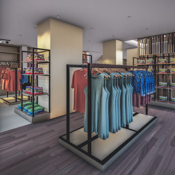
Project: Kandula Clothing Store
Location: Padiyapelella Town
Area: 3500 Sqft
Type: Interior Renovation Project
Budget: 8 Million
We have for a long time been endowed with unique and sustainable designs that have penetrated the various landscapes of the island. Our creations are testifying to this by further beautifying nature, further appeasing human needs, and shining with pride day by day. Combined with our experience, hard work, and the hope of paving the way for an innovative lifestyle for the people, this modern shopping center has been given to the historic town of Padiyapelella. This is not just construction on a piece of land, but an attempt to recall the pride of a historical land mixed with the values of modernity. This is likely to be the first step in making Padiyapella modern shopping hub. We hope that this mall, nurtured by the convenience of our design, will become a part of the lives of the people by meeting their modern needs.
We are ready to give you this kind of sophistication to build your dream construction too. Contact us today and get a 10% discount on your first project.
Learn more about our latest projects from www.royalkandyan.com
https://royalkandyan.com/.../kandula-clothing-store-at.../
P: (77) 719 8825
P: (81) 207 3825
E: Info@royalkandyan.com
©️The Royal Kandyan Design & Engineering (PVT) LTD
#Architecture #InteriorDesign #Design #ModernDesign #KandyArchitect #LuxuryLifestyle #Construction #KandyArchitect #KandyArchitecture #ConstructionCompanyInSriLanka #SriLanka
#DulajJayasinghe

 ODS Architecture
Originally a nearly three-story tall 1920’s European-styled home was turned into a modern villa for work and home. A series of low concrete retaining wall planters and steps gradually takes you up to the second level entry, grounding or anchoring the house into the site, as does a new wrap around veranda and trellis. Large eave overhangs on the upper roof were designed to give the home presence and were accented with a Mid-century orange color. The new master bedroom addition white box creates a better sense of entry and opens to the wrap around veranda at the opposite side. Inside the owners live on the lower floor and work on the upper floor with the garage basement for storage, archives and a ceramics studio. New windows and open spaces were created for the graphic designer owners; displaying their mid-century modern furnishings collection.
A lot of effort went into attempting to lower the house visually by bringing the ground plane higher with the concrete retaining wall planters, steps, wrap around veranda and trellis, and the prominent roof with exaggerated overhangs. That the eaves were painted orange is a cool reflection of the owner’s Dutch heritage. Budget was a driver for the project and it was determined that the footprint of the home should have minimal extensions and that the new windows remain in the same relative locations as the old ones. Wall removal was utilized versus moving and building new walls where possible.
Photo Credit: John Sutton Photography.


 Jacque Jenkins-Stireman: A Design Studio
Mountain style dark wood floor great room photo with a standard fireplace and a stone fireplace
 Architecture Office
The project consists of three primary additions, one a workshop and garage, the second a basement expansion that juts out over the lake, and a third, which expands the existing living areas with a wall of glass. This third addition, originally not part of the project, was a recommendation by Architecture Office well received by the client because of how it transformed the existing living areas.
The existing architecture consists of a historic neo-classical house with a less purist addition that attempts to mimic the original. We took the approach of contrasting the existing to avoid having two additions lacking the craft and integrity of the original. This contrast is a welcoming change to previously dark interiors. The concept opens up opportunities for capturing lake views, creating modern living areas that flow from one to the next.
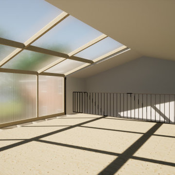
The rear garage and second floor workshop compliment the owners entrepreneurial spirit, a person who enjoys the act of a making. The form is simple but clearly delineates itself form the brick construction with black metal siding and a glass walkway connecting the two. The structure draws from old factory buildings that gather daylight from above, synthesized through a milky polycarbonate portion of roof.
The basement addition expands on an existing subterranean space used for storage and utilities. This room is converted into a living space with sleeping quarters, wet bar, and restroom facilities. This living room is a mini oasis from the rest of the house with views secluded to the water and sky. The openness of the balcony expand the view in all directions, with the sun blocked under a cantilevered shade cover.
 Brendan McHugh, Architect, Manasquan, NJ
VISION AND NEEDS:
Our client came to us with a vision for their dream house for their growing family with three young children. This was their second attempt at getting the right design. The first time around, after working with an out-of-state online architect, they could not achieve the level of quality they wanted. McHugh delivered a home with higher quality design.
MCHUGH SOLUTION:
The Shingle/Dutch Colonial Design was our client's dream home style. Their priorities were to have a home office for both parents. Ample living space for kids and friends, along with outdoor space and a pool. Double sink bathroom for the kids and a master bedroom with bath for the parents. Despite being close a flood zone, clients could have a fully finished basement with 9ft ceilings and a full attic. Because of the higher water table, the first floor was considerably above grade. To soften the ascent of the front walkway, we designed planters around the stairs, leading up to the porch.
 JUMA architects
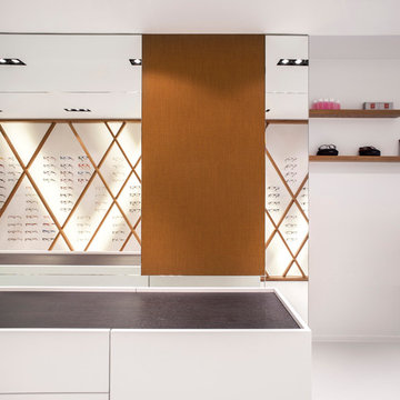
Optiek Herpol wanted to move to a better, more central location with plenty of parking space. A property that complied with these conditions was found on the Market in Deinze, and JUMA architects were subsequently asked to design a new interior for the store.
The property in question is very deep and narrow with little natural light entry. JUMA set to work despite these constraints in an attempt to transform these challenges into qualities.
The architects positioned the sales counter right behind the shop window, so as to make optimum use of the available natural light. This also makes store activities visible from the outside, adding an extra element of attraction. At the narrowest section of the store, a large wall mirror was put in to visually double the space. The wall onto which the eyeglasses are displayed is located opposite the mirror and is literally the eye catcher in the store. A wooden lattice makes for an interesting play of diagonal lines behind which the glasses are presented. This unique concept animates the entire store without detracting from the fact that the glasses should remain the main focal point in the store. The workshop is located in the back, separated from the store by a wall in smoked grey glass. In this way, the optician can keep an eye on the store at all times.
The colour palette is predominantly white, to keep the interior as light as possible. As a counterpoint, warm wood accents are added. The chairs at the counter are upholstered in a colour that harmonizes perfectly with the wood.
Pictures © Thomas De Bruyne

 Scott Simpson Design + Build
Example of a country green tile and subway tile gray floor bathroom design in Chicago with white cabinets, recessed-panel cabinets, an undermount sink, gray countertops and a freestanding vanity
 ODS Architecture
Originally a nearly three-story tall 1920’s European-styled home was turned into a modern villa for work and home. A series of low concrete retaining wall planters and steps gradually takes you up to the second level entry, grounding or anchoring the house into the site, as does a new wrap around veranda and trellis. Large eave overhangs on the upper roof were designed to give the home presence and were accented with a Mid-century orange color. The new master bedroom addition white box creates a better sense of entry and opens to the wrap around veranda at the opposite side. Inside the owners live on the lower floor and work on the upper floor with the garage basement for storage, archives and a ceramics studio. New windows and open spaces were created for the graphic designer owners; displaying their mid-century modern furnishings collection.
A lot of effort went into attempting to lower the house visually by bringing the ground plane higher with the concrete retaining wall planters, steps, wrap around veranda and trellis, and the prominent roof with exaggerated overhangs. That the eaves were painted orange is a cool reflection of the owner’s Dutch heritage. Budget was a driver for the project and it was determined that the footprint of the home should have minimal extensions and that the new windows remain in the same relative locations as the old ones. Wall removal was utilized versus moving and building new walls where possible.
Photo Credit: John Sutton Photography.
 Architecture Office
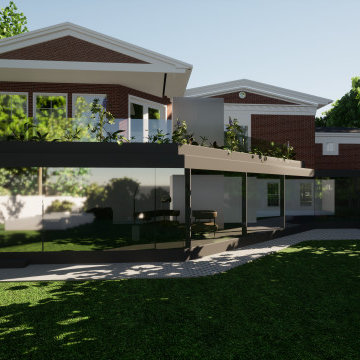
The project consists of three primary additions, one a workshop and garage, the second a basement expansion that juts out over the lake, and a third, which expands the existing living areas with a wall of glass. This third addition, originally not part of the project, was a recommendation by Architecture Office well received by the client because of how it transformed the existing living areas.
The existing architecture consists of a historic neo-classical house with a less purist addition that attempts to mimic the original. We took the approach of contrasting the existing to avoid having two additions lacking the craft and integrity of the original. This contrast is a welcoming change to previously dark interiors. The concept opens up opportunities for capturing lake views, creating modern living areas that flow from one to the next.
The rear garage and second floor workshop compliment the owners entrepreneurial spirit, a person who enjoys the act of a making. The form is simple but clearly delineates itself form the brick construction with black metal siding and a glass walkway connecting the two. The structure draws from old factory buildings that gather daylight from above, synthesized through a milky polycarbonate portion of roof.
The basement addition expands on an existing subterranean space used for storage and utilities. This room is converted into a living space with sleeping quarters, wet bar, and restroom facilities. This living room is a mini oasis from the rest of the house with views secluded to the water and sky. The openness of the balcony expand the view in all directions, with the sun blocked under a cantilevered shade cover.
 Architecture Office
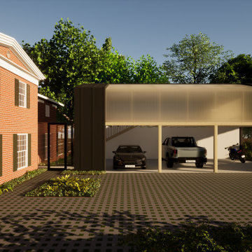
The project consists of three primary additions, one a workshop and garage, the second a basement expansion that juts out over the lake, and a third, which expands the existing living areas with a wall of glass. This third addition, originally not part of the project, was a recommendation by Architecture Office well received by the client because of how it transformed the existing living areas.
The existing architecture consists of a historic neo-classical house with a less purist addition that attempts to mimic the original. We took the approach of contrasting the existing to avoid having two additions lacking the craft and integrity of the original. This contrast is a welcoming change to previously dark interiors. The concept opens up opportunities for capturing lake views, creating modern living areas that flow from one to the next.
The rear garage and second floor workshop compliment the owners entrepreneurial spirit, a person who enjoys the act of a making. The form is simple but clearly delineates itself form the brick construction with black metal siding and a glass walkway connecting the two. The structure draws from old factory buildings that gather daylight from above, synthesized through a milky polycarbonate portion of roof.
The basement addition expands on an existing subterranean space used for storage and utilities. This room is converted into a living space with sleeping quarters, wet bar, and restroom facilities. This living room is a mini oasis from the rest of the house with views secluded to the water and sky. The openness of the balcony expand the view in all directions, with the sun blocked under a cantilevered shade cover.
 Architecture Office
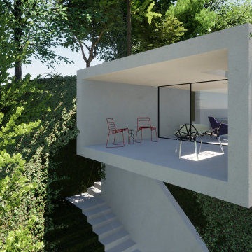
The project consists of three primary additions, one a workshop and garage, the second a basement expansion that juts out over the lake, and a third, which expands the existing living areas with a wall of glass. This third addition, originally not part of the project, was a recommendation by Architecture Office well received by the client because of how it transformed the existing living areas.
The existing architecture consists of a historic neo-classical house with a less purist addition that attempts to mimic the original. We took the approach of contrasting the existing to avoid having two additions lacking the craft and integrity of the original. This contrast is a welcoming change to previously dark interiors. The concept opens up opportunities for capturing lake views, creating modern living areas that flow from one to the next.
The rear garage and second floor workshop compliment the owners entrepreneurial spirit, a person who enjoys the act of a making. The form is simple but clearly delineates itself form the brick construction with black metal siding and a glass walkway connecting the two. The structure draws from old factory buildings that gather daylight from above, synthesized through a milky polycarbonate portion of roof.
The basement addition expands on an existing subterranean space used for storage and utilities. This room is converted into a living space with sleeping quarters, wet bar, and restroom facilities. This living room is a mini oasis from the rest of the house with views secluded to the water and sky. The openness of the balcony expand the view in all directions, with the sun blocked under a cantilevered shade cover.
 Architecture Office
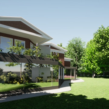
The project consists of three primary additions, one a workshop and garage, the second a basement expansion that juts out over the lake, and a third, which expands the existing living areas with a wall of glass. This third addition, originally not part of the project, was a recommendation by Architecture Office well received by the client because of how it transformed the existing living areas.
The existing architecture consists of a historic neo-classical house with a less purist addition that attempts to mimic the original. We took the approach of contrasting the existing to avoid having two additions lacking the craft and integrity of the original. This contrast is a welcoming change to previously dark interiors. The concept opens up opportunities for capturing lake views, creating modern living areas that flow from one to the next.
The rear garage and second floor workshop compliment the owners entrepreneurial spirit, a person who enjoys the act of a making. The form is simple but clearly delineates itself form the brick construction with black metal siding and a glass walkway connecting the two. The structure draws from old factory buildings that gather daylight from above, synthesized through a milky polycarbonate portion of roof.
The basement addition expands on an existing subterranean space used for storage and utilities. This room is converted into a living space with sleeping quarters, wet bar, and restroom facilities. This living room is a mini oasis from the rest of the house with views secluded to the water and sky. The openness of the balcony expand the view in all directions, with the sun blocked under a cantilevered shade cover.
 Architecture Office
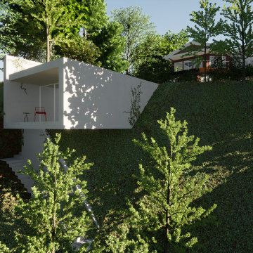
The project consists of three primary additions, one a workshop and garage, the second a basement expansion that juts out over the lake, and a third, which expands the existing living areas with a wall of glass. This third addition, originally not part of the project, was a recommendation by Architecture Office well received by the client because of how it transformed the existing living areas.
The existing architecture consists of a historic neo-classical house with a less purist addition that attempts to mimic the original. We took the approach of contrasting the existing to avoid having two additions lacking the craft and integrity of the original. This contrast is a welcoming change to previously dark interiors. The concept opens up opportunities for capturing lake views, creating modern living areas that flow from one to the next.
The rear garage and second floor workshop compliment the owners entrepreneurial spirit, a person who enjoys the act of a making. The form is simple but clearly delineates itself form the brick construction with black metal siding and a glass walkway connecting the two. The structure draws from old factory buildings that gather daylight from above, synthesized through a milky polycarbonate portion of roof.
The basement addition expands on an existing subterranean space used for storage and utilities. This room is converted into a living space with sleeping quarters, wet bar, and restroom facilities. This living room is a mini oasis from the rest of the house with views secluded to the water and sky. The openness of the balcony expand the view in all directions, with the sun blocked under a cantilevered shade cover.
29