
Search results for "Attempted" in Home Design Ideas
 Roundwood Interiors
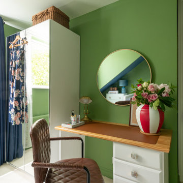
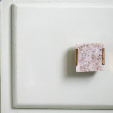
This space was special indeed! When the family moved into their home the daughter of the house immediately laid claim to this room - which included a half-height storage space, full of possibilities!
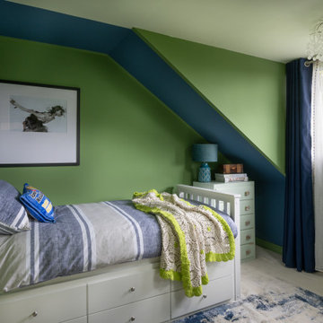
For the main space we chose a bright, fresh green to keep the space uplifting all through the year. I used a blue stripe to mimic the feel of a canopy and to make a feature of the sloped section of the ceiling rather than attempt to hide it.
The room is filled with storage to accommodate a growing wardrobe and features upcycled furniture to ensure the space is completely bespoke.
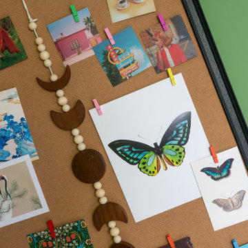
Hidden behind a poster is a secret library, painted a dark, moody blue and styled to give hints of Hogwarts. The ceiling is adorned with a navy, celestial print wallpaper and there are cosy touches dotted around to make this the perfect spot to curl up and while away hours with a good book. Floating candles lend a touch of fun and much needed light to the space.
 Toja Inc.
Setting up your own business is not an easy task. In fact, it is a very complicated mission and a greatly time-consuming process. It requires not only huge amounts of money, but also lots of heart. It is extremely important when you're attempting to build an establishment in which your potential clients are supposed to spend a lot of time and – even more importantly – enjoy it a lot. By this we mean places like – for example – health resorts, hotels and restaurants, but also many, many more. In such places the guests are supposed to be like they're the most important people there, like they're some kind of royalty. That kind of treatment will result in them returning to our business and choosing our services again in the future. This is why it is crucial for them to feel as comfortable as possible. It means that we, as owners, need to invest in the proper furniture. Furniture that will be simply nice to sit in, but also it has to be stylish, inviting and durable so it would stay in good shape for long. Furniture like that doesn't have to be expensive. Our furniture is a proof of that. We married quality with affordable prices and we did it with style. Our collections will make your establishment glow.
 Roundwood Interiors
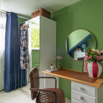
This space was special indeed! When the family moved into their home the daughter of the house immediately laid claim to this room - which included a half-height storage space, full of possibilities!
For the main space we chose a bright, fresh green to keep the space uplifting all through the year. I used a blue stripe to mimic the feel of a canopy and to make a feature of the sloped section of the ceiling rather than attempt to hide it.
The room is filled with storage to accommodate a growing wardrobe and features upcycled furniture to ensure the space is completely bespoke.
Hidden behind a poster is a secret library, painted a dark, moody blue and styled to give hints of Hogwarts. The ceiling is adorned with a navy, celestial print wallpaper and there are cosy touches dotted around to make this the perfect spot to curl up and while away hours with a good book. Floating candles lend a touch of fun and much needed light to the space.
Find the right local pro for your project
 Roundwood Interiors
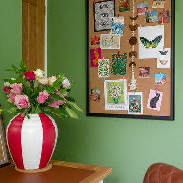
This space was special indeed! When the family moved into their home the daughter of the house immediately laid claim to this room - which included a half-height storage space, full of possibilities!
For the main space we chose a bright, fresh green to keep the space uplifting all through the year. I used a blue stripe to mimic the feel of a canopy and to make a feature of the sloped section of the ceiling rather than attempt to hide it.
The room is filled with storage to accommodate a growing wardrobe and features upcycled furniture to ensure the space is completely bespoke.
Hidden behind a poster is a secret library, painted a dark, moody blue and styled to give hints of Hogwarts. The ceiling is adorned with a navy, celestial print wallpaper and there are cosy touches dotted around to make this the perfect spot to curl up and while away hours with a good book. Floating candles lend a touch of fun and much needed light to the space.
 Roundwood Interiors
This space was special indeed! When the family moved into their home the daughter of the house immediately laid claim to this room - which included a half-height storage space, full of possibilities!
For the main space we chose a bright, fresh green to keep the space uplifting all through the year. I used a blue stripe to mimic the feel of a canopy and to make a feature of the sloped section of the ceiling rather than attempt to hide it.
The room is filled with storage to accommodate a growing wardrobe and features upcycled furniture to ensure the space is completely bespoke.
Hidden behind a poster is a secret library, painted a dark, moody blue and styled to give hints of Hogwarts. The ceiling is adorned with a navy, celestial print wallpaper and there are cosy touches dotted around to make this the perfect spot to curl up and while away hours with a good book. Floating candles lend a touch of fun and much needed light to the space.
 Roundwood Interiors
This space was special indeed! When the family moved into their home the daughter of the house immediately laid claim to this room - which included a half-height storage space, full of possibilities!
For the main space we chose a bright, fresh green to keep the space uplifting all through the year. I used a blue stripe to mimic the feel of a canopy and to make a feature of the sloped section of the ceiling rather than attempt to hide it.
The room is filled with storage to accommodate a growing wardrobe and features upcycled furniture to ensure the space is completely bespoke.
Hidden behind a poster is a secret library, painted a dark, moody blue and styled to give hints of Hogwarts. The ceiling is adorned with a navy, celestial print wallpaper and there are cosy touches dotted around to make this the perfect spot to curl up and while away hours with a good book. Floating candles lend a touch of fun and much needed light to the space.
 Roundwood Interiors
This space was special indeed! When the family moved into their home the daughter of the house immediately laid claim to this room - which included a half-height storage space, full of possibilities!
For the main space we chose a bright, fresh green to keep the space uplifting all through the year. I used a blue stripe to mimic the feel of a canopy and to make a feature of the sloped section of the ceiling rather than attempt to hide it.
The room is filled with storage to accommodate a growing wardrobe and features upcycled furniture to ensure the space is completely bespoke.
Hidden behind a poster is a secret library, painted a dark, moody blue and styled to give hints of Hogwarts. The ceiling is adorned with a navy, celestial print wallpaper and there are cosy touches dotted around to make this the perfect spot to curl up and while away hours with a good book. Floating candles lend a touch of fun and much needed light to the space.
 Adam Gibson Design
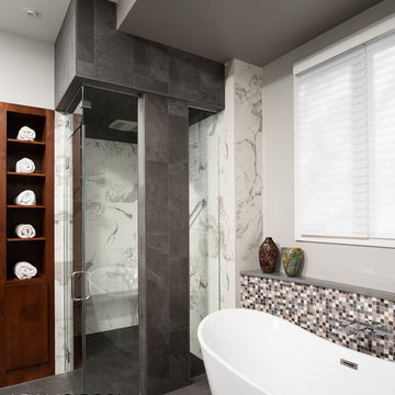
Seems like the ‘80s weren’t all that long ago. Reminiscing about music from the period harkens me back to all kinds of good feelings. The era’s kitchen and bath design, however, causes me to repress a bit of vomit. The lack of creativity, coupled with a love of beige and cheap brass, still makes my skin crawl. Some builder must have purchased entire container ships of that tile. Enter this bath. The homeowners did their best to add color, but nothing could hide the elements so popular in the day.
In attempting to provide something outside the norm (the shower tower), yet warm and inviting, (curved half-wall behind the curved freestanding tub; compressed ceilings above smaller items), and safe (large, curbless shower with door wide enough for future wheelchair), I endeavored to create a bath that would stand time’s test. It didn’t hurt that the clients, second-timers (see Modern Walnut Kitchen and Great Room) and a delight to work with, had strong opinions. The photos will be retaken soon (we didn’t stage the shoot), but they give an idea of the space.
 Corinthian Fine Homes
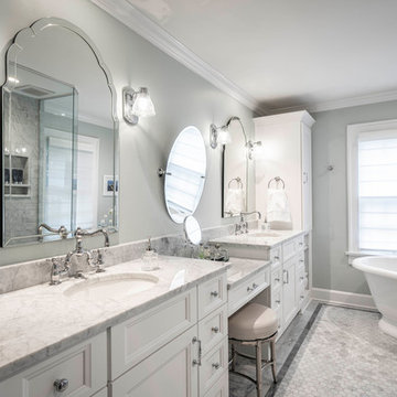
This delightful couple purchased this home with renovation in mind. It was situated in an ideal location, but required a serious update bringing modernization while keeping it’s 1940’s period charm. They asked us to design an elegant Master Suite, complete with a bedroom, master closet and elegant bathroom. While we make every attempt to maintain original walls and floors, this renovation required complete gutting of two bedrooms and closets to open the space and allow for all they wanted. In this process we were able to bring uneven floors and walls into level allowing for great end results. The finishing touches on this bathroom included custom white painted vanity and make-up table with White Carrara Marble countertops and a custom tile floor design using Carrara Marble tile. A free-standing tub and bridge faucets/ tub spout upped the game on a modern take on an old-world plumbing fixture. The glass shower completes this sophisticated space, which gives this master bath a modern twist on traditional.
 B R A D J E N K I N S I N C
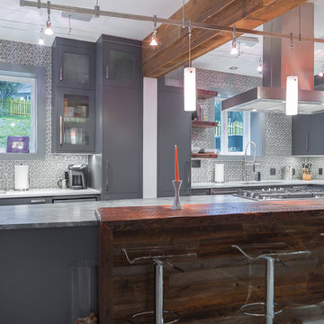
The Bernardsville project was my first attempt at a hybrid IKEA kitchen; a kitchen that utilizes custom made elements combined with IKEA cabinet frames and interiors. This approach ended up saving the client close to $30k in comparison to a total custom job. The outcome is quite close to the quality level of a custom kitchen save for a few quirky IKEA typical issues. A great option if budget is a big element on the project. We chose to work with the Portland based Kokeena to produce the custom end panels, doors, fronts and custom parts like the wine rack.Photo: ISA AYDIN
 Adam Gibson Design
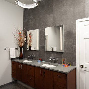
Seems like the ‘80s weren’t all that long ago. Reminiscing about music from the period harkens me back to all kinds of good feelings. The era’s kitchen and bath design, however, causes me to repress a bit of vomit. The lack of creativity, coupled with a love of beige and cheap brass, still makes my skin crawl. Some builder must have purchased entire container ships of that tile. Enter this bath. The homeowners did their best to add color, but nothing could hide the elements so popular in the day.
In attempting to provide something outside the norm (the shower tower), yet warm and inviting, (curved half-wall behind the curved freestanding tub; compressed ceilings above smaller items), and safe (large, curbless shower with door wide enough for future wheelchair), I endeavored to create a bath that would stand time’s test. It didn’t hurt that the clients, second-timers (see Modern Walnut Kitchen and Great Room) and a delight to work with, had strong opinions. The photos will be retaken soon (we didn’t stage the shoot), but they give an idea of the space.
 User
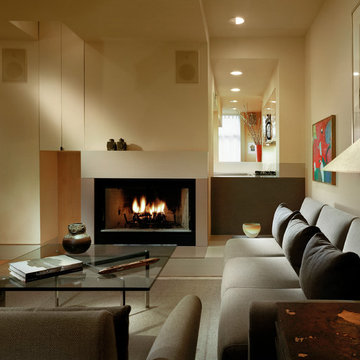
User"To design a house with a garage, an office, three bedrooms and three bathrooms in a 16-foot-wide space was a challenge. The result is a great way to live downtown." Cecil Baker, Philadelphia Style Magazine
11th Street Residence is one of a series of three townhouses built in the Washington Square West neighborhood of Philadelphia. Once a vacant lot owned by the redevelopment authority, the project was seen as an opportunity to infuse new residential life onto 11th Street. The design of the three 16-foot homes was based on maximum flexibility. The 'residence' is encompassed within the second and third floors; the rear portion of the first floor and the entirety of the fourth floor were offered for customization - either as two office suites, as a standalone rental opportunity (in the case of the first floor), or as expansions of the basic residence.
The design resolution of the 11th Street facades attempts to echo the rhythms and materials of the eclectic streetscape without lapsing into historical repetition. Brick, Arriscraft Renaissance masonry units, and Kalwall combine at the exterior to create a thoroughly modern façade in the city.
Barry Halkin and Todd Mason Photography
 Adam Gibson Design
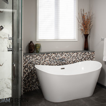
Seems like the ‘80s weren’t all that long ago. Reminiscing about music from the period harkens me back to all kinds of good feelings. The era’s kitchen and bath design, however, causes me to repress a bit of vomit. The lack of creativity, coupled with a love of beige and cheap brass, still makes my skin crawl. Some builder must have purchased entire container ships of that tile. Enter this bath. The homeowners did their best to add color, but nothing could hide the elements so popular in the day.
In attempting to provide something outside the norm (the shower tower), yet warm and inviting, (curved half-wall behind the curved freestanding tub; compressed ceilings above smaller items), and safe (large, curbless shower with door wide enough for future wheelchair), I endeavored to create a bath that would stand time’s test. It didn’t hurt that the clients, second-timers (see Modern Walnut Kitchen and Great Room) and a delight to work with, had strong opinions. The photos will be retaken soon (we didn’t stage the shoot), but they give an idea of the space.
 Dado Interior Design
Location: Denver, CO, USA
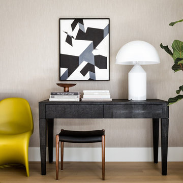
Dado designed this 4,000 SF condo from top to bottom. A full-scale buildout was required, with custom fittings throughout. The brief called for design solutions that catered to both the client’s desire for comfort and easy functionality, along with a modern aesthetic that could support their bold and colorful art collection.
The name of the game - calm modernism. Neutral colors and natural materials were used throughout.
"After a couple of failed attempts with other design firms we were fortunate to find Megan Moore. We were looking for a modern, somewhat minimalist design for our newly built condo in Cherry Creek North. We especially liked Megan’s approach to design: specifically to look at the entire space and consider its flow from every perspective. Megan is a gifted designer who understands the needs of her clients. She spent considerable time talking to us to fully understand what we wanted. Our work together felt like a collaboration and partnership. We always felt engaged and informed. We also appreciated the transparency with product selection and pricing.
Megan brought together a talented team of artisans and skilled craftsmen to complete the design vision. From wall coverings to custom furniture pieces we were always impressed with the quality of the workmanship. And, we were never surprised about costs or timing.
We’ve gone back to Megan several times since our first project together. Our condo is now a Zen-like place of calm and beauty that we enjoy every day. We highly recommend Megan as a designer."
Dado Interior Design
 User
User"To design a house with a garage, an office, three bedrooms and three bathrooms in a 16-foot-wide space was a challenge. The result is a great way to live downtown." Cecil Baker, Philadelphia Style Magazine
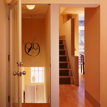
11th Street Residence is one of a series of three townhouses built in the Washington Square West neighborhood of Philadelphia. Once a vacant lot owned by the redevelopment authority, the project was seen as an opportunity to infuse new residential life onto 11th Street. The design of the three 16-foot homes was based on maximum flexibility. The 'residence' is encompassed within the second and third floors; the rear portion of the first floor and the entirety of the fourth floor were offered for customization - either as two office suites, as a standalone rental opportunity (in the case of the first floor), or as expansions of the basic residence.
The design resolution of the 11th Street facades attempts to echo the rhythms and materials of the eclectic streetscape without lapsing into historical repetition. Brick, Arriscraft Renaissance masonry units, and Kalwall combine at the exterior to create a thoroughly modern façade in the city.
Tom Crane Photography
 User
User"To design a house with a garage, an office, three bedrooms and three bathrooms in a 16-foot-wide space was a challenge. The result is a great way to live downtown." Cecil Baker, Philadelphia Style Magazine
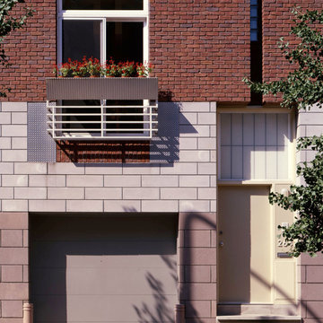
11th Street Residence is one of a series of three townhouses built in the Washington Square West neighborhood of Philadelphia. Once a vacant lot owned by the redevelopment authority, the project was seen as an opportunity to infuse new residential life onto 11th Street. The design of the three 16-foot homes was based on maximum flexibility. The 'residence' is encompassed within the second and third floors; the rear portion of the first floor and the entirety of the fourth floor were offered for customization - either as two office suites, as a standalone rental opportunity (in the case of the first floor), or as expansions of the basic residence.
The design resolution of the 11th Street facades attempts to echo the rhythms and materials of the eclectic streetscape without lapsing into historical repetition. Brick, Arriscraft Renaissance masonry units, and Kalwall combine at the exterior to create a thoroughly modern façade in the city.
Tom Crane Photography
 User
User"To design a house with a garage, an office, three bedrooms and three bathrooms in a 16-foot-wide space was a challenge. The result is a great way to live downtown." Cecil Baker, Philadelphia Style Magazine
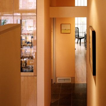
11th Street Residence is one of a series of three townhouses built in the Washington Square West neighborhood of Philadelphia. Once a vacant lot owned by the redevelopment authority, the project was seen as an opportunity to infuse new residential life onto 11th Street. The design of the three 16-foot homes was based on maximum flexibility. The 'residence' is encompassed within the second and third floors; the rear portion of the first floor and the entirety of the fourth floor were offered for customization - either as two office suites, as a standalone rental opportunity (in the case of the first floor), or as expansions of the basic residence.
The design resolution of the 11th Street facades attempts to echo the rhythms and materials of the eclectic streetscape without lapsing into historical repetition. Brick, Arriscraft Renaissance masonry units, and Kalwall combine at the exterior to create a thoroughly modern façade in the city.
Tom Crane Photography
 User
User"To design a house with a garage, an office, three bedrooms and three bathrooms in a 16-foot-wide space was a challenge. The result is a great way to live downtown." Cecil Baker, Philadelphia Style Magazine
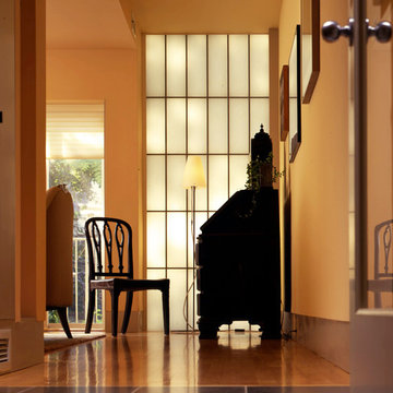
11th Street Residence is one of a series of three townhouses built in the Washington Square West neighborhood of Philadelphia. Once a vacant lot owned by the redevelopment authority, the project was seen as an opportunity to infuse new residential life onto 11th Street. The design of the three 16-foot homes was based on maximum flexibility. The 'residence' is encompassed within the second and third floors; the rear portion of the first floor and the entirety of the fourth floor were offered for customization - either as two office suites, as a standalone rental opportunity (in the case of the first floor), or as expansions of the basic residence.
The design resolution of the 11th Street facades attempts to echo the rhythms and materials of the eclectic streetscape without lapsing into historical repetition. Brick, Arriscraft Renaissance masonry units, and Kalwall combine at the exterior to create a thoroughly modern façade in the city.
Tom Crane Photography
 User
User"To design a house with a garage, an office, three bedrooms and three bathrooms in a 16-foot-wide space was a challenge. The result is a great way to live downtown." Cecil Baker, Philadelphia Style Magazine
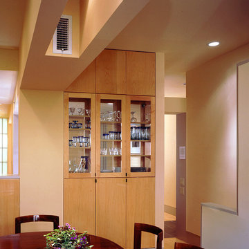
11th Street Residence is one of a series of three townhouses built in the Washington Square West neighborhood of Philadelphia. Once a vacant lot owned by the redevelopment authority, the project was seen as an opportunity to infuse new residential life onto 11th Street. The design of the three 16-foot homes was based on maximum flexibility. The 'residence' is encompassed within the second and third floors; the rear portion of the first floor and the entirety of the fourth floor were offered for customization - either as two office suites, as a standalone rental opportunity (in the case of the first floor), or as expansions of the basic residence.
The design resolution of the 11th Street facades attempts to echo the rhythms and materials of the eclectic streetscape without lapsing into historical repetition. Brick, Arriscraft Renaissance masonry units, and Kalwall combine at the exterior to create a thoroughly modern façade in the city.
Barry Halkin and Todd Mason Photography
 Melissa Clark Interiors
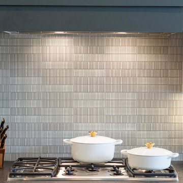
This client contacted us to help her pull her house together. She wanted a modern feel to her home. Before we worked together the kitchen backsplash was blue, green, gray, with gray walls and dark gray trim. The result was a home with two styles that were fighting one another.
Melissa Clark Interiors changed the kitchen backsplash to something that complemented the home's current design. We changed the wall color to a soft creamy white and painted all of the doors in the home to black. We also changed all of the lighting in the home to suit the new look and feel. The home now looks and feels as though it was always meant to be.
Here is what our client is saying: "Melissa did an amazing job bringing the right mix of traditional and contemporary to my home. She is so great to work with and her perfectionism in sizing lighting made all the difference over attempting to decorate on my own."
30