
Search results for "Attempted" in Home Design Ideas
 DesignARC
LOS ANGELES, CA / SINGLE FAMILY RESIDENTIAL
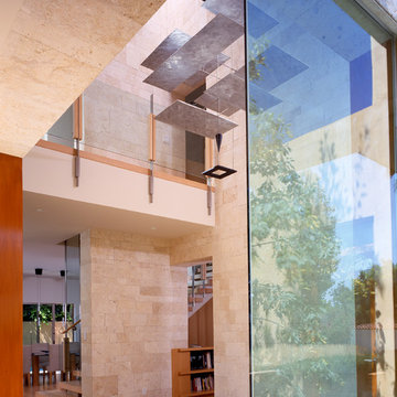
The commission for this 4,300-square-foot residence came with significant challenges for the architects – a house had once existed on the lot but had burned down and the attempt to replace the house had stalled, leading to an abatement order and a lapse of permits.
Our first challenge was to revive the lapsed construction permit by proposing to “modify” the existing structure. The practical effect this had was to fix the footprint of the new home to the existing structure’s plan outline. Having thereby inherited the large, dense block of the original house, the new strategy became one of substituting selective areas of indoor space for outdoor courtyard.
This strategy of trading indoor space for outdoor courtyard allowed an erosion of the formerly monolithic structure into a series of distinct volumetric elements, and further suggested that the architectural pieces could cohere as a “village.” The main level is further eroded by large, glazed planes, merging indoor with outdoor, and virtually stretching the landscape across interior space. Moving the detached garage from the rear yard to beneath the new living space allowed for a 75-meter lap pool and a shaded olive garden.
The gardens include built-in seating, extensive use of ornamental grasses and Zen-like interior courtyards. A material palette of fossilized stone, bonderized-galvanized metal, and natural Douglas fir allows for the warmth desired by the wife, while providing the modernity required by the husband. Programmatically, her music room borrows from the calm and protected olive court in the rear, while his office becomes a pavilion set in the landscape, which both addresses the street and acts as a sheltering monument for the terraced entry garden.
 Brendan McHugh, Architect, Manasquan, NJ
VISION AND NEEDS:
Our client came to us with a vision for their dream house for their growing family with three young children. This was their second attempt at getting the right design. The first time around, after working with an out-of-state online architect, they could not achieve the level of quality they wanted. McHugh delivered a home with higher quality design.
MCHUGH SOLUTION:
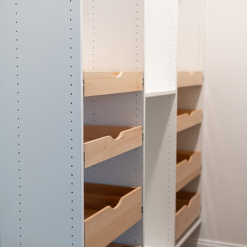
The Shingle/Dutch Colonial Design was our client's dream home style. Their priorities were to have a home office for both parents. Ample living space for kids and friends, along with outdoor space and a pool. Double sink bathroom for the kids and a master bedroom with bath for the parents. Despite being close a flood zone, clients could have a fully finished basement with 9ft ceilings and a full attic. Because of the higher water table, the first floor was considerably above grade. To soften the ascent of the front walkway, we designed planters around the stairs, leading up to the porch.
 Amazing Spaces
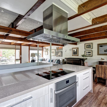
The existing kitchen was separated from the family room by a 17’ long bookcase. It was the first thing you saw upon entering and it hid much of the light and views to the backyard making the space feel claustrophobic. The laundry room was part of the kitchen space without any attempt to conceal the washer and dryer. Removing the long bookcase opened the opportunity to add counter stools in the kitchen and decided to align a target wall opposite the front door to help maintain some division within the main space while creating a space for the refrigerator. This also allowed us to create an open laundry room concept that would be hidden from view from all other areas.
We kept the industrial feel of the exposed building materials, which we complimented with textured melamine slab doors for the new kitchen cabinets. We maintained the galley set up but defined the kitchen from the utility area by changing both thickness and color of the countertop materials. Because the back of the house is mainly windows, there was very little wall space for upper cabinets and everyday dish storage. We designed a custom ceiling hung shelf system that floats in front of the windows, and is mostly out of view from the sitting area. Tall cabinets are installed along the only available wall to support both kitchen and laundry room functions. We used cable lighting threaded through the beams which really punctuates the industrial aesthetic.
Find the right local pro for your project
 Amazing Spaces
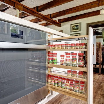
The existing kitchen was separated from the family room by a 17’ long bookcase. It was the first thing you saw upon entering and it hid much of the light and views to the backyard making the space feel claustrophobic. The laundry room was part of the kitchen space without any attempt to conceal the washer and dryer. Removing the long bookcase opened the opportunity to add counter stools in the kitchen and decided to align a target wall opposite the front door to help maintain some division within the main space while creating a space for the refrigerator. This also allowed us to create an open laundry room concept that would be hidden from view from all other areas.
We kept the industrial feel of the exposed building materials, which we complimented with textured melamine slab doors for the new kitchen cabinets. We maintained the galley set up but defined the kitchen from the utility area by changing both thickness and color of the countertop materials. Because the back of the house is mainly windows, there was very little wall space for upper cabinets and everyday dish storage. We designed a custom ceiling hung shelf system that floats in front of the windows, and is mostly out of view from the sitting area. Tall cabinets are installed along the only available wall to support both kitchen and laundry room functions. We used cable lighting threaded through the beams which really punctuates the industrial aesthetic.
 HU-235072162
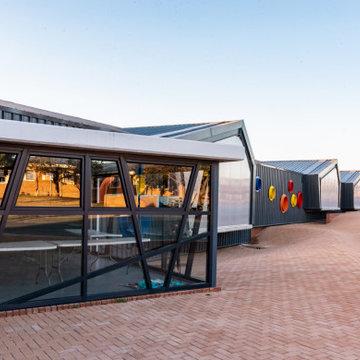
The site is located on the Mitchell House preparatory school campus in Polokwane. The client's brief
called for an early childhood development centre which would accommodate 122 learners and
requested that the building be evident of it's young and playful users.
Curiosity, wonder and intrigue would become defining criteria in an attempt to create a conducive
learning environment for young learners to grow, a building where children would be encouraged to
interact with their environment. The construction methodology of the building would remain apparent,
allowing its users to analyse the assembly of components.
Due to the age group of the users, the building would need to function semi-autonomously from the
rest of the school, while allowing for controlled interaction and inclusivity as is the norm for Mitchell
House. A linear plan which coincides with the developmental progress of the learners was identified
as the appropriate building typology. The spatial constraints of the site required this plan to be
moulded into the available space between the existing infrastructure, however the linear process was
maintained.
From the access-controlled reception and administration area one would move past the creative arts
and exhibition space towards the Northern wing where the youngest learners are taught. These would
share connected ablutions and storerooms between classes to enable fluid movement and
assistance throughout the teaching and service spaces. The East wing of the centre would house the
elder learners who would be in the process of being integrated with the fabric of the main school
campus. These classrooms include storage areas, however, have separate ablution facilities. The two
wings of the building surround a courtyard where play and interaction are in abundance.
 DesignARC
LOS ANGELES, CA / SINGLE FAMILY RESIDENTIAL
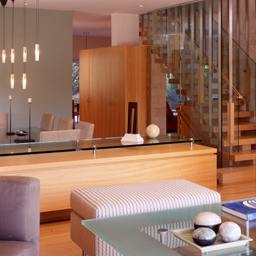
The commission for this 4,300-square-foot residence came with significant challenges for the architects – a house had once existed on the lot but had burned down and the attempt to replace the house had stalled, leading to an abatement order and a lapse of permits.
Our first challenge was to revive the lapsed construction permit by proposing to “modify” the existing structure. The practical effect this had was to fix the footprint of the new home to the existing structure’s plan outline. Having thereby inherited the large, dense block of the original house, the new strategy became one of substituting selective areas of indoor space for outdoor courtyard.
This strategy of trading indoor space for outdoor courtyard allowed an erosion of the formerly monolithic structure into a series of distinct volumetric elements, and further suggested that the architectural pieces could cohere as a “village.” The main level is further eroded by large, glazed planes, merging indoor with outdoor, and virtually stretching the landscape across interior space. Moving the detached garage from the rear yard to beneath the new living space allowed for a 75-meter lap pool and a shaded olive garden.
The gardens include built-in seating, extensive use of ornamental grasses and Zen-like interior courtyards. A material palette of fossilized stone, bonderized-galvanized metal, and natural Douglas fir allows for the warmth desired by the wife, while providing the modernity required by the husband. Programmatically, her music room borrows from the calm and protected olive court in the rear, while his office becomes a pavilion set in the landscape, which both addresses the street and acts as a sheltering monument for the terraced entry garden.
 Shuler Architecture
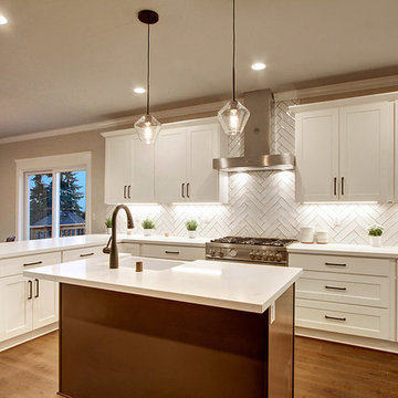
This urban infill project is a make-over of a decrepit structure that had been used as a student rental for close to 50 years. Situated on an elevated, 3300 sf lot, nothing in the original house was salvageable and the entire house was stripped down to the studs. Our challenge with this project was to then open up the original interiors, flood them with natural light while creating a design that appealed to the broadest buyer pool possible.
We solved this problem by organizing a compact floor plan that resulted in a 4 bedroom, 4 bath residence organized around a great room on the main level, a family room on the basement level and an additional 2 bedrooms with city views on the upper. By minimizing circulation space, we were able to re-purpose every square foot of floor area while creating a dramatic, light-filled staircase that tied all 3 levels of the house together into a unified living scheme. Clean lines and clean details, this is another of our attempts at a 'Not So Big House.'
Marketing of the final product lasted less than 10 days and resulted in 3 full priced offers that netted the developer a tidy profit.
 DesignARC
LOS ANGELES, CA / SINGLE FAMILY RESIDENTIAL
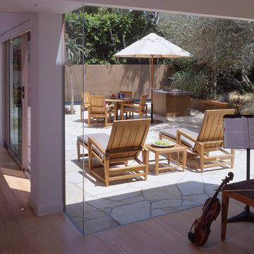
The commission for this 4,300-square-foot residence came with significant challenges for the architects – a house had once existed on the lot but had burned down and the attempt to replace the house had stalled, leading to an abatement order and a lapse of permits.
Our first challenge was to revive the lapsed construction permit by proposing to “modify” the existing structure. The practical effect this had was to fix the footprint of the new home to the existing structure’s plan outline. Having thereby inherited the large, dense block of the original house, the new strategy became one of substituting selective areas of indoor space for outdoor courtyard.
This strategy of trading indoor space for outdoor courtyard allowed an erosion of the formerly monolithic structure into a series of distinct volumetric elements, and further suggested that the architectural pieces could cohere as a “village.” The main level is further eroded by large, glazed planes, merging indoor with outdoor, and virtually stretching the landscape across interior space. Moving the detached garage from the rear yard to beneath the new living space allowed for a 75-meter lap pool and a shaded olive garden.
The gardens include built-in seating, extensive use of ornamental grasses and Zen-like interior courtyards. A material palette of fossilized stone, bonderized-galvanized metal, and natural Douglas fir allows for the warmth desired by the wife, while providing the modernity required by the husband. Programmatically, her music room borrows from the calm and protected olive court in the rear, while his office becomes a pavilion set in the landscape, which both addresses the street and acts as a sheltering monument for the terraced entry garden.
 Brendan McHugh, Architect, Manasquan, NJ
VISION AND NEEDS:
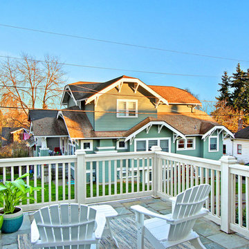
Our client came to us with a vision for their dream house for their growing family with three young children. This was their second attempt at getting the right design. The first time around, after working with an out-of-state online architect, they could not achieve the level of quality they wanted. McHugh delivered a home with higher quality design.
MCHUGH SOLUTION:
The Shingle/Dutch Colonial Design was our client's dream home style. Their priorities were to have a home office for both parents. Ample living space for kids and friends, along with outdoor space and a pool. Double sink bathroom for the kids and a master bedroom with bath for the parents. Despite being close a flood zone, clients could have a fully finished basement with 9ft ceilings and a full attic. Because of the higher water table, the first floor was considerably above grade. To soften the ascent of the front walkway, we designed planters around the stairs, leading up to the porch.
 Shuler Architecture
This urban infill project is a make-over of a decrepit structure that had been used as a student rental for close to 50 years. Situated on an elevated, 3300 sf lot, nothing in the original house was salvageable and the entire house was stripped down to the studs. Our challenge with this project was to then open up the original interiors, flood them with natural light while creating a design that appealed to the broadest buyer pool possible.
We solved this problem by organizing a compact floor plan that resulted in a 4 bedroom, 4 bath residence organized around a great room on the main level, a family room on the basement level and an additional 2 bedrooms with city views on the upper. By minimizing circulation space, we were able to re-purpose every square foot of floor area while creating a dramatic, light-filled staircase that tied all 3 levels of the house together into a unified living scheme. Clean lines and clean details, this is another of our attempts at a 'Not So Big House.'
Marketing of the final product lasted less than 10 days and resulted in 3 full priced offers that netted the developer a tidy profit.
 DesignARC
LOS ANGELES, CA / SINGLE FAMILY RESIDENTIAL
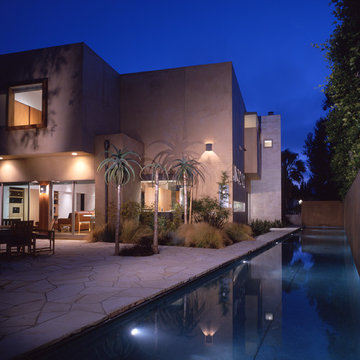
The commission for this 4,300-square-foot residence came with significant challenges for the architects – a house had once existed on the lot but had burned down and the attempt to replace the house had stalled, leading to an abatement order and a lapse of permits.
Our first challenge was to revive the lapsed construction permit by proposing to “modify” the existing structure. The practical effect this had was to fix the footprint of the new home to the existing structure’s plan outline. Having thereby inherited the large, dense block of the original house, the new strategy became one of substituting selective areas of indoor space for outdoor courtyard.
This strategy of trading indoor space for outdoor courtyard allowed an erosion of the formerly monolithic structure into a series of distinct volumetric elements, and further suggested that the architectural pieces could cohere as a “village.” The main level is further eroded by large, glazed planes, merging indoor with outdoor, and virtually stretching the landscape across interior space. Moving the detached garage from the rear yard to beneath the new living space allowed for a 75-meter lap pool and a shaded olive garden.
The gardens include built-in seating, extensive use of ornamental grasses and Zen-like interior courtyards. A material palette of fossilized stone, bonderized-galvanized metal, and natural Douglas fir allows for the warmth desired by the wife, while providing the modernity required by the husband. Programmatically, her music room borrows from the calm and protected olive court in the rear, while his office becomes a pavilion set in the landscape, which both addresses the street and acts as a sheltering monument for the terraced entry garden.
 Root Design Company.com
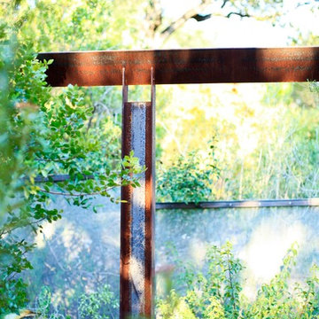
 Landscape & Pool Design: Root Design Company
Photo credits: Jessica Carr
Design ideas for a mediterranean landscaping in Austin.
Design ideas for a mediterranean landscaping in Austin.
 HU-235072162
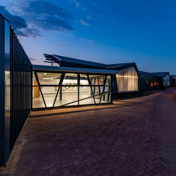
The site is located on the Mitchell House preparatory school campus in Polokwane. The client's brief
called for an early childhood development centre which would accommodate 122 learners and
requested that the building be evident of it's young and playful users.
Curiosity, wonder and intrigue would become defining criteria in an attempt to create a conducive
learning environment for young learners to grow, a building where children would be encouraged to
interact with their environment. The construction methodology of the building would remain apparent,
allowing its users to analyse the assembly of components.
Due to the age group of the users, the building would need to function semi-autonomously from the
rest of the school, while allowing for controlled interaction and inclusivity as is the norm for Mitchell
House. A linear plan which coincides with the developmental progress of the learners was identified
as the appropriate building typology. The spatial constraints of the site required this plan to be
moulded into the available space between the existing infrastructure, however the linear process was
maintained.
From the access-controlled reception and administration area one would move past the creative arts
and exhibition space towards the Northern wing where the youngest learners are taught. These would
share connected ablutions and storerooms between classes to enable fluid movement and
assistance throughout the teaching and service spaces. The East wing of the centre would house the
elder learners who would be in the process of being integrated with the fabric of the main school
campus. These classrooms include storage areas, however, have separate ablution facilities. The two
wings of the building surround a courtyard where play and interaction are in abundance.
 Amazing Spaces
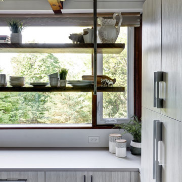
The existing kitchen was separated from the family room by a 17’ long bookcase. It was the first thing you saw upon entering and it hid much of the light and views to the backyard making the space feel claustrophobic. The laundry room was part of the kitchen space without any attempt to conceal the washer and dryer. Removing the long bookcase opened the opportunity to add counter stools in the kitchen and decided to align a target wall opposite the front door to help maintain some division within the main space while creating a space for the refrigerator. This also allowed us to create an open laundry room concept that would be hidden from view from all other areas.
We kept the industrial feel of the exposed building materials, which we complimented with textured melamine slab doors for the new kitchen cabinets. We maintained the galley set up but defined the kitchen from the utility area by changing both thickness and color of the countertop materials. Because the back of the house is mainly windows, there was very little wall space for upper cabinets and everyday dish storage. We designed a custom ceiling hung shelf system that floats in front of the windows, and is mostly out of view from the sitting area. Tall cabinets are installed along the only available wall to support both kitchen and laundry room functions. We used cable lighting threaded through the beams which really punctuates the industrial aesthetic.
 Brendan McHugh, Architect, Manasquan, NJ
VISION AND NEEDS:
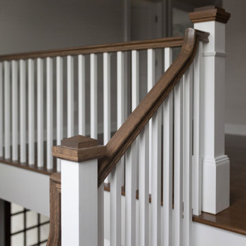
Our client came to us with a vision for their dream house for their growing family with three young children. This was their second attempt at getting the right design. The first time around, after working with an out-of-state online architect, they could not achieve the level of quality they wanted. McHugh delivered a home with higher quality design.
MCHUGH SOLUTION:
The Shingle/Dutch Colonial Design was our client's dream home style. Their priorities were to have a home office for both parents. Ample living space for kids and friends, along with outdoor space and a pool. Double sink bathroom for the kids and a master bedroom with bath for the parents. Despite being close a flood zone, clients could have a fully finished basement with 9ft ceilings and a full attic. Because of the higher water table, the first floor was considerably above grade. To soften the ascent of the front walkway, we designed planters around the stairs, leading up to the porch.
 Brendan McHugh, Architect, Manasquan, NJ
VISION AND NEEDS:
Our client came to us with a vision for their dream house for their growing family with three young children. This was their second attempt at getting the right design. The first time around, after working with an out-of-state online architect, they could not achieve the level of quality they wanted. McHugh delivered a home with higher quality design.
MCHUGH SOLUTION:
The Shingle/Dutch Colonial Design was our client's dream home style. Their priorities were to have a home office for both parents. Ample living space for kids and friends, along with outdoor space and a pool. Double sink bathroom for the kids and a master bedroom with bath for the parents. Despite being close a flood zone, clients could have a fully finished basement with 9ft ceilings and a full attic. Because of the higher water table, the first floor was considerably above grade. To soften the ascent of the front walkway, we designed planters around the stairs, leading up to the porch.
 DesignARC
LOS ANGELES, CA / SINGLE FAMILY RESIDENTIAL
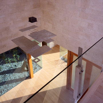
The commission for this 4,300-square-foot residence came with significant challenges for the architects – a house had once existed on the lot but had burned down and the attempt to replace the house had stalled, leading to an abatement order and a lapse of permits.
Our first challenge was to revive the lapsed construction permit by proposing to “modify” the existing structure. The practical effect this had was to fix the footprint of the new home to the existing structure’s plan outline. Having thereby inherited the large, dense block of the original house, the new strategy became one of substituting selective areas of indoor space for outdoor courtyard.
This strategy of trading indoor space for outdoor courtyard allowed an erosion of the formerly monolithic structure into a series of distinct volumetric elements, and further suggested that the architectural pieces could cohere as a “village.” The main level is further eroded by large, glazed planes, merging indoor with outdoor, and virtually stretching the landscape across interior space. Moving the detached garage from the rear yard to beneath the new living space allowed for a 75-meter lap pool and a shaded olive garden.
The gardens include built-in seating, extensive use of ornamental grasses and Zen-like interior courtyards. A material palette of fossilized stone, bonderized-galvanized metal, and natural Douglas fir allows for the warmth desired by the wife, while providing the modernity required by the husband. Programmatically, her music room borrows from the calm and protected olive court in the rear, while his office becomes a pavilion set in the landscape, which both addresses the street and acts as a sheltering monument for the terraced entry garden.
 DesignARC
LOS ANGELES, CA / SINGLE FAMILY RESIDENTIAL
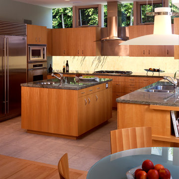
The commission for this 4,300-square-foot residence came with significant challenges for the architects – a house had once existed on the lot but had burned down and the attempt to replace the house had stalled, leading to an abatement order and a lapse of permits.
Our first challenge was to revive the lapsed construction permit by proposing to “modify” the existing structure. The practical effect this had was to fix the footprint of the new home to the existing structure’s plan outline. Having thereby inherited the large, dense block of the original house, the new strategy became one of substituting selective areas of indoor space for outdoor courtyard.
This strategy of trading indoor space for outdoor courtyard allowed an erosion of the formerly monolithic structure into a series of distinct volumetric elements, and further suggested that the architectural pieces could cohere as a “village.” The main level is further eroded by large, glazed planes, merging indoor with outdoor, and virtually stretching the landscape across interior space. Moving the detached garage from the rear yard to beneath the new living space allowed for a 75-meter lap pool and a shaded olive garden.
The gardens include built-in seating, extensive use of ornamental grasses and Zen-like interior courtyards. A material palette of fossilized stone, bonderized-galvanized metal, and natural Douglas fir allows for the warmth desired by the wife, while providing the modernity required by the husband. Programmatically, her music room borrows from the calm and protected olive court in the rear, while his office becomes a pavilion set in the landscape, which both addresses the street and acts as a sheltering monument for the terraced entry garden.
 Brendan McHugh, Architect, Manasquan, NJ
VISION AND NEEDS:
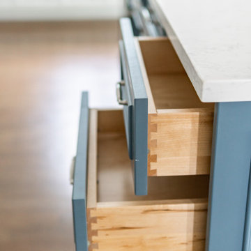
Our client came to us with a vision for their dream house for their growing family with three young children. This was their second attempt at getting the right design. The first time around, after working with an out-of-state online architect, they could not achieve the level of quality they wanted. McHugh delivered a home with higher quality design.
MCHUGH SOLUTION:
The Shingle/Dutch Colonial Design was our client's dream home style. Their priorities were to have a home office for both parents. Ample living space for kids and friends, along with outdoor space and a pool. Double sink bathroom for the kids and a master bedroom with bath for the parents. Despite being close a flood zone, clients could have a fully finished basement with 9ft ceilings and a full attic. Because of the higher water table, the first floor was considerably above grade. To soften the ascent of the front walkway, we designed planters around the stairs, leading up to the porch.
 Brendan McHugh, Architect, Manasquan, NJ
VISION AND NEEDS:
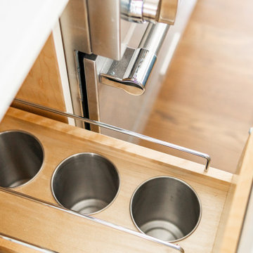
Our client came to us with a vision for their dream house for their growing family with three young children. This was their second attempt at getting the right design. The first time around, after working with an out-of-state online architect, they could not achieve the level of quality they wanted. McHugh delivered a home with higher quality design.
MCHUGH SOLUTION:
The Shingle/Dutch Colonial Design was our client's dream home style. Their priorities were to have a home office for both parents. Ample living space for kids and friends, along with outdoor space and a pool. Double sink bathroom for the kids and a master bedroom with bath for the parents. Despite being close a flood zone, clients could have a fully finished basement with 9ft ceilings and a full attic. Because of the higher water table, the first floor was considerably above grade. To soften the ascent of the front walkway, we designed planters around the stairs, leading up to the porch.
36