
Search results for "Authorization" in Home Design Ideas
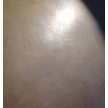
 Deborah Kipp's Decorative Painting (Austin Texas)
CLOSE-UP VIEW
This master bath makeover starts with bare walls that have been floated out smooth over the sheetrock. Then we hand applied a beautiful custom tinted, soft grey Venetian plaster. After two coats of plaster, the walls were waxed and buffed. This process seals the plaster, leaving a long-lasting finish. The finished product is subtle and undeniably beautiful! I’ve included a close-up view of the finish below.
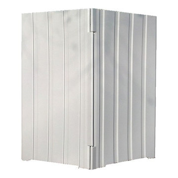


 CoArtCo
 is a progressive company specializing in the manufacturing of quality Interior and Exterior EPS moldings and trims for commercial and Residential, specializes in designing and creating a variety of unique architectural foam products. We stock a wide variety of architectural elements including: Interior & Exterior Trims, 2D and 3D Props and Sculptures, Concrete Casting Moulds, and Signage.
We have a full staff of design and support personnel to meet any and all of your special project requirements. Our Development Team has the ability to design and deliver to your client shop drawings and samples for specification approvals. By combining our team’s fine sculpting techniques and exceptional finishing work, we are able to produce almost anything!
We take pride in each and every project, large or small. Our focus is in satisfying the needs and requirements of our expanding customer base by providing exceptional quality and customer service.
Find the right local pro for your project
 Drury Design
THE SETUP
Client Background: Our clients, a couple who have transitioned into the empty nest phase, have cherished their home for over three decades without undergoing any significant renovations. With a newfound desire to adapt their living space to better suit their current lifestyle, they’ve embarked on a journey to reimagine their kitchen — the heart of their home. Their aspiration is to cultivate a serene, neutral-toned sanctuary on the first floor that seamlessly merges with their family room, ensuring a harmonious and inviting environment.
Design Inspiration: The renovation is inspired by the couple’s penchant for soft, calming neutrals, using their cherished family room and the kitchen’s existing tile flooring as the cornerstone for the color scheme. This approach aims to foster a sense of warmth and tranquility throughout.
Design Objectives:
Harmonize the kitchen with the family room by adopting a soothing, neutral color scheme, ensuring a seamless flow across the first floor.
Enhance kitchen functionality with thoughtfully designed cabinetry, providing a designated place for every item and maximizing storage efficiency.
Cultivate an inviting and comfortable atmosphere that reflects the homeowners’ desire for a calm and relaxing space.
Design Challenges:
The homeowners wish to retain the existing kitchen tile flooring and integrate it into a refreshed, modern design.
Accommodating a dining area spacious enough for family visits without compromising the kitchen’s open feel or functional layout.
Despite liking the current placement of plumbing and appliances, the homeowners aspire for a more open floor plan to facilitate better movement and interaction.
The need to amplify natural light in the kitchen, especially around the sink area, where existing lighting is insufficient.
Preserving the half-wall between the kitchen and family room, a feature the homeowners want to keep, while ensuring it complements the new design.
THE RENEWED SPACE
Design Solutions:
By choosing a neutral color palette that complements the existing tile, the design unifies the kitchen with the adjacent spaces. The tile’s grout was cleaned and restored, enhancing the floor’s appearance and integrating it seamlessly with the new kitchen aesthetic.
The inclusion of a larger island with seating for two, alongside maintaining a substantial dining table, was achieved by optimizing the spatial layout. This allowed for a sociable yet functional kitchen, accommodating large family gatherings without feeling crowded.
Minor adjustments to the kitchen’s layout maintained the preferred locations for plumbing and appliances while introducing an ‘open’ design concept. Strategic modifications, such as angling the pantry wall, improved the flow and accessibility within the space.
Replacing the garden window with a broader, standard window significantly increased natural light, transforming the sink area into a bright, welcoming space with enhanced views of the outdoors.
The decision to keep the half-wall was ingeniously leveraged to define the dining area while maintaining an open connection to the family room. This feature not only serves as a visual separator but also ties the two spaces together through the shared color scheme and design elements.
The homeowners are thrilled with their newly remodeled kitchen, which has become a hub of warmth and hospitality. Hosting a wedding shower and a birthday party, they have shared their renewed space with friends and family, who have been equally enamored. This remodel has not only met their functional and aesthetic desires but has also enriched their home with a fresh sense of serenity and joy.
The upstairs part of the home is shaping up nicely. Here’s their newly remodeled primary bathroom.
 TK Building & Design
Small elegant underground cork floor and brown floor home design photo with beige walls and no fireplace


 Almesedoors
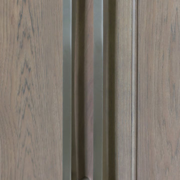
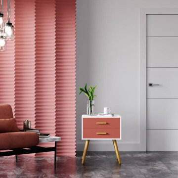
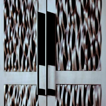
THE DOOR NAME ORIGIN - "ALLUMINIO ELIVIA PAINT 4HS"
One feature of this interior door model stands out among all others, to wit, the fact that here at Almese Doors we can work with pretty much any kind of budget. Allow me another intriguing observation: this one (this interior door, that is) is best suited to bulk orders. Which isn’t to say this one does not fall into the category of affordable luxury (just something we specialize in here at Almese Doors). It certainly does. It has most of the wonderful features characteristic of the brand to recommend it. It was lovingly and imaginatively designed. The name, should you be wondering, is a variation of that of the lovable, honest and faithful Shakespearean heroine (the play, of course, would be The Twelfth Night, one of the happiest and light-hearted comedies the bright British wordsmith ever composed, and arguably the most popular). Only natural wood is used to put it together, which is both aesthetically pleasant and env... Show more!
FINISH: WHITE
This is a bit tricky. Isn’t White the default finish that would look great on any interior door? Well, not quite.
W. is the color most often associated with perfection, honesty, cleanliness, newness, neutrality, and exactitude. The pigment has been known and used by humans since prehistoric times. In ancient Egypt, W. symbolized purity. Roman patricians paraded around in W. togas to distinguish themselves from the common folk. It was the color of choice of French monarchs. Architects of all epochs used W., with considerable enthusiasm, in various projects and for various reasons. In the United States, architects favored it when designing churches, capitols, and municipal buildings – which is, in fact, a tradition they inherited from classical and Renaissance architecture. According to some experts, most of the buildings in the celebrated Forum were either made of, or clad in, W. marble. In Taoism, it represents the yang or masculine energy, one of the two complementary natures of the universe. Many authors, both classical and contemporary, have referred to W. as a sign of purity, either physical (like William Shakespeare, whose treacherous usurper monarch wishes a heavenly rain would cleanse his blood-stained hand, washing it “white as snow”) or spiritual (like Tennessee Williams, who named his lead character Blanche (derived, incidentally, from the Germanic word blanc)) as a symbol of her innocent child-like spirit, perceptible from the moment she makes her first entrance (through the interior door stage-left).
Back in the Seventeenth Century, Sir Isaac Newton discovered that sunlight is composed of light with wavelengths across the visible spectrum which the human eye perceives as W. It is the lightest of the spectrum, and achromatic (hue-less) to boot, because it fully reflects and scatters all visible wavelengths of light, absorbing none. W. objects stand out in the dark. Depending on the surroundings, an interior door with W. finish might come off as emphatic or tactful, dominant or complementary. It blends seamlessly into most types of decor and, once the owner’s needs and disposition are taken into account, can symbolize - oh, so many different things, while bringing back a myriad memories: from those glorious snowy Alpine slopes and peaks to the fluffy tops of the wayward herd of cumulus cloud heap over the horizon on a balmy afternoon in the Caribbean. Tropical sand beaches are W. due to the high quantity of calcium carbonate they get from tiny bits of seashells ground to powder by the waves. In a number of cultures W. can also symbolize festivity, and be used lavishly to brighten up weddings, birthdays, and anniversaries. It is beautiful. Make sure it goes well with your interior door model, though.

 David Lyles Decorative Painting
Close-up of the faux walnut-each piece individuated, each joint carefully drawn, all to satisfy the expectations of your subconscious mind!
Example of a cottage home office design in Dallas
Example of a cottage home office design in Dallas


 Artistic Design Studios
Evening fire colored sky with desert cactus hand painted to create drama & mood in residential home.
Example of a large southwest hallway design in Milwaukee
Example of a large southwest hallway design in Milwaukee



 Michael Humphrey/Humphrey Construction Company
Example of a transitional home design design in Boston


 The Carpet Workroom
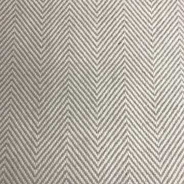
A 100% wool herringbone option by the name of Peter Island by Kaleen! An overall versatile wool that can be used as a stair runner, area rug, and wall to wall installations!


 The Wood Wizard
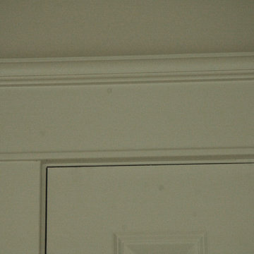
Example of an eclectic l-shaped concrete floor eat-in kitchen design in Los Angeles with a single-bowl sink, flat-panel cabinets, blue cabinets, solid surface countertops, metallic backsplash, stainless steel appliances and an island


 TFLarkin, Inc
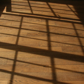
Fluted columned doorways
With a Colonial Crown 5 1/4" at ceiling
Hallway - traditional hallway idea in San Diego
Hallway - traditional hallway idea in San Diego

246