
Search results for "Avoiding closing" in Home Design Ideas
 Treefrog Design
Amy Birrer
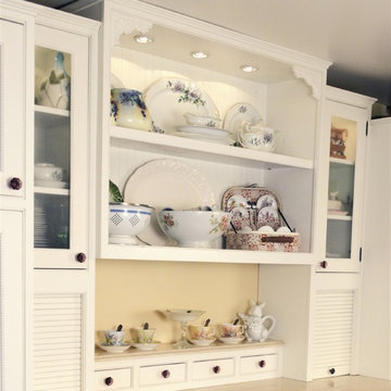
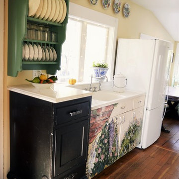
The kitchen pictured here is in a turn of the century home that still uses the original stove from the 1930’s to heat, cook and bake. The porcelain sink with drain boards are also originals still in use from the 1950’s. The idea here was to keep the original appliances still in use while increasing the storage and work surface space. Although the kitchen is rather large it has many of the issues of an older house in that there are 4 integral entrances into the kitchen, none of which could be rerouted or closed off. It also needed to encompass in-kitchen eating and a space for a dishwasher. The fully integrated dishwasher is raised off the floor and sits on ball and claw feet giving it the look of a freestanding piece of furniture. Elevating a dishwasher is a great way to avoid the constant bending over associated with loading and unloading dishes. The cabinets were designed to resemble an antique breakfront in keeping with the style and age of the house.
 Ferriss - Architectural Renderings
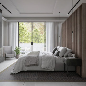
7 mistakes in bedroom design and ways to avoid them.
ERROR # 1 - Incorrect bed size.
This is a problem with any furniture in principle. When, according to the plan and ergonomic calculations, it becomes size to size, but in fact, it looks cumbersome, visually overflowing the space or, on the contrary, turns out to be too small and looks awkward.
How to avoid: Always be guided by the proportions of the size of the furniture in the room. Try to choose as big a bed as possible, but stay realistic. The main thing is that the width of the passageways in the bedroom should not be less than 70cm, and for comfortable movement, it is better to do everything 100cm.
ERROR # 2 - Poor lighting and switches.
Even in a small bedroom, you need multiple light sources. A single chandelier in the center of the ceiling is not enough, because it creates the effect of darkening the corners, and the room seems uncomfortable.
How to avoid: Hang a sconce over your headboard. Don't forget to light up the space next to the mirror and wardrobe. And be sure to place switches close to the bed so that you don't have to go to the other end of the room after an evening with a book in bed.
Do not forget about a sufficient number of outlets, this should be done even at the planning stage.
ERROR # 3 - Few storage locations
The fewer well-thought-out cabinets and shelving, the more things are visible. And the clutter spoils even the most stylish and expensive interior.
How to avoid: In addition to bedside tables, a chest of drawers (for storing small things) and a built-in wardrobe can be placed in a small bedroom: unlike a usual one, it takes up space from floor to ceiling, thereby accommodating more items. In addition, the built-in structure looks more solid and often merges with the walls, making the setting complete.
ERROR # 4 - Carpet of the wrong size.
The carpet in the bedroom is a great addition, and sometimes the final touch of the whole composition. But often people choose the wrong size or do not use it at all.
How to avoid: Choosing the right size can be guided by the unspoken rule, according to which the carpet should be 1 meter larger than the bed, both lengthwise and across. If the room is large, then it is recommended that the indentation of the carpet from the wall is 45-50 cm, if it is small, then 20-30 cm can be dispensed with.
ERROR # 5 Typical design.
If you buy a typical bed, bedside tables, and wardrobe from one manufacturer, then the interior will turn out to be formulaic and impersonal. No accessories and color schemes will help him.
How to avoid: The interior should reflect the character of its owner, and the person living in it will feel comfortable. Explore different collections of furniture and try to assemble a capsule in the same color scheme, but at the same time different in texture and shape.
ERROR # 6 Empty walls.
Even if the bedroom is a room for relaxation, it would be a mistake to make a space out of it that is intended solely for sleeping. Ascetic furnishings, unadorned walls, boring furniture, and bed linen - all this does not improve the mood at all, but, on the contrary, creates a gloomy mood.
How to avoid: The walls in the bedroom are a blank slate that you can transform into something original, beautiful, and unique to your liking. Even if you just paint one of the walls in a contrasting color, and decorate the other with several photos from the Internet, printed and inserted into frames, you can transform the atmosphere of the room as a whole.
ERROR # 7 Too dark interior.
One should not be deceived by the beauty of the thick dark tones of interior paint. It has long been known that dark blue, burgundy, blueberry, chocolate, and black for the bedroom should not be used in large quantities, since such an environment will have a tangible effect and interfere with a vigorous awakening in the morning.
How to avoid: If you like a rich range, try choosing derived shades a few tones lighter, for example, instead of black or graphite, choose gray-brown, dove-gray for the walls, and blue can be replaced with cornflower blue or azure.
Don't forget to combine dark tones with lots of whites, creams, complementing shimmery accessories, and vibrant décor.
https://www.ferriss.co/
#ferriss #We_bring_objects_to_life #3drendering #architecture #San_Francisco
 Chervin Kitchen & Bath Inc.
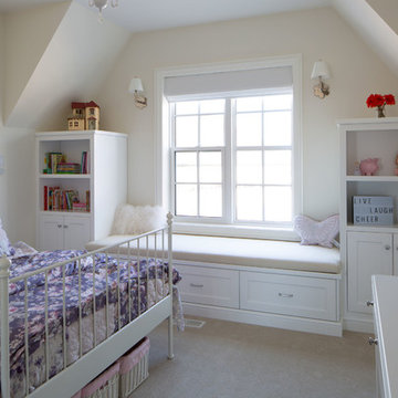
This bedroom made one little girl very happy! An adorable space to begin with, featuring a partial vaulted ceiling over the window, this room is positively dreamy with it’s all-white furniture and cabinetry, and soft pink and purple accent colours. The custom-built window seat provides additional storage space for bedding, toys, or seasonal clothes, while offering a comfy place for reading, playing, or even afternoon naps! The cabinets are balanced and spacious with exposed shelving for decorative or frequently accessed items, as well as closed-in shelving, to avoid clutter. The traditional style of this bed frame completes the look of the room, and sits in the perfect place to be bathed in sun during the day and in place for stargazing at night.
PC: Fred Huntsberger
Find the right local pro for your project
 Treefrog Design
Amy Birrer
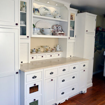
The kitchen pictured here is in a turn of the century home that still uses the original stove from the 1930’s to heat, cook and bake. The porcelain sink with drain boards are also originals still in use from the 1950’s. The idea here was to keep the original appliances still in use while increasing the storage and work surface space. Although the kitchen is rather large it has many of the issues of an older house in that there are 4 integral entrances into the kitchen, none of which could be rerouted or closed off. It also needed to encompass in-kitchen eating and a space for a dishwasher. The fully integrated dishwasher is raised off the floor and sits on ball and claw feet giving it the look of a freestanding piece of furniture. Elevating a dishwasher is a great way to avoid the constant bending over associated with loading and unloading dishes. The cabinets were designed to resemble an antique breakfront in keeping with the style and age of the house.
 Studio MMA Architecture + Design
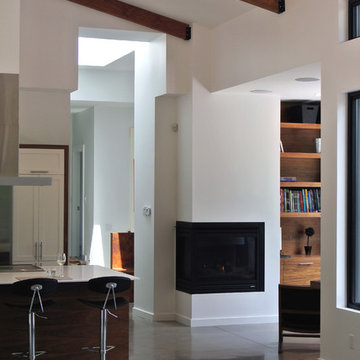
This house is set on a sunny natural plateau, sheltered from the wind and enjoys magnificent views of Sutton Mounts and Echo. The layout of the house integrates harmoniously with the surrounding forest, opening to nature through large expanses of glass and terraces that connect the living spaces to the forest. A long roof shelters the house, its deep eaves acting as a sunshade and defining protected outside spaces. The wide south and east terraces, close to ground level, bring the house into contact with its site and enjoy lots of sunshine. A screen porch is strategically located to avoid blocking the primary views and provides access to the forest. The living living spaces are arranged in an open layout under a ceiling ceiling that reaches 12 feet in height, yet more intimate spaces such as the fireplace alcove modulate the spaces between the higher volumes. The construction will achieve Novoclimat certification and integrates among other things a radiant floor fed by a geothermal heating system. This project was completed in collaboration with engineers and Construction Boivin.
 Studio MMA Architecture + Design
This house is set on a sunny natural plateau, sheltered from the wind and enjoys magnificent views of Sutton Mounts and Echo. The layout of the house integrates harmoniously with the surrounding forest, opening to nature through large expanses of glass and terraces that connect the living spaces to the forest. A long roof shelters the house, its deep eaves acting as a sunshade and defining protected outside spaces. The wide south and east terraces, close to ground level, bring the house into contact with its site and enjoy lots of sunshine. A screen porch is strategically located to avoid blocking the primary views and provides access to the forest. The living living spaces are arranged in an open layout under a ceiling ceiling that reaches 12 feet in height, yet more intimate spaces such as the fireplace alcove modulate the spaces between the higher volumes. The construction will achieve Novoclimat certification and integrates among other things a radiant floor fed by a geothermal heating system. This project was completed in collaboration with engineers and Construction Boivin.


Sponsored
Delaware, OH

Buckeye Basements, Inc.
Central Ohio's Basement Finishing ExpertsBest Of Houzz '13-'21
 Ore Studios
Lauren Colton
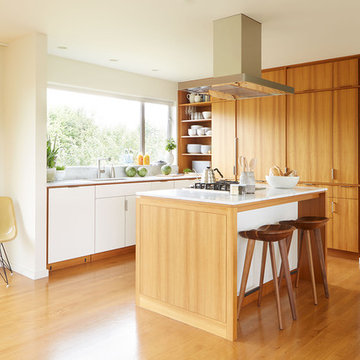
Inspiration for a 1960s medium tone wood floor and orange floor kitchen remodel in Seattle with a single-bowl sink, flat-panel cabinets, medium tone wood cabinets, marble countertops, paneled appliances, an island and window backsplash
Inspiration for a 1960s medium tone wood floor and orange floor kitchen remodel in Seattle with a single-bowl sink, flat-panel cabinets, medium tone wood cabinets, marble countertops, paneled appliances, an island and window backsplash
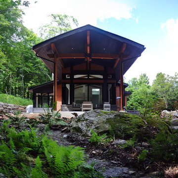 Studio MMA Architecture + Design
This house is set on a sunny natural plateau, sheltered from the wind and enjoys magnificent views of Sutton Mounts and Echo. The layout of the house integrates harmoniously with the surrounding forest, opening to nature through large expanses of glass and terraces that connect the living spaces to the forest. A long roof shelters the house, its deep eaves acting as a sunshade and defining protected outside spaces. The wide south and east terraces, close to ground level, bring the house into contact with its site and enjoy lots of sunshine. A screen porch is strategically located to avoid blocking the primary views and provides access to the forest. The living living spaces are arranged in an open layout under a ceiling ceiling that reaches 12 feet in height, yet more intimate spaces such as the fireplace alcove modulate the spaces between the higher volumes. The construction will achieve Novoclimat certification and integrates among other things a radiant floor fed by a geothermal heating system. This project was completed in collaboration with engineers and Construction Boivin.
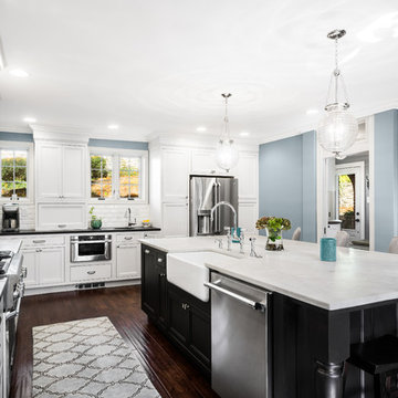
 Bella Casa Design and Build
Scott Fredrick Photography
Large elegant l-shaped dark wood floor eat-in kitchen photo in Philadelphia with a farmhouse sink, recessed-panel cabinets, white cabinets, soapstone countertops, white backsplash, subway tile backsplash, stainless steel appliances and two islands
Large elegant l-shaped dark wood floor eat-in kitchen photo in Philadelphia with a farmhouse sink, recessed-panel cabinets, white cabinets, soapstone countertops, white backsplash, subway tile backsplash, stainless steel appliances and two islands
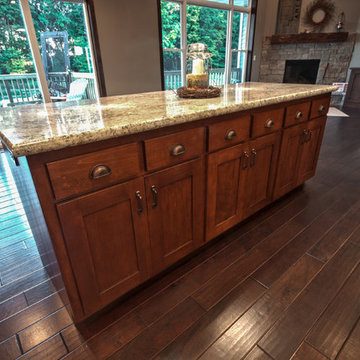
 BECKS Quality Cabinets, Inc.
Photographer: Katherine Brannaman
Mid-sized elegant l-shaped dark wood floor eat-in kitchen photo with an undermount sink, shaker cabinets, medium tone wood cabinets, laminate countertops, beige backsplash, stone tile backsplash, stainless steel appliances and an island
Mid-sized elegant l-shaped dark wood floor eat-in kitchen photo with an undermount sink, shaker cabinets, medium tone wood cabinets, laminate countertops, beige backsplash, stone tile backsplash, stainless steel appliances and an island

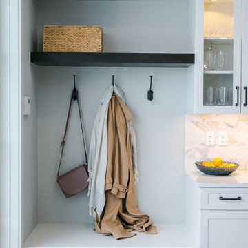
 TVL Creative Ltd.
Our clients had just recently closed on their new house in Stapleton and were excited to transform it into their perfect forever home. They wanted to remodel the entire first floor to create a more open floor plan and develop a smoother flow through the house that better fit the needs of their family. The original layout consisted of several small rooms that just weren’t very functional, so we decided to remove the walls that were breaking up the space and restructure the first floor to create a wonderfully open feel.
After removing the existing walls, we rearranged their spaces to give them an office at the front of the house, a large living room, and a large dining room that connects seamlessly with the kitchen. We also wanted to center the foyer in the home and allow more light to travel through the first floor, so we replaced their existing doors with beautiful custom sliding doors to the back yard and a gorgeous walnut door with side lights to greet guests at the front of their home.
Living Room
Our clients wanted a living room that could accommodate an inviting sectional, a baby grand piano, and plenty of space for family game nights. So, we transformed what had been a small office and sitting room into a large open living room with custom wood columns. We wanted to avoid making the home feel too vast and monumental, so we designed custom beams and columns to define spaces and to make the house feel like a home. Aesthetically we wanted their home to be soft and inviting, so we utilized a neutral color palette with occasional accents of muted blues and greens.
Dining Room
Our clients were also looking for a large dining room that was open to the rest of the home and perfect for big family gatherings. So, we removed what had been a small family room and eat-in dining area to create a spacious dining room with a fireplace and bar. We added custom cabinetry to the bar area with open shelving for displaying and designed a custom surround for their fireplace that ties in with the wood work we designed for their living room. We brought in the tones and materiality from the kitchen to unite the spaces and added a mixed metal light fixture to bring the space together
Kitchen
We wanted the kitchen to be a real show stopper and carry through the calm muted tones we were utilizing throughout their home. We reoriented the kitchen to allow for a big beautiful custom island and to give us the opportunity for a focal wall with cooktop and range hood. Their custom island was perfectly complimented with a dramatic quartz counter top and oversized pendants making it the real center of their home. Since they enter the kitchen first when coming from their detached garage, we included a small mud-room area right by the back door to catch everyone’s coats and shoes as they come in. We also created a new walk-in pantry with plenty of open storage and a fun chalkboard door for writing notes, recipes, and grocery lists.
Office
We transformed the original dining room into a handsome office at the front of the house. We designed custom walnut built-ins to house all of their books, and added glass french doors to give them a bit of privacy without making the space too closed off. We painted the room a deep muted blue to create a glimpse of rich color through the french doors
Powder Room
The powder room is a wonderful play on textures. We used a neutral palette with contrasting tones to create dramatic moments in this little space with accents of brushed gold.
Master Bathroom
The existing master bathroom had an awkward layout and outdated finishes, so we redesigned the space to create a clean layout with a dream worthy shower. We continued to use neutral tones that tie in with the rest of the home, but had fun playing with tile textures and patterns to create an eye-catching vanity. The wood-look tile planks along the floor provide a soft backdrop for their new free-standing bathtub and contrast beautifully with the deep ash finish on the cabinetry.

Sponsored
Columbus, OH

Wannemacher Interiors
Customized Award-Winning Interior Design Solutions in Franklin Cnty OH
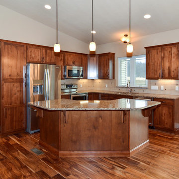
 Keith Homes, Inc
Picatour
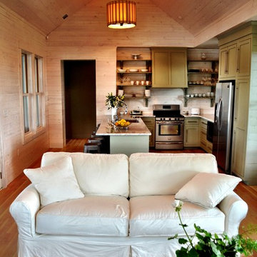
Open concept kitchen - mid-sized rustic l-shaped medium tone wood floor open concept kitchen idea with a double-bowl sink, shaker cabinets, medium tone wood cabinets, quartz countertops, beige backsplash, ceramic backsplash, stainless steel appliances and an island
Open concept kitchen - mid-sized rustic l-shaped medium tone wood floor open concept kitchen idea with a double-bowl sink, shaker cabinets, medium tone wood cabinets, quartz countertops, beige backsplash, ceramic backsplash, stainless steel appliances and an island
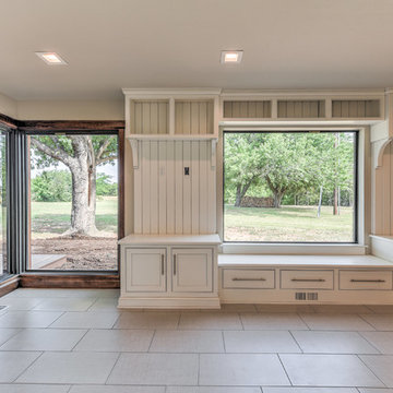
 Brent Cornman Construction Inc.
Reed Ewing
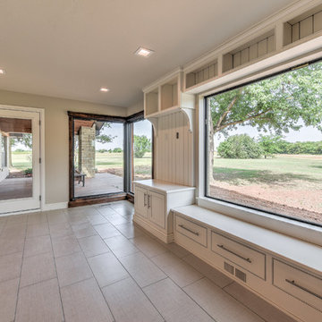
Inspiration for a large farmhouse u-shaped vinyl floor and gray floor utility room remodel in Oklahoma City with shaker cabinets, white cabinets, wood countertops, gray walls and a side-by-side washer/dryer
Inspiration for a large farmhouse u-shaped vinyl floor and gray floor utility room remodel in Oklahoma City with shaker cabinets, white cabinets, wood countertops, gray walls and a side-by-side washer/dryer
 Distinctive Design + Build + Remodel
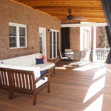
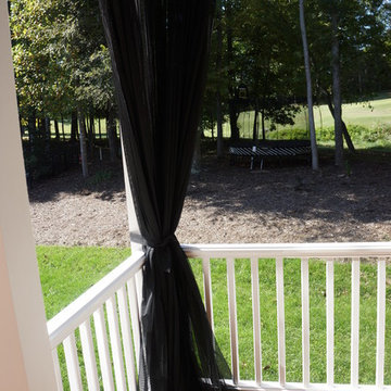
The existing deck on this home was rotting and was a place the homeowner’s avoided rather than enjoyed. They thought about adding a screened porch but didn’t want to obscure their view of the golf course. The solution: we installed elegant Mosquito Curtains which can be easily opened or closed as needed. The new pergola and deck are made from low-maintenance Fiberon Horizon deck boards, Duralife railings and Fypon column wraps. None of those products require painting! For a touch of natural beauty – the rafters are cedar which has been clear coated. Finally - this is a favorite gathering spot for this family. Photo: Erin Dougherty
 Brent Cornman Construction Inc.
Reed Ewing
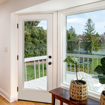
Utility room - large cottage u-shaped vinyl floor and gray floor utility room idea in Oklahoma City with shaker cabinets, white cabinets, wood countertops, gray walls and a side-by-side washer/dryer
Utility room - large cottage u-shaped vinyl floor and gray floor utility room idea in Oklahoma City with shaker cabinets, white cabinets, wood countertops, gray walls and a side-by-side washer/dryer
Sponsored
Plain City, OH

Kuhns Contracting, Inc.
Central Ohio's Trusted Home Remodeler Specializing in Kitchens & Baths
 Distinctive Design + Build + Remodel
The existing deck on this home was rotting and was a place the homeowner’s avoided rather than enjoyed. They thought about adding a screened porch but didn’t want to obscure their view of the golf course. The solution: we installed elegant Mosquito Curtains which can be easily opened or closed as needed. The new pergola and deck are made from low-maintenance Fiberon Horizon deck boards, Duralife railings and Fypon column wraps. None of those products require painting! For a touch of natural beauty – the rafters are cedar which has been clear coated. Finally - this is a favorite gathering spot for this family. Photo: Erin Dougherty
 Treefrog Design
Amy Birrer
The kitchen pictured here is in a turn of the century home that still uses the original stove from the 1930’s to heat, cook and bake. The porcelain sink with drain boards are also originals still in use from the 1950’s. The idea here was to keep the original appliances still in use while increasing the storage and work surface space. Although the kitchen is rather large it has many of the issues of an older house in that there are 4 integral entrances into the kitchen, none of which could be rerouted or closed off. It also needed to encompass in-kitchen eating and a space for a dishwasher. The fully integrated dishwasher is raised off the floor and sits on ball and claw feet giving it the look of a freestanding piece of furniture. Elevating a dishwasher is a great way to avoid the constant bending over associated with loading and unloading dishes. The cabinets were designed to resemble an antique breakfront in keeping with the style and age of the house.

35