
Search results for "Beautiful strategy" in Home Design Ideas

 Kitchen Magic
The homeowners wanted a stylish new kitchen, inclusive of new cabinets, countertops and backsplash. They requested that we upgrade their builder’s grade cabinets to a brighter white kitchen. Acquire a whole new look with new cabinets in Madison style doors and drawer. Build quality, custom cabinets with a sophisticated look and feel. The creamy white Colourtone doors have Coffee glaze offset the stark white look beautifully. The new kitchen’s color and style design is inviting and enriches the home’s overall décor.
We created a kitchen showplace that the homeowners could be proud by incorporating design details that would make their kitchen unique
1. Installed new cabinets, doors, drawers, glass fronts, cabinet details, tile backsplash and flip open basement windows. Used light colors to brighten up the space.
2. Additions of interior storage and a custom wine rack to maximize storage and functionality. This would also assist while entertaining guests.
3. Stay within budget: The Designer’s strategy to install new cabinets while staying within budget would be challenge however, we gave them end- of-year discounts to help with the costs. We wanted to give the homeowners the beautiful kitchen they always wanted
Photographer: David Glasofer


 Greenbuilders, Inc.
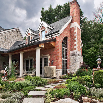
This luxurious patio was created from locally available bluestone, perfectly integrated with the screen porch, (see interior shot above) allowing for a lovely flow from inside to outside. This flow seamlessly continues via a lighted stone pathway through a wooded area that connects the patio to the parking area.
An agile re-design quickly evolved as Greenbuilders worked in concert with architect Laurie Stubb to actualize a design inspired by a visit to a local stone yard, where we saw beautiful local bluestone "steppers" -- massive slabs of natural "live-edge" stone, which we modified just a little for graceful, natural steps. The resulting design complements the style of the house and neighborhood and plays perfectly with the natural setting and landscaping. The connecting wooden deck was constructed from sustainably harvested ipe wood and requires no environmentally harmful preservative treatment.
The permeable patio along with smart grading, plantscaping, an extensive vegetative swale, and water management strategies quickly and efficiently solved the site’s significant stormwater runoff issues. Turning what was once a mud puddle into a stunning and inviting outdoor space, it was common for the neighbors to stop by admire and cheer on the work!
Find the right local pro for your project

 alairhomesdecatur
Jeff Herr Photography
Transitional u-shaped light wood floor open concept kitchen photo in Atlanta with medium tone wood cabinets and an island
Transitional u-shaped light wood floor open concept kitchen photo in Atlanta with medium tone wood cabinets and an island

 John Webb Construction and Design
This countryside farmhouse was remodeled and added on to by removing an interior wall separating the kitchen from the dining/living room, putting an addition at the porch to extend the kitchen by 10', installing an IKEA kitchen cabinets and custom built island using IKEA boxes, custom IKEA fronts, panels, trim, copper and wood trim exhaust wood, wolf appliances, apron front sink, and quartz countertop. The bathroom was redesigned with relocation of the walk-in shower, and installing a pottery barn vanity. the main space of the house was completed with luxury vinyl plank flooring throughout. A beautiful transformation with gorgeous views of the Willamette Valley.


 Olamar Interiors
This condo in Sterling, VA belongs to a couple about to enter into retirement. They own this home in Sterling, along with a weekend home in West Virginia, a vacation home on Emerald Isle in North Carolina and a vacation home in St. John. They want to use this home as their "home-base" during their retirement, when they need to be in the metro area for business or to see family. The condo is small and they felt it was too "choppy," it didn't have good flow and the rooms were too separated and confined. They wondered if it could have more of an open concept feel but were doubtful due to the size and layout of the home. The furnishings they owned from their previous home were very traditional and heavy. They wanted a much lighter, more open and more contemporary feel to this home. They wanted it to feel clean, light, airy and much bigger then it is.
The first thing we tackled was an unsightly, and very heavy stone veneered fireplace wall that separated the family room from the office space. It made both rooms look heavy and dark. We took down the stone and opened up parts of the wall so that the two spaces would flow into each other.
We added a view thru fireplace and gave the fireplace wall a faux marble finish to lighten it and make it much more contemporary. Glass shelves bounce light and keep the wall feeling light and streamlined. Custom built ins add hidden storage and make great use of space in these small rooms.
Our strategy was to open as much as possible and to lighten the space through the use of color, fabric and glass. New furnishings in lighter colors and soft textures help keep the feeling light and modernize the space. Sheer linen draperies soften the hard lines and add to the light, airy feel. Tinius Photography
Sponsored
Columbus, OH

Structural Remodeling
Franklin County's Heavy Timber Specialists | Best of Houzz 2020!

 Versa Style Design
The client wanted to have a modern, bright open-plan space with updated colours, finishes, furniture and lighting in a fresher style. We created plans and recommended storage strategies in the rest of the home so the main living area would be free of clutter and elegant enough for entertaining. The bright colour palette of white and warm greys blends beautifully with the wood elements. The chrome lighting and reflective silver mirror add bling and visual interest to the room. The white sheer curtain adds softness and the final touch.
Materials used:
Wood dining table, modern white leather chairs, black and white trellis dining room curtains, white and chrome light suspension with crystal, hardwood floors, modern chrome tripod floor lamp, dark purple chaise longue, sheer white living room curtains, white lacquer and wood media unit, grey fabric storage ottoman, spotlight-style tripod lamp.
 Versa Style Design
The client wanted to have a modern, bright open-plan space with updated colours, finishes, furniture and lighting in a fresher style. We created plans and recommended storage strategies in the rest of the home so the main living area would be free of clutter and elegant enough for entertaining. The bright colour palette of white and warm greys blends beautifully with the wood elements. The chrome lighting and reflective silver mirror add bling and visual interest to the room. The white sheer curtain adds softness and the final touch.
Materials used:
Wood dining table, modern white leather chairs, black and white trellis dining room curtains, white and chrome light suspension with crystal, hardwood floors, modern chrome tripod floor lamp, dark purple chaise longue, sheer white living room curtains, white lacquer and wood media unit, grey fabric storage ottoman, spotlight-style tripod lamp.
 Versa Style Design
The client wanted to have a modern, bright open-plan space with updated colours, finishes, furniture and lighting in a fresher style. We created plans and recommended storage strategies in the rest of the home so the main living area would be free of clutter and elegant enough for entertaining. The bright colour palette of white and warm greys blends beautifully with the wood elements. The chrome lighting and reflective silver mirror add bling and visual interest to the room. The white sheer curtain adds softness and the final touch.
Materials used:
Wood dining table, modern white leather chairs, black and white trellis dining room curtains, white and chrome light suspension with crystal, hardwood floors, modern chrome tripod floor lamp, dark purple chaise longue, sheer white living room curtains, white lacquer and wood media unit, grey fabric storage ottoman, spotlight-style tripod lamp.
 Versa Style Design
The client wanted to have a modern, bright open-plan space with updated colours, finishes, furniture and lighting in a fresher style. We created plans and recommended storage strategies in the rest of the home so the main living area would be free of clutter and elegant enough for entertaining. The bright colour palette of white and warm greys blends beautifully with the wood elements. The chrome lighting and reflective silver mirror add bling and visual interest to the room. The white sheer curtain adds softness and the final touch.
Materials used:
Wood dining table, modern white leather chairs, black and white trellis dining room curtains, white and chrome light suspension with crystal, hardwood floors, modern chrome tripod floor lamp, dark purple chaise longue, sheer white living room curtains, white lacquer and wood media unit, grey fabric storage ottoman, spotlight-style tripod lamp.
 Kitchen Magic
The homeowners wanted a stylish new kitchen, inclusive of new cabinets, countertops and backsplash. They requested that we upgrade their builder’s grade cabinets to a brighter white kitchen. Acquire a whole new look with new cabinets in Madison style doors and drawer. Build quality, custom cabinets with a sophisticated look and feel. The creamy white Colourtone doors have Coffee glaze offset the stark white look beautifully. The new kitchen’s color and style design is inviting and enriches the home’s overall décor.
We created a kitchen showplace that the homeowners could be proud by incorporating design details that would make their kitchen unique
1. Installed new cabinets, doors, drawers, glass fronts, cabinet details, tile backsplash and flip open basement windows. Used light colors to brighten up the space.
2. Additions of interior storage and a custom wine rack to maximize storage and functionality. This would also assist while entertaining guests.
3. Stay within budget: The Designer’s strategy to install new cabinets while staying within budget would be challenge however, we gave them end- of-year discounts to help with the costs. We wanted to give the homeowners the beautiful kitchen they always wanted
Photographer: David Glasofer

 Anthill Studio
Vancouver's Telus World of Science approached us for partnership in realizing their vision of a highly engaging learn-through-play space, The Wonder Gallery. Their thorough preparation for this new area - for children in their budding developmental years (0-5yrs) - meant that special and varied requirements were critical in successfully fulfilling their design mandate. Collaboration with a diverse roster of professionals helped us to achieve this.
The project's intentions and safety considerations underpinned our process in realizing the beautifully interactive Wonder Gallery. To ensure safe, tactile play, we considered specifics such as corner and surface treatments, material durability and compatibility, and hygiene. Colourful inlays, solid hardwoods, and lasting non-toxic and easily repairable finishes were some strategies we implemented to make this a project with our hallmark Anthill characteristics.
This complex space debuted in the Spring of 2017 to great success. Caregivers, kids, and staff alike have provided resoundingly positive feedback. We were left enthusiastic for future collaborations with the wonderfully creative Science World team.



 River Valley Landscapes
Blending contemporary forms and lush plantings, this Garden maximizes the sensory experience of the materials and planting from inside and outside the home. The garden occupies an interior courtyard framed by four interior walls. The home, designed by Architect Cliff May was built in 1948 and the following year was featured in House Beautiful Magazine. The clients list of needs and desires was brief. They wanted a space that would complement the mid century modern home and provide visual interest from inside the home. Some form of water was also requested. They had a budget of $30,000. In order to stay within their budget the clients performed the demolition of the old garden. The designer’s intent was to create a garden that would possess a clear sculptural quality and would be as visually striking from inside the home as it would be from inside the courtyard. The strategy behind the design was to use hardscape materials characterized by simple geometric forms and a planting palette that would emphasize form over color, and then to arrange the materials to achieve an interpretation of modern aesthetic.
The views from inside the homes three main living rooms present the garden as a graphic composition of space, hardscape materials and planting. Inside the courtyard the edges are defined by stone and planting. The floor is composed of rectangular slabs of Teakwood flagstone with a counterpoint of Mexican beach pebbles set within the joints and around the edges. Concrete along the edges of the Teakwood pads reduces migration of the modified stone and sand base. The contrast of the Mexican beach pebbles accentuates the pattern of the flagstone. The outside perimeter of the pebbles is contained with low profile edging. An existing catch drain was utilized for storm water runoff. A concrete block pier set on a concrete footing is covered with black stucco and provides a perch for a custom made copper bowl that circulates water into the L shaped water feature. The water features subterranean basin is constructed of pressure treated wood with a custom box liner insert. Since the Teakwood flagstone was unavailable as coping for the water feature, the designer chose Shawnee Buff stone to complement the Teakwood flagstone. The subtle sound of water spilling from the copper bowl and the reflective qualities of the water help to create an atmosphere of relaxation. The planting is composed of shades of green with white flowers in order to accentuate the graphic design. ‘Justin Brouwer’ Boxwood, ‘Sum and Substance’ Hosta, white Anemones, black bamboo and ornamental grasses contrast dramatically with the clean lines of the hardscape elements. The black bamboo is set in 30” diameter concrete containers to control the vigorous plant from spreading.
The construction of the interior courtyard space challenged the building team. They set up baffles between the front door and the door to the courtyard as well as temporary protection over the floor to allow the process to move forward without too much disturbance to the client’s lives. All of the materials were shuffled through the temporary portal.
The clients love the space and recently said that “the design is so well thought out and simple that they would never get tired of it.” The designs sculptural quality compliments the modern feel of the home and creates a sublime yet dramatic view from within the house or within the courtyard. The clients plan to purchase two black Bertoia Diamond chairs with red cushions which should perfectly integrate with the space.


 Michael Nash Design, Build & Homes
2011 NATIONAL NARI COTY SOUTHEAST REGIONAL AWARD
This family of four living in a 1987 brick colonial had to make dramatic changes now that their 85 years old grandmother was about to move in. They needed a mother-in-law suite complete with bathroom facilities to meet her needs. Because they were remodeling anyway, they decided to overhaul the rest of the home to create the house they have always dreamed about, including a grand two-story entry.
Starting in the basement, the homeowner added a home theatre room, added storage and a larger bathroom. Hard wood floors and a new stairway were also added.
The main level boasts the new two-story entry foyer. To its left is the mother-in-law suite with a large front bay window and its own walk-in closet and private bath. The bath is furnished with a walk-in jetted tub and aging-in-place accessories. Other first floor highlights include a music room and gourmet kitchen.
Kitchen amenities the client always wanted were added, including a large center island, extended cabinets, double layered crown molding, exotic granite top and wide board mahogany floors throughout entire first floor.
The entire second floor and stairs going up were reconfigured too. The master bedroom is larger with a new tray ceiling and recess lights. The new walk- in closet is now adjacent to the master bath instead of being across the room. The master bathroom was totally gutted and re-positioned. It includes an enlarged shower with bench and frameless shower door, toilet hidden behind a closet and new whirlpool surround with beautiful travertine tile and long double vanity space.
This new renovation is truly a testament to the possibilities of aging-in-place remodeling strategies. Three generations are now living comfortably in this home.
Sponsored
Columbus, OH
Structural Remodeling
Franklin County's Heavy Timber Specialists | Best of Houzz 2020!
 Robert M. Cain, Architect
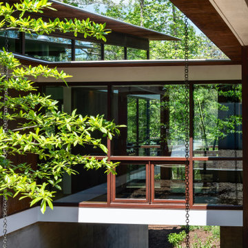
Holly Hill, a retirement home, whose owner's hobbies are gardening and restoration of classic cars, is nestled into the site contours to maximize views of the lake and minimize impact on the site.
Holly Hill is comprised of three wings joined by bridges: A wing facing a master garden to the east, another wing with workshop and a central activity, living, dining wing. Similar to a radiator the design increases the amount of exterior wall maximizing opportunities for natural ventilation during temperate months.
Other passive solar design features will include extensive eaves, sheltering porches and high-albedo roofs, as strategies for considerably reducing solar heat gain.
Daylighting with clerestories and solar tubes reduce daytime lighting requirements. Ground source geothermal heat pumps and superior to code insulation ensure minimal space conditioning costs. Corten steel siding and concrete foundation walls satisfy client requirements for low maintenance and durability. All light fixtures are LEDs.
Open and screened porches are strategically located to allow pleasant outdoor use at any time of day, particular season or, if necessary, insect challenge. Dramatic cantilevers allow the porches to project into the site’s beautiful mixed hardwood tree canopy without damaging root systems.
Guest arrive by vehicle with glimpses of the house and grounds through penetrations in the concrete wall enclosing the garden. One parked they are led through a garden composed of pavers, a fountain, benches, sculpture and plants. Views of the lake can be seen through and below the bridges.
Primary client goals were a sustainable low-maintenance house, primarily single floor living, orientation to views, natural light to interiors, maximization of individual privacy, creation of a formal outdoor space for gardening, incorporation of a full workshop for cars, generous indoor and outdoor social space for guests and parties.

 The Brooklyn Studio
This residence was a complete gut renovation of a 4-story row house in Park Slope, and included a new rear extension and penthouse addition. The owners wished to create a warm, family home using a modern language that would act as a clean canvas to feature rich textiles and items from their world travels. As with most Brooklyn row houses, the existing house suffered from a lack of natural light and connection to exterior spaces, an issue that Principal Brendan Coburn is acutely aware of from his experience re-imagining historic structures in the New York area. The resulting architecture is designed around moments featuring natural light and views to the exterior, of both the private garden and the sky, throughout the house, and a stripped-down language of detailing and finishes allows for the concept of the modern-natural to shine.
Upon entering the home, the kitchen and dining space draw you in with views beyond through the large glazed opening at the rear of the house. An extension was built to allow for a large sunken living room that provides a family gathering space connected to the kitchen and dining room, but remains distinctly separate, with a strong visual connection to the rear garden. The open sculptural stair tower was designed to function like that of a traditional row house stair, but with a smaller footprint. By extending it up past the original roof level into the new penthouse, the stair becomes an atmospheric shaft for the spaces surrounding the core. All types of weather – sunshine, rain, lightning, can be sensed throughout the home through this unifying vertical environment. The stair space also strives to foster family communication, making open living spaces visible between floors. At the upper-most level, a free-form bench sits suspended over the stair, just by the new roof deck, which provides at-ease entertaining. Oak was used throughout the home as a unifying material element. As one travels upwards within the house, the oak finishes are bleached to further degrees as a nod to how light enters the home.
The owners worked with CWB to add their own personality to the project. The meter of a white oak and blackened steel stair screen was designed by the family to read “I love you” in Morse Code, and tile was selected throughout to reference places that hold special significance to the family. To support the owners’ comfort, the architectural design engages passive house technologies to reduce energy use, while increasing air quality within the home – a strategy which aims to respect the environment while providing a refuge from the harsh elements of urban living.
This project was published by Wendy Goodman as her Space of the Week, part of New York Magazine’s Design Hunting on The Cut.
Photography by Kevin Kunstadt
 Nautilus Homes
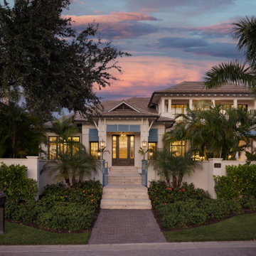
Framed by mature trees and nestled within Sarasota’s historic McClellan Park, Sunset Place is a home shaped by a deep understanding of, and sensibility for, its setting—reflecting the charm of the neighborhood, the rhythm of downtown living, and the client’s vision of entertaining, connection, and family life. Every decision—from site strategy to spatial flow—was made with intention: to support a lifestyle centered on warmth, community, and a strong sense of place.
At its core, the project is a masterclass in leveraging zoning and code to unlock the full potential of a complex site. Though landlocked, the home lives like waterfront—offering openness, privacy, and expansive sunset views. Placing the pool in the front yard, within the 25-foot setback, redefines the entry experience. It captures the western light and sets a relaxed, resort-like tone from the very first step inside the gate. Paired with a rear-loaded garage, accessed discreetly via the side setback, the layout transforms the site’s limitations into its greatest assets. Architecture and landscape take center stage, while the full buildable envelope is maximized without compromise.
A natural rise of eight feet from front to back—rare in Sarasota—was embraced as an opportunity. Site walls function as both retaining structures and architectural elements, elevating the pool terrace and entry by over four feet to align with the main interior floor level. The result is a fluid connection between indoors and out: kitchen, dining, and living spaces unfold onto the terrace, blurring boundaries and enhancing everyday rituals as well as social gatherings.
Architecturally, the home is coastal contemporary: open yet composed, airy yet grounded. Clarity in the massing tells a story of the inhabitants from the first glance, while the interior planning offers spatial generosity and ease. The interiors echo this sensibility with a palette that is soft, natural, and tactile—serene without being neutral. The landscape design provides a lush tropical frame, softening edges and reinforcing privacy through layered plantings rather than enclosure.
Ultimately, Sunset Place is not defined by any single gesture, but by the way the home reflects its owners. Their gracious, family-centered nature informed every layer of design—resulting in a space that feels deeply personal, tailored for connection and ease, and perfectly suited for gathering, unwinding, and watching the sun slip behind the trees from the comfort of home.
16