
Search results for "Because" in Home Design Ideas

 FineLine Kitchens, Inc.
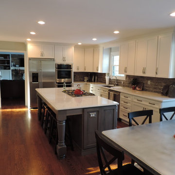
Hi everyone, I'm Sarah and Ogun we are here with fine line kitchens. So we are a couple working together. I do the interior design and remodeling of the space material selection meeting with the clients. And I handled operations outside, you know meaning all the construction work that is taking place the inside. The houses that we work in. I handle all the aspects of the construction, so today's project is very special. We're in Vienna and the client had a very big family. It's a family of seven that lives here. So we had a few aspects that we needed to keep in mind while designing this one. Having everybody be able to sit on the island. So we wanted plenty of seating all the way around. We didn't want anybody standing or anything like that. So what we did is we maximize the space. The center island is the biggest part of the kitchen. We use a natural stone to kind of give it a beautiful texture versus quartz. It's kind of standard white or kind of fabricated, so I wanted something very natural. We did this because I took my inspiration from the outside, so the inspiration if you look at the view right in front of me is there are so many greens there's a lot of brass accents and I wanted to bring this. Into this kitchen while designing it for my clients. She is very warm very. She wanted a very homey, comfy kind of look for the kitchen. So that's what we did today. As you can see, the cabinets are sage green, very light, so I still think it's a neutral, but it's a lighter color that again brings the outside in and we combine that with the oak right behind me so it's a slightly warm oak. It's not very dark. It's not very light. It's a medium brown and the same color went on the island. To kind of tie these two in and the backsplash, my favorite part is where you can see a little bit of design. It is, in my opinion still classic, but includes a pattern so the outside part is as we said in the beginning, is handled by my husband. I'd like him to speak a little bit about that. Thanks, Sarah, I want to talk to you guys a little bit about the construction part of this project. Originally this kitchen was located mostly in this area. They had their stove there sing. It was more of a peninsula layout in Sarah's and the customer vision they wanted. They wanted to get rid of the peninsula and they want to be able to have a huge island that can at least sit seven people because they're familiar with seven. So we wanted to make sure that we can achieve this design and bring it to life so that they can be happy with this layout. Some of the challenges we had, the house, the home being, you know, old home. There were a lot of you know the older electrical and plumbing that had to be replaced. We had to relocate the stove from here to this area. Over here we had put a nice foot fan that we had to relocate all the ductwork and the plumbing. Was being on the peninsula area. We had to relocate it to the center islands. So we achieved all this and kind of like bring it to bring in this kitchen up to date it looks beautiful. That's true, so yes, the old layout did not function for my clients because everything was kind of gathered on one side of the kitchen. So there was like a peninsula right there. So the end of this island kind of continued straight. And that was just the L shape. Kind of where everything was and there used to be another big table here, so they were using only kind of half of the space. So like I said at the beginning, our vision was to kind of feed everybody at the island, create some symmetry. 'cause I love that. So as you can see behind me, this is kind of the focal point symmetrical. Everything is kind of even we wanted to also panel the fridge here so it mimics the pantry and another size. So when you're looking at it, it is bringing again that symmetry back again. I hope you enjoyed this kitchen and this video and I'll see you soon. So how do you think this project turned out? It's nice. I like the color. I think it turned out nice. It's kind of like a little bit different color than what we always do. So I realize. Are you giving me a little bit of credit here that I did something different? Are you proud? I'm so proud of you. Other than that I like it. That they have kind of like a two sink. So if this was our kitchen, if we ever like you can have your own. I can have mine if we ever get into a fight then this can be like my own kitchen. Why are we gonna bring in a fight right now? So I'm cooking anyway. You're grilling most of the time, So what are you even talking about? My kitchen? That's my kitchen. You can just take the small sink. That's fine. It's always good to have your own space right there, so anyways. Thank you guys for watching. We hope to see you soon and if you have any questions please click the link below. It'll lead you to our website, house, YouTube and all of the social media is so nice to have you guys. We'll see you soon. Thanks bye bye-bye.
 FineLine Kitchens, Inc.
Hi everyone, I'm Sarah and Ogun we are here with fine line kitchens. So we are a couple working together. I do the interior design and remodeling of the space material selection meeting with the clients. And I handled operations outside, you know meaning all the construction work that is taking place the inside. The houses that we work in. I handle all the aspects of the construction, so today's project is very special. We're in Vienna and the client had a very big family. It's a family of seven that lives here. So we had a few aspects that we needed to keep in mind while designing this one. Having everybody be able to sit on the island. So we wanted plenty of seating all the way around. We didn't want anybody standing or anything like that. So what we did is we maximize the space. The center island is the biggest part of the kitchen. We use a natural stone to kind of give it a beautiful texture versus quartz. It's kind of standard white or kind of fabricated, so I wanted something very natural. We did this because I took my inspiration from the outside, so the inspiration if you look at the view right in front of me is there are so many greens there's a lot of brass accents and I wanted to bring this. Into this kitchen while designing it for my clients. She is very warm very. She wanted a very homey, comfy kind of look for the kitchen. So that's what we did today. As you can see, the cabinets are sage green, very light, so I still think it's a neutral, but it's a lighter color that again brings the outside in and we combine that with the oak right behind me so it's a slightly warm oak. It's not very dark. It's not very light. It's a medium brown and the same color went on the island. To kind of tie these two in and the backsplash, my favorite part is where you can see a little bit of design. It is, in my opinion still classic, but includes a pattern so the outside part is as we said in the beginning, is handled by my husband. I'd like him to speak a little bit about that. Thanks, Sarah, I want to talk to you guys a little bit about the construction part of this project. Originally this kitchen was located mostly in this area. They had their stove there sing. It was more of a peninsula layout in Sarah's and the customer vision they wanted. They wanted to get rid of the peninsula and they want to be able to have a huge island that can at least sit seven people because they're familiar with seven. So we wanted to make sure that we can achieve this design and bring it to life so that they can be happy with this layout. Some of the challenges we had, the house, the home being, you know, old home. There were a lot of you know the older electrical and plumbing that had to be replaced. We had to relocate the stove from here to this area. Over here we had put a nice foot fan that we had to relocate all the ductwork and the plumbing. Was being on the peninsula area. We had to relocate it to the center islands. So we achieved all this and kind of like bring it to bring in this kitchen up to date it looks beautiful. That's true, so yes, the old layout did not function for my clients because everything was kind of gathered on one side of the kitchen. So there was like a peninsula right there. So the end of this island kind of continued straight. And that was just the L shape. Kind of where everything was and there used to be another big table here, so they were using only kind of half of the space. So like I said at the beginning, our vision was to kind of feed everybody at the island, create some symmetry. 'cause I love that. So as you can see behind me, this is kind of the focal point symmetrical. Everything is kind of even we wanted to also panel the fridge here so it mimics the pantry and another size. So when you're looking at it, it is bringing again that symmetry back again. I hope you enjoyed this kitchen and this video and I'll see you soon. So how do you think this project turned out? It's nice. I like the color. I think it turned out nice. It's kind of like a little bit different color than what we always do. So I realize. Are you giving me a little bit of credit here that I did something different? Are you proud? I'm so proud of you. Other than that I like it. That they have kind of like a two sink. So if this was our kitchen, if we ever like you can have your own. I can have mine if we ever get into a fight then this can be like my own kitchen. Why are we gonna bring in a fight right now? So I'm cooking anyway. You're grilling most of the time, So what are you even talking about? My kitchen? That's my kitchen. You can just take the small sink. That's fine. It's always good to have your own space right there, so anyways. Thank you guys for watching. We hope to see you soon and if you have any questions please click the link below. It'll lead you to our website, house, YouTube and all of the social media is so nice to have you guys. We'll see you soon. Thanks bye bye-bye.
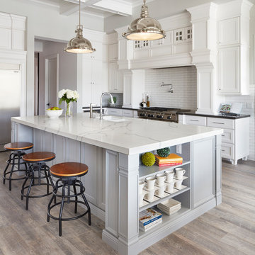
 Arizona Tile
Della Terra is a natural quartz surface, it is a blend of nature and technology, combining beauty and functionality in a high performance surface. Della Terra is comprised of more than 93% natural quartz crystals, one of the hardest minerals in nature. Color controlled quartz is blended together with technologically advanced polymers. Because of its high quartz content, Arizona Tile's Della Terra Quartz surfaces are ultra-durable and resistant to scratches and chipping. Its dense composition also makes Della Terra Quartz highly resistant to staining.
Photo: Aperture Architectural Images
Find the right local pro for your project
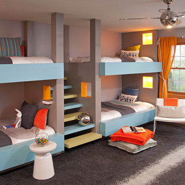
 INVIEW Interior Design
Bunkhouse - an ultimate space for sleep-overs and fun hang-out times.
Photography: Jon Huelskamp
Example of a trendy gray floor and carpeted playroom design in Minneapolis with gray walls
Example of a trendy gray floor and carpeted playroom design in Minneapolis with gray walls

 Liz Schupanitz Designs
Cooking for Two
Location: Plymouth, MN, United States
When this couple’s last child graduated from college they began the process of looking for a new home. After a lengthy search they decided to stay with the neighborhood they loved, saving money by remodeling rather than starting over.
The top priorities on their wish list were adding character to their 1990’s era home with a classic white kitchen and a larger island while keeping within the existing footprint. With the intention of honing their cooking skills, they were also considering better appliances and two ovens.
Challenges and Solutions
Design a larger island with seating for at least two. The existing island was small and the area behind the seating was less than recommended clearances.
To solve this challenge, the seating area of the island was extended out into the open area of the kitchen. This created a larger island with seating for three, extra storage and a bookshelf across from the range.
The original kitchen had a range with microwave above, so adding another oven was a challenge with limited wall space.
Because the adjoining dining room is used infrequently, the homeowner was open to placing the second oven and microwave in the walkway. This made room for the small buffet between the built in refrigerator and ovens, creating one of her favorite areas.
The client requested a white painted kitchen but wanted to make sure it had warmth and character. To achieve this the following elements were chosen:
1) Cabinets painted with Benjamin Moore Capitol White, a luminous and warm shade of white.
2) The Range hood was painted with warm metallic shades to reflect the bronze of the Ashley Norton hardware.
3) Black Aqua Grantique granite was chosen for countertops because it looks like soapstone and adds contrast.
4) Walker Zanger Café tile in Latte was chosen for it’s handmade look with uneven edges.
5) The to-the-counter-cabinet with glass door shows off serving dishes and lends sophisticated charm.
The result is a welcoming classic kitchen, where this couple enjoys cooking more often and sharpening their skills with gourmet appliances.
Liz Schupanitz Designs
Photographed by: Andrea Rugg Photography

 FineLine Kitchens, Inc.
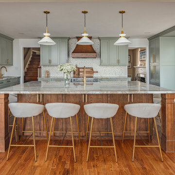
Hi everyone, I'm Sarah and Ogun we are here with fine line kitchens. So we are a couple working together. I do the interior design and remodeling of the space material selection meeting with the clients. And I handled operations outside, you know meaning all the construction work that is taking place the inside. The houses that we work in. I handle all the aspects of the construction, so today's project is very special. We're in Vienna and the client had a very big family. It's a family of seven that lives here. So we had a few aspects that we needed to keep in mind while designing this one. Having everybody be able to sit on the island. So we wanted plenty of seating all the way around. We didn't want anybody standing or anything like that. So what we did is we maximize the space. The center island is the biggest part of the kitchen. We use a natural stone to kind of give it a beautiful texture versus quartz. It's kind of standard white or kind of fabricated, so I wanted something very natural. We did this because I took my inspiration from the outside, so the inspiration if you look at the view right in front of me is there are so many greens there's a lot of brass accents and I wanted to bring this. Into this kitchen while designing it for my clients. She is very warm very. She wanted a very homey, comfy kind of look for the kitchen. So that's what we did today. As you can see, the cabinets are sage green, very light, so I still think it's a neutral, but it's a lighter color that again brings the outside in and we combine that with the oak right behind me so it's a slightly warm oak. It's not very dark. It's not very light. It's a medium brown and the same color went on the island. To kind of tie these two in and the backsplash, my favorite part is where you can see a little bit of design. It is, in my opinion still classic, but includes a pattern so the outside part is as we said in the beginning, is handled by my husband. I'd like him to speak a little bit about that. Thanks, Sarah, I want to talk to you guys a little bit about the construction part of this project. Originally this kitchen was located mostly in this area. They had their stove there sing. It was more of a peninsula layout in Sarah's and the customer vision they wanted. They wanted to get rid of the peninsula and they want to be able to have a huge island that can at least sit seven people because they're familiar with seven. So we wanted to make sure that we can achieve this design and bring it to life so that they can be happy with this layout. Some of the challenges we had, the house, the home being, you know, old home. There were a lot of you know the older electrical and plumbing that had to be replaced. We had to relocate the stove from here to this area. Over here we had put a nice foot fan that we had to relocate all the ductwork and the plumbing. Was being on the peninsula area. We had to relocate it to the center islands. So we achieved all this and kind of like bring it to bring in this kitchen up to date it looks beautiful. That's true, so yes, the old layout did not function for my clients because everything was kind of gathered on one side of the kitchen. So there was like a peninsula right there. So the end of this island kind of continued straight. And that was just the L shape. Kind of where everything was and there used to be another big table here, so they were using only kind of half of the space. So like I said at the beginning, our vision was to kind of feed everybody at the island, create some symmetry. 'cause I love that. So as you can see behind me, this is kind of the focal point symmetrical. Everything is kind of even we wanted to also panel the fridge here so it mimics the pantry and another size. So when you're looking at it, it is bringing again that symmetry back again. I hope you enjoyed this kitchen and this video and I'll see you soon. So how do you think this project turned out? It's nice. I like the color. I think it turned out nice. It's kind of like a little bit different color than what we always do. So I realize. Are you giving me a little bit of credit here that I did something different? Are you proud? I'm so proud of you. Other than that I like it. That they have kind of like a two sink. So if this was our kitchen, if we ever like you can have your own. I can have mine if we ever get into a fight then this can be like my own kitchen. Why are we gonna bring in a fight right now? So I'm cooking anyway. You're grilling most of the time, So what are you even talking about? My kitchen? That's my kitchen. You can just take the small sink. That's fine. It's always good to have your own space right there, so anyways. Thank you guys for watching. We hope to see you soon and if you have any questions please click the link below. It'll lead you to our website, house, YouTube and all of the social media is so nice to have you guys. We'll see you soon. Thanks bye bye-bye.

 Organized Living
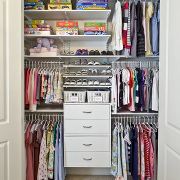
Organized Living freedomRail kids closet. This system grows with your child's needs - from infant to teen. Shelves and brackets adjust instantly without tools. Start with triple hang space for infants and toddlers then change to double hang and long hang later as they grow. See more kid's closet designs at http://organizedliving.com/home/get-inspired/areas-of-the-home/kid-closet
 Tyler Engle Architects PS
Ben Benschneider
Staircase - contemporary wooden staircase idea in Seattle with metal risers
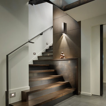
Staircase - contemporary wooden staircase idea in Seattle with metal risers
 Mark Lewis Art ™
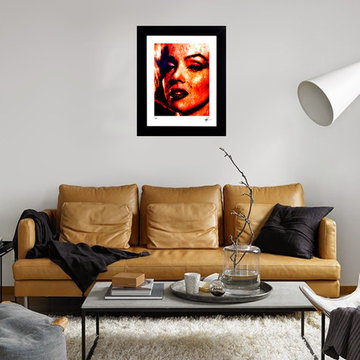
This is a collection of Marilyn Monroe art print installations by artist Mark Lewis. Lewis is a living descendant of Denton Cy Young for which the "Cy" Young pitching award in Major League baseball was created. When one views the work of Mark Lewis, it isn’t “viewing art” like every art critic has dryly gone about doing for years. His work is immersive and passionate. It draws you in and his palette’s diversity gives way for a broad demographic reach. Bold strokes and unexpected color choices epitomize his portrait collection of actors, actresses, and pop culture icons from the 1920s through today.
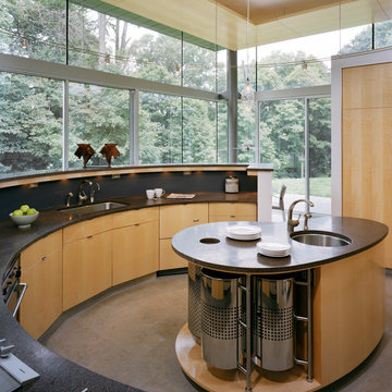
 Studio Hillier
Eat-in kitchen - large contemporary u-shaped marble floor, gray floor and wood ceiling eat-in kitchen idea in Philadelphia with an undermount sink, flat-panel cabinets, light wood cabinets, black backsplash, an island, solid surface countertops, stone tile backsplash and black appliances
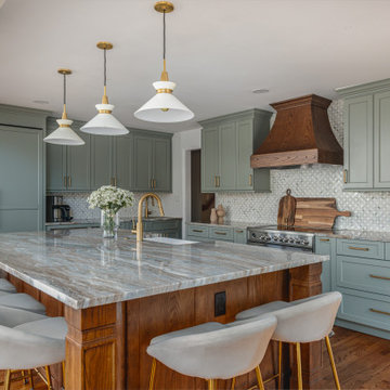 FineLine Kitchens, Inc.
Hi everyone, I'm Sarah and Ogun we are here with fine line kitchens. So we are a couple working together. I do the interior design and remodeling of the space material selection meeting with the clients. And I handled operations outside, you know meaning all the construction work that is taking place the inside. The houses that we work in. I handle all the aspects of the construction, so today's project is very special. We're in Vienna and the client had a very big family. It's a family of seven that lives here. So we had a few aspects that we needed to keep in mind while designing this one. Having everybody be able to sit on the island. So we wanted plenty of seating all the way around. We didn't want anybody standing or anything like that. So what we did is we maximize the space. The center island is the biggest part of the kitchen. We use a natural stone to kind of give it a beautiful texture versus quartz. It's kind of standard white or kind of fabricated, so I wanted something very natural. We did this because I took my inspiration from the outside, so the inspiration if you look at the view right in front of me is there are so many greens there's a lot of brass accents and I wanted to bring this. Into this kitchen while designing it for my clients. She is very warm very. She wanted a very homey, comfy kind of look for the kitchen. So that's what we did today. As you can see, the cabinets are sage green, very light, so I still think it's a neutral, but it's a lighter color that again brings the outside in and we combine that with the oak right behind me so it's a slightly warm oak. It's not very dark. It's not very light. It's a medium brown and the same color went on the island. To kind of tie these two in and the backsplash, my favorite part is where you can see a little bit of design. It is, in my opinion still classic, but includes a pattern so the outside part is as we said in the beginning, is handled by my husband. I'd like him to speak a little bit about that. Thanks, Sarah, I want to talk to you guys a little bit about the construction part of this project. Originally this kitchen was located mostly in this area. They had their stove there sing. It was more of a peninsula layout in Sarah's and the customer vision they wanted. They wanted to get rid of the peninsula and they want to be able to have a huge island that can at least sit seven people because they're familiar with seven. So we wanted to make sure that we can achieve this design and bring it to life so that they can be happy with this layout. Some of the challenges we had, the house, the home being, you know, old home. There were a lot of you know the older electrical and plumbing that had to be replaced. We had to relocate the stove from here to this area. Over here we had put a nice foot fan that we had to relocate all the ductwork and the plumbing. Was being on the peninsula area. We had to relocate it to the center islands. So we achieved all this and kind of like bring it to bring in this kitchen up to date it looks beautiful. That's true, so yes, the old layout did not function for my clients because everything was kind of gathered on one side of the kitchen. So there was like a peninsula right there. So the end of this island kind of continued straight. And that was just the L shape. Kind of where everything was and there used to be another big table here, so they were using only kind of half of the space. So like I said at the beginning, our vision was to kind of feed everybody at the island, create some symmetry. 'cause I love that. So as you can see behind me, this is kind of the focal point symmetrical. Everything is kind of even we wanted to also panel the fridge here so it mimics the pantry and another size. So when you're looking at it, it is bringing again that symmetry back again. I hope you enjoyed this kitchen and this video and I'll see you soon. So how do you think this project turned out? It's nice. I like the color. I think it turned out nice. It's kind of like a little bit different color than what we always do. So I realize. Are you giving me a little bit of credit here that I did something different? Are you proud? I'm so proud of you. Other than that I like it. That they have kind of like a two sink. So if this was our kitchen, if we ever like you can have your own. I can have mine if we ever get into a fight then this can be like my own kitchen. Why are we gonna bring in a fight right now? So I'm cooking anyway. You're grilling most of the time, So what are you even talking about? My kitchen? That's my kitchen. You can just take the small sink. That's fine. It's always good to have your own space right there, so anyways. Thank you guys for watching. We hope to see you soon and if you have any questions please click the link below. It'll lead you to our website, house, YouTube and all of the social media is so nice to have you guys. We'll see you soon. Thanks bye bye-bye.
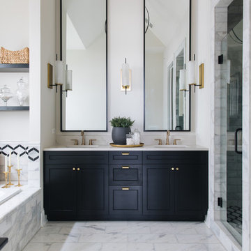
 The Tile Shop
Design by Timber Trails Homes. Photo by Stoffer Photography Interiors.
Inspiration for a transitional master white tile white floor drop-in bathtub remodel in Minneapolis with shaker cabinets, black cabinets, white walls, an undermount sink and white countertops
Inspiration for a transitional master white tile white floor drop-in bathtub remodel in Minneapolis with shaker cabinets, black cabinets, white walls, an undermount sink and white countertops
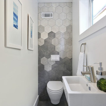
 PROYECTO
Powder room - small modern gray tile powder room idea in San Francisco with a wall-mount toilet, white walls and a wall-mount sink
 Tracy Lynn Studio
Zack Benson Photography
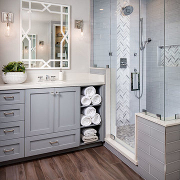
Transitional master gray tile and subway tile medium tone wood floor freestanding bathtub photo in San Diego with gray cabinets, gray walls, an undermount sink and a hinged shower door
Transitional master gray tile and subway tile medium tone wood floor freestanding bathtub photo in San Diego with gray cabinets, gray walls, an undermount sink and a hinged shower door
 Shelf Confident
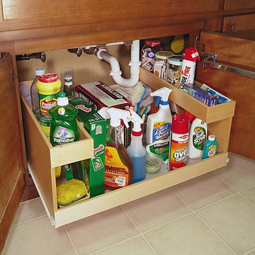
Home design - traditional porcelain tile and gray floor home design idea in Austin with shaker cabinets and medium tone wood cabinets
 Suzanne Nichols Design Group, Inc.
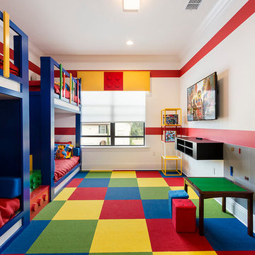
lego room , everything is awesome , lego wall , custom carpet , kids room, bunk beds
Example of a bedroom and mid-sized trendy gender-neutral carpeted and multicolored floor kids' bedroom design in Orlando with multicolored walls
Example of a bedroom and mid-sized trendy gender-neutral carpeted and multicolored floor kids' bedroom design in Orlando with multicolored walls
 SUBU Design Architecture
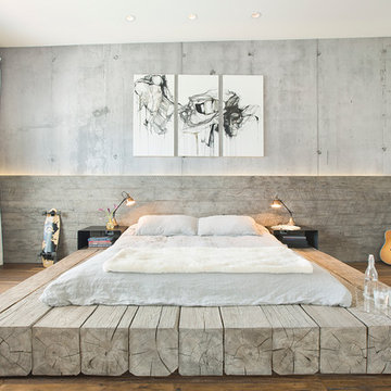
Custom reclaimed log bed with bent blackened steel side tables. Photography by Manolo Langis
Located steps away from the beach, the client engaged us to transform a blank industrial loft space to a warm inviting space that pays respect to its industrial heritage. We use anchored large open space with a sixteen foot conversation island that was constructed out of reclaimed logs and plumbing pipes. The island itself is divided up into areas for eating, drinking, and reading. Bringing this theme into the bedroom, the bed was constructed out of 12x12 reclaimed logs anchored by two bent steel plates for side tables.
 Falcone Homes
Home built by: Falcone Homes.
Interior Design by:
Shawn Falcone & Michele Hybner with Falcone Hybner Design, Inc.
Photo by Amoura Productions
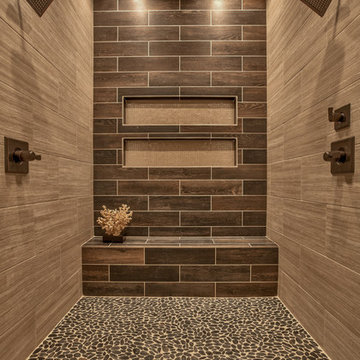
Double shower - transitional brown tile pebble tile floor double shower idea in Omaha
Double shower - transitional brown tile pebble tile floor double shower idea in Omaha
 Barclay Butera Interiors
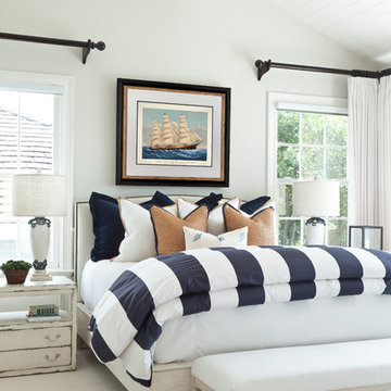
Bedroom - large coastal master carpeted bedroom idea in Orange County with white walls
2