
Search results for "Beneath" in Home Design Ideas
 Eurodale Developments Inc
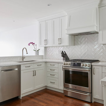
By removing interior walls and installing a structural moment frame, the existing kitchen was transformed to open through to the existing dining room and the new family room addition. Relocating the stair from the basement to the main floor and stacking it beneath the one leading to the second floor allowed for an improved use of available square footage to improve storage, layout and flow.
 Klopf Architecture
Built for the Bluff, A Sea Ranch Home is Remade from the Inside Out
The house had always been grounded, on an ocean bluff at The Sea Ranch. It sits unencumbered, adjacent to one of the most dramatic stretches of the Sonoma coast with protected commons meadow to the east, uninterrupted Pacific views to the west, and a bluff trail running alongside. What it lacked was the feeling of home, one that could hold up its own against the natural landscape.
The owners are entrepreneurs with deep involvement across tech, real estate, and development and they know how things are built. The Sea Ranch house had been in their lives for years, a second residence and a place for family to gather. Built for a different time, it felt more compromising than comfortable. Sitting in a closed off nook, the kitchen fit one cook at a time and turned its back on the rest of the house. The entry was dim and compressed, divided by a structural column that presented itself at exactly the wrong moment. The primary suite was small relative to the view outside it. A large rear bedroom sat behind a lowered ceiling with a bathroom that had never been added. The house was certainly worth the trouble of doing it right.
What followed was not one project but four, each with its own design challenge, each addressed over a period of time.
Where the House Meets the Ocean
The most complex piece of the project, in both structural and spatial terms, was the kitchen expansion. The existing room was a single-person galley squeezed in as an afterthought with no meaningful connection to the dining room, the living space, or the deck outside. To make it useful for a family that cooks and gathers, it needed to grow outward into an existing patio and flow into the rooms around it.
A big challenge was the roofline. Several planes at different pitches and angles converged directly where additional volume was needed. A new form had to join that geometry without reading as a correction. The solution found the simplest possible connection between the existing angles, a roofline that from outside the structure, appears entirely original. From the bluff trail where the addition is visible, there is no discernible seam.
Inside, the kitchen is now open to the living and dining rooms without interruption. A large sliding glass door connects the space onto the rear deck. The deck itself was expanded and oriented so that the body of the house shields it from the coastal wind which is a common consideration that determines whether outdoor space at The Sea Ranch actually gets used. The result is a room that works for large family gatherings where no one feels cutoff, and one that makes the boundary between being inside and outside easy to ignore.
Welcoming Light
A structural column stood at the convergence of eight distinct roof planes in the entry. It was load-bearing, but it was also the reason the entry had always felt like a hallway rather than a welcoming arrival.
With the structural engineer, a custom steel connector was designed to receive beams from six separate directions, redistributing the load through a single new continuous beam. The column was surgically removed. Three triangular skylights were then cut into the roof above, their shapes drawn from the
existing geometry of the planes around them. The entry is now bright and open. The skylights feel native to the structure because they follow the logic already present in the roof.
Two Suites, Two Views
At opposite ends of the house, the two bedroom suites were each reconfigured, and each found a different way to introduce more of the landscape into the room.
An addition to the primary suite extended the structure outward to create a wraparound plan with a loop from the bedroom through bath and closet that had not been possible before. The expansion opened a slot view from the tub and shower toward the ocean. The view is precise and private. The ocean view is present and deliberate.
The rear bedroom absorbed an adjacent storage room to transform it into a full second suite with a vaulted ceiling, a large bathroom with a tub, a shower, and a sauna. A private fenced garden courtyard sits just beyond the glass bringing the outdoors inside. The tub was placed so that, looking past the courtyard and through the bedroom beyond, the ocean is visible at the far end. It is a long view and it makes the room feel larger and more settled than its footprint would suggest.
Glass on Four Sides, Fire at the Center
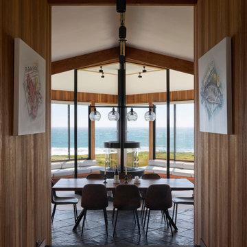
The main living and gathering room had always been caught between two competing facts: glass on four sides meant exceptional views but at The Sea Ranch, it also meant a cold room. A 360-degree cylindrical fireplace was added at the center on a raised stone base, providing radiant heat in every direction and giving the room a focal point around which a group naturally orients itself, whether that means two people at the end of the day or the whole family after dinner.
Owners Who Picked Up the Tools
The owner was not a passive client. they came with construction knowledge, specific ideas, and the desire to be an active part of the process, a dynamic that other architects may had found difficult, which Klopf Architecture accepted as an asset. They took it upon themselves to complete some of the work during construction, including the installation of a new radiant heating system beneath the floors.
The radiant system added to the older and less-desirable forced-air setup. At The Sea Ranch, that change matters as the house sits close enough to the ocean and moving air competes with the sound of it, where radiant heat does not. Solar panels were added to the roof as part of the new system. Insulation was upgraded throughout the walls, roof, and crawl space. The house that had always had the right setting now holds warmth the way a house on the bluff should.
They were also deeply involved in the design and selections throughout, and the finished house reflects both of them in ways that are specific rather than generic. The process took longer and moved through more iterations than a more arms-length relationship might have allowed. The result is more defined and personal because of it.
The Landscape Holds Priority
Every exterior decision was shaped by The Sea Ranch Design Standards, which require that buildings defer to the landscape around them rather than compete with it. Because this house sits on the bluff and is visible from the public trail, the additions faced a close review. Existing materials were matched. Geometries were resolved. The additions had to become indistinguishable from the original building.
From the trail, the house reads exactly as it always has — low, cedar-clad, secondary to the meadow and the water. The setting holds priority. Inside, the house has been remade.
Klopf Architecture Project Team: Geoff Campen and Trenton Jewett
Contractor: Shawn Bettega Construction
Photography: ©2025 Mariko Reed
Year Completed: 2023
Location: The Sea Ranch, CA
 Ryan A. Jones & Associates
Oceanfront Windsor Estate Renovation | Vero Beach, FL 32963
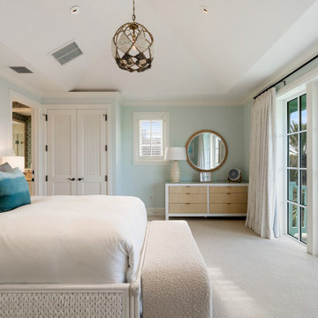
A full-scale renovation of an oceanfront estate in Windsor, the celebrated New Urbanist seaside community on Vero Beach's barrier island (32963). Our team reimagined this residence as a bright, breezy coastal retreat where every primary room captures the Atlantic, and the original architecture—coffered and beamed ceilings, arched passages, soaring window walls—was preserved and brought fully current.
At the heart of the home, an open kitchen and dining space pairs crisp white cabinetry and stone countertops with terracotta floors, a Viking range beneath a plaster hood, woven pendant lighting, and French doors that fold open to a covered loggia. The great room rises to a vaulted shiplap ceiling under woven chandeliers, anchored by a limestone fireplace and walls of glass. Throughout, the palette stays light and elemental—white oak floors, natural fibers, soft coastal blues—so the ocean remains the focal point.
The renovation extends to a window-wrapped oceanview office, a serene primary bath with frameless walk-in shower and direct sea views, a fully fitted dressing room, an oversized dual laundry, and a beachfront sitting room where turquoise water fills the frame. Upstairs, light-filled lounges and a media room continue the relaxed, refined coastal language.
This is turnkey oceanfront living in one of the Treasure Coast's most distinctive gated communities—Windsor's beach club, golf, equestrian center, and village amenities just beyond the door, with the shops and dining of Vero Beach's barrier island close at hand.
Renovation by Ryan A. Jones & Associates — construction, renovation, and estate management, Vero Beach, FL.
Find the right local pro for your project
 Infinite Home
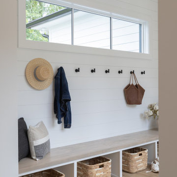
This thoughtfully designed mudroom features shiplap walls, a built-in bench with a light wood top, and plenty of practical storage with woven baskets tucked beneath. Matte black wall hooks offer a stylish spot for jackets, bags, and hats, while a transom window above brings in natural light. A neutral palette and soft textures make this space both functional and inviting.
 repp + mclain design and construction
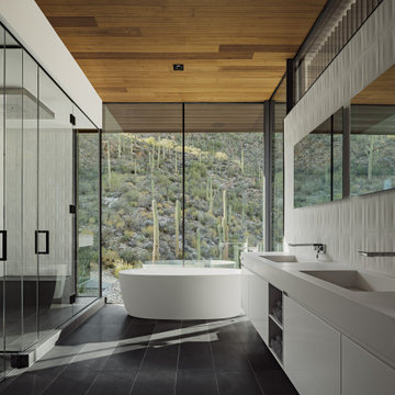
Designed as a private sanctuary, Ventana House is a place to retreat and reflect. Located on a steep hillside overlooking the urban sprawl, the residence feels worlds away from the city below. Its cast-in-place concrete walls anchor the structure into the rugged terrain, grounding the architecture within the landscape. This mass is contrasted by a delicate scrim that appears to float above the living spaces, all tucked safely beneath the deep shadows of a large cowboy hat roof—an essential shield against the desert sun.
 GAYLA BECHTOL ARCHITECT
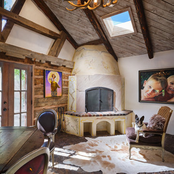
Gather around the custom adobe fireplace beneath soaring ceilings and hand-hewn beams — a centerpiece that brings timeless Santa Fe craftsmanship into everyday living.
 O'Brien Harris LLC
Although this Hinsdale home was only about a decade old, the floor plan and finishes already felt dated. The homeowners expressed that the layout wasn’t working—particularly the disconnect between spaces they used and those they didn’t. O’Brien Harris was originally brought in to renovate the kitchen, but it quickly became clear that a more holistic transformation was needed.
The formal dining room, located at the front of the house, had long gone unused. Along with design Brynn Olson, O’Brien Harris reimagined the space as a high-gloss wine lounge that now opens onto the front terrace. The adjacent covered porch was enclosed and converted into a light-filled new dining room, making entertaining and everyday meals more inviting and accessible. O’Brien Harris also fully paneled the great room, adding built-in bookcases and reshaping existing arches to bring depth, warmth, and architectural continuity.
The galley-style kitchen is now the heart of the home. Designed for a family that loves to cook and entertain, it features a central island and a secondary wall of storage with floor-to-ceiling cabinetry to house refrigeration, freezer drawers, and extensive dish storage, outfitted with a library ladder. The cabinet finishes are a blend of painted surfaces and light oak, offering warmth without heaviness. Icebox-style strap hinges and latches bring refined vintage character to the space while emphasizing functionality with beauty.
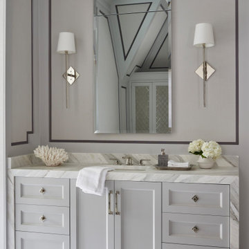
In the primary bath, O’Brien Harris introduced painted cabinetry beneath a waterfall stone counter to coordinate with upholstered panels and full marble finishes. His-and-hers vanities and custom stone flooring complete the serene, tailored retreat.
This was a deeply transformative project, not only in terms of layout, but in the way the spaces now flow and function together—with O’Brien Harris cabinetry anchoring it all in timeless craftsmanship.

 orly eran - architecture & design
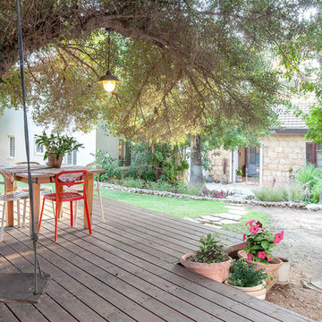
12. In a large garden, create a living space far away from the house.
This makes it possible to enjoy looking at your house from a distance, like in this project : a small path leads away from the house to a lovely space beneath the olice tree.
 Sunwood Kitchen and Bath Design
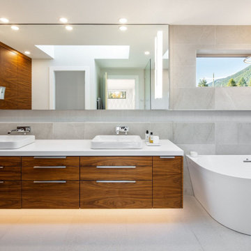
Example of a large trendy gray tile white floor and double-sink bathroom design in Vancouver with medium tone wood cabinets, quartz countertops, white countertops, flat-panel cabinets and a floating vanity
 RED
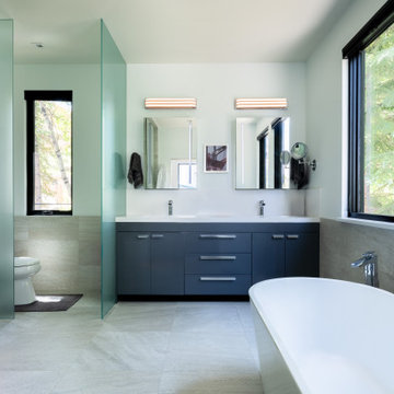
REDThe dual vanity floats above pale stone tile floors, anchoring the space with deep blue cabinetry and clean-lined hardware. Frosted glass partitions create a sense of privacy without sacrificing light, while large windows offer tranquil views of the surrounding evergreens. The freestanding tub sits quietly beneath one of those windows, inviting rest and reflection. Every material and fixture was chosen to feel balanced, functional, and quietly refined.
 Lola Cwikowski Studio
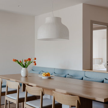
An Ohio family in search of a place to enjoy the Portuguese coast acquired a four-bedroom apartment just outside the center of Cascais. Our studio was engaged to turn a compartmented interior into a holiday residence for a household that gathers in numbers: one that could seat everyone at once and still hold the ease and lightness of a home by the beach.
The original plan included a kitchen and laundry room sealed off from the living room, floor finishes and levels that changed from threshold to threshold, and bathrooms in varying styles. Work began by redefining the alignments and circulation. The principal transformation was the opening of the kitchen, creating a more generous social setting centered on a bespoke island fitted with storage and seating.
The interior takes its cues from the building’s geometric façade, which projects and recedes in volumes and voids. Bespoke joinery in oak and lacquer carries continuity and order through the apartment. Concealed storage runs throughout: at the entrance, in the dining area, along the living area, and beneath built-in benches. The laundry is merged into the kitchen behind perforated doors for ventilation while keeping the service area discreet. Behind the sofa, a console slips a workspace into the living area without conceding its openness.
Curved elements answer the rectilinear architecture; artisanal glazed vertical tiles repeat from the backsplashes onto custom side tables. The palette stays deliberately narrow; the muted oak and lacquer are joined by a softened timber floor, Portuguese Lioz stone, and walls painted to the color of bare plaster. Existing doors and baseboards were repainted in a warm light gray that draws the original elements into the language of the new interior. Upholstery and decorative accents hint at the terracotta, sky blue, and yellow of the façade.
The bedrooms are set with upholstered headboards on oak frames, bedside tables that extend those outlines, and wardrobes fit for a long stay. Locally made rugs, bedcovers, and throw pillows soften the composition. In the bathrooms, the plans were reorganized and the showers enlarged. Lioz was used for the counters and sinks, shelves, shower bases, and bathtub surround, with microcement bringing a soothing warmth to the walls, and storage in floating cabinets. Deeper in tone than the rest of the apartment yet never dim, they are quietly elegant rooms made for lingering — taking one’s time getting ready, or unwinding at the end of a day.
PHOTOGRAPHY: © ALEXANDER BOGORODSKIY
 CB Architecture + Design
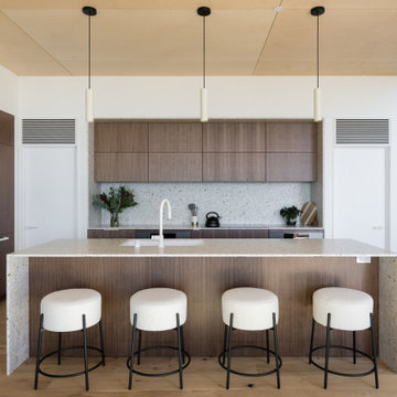
Kitchen of a ground-up new construction home in the Berkeley Hills, CA, as featured on America ByDesign on CBS. Full-height terrazzo backsplash runs continuously from countertop to ceiling across the entire perimeter wall - a bold material statement that carries the terrazzo palette from the island through to the cooking zone in a single uninterrupted surface. Walnut flat-front upper and lower cabinetry with integrated brushed metal pulls, black induction cooktop, and integrated black oven. White terrazzo quartz island countertop with large-format undermount sink and matte white arched gooseneck faucet on the right. Slim cylinder pendant lights drop from birch plywood ceiling panels above. Through the kitchen opening, a white floating open-riser stair with oak laminated veneer lumber treads, glass panel railing, and white steel balustrade rises through the double-height volume — the lush built-in indoor garden of tropical ferns, and ground cover planting visible beneath the stair in a gravel bed. Fold House - Berkeley Hills CA - CB Architecture + Design
 lavish
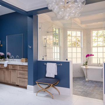
This stunning whole-home renovation seamlessly blends classic architectural details with sophisticated, contemporary design. From a dramatic primary bathroom suite to a light-filled kitchen and refined dining room, every space was thoughtfully reimagined to balance beauty with everyday functionality.
Primary Bathroom
The showstopping centerpiece of this renovation is the expansive primary bathroom, where rich navy blue walls create a bold, jewel-box effect against crisp white coffered ceilings. A sculptural bubble-glass chandelier anchors the space with effortless glamour. The suite is divided into two distinct zones: a serene bathing alcove and a sleek vanity corridor.
The bathing alcove features a freestanding soaking tub set beneath a trio of floor-to-ceiling gridded windows, flooding the space with natural light. Calacatta marble-look wall tile extends seamlessly into the walk-in glass shower, which is equipped with both a ceiling-mounted rain head and an adjustable handheld system. Underfoot, handmade blue arabesque floor tiles add artisanal texture and a soft pop of color that bridges the two tonal worlds of the room.
The double vanity wall makes a statement with natural white oak cabinetry, brushed brass hardware, and a thick Calacatta marble slab countertop with an integrated undermount sink. Polished chrome cross-handle faucets and a large frameless mirror flanked by cylindrical brass sconces complete the refined look. A navy-upholstered bench with gold X-base legs provides both a functional perch and a luxurious finishing touch.
Kitchen
The kitchen celebrates the home's original architecture while bringing it fully into the present. Soaring cathedral ceilings with exposed natural pine tongue-and-groove planks and structural wood beams create an airy, almost chapel-like volume. A bold black iron lantern pendant — scaled dramatically to match the ceiling height — grounds the space and adds farmhouse-inspired character. Classic white inset cabinetry with polished nickel hardware, speckled granite countertops, a subway tile backsplash, and warm hardwood flooring deliver a timeless, livable aesthetic.
Dining Room
The formal dining room strikes an elegant balance between traditional and transitional. Neutral walls with subtle wainscoting provide a quiet backdrop for a stunning modern chandelier featuring gold arms and cylindrical glass shades. A natural oak dining table paired with ivory upholstered chairs keeps the palette light and airy, while a large abstract canvas in shades of blue, grey, and gold echoes the home's broader color story. Herringbone hardwood floors and crisp crown molding tie the space back to the home's classical bones.
 repp + mclain design and construction
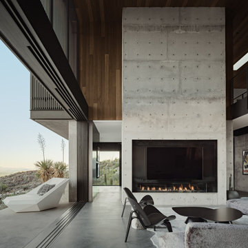
Designed as a private sanctuary, Ventana House is a place to retreat and reflect. Located on a steep hillside overlooking the urban sprawl, the residence feels worlds away from the city below. Its cast-in-place concrete walls anchor the structure into the rugged terrain, grounding the architecture within the landscape. This mass is contrasted by a delicate scrim that appears to float above the living spaces, all tucked safely beneath the deep shadows of a large cowboy hat roof—an essential shield against the desert sun.
 lavish
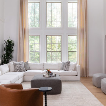
This whole-home remodel in Raleigh, NC blends warm organic textures with clean modern lines for a look that feels current but built to last.
The kitchen remodel pairs white oak cabinetry with a contrasting white island, all wrapped in dramatic full-slab marble that runs from the countertops up the backsplash to a sculpted plaster-style range hood.
Brass hardware, glass cone pendants, woven-back oak counter stools, and wide-plank white oak flooring keep the palette light and layered — a kitchen design that's as practical for family life as it is beautiful.
In the two-story family room, our team designed around the dramatic ceiling height with an oversized gallery of landscape art, a deep white sectional, a caramel leather swivel chair, and a charcoal ottoman that grounds the space.
The formal dining room design makes a bolder statement: a coffered ceiling and wall paneling in a rich espresso-black envelop a solid wood table with rope-back chairs, connected to the rest of the main floor through a series of arched openings.
A casual dining nook nearby features a double-sided fireplace clad in large-format slate-look tile, a round pedestal table, and olive velvet chairs beneath a fluted drum pendant.
As a full-service interior design firm in Raleigh, NC, Lavish led this project from kitchen design and materials selection through the living room, dining room, and finishing details — delivering a cohesive home design where every space connects.
 Tara Fust Design
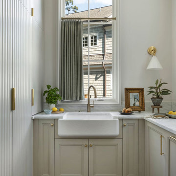
Designed as a hardworking secondary kitchen, the scullery balances traditional detailing with refined material choices to create a space that is both functional and visually consistent with the rest of the home.
Custom inset cabinetry in a soft neutral finish establishes a classic foundation, while warm brass hardware and plumbing fixtures introduce quiet richness. A textured apron-front sink becomes the focal point, centered beneath the window to take advantage of natural light and exterior views. The wall of vertical reeded paneling adds architectural rhythm and subtle dimension, elevating what could have been a purely utilitarian space.
Natural stone countertops continue the material story found throughout the home, ensuring continuity from primary spaces into service areas. Layered lighting, including a tailored wall sconce, brings a residential feel to the room rather than a back-of-house aesthetic.
This scullery exemplifies the project’s philosophy: even the most functional rooms receive the same level of attention to detail, material quality, and visual cohesion as the primary living spaces.
 Manomin Resawn Timbers
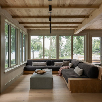
This sunroom in a wabi-sabi lakeside retreat designed by PKA Architecture and Yond Interiors brings together antique elm ceiling paneling, beams, and flooring for a warm, cohesive backdrop of natural wood. A built-in banquette with soft cushions wraps the corner beneath a wall of windows framing the lake and trees beyond, while a black steel column and doors add quiet contrast to the room's soft, earthy palette.
Our antique elm paneling, flooring, and beams are milled from barn timbers dating from 1820 to 1880, carrying unique marks such as wormholes, peg holes, and mortise pockets left behind by centuries old woodworking. Because widespread Dutch Elm Disease in the 1970s made new elm nearly impossible to find, reclaimed elm remains one of the only ways to bring its warm, inviting tones into a home. The natural hues of reclaimed elm are bright and comforting, showing tans, light browns, and a subtle tinge of red that gives the wood an almost iridescent shimmer, embodying the wabi-sabi appreciation for natural imperfection and the passage of time.
Whether you are a homebuilder, a home remodeling contractor, a homeowner, or a designer planning a sunroom like this, Manomin Resawn Timbers has the antique elm paneling, flooring, and beams to bring warmth and character to your home. Visit our showroom in Hugo, MN or reach out to us with a call or a message. 15152 Freeland Avenue North, Hugo MN 55038. Mon–Thu 8am–4:30pm, Fri 8am–4pm. 651.464.1771.
 Lola Cwikowski Studio
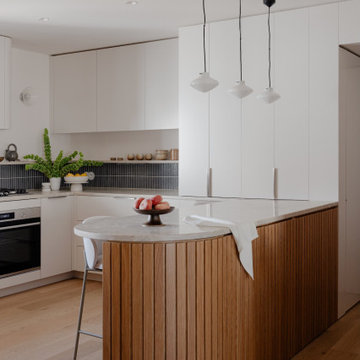
An Ohio family in search of a place to enjoy the Portuguese coast acquired a four-bedroom apartment just outside the center of Cascais. Our studio was engaged to turn a compartmented interior into a holiday residence for a household that gathers in numbers: one that could seat everyone at once and still hold the ease and lightness of a home by the beach.
The original plan included a kitchen and laundry room sealed off from the living room, floor finishes and levels that changed from threshold to threshold, and bathrooms in varying styles. Work began by redefining the alignments and circulation. The principal transformation was the opening of the kitchen, creating a more generous social setting centered on a bespoke island fitted with storage and seating.
The interior takes its cues from the building’s geometric façade, which projects and recedes in volumes and voids. Bespoke joinery in oak and lacquer carries continuity and order through the apartment. Concealed storage runs throughout: at the entrance, in the dining area, along the living area, and beneath built-in benches. The laundry is merged into the kitchen behind perforated doors for ventilation while keeping the service area discreet. Behind the sofa, a console slips a workspace into the living area without conceding its openness.
Curved elements answer the rectilinear architecture; artisanal glazed vertical tiles repeat from the backsplashes onto custom side tables. The palette stays deliberately narrow; the muted oak and lacquer are joined by a softened timber floor, Portuguese Lioz stone, and walls painted to the color of bare plaster. Existing doors and baseboards were repainted in a warm light gray that draws the original elements into the language of the new interior. Upholstery and decorative accents hint at the terracotta, sky blue, and yellow of the façade.
The bedrooms are set with upholstered headboards on oak frames, bedside tables that extend those outlines, and wardrobes fit for a long stay. Locally made rugs, bedcovers, and throw pillows soften the composition. In the bathrooms, the plans were reorganized and the showers enlarged. Lioz was used for the counters and sinks, shelves, shower bases, and bathtub surround, with microcement bringing a soothing warmth to the walls, and storage in floating cabinets. Deeper in tone than the rest of the apartment yet never dim, they are quietly elegant rooms made for lingering — taking one’s time getting ready, or unwinding at the end of a day.
PHOTOGRAPHY: © ALEXANDER BOGORODSKIY
 Pike Properties
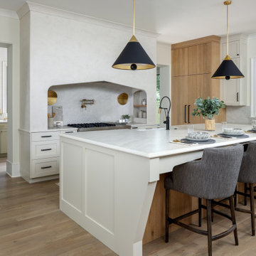
The kitchen is the heart of the Ashmont — and it shows. A plastered custom range hood anchors the space, arched and substantial, with a professional range tucked beneath and a pot filler finished in brass. Taj Mahal quartzite countertops run the length of the oversized island, where three seats pull up naturally for morning coffee or an evening pour.
Black and gold cone pendants overhead tie it all together.
The scullery sits just off the kitchen, keeping the prep work out of sight and the main space ready for company.
 lavish
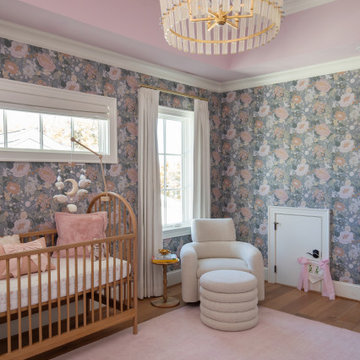
These two adjoining girls' rooms — a show-stopping nursery and a dreamy toddler bedroom — are among the most enchanting children's spaces imaginable. Each room has its own distinct personality while sharing a thread of botanical wonder, soft femininity, and elevated design that refuses to talk down to its young inhabitants. These are spaces designed not just for children, but with genuine artistry — rooms that will inspire wonder for years to come.
The Nursery
Step into this nursery and feel immediately transported into a secret garden at dusk. The design decision that sets the entire room apart is breathtakingly bold: a large-scale dark floral wallpaper — blooming with oversized peonies, roses, and wildflowers in dusty pink, peach, sage, and cream against a deep slate blue ground — wraps every wall from chair rail to ceiling, creating an immersive, almost painterly environment that feels simultaneously dramatic and deeply soft.
The ceiling is painted a warm, powdery pink that picks up the blush tones within the wallpaper perfectly — a "fifth wall" design moment that makes the room feel like a complete, considered installation rather than a decorated room. The transition from wallpapered walls to pink ceiling at the crown molding line is seamless and intentional, wrapping the baby in a floral garden overhead and all around.
Anchoring the room with genuine design authority is a spectacular gold and crystal chandelier — its circular brass frame hung with vertical crystal rods that catch and scatter light like a garden in rain — elevating the nursery from charming to genuinely luxurious. Beneath it, a natural oak arched spindle crib sits against the wallpapered feature wall, its warm honey wood grain providing organic contrast to the moody floral backdrop. Pink velvet pillows and a soft crib mobile of plush clouds and moons complete the crib vignette with gentle whimsy.
A boucle glider chair and matching stacked ottoman in cream provide the nursing corner, paired with a small brass side table for midnight essentials. A soft blush pink area rug anchors the seating area and echoes the ceiling color. Linen drapery panels in soft ivory frame the windows without competing with the wallpaper, their pinch-pleat heading adding a refined tailoring detail.
The Toddler Bedroom
The connecting bedroom takes the botanical theme in a softer, sunnier direction — all blush pink walls (matching ceiling and walls in the same warm rose tone for a cocooning effect), botanical print drapery in cream with red and green wildflowers, and brass curtain hardware that ties to the nursery's gold palette. A gold spindle crib — the metallic version of the nursery's wooden one — grounds the room with warmth, while a sage green upholstered glider provides a reading corner. A white dresser with brass hardware doubles as a changing table, topped with art prints and a Matisse-inspired framed poster in a gold frame that adds a touch of grown-up gallery sensibility.
Floating acrylic shelves hold a curated collection of board books at child-height — a detail that communicates that this room was designed for a child who will love and use it, not just admire it. A whimsical wicker llama toy basket, an indoor olive tree, and a fluffy white boucle child's armchair complete a room that balances magic with livability.
93