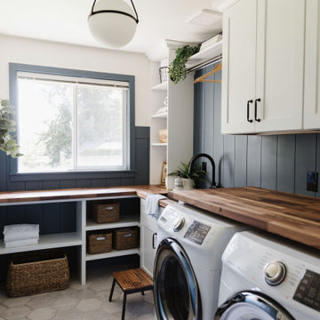
Search results for "Blocking access" in Home Design Ideas
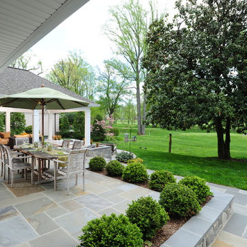
Irving Place Residence. New York, NY. Photography by Biz Jones.
Inspiration for a mid-century modern freestanding desk home office remodel in New York with white walls

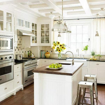
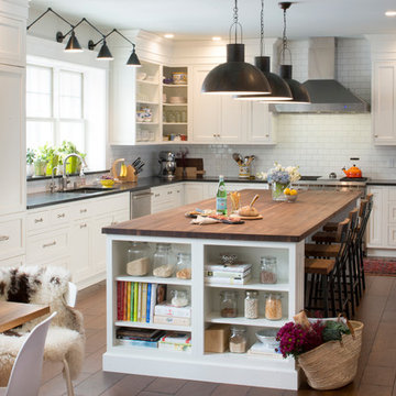
Beach style l-shaped light wood floor, exposed beam and vaulted ceiling kitchen photo in Minneapolis with an undermount sink, open cabinets, gray backsplash and stainless steel appliances

The clients found a house they loved for two reasons…location, location, location (first reason) and the exterior style was similar to a beloved childhood home. They came to LaMantia inquiring as to the possibilities for the first floor. Armed with the clients’ “wants and desires” LaMantia designers Jackie Prazak and Andy LaMantia went about redesigning most of the first floor into an open floor plan fit for the young family.
LaMantia & Prazak found the key to providing the enlarged feeling was through the poorly designed existing home addition. The additional living space was difficult to access, thus providing no useful function to the home.
Completely removing the original exterior walls of the home that blocked access into the addition was the first step in the plan. With the walls removed, the original walled-off space became a part of the home. Relocating the first floor Powder Room, revising the entry closet, removing the wall into the kitchen and resizing the Living Room all were key components to the final rebirth of the larger picture.
To finalize the new kitchen space, it was suggested to raise the Bay window unit thus allowing the relocated sink location. With all the revisions, the Kitchen now could easily accommodate a stretched out “L” layout with a large seated Island and a separate desk area.
With the final plans in place, the clients were amazed to find that within the existing walls of their newly purchased home they had gained so much extra use. And…the very last prize they gained was a dreamed of Mudroom!
Find the right local pro for your project
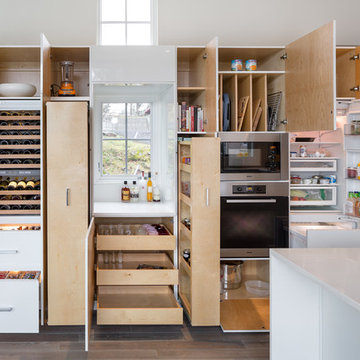
This handicap accessible shower involved removing a corner tub, installing a glass block window, and recessing the floor to allow for a zero- clearance entry. The Schluter shower system was used to water-proof the shower.

The clients found a house they loved for two reasons…location, location, location (first reason) and the exterior style was similar to a beloved childhood home. They came to LaMantia inquiring as to the possibilities for the first floor. Armed with the clients’ “wants and desires” LaMantia designers Jackie Prazak and Andy LaMantia went about redesigning most of the first floor into an open floor plan fit for the young family.
LaMantia & Prazak found the key to providing the enlarged feeling was through the poorly designed existing home addition. The additional living space was difficult to access, thus providing no useful function to the home.
Completely removing the original exterior walls of the home that blocked access into the addition was the first step in the plan. With the walls removed, the original walled-off space became a part of the home. Relocating the first floor Powder Room, revising the entry closet, removing the wall into the kitchen and resizing the Living Room all were key components to the final rebirth of the larger picture.
To finalize the new kitchen space, it was suggested to raise the Bay window unit thus allowing the relocated sink location. With all the revisions, the Kitchen now could easily accommodate a stretched out “L” layout with a large seated Island and a separate desk area.
With the final plans in place, the clients were amazed to find that within the existing walls of their newly purchased home they had gained so much extra use. And…the very last prize they gained was a dreamed of Mudroom!

The clients found a house they loved for two reasons…location, location, location (first reason) and the exterior style was similar to a beloved childhood home. They came to LaMantia inquiring as to the possibilities for the first floor. Armed with the clients’ “wants and desires” LaMantia designers Jackie Prazak and Andy LaMantia went about redesigning most of the first floor into an open floor plan fit for the young family.
LaMantia & Prazak found the key to providing the enlarged feeling was through the poorly designed existing home addition. The additional living space was difficult to access, thus providing no useful function to the home.
Completely removing the original exterior walls of the home that blocked access into the addition was the first step in the plan. With the walls removed, the original walled-off space became a part of the home. Relocating the first floor Powder Room, revising the entry closet, removing the wall into the kitchen and resizing the Living Room all were key components to the final rebirth of the larger picture.
To finalize the new kitchen space, it was suggested to raise the Bay window unit thus allowing the relocated sink location. With all the revisions, the Kitchen now could easily accommodate a stretched out “L” layout with a large seated Island and a separate desk area.
With the final plans in place, the clients were amazed to find that within the existing walls of their newly purchased home they had gained so much extra use. And…the very last prize they gained was a dreamed of Mudroom!

The owners of a charming home in the hills west of Paso Robles recently decided to remodel their not-so-charming kitchen. Referred to San Luis Kitchen by several of their friends, the homeowners visited our showroom and soon decided we were the best people to design a kitchen fitting the style of their home. We were delighted to get to work on the project right away.
When we arrived at the house, we found a small, cramped and out-dated kitchen. The ceiling was low, the cabinets old fashioned and painted a stark dead white, and the best view in the house was neglected in a seldom-used breakfast nook (sequestered behind the kitchen peninsula). This kitchen was also handicapped by white tile counters with dark grout, odd-sized and cluttered cabinets, and small ‘desk’ tacked on to the side of the oven cabinet. Due to a marked lack of counter space & inadequate storage the homeowner had resorted to keeping her small appliances on a little cart parked in the corner and the garbage was just sitting by the wall in full view of everything! On the plus side, the kitchen opened into a nice dining room and had beautiful saltillo tile floors.
Mrs. Homeowner loves to entertain and often hosts dinner parties for her friends. She enjoys visiting with her guests in the kitchen while putting the finishing touches on the evening’s meal. Sadly, her small kitchen really limited her interactions with her guests – she often felt left out of the mix at her own parties! This savvy homeowner dreamed big – a new kitchen that would accommodate multiple workstations, have space for guests to gather but not be in the way, and maybe a prettier transition from the kitchen to the dining (wine service area or hutch?) – while managing the remodel budget by reusing some of her major appliances and keeping (patching as needed) her existing floors.
Responding to the homeowner’s stated wish list and the opportunities presented by the home's setting and existing architecture, the designers at San Luis Kitchen decided to expand the kitchen into the breakfast nook. This change allowed the work area to be reoriented to take advantage of the great view – we replaced the existing window and added another while moving the door to gain space. A second sink and set of refrigerator drawers (housing fresh fruits & veggies) were included for the convenience of this mainly vegetarian cook – her prep station. The clean-up area now boasts a farmhouse style single bowl sink – adding to the ‘cottage’ charm. We located a new gas cook-top between the two workstations for easy access from each. Also tucked in here is a pullout trash/recycle cabinet for convenience and additional drawers for storage.
Running parallel to the work counter we added a long butcher-block island with easy-to-access open shelves for the avid cook and seating for friendly guests placed just right to take in the view. A counter-top garage is used to hide excess small appliances. Glass door cabinets and open shelves are now available to display the owners beautiful dishware. The microwave was placed inconspicuously on the end of the island facing the refrigerator – easy access for guests (and extraneous family members) to help themselves to drinks and snacks while staying out of the cook’s way.
We also moved the pantry storage away from the dining room (putting it on the far wall and closer to the work triangle) and added a furniture-like hutch in its place allowing the more formal dining area to flow seamlessly into the up-beat work area of the kitchen. This space is now also home (opposite wall) to an under counter wine refrigerator, a liquor cabinet and pretty glass door wall cabinet for stemware storage – meeting Mr. Homeowner’s desire for a bar service area.
And then the aesthetic: an old-world style country cottage theme. The homeowners wanted the kitchen to have a warm feel while still loving the look of white cabinetry. San Luis Kitchen melded country-casual knotty pine base cabinets with vintage hand-brushed creamy white wall cabinets to create the desired cottage look. We also added bead board and mullioned glass doors for charm, used an inset doorstyle on the cabinets for authenticity, and mixed stone and wood counters to create an eclectic nuance in the space. All in all, the happy homeowners now boast a charming county cottage kitchen with plenty of space for entertaining their guests while creating gourmet meals to feed them.
Credits:
Custom cabinetry by Wood-Mode Fine Custom Cabinetry
Contracting by Michael Pezzato of Lost Coast Construction
Stone counters by Pyramid M.T.M.

Sponsored
Columbus, OH
Free consultation for landscape design!
Peabody Landscape Group
Columbus' Reliable Landscape Design & Contracting

The clients found a house they loved for two reasons…location, location, location (first reason) and the exterior style was similar to a beloved childhood home. They came to LaMantia inquiring as to the possibilities for the first floor. Armed with the clients’ “wants and desires” LaMantia designers Jackie Prazak and Andy LaMantia went about redesigning most of the first floor into an open floor plan fit for the young family.
LaMantia & Prazak found the key to providing the enlarged feeling was through the poorly designed existing home addition. The additional living space was difficult to access, thus providing no useful function to the home.
Completely removing the original exterior walls of the home that blocked access into the addition was the first step in the plan. With the walls removed, the original walled-off space became a part of the home. Relocating the first floor Powder Room, revising the entry closet, removing the wall into the kitchen and resizing the Living Room all were key components to the final rebirth of the larger picture.
To finalize the new kitchen space, it was suggested to raise the Bay window unit thus allowing the relocated sink location. With all the revisions, the Kitchen now could easily accommodate a stretched out “L” layout with a large seated Island and a separate desk area.
With the final plans in place, the clients were amazed to find that within the existing walls of their newly purchased home they had gained so much extra use. And…the very last prize they gained was a dreamed of Mudroom!

A vintage range is one of the beautiful focal points in the kitchen and the black island is a lovely complement. A clear glass door provides access to the yard.

Photo by KuDa Photography
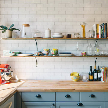
Cottage u-shaped light wood floor and gray floor kitchen pantry photo in Portland with recessed-panel cabinets, blue cabinets, wood countertops and brown countertops

Download our free ebook, Creating the Ideal Kitchen. DOWNLOAD NOW
As with most projects, it all started with the kitchen layout. The home owners came to us wanting to upgrade their kitchen and overall aesthetic in their suburban home, with a combination of fresh paint, updated finishes, and improved flow for more ease when doing everyday activities.
A monochromatic, earth-toned palette left the kitchen feeling uninspired. It lacked the brightness they wanted from their space. An eat-in table underutilized the available square footage. The butler’s pantry was out of the way and hard to access, and the dining room felt detached from the kitchen.
Lead Designer, Stephanie Cole, saw an improved layout for the spaces that were no longer working for this family. By eliminating an existing wall between the kitchen and dining room, and relocating the bar area to the dining room, we opened up the kitchen, providing all the space we needed to create a dreamy and functional layout. A new perimeter configuration promoted circulation while also making space for a large and functional island loaded with seating – a must for any family. Because an island that isn’t big enough for everyone (and a few more) is a recipe for disaster. The light white cabinetry is fresh and contrasts with the deeper tones in the wood flooring, creating a modern aesthetic that is elevated, yet approachable for everyday living.
With better flow as the overarching goal, we made some structural changes too. To remove a bottleneck in the entryway, we angled one of the dining room walls to create more natural separation between rooms and facilitate ease of movement throughout the large space.
At The Kitchen Studio, we believe a well-designed kitchen uses every square inch to the fullest. By starting from scratch, it was possible to rethink the entire kitchen layout and design the space according to how it is used, because the kitchen shouldn’t make it harder to feed the family. A new location for the existing range, flanked by a new column refrigerator and freezer on each side, worked to anchor the space. The very large and very spacious island (a dream island if we do say so ourselves) now houses the primary sink and provides ample space for food prep and family gathering.
The new kitchen table and coordinating banquette seating provide a cozy nook for quick breakfasts before school or work, and evening homework sessions. Elegant gold details catch the natural light, elevating the aesthetic.
The dining room was transformed into one of this client’s favorite spaces and we couldn’t agree more. We saw an opportunity to give the dining room a more distinguished identity by closing off the entrance from the foyer. The relocated wet bar enhances the sophisticated vibe of this gathering space, complete with beautiful antique mirror tiles and open shelving encased by moody built-in cabinets.
Updated furnishings add warmth. A rich walnut table is paired with custom chairs in a muted coral fabric. The large, transitional chandelier grounds the room, pairing beautifully with the gold finishes prevalent in the faucet and cabinet hardware. Linen-inspired wallpaper and cream-toned window treatments add to the glamorous feel of this entertainment space.
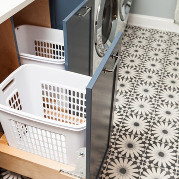
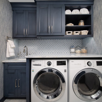
There is no way around it. The laundry room was cramped. The large washer and dryer blocked access to the sink and left little room for the space to serve its other essential function – as a mudroom. Because we reworked the kitchen layout to create more space overall, we could rethink the mudroom too – an essential for any busy family. The first step was moving the washer and dryer to an existing area on the second floor, where most of the family’s laundry lives (no one wants to carry laundry up and down the stairs if they don’t have to anyway). This is a more functional solution and opened up the space for all the mudroom necessities – including the existing kitchen refrigerator, loads of built-in cubbies, and a bench.
It’s hard to not fall in love with every detail of a new space, especially when it serves your day-to-day life. But that doesn’t mean the clients didn’t have their favorite features they use on the daily. This remodel was focused largely on function with a new kitchen layout. And it’s the functional features that have the biggest impact. The large island provides much needed workspace in the kitchen and is a spot where everyone gathers together – it grounds the space and the family. And the custom counter stools are the icing on the cake. The nearby mudroom has everything their previous space was lacking – ample storage, space for everyone’s essentials, and the beloved cement floor tiles that are both durable and artistic.

Sponsored
Columbus, OH
Hope Restoration & General Contracting
Columbus Design-Build, Kitchen & Bath Remodeling, Historic Renovations

The clients found a house they loved for two reasons…location, location, location (first reason) and the exterior style was similar to a beloved childhood home. They came to LaMantia inquiring as to the possibilities for the first floor. Armed with the clients’ “wants and desires” LaMantia designers Jackie Prazak and Andy LaMantia went about redesigning most of the first floor into an open floor plan fit for the young family.
LaMantia & Prazak found the key to providing the enlarged feeling was through the poorly designed existing home addition. The additional living space was difficult to access, thus providing no useful function to the home.
Completely removing the original exterior walls of the home that blocked access into the addition was the first step in the plan. With the walls removed, the original walled-off space became a part of the home. Relocating the first floor Powder Room, revising the entry closet, removing the wall into the kitchen and resizing the Living Room all were key components to the final rebirth of the larger picture.
To finalize the new kitchen space, it was suggested to raise the Bay window unit thus allowing the relocated sink location. With all the revisions, the Kitchen now could easily accommodate a stretched out “L” layout with a large seated Island and a separate desk area.
With the final plans in place, the clients were amazed to find that within the existing walls of their newly purchased home they had gained so much extra use. And…the very last prize they gained was a dreamed of Mudroom!

Jim Bartsch Photography
Bathroom - mid-sized transitional master white tile and subway tile mosaic tile floor and gray floor bathroom idea in Los Angeles with a wall-mount sink, gray walls, a hinged shower door and a niche

The clients found a house they loved for two reasons…location, location, location (first reason) and the exterior style was similar to a beloved childhood home. They came to LaMantia inquiring as to the possibilities for the first floor. Armed with the clients’ “wants and desires” LaMantia designers Jackie Prazak and Andy LaMantia went about redesigning most of the first floor into an open floor plan fit for the young family.
LaMantia & Prazak found the key to providing the enlarged feeling was through the poorly designed existing home addition. The additional living space was difficult to access, thus providing no useful function to the home.
Completely removing the original exterior walls of the home that blocked access into the addition was the first step in the plan. With the walls removed, the original walled-off space became a part of the home. Relocating the first floor Powder Room, revising the entry closet, removing the wall into the kitchen and resizing the Living Room all were key components to the final rebirth of the larger picture.
To finalize the new kitchen space, it was suggested to raise the Bay window unit thus allowing the relocated sink location. With all the revisions, the Kitchen now could easily accommodate a stretched out “L” layout with a large seated Island and a separate desk area.
With the final plans in place, the clients were amazed to find that within the existing walls of their newly purchased home they had gained so much extra use. And…the very last prize they gained was a dreamed of Mudroom!

Michele Lee Willson
Example of an eclectic boy medium tone wood floor kids' room design in San Francisco with blue walls

Sponsored
Columbus, OH
Hope Restoration & General Contracting
Columbus Design-Build, Kitchen & Bath Remodeling, Historic Renovations

Location: Port Townsend, Washington.
Photography by Dale Lang
Inspiration for a mid-sized contemporary l-shaped bamboo floor eat-in kitchen remodel in Seattle with a double-bowl sink, shaker cabinets, light wood cabinets, solid surface countertops, white backsplash, subway tile backsplash, stainless steel appliances and an island
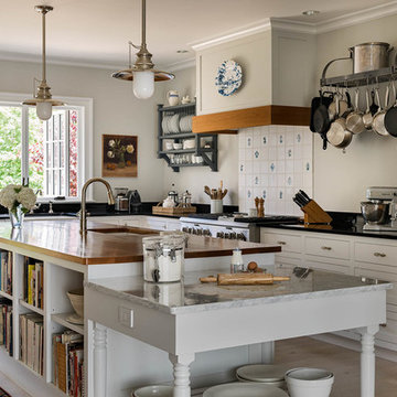

Contemporary coastal kitchen renovation in Wrightsville Beach, NC by core carolinas, part of a full home remodel near Wilmington, North Carolina.
Trendy kitchen photo in Other
2