
Search results for "Bonus start up" in Home Design Ideas
 Studio Kohlhaas
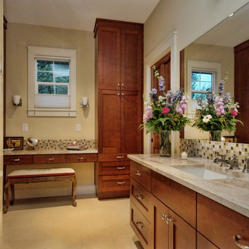
Wood cabinetry in master bathroom.
photographer Chris Diaz
Inspiration for a mid-sized craftsman brown tile and glass tile travertine floor walk-in shower remodel in Austin with an undermount sink, recessed-panel cabinets, medium tone wood cabinets, granite countertops, a two-piece toilet and beige walls
Inspiration for a mid-sized craftsman brown tile and glass tile travertine floor walk-in shower remodel in Austin with an undermount sink, recessed-panel cabinets, medium tone wood cabinets, granite countertops, a two-piece toilet and beige walls
 Kitchen Studio: Kansas City
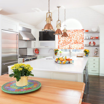
Floating stainless steel shelves pick up the stainless accents throughout the kitchen and sitting room. The ceramic wall tile carries up the wall to the ceiling, encasing a large arched window. The antique lights over the island were salvaged from a ship, the custom made table has a durable top made to withstand water spotting.
Matt Kocourek Photography
 Tiffany Brooks, HGTV Host & Interior Designer
Inquire About Our Design Services
When we first started talking in the spring of 2015, I was impressed. She was witty, realistic, and understood that as much as she loves my shows on HGTV, design does not does not happen in 43 minutes! She told me about her space, and how she felt that her bedroom seemed “blah” to her. She had no retreat. Molly desperately longed for a place that she could spend time in, read in, play in and above all, relax in.
What we did:
Many people are terrified of hiring a designer. Rightfully so, they are investing a pretty penny in their homes. They want to make sure that everything, down to the last floral arrangement, is to their liking, because they will have to live it (and pay for it). Unfortunately, a client can unintentionally stifle a designer’s creativity through micro-management. This can produce lackluster results and ultimately cause more time (and money) to be spent on a project than is really necessary.
With Molly, that was never an issue. Before she even showed me the room in question, she said that I could have full creative license to do what I needed to do to her bedroom. SAY WHAAH!?
With Molly giving me complete creative freedom, I planned everything out and got down to business. The result: Bite-your-bottom-lip sexy. I don’t get jealous of too many of my clients’ spaces, but this one still takes my breath away every time I look at the pics!
The craziest part was that by adding more furniture, it actually made the space feel larger.
Molly and her husband Patrick loved the finished space, and promised me I will be back to finish the rest of the house!
Here’s the highlights of the rest of the project:
I came up with a space plan with three options.
Next, we reviewed mood boards and fabric schemes that would work for both Molly and her hubby Patrick.
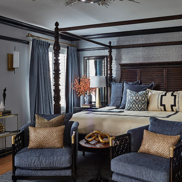
We started with the bed. My goal was to add edge to its otherwise traditional style.
We decided to spice things up by painting the trim work in the room black.
We built in layers of lighting with dimmers. In a bedroom everything should be on dimmers, right? Right.
We designed and customized bedding, chairs and window treatments.
Together with Molly, we selected the most perfect wallpaper. This geometric “grasscloth” adds so much depth and dimension that was just missing before.
What I love:
That light fixture. I mean it is really, really amazing in person.
The porcupine mirror. This thing came packaged like it was the hope diamond, and everyone was terrified to handle it. But it really became a highlight of the room.
Find the right local pro for your project
 Under the Roof Decorating
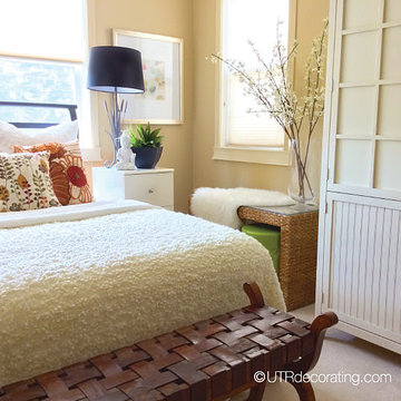
Despite a tight budget and very little time, we were able to transform this teenager’s bedroom into a mature grown-up space that is serene and restful. This one-day makeover was achieved simply by rearranging the furniture, adding new pillows, and by borrowing a few accessories from other rooms in the house.
We started by moving the bed in front of the windows, which made the bedroom look more spacious and created a strong focal point. We kept all of the existing bedding and simply replaced the colorful purple duvet with a large white throw we bought at IKEA. Adding cushions with earthy colors, combined with a Buddha and greenery, helped create a peaceful resting space. In the “before” picture, the night table was hiding beside the bed, now it draws attention and provides the perfect surface on which to display accessories and a table lamp. As for the walls, we switched the purple and white flower artwork for a more abstract piece that ties in nicely with the colors from the throw pillows.
We borrowed a nesting table from the living room and draped it with a sheepskin to add softness and warmth to the room and also brought in tall faux spring blooming branches to add height to the space. The bright green decorative stool injects a pop of color to the room and ties in nicely with the bohemian-inspired pillow. We moved the brown leather bench to the foot of the bed to break up the white-on-white bedding and to create the perfect catch-all to throw clothes on at the end of a long day.
Tip: Adding a touch of black in the room as we did with the lampshade, vase, and bed frame breaks up the neutral color palette and gives the space a touch of elegance.
With only a few hours and a small budget we created an inviting, peaceful and zen-like space, perfect to catch up on beauty sleep.
©UTRdecorating.com
 Klopf Architecture
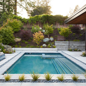
Klopf Architecture, Arterra Landscape Architects and Henry Calvert of Calvert Ventures Designed and built a new warm, modern, Eichler-inspired, open, indoor-outdoor home on a deeper-than-usual San Mateo Highlands property where an original Eichler house had burned to the ground.
The owners wanted multi-generational living and larger spaces than the original home offered, but all parties agreed that the house should respect the neighborhood and blend in stylistically with the other Eichlers. At first the Klopf team considered re-using what little was left of the original home and expanding on it. But after discussions with the owner and builder, all parties agreed that the last few remaining elements of the house were not practical to re-use, so Klopf Architecture designed a new home that pushes the Eichler approach in new directions.
One disadvantage of Eichler production homes is that the house designs were not optimized for each specific lot. A new custom home offered the team a chance to start over. In this case, a longer house that opens up sideways to the south fit the lot better than the original square-ish house that used to open to the rear (west). Accordingly, the Klopf team designed an L-shaped “bar” house with a large glass wall with large sliding glass doors that faces sideways instead of to the rear like a typical Eichler. This glass wall opens to a pool and landscaped yard designed by Arterra Landscape Architects.
Driving by the house, one might assume at first glance it is an Eichler because of the horizontality, the overhanging flat roof eaves, the dark gray vertical siding, and orange solid panel front door, but the house is designed for the 21st Century and is not meant to be a “Likeler.” You won't see any posts and beams in this home. Instead, the ceiling decking is a western red cedar that covers over all the beams. Like Eichlers, this cedar runs continuously from inside to out, enhancing the indoor / outdoor feeling of the house, but unlike Eichlers it conceals a cavity for lighting, wiring, and insulation. Ceilings are higher, rooms are larger and more open, the master bathroom is light-filled and more generous, with a separate tub and shower and a separate toilet compartment, and there is plenty of storage. The garage even easily fits two of today's vehicles with room to spare.
A massive 49-foot by 12-foot wall of glass and the continuity of materials from inside to outside enhance the inside-outside living concept, so the owners and their guests can flow freely from house to pool deck to BBQ to pool and back.
During construction in the rough framing stage, Klopf thought the front of the house appeared too tall even though the house had looked right in the design renderings (probably because the house is uphill from the street). So Klopf Architecture paid the framer to change the roofline from how we had designed it to be lower along the front, allowing the home to blend in better with the neighborhood. One project goal was for people driving up the street to pass the home without immediately noticing there is an "imposter" on this lot, and making that change was essential to achieve that goal.
This 2,606 square foot, 3 bedroom, 3 bathroom Eichler-inspired new house is located in San Mateo in the heart of the Silicon Valley.
Klopf Architecture Project Team: John Klopf, AIA, Klara Kevane
Landscape Architect: Arterra Landscape Architects
Contractor: Henry Calvert of Calvert Ventures
Photography ©2016 Mariko Reed
Location: San Mateo, CA
Year completed: 2016
 Hannah Dee Interiors
Courtney Apple Photography
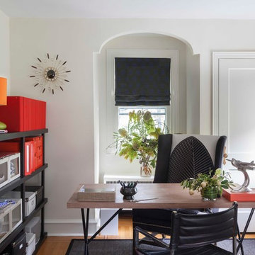
Inspiration for a mid-sized eclectic freestanding desk light wood floor home office remodel in Philadelphia with white walls
Inspiration for a mid-sized eclectic freestanding desk light wood floor home office remodel in Philadelphia with white walls
 Cummings Architecture + Interiors
Mathew and his team at Cummings Architects have a knack for being able to see the perfect vision for a property. They specialize in identifying a building’s missing elements and crafting designs that simultaneously encompass the large scale, master plan and the myriad details that make a home special. For this Winchester home, the vision included a variety of complementary projects that all came together into a single architectural composition.
Starting with the exterior, the single-lane driveway was extended and a new carriage garage that was designed to blend with the overall context of the existing home. In addition to covered parking, this building also provides valuable new storage areas accessible via large, double doors that lead into a connected work area.
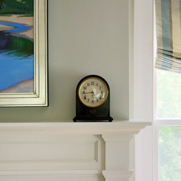
For the interior of the house, new moldings on bay windows, window seats, and two paneled fireplaces with mantles dress up previously nondescript rooms. The family room was extended to the rear of the house and opened up with the addition of generously sized, wall-to-wall windows that served to brighten the space and blur the boundary between interior and exterior.
The family room, with its intimate sitting area, cozy fireplace, and charming breakfast table (the best spot to enjoy a sunlit start to the day) has become one of the family’s favorite rooms, offering comfort and light throughout the day. In the kitchen, the layout was simplified and changes were made to allow more light into the rear of the home via a connected deck with elongated steps that lead to the yard and a blue-stone patio that’s perfect for entertaining smaller, more intimate groups.
From driveway to family room and back out into the yard, each detail in this beautiful design complements all the other concepts and details so that the entire plan comes together into a unified vision for a spectacular home.
Photos By: Eric Roth

Sponsored
Columbus, OH

Structural Remodeling
Franklin County's Heavy Timber Specialists | Best of Houzz 2020!
 Atlanta Porch & Patio
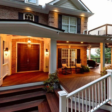
A gorgeous double-decker front porch in Marietta, Georgia. The home overlooks a beautiful tree-lined valley, making the porch a perfect place to enjoy nature!
At Atlanta Porch & Patio we are dedicated to building beautiful custom porches, decks, and outdoor living spaces throughout the metro Atlanta area. Our mission is to turn our clients’ ideas, dreams, and visions into personalized, tangible outcomes. Clients of Atlanta Porch & Patio rest easy knowing each step of their project is performed to the highest standards of honesty, integrity, and dependability. Our team of builders and craftsmen are licensed, insured, and always up to date on trends, products, designs, and building codes. We are constantly educating ourselves in order to provide our clients the best services at the best prices.
We deliver the ultimate professional experience with every step of our projects. After setting up a consultation through our website or by calling the office, we will meet with you in your home to discuss all of your ideas and concerns. After our initial meeting and site consultation, we will compile a detailed design plan and quote complete with renderings and a full listing of the materials to be used. Upon your approval, we will then draw up the necessary paperwork and decide on a project start date. From demo to cleanup, we strive to deliver your ultimate relaxation destination on time and on budget.
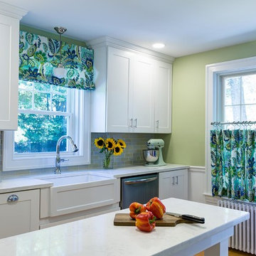
 Designs By Gia Interior Design and Renovation
In this recent kitchen design and renovation project, these long time clients came to me originally, several years ago to start discussing the design of their kitchen. At that time, the kitchen in this 1800’s home included a kitchen that had been poorly remodeled in the 1980’s, so the kitchen had already lost most of it’s original charm. I created a design plan creating a beautiful large kitchen expanding the space into the adjacent rooms. My clients loved this design plan, but other home issues took precedence, so after a few additional years, my clients were now ready to start their kitchen project.
Their overall goals for the property did change since we first looked at this project, my clients decided that they did not want to enlarge or expand the small kitchen by opening it up to the adjacent rooms. So, I went back to the drawing board to create a kitchen in the existing kitchen space that fulfilled their new goals and created a beautiful functional space within the existing kitchen space. This new design, like my former design, honored this home’s traditional architecture, but added a light, fresh feel to the space using updated colors and material selections. This design consisted of additional storage and cabinetry, additional countertop space, and a small space to sit. We added new cabinetry, appliances, electrical, plumbing, beautiful quartz countertops, glass backsplash tile, traditional lighting fixtures, and finished everything off using beautiful classic hardware elements.
My clients are now in love with this new renovated kitchen space. It contains many of the elements of a much larger kitchen, and melds beautifully with the rest of the house which we have also designed renovated over the last few years. Finally my client’s get to enjoy their new kitchen space as much as they enjoy the rest of this beautiful home!
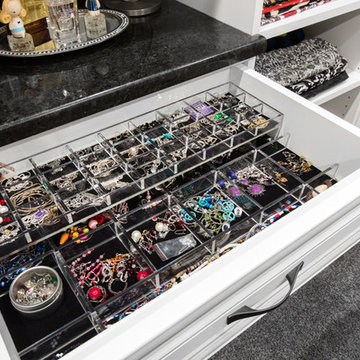
 Closet Organizing Systems
This closet area was part of an expanded bonus space above an existing garage area adjoining to the master suite. The client wanted to create a boutique like closet area to easily display her appealing collection of shoes and hand bags. An up-lit makeup counter and wrapping paper station were added to make it more convenient for the client to get ready in the space and take advantage of the large counter surface for wrapping gifts.
A frosty white Melamine color with charcoal glazed raised panel doors and large crown moulding were used to complement the existing wall color and millwork. The make-up area consisted of a light box tray with a frosted glass insert routed into the countertop, in counter lighting, large framed viewing mirror, side make-up storage drawers, blow dryer holster, and upper storage cabinets with LED down lighting. Also added to further enhance the closet space were his and her jewelry inserts, a space saving fold down ironing board, and color coordinated closet rods and accessories.
Bill Curran-Owner and Designer for Closet Organizing Systems
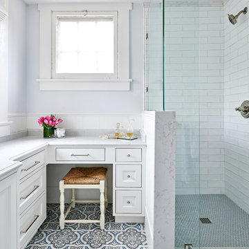
 Haven Design and Construction
This historic guest bathroom needed a fresh look that was in keeping with the home's original character. We started with the gorgeous blue and white handpainted marble tile flooring. Then, we painted the walls in a soft water color blue, freshened up the shower with crisp white subway tile and dressed up the sink area with a custom vanity with legs and Crystorama wall sconces. Fluffy towels and custom roman shades soften the look. The homeowners are thrilled to welcome guests to their new guest bathroom.
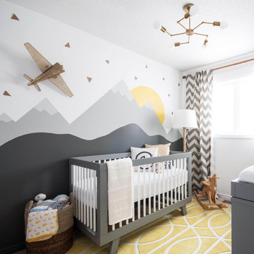
 Leclair Decor
When we found out we were expecting in June, we had already put a plan in motion to merge our home offices to eventually make way for a nursery. After the excitement of the big news we kicked it into high gear!
First off we painted the room a crisp white to contrast from the past 2 tone dark office colours. Our amazing painter Carolyn from Roll Her Sleeves then traced out and painted our vision for the mural. At first we wanted to go very minimal but after looking at it for a few weeks, we asked her to come back and add a forefront layer of grey mountains, details in the peaks and the yellow sun.
During that time the search for the perfect modern crib was on. We found the Hudson model from Babyletto which we loved from one of our suppliers in the states but after duties and shipping it ended up being more practical to buy it here in town.
At the Artemano opening we hosted in November, we connected with Jonathan from Obasan mattresses. He graciously offered to supply us with one of their locally made high quality mattresses. We can’t wait for our baby boy to sleep on it!
Our rocking chair has quite the story behind it. We originally found it for $8 ( yes eight ) dollars last spring. We weren’t sure at the time where and how we were going to use it so we had stored it in one of the garages where we were keeping furniture for an ongoing model home project. One morning we arrived and noticed the chair was missing. We made a call to our construction contact and he relayed the message. Next thing we know a worker was jumping in the garbage bins across the street. They had believed the chair was to be thrown away. Although a bit dusty it was recovered in decent shape. A few months passed and we started entertaining the idea of using it as our rocker. We asked Melissa’s dad if he would be interested in converting it to a rocker for us, and always up for a challenge he accepted and came through big time! At least was the task of reupholstering. We kind of liked the fun bright orange it was but decided to keep it safe with a nice grey material.
After trying numerous curtains ( we lost count ) we finally settled on a old fav, the west elm chevrons. As well, 3 or 4 rugs were attempted until we tried the yellow rug from Urban Barn and instantly knew that was the one.
We slid a couple small Ikea hacks in there. We wrapped an inexpensive floor lamp with rope to give it a different look ( and hide the silver since everything is brass ) and spray painted the shelf hinges to match the rest of the finishes.
Photo: Sacha Leclair
 User
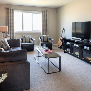
UserThis bonus room is perfect for any activity of your choosing! Set up as a family room, this living space has ample seating, plenty of light, and room for games, guitars, and more! This could also be set up as an office, gym, or flex room.

 Valentini Kids Furniture Brooklyn NY
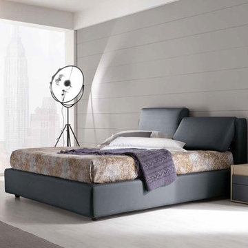
Modern Italian Platform Bed / Bedroom Set Up by Spar (SP-Up)
Made in Italy
The Up by SPAR is a modern italian upholstered bed from the Line Up Collection. Made in Italy and entirely upholstered in top quality italian fabric or eco-leather in a color of your choice, this modern bed will create a special atmosphere in your bedroom interior, providing stunning look and comfortable feel. Headboard features motion cushions that you can adjust according to your needs. Bed can be ordered with a regular platform or one of the storage versions. Optional "Cover" casegoods: nightstands, dresser and chest are also available in a variety of finishes to complement the design of your bedroom and fulfill it with plenty of storage space. Handles of the case-goods can be ordered in a different from structure finish.
The starting price is for the Up Queen Size Bed (platform version #1).
Dimensions:
Queen Size Bed: W66" x D90" x H41.7"
King Size Bed: W83" x D90" x H41.7"
Nightstand: W21.3" x D17.7" x H15.4"
Dresser: W49.2" x D21" x H29.5"
Chest: W26.8" x D21" x H43.3"
 Valentini Kids Furniture Brooklyn NY
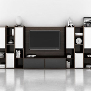
Modern Wall Unit Lyrics 23 by Up Huppe
Made in Canada
The Lyrics by Up Huppe is a modular line of wall units made of specially selected American walnut veneer and a blend of micro-textured lacquer. The collection is equipped with top quality hardware and the drawers, specially treated and stained to match the exterior and equipped with invisible self-closing slow-motion slides, shut gently and silently. All the modules of the Lyrics line can be set on a base, placed on the floor or hung on a wall in unique configurations and ambiances while providing functional storage space. Black smoked glass fronts of the TV base units let remote control rays through and cut-outs on the backs and on the adjustable shelves of each unit provide maximum ventilation. Designed by Joel Dupras and manufactured in Canada by a passionate team, the customer is ensured that his products are unique, authentic and of top quality. Lyrics by Huppe provides you with unlimited design flexibility, you can choose from one of our pre-designed compositions or build your own composition according to your taste and needs.
Features:
Designed by Joel Dupras
Modular line that allows to built your own unique composition
Structure in a veneered wood available in a natural, smoky, chocolate, espresso or tobacco walnut finish
TV base units feature cut-outs for wires and black smoked glass front letting the remote control rays through
Fronts of the closed units and a T-shaped Top available in several lacquered finishes
Drawers are fully finished and equipped with invisible self-closing slow-motion slides
Optional LED Light can be ordered for a TV back panel (for the extra charge)
The starting price is for the Lyrics Wall Unit Composition 23 in Smoky Walnut and White Lacquered finishes as shown in the main picture. (Glass Front TV Base W60" + TV Back Panel + Two 9061B Bookcases + Two 9061C Bookcases + Two 9061A Bookcases).
Dimensions:
Wall Unit: W146" x D21.5" x H61.5"
Individual Components:
TV Base W60": W60" x D21.5" x H15.5"
TV Back Panel: W60" x D2" x H44"
9061B Bookcase (each): W17.2" x D15.7" x H61.5"
9061A Bookcase (each): W12.7" x D15.7" x H61.5"
9061C Bookcase (each): W12.7" x D15.7" x H61.5"
 Klopf Architecture
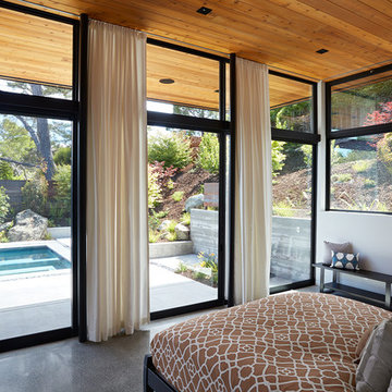
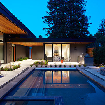
Klopf Architecture, Arterra Landscape Architects and Henry Calvert of Calvert Ventures Designed and built a new warm, modern, Eichler-inspired, open, indoor-outdoor home on a deeper-than-usual San Mateo Highlands property where an original Eichler house had burned to the ground.
The owners wanted multi-generational living and larger spaces than the original home offered, but all parties agreed that the house should respect the neighborhood and blend in stylistically with the other Eichlers. At first the Klopf team considered re-using what little was left of the original home and expanding on it. But after discussions with the owner and builder, all parties agreed that the last few remaining elements of the house were not practical to re-use, so Klopf Architecture designed a new home that pushes the Eichler approach in new directions.
One disadvantage of Eichler production homes is that the house designs were not optimized for each specific lot. A new custom home offered the team a chance to start over. In this case, a longer house that opens up sideways to the south fit the lot better than the original square-ish house that used to open to the rear (west). Accordingly, the Klopf team designed an L-shaped “bar” house with a large glass wall with large sliding glass doors that faces sideways instead of to the rear like a typical Eichler. This glass wall opens to a pool and landscaped yard designed by Arterra Landscape Architects.
Driving by the house, one might assume at first glance it is an Eichler because of the horizontality, the overhanging flat roof eaves, the dark gray vertical siding, and orange solid panel front door, but the house is designed for the 21st Century and is not meant to be a “Likeler.” You won't see any posts and beams in this home. Instead, the ceiling decking is a western red cedar that covers over all the beams. Like Eichlers, this cedar runs continuously from inside to out, enhancing the indoor / outdoor feeling of the house, but unlike Eichlers it conceals a cavity for lighting, wiring, and insulation. Ceilings are higher, rooms are larger and more open, the master bathroom is light-filled and more generous, with a separate tub and shower and a separate toilet compartment, and there is plenty of storage. The garage even easily fits two of today's vehicles with room to spare.
A massive 49-foot by 12-foot wall of glass and the continuity of materials from inside to outside enhance the inside-outside living concept, so the owners and their guests can flow freely from house to pool deck to BBQ to pool and back.
During construction in the rough framing stage, Klopf thought the front of the house appeared too tall even though the house had looked right in the design renderings (probably because the house is uphill from the street). So Klopf Architecture paid the framer to change the roofline from how we had designed it to be lower along the front, allowing the home to blend in better with the neighborhood. One project goal was for people driving up the street to pass the home without immediately noticing there is an "imposter" on this lot, and making that change was essential to achieve that goal.
This 2,606 square foot, 3 bedroom, 3 bathroom Eichler-inspired new house is located in San Mateo in the heart of the Silicon Valley.
Klopf Architecture Project Team: John Klopf, AIA, Klara Kevane
Landscape Architect: Arterra Landscape Architects
Contractor: Henry Calvert of Calvert Ventures
Photography ©2016 Mariko Reed
Location: San Mateo, CA
Year completed: 2016
 KitchenLab Interiors
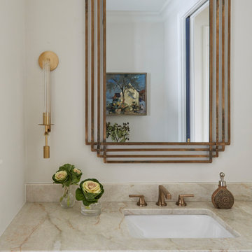
KitchenLab Interiors’ first, entirely new construction project in collaboration with GTH architects who designed the residence. KLI was responsible for all interior finishes, fixtures, furnishings, and design including the stairs, casework, interior doors, moldings and millwork. KLI also worked with the client on selecting the roof, exterior stucco and paint colors, stone, windows, and doors. The homeowners had purchased the existing home on a lakefront lot of the Valley Lo community in Glenview, thinking that it would be a gut renovation, but when they discovered a host of issues including mold, they decided to tear it down and start from scratch. The minute you look out the living room windows, you feel as though you're on a lakeside vacation in Wisconsin or Michigan. We wanted to help the homeowners achieve this feeling throughout the house - merging the causal vibe of a vacation home with the elegance desired for a primary residence. This project is unique and personal in many ways - Rebekah and the homeowner, Lorie, had grown up together in a small suburb of Columbus, Ohio. Lorie had been Rebekah's babysitter and was like an older sister growing up. They were both heavily influenced by the style of the late 70's and early 80's boho/hippy meets disco and 80's glam, and both credit their moms for an early interest in anything related to art, design, and style. One of the biggest challenges of doing a new construction project is that it takes so much longer to plan and execute and by the time tile and lighting is installed, you might be bored by the selections of feel like you've seen them everywhere already. “I really tried to pull myself, our team and the client away from the echo-chamber of Pinterest and Instagram. We fell in love with counter stools 3 years ago that I couldn't bring myself to pull the trigger on, thank god, because then they started showing up literally everywhere", Rebekah recalls. Lots of one of a kind vintage rugs and furnishings make the home feel less brand-spanking new. The best projects come from a team slightly outside their comfort zone. One of the funniest things Lorie says to Rebekah, "I gave you everything you wanted", which is pretty hilarious coming from a client to a designer.
Sponsored
Sunbury, OH

J.Holderby - Renovations
Franklin County's Leading General Contractors - 2X Best of Houzz!
 Klopf Architecture
Klopf Architecture, Arterra Landscape Architects and Henry Calvert of Calvert Ventures Designed and built a new warm, modern, Eichler-inspired, open, indoor-outdoor home on a deeper-than-usual San Mateo Highlands property where an original Eichler house had burned to the ground.
The owners wanted multi-generational living and larger spaces than the original home offered, but all parties agreed that the house should respect the neighborhood and blend in stylistically with the other Eichlers. At first the Klopf team considered re-using what little was left of the original home and expanding on it. But after discussions with the owner and builder, all parties agreed that the last few remaining elements of the house were not practical to re-use, so Klopf Architecture designed a new home that pushes the Eichler approach in new directions.
One disadvantage of Eichler production homes is that the house designs were not optimized for each specific lot. A new custom home offered the team a chance to start over. In this case, a longer house that opens up sideways to the south fit the lot better than the original square-ish house that used to open to the rear (west). Accordingly, the Klopf team designed an L-shaped “bar” house with a large glass wall with large sliding glass doors that faces sideways instead of to the rear like a typical Eichler. This glass wall opens to a pool and landscaped yard designed by Arterra Landscape Architects.
Driving by the house, one might assume at first glance it is an Eichler because of the horizontality, the overhanging flat roof eaves, the dark gray vertical siding, and orange solid panel front door, but the house is designed for the 21st Century and is not meant to be a “Likeler.” You won't see any posts and beams in this home. Instead, the ceiling decking is a western red cedar that covers over all the beams. Like Eichlers, this cedar runs continuously from inside to out, enhancing the indoor / outdoor feeling of the house, but unlike Eichlers it conceals a cavity for lighting, wiring, and insulation. Ceilings are higher, rooms are larger and more open, the master bathroom is light-filled and more generous, with a separate tub and shower and a separate toilet compartment, and there is plenty of storage. The garage even easily fits two of today's vehicles with room to spare.
A massive 49-foot by 12-foot wall of glass and the continuity of materials from inside to outside enhance the inside-outside living concept, so the owners and their guests can flow freely from house to pool deck to BBQ to pool and back.
During construction in the rough framing stage, Klopf thought the front of the house appeared too tall even though the house had looked right in the design renderings (probably because the house is uphill from the street). So Klopf Architecture paid the framer to change the roofline from how we had designed it to be lower along the front, allowing the home to blend in better with the neighborhood. One project goal was for people driving up the street to pass the home without immediately noticing there is an "imposter" on this lot, and making that change was essential to achieve that goal.
This 2,606 square foot, 3 bedroom, 3 bathroom Eichler-inspired new house is located in San Mateo in the heart of the Silicon Valley.
Klopf Architecture Project Team: John Klopf, AIA, Klara Kevane
Landscape Architect: Arterra Landscape Architects
Contractor: Henry Calvert of Calvert Ventures
Photography ©2016 Mariko Reed
Location: San Mateo, CA
Year completed: 2016
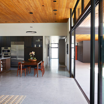 Klopf Architecture
Klopf Architecture, Arterra Landscape Architects and Henry Calvert of Calvert Ventures Designed and built a new warm, modern, Eichler-inspired, open, indoor-outdoor home on a deeper-than-usual San Mateo Highlands property where an original Eichler house had burned to the ground.
The owners wanted multi-generational living and larger spaces than the original home offered, but all parties agreed that the house should respect the neighborhood and blend in stylistically with the other Eichlers. At first the Klopf team considered re-using what little was left of the original home and expanding on it. But after discussions with the owner and builder, all parties agreed that the last few remaining elements of the house were not practical to re-use, so Klopf Architecture designed a new home that pushes the Eichler approach in new directions.
One disadvantage of Eichler production homes is that the house designs were not optimized for each specific lot. A new custom home offered the team a chance to start over. In this case, a longer house that opens up sideways to the south fit the lot better than the original square-ish house that used to open to the rear (west). Accordingly, the Klopf team designed an L-shaped “bar” house with a large glass wall with large sliding glass doors that faces sideways instead of to the rear like a typical Eichler. This glass wall opens to a pool and landscaped yard designed by Arterra Landscape Architects.
Driving by the house, one might assume at first glance it is an Eichler because of the horizontality, the overhanging flat roof eaves, the dark gray vertical siding, and orange solid panel front door, but the house is designed for the 21st Century and is not meant to be a “Likeler.” You won't see any posts and beams in this home. Instead, the ceiling decking is a western red cedar that covers over all the beams. Like Eichlers, this cedar runs continuously from inside to out, enhancing the indoor / outdoor feeling of the house, but unlike Eichlers it conceals a cavity for lighting, wiring, and insulation. Ceilings are higher, rooms are larger and more open, the master bathroom is light-filled and more generous, with a separate tub and shower and a separate toilet compartment, and there is plenty of storage. The garage even easily fits two of today's vehicles with room to spare.
A massive 49-foot by 12-foot wall of glass and the continuity of materials from inside to outside enhance the inside-outside living concept, so the owners and their guests can flow freely from house to pool deck to BBQ to pool and back.
During construction in the rough framing stage, Klopf thought the front of the house appeared too tall even though the house had looked right in the design renderings (probably because the house is uphill from the street). So Klopf Architecture paid the framer to change the roofline from how we had designed it to be lower along the front, allowing the home to blend in better with the neighborhood. One project goal was for people driving up the street to pass the home without immediately noticing there is an "imposter" on this lot, and making that change was essential to achieve that goal.
This 2,606 square foot, 3 bedroom, 3 bathroom Eichler-inspired new house is located in San Mateo in the heart of the Silicon Valley.
Klopf Architecture Project Team: John Klopf, AIA, Klara Kevane
Landscape Architect: Arterra Landscape Architects
Contractor: Henry Calvert of Calvert Ventures
Photography ©2016 Mariko Reed
Location: San Mateo, CA
Year completed: 2016
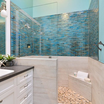
 TaylorPro Design and Remodeling, Inc.
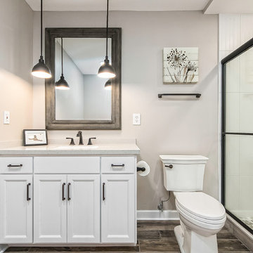
"TaylorPro completely remodeled our master bathroom. We had our outdated shower transformed into a modern walk-in shower, new custom cabinets installed with a beautiful quartz counter top, a giant framed vanity mirror which makes the bathroom look so much bigger and brighter, and a wood ceramic tile floor including under floor heating. Kerry Taylor also solved a hot water problem we had by installing a recirculating hot water system which allows us to have instant hot water in the shower rather than waiting forever for the water to heat up.
From start to finish TaylorPro did a professional, quality job. Kerry Taylor was always quick to respond to any question or problem and made sure all work was done properly. Bonnie, the resident designer, did a great job of creating a beautiful, functional bathroom design combining our ideas with her own. Every member of the TaylorPro team was professional, hard-working, considerate, and competent. Any remodeling project is going to be somewhat disruptive, but the TaylorPro crew made the process as painless as possible by being respectful of our home environment and always cleaning up their mess at the end of the day. I would recommend TaylorPro Design to anyone who wants a quality project done by a great team of professionals. You won't be disappointed!"
~ Judy and Stuart C, Clients
Carlsbad home with Caribbean Blue mosaic glass tile, NuHeat radiant floor heating, grey weathered plank floor tile, pebble shower pan and custom "Whale Tail" towel hooks. Classic white painted vanity with quartz counter tops.
Bathroom Design - Bonnie Bagley Catlin, Signature Designs Kitchen Bath.
Contractor - TaylorPro Design and Remodeling
Photos by: Kerry W. Taylor
22