
Search results for "Bonus start up" in Home Design Ideas
 Zieba Builders, Inc.
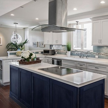
Our clients loved the location of their duplex home with its peak-a-boo ocean view, but their existing kitchen was not suited for their growing family. They wanted a kitchen with a coastal vibe, plenty of storage space, and an eat-in area.
We started by bringing the far wall into the kitchen space to accommodate a large panty and communication center for the family. Doing this allowed us to move the refrigerator out of the main traffic area and doubled the amount of storage space. Several new windows were added to bring in natural light. A half wall was moved to allow more countertop area and open up sight lines. The previously awkwardly shaped island was slimmed down to create better flow.
There were a few venting challenges to overcome; gas lines and plumbing had to be re-routed without disturbing the unit below. To open up sight lines, soffits were eliminated which allowed the extension of cabinets to the ceiling. To stay within the homeowner’s budget, we match existing scraped flooring by lacing in and repairing patches.
The old dining area was too small for table, so we designed and built a custom banquette to maximize the space and take advantage of the outdoor views. The overall space works for family meals as well as entertaining.
A light summer palette was used to reflect the shades of the sand, sea and sky. Even though the new kitchen is actually smaller than the original space, its now far more functional and open.
 Alair Homes Plano
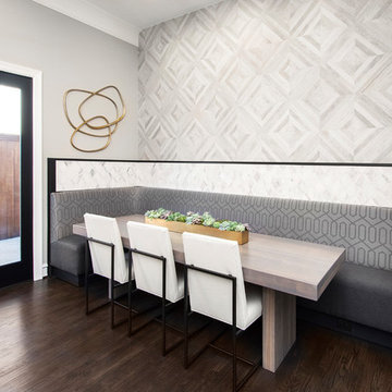
Our clients came to us wanting to update and open up their kitchen, breakfast nook, wet bar, and den. They wanted a cleaner look without clutter but didn’t want to go with an all-white kitchen, fearing it’s too trendy. Their kitchen was not utilized well and was not aesthetically appealing; it was very ornate and dark. The cooktop was too far back in the kitchen towards the butler’s pantry, making it awkward when cooking, so they knew they wanted that moved. The rest was left up to our designer to overcome these obstacles and give them their dream kitchen.
We gutted the kitchen cabinets, including the built-in china cabinet and all finishes. The pony wall that once separated the kitchen from the den (and also housed the sink, dishwasher, and ice maker) was removed, and those appliances were relocated to the new large island, which had a ton of storage and a 15” overhang for bar seating. Beautiful aged brass Quebec 6-light pendants were hung above the island.
All cabinets were replaced and drawers were designed to maximize storage. The Eclipse “Greensboro” cabinetry was painted gray with satin brass Emtek Mod Hex “Urban Modern” pulls. A large banquet seating area was added where the stand-alone kitchen table once sat. The main wall was covered with 20x20 white Golwoo tile. The backsplash in the kitchen and the banquette accent tile was a contemporary coordinating Tempesta Neve polished Wheaton mosaic marble.
In the wet bar, they wanted to completely gut and replace everything! The overhang was useless and it was closed off with a large bar that they wanted to be opened up, so we leveled out the ceilings and filled in the original doorway into the bar in order for the flow into the kitchen and living room more natural. We gutted all cabinets, plumbing, appliances, light fixtures, and the pass-through pony wall. A beautiful backsplash was installed using Nova Hex Graphite ceramic mosaic 5x5 tile. A 15” overhang was added at the counter for bar seating.
In the den, they hated the brick fireplace and wanted a less rustic look. The original mantel was very bulky and dark, whereas they preferred a more rectangular firebox opening, if possible. We removed the fireplace and surrounding hearth, brick, and trim, as well as the built-in cabinets. The new fireplace was flush with the wall and surrounded with Tempesta Neve Polished Marble 8x20 installed in a Herringbone pattern. The TV was hung above the fireplace and floating shelves were added to the surrounding walls for photographs and artwork.
They wanted to completely gut and replace everything in the powder bath, so we started by adding blocking in the wall for the new floating cabinet and a white vessel sink. Black Boardwalk Charcoal Hex Porcelain mosaic 2x2 tile was used on the bathroom floor; coordinating with a contemporary “Cleopatra Silver Amalfi” black glass 2x4 mosaic wall tile. Two Schoolhouse Electric “Isaac” short arm brass sconces were added above the aged brass metal framed hexagon mirror. The countertops used in here, as well as the kitchen and bar, were Elements quartz “White Lightning.” We refinished all existing wood floors downstairs with hand scraped with the grain. Our clients absolutely love their new space with its ease of organization and functionality.
 Valentini Kids Furniture Brooklyn NY
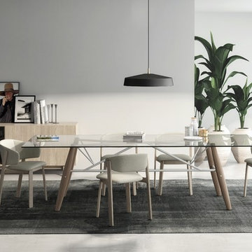
Huppe Connection Modern Glass Dining Table
Made in Canada
Connection by Huppe is a new luxury dining table from the Dining Furniture Up Line. The table is a real masterpiece created in Canada by real professionals from the hand-selected materials. Dining Table Connection features a real Scandinavian European design, that is remarkable by simple design, but astonishing uniqueness. The top of the dining table is made of 12mm (0.5") thick clear tempered glass. The legs are made of 100% solid White Oak or Walnut, that is stain finished up to your choice. The legs are supported with steel beams that carry not only a supporting function but also highlight the design, making the dining table a vivid spot in any interior. Connection glass top dining table is available in three sizes: 84", 98" and 108", so you could find the right size for your modern home.
Connection Dining Table by Huppe is also available with Wooden Top - Click here to View.
Features:
Designed by Up Huppe
Clear thick and durable tempered glass top
Solid oak or walnut legs available in a variety of finishes
Rectangular tabletop shape
Base feature steel beams available in different matt lacquered colors
Available in three different sizes
The starting price is for the Connection Glass Dining Table W84" with the base in Natural Oak Finish / Matt White Lacquer.
Dimensions:
Dining Table: W84" x D40" x H30"
Dining Table: W98" x D40" x H30"
Dining Table: W108" x D40" x H30"
Find the right local pro for your project
 Hearthstone Inc
Richard Herman is in the hospitality business and owns several upscale hotels in Florida and in other states as well as cattle ranches in both Florida and Missouri. Their farm in Ocala is by farm their most unique. The property serves as a 4-H demonstration project for the purpose of children’s education. They have been working with the Academy Prep of St. Pete which is dedicated to inner-city youths that are selected on the basis of need and achievement. Wife Diane spends her time on the farm raising Gypsy Vanners, a diminutive draft horse named after the job they did in Eastern Europe, pulling the wagons (vans) for gypsies that wandered across the continent. On the Ocala farm, there are several mules with a unique profession.
Richard had visited the Hearthstone display at a Log & Timber Home Shows at the Orlando Convention Center many years ago. He was impressed that Hearthstone had stayed in touch with him over the years by mailings, invitations to shows, and periodic phone calls. When the time came to start serious consideration of the design of barn, Hearthstone responded promptly and professionally to Richard and Diane’s requests for information and a review of their ideas for their barn, which would serve as the centerpiece for their new farm.
They wanted a multipurpose facility that could accommodate an educational environment and a large hall suitable for the fundraising events for his charities. Richard wanted a barn that reflected the look and feel of barns built at the dawn of the 20th century. Besides the rustic chicken houses and vegetable gardens, they have completely renovated a 1020’s era farmhouse to be as historically correct as possible and serves as the entry to the farm.
“They very careful to feel us out, get comfortable with our capabilities, and be convinced that we could perform as promised,” said Project Manager John Ricketson of Hearthstone.
Design Process
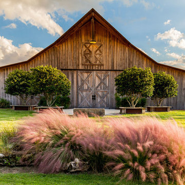
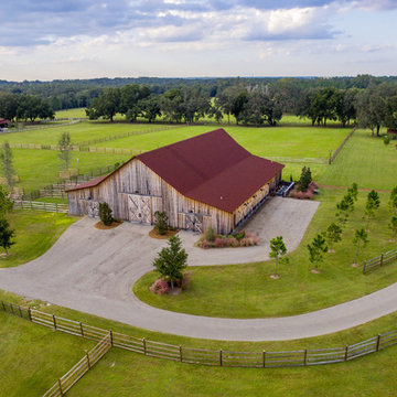
There were some initial drawings that gave us a start on the basic shape and size of the barn. From there, it was a process of narrowing down the uses of each area and the spans that could be achieved. The barn was going to have the traditional “board & batten” exterior siding and a metal roof. There is a cantilevered ‘hay hood” on the north gable end above the large sliding barn doors that open into the foyer and horse stalls. The wings house a combination of areas, beginning with the large restrooms to accommodate crowds for events. Other parts of the wings have garage areas for the farm vehicles, feed room, tack room, wash rack, storage, offices, and smaller restrooms.
Keeping with the look and feel of the turn of the century, Hearthstone developed a process for giving the timbers a surface texture that mimicked the circular cuts of timbers that had just come out of an old sawmill. This was easier said than done. Randy Giles guided his millwright (Wolfgang) in designing a machine that would do this effectively.
The barn was delivered in October of 2014 and was erected over the course of two weeks, thanks to a hardworking crew (Eric Foster) and near-perfect weather. After the Hearthstone crew completed the erection and roof dry-in, it was time for the local carpenters to step up and install some light conventional framing on the gable ends before applying the roof fascia and exterior board & batten siding. Next came the big sliding barn doors, plumbing, electrical, heating, and cooling. Large rustic fixtures were hung from the great hall roof timbers.
Exterior
The board & batten siding was cypress and allowed to turn color naturally as rain hit it and the sun started working on it with UV rays. This method causes a much grayer look closer to the ground and less so where the roof overhang provides protection. The North end has some large limestone boulders and planters arranged around the pad with tall pampas grass. The planters provide casual seating before events and during outside receptions. The entire area was sodded with lush St. Augustine grass and split rail fences were added to enclose the barn area. The corrugated metal roof was a special order material that immediately rusted after being exposed to moisture. The layer of rust protects the metal from the elements.
Interior
The board & batten theme was carried throughout most of the interior with the timbers left natural to show off the circular saw texture. All of the tongue & groove decking was shipped in advance to allow the local painter to pre-stain it with a dark brown transparent stain that is a beautiful background to the light color Eastern White Pine timbers.
“Everything was unique in this project” said Project Manager John Ricketson. “The setting on a small demonstration farm close to Ocala, the multipurpose design, the circular saw texture on the timbers.”
The Hermans are very proud of their farm’s outcome. Richard sent a note to Randy Giles, owner of Hearthstone: “The Barn is fantastic, not a single problem, period. Next month, we have Jo Dee Messina coming in to help with a fundraiser for a local center for abused kids. Folks love the farm, ...... but that barn gets all of the attention. I would encourage you to use me as a reference for your sales team, feel free to extend my cell phone to any prospective purchasers.”
 Décor Aid
Million Dollar Listing’s celebrity broker Ryan Serhant reached out to Decor Aid to stage a luxurious Brooklyn condo development. The only caveat was that our interior designers had 48 hours to come up with the design, concept, and source all the furniture. Always up for a challenge, we partnered with Mitchell Gold & Bob Williams to create this contemporary gem.
Staying true to their contemporary vision, our interior decorators sourced all pieces through MGBW. Starting in the living room, we placed the Gunner Sofa, a piece that offers clean-lined living. The thin arms and slanted profile emphasize the modern elegance of the home. Through the use of various contemporary patterns and textures we were able to avoid the one-dimensional ambiance, and instead, the apartment’s living room feels detailed and thought out, without making anyone who enters overcrowded with home decor.
The Melrose cocktail table was sourced for its sleek, stainless steel and glass design that contrasts with more substantial pieces in the space, while also complementing the contemporary style. The glass design gives the illusion that this table takes up less space, giving the living room design a light and airy feel all around. The living space transformed into something out of a decor catalog with just the right amount of personality, creating a room that follows through with our starting design, yet functional for everyday use.
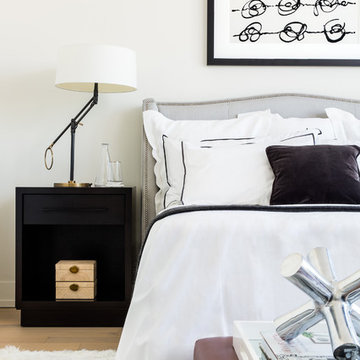
After the living room area, we set our eyes on designing the master bedroom. Our interior decorators were immediately drawn to the Celina Floating Rail Bed, it’s opulent nailhead trim, and dramatic design brings fresh sophistication to the bedroom design, while also standing out as a timeless piece that can complement various trends or styles that might be added later on to the bedroom decoration. We sourced the Roland Table Lamp to add texture, with its elaborate ribbed design, that compliments the air of masculinity the Carmen Leather Ottoman add while contrasting with the light, sleeker pieces. This difference in weight left us with a bedroom decoration that lives up to the trending modern standards, yet a space that is timeless and stylish no matter the decor trends.
Once we finished and the project was completed, our senior designers took a step back and took in all of their hard labor. Decor Aid was able to make this newly built blank space and design it into a modern wonder small brooklyn apartment. The MGBW furnishings were all hand-picked to keep an even balance of complementing and contrasting contemporary pieces, which was one of our more critical apartment decorating ideas. The apartment home decor brings to life this modern concept in a way that isn’t overbearing and shows off their style making the space in every sense an accurate reflection of a chic contemporary style.
 Lars Remodeling & Design
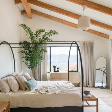
This spectacular family home situated above Lake Hodges in San Diego with sweeping views, was a complete interior and partial exterior remodel. Having gone untouched for decades, the home presented a unique challenge in that it was comprised of many cramped, unpermitted rooms and spaces that had been added over the years, stifling the home's true potential. Our team gutted the home down to the studs and started nearly from scratch.
The goal was to dramatically open up the living space and modernize the home, while capitalizing on the stunning views the property had to offer. With the existing floor plan, only bedrooms had partial views, with common living areas relegated to the back portion, preventing residents from enjoying the expansive sightlines available to the home.
The completely reimagined floorplan included relocating the kitchen and Master Suite to the opposite side of the home to take better advantage of the views and natural light. All bathrooms and the laundry room were completely remodeled along with installing new doors, windows, and flooring throughout the home and completely upgrading all electrical and plumbing.
The end result is simply stunning. Light, bright, and modern, the new version of this home demonstrates the power of thoughtful architectural planning, creative problem solving, and expert design details.
 Drummond House Plans
Blueprints & PDF files on sale starting at $1079 !
Distinctive elements :
5 bedrooms
Home office
Bonus room
Open floor plan layout
2-car garage
Large master suite
Fireplace in the living room
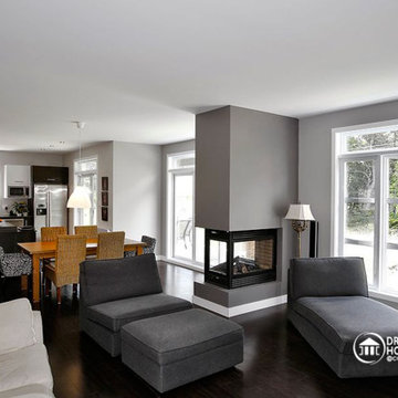
This cottage-style charmer plays down the garage presence with discreet side access. Within, the floor plan includes 3 planned bedrooms with the feasibility of 2 more in the large bonus space above the garage.
On the ground floor, one is greeted by an office or flex room by the front entry. Beyond, one finds a completely open activities area. The living room with fireplace easily flows to the dining area and then to the very open kitchen with island and eating bar.
Upstairs, the 14’ x 14’ master bedroom will easily accommodate a king-size bed with room to spare. Other master suite amenities include a 9’ x 8’ walk-in closet and private bathroom featuring a shower that is nearly 5’ x 4’, a corner bath and double vanity. We also note the presence of two secondary bedrooms and a convenient combined bathroom / laundry. Finally, a bonus space of 22 'x 13' could be used for 2 additional bedrooms or for family recreation space.

Sponsored
Columbus, OH
Free consultation for landscape design!

Peabody Landscape Group
Columbus' Reliable Landscape Design & Contracting
 Steve Masley Consulting and Design
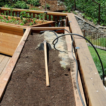
Organic soil amendments are cultivated into the soil. Since their nutrients are released by soil microbes, they need to be mixed into the soil so they're in contact with the soil food web. These organic fertilizers are built into the soil at the start of the season, and release over time--no need for additional fertilizers, it's like winding up a clock.
Photo by Steve Masley
 Valentini Kids Furniture Brooklyn NY
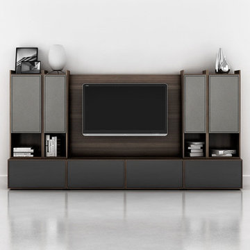
Modern Wall Unit Lyrics 24 by Up Huppe
Made in Canada
The Lyrics by Up Huppe is a modular line of wall units made of specially selected American walnut veneer and a blend of micro-textured lacquer. The collection is equipped with top quality hardware and the drawers, specially treated and stained to match the exterior and equipped with invisible self-closing slow-motion slides, shut gently and silently. All the modules of the Lyrics line can be set on a base, placed on the floor or hung on a wall in unique configurations and ambiances while providing functional storage space. Black smoked glass fronts of the TV base units let remote control rays through and cut-outs on the backs and on the adjustable shelves of each unit provide maximum ventilation. Designed by Joel Dupras and manufactured in Canada by a passionate team, the customer is ensured that his products are unique, authentic and of top quality. Lyrics by Huppe provides you with unlimited design flexibility, you can choose from one of our pre-designed compositions or build your own composition according to your taste and needs.
The starting price is for the Lyrics Wall Unit Composition 24 in Tobacco Walnut and Slate Lacquered finishes as shown in the main picture. (Glass Front TV Base W60" + Two Glass Front TV Bases W30" + TV Back Panel + Two 9046B Bookcases + Two 9046A Bookcases).
Dimensions:
Wall Unit: W120" x D21.5" x H61.5"
Individual Components:
TV Base W60": W60" x D21.5" x H15.5"
Glass Front TV Base W30" (each): W30" x D21.5" x H15.5"
TV Back Panel: W60" x D2" x H44"
9046B Bookcase (each): W17.2" x D15.7" x H46"
9046A Bookcase (each): W12.7" x D15.7" x H46"
 Aspire Fine Homes
Felix Sanchez (www.felixsanchez.com)
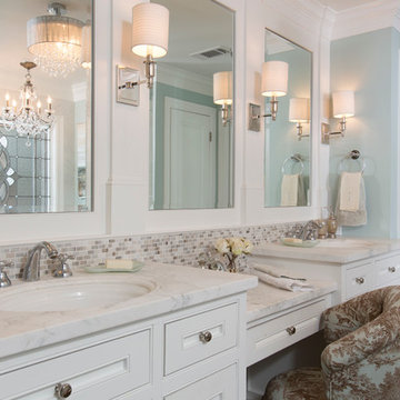
Inspiration for a huge timeless master mosaic tile, beige tile and gray tile dark wood floor, brown floor and double-sink claw-foot bathtub remodel in Houston with an undermount sink, white cabinets, blue walls, marble countertops, white countertops, recessed-panel cabinets and a built-in vanity
Inspiration for a huge timeless master mosaic tile, beige tile and gray tile dark wood floor, brown floor and double-sink claw-foot bathtub remodel in Houston with an undermount sink, white cabinets, blue walls, marble countertops, white countertops, recessed-panel cabinets and a built-in vanity
 Klopf Architecture
Klopf Architecture, Arterra Landscape Architects and Henry Calvert of Calvert Ventures Designed and built a new warm, modern, Eichler-inspired, open, indoor-outdoor home on a deeper-than-usual San Mateo Highlands property where an original Eichler house had burned to the ground.
The owners wanted multi-generational living and larger spaces than the original home offered, but all parties agreed that the house should respect the neighborhood and blend in stylistically with the other Eichlers. At first the Klopf team considered re-using what little was left of the original home and expanding on it. But after discussions with the owner and builder, all parties agreed that the last few remaining elements of the house were not practical to re-use, so Klopf Architecture designed a new home that pushes the Eichler approach in new directions.
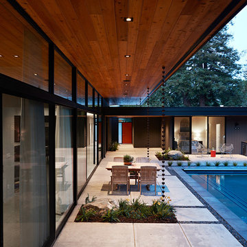
One disadvantage of Eichler production homes is that the house designs were not optimized for each specific lot. A new custom home offered the team a chance to start over. In this case, a longer house that opens up sideways to the south fit the lot better than the original square-ish house that used to open to the rear (west). Accordingly, the Klopf team designed an L-shaped “bar” house with a large glass wall with large sliding glass doors that faces sideways instead of to the rear like a typical Eichler. This glass wall opens to a pool and landscaped yard designed by Arterra Landscape Architects.
Driving by the house, one might assume at first glance it is an Eichler because of the horizontality, the overhanging flat roof eaves, the dark gray vertical siding, and orange solid panel front door, but the house is designed for the 21st Century and is not meant to be a “Likeler.” You won't see any posts and beams in this home. Instead, the ceiling decking is a western red cedar that covers over all the beams. Like Eichlers, this cedar runs continuously from inside to out, enhancing the indoor / outdoor feeling of the house, but unlike Eichlers it conceals a cavity for lighting, wiring, and insulation. Ceilings are higher, rooms are larger and more open, the master bathroom is light-filled and more generous, with a separate tub and shower and a separate toilet compartment, and there is plenty of storage. The garage even easily fits two of today's vehicles with room to spare.
A massive 49-foot by 12-foot wall of glass and the continuity of materials from inside to outside enhance the inside-outside living concept, so the owners and their guests can flow freely from house to pool deck to BBQ to pool and back.
During construction in the rough framing stage, Klopf thought the front of the house appeared too tall even though the house had looked right in the design renderings (probably because the house is uphill from the street). So Klopf Architecture paid the framer to change the roofline from how we had designed it to be lower along the front, allowing the home to blend in better with the neighborhood. One project goal was for people driving up the street to pass the home without immediately noticing there is an "imposter" on this lot, and making that change was essential to achieve that goal.
This 2,606 square foot, 3 bedroom, 3 bathroom Eichler-inspired new house is located in San Mateo in the heart of the Silicon Valley.
Klopf Architecture Project Team: John Klopf, AIA, Klara Kevane
Landscape Architect: Arterra Landscape Architects
Contractor: Henry Calvert of Calvert Ventures
Photography ©2016 Mariko Reed
Location: San Mateo, CA
Year completed: 2016
 Drury Design
THE SETUP
“You have to figure out how to rebuild a life worth living,” Basia Kozub’s client says. Her husband passed away suddenly three years ago. Holidays with family became more important, and she found herself struggling with a 37-year old kitchen that was falling apart. “I made a decision to move forward,” she says. “I went, ‘You know what? I’m redoing the kitchen.'”
The big task of getting started was as easy as having a conversation – literally. Basia was on the job, helping the client sort through priorities, wishes and ideas. Basia’s client is 5′ 4″, likes keeping an eye on the kiddoes in the backyard and wanted certain things to have their own place.
THE REMODEL
The objectives were:
Enlarge and open the space
Find a classic look that incorporates blues
Upgrade to easy-to-use appliances
Hide an office space within the space
Ample storage for dishes
Design challenges:
Uneven window alignment on the back wall
Original kitchen smaller than desired, stuctural concerns if walls to be moved
Keep folks close – figure out seating for entertaining
Main sink in corner is ideal, but windows are hard to reach
Lots of storage needed for dishes, glass collection, pantry items, bar bottles and office supplies
Specific storage needs for oft-used spices and utensils
THE RENEWED SPACE
Design solutions:
Replace back wall windows, establish window size continuity
Take out two walls to open up the space, tall shallow cabinet and a tall filler added to conceal a new header
Large island that seats six easily
Custom corner sink cabinet with recessed edge allows vertically challenged homeowner to reach the windows
Mindful storage planning features: plenty of cabinets, pull-out bar bottle storage, file drawers & cubbies with pocket doors for office appliances, magic corner pullouts, and appliance garages with pocket doors
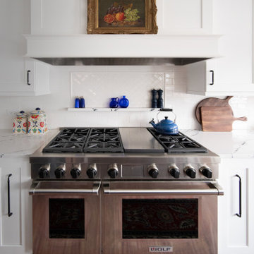
Shelf behind range for easy access to daily-use spices and oils. Also: spice and utensil pullouts on either side of range
The clients says every priority and wish box got checked. The highly functional design absorbed everything that used to be in that area of the house, but now those things are out of the way.
“In the past, we were all spread out when we gathered for the holidays, because we had to spread out. Now, we’re all in here together, including my 92-year old mother. We’re visiting, cooking, laughing… everyone is here. And I’m really learning how to use these appliances. This kitchen has given me a whole new life.”
 TKS Design Group
Download our free ebook, Creating the Ideal Kitchen. DOWNLOAD NOW
Lakefront property in the northwest suburbs of Chicago is hard to come by, so when we were hired by this young family with exactly that, we were immediately inspired by not just the unusually large footprint of this 1950’s colonial revival but also the lovely views of the manmade lake it was sited on. The large 5-bedroom home was solidly stuck in the 1980’s, but we saw tons of potential. We started out by updating the existing staircase with a fresh coat of paint and adding new herringbone slate to the entry hall.
The powder room off the entryway also got a refresh - new flooring, new cabinets and fixtures. We ran the new slate right through into this space for some consistency. A fun wallpaper and shiplap trim add a welcoming feel and set the tone for the home.
Next, we tackled the kitchen. Located away from the rest of the first floor, the kitchen felt a little isolated, so we immediately began planning for how to better connect it to the rest of the first floor. We landed on removing the wall between the kitchen and dining room and designed a modified galley style space with separate cooking and clean up zones. The cooking zone consists of the refrigerator, prep sink and cooktop, along with a nice long run of prep space at the island. The cleanup side of the kitchen consists of the main sink and dishwasher. Both areas are situated so that the user can view the lake during prep work and cleanup!
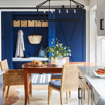
One of the home’s main puzzles was how to incorporate the mudroom and area in front of the patio doors at the back of the house. We already had a breakfast table area, so the space by the patio doors was a bit of a no man’s land. We decided to separate the kitchen proper from what became the new mudroom with a large set of barn doors. That way you can quickly hide any mudroom messes but have easy access to the light coming in through the patio doors as well as the outdoor grilling station. We also love the impact the barn doors add to the overall space.
The homeowners’ first words to us were “it’s time to ditch the brown,” so we did! We chose a lovely blue pallet that reflects the home’s location on the lake which is also vibrant yet easy on the eye. Countertops are white quartz, and the natural oak floor works well with the other honey accents. The breakfast table was given a refresh with new chairs, chandelier and window treatments that frame the gorgeous views of the lake out the back.
We coordinated the slate mudroom flooring with that used in the home’s main entrance for a consistent feel. The storage area consists of open and closed storage to allow for some clutter control as needed.
Next on our “to do” list was revamping the dated brown bar area in the neighboring dining room. We eliminated the clutter by adding some closed cabinets and did some easy updates to help the space feel more current. One snag we ran into here was the discovery of a beam above the existing open shelving that had to be modified with a smaller structural beam to allow for our new design to work. This was an unexpected surprise, but in the end we think it was well worth it!
We kept the colors here a bit more muted to blend with the homeowner’s existing furnishings. Open shelving and polished nickel hardware add some simple detail to the new entertainment zone which also looks out onto the lake!
Next we tackled the upstairs starting with the homeowner’s son’s bath. The bath originally had both a tub shower and a separate shower, so we decided to swap out the shower for a new laundry area. This freed up some space downstairs in what used to be the mudroom/laundry room and is much more convenient for daily laundry needs.
We continued the blue palette here with navy cabinetry and the navy tile in the shower. Porcelain floor tile and chrome fixtures keep maintenance to a minimum while matte black mirrors and lighting add some depth the design. A low maintenance runner adds some warmth underfoot and ties the whole space together.
We added a pocket door to the bathroom to minimize interference with the door swings. The left door of the laundry closet is on a 180 degree hinge to allow for easy full access to the machines. Next we tackled the master bath which is an en suite arrangement. The original was typical of the 1980’s with the vanity outside of the bathroom, situated near the master closet. And the brown theme continued here with multiple shades of brown.
Our first move was to segment off the bath and the closet from the master bedroom. We created a short hall from the bedroom to the bathroom with his and hers walk-in closets on the left and right as well as a separate toilet closet outside of the main bathroom for privacy and flexibility.
The original bathroom had a giant soaking tub with steps (dangerous!) as well as a small shower that did not work well for our homeowner who is 6’3”. With other bathtubs in the home, they decided to eliminate the tub and create an oversized shower which takes up the space where the old tub was located. The double vanity is on the opposite wall and a bench is located under the window for morning conversations and a place to set a couple of towels.
The pallet in here is light and airy with a mix of blond wood, creamy porcelain and marble tile, and brass accents. A simple roman shade adds some texture and it’s top-down mechanism allows for light and privacy.
This large whole house remodel gave our homeowners not only the ability to maximize the potential of their home but also created a lovely new frame from which to view their fabulous lake views.
Designed by: Susan Klimala, CKD, CBD
Photography by: Michael Kaskel
For more information on kitchen and bath design ideas go to: www.kitchenstudio-ge.com
Sponsored
Sunbury, OH

J.Holderby - Renovations
Franklin County's Leading General Contractors - 2X Best of Houzz!
 Hearthstone Inc
Richard Herman is in the hospitality business and owns several upscale hotels in Florida and in other states as well as cattle ranches in both Florida and Missouri. Their farm in Ocala is by farm their most unique. The property serves as a 4-H demonstration project for the purpose of children’s education. They have been working with the Academy Prep of St. Pete which is dedicated to inner-city youths that are selected on the basis of need and achievement. Wife Diane spends her time on the farm raising Gypsy Vanners, a diminutive draft horse named after the job they did in Eastern Europe, pulling the wagons (vans) for gypsies that wandered across the continent. On the Ocala farm, there are several mules with a unique profession.
Richard had visited the Hearthstone display at a Log & Timber Home Shows at the Orlando Convention Center many years ago. He was impressed that Hearthstone had stayed in touch with him over the years by mailings, invitations to shows, and periodic phone calls. When the time came to start serious consideration of the design of barn, Hearthstone responded promptly and professionally to Richard and Diane’s requests for information and a review of their ideas for their barn, which would serve as the centerpiece for their new farm.
They wanted a multipurpose facility that could accommodate an educational environment and a large hall suitable for the fundraising events for his charities. Richard wanted a barn that reflected the look and feel of barns built at the dawn of the 20th century. Besides the rustic chicken houses and vegetable gardens, they have completely renovated a 1020’s era farmhouse to be as historically correct as possible and serves as the entry to the farm.
“They very careful to feel us out, get comfortable with our capabilities, and be convinced that we could perform as promised,” said Project Manager John Ricketson of Hearthstone.
Design Process
There were some initial drawings that gave us a start on the basic shape and size of the barn. From there, it was a process of narrowing down the uses of each area and the spans that could be achieved. The barn was going to have the traditional “board & batten” exterior siding and a metal roof. There is a cantilevered ‘hay hood” on the north gable end above the large sliding barn doors that open into the foyer and horse stalls. The wings house a combination of areas, beginning with the large restrooms to accommodate crowds for events. Other parts of the wings have garage areas for the farm vehicles, feed room, tack room, wash rack, storage, offices, and smaller restrooms.
Keeping with the look and feel of the turn of the century, Hearthstone developed a process for giving the timbers a surface texture that mimicked the circular cuts of timbers that had just come out of an old sawmill. This was easier said than done. Randy Giles guided his millwright (Wolfgang) in designing a machine that would do this effectively.
The barn was delivered in October of 2014 and was erected over the course of two weeks, thanks to a hardworking crew (Eric Foster) and near-perfect weather. After the Hearthstone crew completed the erection and roof dry-in, it was time for the local carpenters to step up and install some light conventional framing on the gable ends before applying the roof fascia and exterior board & batten siding. Next came the big sliding barn doors, plumbing, electrical, heating, and cooling. Large rustic fixtures were hung from the great hall roof timbers.
Exterior
The board & batten siding was cypress and allowed to turn color naturally as rain hit it and the sun started working on it with UV rays. This method causes a much grayer look closer to the ground and less so where the roof overhang provides protection. The North end has some large limestone boulders and planters arranged around the pad with tall pampas grass. The planters provide casual seating before events and during outside receptions. The entire area was sodded with lush St. Augustine grass and split rail fences were added to enclose the barn area. The corrugated metal roof was a special order material that immediately rusted after being exposed to moisture. The layer of rust protects the metal from the elements.
Interior
The board & batten theme was carried throughout most of the interior with the timbers left natural to show off the circular saw texture. All of the tongue & groove decking was shipped in advance to allow the local painter to pre-stain it with a dark brown transparent stain that is a beautiful background to the light color Eastern White Pine timbers.
“Everything was unique in this project” said Project Manager John Ricketson. “The setting on a small demonstration farm close to Ocala, the multipurpose design, the circular saw texture on the timbers.”
The Hermans are very proud of their farm’s outcome. Richard sent a note to Randy Giles, owner of Hearthstone: “The Barn is fantastic, not a single problem, period. Next month, we have Jo Dee Messina coming in to help with a fundraiser for a local center for abused kids. Folks love the farm, ...... but that barn gets all of the attention. I would encourage you to use me as a reference for your sales team, feel free to extend my cell phone to any prospective purchasers.”
 Envision Web
Stuart Wade, Envision Virtual Tours, Inc.
Envision Virtual Tours and High Resolution Photography is your best choice to find just what you are looking for in the Lake Burton Area . Knowing the areas and resources of Lake Burton is our specialty
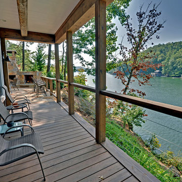
Lake Burton is a 2,775 acre man-made lake with 62 miles of shoreline located in the northeastern corner of Georgia in Rabun County. It is the first lake in a five-lake series called the Tallulah River Watershed that follows the original course of the Tallulah River. The series of lakes starts with Lake Burton as the northernmost lake followed by Lake Seed, Lake Rabun, Lake Tallulah Falls and the eastern arm of Lake Tugalo (the western arm is formed by the Chattooga River. The lakes are owned and operated by the Georgia Power Company to generate hydroelectric energy for Georgia's largest city, Atlanta. At one time these lakes were the largest producers of electricity in the state of Georgia. Now, they only provide peak power supply.
The lake was built in a deep valley located along a 10 mile section of the Tallulah River. The Lake Burton Dam was closed on December 22, 1919 and the lake started to fill. The dam is a gravity concrete dam, with a height of 128 feet and a span of 1,100 feet. The spillway is equipped with eight gates 22 feet wide by 6.6 feet high. The total capacity at an elevation of 1,866.6 feet is 108,000 acre-ft, of which 106,000 acre-ft is usable storage. The generating capacity of the dam is 6,120 kilowatts (two units).Lake Burton is the highest Georgia Power lake in Georgia.
Lake Burton gets its named from the town of Burton, which was the second largest town in Rabun County with a population of approximately 200 but now lies below the lake's surface. The town (and the lake) was named after local prominent citizen Jeremiah Burton and was situated along the road from Clayton, Georgia to the Nacoochee Valley. Andrew Jackson Ritchie served as the postmaster for the area for several years. Gold was first discovered in Rabun County where Dicks Creek and the Tallulah River come together and was the reason for the town's founding in the early 1800s.
The Lake Burton Fish Hatchery and Moccasin Creek State Park are located on the western side of the lake. Lake Burton is home to several species of fish, including Spotted Bass, Largemouth Bass, White Bass, Black Crappie, Bluegill, Redear Sunfish, White Catfish, Walleye, Brown Trout, Rainbow Trout, and Yellow Perch.
The residents of Lake Burton are a mix of permanent residents and seasonal vacationers who together make-up the Lake Burton Civic Association, a local organization who goal is to maintain the lake through volunteer clean-ups and other such events. Let a Lake Burton resident and expert show you the way
The Lake Burton Civic Association is an active homeowners association for residents of the Lake Burton area and sponsors many events throughout the year such as:
burton, custom, envision, georgia, lake, mountain, nc, north, photography, web, western, Lake Burton, Lake Rabun, Seed Lake,Virtual Tours.
 Simply Home Decorating
This beautiful North Vancouver home belongs to a nature-loving and health-conscious couple, Emma and Vince (names changed), their two young children, and their dog, Jasper. When they contacted us about renovating and furnishing their kitchen and family room, we walked in and saw a world of potential waiting to be uncovered.
Before: Larkhall Crescent Home:
Like many original North Vancouver homes, the interior was definitely dated. We encountered late ‘80s finishes in powder pink and teal green, old carpet, and a kitchen that wasn’t maximized to suit this family’s modern-day lifestyle. However, the size of the rooms offered us a ton of space with which to get creative.
Knowing our clients’ love of cooking, need for work spaces (Emma and Vince both work remotely), and growing family, we developed a design concept that would increase usable space, optimize storage, and create intimacy in this large area. As for the style, we were inspired by their European roots, inventing a new and modern take on “Belgian Farmhouse” style. Now, the home is truly one-of-a-kind.
After: Warm & Cozy Family Room:
Fresh, bright, and comfortable, this living area has been transformed! We started with the fireplace as a focal point, selecting aged brick tiles for added texture and a crisp wood mantle. The taupe-coloured sectional infuses the room with visual warmth and serves the added purpose of separating the family room from the kitchen.
Emma and Vince were also keen on using non-toxic materials in their home, and we were happy to oblige. To meet their needs, we sourced natural wood elements and sought out Canadian-made products - that adhere to high health standards - whenever possible.
Look closer at the elements of this space, and you will find this stunning, honeycomb-patterned rug in earthy gold, beige, and charcoal tones. It’s plush to the touch and full of visual texture that brings this room’s colour palette together. We sourced these two-tone chairs with caning, petrified wood side table, black sconces, and botanical prints in greyscale from local artist, Heather Johnston.
We topped off the space with this dark wood and rattan console that offers storage facing the kitchen and presents an opportunity to display cherished items. The result is a cozy lounging space brimming with comfort and functionality. It’s perfect for enjoying quality family time, or Emma can simply slide the coffee table away to make room for her morning yoga practice.
Now, let’s turn around and give some attention to the kitchen. Do you remember what the original kitchen looked like? If not, scroll back up, because the transformation is shocking…
Moody & Welcoming Kitchen for Healthy Living:
This kitchen looks very different from how it started, right? Though we didn’t touch any walls, the kitchen has almost doubled in usable space! We created a long, extended island with storage, an outlet for small appliances, and seating for comfortable prep, after-school snacking, or mingling among friends.
On the other side of the island, the family has even more storage and an integrated dishwasher within easy reach of the sink, perfect for quick clean-up. From this angle, you can also see the expansive custom Shaker cabinetry in white and the integrated double ovens. These facilitate their cooking experience and gave us the opportunity to add an additional surprise…
A coffee garage station and more hidden storage! Keeping these items located along the perimeter allows them to be accessed by the family or their guests without someone getting under the cook’s feet. These are the little details that make everyday life easier and more enjoyable.
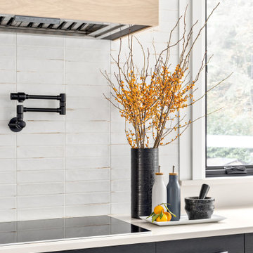
Moving deeper into the kitchen, the seamless induction cooktop topped with a freestanding concealed hood fan commands attention in a soft yet prominent way. The natural wood accent mirrors the fireplace mantle, and the choice of off-black wood-grain cabinets not only continues our black-and-white colour palette but adds a sense of depth and contrast. The corner sink is located to the right and perfectly positioned with a view of their thriving backyard.
To invite more of this family’s character into the space, we mixed metals for interest — matte black, dark pewter, and warm brass — and created open shelves in white oak for their plants and decor. You can also glimpse the tumbled edge of the backsplash tile, which echoes the rustic brick of the fireplace. It adds that farmhouse charm while still feeling timeless and sophisticated.
Last but not least, we designed this dining banquette in the bay window (with integrated bench storage, of course), where the family can share a meal together, the kids can do homework, or Emma and Vince can work and enjoy a change of scenery from their offices. Like the other spaces in the home, it was designed to be beautiful, multi-functional, and long-lasting.
Praise from Our Clients:
It is clear that we love this home, but what did our clients have to say?
“Lori is a visionary and masters execution to the finest detail all at the same time. When she first met us to know more about who we are and how we live, she could right away envision how we could use the space in our kitchen and living room…The results exceeded our expectations.
Lori and her team were also a delight to work with — coordination with all the trades, fast problem-solving, regular updates, professional and friendly attitude of her entire team — made it the dream team. Thank you SHD for making our space so beautiful!”
In turn, we are so grateful for this family’s trust, their open communication, and for being wonderful people with whom to work. (So, thank you!)
 Molly's Marketplace, a home renovation's paradise
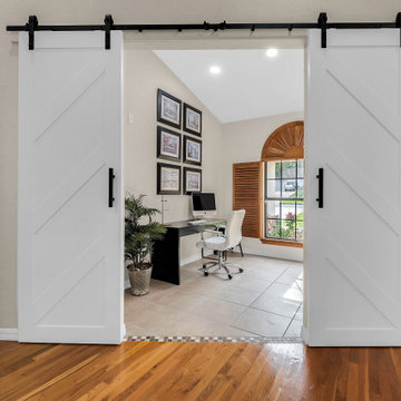
We completely updated this home from the outside to the inside. Every room was touched because the owner wanted to make it very sell-able. Our job was to lighten, brighten and do as many updates as we could on a shoe string budget. We started with the outside and we cleared the lakefront so that the lakefront view was open to the house. We also trimmed the large trees in the front and really opened the house up, before we painted the home and freshen up the landscaping. Inside we painted the house in a white duck color and updated the existing wood trim to a modern white color. We also installed shiplap on the TV wall and white washed the existing Fireplace brick. We installed lighting over the kitchen soffit as well as updated the can lighting. We then updated all 3 bathrooms. We finished it off with custom barn doors in the newly created office as well as the master bedroom. We completed the look with custom furniture!

Sponsored
Sunbury, OH
J.Holderby - Renovations
Franklin County's Leading General Contractors - 2X Best of Houzz!
 Abda Custom Window Fashions
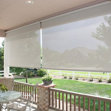
The sun can be overwhelming at times with the brightness and high temperatures. Shades are also a great way to block harmful ultra-violet rays to protect your hardwood flooring, furniture and artwork from fading. There are different types of shades that were engineered to solve a specific dilemma.
We work with clients in the Central Indiana Area. Contact us today to get started on your project. 317-273-8343
 Dura Supreme Cabinetry
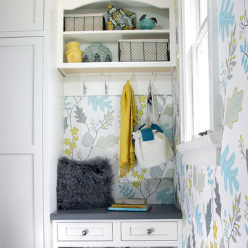
This gray and transitional kitchen remodel bridges the gap between contemporary style and traditional style. The dark gray cabinetry, light gray walls, and white subway tile backsplash make for a beautiful, neutral canvas for the bold teal blue and yellow décor accented throughout the design.
Designer Gwen Adair of Cabinet Supreme by Adair did a fabulous job at using grays to create a neutral backdrop to bring out the bright, vibrant colors that the homeowners love so much.
This Milwaukee, WI kitchen is the perfect example of Dura Supreme's recent launch of gray paint finishes, it has been interesting to see these new cabinetry colors suddenly flowing across our manufacturing floor, destined for homes around the country. We've already seen an enthusiastic acceptance of these new colors as homeowners started immediately selecting our various shades of gray paints, like this example of “Storm Gray”, for their new homes and remodeling projects!
Dura Supreme’s “Storm Gray” is the darkest of our new gray painted finishes (although our current “Graphite” paint finish is a charcoal gray that is almost black). For those that like the popular contrast between light and dark finishes, Storm Gray pairs beautifully with lighter painted and stained finishes.
Request a FREE Dura Supreme Brochure Packet:
http://www.durasupreme.com/request-brochure
 TKS Design Group
Free ebook, Creating the Ideal Kitchen. DOWNLOAD NOW
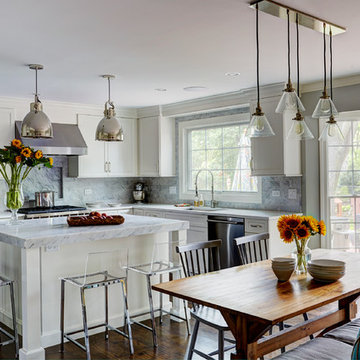
Starting out with a project that has good bones is always a bonus as was the case with the project. This young family has a great house on a great street in a great location. The kitchen was a large space with ample room and great view to the backyard. The dated cabinets and large peninsula layout however were not working for them, so they came in looking for a fresh start.
Goals for the project included adding a large island with seating for four and a bright, open and cheerful space for daily meals and entertaining. Our clients also wanted to keep the existing breakfast table, but the original space did not allow for an island and breakfast table. Our solution was to create banquette seating which gave us the extra inches necessary to accomplish both.
The larger awning window over the kitchen sink allows for ample light in the new space. The wall between the kitchen and family room was partially removed to provide the more open feeling our clients desired.
The work triangle is centered on the island which serves as a big open prep space conveniently located across from the large pro style range. The island also houses the microwave and a 2nd oven for larger gatherings. A new counter depth fridge and beverage center provide options for refrigeration.
A simple pallet of white cabinetry, Carrera marble countertops and polished nickel fixtures will be a timeless look and provide a lovely backdrop for entertaining and spending time with family.
Designed by: Susan Klimala, CKD, CBD
Photography by: Mike Kaskel
For more information on kitchen and bath design ideas go to: www.kitchenstudio-ge.com
24