
Search results for "Bonus start up" in Home Design Ideas
 Nar Design Group
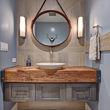
Our carpenters labored every detail from chainsaws to the finest of chisels and brad nails to achieve this eclectic industrial design. This project was not about just putting two things together, it was about coming up with the best solutions to accomplish the overall vision. A true meeting of the minds was required around every turn to achieve "rough" in its most luxurious state.
Featuring: Floating vanity, rough cut wood top, beautiful accent mirror and Porcelanosa wood grain tile as flooring and backsplashes.
PhotographerLink
 TKS Design Group
Download our free ebook, Creating the Ideal Kitchen. DOWNLOAD NOW
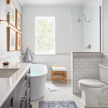
This master bath remodel is the cat's meow for more than one reason! The materials in the room are soothing and give a nice vintage vibe in keeping with the rest of the home. We completed a kitchen remodel for this client a few years’ ago and were delighted when she contacted us for help with her master bath!
The bathroom was fine but was lacking in interesting design elements, and the shower was very small. We started by eliminating the shower curb which allowed us to enlarge the footprint of the shower all the way to the edge of the bathtub, creating a modified wet room. The shower is pitched toward a linear drain so the water stays in the shower. A glass divider allows for the light from the window to expand into the room, while a freestanding tub adds a spa like feel.
The radiator was removed and both heated flooring and a towel warmer were added to provide heat. Since the unit is on the top floor in a multi-unit building it shares some of the heat from the floors below, so this was a great solution for the space.
The custom vanity includes a spot for storing styling tools and a new built in linen cabinet provides plenty of the storage. The doors at the top of the linen cabinet open to stow away towels and other personal care products, and are lighted to ensure everything is easy to find. The doors below are false doors that disguise a hidden storage area. The hidden storage area features a custom litterbox pull out for the homeowner’s cat! Her kitty enters through the cutout, and the pull out drawer allows for easy clean ups.
The materials in the room – white and gray marble, charcoal blue cabinetry and gold accents – have a vintage vibe in keeping with the rest of the home. Polished nickel fixtures and hardware add sparkle, while colorful artwork adds some life to the space.
 Housetrends Magazine
Old fixer-uppers often require two competing levels of priorities from their new homeowners. First and foremost is the need to immediately attend to those repairs that ensure the continued functioning and general well being of the house’s structure. By nature, these usually demand “house on fire!” status, especially when compared to other types of remodeling work that simply enhances aesthetics and general comfort.
In the case of a Delaware couple, a structural issue with the front of their 125 year old Victorian (it was sinking!), along with some other more pressing challenges, put a 13 year long hold on getting the bathroom for which they had long dreamed.
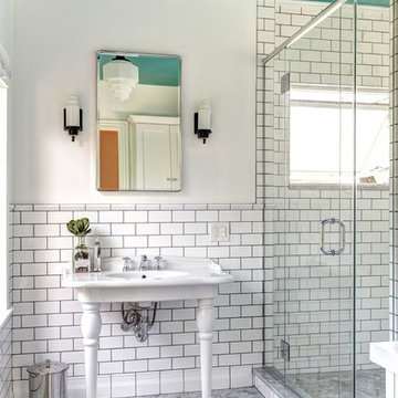
The shower enclosure features a base of hexagon patterned tile, bordered by marble subway tiles.
The shower enclosure features a base of hexagon patterned tile, bordered by marble subway tiles.
By the time Dave Fox Design Build Remodelers was hired to handle the construction, the couple certainly had put plenty of thought into converting a spare second-floor bedroom into the master bath. Courtney Burnett, Fox’s Interior Design Manager on the project, credits the owners for “having great creative minds, with lots of ideas to contribute.” By the time it came to put a formal design plan into place, the client “drove the look while we devised how the space would function.”
It’s worth noting that there are drawbacks in being given too much time for advance planning. Owners’ tastes in design may change, while a steady stream of new fixtures and building products always demand consideration up to the last minute. “We had been collecting ideas for a while…pictures of what we liked, but as it turned out, when it came time to select fixtures, tile, etc., we used little from those pictures,” the owners admit.
A framed herringbone pattern of subway tiles provides a perfect focal point for the shower.
A framed herringbone pattern of subway tiles provides a perfect focal point for the shower.
The finished bath exudes an art deco spirit that isn’t true to the home’s Victorian origins, which Burnett attributes to being more of a reflection of the homeowners’ preferences than the actual era of the structure. Despite that incongruity, everyone feels that they have remained true to the house by selecting vintage style elements, including subway tiles for the walls, hexagonal tile for the floors, and a pedestal sink that served as the focal point for the entire room.
But as with all dreams, once one is achieved, a new one soon beckons. With the bathroom’s strikingly beautiful turquoise paint barely dry, the completion of that long-awaited project has served to kick-start plans for finishing off the remainder of the Victorian’s second floor.
Find the right local pro for your project
 Amy Troute Inspired Interior Design
This designer’s ideal is homeowners with a clear vision, set priorities, and values that align seamlessly with ours. These clients, an accomplished artist and the owner of a generational hops growing farm, were collaborative and trusting from the start. They conscientiously selected a team of Architect (Green Hammer), General Contractor (Cellar Ridge) and ATIID for furnishings and finishing touches. Each firm was able to meticulously manage their leg of the project, while collaborating wholistically with each other and the homeowners.
The family farmhouse, lovingly named “Westwood,” was showing the wear one expects after serving a growing family for decades. The owner’s dream was to revive, open up, and breathe modern life into each space, while respecting the home’s heritage.
One of our first collaborations was the light fixture that would grace the main two-story entry hall. HiiH Lights in Astoria, Oregon, was commissioned to bring “the function of light, the craft of paper, and the art of sculpture” to the home. Visiting the maker’s space – a massive barn on his coastal property – was such an inspiring adventure! Original work by the resident artist sets an ethereal tone in the space, and an antique bench handsomely blends the old with the new.
A wall that divided the home’s living room and kitchen was removed, and the breezy and bright gathering room was born. Light walls, warm wood tones, cozy upholstery, clean lines and heritage elements create a welcoming atmosphere and invite lounging and conversation. The sun-drenched nook is the home’s main indoor dining area, with an extension table and sculpted chairs that are just right for family gatherings or morning rituals with the Sunday paper. The kitchen is a chef’s dream with every modern amenity, but its casual attitude is “let’s make a mess and eat!”
The owner’s artwork graces the mantel over the new fireplace that was carved from a tree felled on the property, illustrating the thoughtful consideration of each element. The muted wool area rugs in the entryways and great room are hard-wearing for farm life, and the furniture’s classic lines, bold contrasting colors, deep seating and soft textures encourage cozy conversations or large group gatherings.
The library is undoubtedly our favorite space in this home. Tucked in “speakeasy style” behind a hidden (wallpapered!) door in the moody wet bar, and drenched in deep green, the room offers a quiet retreat that hugs you in an embrace of books and family photos. The cozy settee nestled between the bookcases sits opposite a custom pair of modern cognac leather wing chairs. The area rug continues the storied look without the antique price tag with a piece from Loloi’s “Heritage Collection.”
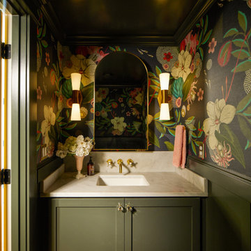
A little va-va-voom was requested for the powder bath and boy did we deliver! Custom wallpaper plays over original wainscotting and ceilings wrapped in more glorious green. The space evokes joy every time you open the door!
A primary suite that would “transport us to another world” and be “classic yet modern, peaceful, collected and uncluttered” was a tall order. Our new furniture layout takes full advantage of the view of wine country hills and the Willamette River, welcomes fireside lounging, and serves as a calm respite for the lovely owners.
Westwood Farmhouse truly was inspired by family, genuine love for home and graciousness for all who enter. Finishing the job was emotional for all involved because we were truly made to feel like part of the family.
Photography by George Barberis
 TKS Design Group
Download our free ebook, Creating the Ideal Kitchen. DOWNLOAD NOW
This client was referred to us from a past client. They are a busy 2-career household with young children and enjoy entertaining friends and family in their home. They have a beautiful open concept home but unfortunately the kitchen was not fitting for the rest of the home. They were not quite sure what to do with the space. We talked about trying to refresh it or do more of a minor remodel, but in the end they decided a full gut would get them to where they wanted to be.
One problem was there was no place for guests to hang out other than the large and awkward banquette area. The brick wall and tiled hood area were feeling a bit dated and tired. The space was just not functional for their lifestyle. There was no prep space near the cooktop and no landing area for items coming out of the ovens or refrigerator, plus a big dead zone in the center of the room.
Banquettes, like the one they previously had in the space, are great for small spaces, but when they get really large like this one, it makes getting in and out of the seating area awkward and uncomfortable. Plus, there was room for a large table, so we eliminated the awkward built in.
We started by removing the faux brick wall between the kitchen and back entry. We relocated the entry to the garage over a couple feet in order to get every last inch out of the new kitchen. We also made the decision to close up the primary window that faced the pretty ho hum brick wall of the neighbor’s house. There was plenty of light coming in from the seating area, so we just didn’t feel the window was adding much to the room.
Construction went smoothy. There was a bit of rework with electrical, flooring and HVAC, but in the end, we think it was well worth it.
The clients really wanted a sleek contemporary look, and we originally had planned for a full height slab backsplash, but due to it’s size, it was a budget buster. Instead, we got creative and settled on large format porcelain tiles that have a similar feel but were a fraction of the cost. We made sure the wall was plumb and level so that the fit and finish would mimic that of slab material.
The final space was quite a change. A large prep sink sits directly across from the new pro-style range with plenty additional prep space on the large island. The refrigerator and ovens now have miles of landing space, and a nice tight work triangle makes cooking a breeze.
Since we wanted a more contemporary feel, not many wall cabinets were included. Instead, we outfitted some of the drawers for dish storage with a peg system. Two large pantries flanking the refrigerator hold baking supplies and small appliances. Large drawers by the cooktop hold pots and pans, and an appliance garage tucked away to the left of the range hides away miscellaneous items. The large island also houses a microwave drawer and tons of storage, most of which is drawers offering maximum convenience.
The island now seats 5-6 people comfortably along with the new table in the seating area which can seat up to 8. Entertaining will be a breeze in this space. With such a clean backdrop, we knew we would need some drama with the lighting, so we chose two sets of staggered pendants, which we adjusted for the right visual balance above the island.
We also included a small coffee station to the right of the main kitchen, which helps keep the coffee clutter out of the kitchen proper. Two tones of complimentary gray are featured in this kitchen. The perimeter is a light gray that reads almost white. The island is a gray stain that adds some depth and interest with the visible wood texture. The countertops are clean white quartz, and the hardware, barstools and light fixtures add warm brass tones. I see lots of cooking and entertaining with family and friends in the near future in this bright and airy new space.
Designed by: Susan Klimala, CKD, CBD
Photography by: Michael Kaskel
For more information on kitchen and bath design ideas go to: www.kitchenstudio-ge.com
 TVL Creative Ltd.
[Our Clients]
We were so excited to help these new homeowners re-envision their split-level diamond in the rough. There was so much potential in those walls, and we couldn’t wait to delve in and start transforming spaces. Our primary goal was to re-imagine the main level of the home and create an open flow between the space. So, we started by converting the existing single car garage into their living room (complete with a new fireplace) and opening up the kitchen to the rest of the level.
[Kitchen]
The original kitchen had been on the small side and cut-off from the rest of the home, but after we removed the coat closet, this kitchen opened up beautifully. Our plan was to create an open and light filled kitchen with a design that translated well to the other spaces in this home, and a layout that offered plenty of space for multiple cooks. We utilized clean white cabinets around the perimeter of the kitchen and popped the island with a spunky shade of blue. To add a real element of fun, we jazzed it up with the colorful escher tile at the backsplash and brought in accents of brass in the hardware and light fixtures to tie it all together. Through out this home we brought in warm wood accents and the kitchen was no exception, with its custom floating shelves and graceful waterfall butcher block counter at the island.
[Dining Room]
The dining room had once been the home’s living room, but we had other plans in mind. With its dramatic vaulted ceiling and new custom steel railing, this room was just screaming for a dramatic light fixture and a large table to welcome one-and-all.
[Living Room]
We converted the original garage into a lovely little living room with a cozy fireplace. There is plenty of new storage in this space (that ties in with the kitchen finishes), but the real gem is the reading nook with two of the most comfortable armchairs you’ve ever sat in.
[Master Suite]
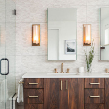
This home didn’t originally have a master suite, so we decided to convert one of the bedrooms and create a charming suite that you’d never want to leave. The master bathroom aesthetic quickly became all about the textures. With a sultry black hex on the floor and a dimensional geometric tile on the walls we set the stage for a calm space. The warm walnut vanity and touches of brass cozy up the space and relate with the feel of the rest of the home. We continued the warm wood touches into the master bedroom, but went for a rich accent wall that elevated the sophistication level and sets this space apart.
[Hall Bathroom]
The floor tile in this bathroom still makes our hearts skip a beat. We designed the rest of the space to be a clean and bright white, and really let the lovely blue of the floor tile pop. The walnut vanity cabinet (complete with hairpin legs) adds a lovely level of warmth to this bathroom, and the black and brass accents add the sophisticated touch we were looking for.
[Office]
We loved the original built-ins in this space, and knew they needed to always be a part of this house, but these 60-year-old beauties definitely needed a little help. We cleaned up the cabinets and brass hardware, switched out the formica counter for a new quartz top, and painted wall a cheery accent color to liven it up a bit. And voila! We have an office that is the envy of the neighborhood.
 Nar Design Group
This home remodel is a celebration of curves and light. Starting from humble beginnings as a basic builder ranch style house, the design challenge was maximizing natural light throughout and providing the unique contemporary style the client’s craved.
The Entry offers a spectacular first impression and sets the tone with a large skylight and an illuminated curved wall covered in a wavy pattern Porcelanosa tile.
The chic entertaining kitchen was designed to celebrate a public lifestyle and plenty of entertaining. Celebrating height with a robust amount of interior architectural details, this dynamic kitchen still gives one that cozy feeling of home sweet home. The large “L” shaped island accommodates 7 for seating. Large pendants over the kitchen table and sink provide additional task lighting and whimsy. The Dekton “puzzle” countertop connection was designed to aid the transition between the two color countertops and is one of the homeowner’s favorite details. The built-in bistro table provides additional seating and flows easily into the Living Room.
A curved wall in the Living Room showcases a contemporary linear fireplace and tv which is tucked away in a niche. Placing the fireplace and furniture arrangement at an angle allowed for more natural walkway areas that communicated with the exterior doors and the kitchen working areas.
The dining room’s open plan is perfect for small groups and expands easily for larger events. Raising the ceiling created visual interest and bringing the pop of teal from the Kitchen cabinets ties the space together. A built-in buffet provides ample storage and display.
The Sitting Room (also called the Piano room for its previous life as such) is adjacent to the Kitchen and allows for easy conversation between chef and guests. It captures the homeowner’s chic sense of style and joie de vivre.


 Oliver Designs
Photo by Christopher Carter
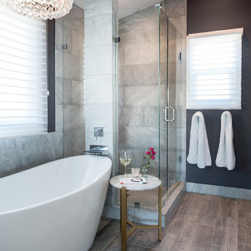
Inspiration for a mid-sized transitional master gray tile and marble tile porcelain tile and gray floor bathroom remodel in Denver with a hinged shower door, black walls, marble countertops and gray countertops
Inspiration for a mid-sized transitional master gray tile and marble tile porcelain tile and gray floor bathroom remodel in Denver with a hinged shower door, black walls, marble countertops and gray countertops
 emma delon
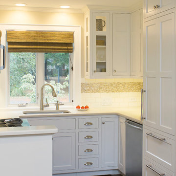
Maximizing the functionality of this space, and coordinating the new kitchen with the beautiful remodel completed previously by the client were the two most important aspects of this project. The existing spaces are elegantly decorated with an open plan, dark hardwood floors, and natural stone accents. The new, lighter, more open kitchen flows beautifully into the client’s existing dining room space. Satin nickel hardware blends with the stainless steel appliances and matches the satin nickel details throughout the home. The fully integrated refrigerator next to the narrow pull-out pantry cabinet, take up less visual weight than a traditional stainless steel appliance and the two combine to provide fantastic storage. The glass cabinet doors and decorative lighting beautifully highlight the client’s glassware and dishes. Finished with white subway tile, Dreamy Marfil quartz countertops, and a warm natural wood blind; the space warm, inviting, elegant, and extremely functional.
copyright 2013 marilyn peryer photography
 TVL Creative Ltd.
[Our Clients]
We were so excited to help these new homeowners re-envision their split-level diamond in the rough. There was so much potential in those walls, and we couldn’t wait to delve in and start transforming spaces. Our primary goal was to re-imagine the main level of the home and create an open flow between the space. So, we started by converting the existing single car garage into their living room (complete with a new fireplace) and opening up the kitchen to the rest of the level.
[Kitchen]
The original kitchen had been on the small side and cut-off from the rest of the home, but after we removed the coat closet, this kitchen opened up beautifully. Our plan was to create an open and light filled kitchen with a design that translated well to the other spaces in this home, and a layout that offered plenty of space for multiple cooks. We utilized clean white cabinets around the perimeter of the kitchen and popped the island with a spunky shade of blue. To add a real element of fun, we jazzed it up with the colorful escher tile at the backsplash and brought in accents of brass in the hardware and light fixtures to tie it all together. Through out this home we brought in warm wood accents and the kitchen was no exception, with its custom floating shelves and graceful waterfall butcher block counter at the island.
[Dining Room]
The dining room had once been the home’s living room, but we had other plans in mind. With its dramatic vaulted ceiling and new custom steel railing, this room was just screaming for a dramatic light fixture and a large table to welcome one-and-all.
[Living Room]
We converted the original garage into a lovely little living room with a cozy fireplace. There is plenty of new storage in this space (that ties in with the kitchen finishes), but the real gem is the reading nook with two of the most comfortable armchairs you’ve ever sat in.
[Master Suite]
This home didn’t originally have a master suite, so we decided to convert one of the bedrooms and create a charming suite that you’d never want to leave. The master bathroom aesthetic quickly became all about the textures. With a sultry black hex on the floor and a dimensional geometric tile on the walls we set the stage for a calm space. The warm walnut vanity and touches of brass cozy up the space and relate with the feel of the rest of the home. We continued the warm wood touches into the master bedroom, but went for a rich accent wall that elevated the sophistication level and sets this space apart.
[Hall Bathroom]
The floor tile in this bathroom still makes our hearts skip a beat. We designed the rest of the space to be a clean and bright white, and really let the lovely blue of the floor tile pop. The walnut vanity cabinet (complete with hairpin legs) adds a lovely level of warmth to this bathroom, and the black and brass accents add the sophisticated touch we were looking for.
[Office]
We loved the original built-ins in this space, and knew they needed to always be a part of this house, but these 60-year-old beauties definitely needed a little help. We cleaned up the cabinets and brass hardware, switched out the formica counter for a new quartz top, and painted wall a cheery accent color to liven it up a bit. And voila! We have an office that is the envy of the neighborhood.

 Liz Schupanitz Designs
Cooking for Two
Location: Plymouth, MN, United States
When this couple’s last child graduated from college they began the process of looking for a new home. After a lengthy search they decided to stay with the neighborhood they loved, saving money by remodeling rather than starting over.
The top priorities on their wish list were adding character to their 1990’s era home with a classic white kitchen and a larger island while keeping within the existing footprint. With the intention of honing their cooking skills, they were also considering better appliances and two ovens.
Challenges and Solutions
Design a larger island with seating for at least two. The existing island was small and the area behind the seating was less than recommended clearances.
To solve this challenge, the seating area of the island was extended out into the open area of the kitchen. This created a larger island with seating for three, extra storage and a bookshelf across from the range.
The original kitchen had a range with microwave above, so adding another oven was a challenge with limited wall space.
Because the adjoining dining room is used infrequently, the homeowner was open to placing the second oven and microwave in the walkway. This made room for the small buffet between the built in refrigerator and ovens, creating one of her favorite areas.
The client requested a white painted kitchen but wanted to make sure it had warmth and character. To achieve this the following elements were chosen:
1) Cabinets painted with Benjamin Moore Capitol White, a luminous and warm shade of white.
2) The Range hood was painted with warm metallic shades to reflect the bronze of the Ashley Norton hardware.
3) Black Aqua Grantique granite was chosen for countertops because it looks like soapstone and adds contrast.
4) Walker Zanger Café tile in Latte was chosen for it’s handmade look with uneven edges.
5) The to-the-counter-cabinet with glass door shows off serving dishes and lends sophisticated charm.
The result is a welcoming classic kitchen, where this couple enjoys cooking more often and sharpening their skills with gourmet appliances.
Liz Schupanitz Designs
Photographed by: Andrea Rugg Photography
 TKS Design Group
Free ebook, Creating the Ideal Kitchen. DOWNLOAD NOW
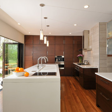
Collaborations are typically so fruitful and this one was no different. The homeowners started by hiring an architect to develop a vision and plan for transforming their very traditional brick home into a contemporary family home full of modern updates. The Kitchen Studio of Glen Ellyn was hired to provide kitchen design expertise and to bring the vision to life.
The bamboo cabinetry and white Ceasarstone countertops provide contrast that pops while the white oak floors and limestone tile bring warmth to the space. A large island houses a Galley Sink which provides a multi-functional work surface fantastic for summer entertaining. And speaking of summer entertaining, a new Nana Wall system — a large glass wall system that creates a large exterior opening and can literally be opened and closed with one finger – brings the outdoor in and creates a very unique flavor to the space.
Matching bamboo cabinetry and panels were also installed in the adjoining family room, along with aluminum doors with frosted glass and a repeat of the limestone at the newly designed fireplace.
Designed by: Susan Klimala, CKD, CBD
Photography by: Carlos Vergara
For more information on kitchen and bath design ideas go to: www.kitchenstudio-ge.com

 Barbara Grushow Designs Inc.
Jim Bartsch Photography
Bathroom - mid-sized transitional master white tile and subway tile mosaic tile floor and gray floor bathroom idea in Los Angeles with a wall-mount sink, gray walls, a hinged shower door and a niche
Bathroom - mid-sized transitional master white tile and subway tile mosaic tile floor and gray floor bathroom idea in Los Angeles with a wall-mount sink, gray walls, a hinged shower door and a niche
Sponsored
Sunbury, OH

J.Holderby - Renovations
Franklin County's Leading General Contractors - 2X Best of Houzz!
 Klopf Architecture
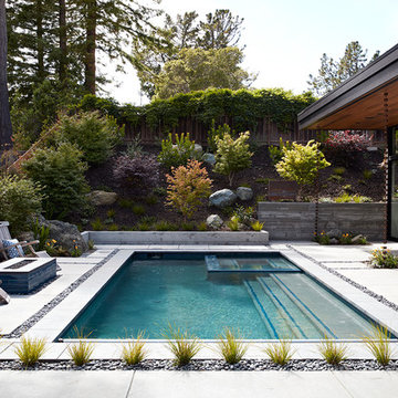
Klopf Architecture, Arterra Landscape Architects and Henry Calvert of Calvert Ventures Designed and built a new warm, modern, Eichler-inspired, open, indoor-outdoor home on a deeper-than-usual San Mateo Highlands property where an original Eichler house had burned to the ground.
The owners wanted multi-generational living and larger spaces than the original home offered, but all parties agreed that the house should respect the neighborhood and blend in stylistically with the other Eichlers. At first the Klopf team considered re-using what little was left of the original home and expanding on it. But after discussions with the owner and builder, all parties agreed that the last few remaining elements of the house were not practical to re-use, so Klopf Architecture designed a new home that pushes the Eichler approach in new directions.
One disadvantage of Eichler production homes is that the house designs were not optimized for each specific lot. A new custom home offered the team a chance to start over. In this case, a longer house that opens up sideways to the south fit the lot better than the original square-ish house that used to open to the rear (west). Accordingly, the Klopf team designed an L-shaped “bar” house with a large glass wall with large sliding glass doors that faces sideways instead of to the rear like a typical Eichler. This glass wall opens to a pool and landscaped yard designed by Arterra Landscape Architects.
Driving by the house, one might assume at first glance it is an Eichler because of the horizontality, the overhanging flat roof eaves, the dark gray vertical siding, and orange solid panel front door, but the house is designed for the 21st Century and is not meant to be a “Likeler.” You won't see any posts and beams in this home. Instead, the ceiling decking is a western red cedar that covers over all the beams. Like Eichlers, this cedar runs continuously from inside to out, enhancing the indoor / outdoor feeling of the house, but unlike Eichlers it conceals a cavity for lighting, wiring, and insulation. Ceilings are higher, rooms are larger and more open, the master bathroom is light-filled and more generous, with a separate tub and shower and a separate toilet compartment, and there is plenty of storage. The garage even easily fits two of today's vehicles with room to spare.
A massive 49-foot by 12-foot wall of glass and the continuity of materials from inside to outside enhance the inside-outside living concept, so the owners and their guests can flow freely from house to pool deck to BBQ to pool and back.
During construction in the rough framing stage, Klopf thought the front of the house appeared too tall even though the house had looked right in the design renderings (probably because the house is uphill from the street). So Klopf Architecture paid the framer to change the roofline from how we had designed it to be lower along the front, allowing the home to blend in better with the neighborhood. One project goal was for people driving up the street to pass the home without immediately noticing there is an "imposter" on this lot, and making that change was essential to achieve that goal.
This 2,606 square foot, 3 bedroom, 3 bathroom Eichler-inspired new house is located in San Mateo in the heart of the Silicon Valley.
Klopf Architecture Project Team: John Klopf, AIA, Klara Kevane
Landscape Architect: Arterra Landscape Architects
Contractor: Henry Calvert of Calvert Ventures
Photography ©2016 Mariko Reed
Location: San Mateo, CA
Year completed: 2016
 TKS Design Group
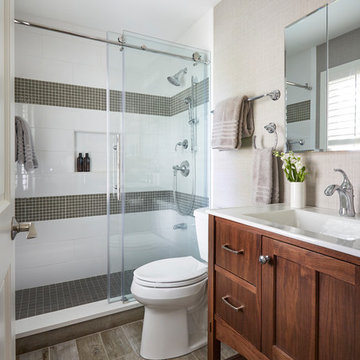
Our clients had been in their home since the early 1980’s and decided it was time for some updates. We took on the kitchen, two bathrooms and a powder room.
This petite master bathroom primarily had storage and space planning challenges. Since the wife uses a larger bath down the hall, this bath is primarily the husband’s domain and was designed with his needs in mind. We started out by converting an existing alcove tub to a new shower since the tub was never used. The custom shower base and decorative tile are now visible through the glass shower door and help to visually elongate the small room. A Kohler tailored vanity provides as much storage as possible in a small space, along with a small wall niche and large medicine cabinet to supplement. “Wood” plank tile, specialty wall covering and the darker vanity and glass accents give the room a more masculine feel as was desired. Floor heating and 1 piece ceramic vanity top add a bit of luxury to this updated modern feeling space.
Designed by: Susan Klimala, CKD, CBD
Photography by: Michael Alan Kaskel
For more information on kitchen and bath design ideas go to: www.kitchenstudio-ge.com

 Thyme & Place Design LLC
When my client had to move from her company office to work at home, she set up in the dining room. Despite her best efforts, this was not the long-term solution she was looking for. My client realized she needed a dedicated space not on the main floor of the home. On one hand, having your office space right next to the kitchen is handy. On the other hand, it made separating work and home life was not that easy.
The house was a ranch. In essence, the basement would run entire length of the home. As we came down the steps, we entered a time capsule. The house was built in the 1950’s. The walls were covered with original knotty pine paneling. There was a wood burning fireplace and considering this was a basement, high ceilings. In addition, there was everything her family could not store at their own homes. As we wound though the space, I though “wow this has potential”, Eventually, after walking through the laundry room we came to a small nicely lit room. This would be the office.
My client looked at me and asked what I thought. Undoubtedly, I said, this can be a great workspace, but do you really want to walk through this basement and laundry to get here? Without reservation, my client said where do we start?
Once the design was in place, we started the renovation. The knotty pine paneling had to go. Specifically, to add some insulation and control the dampness and humidity. The laundry room wall was relocated to create a hallway to the office.
At the far end of the room, we designated a workout zone. Weights, mats, exercise bike and television are at the ready for morning or afternoon workouts. The space can be concealed by a folding screen for party time. Doors to an old closet under the stairs were relocated to the workout area for hidden storage. Now we had nice wall for a beautiful console and mirror for storage and serving during parties.
In order to add architectural details, we covered the old ugly support columns with simple recessed millwork panels. This detail created a visual division between the bar area and the seating area in front of the fireplace. The old red brick on the fireplace surround was replaced with stack stone. A mantle was made from reclaimed wood. Additional reclaimed wood floating shelves left and right of the fireplace provides decorative display while maintaining a rustic element balancing the copper end table and leather swivel rocker.
We found an amazing rug which tied all of the colors together further defining the gathering space. Russet and burnt orange became the accent color unifying each space. With a bit of whimsy, a rather unusual light fixture which looks like roots from a tree growing through the ceiling is a conversation piece.
The office space is quite and removed from the main part of the basement. There is a desk large enough for multiple screens, a small bookcase holding office supplies and a comfortable chair for conference calls. Because working from home requires many online meetings, we added a shiplap wall painted in Hale Navy to contrast with the orange fabric on the chair. We finished the décor with a painting from my client’s father. This is the background online visitors will see.
The last and best part of the renovation is the beautiful bar. My client is an avid collector of wine. She already had the EuroCave refrigerator, so I incorporated it into the design. The cabinets are painted Temptation Grey from Benjamin Moore. The counter tops are my favorite hard working quartzite Brown Fantasy. The backsplash is a combination of rustic wood and old tin ceiling like porcelain tiles. Together with the textures of the reclaimed wood and hide poofs balanced against the smooth finish of the cabinets, we created a comfortable luxury for relaxing.
There is ample storage for bottles, cans, glasses, and anything else you can think of for a great party. In addition to the wine storage, we incorporated a beverage refrigerator, an ice maker, and a sink. Floating shelves with integrated lighting illuminate the back bar. The raised height of the front bar provides the perfect wine tasting and paring spot. I especially love the pendant lights which look like wine glasses.
Finally, I selected carpet for the stairs and office. It is perfect for noise reduction. Meanwhile for the overall flooring, I specifically selected a high-performance vinyl plank floor. We often use this product as it is perfect to install on a concrete floor. It is soft to walk on, easy to clean and does not reduce the overall height of the space.
 designstiles
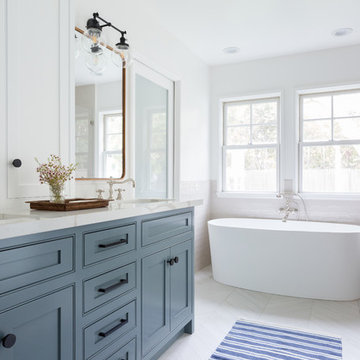
Master Bathroom Addition with custom double vanity.
White herringbone tile with white wall subway tile. white pebble shower floor tile. Walnut rounded vanity mirrors. Brizo Fixtures. Cabinet hardware by School House Electric.
Vanity Tower recessed into wall for extra storage with out taking up too much counterspace. Bonus: it keeps the outlets hidden! Photo Credit: Amy Bartlam



 Change Your Bathroom©
The goal of this project was to upgrade the builder grade finishes and create an ergonomic space that had a contemporary feel. This bathroom transformed from a standard, builder grade bathroom to a contemporary urban oasis. This was one of my favorite projects, I know I say that about most of my projects but this one really took an amazing transformation. By removing the walls surrounding the shower and relocating the toilet it visually opened up the space. Creating a deeper shower allowed for the tub to be incorporated into the wet area. Adding a LED panel in the back of the shower gave the illusion of a depth and created a unique storage ledge. A custom vanity keeps a clean front with different storage options and linear limestone draws the eye towards the stacked stone accent wall.
Houzz Write Up: https://www.houzz.com/magazine/inside-houzz-a-chopped-up-bathroom-goes-streamlined-and-swank-stsetivw-vs~27263720
The layout of this bathroom was opened up to get rid of the hallway effect, being only 7 foot wide, this bathroom needed all the width it could muster. Using light flooring in the form of natural lime stone 12x24 tiles with a linear pattern, it really draws the eye down the length of the room which is what we needed. Then, breaking up the space a little with the stone pebble flooring in the shower, this client enjoyed his time living in Japan and wanted to incorporate some of the elements that he appreciated while living there. The dark stacked stone feature wall behind the tub is the perfect backdrop for the LED panel, giving the illusion of a window and also creates a cool storage shelf for the tub. A narrow, but tasteful, oval freestanding tub fit effortlessly in the back of the shower. With a sloped floor, ensuring no standing water either in the shower floor or behind the tub, every thought went into engineering this Atlanta bathroom to last the test of time. With now adequate space in the shower, there was space for adjacent shower heads controlled by Kohler digital valves. A hand wand was added for use and convenience of cleaning as well. On the vanity are semi-vessel sinks which give the appearance of vessel sinks, but with the added benefit of a deeper, rounded basin to avoid splashing. Wall mounted faucets add sophistication as well as less cleaning maintenance over time. The custom vanity is streamlined with drawers, doors and a pull out for a can or hamper.
A wonderful project and equally wonderful client. I really enjoyed working with this client and the creative direction of this project.
Brushed nickel shower head with digital shower valve, freestanding bathtub, curbless shower with hidden shower drain, flat pebble shower floor, shelf over tub with LED lighting, gray vanity with drawer fronts, white square ceramic sinks, wall mount faucets and lighting under vanity. Hidden Drain shower system. Atlanta Bathroom.
 Timberbuilt, Inc.
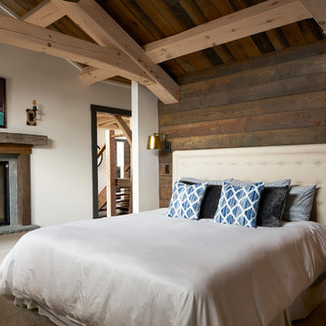
Sitting aside the slopes of Windham Ski Resort in the Catskills, this is a stunning example of what happens when everything gels — from the homeowners’ vision, the property, the design, the decorating, and the workmanship involved throughout.
An outstanding finished home materializes like a complex magic trick. You start with a piece of land and an undefined vision. Maybe you know it’s a timber frame, maybe not. But soon you gather a team and you have this wide range of inter-dependent ideas swirling around everyone’s heads — architects, engineers, designers, decorators — and like alchemy you’re just not 100% sure that all the ingredients will work. And when they do, you end up with a home like this.
The architectural design and engineering is based on our versatile Olive layout. Our field team installed the ultra-efficient shell of Insulspan SIP wall and roof panels, local tradesmen did a great job on the rest.
And in the end the homeowners made us all look like first-ballot-hall-of-famers by commissioning Design Bar by Kathy Kuo for the interior design.
Doesn’t hurt to send the best photographer we know to capture it all. Pics from Kim Smith Photo.
 TKS Design Group
Free ebook, Creating the Ideal Kitchen. DOWNLOAD NOW
Our clients and their three teenage kids had outgrown the footprint of their existing home and felt they needed some space to spread out. They came in with a couple of sets of drawings from different architects that were not quite what they were looking for, so we set out to really listen and try to provide a design that would meet their objectives given what the space could offer.
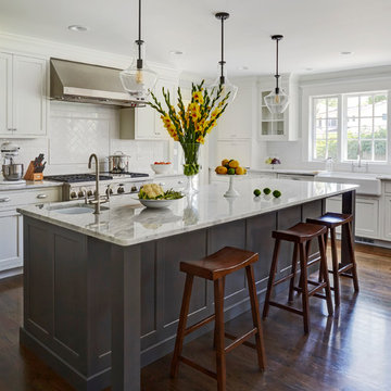
We started by agreeing that a bump out was the best way to go and then decided on the size and the floor plan locations of the mudroom, powder room and butler pantry which were all part of the project. We also planned for an eat-in banquette that is neatly tucked into the corner and surrounded by windows providing a lovely spot for daily meals.
The kitchen itself is L-shaped with the refrigerator and range along one wall, and the new sink along the exterior wall with a large window overlooking the backyard. A large island, with seating for five, houses a prep sink and microwave. A new opening space between the kitchen and dining room includes a butler pantry/bar in one section and a large kitchen pantry in the other. Through the door to the left of the main sink is access to the new mudroom and powder room and existing attached garage.
White inset cabinets, quartzite countertops, subway tile and nickel accents provide a traditional feel. The gray island is a needed contrast to the dark wood flooring. Last but not least, professional appliances provide the tools of the trade needed to make this one hardworking kitchen.
Designed by: Susan Klimala, CKD, CBD
Photography by: Mike Kaskel
For more information on kitchen and bath design ideas go to: www.kitchenstudio-ge.com
3