
Search results for "Both nos te" in Home Design Ideas

 Stepien y Barnó Estudio de Arquitectura
Atrapando el paisaje
EL PORQUE DE LAS COSAS.
Nos encontramos con una parcela orientada norte-sur, en una urbanización constituida por la simple adición de una finca junto a otra.
La finca donde se ubica la vivienda disfruta de unas vistas privilegiadas, tanto hacia el sur con la presencia de Montejurra, como hacia el norte con la visión sobre la sierra de Lóquiz y Andía.
La intención inicial fue dar y recibir.
Recibir esa escala lejana y que la vivienda respirase de ella y dar a los propietarios una serie de espacios dentro de la parcela para crear un nuevo mundo, una escala cercana que tuviese interés para las necesidades que ellos tenían.
Estas necesidades, no se ven cumplidas únicamente por la definición de los espacios interiores de la edificación, sino que es la constitución de estos espacios exteriores la que termina de satisfacer todas las ilusiones que la familia depositó en el proyecto.
Debía existir una concordancia entre lo proyectado y la vida que ellos llevaran en el lugar tan anhelado.
Por ello el proyecto huye de toda forma predeterminada y nos dejamos sorprender con el resultado final.
La vivienda funciona con una tipología binuclear, con clara diferenciación entre el volumen de la zona de noche y el volumen de la zona de día, siendo la entrada el nexo de unión de ambos.
Dentro de esta planta los cuartos húmedos, se sitúan en la parte central, exente de vistas, y bien situada dentro del conjunto de la vivienda.
A su vez, tiene otra clara diferenciación, entre las partes más servidoras que quedan en semisótano y las partes más nobles de la casa que quedan en la planta superior a esta.
La casa por la configuración espacial que forma va creando distintos espacios en el jardín cada uno con un carácter. Desde zonas más expuestas y sombrías como en la entrada, hasta pequeños espacios (estanque), zonas más soleadas aunque acotadas y otras más publicas y expuestas como la zona de la piscina.
Se trata de una casa diseñada con criterios de aprovechamiento pasivo de la energía solar, como describiremos con detalle mas adelante. Busca un buen asoleo y se intenta una adecuada integración en el paisaje. Nos encontramos en una zona climática con inviernos relativamente duros, y veranos bastante llevaderos. Entendemos que con una buena planificación de la vivienda en verano no necesitará aire acondicionado y durante el invierno tenga el mínimo gasto energético.
La parcela donde se ubica tiene algo más de mil metros, con acceso desde el norte por la calle san Sebastián, lindando por los otros tres frentes con diferentes pardelas de la urbanización. Dicha parcela tiene una diferencia de nivel de unos cinco metros desde el acceso hasta su parte más alta, encontrándose bastante protegida de la influencia de vientos.
La lectura del lugar, nos lleva a decidir que la vivienda se abra con grandes huecos a sur y que busque un compromiso en la fachada norte.
Las fachadas este y oeste que lindan con distintas parcelas y por preservar la intimidad, se intentan dejar lo mas huérfanas de huecos posible.
De hecho la fachada que da a oeste resulta casi muda, como si fuera un medianil.
Aunque la lógica nos dice que no conviene abrir grandes huecos en orientación norte, esta opción se hacía del todo inviable.
El entorno nos pedía ser valorado, por ello se disponen ventanas alargadas, que nos proporcionan una serie de marcos, en estancias como la cocina-comedor, la sala de pintura-biblioteca, o la habitación principal. Así desde estos espacios queda enmarcada la privilegiada vista sobre la sierra de Loquiz y Andía.
La vivienda así, se adueña de esa visión lejana y el paisaje participa como un elemento compositivo mas del proyecto.
La casa se muestra con dos realidades bien distintas, depende de dónde la miremos.
Desde la entrada tiene cierto aire de objeto (su tamaño es bastante más grande que quien la mira), una especie de presencia que en cierta manera se impone, se nota que está, a pesar del zócalo de color verde mar que lo liga al suelo, y que hace que la casa quede mas agarrada al terreno.
Pero la fachada no enseña todo, más bien enseña poco, ciertas cosas están en el interior y no incumben a quien mira la casa desde fuera.
Se trabajó especialmente este concepto, qué quiero que se vea desde la casa y qué se quiere que se vea de la casa.
Por otro lado, desde el espacio exterior orientado a sur y definido por los propios cuerpos del edificio, su escala es mucho más humana (su tamaño es solamente un poco mayor que quien la mira), creemos que resulta acogedora y crea un ambiente de protección y paz.
En este jardín sur se ubicará la piscina antes mencionada, con varios árboles que la propia familia transplantará de su anterior residencia.
De alguna manera el conjunto intenta atrapar las luces y sombras que durante el transcurso de las estaciones se irán produciendo.
La familia que habitará la casa tiene una gran sensibilidad por la naturaleza, por lo que crear trozos de ella dentro del conjunto era importante.
Matizar la relación entre el exterior y el interior cobró especial importancia.
Se busca que el interior de la vivienda tenga cierta continuidad de espacios, que unos participen de los otros y que los límites no estén claros.
En la zona de noche los espacios están delimitados, en la zona de día exterior e interior se funden, se difumina el límite, y se intenta provocar esa vida tanto dentro como fuera de la casa.
Existe una tensión entre interior y exterior. Hay un dentro y un fuera y a veces se estará dentro estando fuera. Tenemos umbrales, tránsitos, pequeños escondrijos….
Existen lugares donde se ubicarán peceras, habrá pájaros, tortugas, los perros tienen su espacio bien definido, estos convivirán con los gatos, esperamos que la vivienda tenga su propio sonido.
Los arquitectos por nosotros mismos no hacemos buena arquitectura, tenemos que aprender a escuchar más y a hablar menos, tenemos que convertirnos en lectores de lo que de verdad necesita cada familia, a escuchar el lugar (sus dificultades y sus bondades) y ser conscientes de los medios de que dispone.
La luz que entra en cada estancia de la casa, busca crear espacios tranquilos, que no te lleven con prisa de un lado a otro, se intenta inducir a la calma y al sosiego, que haya lugares donde estar, simplemente estar, contemplar el paisaje y disfrutar del estanque o la zona de piscina, un lugar para vivir y sentir y pensar despacio, siempre muy despacio.
Como dice Zumthor “la arquitectura se ha hecho para nuestro uso. No es un arte libre, hay que trabajar con un ojo puesto en el lugar y otro en el uso”.
Esperemos que así sea, y que lo que hoy son buenos propósitos en breve pase ser una realidad construida que no necesite ningún tipo de explicación.

 Edmond Kitchen & Bath LLC
This markedly modern, yet warm and inviting abode in the Oklahoma countryside boasts some of our favorite kitchen items all in one place. Miele appliances (oven, steam, coffee maker, paneled refrigerator, freezer, and "knock to open" dishwasher), induction cooking on an island, a highly functional Galley Workstation and the latest technology in cabinetry and countertop finishes to last a lifetime. Grain matched natural walnut and matte nanotech touch-to-open white and grey cabinets provide a natural color palette that allows the interior of this home to blend beautifully with the prairie and pastures seen through the large commercial windows on both sides of this kitchen & living great room. Cambria quartz countertops in Brittanica formed with a waterfall edge give a natural random pattern against the square lines of the rest of the kitchen. David Cobb photography

 re:architecture
Living room - mid-sized 1960s gray floor, wood ceiling and wood wall living room idea in Denver with a wood stove and a tile fireplace
Find the right local pro for your project

 Dianne Davant and Associates
Master Bedroom with Red Bed Frame and custom drapery and bedding.
Bedroom - traditional master light wood floor bedroom idea in Charlotte
Bedroom - traditional master light wood floor bedroom idea in Charlotte

 McCullough's Landscape & Nursery
Apple crate planters placed around Jorgensen Farms, a premier organic farm and wedding venue in Plain Township, OH. The planters are filled with a variety of annuals and perennials highlighted by
Ipomea ‘Illusion Emerald Lace’, Plectranthus 'Silver Shield', Plectranthus 'Mona Lavender' Digiplexis 'Illumination Apricot', Supertunia 'White Russian'
Nick McCullough

 Simply Home Decorating
Our goal on this project was to make the main floor of this lovely early 20th century home in a popular Vancouver neighborhood work for a growing family of four. We opened up the space, both literally and aesthetically, with windows and skylights, an efficient layout, some carefully selected furniture pieces and a soft colour palette that lends a light and playful feel to the space. Our clients can hardly believe that their once small, dark, uncomfortable main floor has become a bright, functional and beautiful space where they can now comfortably host friends and hang out as a family. Interior Design by Lori Steeves of Simply Home Decorating Inc. Photos by Tracey Ayton Photography.

 AM Dolce Vita
Michelle AM Dolce Vita, Scandinavian cottage style, Nordic cottage style, Scandinavian living room, modern rustic living room, Rove Concepts Norman counter stools, Florence Knoll style tufted sofa, floating TV cabinet, Ikea Stockholm coffee table bench, Tonic living pillow, faux fiddle leaf fig tree in a basket, salt and pepper cowhide rug, modern rustic living room, pink kilim pillow
Sponsored
Columbus, OH
Free consultation for landscape design!

Peabody Landscape Group
Franklin County's Reliable Landscape Design & Contracting


 Davey McEathron Architecture
Leonid Furmansky
Large minimalist dark wood floor open concept kitchen photo in Austin with an undermount sink, flat-panel cabinets, blue cabinets, marble countertops, cement tile backsplash, stainless steel appliances, an island and white countertops
Large minimalist dark wood floor open concept kitchen photo in Austin with an undermount sink, flat-panel cabinets, blue cabinets, marble countertops, cement tile backsplash, stainless steel appliances, an island and white countertops

 Maraya Interior Design
Modern Home Interiors and Exteriors, featuring clean lines, textures, colors and simple design with floor to ceiling windows. Hardwood, slate, and porcelain floors, all natural materials that give a sense of warmth throughout the spaces. Some homes have steel exposed beams and monolith concrete and galvanized steel walls to give a sense of weight and coolness in these very hot, sunny Southern California locations. Kitchens feature built in appliances, and glass backsplashes. Living rooms have contemporary style fireplaces and custom upholstery for the most comfort.
Bedroom headboards are upholstered, with most master bedrooms having modern wall fireplaces surounded by large porcelain tiles.
Project Locations: Ojai, Santa Barbara, Westlake, California. Projects designed by Maraya Interior Design. From their beautiful resort town of Ojai, they serve clients in Montecito, Hope Ranch, Malibu, Westlake and Calabasas, across the tri-county areas of Santa Barbara, Ventura and Los Angeles, south to Hidden Hills- north through Solvang and more.
Modern Ojai home designed by Maraya and Tim Droney
Patrick Price Photography.
 Ravensqare
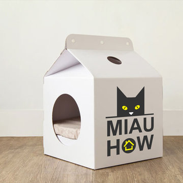
Cats love boxes, right? Oh yes they do!!!
We love cats and have a great offer: it's both a house and a box at the same time.
Our box-house is made of sturdy cardboard, so it'll last some time, up to 4-6 months actually, even if it's used realy intensively. Like reeeealy intensively. :)
You'll get package with unfolded house and detailed instructions how to fold it. You won't need any additional tools or glue, everything you'll need is included in the package.
It'll take barely few minutes to make your cat a happy owner of a new box-house.
1€ of every sold product is donated to local animal shelter "SOS-gyvūnai".
Shipping every saturday (if you placed your order after 12 pm on friday we'll ship it next saturday).

 User
Sight & Sound
This clean modern south Oakville Ontario remodel proves you don’t need to move
to a condo to completely update your surroundings.
These Oakville empty nesters with an active social life aren't interested in “fuddy-duddy” decor.
On the contrary, they are interested in the latest design trends, as well as the most current audio/visual components.
The original stone fireplace was updated with a custom designed mantle and a new gas insert. The updated warm grey
colour palette balances the natural stone making it an inviting focal point. The interior design included reconfiguring the room layout. Originally a smaller TV was located in-between the window and the fireplace and the sofa was where the current cabinet is now.
Our new layout opens up the room taking full advantage of it’s size. The sumptuous sectional allows for relaxed tete a tete
evenings as well as seating for larger groups. The additional leather occasional chair completes the conversation circle too. We naturally selected fabrics that are family friendly to ensure the grandchildren and adults can all be at ease. The flexibility of the 3
piece coffee table is both practical and adds an element of modern artistry. Grounding the room is a carpet graphic grey animal
skin custom sized into an area rug. Components as well as miscellaneous items are easily stored in the customised wood cabinet.
Stephani Buchman Photography

 Moderne Builders
Gorgeous master bath with dramatic retro "wave" tile. Peak Photography
Example of a 1950s bathroom design in Los Angeles
Example of a 1950s bathroom design in Los Angeles
Sponsored
Columbus, OH
Free consultation for landscape design!
Peabody Landscape Group
Franklin County's Reliable Landscape Design & Contracting

 Moss Yaw Design studio
Engineered cedar siding creates beautiful gray-blue tones at the exterior of the home, while adding a textural element to activate the simple exterior design.

 Spaces Renewed
This is a stunning modern kitchen. Sometimes, contemporary design can feel cold or sterile. This kitchen sets itself apart by adding color, warmth, and custom design elements that remain true to modern aesthetic but add in character and personality. The extra tall upper cabinets add height and drama to the space. The glass inserts at the top have lighted interiors which serve as storage and display areas. The Crown molding continues over the stainless hood, bridging the nearly 4 foot gap between the two sides. The grey accent color on the wall cabinets is echoed at the large kitchen island. The soft white perimeter color serves as a great anchor for the bold grey accent. The granite stays true to the color scheme with its white base and grey and black veining. The back splash is a grey vein cut limestone. The glass inset tiles offer color and shine to the subway limestone. At the hood area, the pattern switches to herringbone, but maintains the glass accent. By using the same tile and simply changing the format, we add visual interest to the space without creating competing elements. The built in Wolf convection oven and steam oven are a superior option for any cook. The built in window seat is both practical and serves a visual purpose. An overly long counter can feel industrial or boring. The height variation added at the desk and window seat break up the long expanse while adding function. The wood plank floor is actually porcelain tile. Porcelain tile is easier to maintain than wood, and holds up better in heavy traffic or water environments, such as kitchen. The purple pendants and crystal drum light over the nook are the icing on this modern kitchen cake!

 Homestead Doors, Inc.
Door #10
FP3190
Flat 3 Panel Interior Door with Farmhouse Sticking
Solid Poplar stiles and rails
MDF panels
Painted White
1 x 4 door casing
1 x 6 baseboard
Bravura 336B door knob
Call us for a quote on your door project
419-684-9582
Visit https://www.door.cc

 Warm Timber Saunas & Wine Cellars
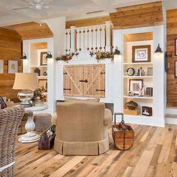
This previously unused attic space is now a sauna/yoga room. The left sauna wall follows the attic rafters down diagonally to allow a wider space for leg room on the twin sauna benches.


 KINGDOM WOODWORKS
Collaboration with Canonbury Homes and Frank Neely Design Associates.
Inspiration for a timeless open concept kitchen remodel in Atlanta with beaded inset cabinets and two islands
Inspiration for a timeless open concept kitchen remodel in Atlanta with beaded inset cabinets and two islands

 Bridgewater
The new owners were looking forward to living in their new home with an open floor plan, tall vaulted ceilings, and great views. It featured a large Great Room with two big French Doors separating the Dining Room from the Master Bedroom.
But after only a few months they identified a major design flaw: Each of the French Doors had ten glass windows with two large windows above each door. (Check out our before and after designs, traffic flow diagrams and photos of this project.) Glass windows and doors allowed sound and light from guests or the TV in the great room to easily sneak into the bedroom. With unique work and sleep schedules (he’s a pilot, she’s a registered nurse) this design wasn’t working.
Then there was a traffic flow design flaw: The Master Bedroom had a second entrance from a hallway. To get into the bedroom from the hallway you needed to walk down another claustrophobic hallway.
To get from the Master Bedroom to the Master Bath begin at the most remote corner of the bedroom and down a hallway between two closets. Once inside the bath, a huge triangular Jacuzzi dominating the space.
So, from a privacy and traffic flow perspective, this home had some major design issues.
When Craig Weber first met with the owners, he listened to their ideas and concerns. The owners trusted Craig to come up with the most efficient and most effective solution to this design dilemma. He offered a solution that resolved the bed-bath traffic flow problem, offered some bedroom room privacy, and updated the bath.
First, the two French Doors and windows were removed. A new wall was built with sound-absorbing materials, making the Great Room and Dining Room more comfortable spaces for entertaining while creating the bedroom privacy the owners craved.
Solving the Bedroom/Bath traffic flow problem began with removing the two existing closets. The bath door was relocated next to the hall entrance, and then a new walk-in closet was added adjacent to the hallway entrance. The solution offered easy access to and from the bath, closet and hallway without a hint of claustrophobia.
The Master Bath underwent a major transformation designed for convenience and comfort – especially during long, cold Minnesota winters.
Most everything from the former bath was torn out, beginning with the giant Jacuzzi.
A new bathtub that is wider and deeper than the standard size was installed with brushed Nickel fixtures. It’s the perfect place to relax with a glass of wine and candles.
Warm floors are a Minnesota “must have.” The bath’s new ceramic floor features in-floor electric heat. Getting in and out of the tub is easy and comfortable.
The new walk-in shower again features in-floor heating and a place to sit. The most interesting feature of this shower may the custom ceramic tile installed with unique patterns.
A new vanity Cambria Bradshaw countertops features two under-hung ceramic sinks with matching brushed Nickel fixtures.
Tall ceilings and three glass windows near the ceiling flood the room with natural light. A new energy-efficient window frames an ornamental stained glass window created by the owner’s father – a great personal touch.
A quiet place to sleep. A private dining room for entertaining. A Master Bath to die for. And easy traffic flow. The owners couldn’t have been more delighted with the outcome. And Lilly, their cat, loves it too.
12