
Search results for "Briefing" in Home Design Ideas
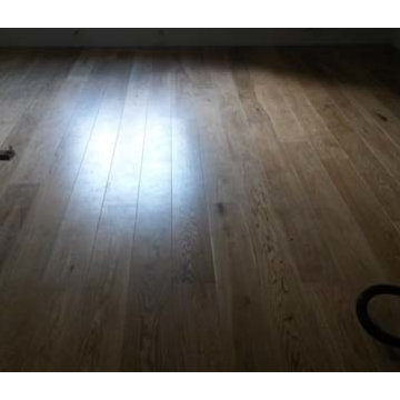
 The Flooring Group Ltd
Client: Private Residence In London
Brief: To supply & install mid-range oak wood to living areas
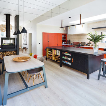
Inspiration for a transitional medium tone wood floor kitchen remodel in London
Inspiration for a transitional medium tone wood floor kitchen remodel in London
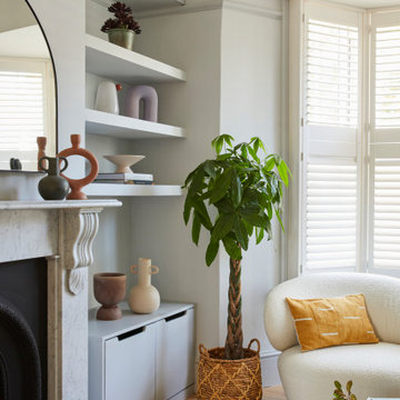
 Owl Design
Our clients – a family of four – had moved into a terraced home that needed updating. Our brief was an interiors scheme for the whole house.
The living room needed character adding back to it, so we chose pieces that complimented the original features of the beautiful house.
The neutral bathroom was designed to feel light and airy. In the kitchen, deep hues compliment neutral wood, for a modern update. For the study area – an extension of the living room – we chose a muted blue to contrast against the light oak, for a calming space to work, featuring bespoke joinery (seen here).
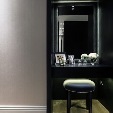 The Flooring Group Ltd
Client: Private Residence In Central London
Brief: To carpet the stairs & bedrooms with luxurious products.
Works completed in liaison with Whitebox London.
Find the right local pro for your project
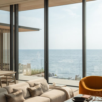
 dSPACE Studio Architecture
Built on a dune overlooking Lake Michigan, this residence appears to emerge from the landscape. The project brief called for an artful house that promotes wellness and outdoor living. Rugged beauty and four-season adventure drew the owners to the area but presented challenges, including wildfire risk. The site needed a durable shelter that responsibly integrates with the environment.
Clad in sand-colored stucco, the house will intentionally be obscured by grasses and junipers over time. Outdoor spaces are layered to match the undulating topography. A steel superstructure enables an ultra-thin roof with overhangs for passive solar design that withstand gale-force winds and heavy snow loads.
A crushed-granite courtyard offers refuge on windy days. This space is enclosed by operable Cor-Ten panels that rotate open to reveal dune views or close for a cloistered experience. The courtyard is further defined by a deconstructed roof with an aperture that frames sky views.
Expansive glazing and porcelain flooring unites interior and exterior, evoking a sense of inhabiting an infinity house. A screen porch, concealed by louvers, is a contemporary interpretation of a time-honored lake house vernacular. Layers of light and an edited palette of materials unify the interior and evoke a laid-back feeling of beach towns. On both levels, bronze glass walls artfully define rooms while preserving views.
 Granit Architects + Interiors
We are delighted to have completed the radical transformation of a tired detached property in South Croydon.
When they appointed Granit, our clients were living in the property which had previously been divided into a number of flats.
The historic sub-division had resulted in an extremely poor use of space with redundant staircases, kitchens and bathrooms throughout.
Our clients sought to reconfigure the property back into a single dwelling for his growing family.
Our client had an eye for design and was keen to balance contemporary design whilst maintaining as much of the character of the original house.
Maximising natural light, space and establishing a visual and physical connection were also key drivers for the design. Owing to the size of the property, it became apparent that reconfiguration rather than extension provided the solution to meet the brief.
A metal clad ‘intervention’ was introduced to the rear facade. This created a strong horizontal element creating a visual balance with the vertical nature of the three storey gable.
The metal cladding specified echoed the colour of the red brick string courses tying old with new. Slender frame sliding doors provide access and views of the large garden.
The central circulation space was transformed by the introduction of a double height glazed slot wrapping up the rear facade and onto the roof. This allows daylight to permeate into the heart of the otherwise dark deep floor plan. The staircase was reconfigured into a series of landings looking down over the main void space below and out towards the tree canopies at the rear of the garden.
The introduction of double pocket doors throughout the ground floor creates a series of interconnected spaces and the whitewashed Larch flooring flows seamlessly from room to room. A bold palette of colours and materials lends character and texture throughout the property.
The end result is a spacious yet cosy environment for the family to inhabit for years to come.
 Lola Cwikowski Studio
Eagerly awaiting retirement, a New England-based client acquired a property in a former office building in central Lisbon. Artfully refurbished by Frederico Valsassina Arquitectos, the façade is composed of geometric strata of medium-gray panels alternating with weathered vertical staves. Our studio’s brief was to furnish and equip the interior of the vacation home to converse with the architecture, so family and friends visiting Lisbon would stay in an elegant, private setting, filled with locally-made and designer items.
Upon entering, a small shelf and mirror function as a welcome valet. The corridor opens to a cozy living room with lambent afternoon light let in by large sliding doors. Just outside, the balcony sports a café table and chairs set for an aperitivo. An enveloping sofa, produced in Portugal, and an organic recliner, create an intimate lounge area facing a classic, modular media cabinet. An artisan-made wool ottoman adds a beat of color; the lights speak in plump opaline glass and thin black metal rods. The glass top of the dining table fades into the space, leaving its sculptural, marine blue base; in a play of textures, the upholstery of the dining chairs coordinates elegantly with the smoked glass. Tile, oak, and stainless steel come together in a custom kitchen island, with additional counter space and convenient storage.
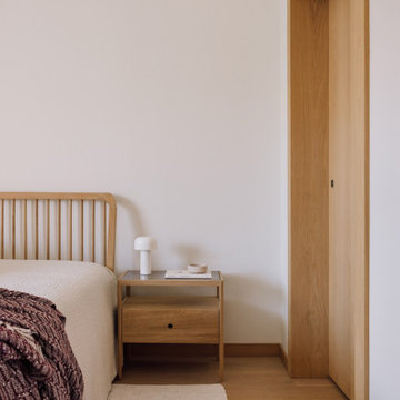
As the interior is replete with oiled oak in the floors, baseboards, doors, and cabinetry, matching wood furniture warms the bedrooms. The vertical spindles of the beds recall the pattern of the exterior façade. Laptop work is accommodated by a small console desk with a chair clothed in burgundy. Acorn-shaped pendants, inviting bed linens and rugs, and undulating curtains, all in the warm white of the walls, form a nest for relaxation.
 Christopher Simmonds Architect
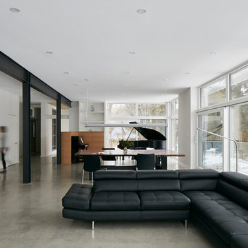
The client’s brief was to create a space reminiscent of their beloved downtown Chicago industrial loft, in a rural farm setting, while incorporating their unique collection of vintage and architectural salvage. The result is a custom designed space that blends life on the farm with an industrial sensibility.
The new house is located on approximately the same footprint as the original farm house on the property. Barely visible from the road due to the protection of conifer trees and a long driveway, the house sits on the edge of a field with views of the neighbouring 60 acre farm and creek that runs along the length of the property.
The main level open living space is conceived as a transparent social hub for viewing the landscape. Large sliding glass doors create strong visual connections with an adjacent barn on one end and a mature black walnut tree on the other.
The house is situated to optimize views, while at the same time protecting occupants from blazing summer sun and stiff winter winds. The wall to wall sliding doors on the south side of the main living space provide expansive views to the creek, and allow for breezes to flow throughout. The wrap around aluminum louvered sun shade tempers the sun.
The subdued exterior material palette is defined by horizontal wood siding, standing seam metal roofing and large format polished concrete blocks.
The interiors were driven by the owners’ desire to have a home that would properly feature their unique vintage collection, and yet have a modern open layout. Polished concrete floors and steel beams on the main level set the industrial tone and are paired with a stainless steel island counter top, backsplash and industrial range hood in the kitchen. An old drinking fountain is built-in to the mudroom millwork, carefully restored bi-parting doors frame the library entrance, and a vibrant antique stained glass panel is set into the foyer wall allowing diffused coloured light to spill into the hallway. Upstairs, refurbished claw foot tubs are situated to view the landscape.
The double height library with mezzanine serves as a prominent feature and quiet retreat for the residents. The white oak millwork exquisitely displays the homeowners’ vast collection of books and manuscripts. The material palette is complemented by steel counter tops, stainless steel ladder hardware and matte black metal mezzanine guards. The stairs carry the same language, with white oak open risers and stainless steel woven wire mesh panels set into a matte black steel frame.
The overall effect is a truly sublime blend of an industrial modern aesthetic punctuated by personal elements of the owners’ storied life.
Photography: James Brittain
 JAM Architects Ltd
This unique opportunity to design a new home in Millport was one which JAM Architects relished. The location of the site on a hill on the outskirts of the village presented an opportunity to design a new two bedroom home taking advantage of the views of the ocean. The unusual floorplan design with a ‘kink’ at the centre point of the building is as a result of this with the front of the home orientated to address the street and the rear half positioned to ensure the best views from the corner window in the livingroom and the master bedroom window.
As a result of a recent accident our client for this project was unfortunately left with some mobility issues and our brief was therefore to design a two bedroom home with all the primary accomodation on the ground floor, with a studio space, guest bedroom and guest shower room on the first floor. The ground floor consists of a open plan kitchen, dining and living room with direct access to a generous outside patio area. In addition to this living space there is also a utility room, w.c, master bedroom and ensuite bathroom.
On the first floor our client was also keen to take advantage of the sea views from this elevated position and a sheletered balcony area has been incorporated adjacent to the studio space.
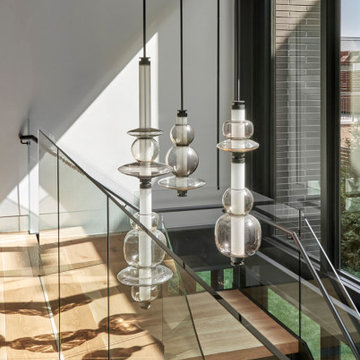 dSPACE Studio Architecture
Brickyard is home to clients passionate about contemporary architecture. They envisioned a private refuge that maintains a strong connection to nature while preserving walkable access to city life. The project brief included space to accommodate their extended family and a lounge with skyline views.
Constructed from steel, brick and glass, the home has a refined modern aesthetic that nods to Chicago’s industrial history. Its L-shaped footprint creates an open plan sanctuary that shelters a landscaped yard.
A perforated screen wall defines the front elevation, adding privacy while allowing natural light to filter through. Made from custom tapered bricks, this sculptural element casts dynamic shadows and evokes a sense of movement across the facade as the sun shifts through the day. This design elevates the material, creating a luxurious texture that transforms the building’s exterior.
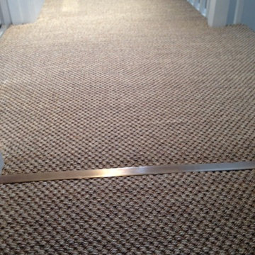 The Flooring Group Ltd
Client: Private Residence In West London.
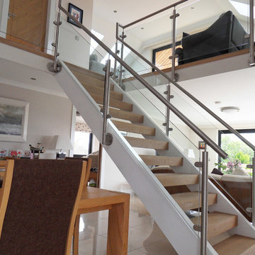
Brief: To supply & install sisal carpet to stairs, hallway & landings.
Staircase photo in London
Staircase photo in London
 Mark English Architects, AIA
The Atherton House is a family compound for a professional couple in the tech industry, and their two teenage children. After living in Singapore, then Hong Kong, and building homes there, they looked forward to continuing their search for a new place to start a life and set down roots.
The site is located on Atherton Avenue on a flat, 1 acre lot. The neighboring lots are of a similar size, and are filled with mature planting and gardens. The brief on this site was to create a house that would comfortably accommodate the busy lives of each of the family members, as well as provide opportunities for wonder and awe. Views on the site are internal. Our goal was to create an indoor- outdoor home that embraced the benign California climate.
The building was conceived as a classic “H” plan with two wings attached by a double height entertaining space. The “H” shape allows for alcoves of the yard to be embraced by the mass of the building, creating different types of exterior space. The two wings of the home provide some sense of enclosure and privacy along the side property lines. The south wing contains three bedroom suites at the second level, as well as laundry. At the first level there is a guest suite facing east, powder room and a Library facing west.
The north wing is entirely given over to the Primary suite at the top level, including the main bedroom, dressing and bathroom. The bedroom opens out to a roof terrace to the west, overlooking a pool and courtyard below. At the ground floor, the north wing contains the family room, kitchen and dining room. The family room and dining room each have pocketing sliding glass doors that dissolve the boundary between inside and outside.
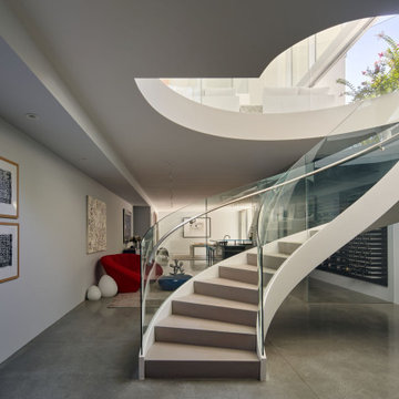
Connecting the wings is a double high living space meant to be comfortable, delightful and awe-inspiring. A custom fabricated two story circular stair of steel and glass connects the upper level to the main level, and down to the basement “lounge” below. An acrylic and steel bridge begins near one end of the stair landing and flies 40 feet to the children’s bedroom wing. People going about their day moving through the stair and bridge become both observed and observer.
The front (EAST) wall is the all important receiving place for guests and family alike. There the interplay between yin and yang, weathering steel and the mature olive tree, empower the entrance. Most other materials are white and pure.
The mechanical systems are efficiently combined hydronic heating and cooling, with no forced air required.
 Klopf Architecture
From Mid-Century Classic to the Present
An iconic design updated with comfort, function, and flow for today.
A Remodel That Balances Past and Present
What started as a desire to update a classic Eichler soon became an exploration of how Mid-Century Modern design can successfully evolve for today. The client, a tech professional with a passion for scuba diving and underwater photography, wanted a home that would both honor its original character and feel tailored to his daily life. A lifelong technology enthusiast, he still owns the very first Mac desktop he saved up for as a teenager working at Radio Shack, a detail that underscores his appreciation for design that melds function and form.
Honoring Separation While Expanding Possibility
Unlike many contemporary remodels where walls are opened up to create expansive living spaces, this project took a more restrained approach. The client valued the defined rooms of the original plan and wanted to preserve as much wall space as possible for displaying his large-format underwater photography. The emphasis was not on dramatic spatial reinvention, but on thoughtful refinements. Klopf Architecture shaped a gallery-like backdrop while also expanding the primary suite, modernizing materials and fixtures throughout the home, and improving the functionality and layout of the kitchen. The finished home feels at once timeless and renewed, an Eichler that continues to inspire while fully supporting the lifestyle of its present-day owner.
A major turning point came mid-design. The original project brief had not included an addition, but as the reconfiguration of the primary bedroom and bath unfolded, it became clear that an expansion was the best approach to achieve the client’s vision of a more spacious suite. Fortunately, the adjustment came at a stage when revisions were still manageable and was integrated seamlessly, showing how thoughtful course corrections can strengthen a project rather than hinder it.
Navigating Challenges With Precision
The design development included multiple conceptual rounds, balancing preservation with subtle expansion. During construction, an existing post previously thought to be load-bearing turned out not to be. The structural engineer was able to pivot quickly, and both the post and the cross beam that had been intended to replace it could be omitted, allowing the original rhythm of the Eichler beam bays to be preserved.
Sustainability was not just a checklist item, but a way to align the home with the client’s values of simplicity, efficiency, and long-term functionality. R-38 roof insulation reduced energy usage, solar panels with battery storage provided independence and resilience, and passive comfort strategies eliminated the need forenergy-intensive air conditioning. An electric vehicle charger and an on-demand hot water recirculation system (with call buttons as opposed to having constant circulation) add to the home’s long-term efficiency factors. Together, these moves created a home that is quieter, more comfortable, and better equipped for the future, qualities that supported the client’s pragmatic approach to design and living lightly.
Details That Respect the Eichler DNA
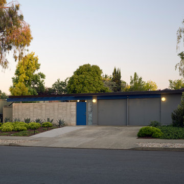
The remodel carries forward the Eichler’s original spirit while introducing new layers of modern livability. Originally, the house was approached along a deep, narrow walk, with the garage on one side and the house on the other, leaving the front door tucked far back within this chasm-like space. By pulling the entry forward, the design reshaped the arrival experience, creating a clearer threshold and a natural drop-off zone for bags, shoes, and keys. This shift also made room for a custom bench at the entry that extends seamlessly through the glass sidelight. The bench and drop-off zone now work together as a single, integrated sequence that supports everyday living while offering a tactile reminder of Eichler’s philosophy of connectedness.
At the client’s request, Klopf reintroduced a classic Eichler gesture by extending the exterior siding into the entry and living room. The detail reinforces a sense of indoor/outdoor continuity while providing a subtle architectural surface that allows the client’s photography to take visual precedence.
The signature concrete masonry wall at the front was reconstructed using blocks sourced to match the originals, now strengthened with rebar for seismic resilience while maintaining a private outdoor courtyard, visually extending the kitchen outward. A decorative trellis element, a detail borrowed from a neighboring Eichler, restores a familiar mid-century modern architectural motif. At the courtyard entry door, a custom etched glass sidelight with an ocean-themed design featuring kelp and jellyfish serves as a subtle homage to the client’s passion for deep-sea diving.
Landscaping became an integral part of the overall transformation. The homeowner engaged landscape architect Randi Johnsen of Third Nature Studio to shape a series of calm, inviting outdoor rooms that read as a natural extension of the interiors. While technically outside of the core construction scope, the landscape design proved central to achieving a sense of completeness and connectedness across the property. Such whole-property considerations often emerge as design ideas take shape, underscoring the importance of flexibility in planning and budgeting, as well as close collaboration among the design team starting early in the process.
The Value of Evolving Scope
As with many custom residential projects, the scope evolved during the design process. What began as a targeted remodel grew to include a new/expanded primary suite, a rebuilt CMU patio wall for strength and longevity, and a solar panel array and battery storage for energy resilience and carbon-reduction. Each thoughtful decision represented a conscious investment in the home’s performance and character, rather than a cost overrun.
The result was a project delivered on schedule, tailored precisely to the client’s lifestyle, and positioned to add long-term value both functionally and aesthetically. By embracing scope evolution as an opportunity rather than a challenge, and relying on good design paired with transparent communication, this remodel demonstrates how Eichler homes can be adapted for contemporary living without erasing their DNA.
Klopf Architecture project team: John Klopf, AIA, and Klara Kevane, Elise Webb and Nicholas LaNasa.
Contractor: Golden Cove Construction
Landscape Design: Third Nature Studio
Structural Engineer: Daniel Bastiao Design
Photography: ©2025 Mariko Reed
Year Completed: 2024
Location: Sunnyvale, CA
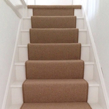 The Flooring Group Ltd
Client: Private Residence In South London
Brief: To supply & install brown carpet to stairs as a runner with whipping
Inspiration for a staircase remodel in London
Inspiration for a staircase remodel in London
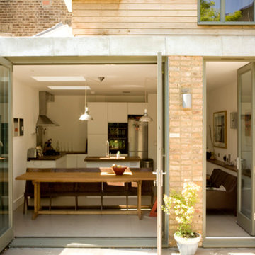
 TURN Architects llp
view from rear patio
The client’s brief was to extend the kitchen/dining room to the side to provide a generous and well-lit family space, and to add a loft bedroom and shower room to their 2-storey Victorian mid-terraced house.
The project also includes thermal improvement of the rear addition envelope (insulation + render system and roof refurbishment), as well as restoration of the front facade and hard landscaping (patio) to the rear.
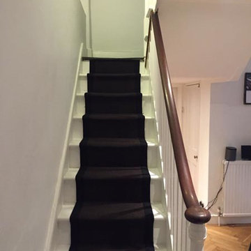 The Flooring Group Ltd
Client: Private Residence In East London
Brief: To supply & install black carpet to stairs as a runner with border
Mid-sized trendy carpeted u-shaped wood railing staircase photo in London
Mid-sized trendy carpeted u-shaped wood railing staircase photo in London
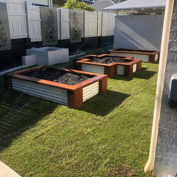
 Listonia Landscaping and Building
The brief for this house was for a Hampton style beach resort type design...designed by Burleigh Beach Designs and constructed by Listonia Landscaping. Photos by Listonia Landscaping
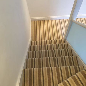 The Flooring Group Ltd
Client: Private Residence In Central London
Brief: To supply & install stripey carpet to stairs
Mid-sized transitional carpeted u-shaped wood railing staircase photo in London with carpeted risers
Mid-sized transitional carpeted u-shaped wood railing staircase photo in London with carpeted risers
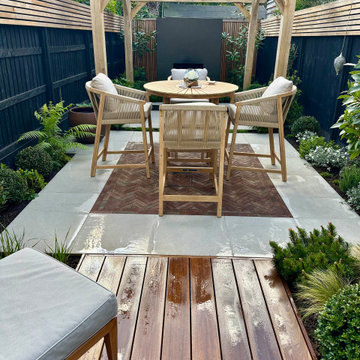
 Daryl Gannon Landscapes
Minimal palette, Maximum impact!
The brief was highly specific, an outdoor space suited for relaxing, entertaining friends and most importantly, featuring an outdoor fire place. Materials needed to echo the interior and architectural style of the house. With the planting all plants were to be evergreen, limited to various shades of green with no additional colour. The only permitted flower colour was white - with Rosemary being the sole exception to the rule.
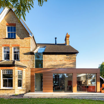 Granit Architects + Interiors
We are delighted to have completed the radical transformation of a tired detached property in South Croydon.
When they appointed Granit, our clients were living in the property which had previously been divided into a number of flats.
The historic sub-division had resulted in an extremely poor use of space with redundant staircases, kitchens and bathrooms throughout.
Our clients sought to reconfigure the property back into a single dwelling for his growing family.
Our client had an eye for design and was keen to balance contemporary design whilst maintaining as much of the character of the original house.
Maximising natural light, space and establishing a visual and physical connection were also key drivers for the design. Owing to the size of the property, it became apparent that reconfiguration rather than extension provided the solution to meet the brief.
A metal clad ‘intervention’ was introduced to the rear facade. This created a strong horizontal element creating a visual balance with the vertical nature of the three storey gable.
The metal cladding specified echoed the colour of the red brick string courses tying old with new. Slender frame sliding doors provide access and views of the large garden.
The central circulation space was transformed by the introduction of a double height glazed slot wrapping up the rear facade and onto the roof. This allows daylight to permeate into the heart of the otherwise dark deep floor plan. The staircase was reconfigured into a series of landings looking down over the main void space below and out towards the tree canopies at the rear of the garden.
The introduction of double pocket doors throughout the ground floor creates a series of interconnected spaces and the whitewashed Larch flooring flows seamlessly from room to room. A bold palette of colours and materials lends character and texture throughout the property.
The end result is a spacious yet cosy environment for the family to inhabit for years to come.
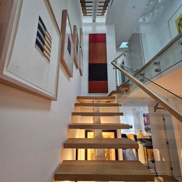
 Lindy Architect
This project was never really about the architecture. It was about a family that collects — art, ceramics, books, ideas — and needed a home that could hold all of that without turning into a museum.
The existing unit had good bones: generous ceiling heights, a floating stair, and enough square footage to work with. What it lacked was a coherent logic — a way of moving through the space that felt intentional, where each transition earned its moment.
We rebuilt that logic from the ground up.
The ground floor is organized around a single corridor that runs from the kitchen island through to the living room, with the staircase serving as the spine of the whole sequence. Rather than treating the stair as purely functional, we kept the glass balustrade open and lit the treads from below, so it reads as a light source as much as a passage. The console beneath it became a natural landing for ceramics and found objects — not styled, just placed.
In the living room, the brief was simple: make room for a very large painting without the room feeling like a gallery. The answer was to keep everything else quiet — a white built-in that does its job, sheer linen curtains that diffuse the light, black leather chairs that anchor the space without competing. The painting does the rest.
Upstairs, the landing is lit by a skylight that washes the hallway in natural light through most of the day. We lined one side with a burl wood console and let the ceramics and framed works speak for themselves. The mix of abstract prints, a bold red canvas, and handmade vessels gives the corridor a rhythm that feels accumulated over time rather than installed all at once — because it was.
Throughout, the material palette is deliberately restrained: white oak floors, white walls, white millwork. The restraint isn't minimalism for its own sake — it's a backdrop. The owners bring the color, texture, and personality. Our job was to give them the right walls to hang things on.
49