
Search results for "Bulkhead" in Home Design Ideas
 Debra Seabrook Design
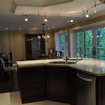
This space was achieved by removing walls around the staircase, center of the room and installing full glass doors and windows across the entire width of the room. To enhance the kitchen a bulkhead was built mimicking the shape of the island detailed with crown molding and flexible track lighting.
 Sosna Inc
Our clients, a family of professionals with 2 young kids, approached us to renovate their early 2000’s Toronto home to make it better suit the needs of their family. Although they were happy with the Kitchen layout, they requested that we update the existing cabinetry, and add additional cabinetry for increased storage. In the Laundry Room, they needed a storage solution for cleaning materials, and an updated laundry sink. They wanted the Basement to be a comfortable family space to spend time together, and for the kids to have a space to play.
The Kitchen cabinets were dated and starting to fall apart, and the Master En-Suite was dated and awkwardly shaped, with a tight walk-in shower.
In the Basement, the HVAC bulkhead was awkward and unsightly, and the space was not ideal for the kids to play, due to outdated carpeting, and a lack of storage space for their toys.
We spent time getting to know our clients to design a space that optimized functionality and comfort for their family.
In the Kitchen, we kept the existing layout, but added a tall cabinet for pantry and broom storage. A new island was built with a space to accommodate a built-in microwave, to keep it from cluttering the countertop. The new white oak tall cabinets and island cabinets were complimented by light coloured marble-looking quartz countertops and the handmade subway tile backsplash for a fresh, updated look.
In the Master Ensuite, we replaced the large, dated deck-mounted tub with a semi-freestanding tub, tucked nicely into the corner. The extra space this created allowed us to add a walk-in shower without the awkward angle that had existed prior to the renovation. The new walk-in shower featured a ceiling mounted showerhead, and a useful ledge for toiletries. We even had enough space to add a bonus make-up table to match the new double vanity. Both were custom built to be floating for a modern look, and easier maintenance.
In the Laundry Room, we installed the washer and dryer side by side, instead of stacked. This allowed for a long working countertop and upper storage cabinets that were custom built. Additionally, a hanging rack installed above the sink is perfect for drying small items, and the adjustable shelves and dividers in the custom built cabinetry will provide plenty of convenient space to store cleaning materials.
In the Basement, we widened the bulkhead to allow us to center the wall-mounted TV, and added custom media cabinets with floating shelves to accommodate electronics.
The space was made more comfortable for the kids to play with new vinyl heated flooring, and tall cabinets with adjustable shelves, dividers, and deep drawers to keep all of their toys organized.
All of these updates provided our clients with a home that fits their family’s needs and lifestyle.
If your home isn’t functional for your family, contact us to learn more. We’re the Renovator You Can Count On!
 Revitalize Design by Val Valdez
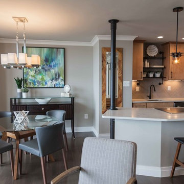
The property is a 700 square foot condo. The homeowner's goal was to have his 40+ year old unit transformed into a brand new space. To accomplish this, we gutted the entire unit; we replaced the popcorn ceiling with new drywall, replaced the old flooring with maple engineered wood flooring, removed the mirrored walls and painted the drywall a soothing neutral gray, and removed the kitchen walls and bulkheads to create an open concept. The bathroom and kitchen were totally renovated as well.
The outer kitchen walls and bulkheads were removed to create an open feel. The main challenge in opening up the space was the building restricting the removal of the existing telephone wires that were located in one of the walls. To maintain compliance with the building rules, I designed an "iron pipe" to house the phone wires which also serves as a conduit for the required wiring to the island. This pipe has an industrial influence which ties in perfectly with the custom-made shelving over the kitchen sink.
Additions include: Handsome crown moulding and custom baseboards, Sherwin Williams wall, ceiling and trim paint (the ceiling is NOT white), LED recessed light fixtures, custom island pendants, Quartz countertops, custom dining chandelier, custom shelving over the kitchen sink and custom "iron pipe" designed to house existing telephone wires (the building restricted the removal of existing phone line).
Photography by Michael Anthony Harrison, www.MikeAntPhotography.com
Find the right local pro for your project
 OakWood Design-Build
The renovation of the project included a main floor renovation which included a brand-new kitchen and a sunroom addition. This renovation revised the space in the kitchen area by removing a load-bearing wall and relocating the mechanical and electrical systems inside. This freed up space and allowed for a more open design in the kitchen area.
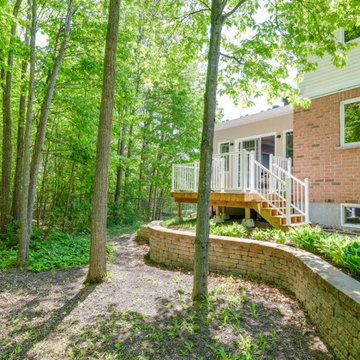
The client had several requests for this project, including large windows to allow maximum natural light. This idea was further added upon by adding sun tunnels in the roof for even more light. The sunroom also features a custom deck on the back of the house with aluminum handrails. The addition to the house was to have its own air conditioning system with custom ceiling tray detailing with crown moulding. This also served to hide the attic hatch with millwork finish. Besides, the sunroom space was designed as both a living room and extra dining space. During the pandemic, it also served as an office and home work hub for their children.
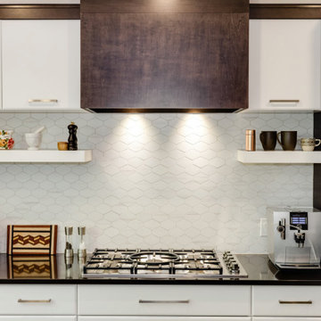
What makes this project appealing is the enhanced natural light being brought into the spaces through large windows and sun tunnels. Other enhancements include a large-scale hexagonal mosaic in marble-looking material to add texture to the wall, as well as the use of accent panels to extend custom hood cabinets to the ceiling. Next, the island in the kitchen can seat 4 comfortably enhancing the usefulness of the space. The colours chosen for the kitchen include off white slab doors and deep rich wood accents and island. The hardware is brushed nickel as well as the light fixture, all to match the plumbing fixtures. Around the walls in the sunroom is custom wainscotting using millwork and casing.
Special work was done on the ceiling, by concealing the beams with bulkheads and then angling them to match the existing bulkheads in the kitchen and original dining room. Besides, a custom appliance garage corner cabinet sits on the countertop which offers convenience and efficiency. The size of the island was maximized to get the most storage space out of it, including a pull-out spice rack and a space for a wine fridge. The unique transition between tile and hardwood was done out of necessity, as the sitting stools had to sit on only one medium. Plus, it is a unique way to transition from two different flooring materials!
The unique challenges of this project include the wood to tile interface. This was required for the sitting stools to rest on only one medium. This design feature turned out to be an attractive solution to the design problem. This solution was also used at the patio door entrance. The plumbing in this project was challenging since it connected to an existing reverse osmosis system. There was a large beam in the kitchen ceiling which interfered with lighting placement. Additionally, picking a complimentary wood colour which would go with the existing flooring was challenging. The overall design of the addition took extra time to make the space well-used as the lot itself was an irregular shape.

 Cascade Outdoor Design
This riverfront property received a major facelift while keeping with the traditional style of the home. Working between an existing bulkhead and a covered patio off the back of the house, we incorporated various design elements to add plenty of "rooms" for the homeowners to entertain in. The linear pool features an elevated inset spa, with infinity edge. The pool deck, landing, and cabana floor are travertine. Brick stairs and walls match the existing brick from the property. A linear fire pit sits in a sunken gravel patio, to create a more intimate space and soften the feel of the hardscape surround. Raised planters break up space and add a bright pop of color, encouraging butterflies and birds to visit often.
Photo by Josh Mauser
 Jordan Design Build Group
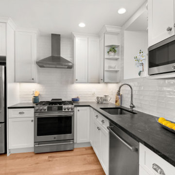
Built in 1910, this charming DC row house is located in the historic Bloomingdale neighborhood. At some point, the home had been converted into two separate apartments and, in doing so, the previous owners had removed the connecting stairs and made some other problematic design decisions. When our clients purchased the home in 2017, it required a full gut renovation in order to bring it up to code and return it to a single family residence. One of the initial challenges was to address the excessive bulkheads, soffits and ceiling height changes that made the rooms feel off kilter. Reconfiguring the HVAC system and ductwork allowed us to minimize bulkheads and raise the ceilings which, in turn made the spaces feel larger and more open. In the kitchen, the extra height meant we could install taller upper cabinets which provided much needed storage. By expanding the kitchen we were able to reconfigure the layout and create additional prep space and a more functional location for the range.
 Laqfoil Ltd.
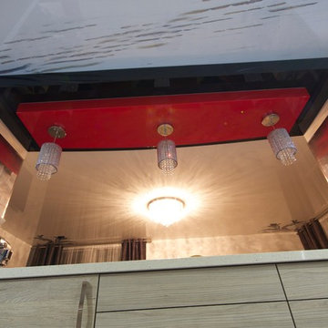
Solution to low high, popcorn ceiling in ceiling was found by implementing multilevel bulkhead as well as printed graphic, using stretch ceiling technologies. Designed and installed by Laqfoil Stretch Ceilings.
 Thompson Remodeling
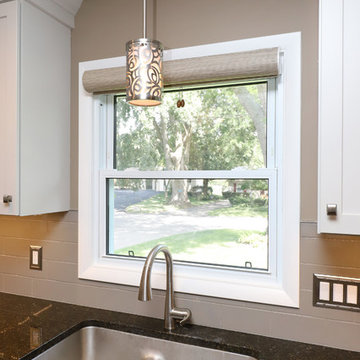
It's amazing what the removal of bulkheads and a wall can do for a kitchen! In this kitchen remodel, we removed a wall to make the kitchen larger and integrated an eat-in space. We also took out bulkheads and extended cabinets to the ceiling, which makes the space feel larger and provides more storage space.
For a modern take on the traditional design aesthetic, we paired white upper cabinets with dark toned wood bottoms and island. A dry bar with glass front cabinets was added to the eat-in area.

 Revitalize Design by Val Valdez
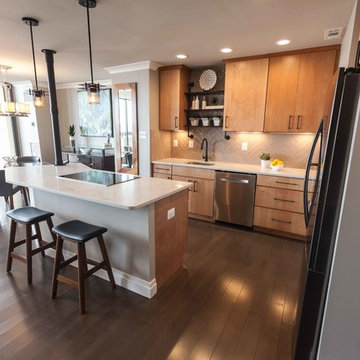
This is the view upon entering the unit. The kitchen was encapsulated by bulkheads that hung down from the popcorn ceiling. Although there was a countertop with a window cut-out for seating, it felt claustrophobic with the full-height walls.
We removed all the walls and bulkheads, and eliminated the popcorn ceiling. The addition of LED recessed light fixtures brigthens the spaces and enhances the overall spatial effect. The refrigerator was relocated from the center of the kitchen to a nook, which previously housed a stackable washer/dryer unit.
Photography by Michael Anthony Harrison, www.MikeAntPhotography.com
 Michael Nash Design, Build & Homes
2013 NARI CAPITAL COTY, MERIT AWARD WINNER, RESIDENTIAL KITCHEN $80,001-$120,000
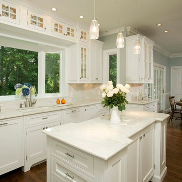
This homeowner knew her kitchen wasn’t living up to its full potential. Built in the mid-1980s, it had short wall cabinetry, large bulkheads, a cooktop across an aisle from the sink and a dysfunctional peninsula that separated the kitchen and the breakfast room.
The proposed design promised to lighten up space by introducing white cabinets with lots of glass options and large molding. Stacked upper glass cabinets have taken over the bulkheads. A large island with glass display cabinets is now central to the design.
A large professional stove with a custom range hood is the focal point of the space. Exotic white marble counters match the white cabinetry beautifully. A bay window over the sink, a skylight and French doors with a glass transom bring more natural light into the room.
 Revitalize Design by Val Valdez
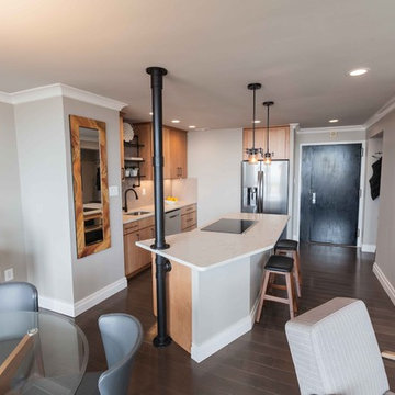
The outer kitchen walls and bulkheads were removed to create an open feel. The main challenge in opening up the space was the building restricting the removal of the existing telephone wires that were located in one of the walls. To maintain compliance with the building rules, I designed an "iron pipe" to house the phone wires which also serves as a conduit for the required wiring to the island. This pipe has an industrial influence which ties in perfectly with the custom-made shelving over the kitchen sink.
The property is a 700 square foot condo. The homeowner's goal was to have his 40+ year old unit transformed into a brand new space. To accomplish this, we gutted the entire unit; we replaced the popcorn ceiling with new drywall, replaced the old flooring with maple engineered wood flooring, removed the mirrored walls and painted the drywall a soothing neutral gray, and removed the kitchen walls and bulkheads to create an open concept.
Additions include: Handsome crown moulding and custom baseboards, Sherwin Williams wall, ceiling and trim paint (the ceiling is NOT white), LED recessed light fixtures, custom island pendants, Quartz countertops, custom dining chandelier, custom shelving over the kitchen sink and custom "iron pipe" designed to house existing telephone wires (building restricted the removal of existing phone line).
Photography by Michael Anthony Harrison, www.MikeAntPhotography.com
 OakWood Design-Build
The renovation of the project included a main floor renovation which included a brand-new kitchen and a sunroom addition. This renovation revised the space in the kitchen area by removing a load-bearing wall and relocating the mechanical and electrical systems inside. This freed up space and allowed for a more open design in the kitchen area.
The client had several requests for this project, including large windows to allow maximum natural light. This idea was further added upon by adding sun tunnels in the roof for even more light. The sunroom also features a custom deck on the back of the house with aluminum handrails. The addition to the house was to have its own air conditioning system with custom ceiling tray detailing with crown moulding. This also served to hide the attic hatch with millwork finish. Besides, the sunroom space was designed as both a living room and extra dining space. During the pandemic, it also served as an office and home work hub for their children.
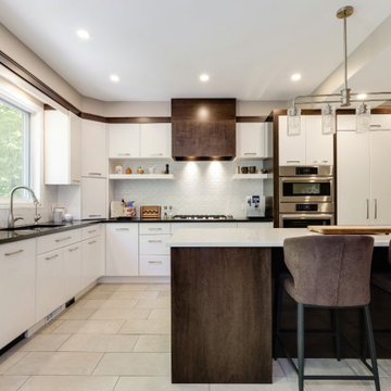
What makes this project appealing is the enhanced natural light being brought into the spaces through large windows and sun tunnels. Other enhancements include a large-scale hexagonal mosaic in marble-looking material to add texture to the wall, as well as the use of accent panels to extend custom hood cabinets to the ceiling. Next, the island in the kitchen can seat 4 comfortably enhancing the usefulness of the space. The colours chosen for the kitchen include off white slab doors and deep rich wood accents and island. The hardware is brushed nickel as well as the light fixture, all to match the plumbing fixtures. Around the walls in the sunroom is custom wainscotting using millwork and casing.
Special work was done on the ceiling, by concealing the beams with bulkheads and then angling them to match the existing bulkheads in the kitchen and original dining room. Besides, a custom appliance garage corner cabinet sits on the countertop which offers convenience and efficiency. The size of the island was maximized to get the most storage space out of it, including a pull-out spice rack and a space for a wine fridge. The unique transition between tile and hardwood was done out of necessity, as the sitting stools had to sit on only one medium. Plus, it is a unique way to transition from two different flooring materials!
The unique challenges of this project include the wood to tile interface. This was required for the sitting stools to rest on only one medium. This design feature turned out to be an attractive solution to the design problem. This solution was also used at the patio door entrance. The plumbing in this project was challenging since it connected to an existing reverse osmosis system. There was a large beam in the kitchen ceiling which interfered with lighting placement. Additionally, picking a complimentary wood colour which would go with the existing flooring was challenging. The overall design of the addition took extra time to make the space well-used as the lot itself was an irregular shape.
 OakWood Design-Build
The renovation of the project included a main floor renovation which included a brand-new kitchen and a sunroom addition. This renovation revised the space in the kitchen area by removing a load-bearing wall and relocating the mechanical and electrical systems inside. This freed up space and allowed for a more open design in the kitchen area.
The client had several requests for this project, including large windows to allow maximum natural light. This idea was further added upon by adding sun tunnels in the roof for even more light. The sunroom also features a custom deck on the back of the house with aluminum handrails. The addition to the house was to have its own air conditioning system with custom ceiling tray detailing with crown moulding. This also served to hide the attic hatch with millwork finish. Besides, the sunroom space was designed as both a living room and extra dining space. During the pandemic, it also served as an office and home work hub for their children.
What makes this project appealing is the enhanced natural light being brought into the spaces through large windows and sun tunnels. Other enhancements include a large-scale hexagonal mosaic in marble-looking material to add texture to the wall, as well as the use of accent panels to extend custom hood cabinets to the ceiling. Next, the island in the kitchen can seat 4 comfortably enhancing the usefulness of the space. The colours chosen for the kitchen include off white slab doors and deep rich wood accents and island. The hardware is brushed nickel as well as the light fixture, all to match the plumbing fixtures. Around the walls in the sunroom is custom wainscotting using millwork and casing.
Special work was done on the ceiling, by concealing the beams with bulkheads and then angling them to match the existing bulkheads in the kitchen and original dining room. Besides, a custom appliance garage corner cabinet sits on the countertop which offers convenience and efficiency. The size of the island was maximized to get the most storage space out of it, including a pull-out spice rack and a space for a wine fridge. The unique transition between tile and hardwood was done out of necessity, as the sitting stools had to sit on only one medium. Plus, it is a unique way to transition from two different flooring materials!
The unique challenges of this project include the wood to tile interface. This was required for the sitting stools to rest on only one medium. This design feature turned out to be an attractive solution to the design problem. This solution was also used at the patio door entrance. The plumbing in this project was challenging since it connected to an existing reverse osmosis system. There was a large beam in the kitchen ceiling which interfered with lighting placement. Additionally, picking a complimentary wood colour which would go with the existing flooring was challenging. The overall design of the addition took extra time to make the space well-used as the lot itself was an irregular shape.
 Toronto Bath Centre
Project: Full Ensuite Bathroom Renovation
Location: Mississauga – Square One Area
This full ensuite renovation focused on improving layout, comfort, and functionality.
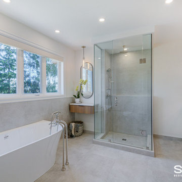
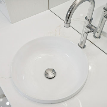
The original bathroom felt enclosed and outdated. The shower was dark, closed off, and had a low ceiling due to a bulkhead. A large deck-mounted bathtub occupied significant space and was never used by the homeowner. The existing cabinetry lacked proper storage and did not meet the client’s needs.
To transform the space, we fully opened the shower area by removing the bulkhead and side wall, allowing for better light flow and ceiling height. The deck-mounted bathtub, old tile, and existing furniture were completely removed.
The new walk-in shower features a linear drain with a non-threshold Schluter system, creating a seamless, clean look and improving accessibility. The custom glass enclosure was designed to maintain openness while defining the space.
We installed a custom vanity to maximize storage and discreetly conceal electrical outlets, keeping the design streamlined and practical.
Key features include:
Zitta freestanding bathtub
Tenzo freestanding tub filler
Tenzo shower valve with thermostatic and volume control
The result is a bright, functional, and thoughtfully planned ensuite that feels open, modern, and tailored to the homeowner’s lifestyle.
 York
YorkLuisa Bellini
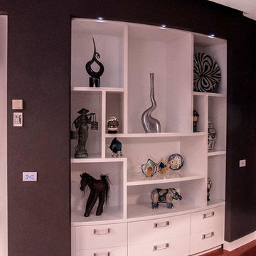
Great room - mid-sized contemporary medium tone wood floor great room idea in Brisbane with gray walls
Great room - mid-sized contemporary medium tone wood floor great room idea in Brisbane with gray walls
 Thompson Remodeling
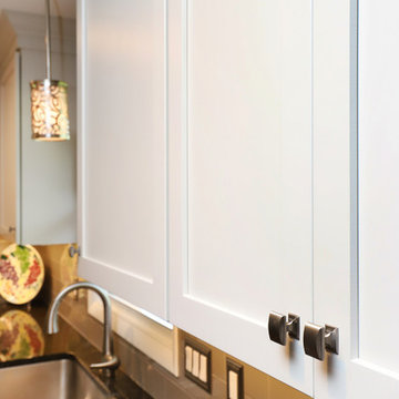
It's amazing what the removal of bulkheads and a wall can do for a kitchen! In this kitchen remodel, we removed a wall to make the kitchen larger and integrated an eat-in space. We also took out bulkheads and extended cabinets to the ceiling, which makes the space feel larger and provides more storage space.
For a modern take on the traditional design aesthetic, we paired white upper cabinets with dark toned wood bottoms and island. A dry bar with glass front cabinets was added to the eat-in area.
 Piller & Putz Construction
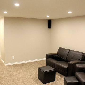
Basements in houses built in the 50's face a lot of challenges when it comes to development - bulkheads, uneven floors, small windows, disintegrating plumbing, and cracked walls all need to be dealt with to provide a perfect modern finish. This basement required everything from completely new plumbing from the stack to the street, levelled breathable subfloor, spray foamed walls and rim joists, bulkheads, and a load bearing support wall.
 Piller & Putz Construction
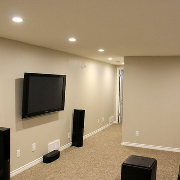
Basements in houses built in the 50's face a lot of challenges when it comes to development - bulkheads, uneven floors, small windows, disintegrating plumbing, and cracked walls all need to be dealt with to provide a perfect modern finish. This basement required everything from completely new plumbing from the stack to the street, levelled breathable subfloor, spray foamed walls and rim joists, bulkheads, and a load bearing support wall.
 Ripplinger Homes
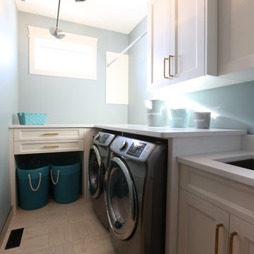
Example of a minimalist l-shaped ceramic tile and beige floor dedicated laundry room design in Other with a drop-in sink, recessed-panel cabinets, white cabinets, quartz countertops, blue walls and a side-by-side washer/dryer
30