
Search results for "Business structure" in Home Design Ideas

 Lauren M. Smith Interiors, LLC
Building of the Outdoor Deck and Veranda: Chicago Roof Deck & Garden (Design collaboration with Adam Miller & Vanessa Slivinski)
Photography by: Mieke Zuiderweg

 Jim Dase, CMKBD
Here is an award winning streamlined kitchen I designed executed in a warm grey rift cut oak. One can walk completely around the main structure housing the range-top, ovens and refrigeration to find another oven, coffee bar and desk area at the rear. The island functions as prep and clean-up zones with a snack bar at the rear and a stepped down dining table at one end. The wide open space overlooks woods to the rear, water to the front and the living space on the lower level.
 Drury Design
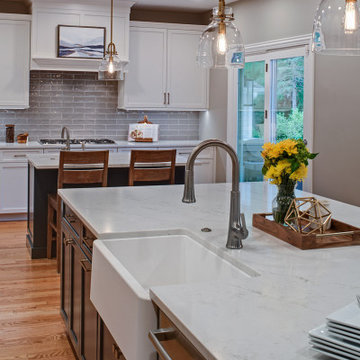
The family liked having a general dining area as well as a formal dining room but wanted to change up the overall layout while opening up the kitchen.
Design Objectives
• Open up the space to the formal dining room and move the general dining area to be next to the living room
• Give the space an expansive feel
• Create multiple work areas
• Create easy flow/walkways/continuity to allow a family of four to move about freely and complete different tasks in the space
• Make the space adaptable for entertaining
• Bring in more natural light
Design Challenges
• Work around obstacles like the fireplace in the dining room and structural fixtures between the dining room and the kitchen
• Design a plan for a very big area that is proportional with no wasted space
Design Solutions
• A structural engineer was brought in to give options for relocating duct work and building a new header.
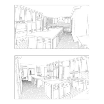
• Combining the old kitchen and dining room resulted in a great new space that was very long. This allowed us to create new workspaces across two islands.
• A contrasting color theme (bright perimeter cabinets and dark islands) helped ground the space, making it flow while still feeling intimate and inviting.
The homeowners love their new space and report that the aesthetic and functional changes allow them to do more, both individually and together. As a hub for everything their busy lives entail – from day-to-day routines to a wide range of entertaining arrangements – their wide-open kitchen handles it all while keeping the space and the family connected.
Find the right local pro for your project
 Kimberlee Marie Interiors
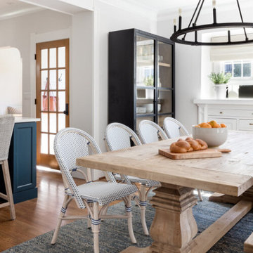
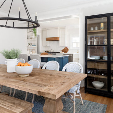
The owners of this cheery and bright kitchen and dining room are a young family with a busy and active life. They approached KMI because they needed an updated kitchen that functionally served their needs better and allowed for more connection to the dining room for entertaining. Where the peninsula stands currently, there once stood a wall completely segmenting the two spaces. We worked with a structural engineer to help our clients eliminate that wall so we could create the open floor plan they were dreaming of.
We also helped our clients think creatively about maximizing storage in their small but mighty kitchen. In smaller spaces, good organization is all the more important. We added a pantry cabinet, utilized dead space by the fridge for open shelves, and added storage drawers to the built-in bench seat in the breakfast nook – not for storing serveware, but for their two boys' Lego collection that once lived on the table.
When it came to the finishes and the design, we knew this kitchen needed to fit into the historic craftsman home. We chose colors and fixtures that honored the age and style of the home while allowing the kitchen to also fit the aesthetic of a modern family. Wood accents, brass hardware, and the pop of deep blue in the peninsula were chosen to add warmth and character to the space, while the creamy off-white cabinets add an air of lightness and brightness to the kitchen, ultimately creating an effortlessly balanced design.
 Drury Design
The family liked having a general dining area as well as a formal dining room but wanted to change up the overall layout while opening up the kitchen.
Design Objectives
• Open up the space to the formal dining room and move the general dining area to be next to the living room
• Give the space an expansive feel
• Create multiple work areas
• Create easy flow/walkways/continuity to allow a family of four to move about freely and complete different tasks in the space
• Make the space adaptable for entertaining
• Bring in more natural light
Design Challenges
• Work around obstacles like the fireplace in the dining room and structural fixtures between the dining room and the kitchen
• Design a plan for a very big area that is proportional with no wasted space
Design Solutions
• A structural engineer was brought in to give options for relocating duct work and building a new header.
• Combining the old kitchen and dining room resulted in a great new space that was very long. This allowed us to create new workspaces across two islands.
• A contrasting color theme (bright perimeter cabinets and dark islands) helped ground the space, making it flow while still feeling intimate and inviting.
The homeowners love their new space and report that the aesthetic and functional changes allow them to do more, both individually and together. As a hub for everything their busy lives entail – from day-to-day routines to a wide range of entertaining arrangements – their wide-open kitchen handles it all while keeping the space and the family connected.

 Mark Brand Architecture
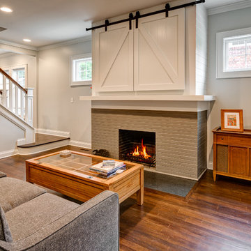
Fireplace Detail Photo.
"Business in the Front, Party in the Back"
This project provided Mark with the opportunity to revisit a project from the first year of his practice. Our clients were the third owners since Mark first worked on this house in 1987. The original project had consisted of a small addition to the rear of an existing single-story (over garage) house. The new owners wanted to completely remodel the house and add two floors. In addition they wanted it to be MODERN. This was a perfect fit for where the firm had evolved to over the years, but the neighbors weren't having it. The neighbors were very organized and didn’t like the idea of a large modern structure in what was a mostly traditional block. We were able to work with the neighbors to agree to a design that was Craftsman on the front and modern on the interior and rear. Because of this dichotomy, we sometimes refer to this as the "Mullet House". We were able to minimize the apparent height of the facade by hiding the top floor behind a dormered roof. Unique features of this house include a stunning roof deck with glass guardrails, a custom stair with a zigzag edge and a guardrail composed of vertical stainless steel tubes and an asymmetrical fireplace composition.
Photo by Michael David Rose

 Saikley Architects
Our busy Silicon Valley clients asked us to convert their tight-quartered 1960’s ranch house to a gracious family home that would meet their long term needs. Ease of living was paramount, both in functionality and in ordered design.
The project was completed on a moderate budget.While retaining most of the structure of the existing house to avoid costly structural changes, we opened walls to improve the sight lines and flow of the house and bring in more light. We made small additions at the front and back bedrooms to gain space for the family and relatives. An existing underused patio area was improved with a simple outdoor kitchen and overhang to extend the living space to the outside. Costs were kept down with choices of modest materials.
Everything was made to be functional. Ample storage has been built into the right places. The details of the kitchen were carefully worked out to accommodate all the wishes of the various cooks in the family. The house is set up to be easy to keep clean. Acoustic walls separate living from bedroom spaces so adults can enjoy time together while children sleep. The outdoor kitchen has easy access to the indoor kitchen and the garage, and its setup promotes socializing while cooking outdoors.
A large part of the narrow back yard was previously unusable space due to a steep slope up to a neighbor’s higher fence. With a new retaining wall and some re-grading we took back more of the yard for the patio and play space on a new lawn.
The remodeled house is a mix of contemporary and traditional elements. Cool colors have a calming effect. Traditional items such as prairie style windows, trellis, mosaic tiles, and Shaker style cabinets, break down the scale in an otherwise streamlined, contemporary design. A new gabled roof with a broad arch at the front of the house marks the entry and resolves a challenging form where the central entry is set back from walls on both sides.
Photography: Kurt Manley
https://saikleyarchitects.com/portfolio/modern-ranch/

 Drury Design
The family liked having a general dining area as well as a formal dining room but wanted to change up the overall layout while opening up the kitchen.
Design Objectives
• Open up the space to the formal dining room and move the general dining area to be next to the living room
• Give the space an expansive feel
• Create multiple work areas
• Create easy flow/walkways/continuity to allow a family of four to move about freely and complete different tasks in the space
• Make the space adaptable for entertaining
• Bring in more natural light
Design Challenges
• Work around obstacles like the fireplace in the dining room and structural fixtures between the dining room and the kitchen
• Design a plan for a very big area that is proportional with no wasted space
Design Solutions
• A structural engineer was brought in to give options for relocating duct work and building a new header.
• Combining the old kitchen and dining room resulted in a great new space that was very long. This allowed us to create new workspaces across two islands.
• A contrasting color theme (bright perimeter cabinets and dark islands) helped ground the space, making it flow while still feeling intimate and inviting.
The homeowners love their new space and report that the aesthetic and functional changes allow them to do more, both individually and together. As a hub for everything their busy lives entail – from day-to-day routines to a wide range of entertaining arrangements – their wide-open kitchen handles it all while keeping the space and the family connected.
 Mark Brand Architecture
Kitchen Photo.
"Business in the Front, Party in the Back"
This project provided Mark with the opportunity to revisit a project from the first year of his practice. Our clients were the third owners since Mark first worked on this house in 1987. The original project had consisted of a small addition to the rear of an existing single-story (over garage) house. The new owners wanted to completely remodel the house and add two floors. In addition they wanted it to be MODERN. This was a perfect fit for where the firm had evolved to over the years, but the neighbors weren't having it. The neighbors were very organized and didn’t like the idea of a large modern structure in what was a mostly traditional block. We were able to work with the neighbors to agree to a design that was Craftsman on the front and modern on the interior and rear. Because of this dichotomy, we sometimes refer to this as the "Mullet House". We were able to minimize the apparent height of the facade by hiding the top floor behind a dormered roof. Unique features of this house include a stunning roof deck with glass guardrails, a custom stair with a zigzag edge and a guardrail composed of vertical stainless steel tubes and an asymmetrical fireplace composition.
Photo by Michael David Rose

 CoverMyPatio.com
The Arcadia Louvered Roof enhances the beauty of any style home and provides the flexibility of having an open roof when the weather is good or a solid roof to keep the rain off your patio when the weather turns bad.
Eco-friendly Construction
The Arcadia system is made up of recycled aluminum making it an extremely Green product. It is also eco-friendly, helping consumers save on passive solar heating and cooling.
We Think Green
Arcadia is proud to continue the company's tradition with its approach to Environmental Innovation. From the choice of lightweight materials and lean production methods to the efficiency of its drive system and designs, Arcadia is committed to operating as a more sustainable business and reducing its overall environmental impact.
High-quality Building Materials
Each Arcadia system is a work of art, constructed with care and attention to every little detail.
Our system is powered coated, extruded aluminum with stainless steel components giving us the most durable louvered roof on the market today. From our superior drive system, which is UL & CE certified, down to the stainless steel tex screws that secures the system together. Nothing but the best!
Our low-maintenance components eliminate painting, staining, and waterproofing of traditional shading structures. Using powder-coated aluminum construction prevents warping, cracking, and corrosion.
Photographed by: Roger Chafin

 Matt Powers Custom Homes & Renovations
TK Images
Example of a large classic open concept dark wood floor family room design in Houston with beige walls, a standard fireplace, a tile fireplace and a media wall
Example of a large classic open concept dark wood floor family room design in Houston with beige walls, a standard fireplace, a tile fireplace and a media wall

 Advance Design Studio, Ltd.
When you see the before photos of this kitchen, the finished product is nearly unrecognizable! This is because the original kitchen was 10x10, and wall separated the kitchen area from the eating area. Opening up the 2 spaces was exactly what this new kitchen needed!
Since the dining area was directly adjacent to the family room, the designer at Advance Design created a low wall of matching decorative book case cabinets with a granite top to create separation needed between the spaces. This bank also eloquently held a beautifully wood appointed supporting column necessary for the structural ceiling load.
The focal point of the new kitchen is the hand-painted backsplash centered under a wooden hood in the chef’s special cooking area. A completely functional island now has space for several stools, and even has a decorative touch with the shelving unit facing the eating area.
The space next to the refrigerator became an efficiently organized bill paying area for the lady of the house, complete with pull out file drawers hidden behind matching kitchen cabinets. Replacing the “black hole” of a pantry; pull out shelves grace the interior of new pantry units suitable for the family of five busy people.
Existing hardwood oak was repaired and refinished on the entire first floor. A light patterned gold granite works effortlessly with the tumbled marble backsplash that enjoys hints of weathered iron looking details that coordinate nicely with the cabinetry hardware.
What makes this kitchen special is how elegant it appears despite the rustic feel of the knotty alder cabinetry. Clean design lines lend an air of sophistication to the otherwise “rustic” looking materials. Now this active family can enjoy the open space, cooking and hanging out together is now an enjoyable pastime.

 Rudloff Custom Builders
We renovated the exterior and the 4-car garage of this colonial, New England-style estate in Haverford, PA. The 3-story main house has white, western red cedar siding and a green roof. The detached, 4-car garage also functions as a gentleman’s workshop. Originally, that building was two separate structures. The challenge was to create one building with a cohesive look that fit with the main house’s New England style. Challenge accepted! We started by building a breezeway to connect the two structures. The new building’s exterior mimics that of the main house’s siding, stone and roof, and has copper downspouts and gutters. The stone exterior has a German shmear finish to make the stone look as old as the stone on the house. The workshop portion features mahogany, carriage style doors. The workshop floors are reclaimed Belgian block brick.
RUDLOFF Custom Builders has won Best of Houzz for Customer Service in 2014, 2015 2016 and 2017. We also were voted Best of Design in 2016, 2017 and 2018, which only 2% of professionals receive. Rudloff Custom Builders has been featured on Houzz in their Kitchen of the Week, What to Know About Using Reclaimed Wood in the Kitchen as well as included in their Bathroom WorkBook article. We are a full service, certified remodeling company that covers all of the Philadelphia suburban area. This business, like most others, developed from a friendship of young entrepreneurs who wanted to make a difference in their clients’ lives, one household at a time. This relationship between partners is much more than a friendship. Edward and Stephen Rudloff are brothers who have renovated and built custom homes together paying close attention to detail. They are carpenters by trade and understand concept and execution. RUDLOFF CUSTOM BUILDERS will provide services for you with the highest level of professionalism, quality, detail, punctuality and craftsmanship, every step of the way along our journey together.
Specializing in residential construction allows us to connect with our clients early in the design phase to ensure that every detail is captured as you imagined. One stop shopping is essentially what you will receive with RUDLOFF CUSTOM BUILDERS from design of your project to the construction of your dreams, executed by on-site project managers and skilled craftsmen. Our concept: envision our client’s ideas and make them a reality. Our mission: CREATING LIFETIME RELATIONSHIPS BUILT ON TRUST AND INTEGRITY.
Photo Credit: JMB Photoworks
Sponsored
Columbus, OH

Hope Restoration & General Contracting
Columbus Design-Build, Kitchen & Bath Remodeling, Historic Renovations
 Mark Brand Architecture
Master Bathroom Photo.
"Business in the Front, Party in the Back"
This project provided Mark with the opportunity to revisit a project from the first year of his practice. Our clients were the third owners since Mark first worked on this house in 1987. The original project had consisted of a small addition to the rear of an existing single-story (over garage) house. The new owners wanted to completely remodel the house and add two floors. In addition they wanted it to be MODERN. This was a perfect fit for where the firm had evolved to over the years, but the neighbors weren't having it. The neighbors were very organized and didn’t like the idea of a large modern structure in what was a mostly traditional block. We were able to work with the neighbors to agree to a design that was Craftsman on the front and modern on the interior and rear. Because of this dichotomy, we sometimes refer to this as the "Mullet House". We were able to minimize the apparent height of the facade by hiding the top floor behind a dormered roof. Unique features of this house include a stunning roof deck with glass guardrails, a custom stair with a zigzag edge and a guardrail composed of vertical stainless steel tubes and an asymmetrical fireplace composition.
Photo by Michael David Rose.
 Kimberlee Marie Interiors
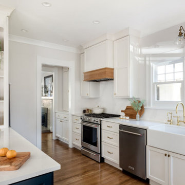
The owners of this cheery and bright kitchen and dining room are a young family with a busy and active life. They approached KMI because they needed an updated kitchen that functionally served their needs better and allowed for more connection to the dining room for entertaining. Where the peninsula stands currently, there once stood a wall completely segmenting the two spaces. We worked with a structural engineer to help our clients eliminate that wall so we could create the open floor plan they were dreaming of.
We also helped our clients think creatively about maximizing storage in their small but mighty kitchen. In smaller spaces, good organization is all the more important. We added a pantry cabinet, utilized dead space by the fridge for open shelves, and added storage drawers to the built-in bench seat in the breakfast nook – not for storing serveware, but for their two boys' Lego collection that once lived on the table.
When it came to the finishes and the design, we knew this kitchen needed to fit into the historic craftsman home. We chose colors and fixtures that honored the age and style of the home while allowing the kitchen to also fit the aesthetic of a modern family. Wood accents, brass hardware, and the pop of deep blue in the peninsula were chosen to add warmth and character to the space, while the creamy off-white cabinets add an air of lightness and brightness to the kitchen, ultimately creating an effortlessly balanced design.
 Kimberlee Marie Interiors
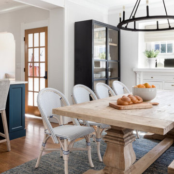
The owners of this cheery and bright kitchen and dining room are a young family with a busy and active life. They approached KMI because they needed an updated kitchen that functionally served their needs better and allowed for more connection to the dining room for entertaining. Where the peninsula stands currently, there once stood a wall completely segmenting the two spaces. We worked with a structural engineer to help our clients eliminate that wall so we could create the open floor plan they were dreaming of.
We also helped our clients think creatively about maximizing storage in their small but mighty kitchen. In smaller spaces, good organization is all the more important. We added a pantry cabinet, utilized dead space by the fridge for open shelves, and added storage drawers to the built-in bench seat in the breakfast nook – not for storing serveware, but for their two boys' Lego collection that once lived on the table.
When it came to the finishes and the design, we knew this kitchen needed to fit into the historic craftsman home. We chose colors and fixtures that honored the age and style of the home while allowing the kitchen to also fit the aesthetic of a modern family. Wood accents, brass hardware, and the pop of deep blue in the peninsula were chosen to add warmth and character to the space, while the creamy off-white cabinets add an air of lightness and brightness to the kitchen, ultimately creating an effortlessly balanced design.
 Kimberlee Marie Interiors
The owners of this cheery and bright kitchen and dining room are a young family with a busy and active life. They approached KMI because they needed an updated kitchen that functionally served their needs better and allowed for more connection to the dining room for entertaining. Where the peninsula stands currently, there once stood a wall completely segmenting the two spaces. We worked with a structural engineer to help our clients eliminate that wall so we could create the open floor plan they were dreaming of.
We also helped our clients think creatively about maximizing storage in their small but mighty kitchen. In smaller spaces, good organization is all the more important. We added a pantry cabinet, utilized dead space by the fridge for open shelves, and added storage drawers to the built-in bench seat in the breakfast nook – not for storing serveware, but for their two boys' Lego collection that once lived on the table.
When it came to the finishes and the design, we knew this kitchen needed to fit into the historic craftsman home. We chose colors and fixtures that honored the age and style of the home while allowing the kitchen to also fit the aesthetic of a modern family. Wood accents, brass hardware, and the pop of deep blue in the peninsula were chosen to add warmth and character to the space, while the creamy off-white cabinets add an air of lightness and brightness to the kitchen, ultimately creating an effortlessly balanced design.
Sponsored
Columbus, OH
Hope Restoration & General Contracting
Columbus Design-Build, Kitchen & Bath Remodeling, Historic Renovations

 Howell Custom Building Group
This project consisted of remodeling an existing master bath and closet. The owners asked for a
functional and brighter space that would more easily accommodate two people simultaneously getting ready for work. The original bath had multiple doors that opened into each other, a small dark shower, and little natural light. The solution was to add a new shed dormer to expand the room’s footprint. This proved to be an interesting structural problem, as the owners did not want to involve any of the first floor spaces in the project. So, the new shed was hung off of the existing rafters (in a sense this bath is hanging from the rafters.)
The expanded space allowed for a generous window in the shower, with a high window sill height to provide privacy from the back yard. The Strasser vanities were a great value and had the desired finish. The mirror frame and center shelves were painted to match the cabinet finish. The shower can easily function for two, allowing for their busy morning schedules. All of the fixtures matched nicely in a brushed nickel finish.
Toto Eco Dartmouth toilet; Farimont undermount Rectangular sinks; Toto widespread lav faucet; Toto multispray handshower and showerhead
Photography by Emily O'brien
 CoverMyPatio.com
The Arcadia Louvered Roof enhances the beauty of any style home and provides the flexibility of having an open roof when the weather is good or a solid roof to keep the rain off your patio when the weather turns bad.
Eco-friendly Construction
The Arcadia system is made up of recycled aluminum making it an extremely Green product. It is also eco-friendly, helping consumers save on passive solar heating and cooling.
We Think Green
Arcadia is proud to continue the company's tradition with its approach to Environmental Innovation. From the choice of lightweight materials and lean production methods to the efficiency of its drive system and designs, Arcadia is committed to operating as a more sustainable business and reducing its overall environmental impact.
High-quality Building Materials
Each Arcadia system is a work of art, constructed with care and attention to every little detail.
Our system is powered coated, extruded aluminum with stainless steel components giving us the most durable louvered roof on the market today. From our superior drive system, which is UL & CE certified, down to the stainless steel tex screws that secures the system together. Nothing but the best!
Our low-maintenance components eliminate painting, staining, and waterproofing of traditional shading structures. Using powder-coated aluminum construction prevents warping, cracking, and corrosion.
Photographed by: Roger Chafin

 MCDW + Architecture
Kitchen Cube 1
Upper East- Residence
Work: Full Gut renovation- 2 apartments- in the same ‘S’ line
Size: 650 Sq Ft of space in both apartments, 5S and 4S
Using the Frankfurt Kitchen of 1926 for inspiration, Ms.Cianfaglione began asking herself how the typology of the NYC kitchenette for her building, in the ‘S’ line, needed to be upgraded to fit today’s physical and aesthetic needs. The Frankfurt Kitchen was the forerunner of modern fitted kitchens and had an unified concept to enable efficient work, consolidating a woman’s efforts and allowing her more time to spend else ware. But unlike the Frankfurt kitchen, Ms. Cianfaglione wanted to take this a step further and open it up rather than concealing it, and its user, inside a room. This would showcase the designer’s evolved notion of “cooking”,that would now become an orchestrated dance to be put on display.
Ms. Cianfaglione had a typical NYC kitchenette, a small room with an air grille for ventilation, and in this case, there was a small window that was currently blocked by a refrigerator. There was also the problem of the foyer space, which was just a waste in an apartment this small, and the structural wall that could not be removed. Ms. Cianfaglione responded to these conditions by designing the kitchen to become a wrap around condition, in an ‘L’ shape, that would use the foyer more effectively and at the same time, face the living area, and all the while concealing the structural wall that separates them.
The interesting thing about the ‘L’ shape was that it allows for a beautifully orchestrated flow that makes cooking look like a beautiful dance that moves back and forth along the’ L.’
The appliances are designed within the cabinetry to give a tailored look that does not allow for distraction, and you instead focus on the user. This renovation made the otherwise small, unused foyer and ineffective kitchen, now a focal point that dictates movement throughout. The kitchen has unified and designed an otherwise standard one bedroom apartment and seeks to become a new standard in this building’s typology.
83