
Search results for "Calm decisions" in Home Design Ideas
 Susan Tully Interiors
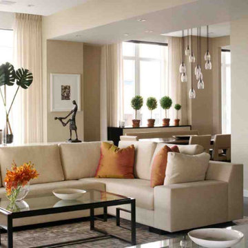
We love when our clients trust us enough to do a second project for them. In the case of this couple looking for a NYC Pied-a-Terre – this was our 4th! After designing their homes in Bernardsville, NJ and San Diego, CA and a home for their daughter in Orange County, CA, we were called up for duty on the search for a NYC apartment which would accommodate this couple with room enough for their four children as well!
What we cherish most about working with clients is the trust that develops over time. In this case, not only were we asked to come on board for design and project coordination, but we also helped with the actual apartment selection decision between locations in TriBeCa, Upper West Side and the West Village. The TriBeCa building didn’t have enough services in the building; the Upper West Side neighborhood was too busy and impersonal; and, the West Village apartment was just right.
Our work on this apartment was to oversee the design and build-out of the combination of a 3,000 square foot 3-bedroom unit with a 1,000 square foot 1-bedroom unit. We reorganized the space to accommodate this family of 6. The living room in the 1 bedroom became the media room; the kitchen became a bar; and the bedroom became a guest suite.
The most amazing feature of this apartment are its views – uptown to the Empire State Building, downtown to the Statue of Liberty and west for the most vibrant sunsets. We opened up the space to create view lines through the apartment all the way back into the home office.
Customizing New York City apartments takes creativity and patience. In order to install recessed lighting, Ray devised a floating ceiling situated below the existing concrete ceiling to accept the wiring and housing.
In the design of the space, we wanted to create a flow and continuity between the public spaces. To do this, we designed walnut panels which run from the center hall through the media room into the office and on to the sitting room. The richness of the wood helps ground the space and draws your eye to the lightness of the gorgeous views. For additional light capture, we designed a 9 foot by 10 foot metal and mirror wall treatment in the living room. The purpose is to catch the light and reflect it back into the living space creating expansiveness and brightness.
Adding unique and meaningful art pieces is the critical final stage of design. For the master bedroom, we commissioned Ira Lohan, a Santa Fe, NM artist we know, to create a totem with glass feathers. This piece was inspired by folklore from his Native American roots which says home is defined by where an eagle’s feathers land. Ira drove this piece across the country and delivered and installed it himself!!
 Fiorito Interior Design
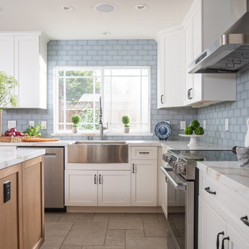
My clients approached this kitchen remodel hoping not only for improved functionality but for a space that invited comfort, warmth, and daily enjoyment. Their existing kitchen was limited in both layout and atmosphere where a small island barely larger than a podium offered little utility. An oversized double-width doorway at the rear of the room leading into the adjacent living space disrupted the flow, making furniture placement nearly impossible. They longed for a kitchen where cooking felt easy and intuitive, but also one where they could sit at the table with a book and a cup of tea, or host friends without feeling cramped or awkwardly positioned.
One of the most impactful decisions we made early on was to close off that extra-wide opening to the living room. Doing so allowed us to reclaim the wall, which not only improved circulation but also gave us the freedom to rethink the spacing of the kitchen and eat-in area. With that change, we could introduce a much larger island—truly functional this time—complete with generous workspace and storage. It became a true centerpiece for meal prep, casual dining, and gathering.
From there I turned my attention to layering in comfort, personality, and style. I curated a color palette of soft white, pale blue, light wood tones, and touches of sunshine yellow. This fresh and uplifting combination feels timeless and relaxed. We chose cabinetry with traditional Shaker-style doors, accented by black forged iron hardware for a subtle hint of contrast and authenticity. For the countertops we chose a Gold Calacatta-look quartz, bringing elegance and warmth with its soft veining and classic appeal.
To elevate the kitchen walls I selected a soft matte glass tile in a moody, sky-blue that blankets the backsplash, providing a gentle wash of color that’s calming and cohesive. On the floors I chose a limestone-look porcelain tile in a classic Versailles pattern as an homage to old English manor houses—bringing character and texture underfoot while remaining durable and low-maintenance for modern life.
Lastly I transformed the adjacent eat-in area into a cozy, multifunctional space. We added custom built-in bookshelves and a sideboard for serving and display—perfect for entertaining or simply making daily routines feel more special. A black iron picture light softly illuminates the buffet, lending a warm, ambient glow in the evenings. I carefully planned the seating arrangement to include a space-saving banquette along the wall, paired with a trestle-style dining table and side chairs. At either end I placed tufted host chairs upholstered in an exquisite, tonal Chinoiserie dragon pattern that are comfortable enough to sit on for hours. Whether sharing a leisurely meal, reading in the sunlight, or gazing out at the greenery just beyond the windows, this spot now invites my clients to truly enjoy their home in a new, deeper way.
Photo: Bernardo Grijalva
 HouseHome
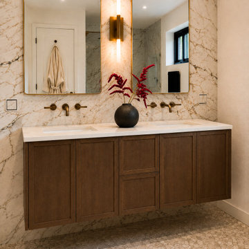
Nestled in the heart of Denver's historic Park Hill neighborhood, Park Hill Haus is a complete luxury home renovation and interior design project that reimagines a 1946 residence into a refined yet deeply livable family retreat. Designed for two medical professionals seeking sanctuary from demanding careers, this full-scale transformation was guided by a vision of creating a home that feels elevated, peaceful, and effortlessly welcoming.
Every inch of the home was thoughtfully redesigned and renovated from top to bottom, with no detail overlooked. While the residence underwent a comprehensive modernization, great care was taken to preserve the character and architectural heritage that make Park Hill homes so beloved. The result is a seamless blend of old and new—a modern transitional home that honors its roots while embracing contemporary luxury living.
Inspired by the clients' love of international travel and iconic luxury fashion houses, the interiors draw subtle influence from the timeless sophistication of Chanel. Layered textures, restrained elegance, and carefully curated materials create a sense of understated luxury that feels both aspirational and approachable. Rather than designing a home that feels formal or untouchable, the goal was to create spaces that invite connection, comfort, and everyday enjoyment.
Throughout the home, a palette of warm neutrals and earthy tones establishes a calming foundation. Natural materials, rich textures, and globally inspired details reflect the clients' travels around the world, adding depth, personality, and a collected feel to each space. The design balances refinement with warmth, creating an environment that feels luxurious without ever feeling cold.
Family-centered living was at the heart of every design decision. Gathering spaces were thoughtfully planned to support both intimate moments and effortless entertaining, while private areas provide a serene retreat for rest and restoration. The home's atmosphere evokes the feeling of a boutique luxury hotel layered with the comfort and authenticity of a well-loved family home.
Park Hill Haus stands as a testament to the power of thoughtful luxury interior design—where heritage architecture, modern functionality, and worldly inspiration come together to create a home that is timeless, inviting, and uniquely personal.
Services: Luxury Interior Design, Full Home Renovation, Historic Home Remodeling, Custom Furnishings, Space Planning, Architectural Finishes Selection
Find the right local pro for your project
 Fiorito Interior Design
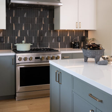
When I began this kitchen project, the space was constrained by an awkward peninsula and a dropped ceiling that compressed the room both physically and visually. Fluorescent fixtures sat behind a plastic diffuser, and the refrigerator was wedged beside the range, leaving the kitchen feeling crowded while also making poor use of the available space. The transformation began by taking things away. The dropped ceiling was removed, the fluorescent tubes went with it, and the room suddenly gained height and light. The peninsula was removed too, opening the floor plan and allowing the cabinetry to continue down an adjacent wall and incorporate a second window. What had been a small, enclosed kitchen became a generous working space with room for a slim, functional L-shaped island, additional cabinetry and, perhaps most importantly, a much more natural relationship between the different parts of the kitchen.
The palette is quiet, but there is a lot happening within it. Soft sage cabinetry grounds the room, while warm white upper cabinets and pantry cabinetry lift the space. A pure white quartz countertop provides a crisp surface against the cabinetry, and soft brass hardware adds just enough warmth. The new Sub Zero refrigerator was given its own wall, beside a full pantry, freeing the range wall to become a strong focal point. A Monogram range now sits centered beneath an angular stainless-steel Zephyr hood, framed by the kitchen's most distinctive element: a graphite backsplash made from WOW Design's Pottery tile. Inspired by Japanese handmade ceramics, the tiles have a wonderfully tactile, imperfect character. Most are deep graphite, but here and there the surface breaks into strokes of camel, dusty peach and deep blue-gunmetal glaze. There is an almost painterly quality to the way those colors move across the wall, giving the kitchen something that is difficult to achieve with a more uniform material—the feeling that someone actually made it.
The rest of the room was designed around that same balance of simplicity and warmth. New pale oak flooring runs throughout the ground floor, bringing a natural material and a soft golden tone beneath the cooler sage and graphite. Floating oak shelves flank the windows and provide a home for plants, ceramics and a few favorite objects, while another pair of shelves beside the refrigerator creates a small landing place for the things that inevitably arrive with you at the end of the day—keys, mail, bags and whatever else happens to be in your hands. The island occupies a surprisingly small footprint, yet its L-shaped form provides both additional work surface and seating without interrupting the flow of the room. A deep sink with an integrated cutting board and roll-up drying rack, a commercial-style faucet and under-cabinet LED lighting bring the practical details up to the same level of thoughtfulness as the larger design decisions. In the end, the renovation did more than just enlarge the kitchen; it created a space that feels calm, contemporary, warm, and a little unexpected … and, most importantly, we created a kitchen that finally makes sense for the way my clients live.
AFTER photos: Bernardo Grijalva
 Klopf Architecture
From Mid-Century Classic to the Present
An iconic design updated with comfort, function, and flow for today.
A Remodel That Balances Past and Present
What started as a desire to update a classic Eichler soon became an exploration of how Mid-Century Modern design can successfully evolve for today. The client, a tech professional with a passion for scuba diving and underwater photography, wanted a home that would both honor its original character and feel tailored to his daily life. A lifelong technology enthusiast, he still owns the very first Mac desktop he saved up for as a teenager working at Radio Shack, a detail that underscores his appreciation for design that melds function and form.
Honoring Separation While Expanding Possibility
Unlike many contemporary remodels where walls are opened up to create expansive living spaces, this project took a more restrained approach. The client valued the defined rooms of the original plan and wanted to preserve as much wall space as possible for displaying his large-format underwater photography. The emphasis was not on dramatic spatial reinvention, but on thoughtful refinements. Klopf Architecture shaped a gallery-like backdrop while also expanding the primary suite, modernizing materials and fixtures throughout the home, and improving the functionality and layout of the kitchen. The finished home feels at once timeless and renewed, an Eichler that continues to inspire while fully supporting the lifestyle of its present-day owner.
A major turning point came mid-design. The original project brief had not included an addition, but as the reconfiguration of the primary bedroom and bath unfolded, it became clear that an expansion was the best approach to achieve the client’s vision of a more spacious suite. Fortunately, the adjustment came at a stage when revisions were still manageable and was integrated seamlessly, showing how thoughtful course corrections can strengthen a project rather than hinder it.
Navigating Challenges With Precision
The design development included multiple conceptual rounds, balancing preservation with subtle expansion. During construction, an existing post previously thought to be load-bearing turned out not to be. The structural engineer was able to pivot quickly, and both the post and the cross beam that had been intended to replace it could be omitted, allowing the original rhythm of the Eichler beam bays to be preserved.
Sustainability was not just a checklist item, but a way to align the home with the client’s values of simplicity, efficiency, and long-term functionality. R-38 roof insulation reduced energy usage, solar panels with battery storage provided independence and resilience, and passive comfort strategies eliminated the need forenergy-intensive air conditioning. An electric vehicle charger and an on-demand hot water recirculation system (with call buttons as opposed to having constant circulation) add to the home’s long-term efficiency factors. Together, these moves created a home that is quieter, more comfortable, and better equipped for the future, qualities that supported the client’s pragmatic approach to design and living lightly.
Details That Respect the Eichler DNA
The remodel carries forward the Eichler’s original spirit while introducing new layers of modern livability. Originally, the house was approached along a deep, narrow walk, with the garage on one side and the house on the other, leaving the front door tucked far back within this chasm-like space. By pulling the entry forward, the design reshaped the arrival experience, creating a clearer threshold and a natural drop-off zone for bags, shoes, and keys. This shift also made room for a custom bench at the entry that extends seamlessly through the glass sidelight. The bench and drop-off zone now work together as a single, integrated sequence that supports everyday living while offering a tactile reminder of Eichler’s philosophy of connectedness.
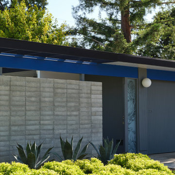
At the client’s request, Klopf reintroduced a classic Eichler gesture by extending the exterior siding into the entry and living room. The detail reinforces a sense of indoor/outdoor continuity while providing a subtle architectural surface that allows the client’s photography to take visual precedence.
The signature concrete masonry wall at the front was reconstructed using blocks sourced to match the originals, now strengthened with rebar for seismic resilience while maintaining a private outdoor courtyard, visually extending the kitchen outward. A decorative trellis element, a detail borrowed from a neighboring Eichler, restores a familiar mid-century modern architectural motif. At the courtyard entry door, a custom etched glass sidelight with an ocean-themed design featuring kelp and jellyfish serves as a subtle homage to the client’s passion for deep-sea diving.
Landscaping became an integral part of the overall transformation. The homeowner engaged landscape architect Randi Johnsen of Third Nature Studio to shape a series of calm, inviting outdoor rooms that read as a natural extension of the interiors. While technically outside of the core construction scope, the landscape design proved central to achieving a sense of completeness and connectedness across the property. Such whole-property considerations often emerge as design ideas take shape, underscoring the importance of flexibility in planning and budgeting, as well as close collaboration among the design team starting early in the process.
The Value of Evolving Scope
As with many custom residential projects, the scope evolved during the design process. What began as a targeted remodel grew to include a new/expanded primary suite, a rebuilt CMU patio wall for strength and longevity, and a solar panel array and battery storage for energy resilience and carbon-reduction. Each thoughtful decision represented a conscious investment in the home’s performance and character, rather than a cost overrun.
The result was a project delivered on schedule, tailored precisely to the client’s lifestyle, and positioned to add long-term value both functionally and aesthetically. By embracing scope evolution as an opportunity rather than a challenge, and relying on good design paired with transparent communication, this remodel demonstrates how Eichler homes can be adapted for contemporary living without erasing their DNA.
Klopf Architecture project team: John Klopf, AIA, and Klara Kevane, Elise Webb and Nicholas LaNasa.
Contractor: Golden Cove Construction
Landscape Design: Third Nature Studio
Structural Engineer: Daniel Bastiao Design
Photography: ©2025 Mariko Reed
Year Completed: 2024
Location: Sunnyvale, CA
 Fiorito Interior Design
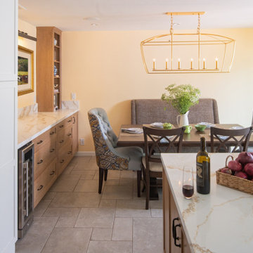
My clients approached this kitchen remodel hoping not only for improved functionality but for a space that invited comfort, warmth, and daily enjoyment. Their existing kitchen was limited in both layout and atmosphere where a small island barely larger than a podium offered little utility. An oversized double-width doorway at the rear of the room leading into the adjacent living space disrupted the flow, making furniture placement nearly impossible. They longed for a kitchen where cooking felt easy and intuitive, but also one where they could sit at the table with a book and a cup of tea, or host friends without feeling cramped or awkwardly positioned.
One of the most impactful decisions we made early on was to close off that extra-wide opening to the living room. Doing so allowed us to reclaim the wall, which not only improved circulation but also gave us the freedom to rethink the spacing of the kitchen and eat-in area. With that change, we could introduce a much larger island—truly functional this time—complete with generous workspace and storage. It became a true centerpiece for meal prep, casual dining, and gathering.
From there I turned my attention to layering in comfort, personality, and style. I curated a color palette of soft white, pale blue, light wood tones, and touches of sunshine yellow. This fresh and uplifting combination feels timeless and relaxed. We chose cabinetry with traditional Shaker-style doors, accented by black forged iron hardware for a subtle hint of contrast and authenticity. For the countertops we chose a Gold Calacatta-look quartz, bringing elegance and warmth with its soft veining and classic appeal.
To elevate the kitchen walls I selected a soft matte glass tile in a moody, sky-blue that blankets the backsplash, providing a gentle wash of color that’s calming and cohesive. On the floors I chose a limestone-look porcelain tile in a classic Versailles pattern as an homage to old English manor houses—bringing character and texture underfoot while remaining durable and low-maintenance for modern life.
Lastly I transformed the adjacent eat-in area into a cozy, multifunctional space. We added custom built-in bookshelves and a sideboard for serving and display—perfect for entertaining or simply making daily routines feel more special. A black iron picture light softly illuminates the buffet, lending a warm, ambient glow in the evenings. I carefully planned the seating arrangement to include a space-saving banquette along the wall, paired with a trestle-style dining table and side chairs. At either end I placed tufted host chairs upholstered in an exquisite, tonal Chinoiserie dragon pattern that are comfortable enough to sit on for hours. Whether sharing a leisurely meal, reading in the sunlight, or gazing out at the greenery just beyond the windows, this spot now invites my clients to truly enjoy their home in a new, deeper way.
Photo: Bernardo Grijalva
 House Of Suris Interior Design
This project reimagines a 1940s Maple Leaf residence for a young family of four—transforming it into a modern transitional home that feels timeless, warm, and truly lived in. The goal was to balance character with comfort, creating spaces that support daily family life while remaining refined and enduring in design.
Our approach focused on optimizing the space plan to improve flow, storage, and functionality throughout the home. Every decision was guided by how the family lives, works, and gathers, ensuring each room feels intuitive, comfortable, and purposeful without sacrificing beauty.
A cohesive, nature-inspired palette ties the home together. Warm whites and oak tones form a calm foundation, layered with greens and soft blues for depth and balance. From the serene, color-drenched primary bedroom to the playful nursery and the productivity-focused home office anchored by a landscape mural, each space was designed to elevate everyday living while feeling effortlessly welcoming.

Sponsored
Columbus, OH

Wannemacher Interiors
Customized Award-Winning Interior Design Solutions in Franklin Cnty OH
 Klopf Architecture
Set on a narrow hillside lot overlooking the San Francisco Bay in Point Richmond, California, Bay Heirloom is a Mid-Century Modern family home restored, modernized and adapted for contemporary living. Oriented south-southwest toward the Marin Headlands, with views of the Golden Gate Bridge, the residence captures shifting Bay light throughout the day, from fog-muted mornings to vivid, glowing sunsets.
The home was built by Karlyn Neel’s grandfather, the owner of the construction company Flo-Crete, one of the Bay Area’s early concrete pumping firms. Flo-Crete completed the foundation and structural concrete work, with family photographs documenting the original cinderblock walls and pours. The firm also contributed to major regional infrastructure projects, including the Transbay BART tube and Candlestick Park, situating the house within a broader legacy of Bay Area construction. Growing up, Neel spent considerable time in the home, developing an early appreciation for mid-century modern principles. Instead of parting with this family heirloom, she purchased the home from her grandfather’s estate.
While her grandfather continued to live in the Point Richmond house, Neel purchased a Mid-Century Modern residence in Palm Desert. In contrast to the Bay Area’s cool temperatures, salt air, and persistent winds, the desert home is shaped by heat and sun and requires a different material response. A substantial renovation she led there emphasized thermal performance, filtered light, and restrained detailing. The experience later informed the restoration of her Bay Area family home.
What began as a modest Mid-Century Modern update expanded when decades of exposure to marine conditions revealed leaks and significant structural and seismic deficiencies. Neel was determined to honor her grandfather’s perseverance and without hesitation pivoted to a much more intensive project. Addressing these challenges required close coordination between Neel, Klopf Architecture and Kasten Builders, with architectural restraint and construction precision guiding each intervention. Rather than alter the home’s defining features, the project focused on reinforcing the structure from within. Discreet beams were embedded along the rear facade and in an upstairs wall, strengthening the building while maximizing the wall of glass facing the Bay and opening the wall between the kitchen and the living space. These structural interventions allowed the space to open fully to the Bay without visual interruption, with the kitchen repositioned as the social and functional core of an open, continuous living space. The building envelope was updated using weather- and corrosion-resistant materials appropriate to the marine environment.
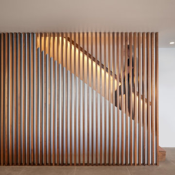
The house unfolds vertically from the street, beginning with a modest garage level and workshop, with the main living spaces located below. Original slate flooring at the entry was preserved, along with select furnishings and artwork collected by Neel’s grandfather, anchoring the restored interior in its past. A restrained palette of black accents and pale, natural finishes replaces darker wood tones, reinforcing openness and calm. A naturally illuminated stair connects to the lowest level, where a former basement was transformed into a guest suite and family room opening onto a deck. From there, steps lead directly to a small concrete boat ramp at the water’s edge.
Throughout the project, decisions were guided by continuity rather than transformation for its own sake. Lessons drawn from both desert and coastal climates informed a material strategy rooted in performance and restraint. Bay Heirloom stands as a measured evolution of a family house, structurally renewed and carefully modernized, grounded in the discipline and care that first shaped it.
Klopf Architecture Project Team: John Klopf, AIA, Angela Todorova and Fernanda Bernardes
Landscape Architect: Huettl Landscape Architecture
General Contractor: Kasten Builders
Photography: ©2025 Mariko Reed
Year Completed: 2022
Location: Point Richmond, CA
 HouseHome
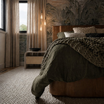
Nestled in the heart of Denver's historic Park Hill neighborhood, Park Hill Haus is a complete luxury home renovation and interior design project that reimagines a 1946 residence into a refined yet deeply livable family retreat. Designed for two medical professionals seeking sanctuary from demanding careers, this full-scale transformation was guided by a vision of creating a home that feels elevated, peaceful, and effortlessly welcoming.
Every inch of the home was thoughtfully redesigned and renovated from top to bottom, with no detail overlooked. While the residence underwent a comprehensive modernization, great care was taken to preserve the character and architectural heritage that make Park Hill homes so beloved. The result is a seamless blend of old and new—a modern transitional home that honors its roots while embracing contemporary luxury living.
Inspired by the clients' love of international travel and iconic luxury fashion houses, the interiors draw subtle influence from the timeless sophistication of Chanel. Layered textures, restrained elegance, and carefully curated materials create a sense of understated luxury that feels both aspirational and approachable. Rather than designing a home that feels formal or untouchable, the goal was to create spaces that invite connection, comfort, and everyday enjoyment.
Throughout the home, a palette of warm neutrals and earthy tones establishes a calming foundation. Natural materials, rich textures, and globally inspired details reflect the clients' travels around the world, adding depth, personality, and a collected feel to each space. The design balances refinement with warmth, creating an environment that feels luxurious without ever feeling cold.
Family-centered living was at the heart of every design decision. Gathering spaces were thoughtfully planned to support both intimate moments and effortless entertaining, while private areas provide a serene retreat for rest and restoration. The home's atmosphere evokes the feeling of a boutique luxury hotel layered with the comfort and authenticity of a well-loved family home.
Park Hill Haus stands as a testament to the power of thoughtful luxury interior design—where heritage architecture, modern functionality, and worldly inspiration come together to create a home that is timeless, inviting, and uniquely personal.
Services: Luxury Interior Design, Full Home Renovation, Historic Home Remodeling, Custom Furnishings, Space Planning, Architectural Finishes Selection
 Klopf Architecture
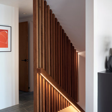
Set on a narrow hillside lot overlooking the San Francisco Bay in Point Richmond, California, Bay Heirloom is a Mid-Century Modern family home restored, modernized and adapted for contemporary living. Oriented south-southwest toward the Marin Headlands, with views of the Golden Gate Bridge, the residence captures shifting Bay light throughout the day, from fog-muted mornings to vivid, glowing sunsets.
The home was built by Karlyn Neel’s grandfather, the owner of the construction company Flo-Crete, one of the Bay Area’s early concrete pumping firms. Flo-Crete completed the foundation and structural concrete work, with family photographs documenting the original cinderblock walls and pours. The firm also contributed to major regional infrastructure projects, including the Transbay BART tube and Candlestick Park, situating the house within a broader legacy of Bay Area construction. Growing up, Neel spent considerable time in the home, developing an early appreciation for mid-century modern principles. Instead of parting with this family heirloom, she purchased the home from her grandfather’s estate.
While her grandfather continued to live in the Point Richmond house, Neel purchased a Mid-Century Modern residence in Palm Desert. In contrast to the Bay Area’s cool temperatures, salt air, and persistent winds, the desert home is shaped by heat and sun and requires a different material response. A substantial renovation she led there emphasized thermal performance, filtered light, and restrained detailing. The experience later informed the restoration of her Bay Area family home.
What began as a modest Mid-Century Modern update expanded when decades of exposure to marine conditions revealed leaks and significant structural and seismic deficiencies. Neel was determined to honor her grandfather’s perseverance and without hesitation pivoted to a much more intensive project. Addressing these challenges required close coordination between Neel, Klopf Architecture and Kasten Builders, with architectural restraint and construction precision guiding each intervention. Rather than alter the home’s defining features, the project focused on reinforcing the structure from within. Discreet beams were embedded along the rear facade and in an upstairs wall, strengthening the building while maximizing the wall of glass facing the Bay and opening the wall between the kitchen and the living space. These structural interventions allowed the space to open fully to the Bay without visual interruption, with the kitchen repositioned as the social and functional core of an open, continuous living space. The building envelope was updated using weather- and corrosion-resistant materials appropriate to the marine environment.
The house unfolds vertically from the street, beginning with a modest garage level and workshop, with the main living spaces located below. Original slate flooring at the entry was preserved, along with select furnishings and artwork collected by Neel’s grandfather, anchoring the restored interior in its past. A restrained palette of black accents and pale, natural finishes replaces darker wood tones, reinforcing openness and calm. A naturally illuminated stair connects to the lowest level, where a former basement was transformed into a guest suite and family room opening onto a deck. From there, steps lead directly to a small concrete boat ramp at the water’s edge.
Throughout the project, decisions were guided by continuity rather than transformation for its own sake. Lessons drawn from both desert and coastal climates informed a material strategy rooted in performance and restraint. Bay Heirloom stands as a measured evolution of a family house, structurally renewed and carefully modernized, grounded in the discipline and care that first shaped it.
Klopf Architecture Project Team: John Klopf, AIA, Angela Todorova and Fernanda Bernardes
Landscape Architect: Huettl Landscape Architecture
General Contractor: Kasten Builders
Photography: ©2025 Mariko Reed
Year Completed: 2022
Location: Point Richmond, CA
 Fiorito Interior Design
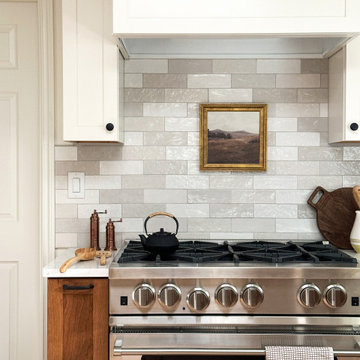
When I began this kitchen project, the space was constrained by an awkward peninsula and a dropped ceiling that compressed the room both physically and visually. Fluorescent fixtures sat behind a plastic diffuser, and the refrigerator was wedged beside the range, leaving the kitchen feeling crowded while also making poor use of the available space. The transformation began by taking things away. The dropped ceiling was removed, the fluorescent tubes went with it, and the room suddenly gained height and light. The peninsula was removed too, opening the floor plan and allowing the cabinetry to continue down an adjacent wall and incorporate a second window. What had been a small, enclosed kitchen became a generous working space with room for a slim, functional L-shaped island, additional cabinetry and, perhaps most importantly, a much more natural relationship between the different parts of the kitchen.
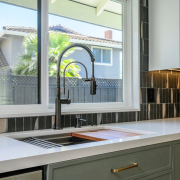
The palette is quiet, but there is a lot happening within it. Soft sage cabinetry grounds the room, while warm white upper cabinets and pantry cabinetry lift the space. A pure white quartz countertop provides a crisp surface against the cabinetry, and soft brass hardware adds just enough warmth. The new Sub Zero refrigerator was given its own wall, beside a full pantry, freeing the range wall to become a strong focal point. A Monogram range now sits centered beneath an angular stainless-steel Zephyr hood, framed by the kitchen's most distinctive element: a graphite backsplash made from WOW Design's Pottery tile. Inspired by Japanese handmade ceramics, the tiles have a wonderfully tactile, imperfect character. Most are deep graphite, but here and there the surface breaks into strokes of camel, dusty peach and deep blue-gunmetal glaze. There is an almost painterly quality to the way those colors move across the wall, giving the kitchen something that is difficult to achieve with a more uniform material—the feeling that someone actually made it.
The rest of the room was designed around that same balance of simplicity and warmth. New pale oak flooring runs throughout the ground floor, bringing a natural material and a soft golden tone beneath the cooler sage and graphite. Floating oak shelves flank the windows and provide a home for plants, ceramics and a few favorite objects, while another pair of shelves beside the refrigerator creates a small landing place for the things that inevitably arrive with you at the end of the day—keys, mail, bags and whatever else happens to be in your hands. The island occupies a surprisingly small footprint, yet its L-shaped form provides both additional work surface and seating without interrupting the flow of the room. A deep sink with an integrated cutting board and roll-up drying rack, a commercial-style faucet and under-cabinet LED lighting bring the practical details up to the same level of thoughtfulness as the larger design decisions. In the end, the renovation did more than just enlarge the kitchen; it created a space that feels calm, contemporary, warm, and a little unexpected … and, most importantly, we created a kitchen that finally makes sense for the way my clients live.
AFTER photos: Bernardo Grijalva
 Swatch Design Group
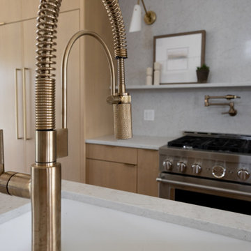
As a part of a larger transformation, the kitchen served as an anchor for rethinking how the home could feel and function. The goal was to create a space that felt truly integrated, flowed naturally within itself, and connected seamlessly to the outdoors. Storage was a top priority, with an emphasis on keeping countertops clean and the space feeling calm and open. Flow was equally important. What began as a layout optimized for entertaining evolved into a more intentional approach, where every sightline and transition was thoughtfully considered. The clients also needed the kitchen to work hard for their lifestyle, with a commercial-size refrigerator and freezer, generous prep space, and room to gather. The challenge was to bring purpose and polish to a space that didn’t quite feel like it belonged. The result is a kitchen that’s not only highly functional but finally feels like part of the home.
Project challenges:
- Maximizing storage was a primary challenge, especially with the inclusion of a commercial-sized fridge and freezer that occupied valuable cabinetry space.
- The need for clean, uninterrupted lines throughout the kitchen required thoughtful detailing, especially around cabinetry transitions and appliance integration.
- The oversized island design required two stone slabs and waterfall edges on both sides which posed both visual and logistical challenges.
- Incorporating electrical outlets into the island in a way that felt intentional and unobtrusive demanded creative problem-solving.
- The unique rooflines created strong visual angles that required a considered design approach to ensure the space felt cohesive rather than disjointed.
- Balancing symmetry and flow in a kitchen with structural constraints required precise layout planning to maintain a cohesive visual rhythm.
- Creating an intentional indoor/outdoor living flow, especially in the transitional space between the sliding doors to the backyard and the kitchen.
Project solutions:
- To balance the visual weight of the commercial-grade fridge and freezer, we flanked the range and hood with full-height pocket cabinetry, which created symmetry while reclaiming storage space. We also took a look into internal organization and carefully mapped out where every kitchen item would live. This allowed us to make informed decisions about drawer versus door configurations, and when to incorporate features like roll-out shelving to maximize accessibility and function.
- Linear light fixtures above the island were chosen for their low visual impact, allowing sightlines to remain clear and emphasizing the thoughtful spatial layout.
- The oversized island was carefully executed using two coordinated slabs, with a subtle brass inlay detail between them to turn a logistical challenge into a design feature.
- Pop-up electrical outlets were integrated into the island to keep surfaces clutter-free while maintaining easy access, which combined form and function seamlessly.
- With multiple focal points and a peaked vaulted ceiling, layout precision was key. The island, hood, and adjacent staircase were all perfectly centered on the vault, creating a sense of alignment across the open space.
- In the transitional area between kitchen and backyard, we added a wet bar that visually and functionally connects the indoor space with the outdoors. This addition provides extra storage and creates a dedicated entertainment spot for guests, enhancing the overall flow and usability of the home.
 Rodwin Architecture & Skycastle Construction
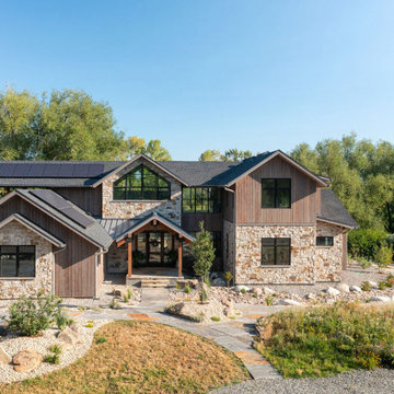
Nestled along South Boulder Creek with sweeping Flatirons views, Creekside is a custom modern mountain home shaped by one guiding principle: dissolve the boundary between light, landscape, and daily living. From the first conversations, the project began not with a floor plan, but with the land itself—carefully evaluating a rare, delicate site and letting its rhythms, constraints, and beauty set the tone for every decision.
Designed for a couple building their forever home in the Boulder foothills, the residence balances crisp modernity with the warmth and honesty of natural materials. Expansive glazing and clean lines are grounded by timber, stone, and tactile finishes—quietly luxurious rather than showy. The clients had spent years “chasing the light” from home to home; here, that pursuit became something more intentional. Instead of chasing the sun, the architecture invites sunlight to travel through the house across the day and seasons.
Light is treated as a living element, orchestrated to create moments of surprise and calm. An interior window captures southern exposure at the upper level, guiding it through the loft and filtering it into the northern living room below—an atmospheric shift that changes hour by hour. A glass stair bridge adds levitation and clarity, linking front and back, public and private. Beneath it, a serene Zen garden winds under floating stairs, creating a quiet pause in the home’s circulation.
Facing the creek, the home opens into a composition of glass and crisp geometry, framing moving water and long bands of daylight. Peaked roofs, timber beams, and stone cladding nod to regional vernacular, rooting the modern form in its mountain context.
Set beside a sensitive riparian corridor, Creekside demanded exceptional care, including meticulous deconstruction of an existing structure with 94% landfill diversion. Performance was treated as a design feature: HERS 4, ENERGY STAR certification, a 15.8 kWh solar array, 30 kW battery backup, 1 ACH air-sealed construction, and air-source heat pumps—proof that stewardship and comfort can coexist beautifully.
 HouseHome
Nestled in the heart of Denver's historic Park Hill neighborhood, Park Hill Haus is a complete luxury home renovation and interior design project that reimagines a 1946 residence into a refined yet deeply livable family retreat. Designed for two medical professionals seeking sanctuary from demanding careers, this full-scale transformation was guided by a vision of creating a home that feels elevated, peaceful, and effortlessly welcoming.
Every inch of the home was thoughtfully redesigned and renovated from top to bottom, with no detail overlooked. While the residence underwent a comprehensive modernization, great care was taken to preserve the character and architectural heritage that make Park Hill homes so beloved. The result is a seamless blend of old and new—a modern transitional home that honors its roots while embracing contemporary luxury living.
Inspired by the clients' love of international travel and iconic luxury fashion houses, the interiors draw subtle influence from the timeless sophistication of Chanel. Layered textures, restrained elegance, and carefully curated materials create a sense of understated luxury that feels both aspirational and approachable. Rather than designing a home that feels formal or untouchable, the goal was to create spaces that invite connection, comfort, and everyday enjoyment.
Throughout the home, a palette of warm neutrals and earthy tones establishes a calming foundation. Natural materials, rich textures, and globally inspired details reflect the clients' travels around the world, adding depth, personality, and a collected feel to each space. The design balances refinement with warmth, creating an environment that feels luxurious without ever feeling cold.
Family-centered living was at the heart of every design decision. Gathering spaces were thoughtfully planned to support both intimate moments and effortless entertaining, while private areas provide a serene retreat for rest and restoration. The home's atmosphere evokes the feeling of a boutique luxury hotel layered with the comfort and authenticity of a well-loved family home.
Park Hill Haus stands as a testament to the power of thoughtful luxury interior design—where heritage architecture, modern functionality, and worldly inspiration come together to create a home that is timeless, inviting, and uniquely personal.
Services: Luxury Interior Design, Full Home Renovation, Historic Home Remodeling, Custom Furnishings, Space Planning, Architectural Finishes Selection
 HouseHome
Nestled in the heart of Denver's historic Park Hill neighborhood, Park Hill Haus is a complete luxury home renovation and interior design project that reimagines a 1946 residence into a refined yet deeply livable family retreat. Designed for two medical professionals seeking sanctuary from demanding careers, this full-scale transformation was guided by a vision of creating a home that feels elevated, peaceful, and effortlessly welcoming.
Every inch of the home was thoughtfully redesigned and renovated from top to bottom, with no detail overlooked. While the residence underwent a comprehensive modernization, great care was taken to preserve the character and architectural heritage that make Park Hill homes so beloved. The result is a seamless blend of old and new—a modern transitional home that honors its roots while embracing contemporary luxury living.
Inspired by the clients' love of international travel and iconic luxury fashion houses, the interiors draw subtle influence from the timeless sophistication of Chanel. Layered textures, restrained elegance, and carefully curated materials create a sense of understated luxury that feels both aspirational and approachable. Rather than designing a home that feels formal or untouchable, the goal was to create spaces that invite connection, comfort, and everyday enjoyment.
Throughout the home, a palette of warm neutrals and earthy tones establishes a calming foundation. Natural materials, rich textures, and globally inspired details reflect the clients' travels around the world, adding depth, personality, and a collected feel to each space. The design balances refinement with warmth, creating an environment that feels luxurious without ever feeling cold.
Family-centered living was at the heart of every design decision. Gathering spaces were thoughtfully planned to support both intimate moments and effortless entertaining, while private areas provide a serene retreat for rest and restoration. The home's atmosphere evokes the feeling of a boutique luxury hotel layered with the comfort and authenticity of a well-loved family home.
Park Hill Haus stands as a testament to the power of thoughtful luxury interior design—where heritage architecture, modern functionality, and worldly inspiration come together to create a home that is timeless, inviting, and uniquely personal.
Services: Luxury Interior Design, Full Home Renovation, Historic Home Remodeling, Custom Furnishings, Space Planning, Architectural Finishes Selection
 Swatch Design Group
As a part of a larger transformation, the kitchen served as an anchor for rethinking how the home could feel and function. The goal was to create a space that felt truly integrated, flowed naturally within itself, and connected seamlessly to the outdoors. Storage was a top priority, with an emphasis on keeping countertops clean and the space feeling calm and open. Flow was equally important. What began as a layout optimized for entertaining evolved into a more intentional approach, where every sightline and transition was thoughtfully considered. The clients also needed the kitchen to work hard for their lifestyle, with a commercial-size refrigerator and freezer, generous prep space, and room to gather. The challenge was to bring purpose and polish to a space that didn’t quite feel like it belonged. The result is a kitchen that’s not only highly functional but finally feels like part of the home.
Project challenges:
- Maximizing storage was a primary challenge, especially with the inclusion of a commercial-sized fridge and freezer that occupied valuable cabinetry space.
- The need for clean, uninterrupted lines throughout the kitchen required thoughtful detailing, especially around cabinetry transitions and appliance integration.
- The oversized island design required two stone slabs and waterfall edges on both sides which posed both visual and logistical challenges.
- Incorporating electrical outlets into the island in a way that felt intentional and unobtrusive demanded creative problem-solving.
- The unique rooflines created strong visual angles that required a considered design approach to ensure the space felt cohesive rather than disjointed.
- Balancing symmetry and flow in a kitchen with structural constraints required precise layout planning to maintain a cohesive visual rhythm.
- Creating an intentional indoor/outdoor living flow, especially in the transitional space between the sliding doors to the backyard and the kitchen.
Project solutions:
- To balance the visual weight of the commercial-grade fridge and freezer, we flanked the range and hood with full-height pocket cabinetry, which created symmetry while reclaiming storage space. We also took a look into internal organization and carefully mapped out where every kitchen item would live. This allowed us to make informed decisions about drawer versus door configurations, and when to incorporate features like roll-out shelving to maximize accessibility and function.
- Linear light fixtures above the island were chosen for their low visual impact, allowing sightlines to remain clear and emphasizing the thoughtful spatial layout.
- The oversized island was carefully executed using two coordinated slabs, with a subtle brass inlay detail between them to turn a logistical challenge into a design feature.
- Pop-up electrical outlets were integrated into the island to keep surfaces clutter-free while maintaining easy access, which combined form and function seamlessly.
- With multiple focal points and a peaked vaulted ceiling, layout precision was key. The island, hood, and adjacent staircase were all perfectly centered on the vault, creating a sense of alignment across the open space.
- In the transitional area between kitchen and backyard, we added a wet bar that visually and functionally connects the indoor space with the outdoors. This addition provides extra storage and creates a dedicated entertainment spot for guests, enhancing the overall flow and usability of the home.
 Fiorito Interior Design
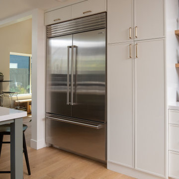
When I began this kitchen project, the space was constrained by an awkward peninsula and a dropped ceiling that compressed the room both physically and visually. Fluorescent fixtures sat behind a plastic diffuser, and the refrigerator was wedged beside the range, leaving the kitchen feeling crowded while also making poor use of the available space. The transformation began by taking things away. The dropped ceiling was removed, the fluorescent tubes went with it, and the room suddenly gained height and light. The peninsula was removed too, opening the floor plan and allowing the cabinetry to continue down an adjacent wall and incorporate a second window. What had been a small, enclosed kitchen became a generous working space with room for a slim, functional L-shaped island, additional cabinetry and, perhaps most importantly, a much more natural relationship between the different parts of the kitchen.
The palette is quiet, but there is a lot happening within it. Soft sage cabinetry grounds the room, while warm white upper cabinets and pantry cabinetry lift the space. A pure white quartz countertop provides a crisp surface against the cabinetry, and soft brass hardware adds just enough warmth. The new Sub Zero refrigerator was given its own wall, beside a full pantry, freeing the range wall to become a strong focal point. A Monogram range now sits centered beneath an angular stainless-steel Zephyr hood, framed by the kitchen's most distinctive element: a graphite backsplash made from WOW Design's Pottery tile. Inspired by Japanese handmade ceramics, the tiles have a wonderfully tactile, imperfect character. Most are deep graphite, but here and there the surface breaks into strokes of camel, dusty peach and deep blue-gunmetal glaze. There is an almost painterly quality to the way those colors move across the wall, giving the kitchen something that is difficult to achieve with a more uniform material—the feeling that someone actually made it.
The rest of the room was designed around that same balance of simplicity and warmth. New pale oak flooring runs throughout the ground floor, bringing a natural material and a soft golden tone beneath the cooler sage and graphite. Floating oak shelves flank the windows and provide a home for plants, ceramics and a few favorite objects, while another pair of shelves beside the refrigerator creates a small landing place for the things that inevitably arrive with you at the end of the day—keys, mail, bags and whatever else happens to be in your hands. The island occupies a surprisingly small footprint, yet its L-shaped form provides both additional work surface and seating without interrupting the flow of the room. A deep sink with an integrated cutting board and roll-up drying rack, a commercial-style faucet and under-cabinet LED lighting bring the practical details up to the same level of thoughtfulness as the larger design decisions. In the end, the renovation did more than just enlarge the kitchen; it created a space that feels calm, contemporary, warm, and a little unexpected … and, most importantly, we created a kitchen that finally makes sense for the way my clients live.
AFTER photos: Bernardo Grijalva
 HouseHome
Nestled in the heart of Denver's historic Park Hill neighborhood, Park Hill Haus is a complete luxury home renovation and interior design project that reimagines a 1946 residence into a refined yet deeply livable family retreat. Designed for two medical professionals seeking sanctuary from demanding careers, this full-scale transformation was guided by a vision of creating a home that feels elevated, peaceful, and effortlessly welcoming.
Every inch of the home was thoughtfully redesigned and renovated from top to bottom, with no detail overlooked. While the residence underwent a comprehensive modernization, great care was taken to preserve the character and architectural heritage that make Park Hill homes so beloved. The result is a seamless blend of old and new—a modern transitional home that honors its roots while embracing contemporary luxury living.
Inspired by the clients' love of international travel and iconic luxury fashion houses, the interiors draw subtle influence from the timeless sophistication of Chanel. Layered textures, restrained elegance, and carefully curated materials create a sense of understated luxury that feels both aspirational and approachable. Rather than designing a home that feels formal or untouchable, the goal was to create spaces that invite connection, comfort, and everyday enjoyment.
Throughout the home, a palette of warm neutrals and earthy tones establishes a calming foundation. Natural materials, rich textures, and globally inspired details reflect the clients' travels around the world, adding depth, personality, and a collected feel to each space. The design balances refinement with warmth, creating an environment that feels luxurious without ever feeling cold.
Family-centered living was at the heart of every design decision. Gathering spaces were thoughtfully planned to support both intimate moments and effortless entertaining, while private areas provide a serene retreat for rest and restoration. The home's atmosphere evokes the feeling of a boutique luxury hotel layered with the comfort and authenticity of a well-loved family home.
Park Hill Haus stands as a testament to the power of thoughtful luxury interior design—where heritage architecture, modern functionality, and worldly inspiration come together to create a home that is timeless, inviting, and uniquely personal.
Services: Luxury Interior Design, Full Home Renovation, Historic Home Remodeling, Custom Furnishings, Space Planning, Architectural Finishes Selection
 HouseHome
Nestled in the heart of Denver's historic Park Hill neighborhood, Park Hill Haus is a complete luxury home renovation and interior design project that reimagines a 1946 residence into a refined yet deeply livable family retreat. Designed for two medical professionals seeking sanctuary from demanding careers, this full-scale transformation was guided by a vision of creating a home that feels elevated, peaceful, and effortlessly welcoming.
Every inch of the home was thoughtfully redesigned and renovated from top to bottom, with no detail overlooked. While the residence underwent a comprehensive modernization, great care was taken to preserve the character and architectural heritage that make Park Hill homes so beloved. The result is a seamless blend of old and new—a modern transitional home that honors its roots while embracing contemporary luxury living.
Inspired by the clients' love of international travel and iconic luxury fashion houses, the interiors draw subtle influence from the timeless sophistication of Chanel. Layered textures, restrained elegance, and carefully curated materials create a sense of understated luxury that feels both aspirational and approachable. Rather than designing a home that feels formal or untouchable, the goal was to create spaces that invite connection, comfort, and everyday enjoyment.
Throughout the home, a palette of warm neutrals and earthy tones establishes a calming foundation. Natural materials, rich textures, and globally inspired details reflect the clients' travels around the world, adding depth, personality, and a collected feel to each space. The design balances refinement with warmth, creating an environment that feels luxurious without ever feeling cold.
Family-centered living was at the heart of every design decision. Gathering spaces were thoughtfully planned to support both intimate moments and effortless entertaining, while private areas provide a serene retreat for rest and restoration. The home's atmosphere evokes the feeling of a boutique luxury hotel layered with the comfort and authenticity of a well-loved family home.
Park Hill Haus stands as a testament to the power of thoughtful luxury interior design—where heritage architecture, modern functionality, and worldly inspiration come together to create a home that is timeless, inviting, and uniquely personal.
Services: Luxury Interior Design, Full Home Renovation, Historic Home Remodeling, Custom Furnishings, Space Planning, Architectural Finishes Selection
 Bespoke By Acorn
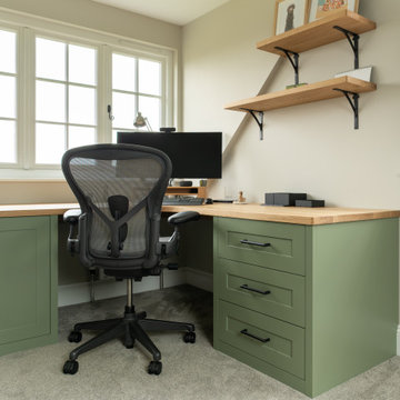
We had the pleasure of crafting this bespoke modern, painted home office for our client’s residence in Reigate, Surrey. They had decided it was time to invest in a fresh, inviting and dedicated workspace where they could be more productive. The desk, which fits seamlessly into the space, features a full stave prime oak worktop finished with a protective oil to provide a superior long-lasting surface. The custom desk cabinetry has been flawlessly spray finished Little Greene Sage Green, which contrasts beautifully with the attractive, natural oak wood desktop. The soothing, muted green paint colour and tailored storage creates a calm, uncluttered setting, perfect for a focused workspace.
Customised and crafted for comfort
The right storage was vital for our client and this made to measure desk features integrated drawers and a double cupboard putting work essentials right at their fingertips. Every drawer and door functions effortlessly and quietly thanks to the best quality Hafele ironmongery and soft close mechanisms. In this home office design, we also incorporated two matching oak wall-mounted shelves which follow the angle of the ceiling and a low-level built-in bookcase which fits perfectly under the sloped ceiling.
Made to measure curved corner desk
The curved corner desk has been constructed with integrated drawers, cupboard space, cable management tray on the underside, and an open bookshelf unit to one side. Having a curved corner desk in front of the window is a strategic decision that combines ergonomic comfort and enhanced use of space. The curved shape brings the workspace closer to the body, allowing for a more natural, wraparound working experience that pairs well with the natural light and views from the window. The design also delivers additional comfort, thanks to the spacious full depth leg room underneath. A curved L-shape design also makes the desk feel less dominant than a traditional straight desk, preventing the room from feeling cramped while still providing ample workspace.
Solid prime oak work top
The desk’s beautiful solid prime oak top provides a stable, heavy surface for working. It also offers exceptional strength and durability. While oak resists dents and scratches, it can be sanded and refinished, when necessary, to restore its condition. Real wood surfaces, such as oak, have natural antibacterial properties, which can help maintain a cleaner working environment too.
A full stave worktop is a premium one-piece surface made from a continuous oak plank (stave) that runs the entire length of the worktop creating a luxurious, linear, and consistent appearance and showcasing the natural beauty of the timber.
13