
Search results for "Calm decisions" in Home Design Ideas
 HouseHome
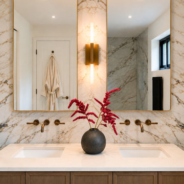
Nestled in the heart of Denver's historic Park Hill neighborhood, Park Hill Haus is a complete luxury home renovation and interior design project that reimagines a 1946 residence into a refined yet deeply livable family retreat. Designed for two medical professionals seeking sanctuary from demanding careers, this full-scale transformation was guided by a vision of creating a home that feels elevated, peaceful, and effortlessly welcoming.
Every inch of the home was thoughtfully redesigned and renovated from top to bottom, with no detail overlooked. While the residence underwent a comprehensive modernization, great care was taken to preserve the character and architectural heritage that make Park Hill homes so beloved. The result is a seamless blend of old and new—a modern transitional home that honors its roots while embracing contemporary luxury living.
Inspired by the clients' love of international travel and iconic luxury fashion houses, the interiors draw subtle influence from the timeless sophistication of Chanel. Layered textures, restrained elegance, and carefully curated materials create a sense of understated luxury that feels both aspirational and approachable. Rather than designing a home that feels formal or untouchable, the goal was to create spaces that invite connection, comfort, and everyday enjoyment.
Throughout the home, a palette of warm neutrals and earthy tones establishes a calming foundation. Natural materials, rich textures, and globally inspired details reflect the clients' travels around the world, adding depth, personality, and a collected feel to each space. The design balances refinement with warmth, creating an environment that feels luxurious without ever feeling cold.
Family-centered living was at the heart of every design decision. Gathering spaces were thoughtfully planned to support both intimate moments and effortless entertaining, while private areas provide a serene retreat for rest and restoration. The home's atmosphere evokes the feeling of a boutique luxury hotel layered with the comfort and authenticity of a well-loved family home.
Park Hill Haus stands as a testament to the power of thoughtful luxury interior design—where heritage architecture, modern functionality, and worldly inspiration come together to create a home that is timeless, inviting, and uniquely personal.
Services: Luxury Interior Design, Full Home Renovation, Historic Home Remodeling, Custom Furnishings, Space Planning, Architectural Finishes Selection
 HouseHome
Nestled in the heart of Denver's historic Park Hill neighborhood, Park Hill Haus is a complete luxury home renovation and interior design project that reimagines a 1946 residence into a refined yet deeply livable family retreat. Designed for two medical professionals seeking sanctuary from demanding careers, this full-scale transformation was guided by a vision of creating a home that feels elevated, peaceful, and effortlessly welcoming.
Every inch of the home was thoughtfully redesigned and renovated from top to bottom, with no detail overlooked. While the residence underwent a comprehensive modernization, great care was taken to preserve the character and architectural heritage that make Park Hill homes so beloved. The result is a seamless blend of old and new—a modern transitional home that honors its roots while embracing contemporary luxury living.
Inspired by the clients' love of international travel and iconic luxury fashion houses, the interiors draw subtle influence from the timeless sophistication of Chanel. Layered textures, restrained elegance, and carefully curated materials create a sense of understated luxury that feels both aspirational and approachable. Rather than designing a home that feels formal or untouchable, the goal was to create spaces that invite connection, comfort, and everyday enjoyment.
Throughout the home, a palette of warm neutrals and earthy tones establishes a calming foundation. Natural materials, rich textures, and globally inspired details reflect the clients' travels around the world, adding depth, personality, and a collected feel to each space. The design balances refinement with warmth, creating an environment that feels luxurious without ever feeling cold.
Family-centered living was at the heart of every design decision. Gathering spaces were thoughtfully planned to support both intimate moments and effortless entertaining, while private areas provide a serene retreat for rest and restoration. The home's atmosphere evokes the feeling of a boutique luxury hotel layered with the comfort and authenticity of a well-loved family home.
Park Hill Haus stands as a testament to the power of thoughtful luxury interior design—where heritage architecture, modern functionality, and worldly inspiration come together to create a home that is timeless, inviting, and uniquely personal.
Services: Luxury Interior Design, Full Home Renovation, Historic Home Remodeling, Custom Furnishings, Space Planning, Architectural Finishes Selection
 SERGIO HALFON | Architecture & Interior Design
English
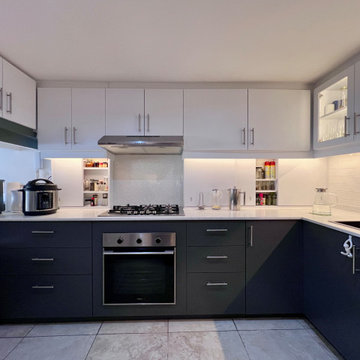
This kitchen renovation focused on transforming a visually cluttered and spatially inefficient space into a calm, functional, and architecturally coherent environment. The original kitchen felt overcrowded, dark, and constrained, limiting both usability and spatial clarity.
A key strategic decision was relocating the refrigerator to the adjacent patio, which functions as a natural extension of the kitchen. This intervention significantly improved circulation, freed valuable workspace, and enhanced the perception of openness within the interior.
The material palette was developed in response to the client’s preference for neutral, timeless tones, combining white quartz countertops, soft gray cabinetry, and warm wood accents to create visual balance and spatial continuity.
Custom millwork plays a central role in the project. Upper cabinets with glass fronts and integrated interior lighting introduce depth, transparency, and a lighter visual presence, while concealed spice storage was integrated directly into the backsplash through sliding panels, optimizing accessibility without introducing visual clutter.
Under-cabinet lighting enhances functionality and provides a soft ambient glow, reinforcing the clarity of surfaces and work zones. The installation of a separate cooktop and built-in oven, instead of a conventional range, contributes to a cleaner and more contemporary architectural expression.
An existing counter was redefined and fully integrated as a breakfast bar for four people, improving the kitchen’s social function and reinforcing its role as a central living space.
The result is a kitchen that prioritizes spatial efficiency, material clarity, and functional precision, transforming a previously constrained space into a calm, modern, and highly usable architectural environment.
Español
La remodelación de esta cocina se centró en transformar un espacio visualmente saturado y espacialmente ineficiente en un entorno funcional, claro y arquitectónicamente coherente. La cocina original se percibía oscura, sobrecargada y limitada, lo que afectaba tanto su uso cotidiano como la calidad espacial.
Una decisión clave fue reubicar el refrigerador en el patio adyacente, el cual funciona como una extensión natural de la cocina. Esta intervención permitió liberar superficie de trabajo, mejorar la circulación y generar una percepción mucho mayor de amplitud.
La selección de materiales respondió a la preferencia de la clienta por tonos neutros y atemporales, incorporando cubiertas de cuarzo blanco, gabinetes en tonos grises y acentos en madera cálida, creando un equilibrio visual y continuidad espacial.
La carpintería diseñada a medida es un elemento central del proyecto. Los gabinetes superiores con frentes de vidrio e iluminación interior aportan ligereza visual y profundidad, mientras que los especieros ocultos integrados en el backsplash, mediante puertas corredizas, optimizan la funcionalidad sin generar ruido visual.
La iluminación bajo gabinetes mejora la ergonomía del espacio y aporta una iluminación ambiental cálida que refuerza la claridad de las superficies. La instalación de parrilla y horno independientes, en lugar de una estufa convencional, contribuye a una expresión más limpia y contemporánea.
La barra existente fue rediseñada y plenamente integrada como desayunador para cuatro personas, fortaleciendo el carácter social de la cocina y ampliando su funcionalidad.
El resultado es una cocina que prioriza la eficiencia espacial, la claridad material y la precisión funcional, transformando un espacio previamente limitado en un entorno contemporáneo, sereno y altamente funcional.
Find the right local pro for your project

 Klopf Architecture
From Mid-Century Classic to the Present
An iconic design updated with comfort, function, and flow for today.
A Remodel That Balances Past and Present
What started as a desire to update a classic Eichler soon became an exploration of how Mid-Century Modern design can successfully evolve for today. The client, a tech professional with a passion for scuba diving and underwater photography, wanted a home that would both honor its original character and feel tailored to his daily life. A lifelong technology enthusiast, he still owns the very first Mac desktop he saved up for as a teenager working at Radio Shack, a detail that underscores his appreciation for design that melds function and form.
Honoring Separation While Expanding Possibility
Unlike many contemporary remodels where walls are opened up to create expansive living spaces, this project took a more restrained approach. The client valued the defined rooms of the original plan and wanted to preserve as much wall space as possible for displaying his large-format underwater photography. The emphasis was not on dramatic spatial reinvention, but on thoughtful refinements. Klopf Architecture shaped a gallery-like backdrop while also expanding the primary suite, modernizing materials and fixtures throughout the home, and improving the functionality and layout of the kitchen. The finished home feels at once timeless and renewed, an Eichler that continues to inspire while fully supporting the lifestyle of its present-day owner.
A major turning point came mid-design. The original project brief had not included an addition, but as the reconfiguration of the primary bedroom and bath unfolded, it became clear that an expansion was the best approach to achieve the client’s vision of a more spacious suite. Fortunately, the adjustment came at a stage when revisions were still manageable and was integrated seamlessly, showing how thoughtful course corrections can strengthen a project rather than hinder it.
Navigating Challenges With Precision
The design development included multiple conceptual rounds, balancing preservation with subtle expansion. During construction, an existing post previously thought to be load-bearing turned out not to be. The structural engineer was able to pivot quickly, and both the post and the cross beam that had been intended to replace it could be omitted, allowing the original rhythm of the Eichler beam bays to be preserved.
Sustainability was not just a checklist item, but a way to align the home with the client’s values of simplicity, efficiency, and long-term functionality. R-38 roof insulation reduced energy usage, solar panels with battery storage provided independence and resilience, and passive comfort strategies eliminated the need forenergy-intensive air conditioning. An electric vehicle charger and an on-demand hot water recirculation system (with call buttons as opposed to having constant circulation) add to the home’s long-term efficiency factors. Together, these moves created a home that is quieter, more comfortable, and better equipped for the future, qualities that supported the client’s pragmatic approach to design and living lightly.
Details That Respect the Eichler DNA
The remodel carries forward the Eichler’s original spirit while introducing new layers of modern livability. Originally, the house was approached along a deep, narrow walk, with the garage on one side and the house on the other, leaving the front door tucked far back within this chasm-like space. By pulling the entry forward, the design reshaped the arrival experience, creating a clearer threshold and a natural drop-off zone for bags, shoes, and keys. This shift also made room for a custom bench at the entry that extends seamlessly through the glass sidelight. The bench and drop-off zone now work together as a single, integrated sequence that supports everyday living while offering a tactile reminder of Eichler’s philosophy of connectedness.
At the client’s request, Klopf reintroduced a classic Eichler gesture by extending the exterior siding into the entry and living room. The detail reinforces a sense of indoor/outdoor continuity while providing a subtle architectural surface that allows the client’s photography to take visual precedence.
The signature concrete masonry wall at the front was reconstructed using blocks sourced to match the originals, now strengthened with rebar for seismic resilience while maintaining a private outdoor courtyard, visually extending the kitchen outward. A decorative trellis element, a detail borrowed from a neighboring Eichler, restores a familiar mid-century modern architectural motif. At the courtyard entry door, a custom etched glass sidelight with an ocean-themed design featuring kelp and jellyfish serves as a subtle homage to the client’s passion for deep-sea diving.
Landscaping became an integral part of the overall transformation. The homeowner engaged landscape architect Randi Johnsen of Third Nature Studio to shape a series of calm, inviting outdoor rooms that read as a natural extension of the interiors. While technically outside of the core construction scope, the landscape design proved central to achieving a sense of completeness and connectedness across the property. Such whole-property considerations often emerge as design ideas take shape, underscoring the importance of flexibility in planning and budgeting, as well as close collaboration among the design team starting early in the process.
The Value of Evolving Scope
As with many custom residential projects, the scope evolved during the design process. What began as a targeted remodel grew to include a new/expanded primary suite, a rebuilt CMU patio wall for strength and longevity, and a solar panel array and battery storage for energy resilience and carbon-reduction. Each thoughtful decision represented a conscious investment in the home’s performance and character, rather than a cost overrun.
The result was a project delivered on schedule, tailored precisely to the client’s lifestyle, and positioned to add long-term value both functionally and aesthetically. By embracing scope evolution as an opportunity rather than a challenge, and relying on good design paired with transparent communication, this remodel demonstrates how Eichler homes can be adapted for contemporary living without erasing their DNA.
Klopf Architecture project team: John Klopf, AIA, and Klara Kevane, Elise Webb and Nicholas LaNasa.
Contractor: Golden Cove Construction
Landscape Design: Third Nature Studio
Structural Engineer: Daniel Bastiao Design
Photography: ©2025 Mariko Reed
Year Completed: 2024
Location: Sunnyvale, CA
 Fiorito Interior Design
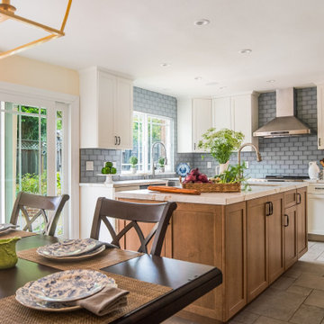
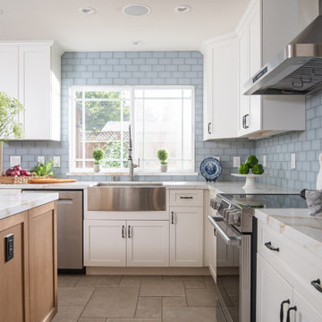
My clients approached this kitchen remodel hoping not only for improved functionality but for a space that invited comfort, warmth, and daily enjoyment. Their existing kitchen was limited in both layout and atmosphere where a small island barely larger than a podium offered little utility. An oversized double-width doorway at the rear of the room leading into the adjacent living space disrupted the flow, making furniture placement nearly impossible. They longed for a kitchen where cooking felt easy and intuitive, but also one where they could sit at the table with a book and a cup of tea, or host friends without feeling cramped or awkwardly positioned.
One of the most impactful decisions we made early on was to close off that extra-wide opening to the living room. Doing so allowed us to reclaim the wall, which not only improved circulation but also gave us the freedom to rethink the spacing of the kitchen and eat-in area. With that change, we could introduce a much larger island—truly functional this time—complete with generous workspace and storage. It became a true centerpiece for meal prep, casual dining, and gathering.
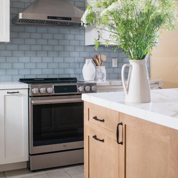
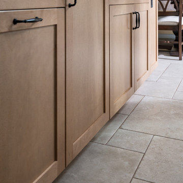
From there I turned my attention to layering in comfort, personality, and style. I curated a color palette of soft white, pale blue, light wood tones, and touches of sunshine yellow. This fresh and uplifting combination feels timeless and relaxed. We chose cabinetry with traditional Shaker-style doors, accented by black forged iron hardware for a subtle hint of contrast and authenticity. For the countertops we chose a Gold Calacatta-look quartz, bringing elegance and warmth with its soft veining and classic appeal.
To elevate the kitchen walls I selected a soft matte glass tile in a moody, sky-blue that blankets the backsplash, providing a gentle wash of color that’s calming and cohesive. On the floors I chose a limestone-look porcelain tile in a classic Versailles pattern as an homage to old English manor houses—bringing character and texture underfoot while remaining durable and low-maintenance for modern life.
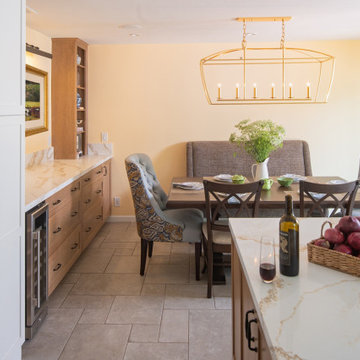
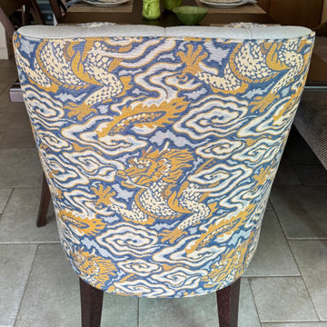
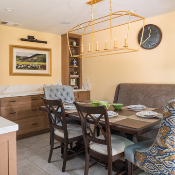
Lastly I transformed the adjacent eat-in area into a cozy, multifunctional space. We added custom built-in bookshelves and a sideboard for serving and display—perfect for entertaining or simply making daily routines feel more special. A black iron picture light softly illuminates the buffet, lending a warm, ambient glow in the evenings. I carefully planned the seating arrangement to include a space-saving banquette along the wall, paired with a trestle-style dining table and side chairs. At either end I placed tufted host chairs upholstered in an exquisite, tonal Chinoiserie dragon pattern that are comfortable enough to sit on for hours. Whether sharing a leisurely meal, reading in the sunlight, or gazing out at the greenery just beyond the windows, this spot now invites my clients to truly enjoy their home in a new, deeper way.
Photo: Bernardo Grijalva
 Warm Timber Saunas & Wine Cellars
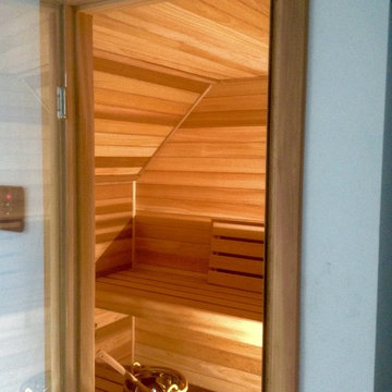
This previously unused attic space is now a sauna/yoga room. The left sauna wall follows the attic rafters down diagonally to allow a wider space for leg room on the twin sauna benches.

 Total System Service
As a manager of a building or property, you quickly learn the art of mediation. One minute you may be working with a vendor to keep the building’s operating system running efficient and smooth; the next moment you may be calming a tenant down after finding the change in the system disrupted his office’s workflow. Give and take; it’s the only way to make sure every day runs perfectly.
Overall, you have two goals to strive for in everything you do.
1. Keep the building running properly, upgrading systems as appropriate, and striving to do all you can on a pre-established budget.
2. Keep the building occupants happy, with as little disruption as possible.
While some changes are minor, barely registering on a building occupant’s mind, with HVAC challenges, that’s rarely the case. If a HVAC contractor is replacing an air handler, for instance, and disconnects one and moves to the next unit, it may cause major disruptions to sensitive areas of a building. And if the occupant wasn’t prepared for the disruption, you can have a mighty unhappy customer on your hand.
Anytime you are working on HVAC projects throughout your building, there are strategies you can put into place to keep things running smooth.
Communicate with occupants
Communication is key to any good relationship, and as a property manager, this rule is a great place to start. If you will be working with the HVAC equipment, block out the timeframe for work to be done, and understand the potential consequences of the process. Then communicate this process with every point of contact you have throughout the building. The more detail you can provide, the less surprises you’ll have throughout the process. You can also work with your building’s occupants before the process begins, finding out if there are better timeframes than others.
Establish a realistic schedule
As a property manager, its easy to provide your expectations for the HVAC project at hand, and request that the proposal be written in such a way that work is completed on your timeframe. Unfortunately, many contractors want your business and will agree to anything upfront in order to win the bid, knowing full well the work will take longer than specified. Instead of projecting your timeframes into the proposal process, ask for HVAC project bids to establish realistic schedules of how long the process will take, and what areas of your property will be most effected throughout the schedule. This will help you avoid crises between you and the contractor, and you and your tenants.
Plan for the whole system
If one small piece of your HVAC system is weak, its easy to fix that one small piece. But how will that impact your overall system? Will it cause weak spots in different parts of the building – maybe a corner office will have reduced air flow, and therefore be colder in the winter and warmer in the summer? When retrofitting new pieces with older existing systems, its easy to reduce the efficiency of your entire system. Before agreeing to certain repairs, make sure you understand how it will impact your entire system overall. An easy way of handling this problem is by working with the same HVAC contractor again and again, He will understand your system’s potential, and know when to make repairs, and when to replace.
Have points of contact available for immediate assistance
In many cases, problems arise because connections can’t be made. Can the HVAC contractor get a hold or you or another person that can make decisions at a moments notice if a problem arises? Do you have access to decision makers throughout the building that may be impacted by this change? Many projects have been put on hold simply because a person in authority can’t be found to give the go-ahead to move forward. If you have access to these people during the time of the project, you’ll be able to complete the project in record time.
Test
Finally, if you can test things in stages, or test when the potential for problems is the smallest, you reduce the chances of bigger emergency issues falling into your lap. If you’ll be installing a new terminal unit, can you make the switch on a Saturday morning when the building is largely unoccupied? If you’re replacing a large system, can you replace and test in phases so the entire project isn’t released at once?
Most issues can be avoided with just a little strategy from the beginning. If you’ve never had a HVAC maintenance team to help you stay on track with your building’s heating and cooling, now may be the time to find out how easy a team approach makes the process.

Sponsored
Columbus, OH

Wannemacher Interiors
Customized Award-Winning Interior Design Solutions in Franklin Cnty OH
 Fiorito Interior Design
My clients approached this kitchen remodel hoping not only for improved functionality but for a space that invited comfort, warmth, and daily enjoyment. Their existing kitchen was limited in both layout and atmosphere where a small island barely larger than a podium offered little utility. An oversized double-width doorway at the rear of the room leading into the adjacent living space disrupted the flow, making furniture placement nearly impossible. They longed for a kitchen where cooking felt easy and intuitive, but also one where they could sit at the table with a book and a cup of tea, or host friends without feeling cramped or awkwardly positioned.
One of the most impactful decisions we made early on was to close off that extra-wide opening to the living room. Doing so allowed us to reclaim the wall, which not only improved circulation but also gave us the freedom to rethink the spacing of the kitchen and eat-in area. With that change, we could introduce a much larger island—truly functional this time—complete with generous workspace and storage. It became a true centerpiece for meal prep, casual dining, and gathering.
From there I turned my attention to layering in comfort, personality, and style. I curated a color palette of soft white, pale blue, light wood tones, and touches of sunshine yellow. This fresh and uplifting combination feels timeless and relaxed. We chose cabinetry with traditional Shaker-style doors, accented by black forged iron hardware for a subtle hint of contrast and authenticity. For the countertops we chose a Gold Calacatta-look quartz, bringing elegance and warmth with its soft veining and classic appeal.
To elevate the kitchen walls I selected a soft matte glass tile in a moody, sky-blue that blankets the backsplash, providing a gentle wash of color that’s calming and cohesive. On the floors I chose a limestone-look porcelain tile in a classic Versailles pattern as an homage to old English manor houses—bringing character and texture underfoot while remaining durable and low-maintenance for modern life.
Lastly I transformed the adjacent eat-in area into a cozy, multifunctional space. We added custom built-in bookshelves and a sideboard for serving and display—perfect for entertaining or simply making daily routines feel more special. A black iron picture light softly illuminates the buffet, lending a warm, ambient glow in the evenings. I carefully planned the seating arrangement to include a space-saving banquette along the wall, paired with a trestle-style dining table and side chairs. At either end I placed tufted host chairs upholstered in an exquisite, tonal Chinoiserie dragon pattern that are comfortable enough to sit on for hours. Whether sharing a leisurely meal, reading in the sunlight, or gazing out at the greenery just beyond the windows, this spot now invites my clients to truly enjoy their home in a new, deeper way.
Photo: Bernardo Grijalva
 Fiorito Interior Design
My clients approached this kitchen remodel hoping not only for improved functionality but for a space that invited comfort, warmth, and daily enjoyment. Their existing kitchen was limited in both layout and atmosphere where a small island barely larger than a podium offered little utility. An oversized double-width doorway at the rear of the room leading into the adjacent living space disrupted the flow, making furniture placement nearly impossible. They longed for a kitchen where cooking felt easy and intuitive, but also one where they could sit at the table with a book and a cup of tea, or host friends without feeling cramped or awkwardly positioned.
One of the most impactful decisions we made early on was to close off that extra-wide opening to the living room. Doing so allowed us to reclaim the wall, which not only improved circulation but also gave us the freedom to rethink the spacing of the kitchen and eat-in area. With that change, we could introduce a much larger island—truly functional this time—complete with generous workspace and storage. It became a true centerpiece for meal prep, casual dining, and gathering.
From there I turned my attention to layering in comfort, personality, and style. I curated a color palette of soft white, pale blue, light wood tones, and touches of sunshine yellow. This fresh and uplifting combination feels timeless and relaxed. We chose cabinetry with traditional Shaker-style doors, accented by black forged iron hardware for a subtle hint of contrast and authenticity. For the countertops we chose a Gold Calacatta-look quartz, bringing elegance and warmth with its soft veining and classic appeal.
To elevate the kitchen walls I selected a soft matte glass tile in a moody, sky-blue that blankets the backsplash, providing a gentle wash of color that’s calming and cohesive. On the floors I chose a limestone-look porcelain tile in a classic Versailles pattern as an homage to old English manor houses—bringing character and texture underfoot while remaining durable and low-maintenance for modern life.
Lastly I transformed the adjacent eat-in area into a cozy, multifunctional space. We added custom built-in bookshelves and a sideboard for serving and display—perfect for entertaining or simply making daily routines feel more special. A black iron picture light softly illuminates the buffet, lending a warm, ambient glow in the evenings. I carefully planned the seating arrangement to include a space-saving banquette along the wall, paired with a trestle-style dining table and side chairs. At either end I placed tufted host chairs upholstered in an exquisite, tonal Chinoiserie dragon pattern that are comfortable enough to sit on for hours. Whether sharing a leisurely meal, reading in the sunlight, or gazing out at the greenery just beyond the windows, this spot now invites my clients to truly enjoy their home in a new, deeper way.
Photo: Bernardo Grijalva
 Fiorito Interior Design
My clients approached this kitchen remodel hoping not only for improved functionality but for a space that invited comfort, warmth, and daily enjoyment. Their existing kitchen was limited in both layout and atmosphere where a small island barely larger than a podium offered little utility. An oversized double-width doorway at the rear of the room leading into the adjacent living space disrupted the flow, making furniture placement nearly impossible. They longed for a kitchen where cooking felt easy and intuitive, but also one where they could sit at the table with a book and a cup of tea, or host friends without feeling cramped or awkwardly positioned.
One of the most impactful decisions we made early on was to close off that extra-wide opening to the living room. Doing so allowed us to reclaim the wall, which not only improved circulation but also gave us the freedom to rethink the spacing of the kitchen and eat-in area. With that change, we could introduce a much larger island—truly functional this time—complete with generous workspace and storage. It became a true centerpiece for meal prep, casual dining, and gathering.
From there I turned my attention to layering in comfort, personality, and style. I curated a color palette of soft white, pale blue, light wood tones, and touches of sunshine yellow. This fresh and uplifting combination feels timeless and relaxed. We chose cabinetry with traditional Shaker-style doors, accented by black forged iron hardware for a subtle hint of contrast and authenticity. For the countertops we chose a Gold Calacatta-look quartz, bringing elegance and warmth with its soft veining and classic appeal.
To elevate the kitchen walls I selected a soft matte glass tile in a moody, sky-blue that blankets the backsplash, providing a gentle wash of color that’s calming and cohesive. On the floors I chose a limestone-look porcelain tile in a classic Versailles pattern as an homage to old English manor houses—bringing character and texture underfoot while remaining durable and low-maintenance for modern life.
Lastly I transformed the adjacent eat-in area into a cozy, multifunctional space. We added custom built-in bookshelves and a sideboard for serving and display—perfect for entertaining or simply making daily routines feel more special. A black iron picture light softly illuminates the buffet, lending a warm, ambient glow in the evenings. I carefully planned the seating arrangement to include a space-saving banquette along the wall, paired with a trestle-style dining table and side chairs. At either end I placed tufted host chairs upholstered in an exquisite, tonal Chinoiserie dragon pattern that are comfortable enough to sit on for hours. Whether sharing a leisurely meal, reading in the sunlight, or gazing out at the greenery just beyond the windows, this spot now invites my clients to truly enjoy their home in a new, deeper way.
Photo: Bernardo Grijalva
 Fiorito Interior Design
My clients approached this kitchen remodel hoping not only for improved functionality but for a space that invited comfort, warmth, and daily enjoyment. Their existing kitchen was limited in both layout and atmosphere where a small island barely larger than a podium offered little utility. An oversized double-width doorway at the rear of the room leading into the adjacent living space disrupted the flow, making furniture placement nearly impossible. They longed for a kitchen where cooking felt easy and intuitive, but also one where they could sit at the table with a book and a cup of tea, or host friends without feeling cramped or awkwardly positioned.
One of the most impactful decisions we made early on was to close off that extra-wide opening to the living room. Doing so allowed us to reclaim the wall, which not only improved circulation but also gave us the freedom to rethink the spacing of the kitchen and eat-in area. With that change, we could introduce a much larger island—truly functional this time—complete with generous workspace and storage. It became a true centerpiece for meal prep, casual dining, and gathering.
From there I turned my attention to layering in comfort, personality, and style. I curated a color palette of soft white, pale blue, light wood tones, and touches of sunshine yellow. This fresh and uplifting combination feels timeless and relaxed. We chose cabinetry with traditional Shaker-style doors, accented by black forged iron hardware for a subtle hint of contrast and authenticity. For the countertops we chose a Gold Calacatta-look quartz, bringing elegance and warmth with its soft veining and classic appeal.
To elevate the kitchen walls I selected a soft matte glass tile in a moody, sky-blue that blankets the backsplash, providing a gentle wash of color that’s calming and cohesive. On the floors I chose a limestone-look porcelain tile in a classic Versailles pattern as an homage to old English manor houses—bringing character and texture underfoot while remaining durable and low-maintenance for modern life.
Lastly I transformed the adjacent eat-in area into a cozy, multifunctional space. We added custom built-in bookshelves and a sideboard for serving and display—perfect for entertaining or simply making daily routines feel more special. A black iron picture light softly illuminates the buffet, lending a warm, ambient glow in the evenings. I carefully planned the seating arrangement to include a space-saving banquette along the wall, paired with a trestle-style dining table and side chairs. At either end I placed tufted host chairs upholstered in an exquisite, tonal Chinoiserie dragon pattern that are comfortable enough to sit on for hours. Whether sharing a leisurely meal, reading in the sunlight, or gazing out at the greenery just beyond the windows, this spot now invites my clients to truly enjoy their home in a new, deeper way.
Photo: Bernardo Grijalva
 Fiorito Interior Design
My clients approached this kitchen remodel hoping not only for improved functionality but for a space that invited comfort, warmth, and daily enjoyment. Their existing kitchen was limited in both layout and atmosphere where a small island barely larger than a podium offered little utility. An oversized double-width doorway at the rear of the room leading into the adjacent living space disrupted the flow, making furniture placement nearly impossible. They longed for a kitchen where cooking felt easy and intuitive, but also one where they could sit at the table with a book and a cup of tea, or host friends without feeling cramped or awkwardly positioned.
One of the most impactful decisions we made early on was to close off that extra-wide opening to the living room. Doing so allowed us to reclaim the wall, which not only improved circulation but also gave us the freedom to rethink the spacing of the kitchen and eat-in area. With that change, we could introduce a much larger island—truly functional this time—complete with generous workspace and storage. It became a true centerpiece for meal prep, casual dining, and gathering.
From there I turned my attention to layering in comfort, personality, and style. I curated a color palette of soft white, pale blue, light wood tones, and touches of sunshine yellow. This fresh and uplifting combination feels timeless and relaxed. We chose cabinetry with traditional Shaker-style doors, accented by black forged iron hardware for a subtle hint of contrast and authenticity. For the countertops we chose a Gold Calacatta-look quartz, bringing elegance and warmth with its soft veining and classic appeal.
To elevate the kitchen walls I selected a soft matte glass tile in a moody, sky-blue that blankets the backsplash, providing a gentle wash of color that’s calming and cohesive. On the floors I chose a limestone-look porcelain tile in a classic Versailles pattern as an homage to old English manor houses—bringing character and texture underfoot while remaining durable and low-maintenance for modern life.
Lastly I transformed the adjacent eat-in area into a cozy, multifunctional space. We added custom built-in bookshelves and a sideboard for serving and display—perfect for entertaining or simply making daily routines feel more special. A black iron picture light softly illuminates the buffet, lending a warm, ambient glow in the evenings. I carefully planned the seating arrangement to include a space-saving banquette along the wall, paired with a trestle-style dining table and side chairs. At either end I placed tufted host chairs upholstered in an exquisite, tonal Chinoiserie dragon pattern that are comfortable enough to sit on for hours. Whether sharing a leisurely meal, reading in the sunlight, or gazing out at the greenery just beyond the windows, this spot now invites my clients to truly enjoy their home in a new, deeper way.
Photo: Bernardo Grijalva
 Fiorito Interior Design
My clients approached this kitchen remodel hoping not only for improved functionality but for a space that invited comfort, warmth, and daily enjoyment. Their existing kitchen was limited in both layout and atmosphere where a small island barely larger than a podium offered little utility. An oversized double-width doorway at the rear of the room leading into the adjacent living space disrupted the flow, making furniture placement nearly impossible. They longed for a kitchen where cooking felt easy and intuitive, but also one where they could sit at the table with a book and a cup of tea, or host friends without feeling cramped or awkwardly positioned.
One of the most impactful decisions we made early on was to close off that extra-wide opening to the living room. Doing so allowed us to reclaim the wall, which not only improved circulation but also gave us the freedom to rethink the spacing of the kitchen and eat-in area. With that change, we could introduce a much larger island—truly functional this time—complete with generous workspace and storage. It became a true centerpiece for meal prep, casual dining, and gathering.
From there I turned my attention to layering in comfort, personality, and style. I curated a color palette of soft white, pale blue, light wood tones, and touches of sunshine yellow. This fresh and uplifting combination feels timeless and relaxed. We chose cabinetry with traditional Shaker-style doors, accented by black forged iron hardware for a subtle hint of contrast and authenticity. For the countertops we chose a Gold Calacatta-look quartz, bringing elegance and warmth with its soft veining and classic appeal.
To elevate the kitchen walls I selected a soft matte glass tile in a moody, sky-blue that blankets the backsplash, providing a gentle wash of color that’s calming and cohesive. On the floors I chose a limestone-look porcelain tile in a classic Versailles pattern as an homage to old English manor houses—bringing character and texture underfoot while remaining durable and low-maintenance for modern life.
Lastly I transformed the adjacent eat-in area into a cozy, multifunctional space. We added custom built-in bookshelves and a sideboard for serving and display—perfect for entertaining or simply making daily routines feel more special. A black iron picture light softly illuminates the buffet, lending a warm, ambient glow in the evenings. I carefully planned the seating arrangement to include a space-saving banquette along the wall, paired with a trestle-style dining table and side chairs. At either end I placed tufted host chairs upholstered in an exquisite, tonal Chinoiserie dragon pattern that are comfortable enough to sit on for hours. Whether sharing a leisurely meal, reading in the sunlight, or gazing out at the greenery just beyond the windows, this spot now invites my clients to truly enjoy their home in a new, deeper way.
Photo: Bernardo Grijalva
 Fiorito Interior Design
When I began this kitchen project, the space was constrained by an awkward peninsula and a dropped ceiling that compressed the room both physically and visually. Fluorescent fixtures sat behind a plastic diffuser, and the refrigerator was wedged beside the range, leaving the kitchen feeling crowded while also making poor use of the available space. The transformation began by taking things away. The dropped ceiling was removed, the fluorescent tubes went with it, and the room suddenly gained height and light. The peninsula was removed too, opening the floor plan and allowing the cabinetry to continue down an adjacent wall and incorporate a second window. What had been a small, enclosed kitchen became a generous working space with room for a slim, functional L-shaped island, additional cabinetry and, perhaps most importantly, a much more natural relationship between the different parts of the kitchen.
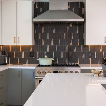
The palette is quiet, but there is a lot happening within it. Soft sage cabinetry grounds the room, while warm white upper cabinets and pantry cabinetry lift the space. A pure white quartz countertop provides a crisp surface against the cabinetry, and soft brass hardware adds just enough warmth. The new Sub Zero refrigerator was given its own wall, beside a full pantry, freeing the range wall to become a strong focal point. A Monogram range now sits centered beneath an angular stainless-steel Zephyr hood, framed by the kitchen's most distinctive element: a graphite backsplash made from WOW Design's Pottery tile. Inspired by Japanese handmade ceramics, the tiles have a wonderfully tactile, imperfect character. Most are deep graphite, but here and there the surface breaks into strokes of camel, dusty peach and deep blue-gunmetal glaze. There is an almost painterly quality to the way those colors move across the wall, giving the kitchen something that is difficult to achieve with a more uniform material—the feeling that someone actually made it.
The rest of the room was designed around that same balance of simplicity and warmth. New pale oak flooring runs throughout the ground floor, bringing a natural material and a soft golden tone beneath the cooler sage and graphite. Floating oak shelves flank the windows and provide a home for plants, ceramics and a few favorite objects, while another pair of shelves beside the refrigerator creates a small landing place for the things that inevitably arrive with you at the end of the day—keys, mail, bags and whatever else happens to be in your hands. The island occupies a surprisingly small footprint, yet its L-shaped form provides both additional work surface and seating without interrupting the flow of the room. A deep sink with an integrated cutting board and roll-up drying rack, a commercial-style faucet and under-cabinet LED lighting bring the practical details up to the same level of thoughtfulness as the larger design decisions. In the end, the renovation did more than just enlarge the kitchen; it created a space that feels calm, contemporary, warm, and a little unexpected … and, most importantly, we created a kitchen that finally makes sense for the way my clients live.
AFTER photos: Bernardo Grijalva
 Fiorito Interior Design
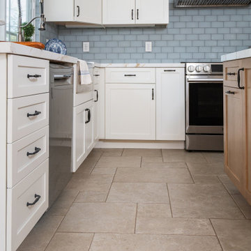
My clients approached this kitchen remodel hoping not only for improved functionality but for a space that invited comfort, warmth, and daily enjoyment. Their existing kitchen was limited in both layout and atmosphere where a small island barely larger than a podium offered little utility. An oversized double-width doorway at the rear of the room leading into the adjacent living space disrupted the flow, making furniture placement nearly impossible. They longed for a kitchen where cooking felt easy and intuitive, but also one where they could sit at the table with a book and a cup of tea, or host friends without feeling cramped or awkwardly positioned.
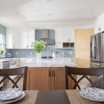
One of the most impactful decisions we made early on was to close off that extra-wide opening to the living room. Doing so allowed us to reclaim the wall, which not only improved circulation but also gave us the freedom to rethink the spacing of the kitchen and eat-in area. With that change, we could introduce a much larger island—truly functional this time—complete with generous workspace and storage. It became a true centerpiece for meal prep, casual dining, and gathering.
From there I turned my attention to layering in comfort, personality, and style. I curated a color palette of soft white, pale blue, light wood tones, and touches of sunshine yellow. This fresh and uplifting combination feels timeless and relaxed. We chose cabinetry with traditional Shaker-style doors, accented by black forged iron hardware for a subtle hint of contrast and authenticity. For the countertops we chose a Gold Calacatta-look quartz, bringing elegance and warmth with its soft veining and classic appeal.
To elevate the kitchen walls I selected a soft matte glass tile in a moody, sky-blue that blankets the backsplash, providing a gentle wash of color that’s calming and cohesive. On the floors I chose a limestone-look porcelain tile in a classic Versailles pattern as an homage to old English manor houses—bringing character and texture underfoot while remaining durable and low-maintenance for modern life.
Lastly I transformed the adjacent eat-in area into a cozy, multifunctional space. We added custom built-in bookshelves and a sideboard for serving and display—perfect for entertaining or simply making daily routines feel more special. A black iron picture light softly illuminates the buffet, lending a warm, ambient glow in the evenings. I carefully planned the seating arrangement to include a space-saving banquette along the wall, paired with a trestle-style dining table and side chairs. At either end I placed tufted host chairs upholstered in an exquisite, tonal Chinoiserie dragon pattern that are comfortable enough to sit on for hours. Whether sharing a leisurely meal, reading in the sunlight, or gazing out at the greenery just beyond the windows, this spot now invites my clients to truly enjoy their home in a new, deeper way.
Photo: Bernardo Grijalva
 Fiorito Interior Design
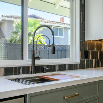
When I began this kitchen project, the space was constrained by an awkward peninsula and a dropped ceiling that compressed the room both physically and visually. Fluorescent fixtures sat behind a plastic diffuser, and the refrigerator was wedged beside the range, leaving the kitchen feeling crowded while also making poor use of the available space. The transformation began by taking things away. The dropped ceiling was removed, the fluorescent tubes went with it, and the room suddenly gained height and light. The peninsula was removed too, opening the floor plan and allowing the cabinetry to continue down an adjacent wall and incorporate a second window. What had been a small, enclosed kitchen became a generous working space with room for a slim, functional L-shaped island, additional cabinetry and, perhaps most importantly, a much more natural relationship between the different parts of the kitchen.
The palette is quiet, but there is a lot happening within it. Soft sage cabinetry grounds the room, while warm white upper cabinets and pantry cabinetry lift the space. A pure white quartz countertop provides a crisp surface against the cabinetry, and soft brass hardware adds just enough warmth. The new Sub Zero refrigerator was given its own wall, beside a full pantry, freeing the range wall to become a strong focal point. A Monogram range now sits centered beneath an angular stainless-steel Zephyr hood, framed by the kitchen's most distinctive element: a graphite backsplash made from WOW Design's Pottery tile. Inspired by Japanese handmade ceramics, the tiles have a wonderfully tactile, imperfect character. Most are deep graphite, but here and there the surface breaks into strokes of camel, dusty peach and deep blue-gunmetal glaze. There is an almost painterly quality to the way those colors move across the wall, giving the kitchen something that is difficult to achieve with a more uniform material—the feeling that someone actually made it.
The rest of the room was designed around that same balance of simplicity and warmth. New pale oak flooring runs throughout the ground floor, bringing a natural material and a soft golden tone beneath the cooler sage and graphite. Floating oak shelves flank the windows and provide a home for plants, ceramics and a few favorite objects, while another pair of shelves beside the refrigerator creates a small landing place for the things that inevitably arrive with you at the end of the day—keys, mail, bags and whatever else happens to be in your hands. The island occupies a surprisingly small footprint, yet its L-shaped form provides both additional work surface and seating without interrupting the flow of the room. A deep sink with an integrated cutting board and roll-up drying rack, a commercial-style faucet and under-cabinet LED lighting bring the practical details up to the same level of thoughtfulness as the larger design decisions. In the end, the renovation did more than just enlarge the kitchen; it created a space that feels calm, contemporary, warm, and a little unexpected … and, most importantly, we created a kitchen that finally makes sense for the way my clients live.
AFTER photos: Bernardo Grijalva
 Fiorito Interior Design
My clients approached this kitchen remodel hoping not only for improved functionality but for a space that invited comfort, warmth, and daily enjoyment. Their existing kitchen was limited in both layout and atmosphere where a small island barely larger than a podium offered little utility. An oversized double-width doorway at the rear of the room leading into the adjacent living space disrupted the flow, making furniture placement nearly impossible. They longed for a kitchen where cooking felt easy and intuitive, but also one where they could sit at the table with a book and a cup of tea, or host friends without feeling cramped or awkwardly positioned.
One of the most impactful decisions we made early on was to close off that extra-wide opening to the living room. Doing so allowed us to reclaim the wall, which not only improved circulation but also gave us the freedom to rethink the spacing of the kitchen and eat-in area. With that change, we could introduce a much larger island—truly functional this time—complete with generous workspace and storage. It became a true centerpiece for meal prep, casual dining, and gathering.
From there I turned my attention to layering in comfort, personality, and style. I curated a color palette of soft white, pale blue, light wood tones, and touches of sunshine yellow. This fresh and uplifting combination feels timeless and relaxed. We chose cabinetry with traditional Shaker-style doors, accented by black forged iron hardware for a subtle hint of contrast and authenticity. For the countertops we chose a Gold Calacatta-look quartz, bringing elegance and warmth with its soft veining and classic appeal.
To elevate the kitchen walls I selected a soft matte glass tile in a moody, sky-blue that blankets the backsplash, providing a gentle wash of color that’s calming and cohesive. On the floors I chose a limestone-look porcelain tile in a classic Versailles pattern as an homage to old English manor houses—bringing character and texture underfoot while remaining durable and low-maintenance for modern life.
Lastly I transformed the adjacent eat-in area into a cozy, multifunctional space. We added custom built-in bookshelves and a sideboard for serving and display—perfect for entertaining or simply making daily routines feel more special. A black iron picture light softly illuminates the buffet, lending a warm, ambient glow in the evenings. I carefully planned the seating arrangement to include a space-saving banquette along the wall, paired with a trestle-style dining table and side chairs. At either end I placed tufted host chairs upholstered in an exquisite, tonal Chinoiserie dragon pattern that are comfortable enough to sit on for hours. Whether sharing a leisurely meal, reading in the sunlight, or gazing out at the greenery just beyond the windows, this spot now invites my clients to truly enjoy their home in a new, deeper way.
Photo: Bernardo Grijalva
 Fiorito Interior Design
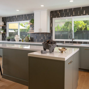
When I began this kitchen project, the space was constrained by an awkward peninsula and a dropped ceiling that compressed the room both physically and visually. Fluorescent fixtures sat behind a plastic diffuser, and the refrigerator was wedged beside the range, leaving the kitchen feeling crowded while also making poor use of the available space. The transformation began by taking things away. The dropped ceiling was removed, the fluorescent tubes went with it, and the room suddenly gained height and light. The peninsula was removed too, opening the floor plan and allowing the cabinetry to continue down an adjacent wall and incorporate a second window. What had been a small, enclosed kitchen became a generous working space with room for a slim, functional L-shaped island, additional cabinetry and, perhaps most importantly, a much more natural relationship between the different parts of the kitchen.
The palette is quiet, but there is a lot happening within it. Soft sage cabinetry grounds the room, while warm white upper cabinets and pantry cabinetry lift the space. A pure white quartz countertop provides a crisp surface against the cabinetry, and soft brass hardware adds just enough warmth. The new Sub Zero refrigerator was given its own wall, beside a full pantry, freeing the range wall to become a strong focal point. A Monogram range now sits centered beneath an angular stainless-steel Zephyr hood, framed by the kitchen's most distinctive element: a graphite backsplash made from WOW Design's Pottery tile. Inspired by Japanese handmade ceramics, the tiles have a wonderfully tactile, imperfect character. Most are deep graphite, but here and there the surface breaks into strokes of camel, dusty peach and deep blue-gunmetal glaze. There is an almost painterly quality to the way those colors move across the wall, giving the kitchen something that is difficult to achieve with a more uniform material—the feeling that someone actually made it.
The rest of the room was designed around that same balance of simplicity and warmth. New pale oak flooring runs throughout the ground floor, bringing a natural material and a soft golden tone beneath the cooler sage and graphite. Floating oak shelves flank the windows and provide a home for plants, ceramics and a few favorite objects, while another pair of shelves beside the refrigerator creates a small landing place for the things that inevitably arrive with you at the end of the day—keys, mail, bags and whatever else happens to be in your hands. The island occupies a surprisingly small footprint, yet its L-shaped form provides both additional work surface and seating without interrupting the flow of the room. A deep sink with an integrated cutting board and roll-up drying rack, a commercial-style faucet and under-cabinet LED lighting bring the practical details up to the same level of thoughtfulness as the larger design decisions. In the end, the renovation did more than just enlarge the kitchen; it created a space that feels calm, contemporary, warm, and a little unexpected … and, most importantly, we created a kitchen that finally makes sense for the way my clients live.
AFTER photos: Bernardo Grijalva
 Fiorito Interior Design
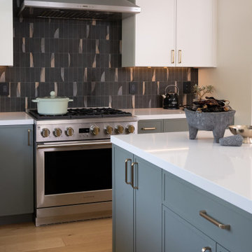
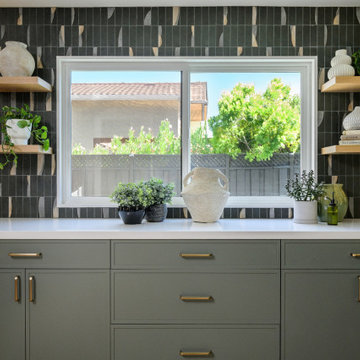
When I began this kitchen project, the space was constrained by an awkward peninsula and a dropped ceiling that compressed the room both physically and visually. Fluorescent fixtures sat behind a plastic diffuser, and the refrigerator was wedged beside the range, leaving the kitchen feeling crowded while also making poor use of the available space. The transformation began by taking things away. The dropped ceiling was removed, the fluorescent tubes went with it, and the room suddenly gained height and light. The peninsula was removed too, opening the floor plan and allowing the cabinetry to continue down an adjacent wall and incorporate a second window. What had been a small, enclosed kitchen became a generous working space with room for a slim, functional L-shaped island, additional cabinetry and, perhaps most importantly, a much more natural relationship between the different parts of the kitchen.
The palette is quiet, but there is a lot happening within it. Soft sage cabinetry grounds the room, while warm white upper cabinets and pantry cabinetry lift the space. A pure white quartz countertop provides a crisp surface against the cabinetry, and soft brass hardware adds just enough warmth. The new Sub Zero refrigerator was given its own wall, beside a full pantry, freeing the range wall to become a strong focal point. A Monogram range now sits centered beneath an angular stainless-steel Zephyr hood, framed by the kitchen's most distinctive element: a graphite backsplash made from WOW Design's Pottery tile. Inspired by Japanese handmade ceramics, the tiles have a wonderfully tactile, imperfect character. Most are deep graphite, but here and there the surface breaks into strokes of camel, dusty peach and deep blue-gunmetal glaze. There is an almost painterly quality to the way those colors move across the wall, giving the kitchen something that is difficult to achieve with a more uniform material—the feeling that someone actually made it.
The rest of the room was designed around that same balance of simplicity and warmth. New pale oak flooring runs throughout the ground floor, bringing a natural material and a soft golden tone beneath the cooler sage and graphite. Floating oak shelves flank the windows and provide a home for plants, ceramics and a few favorite objects, while another pair of shelves beside the refrigerator creates a small landing place for the things that inevitably arrive with you at the end of the day—keys, mail, bags and whatever else happens to be in your hands. The island occupies a surprisingly small footprint, yet its L-shaped form provides both additional work surface and seating without interrupting the flow of the room. A deep sink with an integrated cutting board and roll-up drying rack, a commercial-style faucet and under-cabinet LED lighting bring the practical details up to the same level of thoughtfulness as the larger design decisions. In the end, the renovation did more than just enlarge the kitchen; it created a space that feels calm, contemporary, warm, and a little unexpected … and, most importantly, we created a kitchen that finally makes sense for the way my clients live.
AFTER photos: Bernardo Grijalva
 Fiorito Interior Design
When I began this kitchen project, the space was constrained by an awkward peninsula and a dropped ceiling that compressed the room both physically and visually. Fluorescent fixtures sat behind a plastic diffuser, and the refrigerator was wedged beside the range, leaving the kitchen feeling crowded while also making poor use of the available space. The transformation began by taking things away. The dropped ceiling was removed, the fluorescent tubes went with it, and the room suddenly gained height and light. The peninsula was removed too, opening the floor plan and allowing the cabinetry to continue down an adjacent wall and incorporate a second window. What had been a small, enclosed kitchen became a generous working space with room for a slim, functional L-shaped island, additional cabinetry and, perhaps most importantly, a much more natural relationship between the different parts of the kitchen.
The palette is quiet, but there is a lot happening within it. Soft sage cabinetry grounds the room, while warm white upper cabinets and pantry cabinetry lift the space. A pure white quartz countertop provides a crisp surface against the cabinetry, and soft brass hardware adds just enough warmth. The new Sub Zero refrigerator was given its own wall, beside a full pantry, freeing the range wall to become a strong focal point. A Monogram range now sits centered beneath an angular stainless-steel Zephyr hood, framed by the kitchen's most distinctive element: a graphite backsplash made from WOW Design's Pottery tile. Inspired by Japanese handmade ceramics, the tiles have a wonderfully tactile, imperfect character. Most are deep graphite, but here and there the surface breaks into strokes of camel, dusty peach and deep blue-gunmetal glaze. There is an almost painterly quality to the way those colors move across the wall, giving the kitchen something that is difficult to achieve with a more uniform material—the feeling that someone actually made it.
The rest of the room was designed around that same balance of simplicity and warmth. New pale oak flooring runs throughout the ground floor, bringing a natural material and a soft golden tone beneath the cooler sage and graphite. Floating oak shelves flank the windows and provide a home for plants, ceramics and a few favorite objects, while another pair of shelves beside the refrigerator creates a small landing place for the things that inevitably arrive with you at the end of the day—keys, mail, bags and whatever else happens to be in your hands. The island occupies a surprisingly small footprint, yet its L-shaped form provides both additional work surface and seating without interrupting the flow of the room. A deep sink with an integrated cutting board and roll-up drying rack, a commercial-style faucet and under-cabinet LED lighting bring the practical details up to the same level of thoughtfulness as the larger design decisions. In the end, the renovation did more than just enlarge the kitchen; it created a space that feels calm, contemporary, warm, and a little unexpected … and, most importantly, we created a kitchen that finally makes sense for the way my clients live.
AFTER photos: Bernardo Grijalva
14