
Search results for "Central element" in Home Design Ideas

 Visbeen Architects
Function meets fashion in this relaxing retreat inspired by turn-of-the-century cottages. Perfect for a lot with limited space or a water view, this delightful design packs ample living into an open floor plan spread out on three levels. Elements of classic farmhouses and Craftsman-style bungalows can be seen in the updated exterior, which boasts shingles, porch columns, and decorative venting and windows. Inside, a covered front porch leads into an entry with a charming window seat and to the centrally located 17 by 12-foot kitchen. Nearby is an 11 by 15-foot dining and a picturesque outdoor patio. On the right side of the more than 1,500-square-foot main level is the 14 by 18-foot living room with a gas fireplace and access to the adjacent covered patio where you can enjoy the changing seasons. Also featured is a convenient mud room and laundry near the 700-square-foot garage, a large master suite and a handy home management center off the dining and living room. Upstairs, another approximately 1,400 square feet include two family bedrooms and baths, a 15 by 14-foot loft dedicated to music, and another area designed for crafts and sewing. Other hobbies and entertaining aren’t excluded in the lower level, where you can enjoy the billiards or games area, a large family room for relaxing, a guest bedroom, exercise area and bath.
Photographers: Ashley Avila Photography
Pat Chambers
Builder: Bouwkamp Builders, Inc.

 Kelly Johnson Design
Alise O'brien Photography
Inspiration for a transitional living room remodel in St Louis
Inspiration for a transitional living room remodel in St Louis

 Gallery KBNY
For this Brooklyn condo renovation, Gallery Kitchen and Bath updated the entire kitchen and both bathrooms, as well as painted and laid out new flooring throughout the entire apartment. The owners wanted to unite the seeming medley of the existing space into a cohesive design more representative of their own style. With its ultra-high ceilings and exposed joints and beams, the space already lent itself to the farmhouse look. The end result is a modernized, eclectic farmhouse style that we keenly carried throughout the home.
MORE DETAILS
Compelling textures and color combos reign supreme. The kitchen features semi-custom Shaker-style stone gray cabinets, a white subway tile backsplash running all the way up the wall, and white quartz countertops. We built the island in part to create a pleasing yet efficient flow from the kitchen into the living and dining areas as the space was opened up. We also painted the plumbing stack white to not make it stand out.
We also redesigned the bathrooms, giving each a unique treatment. In the master bath, we took a Victorian-goes-modern approach with coral walls, champagne fixtures, and a clawfoot tub. In the guest bathroom, we stuck to a transitional style that approaches modern without becoming contemporary, pairing herringbone marble floor tiles with a mix of subway and penny tiles on the walls and in the shower. Both maintain elements, such as tiles, fixtures, and colors, that coordinate with the overall eclectic farmhouse look.
HOW WE COLLABORATE
Collaboration with our clients to their desired degree is one of our core pillars. In this condo renovation, the clients wanted central air and were initially considering a true central air system. We advised against it, as not only would it take away from the unique beauty of unusually tall ceilings by adding unsightly ductwork, but it would also significantly detract from the farmhouse look. Instead, we suggested a mini-split system. Our recommended units were both cost-effective and much more complementary to the comprehensive theme. Of course, we ultimately always honor the clients’ choices but it’s just as important to us that we make sure to provide all the necessary information so our clients can make educated decisions that are best for their needs.
SPACE PLANNING
Another key element of the renovation process is space planning. From this perspective, we consider the placement and positioning of objects with regard to the overall flow of space. The building where this renovation took place is U-shaped at one end, which happens to be where this particular apartment is located. Uniquely-shaped spaces naturally require more concentration than those built in the standard rectangular shape. Questions we consider include: Where will people really spend time in this space? What will the flow of foot traffic be? Is there easy access to the kitchen island? Does it flow well into the hallways? Does the island protrude into anything? Working in New York, with its variety of homes and architectural styles, has greatly developed our experience with standard spaces and unconventional ones alike.
SOME HIGHLIGHTS
- Ultra-tall ceilings, allowing for stacked cabinets in the kitchen, as well as long pendant light fixtures and more chandeliers than usual throughout the home
- Completely refurbished cast iron clawfoot tub in one bathroom, with a 270-degree shower curtain around the tub
- Vibrant color choices, including an all-blue bedroom in various shades
- Treated exposed brick walls
Fun Fact: A client once showed us inspiration photos that they sourced online of this exact project, having no idea it was one of ours.
Thinking about renovating your condo? Contact us today to find out how you can benefit from our expertise in remodeling New York City condos. We are a design-and-build firm with a full-scale approach that handles every single aspect of your condo renovation from start to finish.
Find the right local pro for your project
 Gallery KBNY
For this Brooklyn condo renovation, Gallery Kitchen and Bath updated the entire kitchen and both bathrooms, as well as painted and laid out new flooring throughout the entire apartment. The owners wanted to unite the seeming medley of the existing space into a cohesive design more representative of their own style. With its ultra-high ceilings and exposed joints and beams, the space already lent itself to the farmhouse look. The end result is a modernized, eclectic farmhouse style that we keenly carried throughout the home.
MORE DETAILS
Compelling textures and color combos reign supreme. The kitchen features semi-custom Shaker-style stone gray cabinets, a white subway tile backsplash running all the way up the wall, and white quartz countertops. We built the island in part to create a pleasing yet efficient flow from the kitchen into the living and dining areas as the space was opened up. We also painted the plumbing stack white to not make it stand out.
We also redesigned the bathrooms, giving each a unique treatment. In the master bath, we took a Victorian-goes-modern approach with coral walls, champagne fixtures, and a clawfoot tub. In the guest bathroom, we stuck to a transitional style that approaches modern without becoming contemporary, pairing herringbone marble floor tiles with a mix of subway and penny tiles on the walls and in the shower. Both maintain elements, such as tiles, fixtures, and colors, that coordinate with the overall eclectic farmhouse look.
HOW WE COLLABORATE
Collaboration with our clients to their desired degree is one of our core pillars. In this condo renovation, the clients wanted central air and were initially considering a true central air system. We advised against it, as not only would it take away from the unique beauty of unusually tall ceilings by adding unsightly ductwork, but it would also significantly detract from the farmhouse look. Instead, we suggested a mini-split system. Our recommended units were both cost-effective and much more complementary to the comprehensive theme. Of course, we ultimately always honor the clients’ choices but it’s just as important to us that we make sure to provide all the necessary information so our clients can make educated decisions that are best for their needs.
SPACE PLANNING
Another key element of the renovation process is space planning. From this perspective, we consider the placement and positioning of objects with regard to the overall flow of space. The building where this renovation took place is U-shaped at one end, which happens to be where this particular apartment is located. Uniquely-shaped spaces naturally require more concentration than those built in the standard rectangular shape. Questions we consider include: Where will people really spend time in this space? What will the flow of foot traffic be? Is there easy access to the kitchen island? Does it flow well into the hallways? Does the island protrude into anything? Working in New York, with its variety of homes and architectural styles, has greatly developed our experience with standard spaces and unconventional ones alike.
SOME HIGHLIGHTS
- Ultra-tall ceilings, allowing for stacked cabinets in the kitchen, as well as long pendant light fixtures and more chandeliers than usual throughout the home
- Completely refurbished cast iron clawfoot tub in one bathroom, with a 270-degree shower curtain around the tub
- Vibrant color choices, including an all-blue bedroom in various shades
- Treated exposed brick walls
Fun Fact: A client once showed us inspiration photos that they sourced online of this exact project, having no idea it was one of ours.
Thinking about renovating your condo? Contact us today to find out how you can benefit from our expertise in remodeling New York City condos. We are a design-and-build firm with a full-scale approach that handles every single aspect of your condo renovation from start to finish.

 Saikley Architects
Our busy Silicon Valley clients asked us to convert their tight-quartered 1960’s ranch house to a gracious family home that would meet their long term needs. Ease of living was paramount, both in functionality and in ordered design.
The project was completed on a moderate budget.While retaining most of the structure of the existing house to avoid costly structural changes, we opened walls to improve the sight lines and flow of the house and bring in more light. We made small additions at the front and back bedrooms to gain space for the family and relatives. An existing underused patio area was improved with a simple outdoor kitchen and overhang to extend the living space to the outside. Costs were kept down with choices of modest materials.
Everything was made to be functional. Ample storage has been built into the right places. The details of the kitchen were carefully worked out to accommodate all the wishes of the various cooks in the family. The house is set up to be easy to keep clean. Acoustic walls separate living from bedroom spaces so adults can enjoy time together while children sleep. The outdoor kitchen has easy access to the indoor kitchen and the garage, and its setup promotes socializing while cooking outdoors.
A large part of the narrow back yard was previously unusable space due to a steep slope up to a neighbor’s higher fence. With a new retaining wall and some re-grading we took back more of the yard for the patio and play space on a new lawn.
The remodeled house is a mix of contemporary and traditional elements. Cool colors have a calming effect. Traditional items such as prairie style windows, trellis, mosaic tiles, and Shaker style cabinets, break down the scale in an otherwise streamlined, contemporary design. A new gabled roof with a broad arch at the front of the house marks the entry and resolves a challenging form where the central entry is set back from walls on both sides.
Photography: Kurt Manley
https://saikleyarchitects.com/portfolio/modern-ranch/

 JRP Design & Remodel
Our clients had a cramped and outdated kitchen that lacked flow. They envisioned a space the family could share, including an eat-in kitchen with an island. Their small master bathroom also needed a facelift, more counter space, and storage options. They desired both spaces to be clean with a modern aesthetic.
Thoughtful architectural planning dramatically opened the space in this home to encompass the kitchen, dining, and hallway areas into one unified expanse. JRP removed the soffit and pushed back the appliance wall into the hallway to create the space needed for the central island-a place to hang out while dinner is being made, but also double as an additional food prep area. The cabinetry, along with the quartz backsplash and countertop, made for a clean, modern look.
Upstairs, the master bathroom transformed into a clutter-free zen zone. The tiny closet and outdated vanity were removed and replaced by an integrated counter space with white oak cabinetry, drawers, and open space shelving. The dated round-framed mirrors were swapped out in favor of one large, singular mirror.
The most used areas in this home are now comfortable and polished with surfaces that are both simple and easy to clean. This remodel design embraces modern living at its best. The focus on clean, uncluttered lines, light timber elements, and white countertops came together to give our clients the minimalist esthetics they were looking for.
Photographer: Andrew (Open House VC)
 Saikley Architects
Our busy Silicon Valley clients asked us to convert their tight-quartered 1960’s ranch house to a gracious family home that would meet their long term needs. Ease of living was paramount, both in functionality and in ordered design.
The project was completed on a moderate budget.While retaining most of the structure of the existing house to avoid costly structural changes, we opened walls to improve the sight lines and flow of the house and bring in more light. We made small additions at the front and back bedrooms to gain space for the family and relatives. An existing underused patio area was improved with a simple outdoor kitchen and overhang to extend the living space to the outside. Costs were kept down with choices of modest materials.
Everything was made to be functional. Ample storage has been built into the right places. The details of the kitchen were carefully worked out to accommodate all the wishes of the various cooks in the family. The house is set up to be easy to keep clean. Acoustic walls separate living from bedroom spaces so adults can enjoy time together while children sleep. The outdoor kitchen has easy access to the indoor kitchen and the garage, and its setup promotes socializing while cooking outdoors.
A large part of the narrow back yard was previously unusable space due to a steep slope up to a neighbor’s higher fence. With a new retaining wall and some re-grading we took back more of the yard for the patio and play space on a new lawn.
The remodeled house is a mix of contemporary and traditional elements. Cool colors have a calming effect. Traditional items such as prairie style windows, trellis, mosaic tiles, and Shaker style cabinets, break down the scale in an otherwise streamlined, contemporary design. A new gabled roof with a broad arch at the front of the house marks the entry and resolves a challenging form where the central entry is set back from walls on both sides.
Photography: Kurt Manley
https://saikleyarchitects.com/portfolio/modern-ranch/
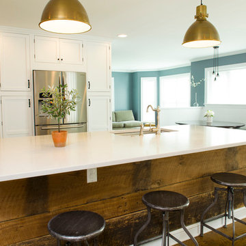
Sponsored
Plain City, OH

The Creative Kitchen Company
Columbus Area Kitchen Remodeling and Refacing Professional

 Premier Service
Inspired by the client’s frequent trips to Martha’s Vineyard, this renovation project’s primary goal was to create a landscape complimentary of this Colonial Revival style home, reminiscent of Edgartown, Massachusetts.
The front landscape was specifically designed to offer expansive views of a layered horizontal foundation planting that nestled itself around the base of the home, allowing the home itself to be the star of the show. Flowering borders that rotate with the seasons create a strong foreground while a clipped yew hedge forms the barrier needed to separate the billowing panicle hydrangeas in the background. The axial design of the herringbone front walk, punctuated by a bluestone transitional space and formal cast limestone urn, create an axis by which all other landscape elements are symmetrically mirrored.
Desiring a rear entertainment space separated from the adjacent 4 car garage and recreational lawn, a series of intimate gathering spaces were designed to include Edgartown inspired architectural features that would establish the character of the garden while setting the backdrop for a robust mix of perennials, grasses, hedges and annuals. Mimicking the pattern and detail previously established on the stone base of the home, individually hand chiseled pieces of Valders veneer were used to construct the garden walls. Reclaimed street pavers border a reconfigured bluestone patio and create a garden walk that separates the garden into 4 equal quadrants; each section of the walk connecting itself to a prominent feature of the garden. The central paver transition space is backed by a concentric hedge of low growing boxwoods, delineating annual and perennial. The relocation of an arbor, in conjunction with a new evergreen hedge, creates the desired partition between relaxed conversation and open lawn activities. A brick masonry water feature with reclaimed 1916 antique cast iron tub anchors the garden and terminates the perennial adorned paver walk opposite the home’s fireplace centered within the main seating area.
Whether spending an evening with friends or a quiet moment alone, this quaint garden space offers our clients the perfect ambiance to pause and reflect on life’s special treasures.
 JRP Design & Remodel
Our clients had a cramped and outdated kitchen that lacked flow. They envisioned a space the family could share, including an eat-in kitchen with an island. Their small master bathroom also needed a facelift, more counter space, and storage options. They desired both spaces to be clean with a modern aesthetic.
Thoughtful architectural planning dramatically opened the space in this home to encompass the kitchen, dining, and hallway areas into one unified expanse. JRP removed the soffit and pushed back the appliance wall into the hallway to create the space needed for the central island-a place to hang out while dinner is being made, but also double as an additional food prep area. The cabinetry, along with the quartz backsplash and countertop, made for a clean, modern look.
Upstairs, the master bathroom transformed into a clutter-free zen zone. The tiny closet and outdated vanity were removed and replaced by an integrated counter space with white oak cabinetry, drawers, and open space shelving. The dated round-framed mirrors were swapped out in favor of one large, singular mirror.
The most used areas in this home are now comfortable and polished with surfaces that are both simple and easy to clean. This remodel design embraces modern living at its best. The focus on clean, uncluttered lines, light timber elements, and white countertops came together to give our clients the minimalist esthetics they were looking for.
Photographer: Andrew (Open House VC)
 Gallery KBNY
For this Brooklyn condo renovation, Gallery Kitchen and Bath updated the entire kitchen and both bathrooms, as well as painted and laid out new flooring throughout the entire apartment. The owners wanted to unite the seeming medley of the existing space into a cohesive design more representative of their own style. With its ultra-high ceilings and exposed joints and beams, the space already lent itself to the farmhouse look. The end result is a modernized, eclectic farmhouse style that we keenly carried throughout the home.
MORE DETAILS
Compelling textures and color combos reign supreme. The kitchen features semi-custom Shaker-style stone gray cabinets, a white subway tile backsplash running all the way up the wall, and white quartz countertops. We built the island in part to create a pleasing yet efficient flow from the kitchen into the living and dining areas as the space was opened up. We also painted the plumbing stack white to not make it stand out.
We also redesigned the bathrooms, giving each a unique treatment. In the master bath, we took a Victorian-goes-modern approach with coral walls, champagne fixtures, and a clawfoot tub. In the guest bathroom, we stuck to a transitional style that approaches modern without becoming contemporary, pairing herringbone marble floor tiles with a mix of subway and penny tiles on the walls and in the shower. Both maintain elements, such as tiles, fixtures, and colors, that coordinate with the overall eclectic farmhouse look.
HOW WE COLLABORATE
Collaboration with our clients to their desired degree is one of our core pillars. In this condo renovation, the clients wanted central air and were initially considering a true central air system. We advised against it, as not only would it take away from the unique beauty of unusually tall ceilings by adding unsightly ductwork, but it would also significantly detract from the farmhouse look. Instead, we suggested a mini-split system. Our recommended units were both cost-effective and much more complementary to the comprehensive theme. Of course, we ultimately always honor the clients’ choices but it’s just as important to us that we make sure to provide all the necessary information so our clients can make educated decisions that are best for their needs.
SPACE PLANNING
Another key element of the renovation process is space planning. From this perspective, we consider the placement and positioning of objects with regard to the overall flow of space. The building where this renovation took place is U-shaped at one end, which happens to be where this particular apartment is located. Uniquely-shaped spaces naturally require more concentration than those built in the standard rectangular shape. Questions we consider include: Where will people really spend time in this space? What will the flow of foot traffic be? Is there easy access to the kitchen island? Does it flow well into the hallways? Does the island protrude into anything? Working in New York, with its variety of homes and architectural styles, has greatly developed our experience with standard spaces and unconventional ones alike.
SOME HIGHLIGHTS
- Ultra-tall ceilings, allowing for stacked cabinets in the kitchen, as well as long pendant light fixtures and more chandeliers than usual throughout the home
- Completely refurbished cast iron clawfoot tub in one bathroom, with a 270-degree shower curtain around the tub
- Vibrant color choices, including an all-blue bedroom in various shades
- Treated exposed brick walls
Fun Fact: A client once showed us inspiration photos that they sourced online of this exact project, having no idea it was one of ours.
Thinking about renovating your condo? Contact us today to find out how you can benefit from our expertise in remodeling New York City condos. We are a design-and-build firm with a full-scale approach that handles every single aspect of your condo renovation from start to finish.
 Nar Design Group
This client grew up in this 1950’s family home and has now become owner in his adult life. Designing and remodeling this childhood home that the client was very bonded and familiar with was a tall order. This modern twist of original mid-century style combined with an eclectic fusion of modern day materials and concepts fills the room with a powerful presence while maintaining its clean lined austerity and elegance. The kitchen was part of a grander complete home re-design and remodel.
A modern version of a mid-century His and Hers grand master bathroom was created to include all the amenities and nothing left behind! This bathroom has so much noticeable and hidden “POW” that commands its peaceful spa feeling with a lot of attitude. Maintaining ultra-clean lines yet delivering ample design interest at every detail, This bathroom is eclectically a one of a kind luxury statement.
The concept in the laundry room was to create a simple, easy to use and clean space with ample storage and a place removed from the central part of the home to house the necessity of the cats and their litter box needs. There was no need for glamour in the laundry room yet we were able to create a simple highly utilitarian space.
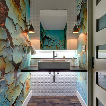
If there is one room in the home that requires frequent visitors to thoroughly enjoy with a huge element of surprise, it’s the powder room! This is a room where you know that eventually, every guest will visit. Knowing this, we created a bold statement with layers of intrigue that would leave ample room for fun conversation with your guests upon their prolonged exit. We kept the lights dim here for that intriguing experience of crafted elegance and created ambiance. The walls of peeling metallic rust are the welcoming gesture to a powder room experience of defiance and elegant mystical complexity.
It's a lucky house guest indeed who gets to stay in this newly remodeled home. This on-suite bathroom allows them their own space and privacy. Both Bedroom and Bathroom offer plenty of storage for an extended stay. Rift White Oak cabinets and sleek Silestone counters make a lovely combination in the bathroom while the bedroom showcases textured white cabinets with a dark walnut wrap.
Photo credit: Fred Donham of PhotographerLink

 Bilotta Kitchen & Home
This kitchen by Bilotta’s Fabrice Garson was done in collaboration with Constantin Wickenburg Architects. Featuring Rutt cabinetry the client opted for a Shaker-style door with a step and thinner stiles and rails – a more sophisticated take on a typical Shaker. The perimeter is Super White paint and the island Baltic Grey. The drawers are Rutt’s patented dovetail drawer in walnut – like a jewelry box for your silverware and other accessories. Overall, the space is clean, classic and inviting. It’s a traditional design with transitional elements. The original kitchen had a flat ceiling – a coffered ceiling and central skylight were added to the space to bring in additional natural light. The kitchen is separated into two areas – the prepping, cooking area and the dining area with the custom china cabinet and banquet, both in the Baltic Grey to mimic the island. The cooking area has a lot more natural light with its big open windows on all sides allowing for the client to look out on her garden while preparing meals. The banquette area is a cozy nook, a little more formal than the rest of the space with the beautiful custom curved mullions on the china cabinet that light up inside to show off their serving pieces and stemware. The soft gray fabric on the banquette cushions make for a peaceful corner in which to relax after a long day or preparing a big meal. Appliances are a mix of Gaggenau, Sub-Zero and Marvel. The countertops are Super White quartzite with a square edge and backslash is marble subway tile. The countertop behind the banquette and at the china cabinet are natural walnut by Grothouse Lumber.
Designer: Fabrice Garson
Photographer – Peter Krupenye
 STUDIO TASHIMA
Keyes Road is a two-storey, semi-detached red brick house dating to around 1890-1910. The focus of our work was on the ground floor where we were asked to improve the layout and use of the main living areas of the house, for an active family of four. Important to the design was to maximise the quality and amount of light as well as connection to the garden and flow to the rest of the house.
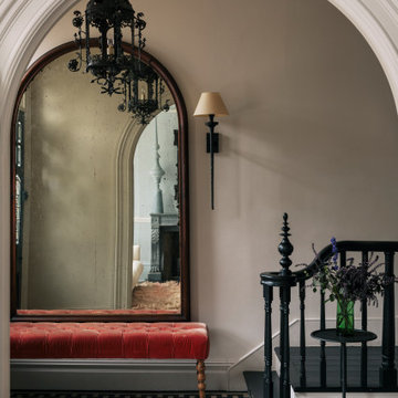
Our proposal introduces three single storey extensions, comprising a central, large space that extends the main outrigger of the house. To each side are smaller volumes, affording a full width kitchen. While defining a series of discrete volumes, it was important for us to ensure that the kitchen, living, family and dining rooms that are interconnecting and continuous. The result is a big space punctuated by a series of differently sized arches, defining spaces to ensure their intimacy.
It was important for our client to have a sense of warmth and comfort - perhaps not dissimilar to the qualities of a hotel lobby. The colour scheme of the rooms are warm white painted plaster, natural wood flooring with black, bronze and brass accents. Indirect and carefully placed light fittings pulls together the atmosphere of the rooms - particularly in the evenings.
Externally, we felt it important to differentiate the extensions from the main house by using a dark, charcoal grey brick. This sets up a contrasting yet complimentary relationship to the rich red coloured brick house. The facets of the brick play with light and depth as do the graduated brick arches.
During the design process, we grappled with floor levels, the direction of sunlight, and care to not encroach on the neighbouring properties. As the house is in a conservation area, we worked closely with our trusted planning advisor. Throughout, we pursued a sensitive design strategy, using pitched roofs, matching materials and careful detailing. Internally, many of the original details are intact. This has enabled us to create an eclectic ensemble of elements, colours and materials varying in age and period.
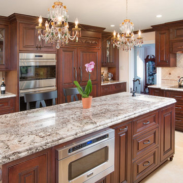
Sponsored
Columbus, OH

Trish Takacs Design
Award Winning & Highly Skilled Kitchen & Bath Designer in Columbus
 Saikley Architects
Our busy Silicon Valley clients asked us to convert their tight-quartered 1960’s ranch house to a gracious family home that would meet their long term needs. Ease of living was paramount, both in functionality and in ordered design.
The project was completed on a moderate budget.While retaining most of the structure of the existing house to avoid costly structural changes, we opened walls to improve the sight lines and flow of the house and bring in more light. We made small additions at the front and back bedrooms to gain space for the family and relatives. An existing underused patio area was improved with a simple outdoor kitchen and overhang to extend the living space to the outside. Costs were kept down with choices of modest materials.
Everything was made to be functional. Ample storage has been built into the right places. The details of the kitchen were carefully worked out to accommodate all the wishes of the various cooks in the family. The house is set up to be easy to keep clean. Acoustic walls separate living from bedroom spaces so adults can enjoy time together while children sleep. The outdoor kitchen has easy access to the indoor kitchen and the garage, and its setup promotes socializing while cooking outdoors.
A large part of the narrow back yard was previously unusable space due to a steep slope up to a neighbor’s higher fence. With a new retaining wall and some re-grading we took back more of the yard for the patio and play space on a new lawn.
The remodeled house is a mix of contemporary and traditional elements. Cool colors have a calming effect. Traditional items such as prairie style windows, trellis, mosaic tiles, and Shaker style cabinets, break down the scale in an otherwise streamlined, contemporary design. A new gabled roof with a broad arch at the front of the house marks the entry and resolves a challenging form where the central entry is set back from walls on both sides.
Photography: Kurt Manley
https://saikleyarchitects.com/portfolio/modern-ranch/
 Visbeen Architects
Function meets fashion in this relaxing retreat inspired by turn-of-the-century cottages. Perfect for a lot with limited space or a water view, this delightful design packs ample living into an open floor plan spread out on three levels. Elements of classic farmhouses and Craftsman-style bungalows can be seen in the updated exterior, which boasts shingles, porch columns, and decorative venting and windows. Inside, a covered front porch leads into an entry with a charming window seat and to the centrally located 17 by 12-foot kitchen. Nearby is an 11 by 15-foot dining and a picturesque outdoor patio. On the right side of the more than 1,500-square-foot main level is the 14 by 18-foot living room with a gas fireplace and access to the adjacent covered patio where you can enjoy the changing seasons. Also featured is a convenient mud room and laundry near the 700-square-foot garage, a large master suite and a handy home management center off the dining and living room. Upstairs, another approximately 1,400 square feet include two family bedrooms and baths, a 15 by 14-foot loft dedicated to music, and another area designed for crafts and sewing. Other hobbies and entertaining aren’t excluded in the lower level, where you can enjoy the billiards or games area, a large family room for relaxing, a guest bedroom, exercise area and bath.
Photographers: Ashley Avila Photography
Pat Chambers
Builder: Bouwkamp Builders, Inc.
 Saikley Architects
Our busy Silicon Valley clients asked us to convert their tight-quartered 1960’s ranch house to a gracious family home that would meet their long term needs. Ease of living was paramount, both in functionality and in ordered design.
The project was completed on a moderate budget.While retaining most of the structure of the existing house to avoid costly structural changes, we opened walls to improve the sight lines and flow of the house and bring in more light. We made small additions at the front and back bedrooms to gain space for the family and relatives. An existing underused patio area was improved with a simple outdoor kitchen and overhang to extend the living space to the outside. Costs were kept down with choices of modest materials.
Everything was made to be functional. Ample storage has been built into the right places. The details of the kitchen were carefully worked out to accommodate all the wishes of the various cooks in the family. The house is set up to be easy to keep clean. Acoustic walls separate living from bedroom spaces so adults can enjoy time together while children sleep. The outdoor kitchen has easy access to the indoor kitchen and the garage, and its setup promotes socializing while cooking outdoors.
A large part of the narrow back yard was previously unusable space due to a steep slope up to a neighbor’s higher fence. With a new retaining wall and some re-grading we took back more of the yard for the patio and play space on a new lawn.
The remodeled house is a mix of contemporary and traditional elements. Cool colors have a calming effect. Traditional items such as prairie style windows, trellis, mosaic tiles, and Shaker style cabinets, break down the scale in an otherwise streamlined, contemporary design. A new gabled roof with a broad arch at the front of the house marks the entry and resolves a challenging form where the central entry is set back from walls on both sides.
Photography: Kurt Manley
https://saikleyarchitects.com/portfolio/modern-ranch/
 Visbeen Architects
Function meets fashion in this relaxing retreat inspired by turn-of-the-century cottages. Perfect for a lot with limited space or a water view, this delightful design packs ample living into an open floor plan spread out on three levels. Elements of classic farmhouses and Craftsman-style bungalows can be seen in the updated exterior, which boasts shingles, porch columns, and decorative venting and windows. Inside, a covered front porch leads into an entry with a charming window seat and to the centrally located 17 by 12-foot kitchen. Nearby is an 11 by 15-foot dining and a picturesque outdoor patio. On the right side of the more than 1,500-square-foot main level is the 14 by 18-foot living room with a gas fireplace and access to the adjacent covered patio where you can enjoy the changing seasons. Also featured is a convenient mud room and laundry near the 700-square-foot garage, a large master suite and a handy home management center off the dining and living room. Upstairs, another approximately 1,400 square feet include two family bedrooms and baths, a 15 by 14-foot loft dedicated to music, and another area designed for crafts and sewing. Other hobbies and entertaining aren’t excluded in the lower level, where you can enjoy the billiards or games area, a large family room for relaxing, a guest bedroom, exercise area and bath.
Photographers: Ashley Avila Photography
Pat Chambers
Builder: Bouwkamp Builders, Inc.
Sponsored
Delaware, OH

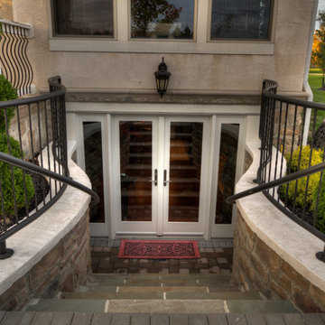
Buckeye Basements, Inc.
Central Ohio's Basement Finishing ExpertsBest Of Houzz '13-'21
 Saikley Architects
Our busy Silicon Valley clients asked us to convert their tight-quartered 1960’s ranch house to a gracious family home that would meet their long term needs. Ease of living was paramount, both in functionality and in ordered design.
The project was completed on a moderate budget.While retaining most of the structure of the existing house to avoid costly structural changes, we opened walls to improve the sight lines and flow of the house and bring in more light. We made small additions at the front and back bedrooms to gain space for the family and relatives. An existing underused patio area was improved with a simple outdoor kitchen and overhang to extend the living space to the outside. Costs were kept down with choices of modest materials.
Everything was made to be functional. Ample storage has been built into the right places. The details of the kitchen were carefully worked out to accommodate all the wishes of the various cooks in the family. The house is set up to be easy to keep clean. Acoustic walls separate living from bedroom spaces so adults can enjoy time together while children sleep. The outdoor kitchen has easy access to the indoor kitchen and the garage, and its setup promotes socializing while cooking outdoors.
A large part of the narrow back yard was previously unusable space due to a steep slope up to a neighbor’s higher fence. With a new retaining wall and some re-grading we took back more of the yard for the patio and play space on a new lawn.
The remodeled house is a mix of contemporary and traditional elements. Cool colors have a calming effect. Traditional items such as prairie style windows, trellis, mosaic tiles, and Shaker style cabinets, break down the scale in an otherwise streamlined, contemporary design. A new gabled roof with a broad arch at the front of the house marks the entry and resolves a challenging form where the central entry is set back from walls on both sides.
Photography: Kurt Manley
https://saikleyarchitects.com/portfolio/modern-ranch/
 Visbeen Architects
Function meets fashion in this relaxing retreat inspired by turn-of-the-century cottages. Perfect for a lot with limited space or a water view, this delightful design packs ample living into an open floor plan spread out on three levels. Elements of classic farmhouses and Craftsman-style bungalows can be seen in the updated exterior, which boasts shingles, porch columns, and decorative venting and windows. Inside, a covered front porch leads into an entry with a charming window seat and to the centrally located 17 by 12-foot kitchen. Nearby is an 11 by 15-foot dining and a picturesque outdoor patio. On the right side of the more than 1,500-square-foot main level is the 14 by 18-foot living room with a gas fireplace and access to the adjacent covered patio where you can enjoy the changing seasons. Also featured is a convenient mud room and laundry near the 700-square-foot garage, a large master suite and a handy home management center off the dining and living room. Upstairs, another approximately 1,400 square feet include two family bedrooms and baths, a 15 by 14-foot loft dedicated to music, and another area designed for crafts and sewing. Other hobbies and entertaining aren’t excluded in the lower level, where you can enjoy the billiards or games area, a large family room for relaxing, a guest bedroom, exercise area and bath.
Photographers: Ashley Avila Photography
Pat Chambers
Builder: Bouwkamp Builders, Inc.
 Gallery KBNY
For this Brooklyn condo renovation, Gallery Kitchen and Bath updated the entire kitchen and both bathrooms, as well as painted and laid out new flooring throughout the entire apartment. The owners wanted to unite the seeming medley of the existing space into a cohesive design more representative of their own style. With its ultra-high ceilings and exposed joints and beams, the space already lent itself to the farmhouse look. The end result is a modernized, eclectic farmhouse style that we keenly carried throughout the home.
MORE DETAILS
Compelling textures and color combos reign supreme. The kitchen features semi-custom Shaker-style stone gray cabinets, a white subway tile backsplash running all the way up the wall, and white quartz countertops. We built the island in part to create a pleasing yet efficient flow from the kitchen into the living and dining areas as the space was opened up. We also painted the plumbing stack white to not make it stand out.
We also redesigned the bathrooms, giving each a unique treatment. In the master bath, we took a Victorian-goes-modern approach with coral walls, champagne fixtures, and a clawfoot tub. In the guest bathroom, we stuck to a transitional style that approaches modern without becoming contemporary, pairing herringbone marble floor tiles with a mix of subway and penny tiles on the walls and in the shower. Both maintain elements, such as tiles, fixtures, and colors, that coordinate with the overall eclectic farmhouse look.
HOW WE COLLABORATE
Collaboration with our clients to their desired degree is one of our core pillars. In this condo renovation, the clients wanted central air and were initially considering a true central air system. We advised against it, as not only would it take away from the unique beauty of unusually tall ceilings by adding unsightly ductwork, but it would also significantly detract from the farmhouse look. Instead, we suggested a mini-split system. Our recommended units were both cost-effective and much more complementary to the comprehensive theme. Of course, we ultimately always honor the clients’ choices but it’s just as important to us that we make sure to provide all the necessary information so our clients can make educated decisions that are best for their needs.
SPACE PLANNING
Another key element of the renovation process is space planning. From this perspective, we consider the placement and positioning of objects with regard to the overall flow of space. The building where this renovation took place is U-shaped at one end, which happens to be where this particular apartment is located. Uniquely-shaped spaces naturally require more concentration than those built in the standard rectangular shape. Questions we consider include: Where will people really spend time in this space? What will the flow of foot traffic be? Is there easy access to the kitchen island? Does it flow well into the hallways? Does the island protrude into anything? Working in New York, with its variety of homes and architectural styles, has greatly developed our experience with standard spaces and unconventional ones alike.
SOME HIGHLIGHTS
- Ultra-tall ceilings, allowing for stacked cabinets in the kitchen, as well as long pendant light fixtures and more chandeliers than usual throughout the home
- Completely refurbished cast iron clawfoot tub in one bathroom, with a 270-degree shower curtain around the tub
- Vibrant color choices, including an all-blue bedroom in various shades
- Treated exposed brick walls
Fun Fact: A client once showed us inspiration photos that they sourced online of this exact project, having no idea it was one of ours.
Thinking about renovating your condo? Contact us today to find out how you can benefit from our expertise in remodeling New York City condos. We are a design-and-build firm with a full-scale approach that handles every single aspect of your condo renovation from start to finish.
168