
Search results for "Central element" in Home Design Ideas

 Studio Upwall Architects
This project was a retrofit and expansion of an existing house in San Francisco's Noe Valley Neighborhood. The original house, built in 1910, had been insensitively remodeled in the 1950’s to mimic the Spanish Mediterranean style. Located on a typical narrow San Francisco lot, the interior of the existing house consisted of a series of disconnected rooms, lacking daylight and lacked daylight and open “flow”. The homeowners had lived in the house for nearly 20 years, becoming familiar with its shortcomings, and wanted to overhaul the majority of the building. The new design includes an enlarged 2 car garage and garden master bedroom suite on the ground level, and a 400 square foot addition with two bedrooms and a full bath at the third floor. While enlarging the home the new design strategically incorporates several small courtyard spaces which are carved into the footprint to bring daylight and views to all areas of the house. These spaces create much needed relief to the interior of the long narrow footprint so that every space has a connection, actual or visual, to the outside. The narrow driveway at the front of the house was widened and repurposed to incorporate a covered front walkway to the elevated porch. The original entrance was trapped along the side of the house opening to a long narrow hallway. The new entrance has been relocated allowing one to enter at the center of the house rather than the corner. The new entrance opens to an implied vestibule that is contiguous with the dining and living areas. The glazing at the entry brings daylight to the interior and allows occupants visual access to the porch, sidewalk and street beyond, adding a degree of security. The mid garden court defines the boundary between the formal living areas to toward the front and the kitchen at the heart of the house. Hallways are eliminated in the new open plan replaced by a central circulation zone that terminates at the through the windows in the raised Media room at the rear. The high wall of the stair tower forms the south facing edge of the garden court, and faced in light colored stucco, reflects light into the formal living areas. The stairway walls are perforated by large translucent vertical widows bringing diffuse illumination as a backdrop to the adjacent kitchen. The stairway wraps lightly through the space around a pedestal altar-like drybar. This creates a bridge from the kitchen into the core of the circulation space which bridges spatially to the new living levels above and below. The slightly raised floor of the Media Room with its built-in window seat, and access to a private deck provide a greater sense of intimacy and create a comfortable transition zone facing the rear yard. Windows at the rear wall are strategically placed to provide “snapshot” views and to screen out the less desirable views of the neighboring buildings to the sides and rear.
photography by: Cesar Rubio
 Dimensions in Wood Inc
This client’s vision for their kitchen/hearth room remodel was to create a harmonious space for gathering and socializing with family and friends. Without the before and after photos, you would scarcely believe this was the same home.
This huge home renovation perfectly illustrates that Dimensions In Wood’s expert team can handle every aspect of your remodeling project. Plumbing, flooring, electrical wiring, custom cabinets, structural engineering, appliances, windows, interior and exterior doors, entertainment and more. Contact us today to discuss Translating Your Visions into Reality
The client was interested in new appliance technology, cabinetry to the ceiling, and an Island large enough to seat 3. They also wanted a built-in breakfast nook, improved pantry space, more functional storage on either side of their fireplace, and a built-in appearance for the TV above the mantel. The original built-in desk was not used, and they preferred for that space to serve as a small bar area with refrigeration and a place to store their printer. We designed several plans for the space before selecting the final layout.
The new design required the removal of the soffit over the old sink, as well as a small wall beside the old refrigerator. The wall beside the stairwell had to be shortened 13 inches and a new beam installed to carry the load of the home’s 2nd story to gain enough space for the large central island. The existing closet pantry walls were also reconfigured as per the new plan.
This serves as a great reminder that Dimensions In Wood is much more than just custom cabinets.
Central to the entire custom kitchen is an 8-foot Walnut island. The huge island, which comfortably seats three, is topped with Essenza Blue quartzite. The stone’s natural striations are beautiful. Quartzite is harder than granite, and less likely to stain than other stones because of its density. The couple had to look through multiple slabs to find a piece they LOVED. The island’s custom Walnut cabinetry, built to resemble a piece of custom furniture, was stained Bronzed Walnut by Sherwin Williams.
The 4-foot Galley Workstation in the island, handles all the kitchen’s prep, serving, and cleanup needs. The Galley’s culinary tools include an upper tier cutting board, upper tier drying rack, 2 lower tier platforms, 11″ colander with non-slip handles, and 11” mixing bowl with lid and non-slip bottom. Learn more about the amazing Galley Workstation here. A Waterstone gantry faucet in a pewter finish combines a pull-down sprayer for maximum mobility and a articulated swivel spout. A water tap with reverse osmosis filter provides the highest quality drinking water. To keep a clean and sleek counter we installed a raised air switch for the garbage disposal and integrated soap dispenser. The island also houses the Thermador Sapphire 7-Program Dishwasher with a hidden touch control panel and a custom Walnut wood front. The cabinetry under the Galley Workstation features a trash roll out, as well as storage for the culinary tools.
Shortening the stairwell wall, and reframing around the stairs, which included shortening the handrail, also made room for a bi-fold door walk-in pantry with extra roll out storage and space for a small microwave. Above the panty doors is a remote controlled, electric motor powered, lift up cabinet door which hides a flat screen TV, used while the family is cooking.
To the right of the walk-in pantry is cold food storage. The Thermador, 30-inch Freedom Collection refrigerator and 24-inch built-in freezer column with internal ice maker are covered with matching cabinetry fronts. An open display space was designed above the units, creating an aesthetically beautiful wall. To the right of the refrigerator & freezer columns is a tall cabinet designed for the built-in Thermador steam and convection oven. The convention steam oven is a relatively new technology for homes, but its versatility and food quality is amazing. To the right of this is a pull-out appliance pantry which provides easy access and storage for a stand mixer, blender, and any other appliance you do not want to clutter the counter.
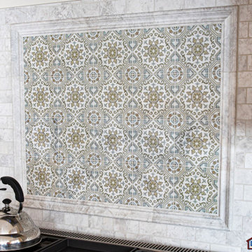
The most visible wall of the kitchen features the 36-inch Thermador Professional Series Harmony Gas Range with Griddle. Between the range and custom designed wood hood, a framed mosaic tile accent in the backsplash, creates a focal point. To clear the air, the Professional Series Thermador 42-inch ventilation insert provides excellent exhaust capabilities, as well as providing multi-level, vivid LED lights for beautiful illumination.
The wall cabinetry symmetrically flanks the custom hood, utilizing deeper wall cabinetry on each end, allowing for storage of oversized dishware. The base cabinetry on this wall is made up of drawers, except for the corner, which is a Kesseböhmer LeMans II. This specially designed shelf system allows ease of access in underutilized blind corners. The dual action articulation system with soft close mechanism ensures a smooth open and close.
Rounding the corner to the outside wall, the base cabinetry was built to a narrower depth, providing additional space for the island, as well as easier access to the new larger pass-thru window which serves the screen porch. The client selected Black Vermont granite countertops with an ogee edge to contrast the Linen White painted cabinetry.
The door to the screen porch was replaced with a Marvin Exterior Door with a raised panel at the bottom of the 3⁄4 glass door.
Marvin Windows replaced the other windows in the space increasing the energy efficiency and value of the home. To establish the breakfast nook, a bench with drawers and an upholstered seat was built into the bay area of the room.
Custom bookshelves were built with open shelves, cabinet doors, and drawers on either side of the fireplace. A new stone hearth and fireplace surround were installed. Above the existing mantel we built a recessed space for the flat screen television hiding all wiring inside the walls for a completely clean look.
The space that was once a desk was transformed into a bar area. The glass shelves and glass cabinet front liquor cabinet stand out. But this bar area has hidden secrets. Tucked beneath the black granite is a Thermador under-counter double drawer refrigerator with matching wood front panels. They blend in perfectly with the cabinets. A wireless printer is easily accessed on a slide out drawer. Plus, what looks like merely wooden panels on the wall are concealing recessed storage for more bottles and glasses!
Overhead recessed lighting and speaker system provide illumination and entertainment through the entire space.
This luxury home had original, solid oak flooring through most of the first floor which the homeowner obviously wanted to keep but were in desperate need of repair and refinishing. Our master craftsmen wove in new wood flooring to match the old where needed, particularly where walls had been changed and where the floor was damaged. We sanded the floors, smoothing away years of wear and tear. The entire wood floor was then uniformly stained, making it impossible to differentiate where any repairs were made.
If this renovation has inspired you, then contact us today! There is no limit to our Dimensions.


Find the right local pro for your project
 VAULT®
In the Tuscany region of central Italy, a region made famous around the world for its history, landscapes, traditions, artistic legacy and fine wine, perhaps nothing is more universally recognized than the old world villa’s that are nestled into the rolling countryside. Standing at approximately 10,500 square feet, this custom residence has all of the elegance, style and craftsmanship of those old world homes, but with all of the modern amenities of a new modern luxury home. This stunning residence was recognized by the National Association of Home Builders (NAHB) as the best custom built home in the country in 2010, a testament to the skillful designers and craftsmen who brought the homeowners vision into reality.
When Chad Haas, Founder of VAULT (www.vaultgarage.com), a company that prides itself in furnishing some of the most beautiful garages in the world, was brought into the project, the home and garage had already been built. The accolades of the gorgeous villa already awarded. But the homeowner felt that the exterior and interior of the garage lacked architectural harmony with the rest of the home and so he flew Mr. Haas out to visit the space directly so that he could assist hands-on with re-designing a new look and to add furnishings to accessories the space.
“When I first approached the villa from the street, I knew that I’d have my work cut out for me. Everything looked so perfect exactly the way it was designed and built. I questioned myself ‘how was I going to improve upon perfection?’, since remarkable attention was paid to even the smallest of details in the home” asked Haas.
The client’s goal was to engage Haas to design and furnish a garage where he could relax, separate from the home, enjoy his growing car collection and entertain family and friends.
After spending a short weekend together with the home owner to gather his ideas, Haas returned back to his Beaverton, Oregon-based company with a clearer vision: create the ultimate gentlemen’s retreat through the look of a turn-of-a-century Tuscan ‘car barn’.
Absolutely nothing in the garage was overlooked – and it shows. Every design element in the garage for color, texture and material was meticulously thought out to elicit just the right feeling and emotion in everyone that enters what may be one of the most beautifully elegant garages in America, a space commonly overlooked in the construction of homes today.
A main focal point of the exterior of garage is the beautiful view from the courtyard, where all three carriage doors can be seen. While the existing wood doors looked acceptable, it was agreed that something more befitting of the quality and beauty of the home were appropriate. Haas designed luxurious castle-style doors handcrafted from solid Mahogany and bathed in a rich dark brown stain that was complemented by hand-wrought iron grills, clavos and door pull hardware. The double-wide door, in particular, is truly remarkable in both its elegance, as well as its one-of-a-kind operation. “The client was concerned in this area of having mounting hardware and a motor on the ceiling. Because the cars in this area do not get brought out on a regular (daily) basis, the doors open manually by hand and operate accordion style on a track”. The homes main overhead garage doors feature jack-shaft operation which removes the clutter of a motor on the garage ceiling, but offers the convenience of powered operation. These extraordinary, custom-made castle doors look just as beautiful on the inside as the out and their unparalleled design and craftsmanship take the exterior of the home to even greater heights than before.
On to the interior, a black and white epoxy coating was stripped and replaced with porcelain tiles that resembled Italian travertine stone. To give the car barn a rustic feeling and a presence that it was older, not modern, Haas worked on the development and concept directly with the home owner to collaborate with a local millwork company that designed and hand-finished substantial wood beams from distressed Doug Fir. All of the walls were hand-plastered by a local artist using straw that was harvested from the immediate area surrounding the home and incorporated into the plaster to give it a rustic antique quality.
Haas conceived and designed a bar area and cabinetry for a work area that pulled inspiration from old ice boxes of the 1920’s that utilized heavy nickel-plated hardware, again to give storage spaces a rustic appearance.
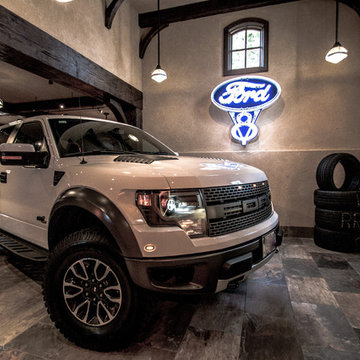
The warm glow from several custom porcelain neon signs, each one meticulously built entirely by hand by VAULT, are dispersed throughout the space and transform the entire room and bring it to life. The client had never previously owned a neon sign before and along with the carriage doors felt that these items have transformed the space more than any other feature. Several antique gas pumps, restored in the client’s favorite petro bran, and a few additional porcelain signs will eventually furnish the rest of the space to complement the clients amazing car collection.
In addition to the countless details that set this showcase garage apart, its ability to seamlessly blend with the rest of the home and the natural, rustic setting of the Colorado Rockies, yet house modern automobiles in a manner in which they feel well placed and belong, is also noteworthy.
GARAGE DESIGN & FURNISHINGS
To learn more about VAULT visit them at: http://www.vaultgarage.com/
And on Facebook: http://www.facebook.com/VaultGarage
PHOTOGRAPHY
All photographs were used with the permission of photographer John Vanderpool (john.vanderpool5@gmail.com)
You can visit John Vanderpool on Facebook at: https://www.facebook.com/JVanderpoolPhotography
ARCHITECTURE
Jerry Gloss, Principal, KGA Architects: http://www.kgarch.com/
HOMEBUILDER
Thomas Sattler Home: http://thomassattlerhomes.com/
VEHICLES
Here is an overview of the cars that were photographed in this article:
1. 2014 Ferrari 458 Italia
2. 2013 Maserati GranTurismo Sport
3. 2007 Porsche 911 GT3 RS (997)
4. 2008 Porsche Cayenne GTS
5. 2008 Porsche GT3 RS
6. 2013 Porsche 911 Turbo S (997)
7. 2014 Porsche Panamera GTS
8. 2013 Ford SVT Raptor (6.2L CrewCab)’
Overview of project reprinted with permission of DuPont Registry.
 Cast Glass Images Inc.
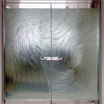
Cast Glass front doors add character and absolutely make an impression. The texture and design of double entry doors utilizing cast glass can be dramatic or simple - both options can still provide the desired privacy. Featured texture is "Oceanwave" on clear glass.
 Klopf Architecture
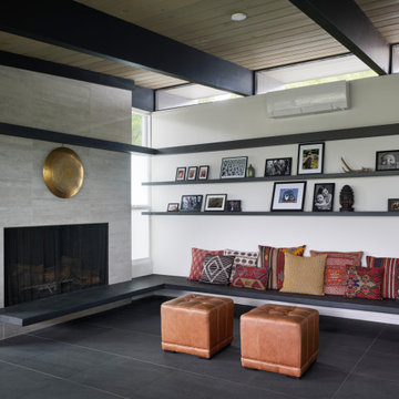
Set in a quiet neighborhood and framed by mature trees, this residence presented a unique opportunity: to thoughtfully evolve a custom mid-century modern home into a space that supports the everyday rhythms of a growing family. With a deep respect for the home’s original architecture, Klopf Architecture reimagined the house to better meet the needs of its owners—introducing functional improvements while preserving the spirit and character of its mid-century roots.
The clients approached Klopf Architecture with a clear vision: refresh their home while seamlessly integrating new programmatic elements. Key goals included clarifying and enhancing the entry sequence; connecting the detached garage to the main house with a practical yet architecturally intentional intervention; adding functional spaces such as a mudroom and laundry room; expanding and remodeling the primary suite’s bathroom and closet; and creating a more engaging outdoor space that capitalized on the site’s impressive views, featuring a fire pit and outdoor kitchen.
As a couple with distinct yet complementary perspectives—one focused on modern functionality and technology, and the other dedicated to preserving the home’s architectural integrity—their collaboration with Klopf Architecture resulted in a solution that harmonized both ideals. Their shared commitment to improving the livability of their home led to a design dialogue rooted in balance. This dynamic partnership shaped the direction of the renovation, ensuring that every decision honored the spirit of the original home while aligning with the practical needs of their growing family.
Designing within the constraints of the sloped site posed one of the project’s central challenges. The detached garage sat at a higher elevation than the main house, requiring a solution that ensured architectural and geometric compatibility between the two structures. Rather than create a purely utilitarian link, Klopf Architecture introduced an intentional connection that contributes to the overall architectural language. A notable pinch point in the plan—where differing geometries converged—was treated as a hinge point, turning a potentially awkward juncture into an architectural feature. This area now functions as both a transition and a moment of design interest that unifies the overall plan.
The design also addressed the underutilized outdoor area, which was located in a shadowed portion of the site with geometrical limitations. A new connection to the rear deck was created in this same area, making the outdoor space more useful and inviting. Klopf Architecture introduced carefully positioned openings and spatial improvements that forged a strong visual and functional connection between indoor and outdoor spaces. The outdoor area now reads as a deliberate extension of the home, embracing natural light and emphasizing the dramatic views.
Working through multiple design iterations, Klopf Architecture crafted a solution that preserved the architectural language of the original home while supporting the functional needs of modern life. The garage-to-house connection became more than a passage—it evolved into an architectural moment of transition. A new mudroom and laundry space enhanced convenience without compromising the clean lines of the design. The primary suite was expanded to create a private, serene retreat. The reimagined backyard, complete with fire pit and kitchen, now plays a vital role in the family’s daily routine and social life.
Outcomes and Lasting Impact
The result is a home that balances heritage with contemporary design, technical precision with design sensibility. The redesign not only met the clients’ initial goals but also exceeded expectations in its ability to seamlessly blend past and present, function and beauty, making the outdoor kitchen a favorite gathering place.
Beyond aesthetics, the renovation has significantly improved daily life for the family. The newly integrated garage connection has streamlined routines, providing a seamless transition between arriving home, storing belongings, and entering the main living spaces. The expanded primary suite offers a retreat-like atmosphere, creating a private space to unwind at the end of the day. The redesigned outdoor areas have also become an extension of their lifestyle—whether it's casual family dinners around the fire pit, entertaining friends in the outdoor kitchen, or simply enjoying the view from the reimagined backyard.
Through a thoughtful and strategic approach, the house has been successfully evolved into a home that remains true to its mid-century modern roots while enhancing livability, functionality, and the overall quality of life for the modern-day owners.
Klopf Architecture Team: Geoffrey Campen, Fernanda Bernardes
Architectural Interior Design: Klopf Architecture
Structural Engineer: Base Design Inc.
Contractor: Golden Snail Builders
Photography: Mariko Reed
Year Completed:2022
 SM Design
Bridle Path Residence — Formal Living & Music Room
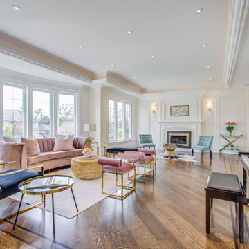
This Bridle Path Residence living room is conceived as an elegant, light-filled entertaining space where classical architectural structure meets contemporary glamour and collected residential comfort. Rather than relying on ornament alone, the design uses proportion, symmetry, material contrast, and carefully selected furniture to create a room that feels sophisticated yet genuinely livable.
The architecture establishes a strong sense of permanence. Extensive wall panelling, substantial crown moulding, layered ceiling details, and classical fireplace architecture give the room an established character reminiscent of a refined estate interior. At the same time, the clean white envelope keeps the architecture fresh and allows the furnishings and artwork to provide the personality.
The expansive bay windows are one of the defining features of the room. Their repeated vertical proportions bring abundant natural light deep into the space while creating a strong relationship with the surrounding landscape. The windows also soften the formal architecture, giving the room an open, airy quality rather than the heaviness often associated with traditional interiors.
The furniture introduces a deliberately more contemporary language. A blush-toned sofa and upholstered accent chairs bring softness and warmth, while deep navy seating adds contrast and visual depth. Slim brass frames on the chairs and occasional tables introduce a subtle metallic thread throughout the room, connecting the individual seating pieces into a cohesive composition.
The central seating arrangement is intentionally conversational. Rather than orienting every piece toward the fireplace, the furniture creates an intimate social zone within the much larger room. The mix of rounded forms, sculptural silhouettes, and geometric metal bases prevents the formal architecture from feeling rigid.
A sculptural gold-toned coffee table becomes an important visual anchor. Its organic texture contrasts with the linear architectural detailing and polished hardwood floor, adding a layer of tactile richness. Smaller glass and metal tables maintain visual openness and allow the expansive room to remain uncluttered.
The fireplace provides a secondary focal point at the far end of the room, framed by symmetrical architectural detailing and flanking sconces. Its position establishes a visual axis through the space, while the artwork above introduces a curated, contemporary note within the traditional setting.
The piano adds an important dimension to the room's identity. Rather than being treated as a separate musical installation, it is integrated naturally into the overall composition, reinforcing the idea of the room as a space for music, entertaining, conversation, and everyday enjoyment. It also adds a rich dark element that balances the lighter furnishings and architectural envelope.
The warm hardwood flooring provides continuity and grounds the predominantly white palette. Against it, the combination of blush, navy, muted green, brass, glass, and natural textures creates a sophisticated but approachable colour story.
Overall, the room demonstrates a modern interpretation of classic luxury. Traditional architectural detailing provides the foundation, while contemporary furniture, sculptural lighting, metallic accents, art, and layered upholstery bring freshness and personality. The result is an elegant Bridle Path living space that feels tailored, highly finished, and timeless without becoming overly formal.
Sponsored
Columbus, OH

Trish Takacs Design
Award Winning & Highly Skilled Kitchen & Bath Designer in Columbus
 Klopf Architecture
Set in a quiet neighborhood and framed by mature trees, this residence presented a unique opportunity: to thoughtfully evolve a custom mid-century modern home into a space that supports the everyday rhythms of a growing family. With a deep respect for the home’s original architecture, Klopf Architecture reimagined the house to better meet the needs of its owners—introducing functional improvements while preserving the spirit and character of its mid-century roots.
The clients approached Klopf Architecture with a clear vision: refresh their home while seamlessly integrating new programmatic elements. Key goals included clarifying and enhancing the entry sequence; connecting the detached garage to the main house with a practical yet architecturally intentional intervention; adding functional spaces such as a mudroom and laundry room; expanding and remodeling the primary suite’s bathroom and closet; and creating a more engaging outdoor space that capitalized on the site’s impressive views, featuring a fire pit and outdoor kitchen.
As a couple with distinct yet complementary perspectives—one focused on modern functionality and technology, and the other dedicated to preserving the home’s architectural integrity—their collaboration with Klopf Architecture resulted in a solution that harmonized both ideals. Their shared commitment to improving the livability of their home led to a design dialogue rooted in balance. This dynamic partnership shaped the direction of the renovation, ensuring that every decision honored the spirit of the original home while aligning with the practical needs of their growing family.
Designing within the constraints of the sloped site posed one of the project’s central challenges. The detached garage sat at a higher elevation than the main house, requiring a solution that ensured architectural and geometric compatibility between the two structures. Rather than create a purely utilitarian link, Klopf Architecture introduced an intentional connection that contributes to the overall architectural language. A notable pinch point in the plan—where differing geometries converged—was treated as a hinge point, turning a potentially awkward juncture into an architectural feature. This area now functions as both a transition and a moment of design interest that unifies the overall plan.
The design also addressed the underutilized outdoor area, which was located in a shadowed portion of the site with geometrical limitations. A new connection to the rear deck was created in this same area, making the outdoor space more useful and inviting. Klopf Architecture introduced carefully positioned openings and spatial improvements that forged a strong visual and functional connection between indoor and outdoor spaces. The outdoor area now reads as a deliberate extension of the home, embracing natural light and emphasizing the dramatic views.
Working through multiple design iterations, Klopf Architecture crafted a solution that preserved the architectural language of the original home while supporting the functional needs of modern life. The garage-to-house connection became more than a passage—it evolved into an architectural moment of transition. A new mudroom and laundry space enhanced convenience without compromising the clean lines of the design. The primary suite was expanded to create a private, serene retreat. The reimagined backyard, complete with fire pit and kitchen, now plays a vital role in the family’s daily routine and social life.
Outcomes and Lasting Impact
The result is a home that balances heritage with contemporary design, technical precision with design sensibility. The redesign not only met the clients’ initial goals but also exceeded expectations in its ability to seamlessly blend past and present, function and beauty, making the outdoor kitchen a favorite gathering place.
Beyond aesthetics, the renovation has significantly improved daily life for the family. The newly integrated garage connection has streamlined routines, providing a seamless transition between arriving home, storing belongings, and entering the main living spaces. The expanded primary suite offers a retreat-like atmosphere, creating a private space to unwind at the end of the day. The redesigned outdoor areas have also become an extension of their lifestyle—whether it's casual family dinners around the fire pit, entertaining friends in the outdoor kitchen, or simply enjoying the view from the reimagined backyard.
Through a thoughtful and strategic approach, the house has been successfully evolved into a home that remains true to its mid-century modern roots while enhancing livability, functionality, and the overall quality of life for the modern-day owners.
Klopf Architecture Team: Geoffrey Campen, Fernanda Bernardes
Architectural Interior Design: Klopf Architecture
Structural Engineer: Base Design Inc.
Contractor: Golden Snail Builders
Photography: Mariko Reed
Year Completed:2022
 NanaWall
Molly Mesnick, known from Season 13 of "The Bachelor," envisioned her Kirkland, WA dream home as a seamless blend of indoor comfort and outdoor beauty. Her goal was to create an open, airy living space that could easily transition from cozy indoors to expansive outdoors. Central to this vision was NanaWall Generation 4 Folding Glass Wall Systems, state-of-the-art solutions redefining modern living with its innovative design and exceptional functionality.
The Vision: Mesnick wanted a home that offered a seamless connection between indoors and outdoors, allowing for effortless entertaining, maximizing natural light, and providing stunning views. The NanaWall Generation 4 system was identified early in the design process as a key element in achieving this vision.
Homeowner Experience: “My NanaWall was my top wish list item for this house. I just LOVE the look of seamless indoor/outdoor entertaining and NanaWall makes that all possible! The Generation 4 system has a slimmer profile, offering more window view. The wall of windows floods our space with natural light but when it is open, it expands our living space to that covered patio.”
“I went with NanaWall because they are the original for bifold doors; they just have perfected it, and they do it better than anyone else.” — Molly Mesnick, Mesnick Homes
Slim Profiles and Minimal Aesthetics: The Generation 4 system has the slimmest frames in the industry, minimizing visible hardware and enhancing the streamlined appearance.
Enhanced Performance: Engineered to withstand harsh weather, extreme temperatures, and potential forced entry, ensuring safety and durability.
Ease of Operation: Effortless to open and close, the panels glide smoothly, providing a seamless transition between indoor and outdoor spaces.
Barefoot Friendly Sills: Aluminum sill inserts provide high heel and barefoot-safe transitions.
Floating Fourfold and Sixfold Panel Sets: Greater flexibility in configuration, allowing them to move and stack to the left, right, or center of the opening.
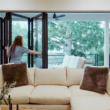
Molly Mesnick is opening a set of bifold doors in a modern living room leading to an outdoor seating area with greenery visible beyond.
Design and Installation: Using NanaWall Certified Installation services, the NW Aluminum 640 system in Mesnick's living room transformed the space into a versatile area perfect for entertaining and everyday living. The 15-foot-wide, 8-foot-tall, black-framed folding glass wall enhances the home's aesthetic appeal and provides:
Uninterrupted Views: The slim profile and large glass panels offer expansive views of the outdoor patio and garden, making the natural scenery a continuous backdrop to the indoor environment.
Natural Light: The glass wall floods the living room with natural light, creating a bright and inviting atmosphere.
Indoor-Outdoor Connectivity When fully opened, the glass wall extends the living space to the outdoor patio, perfect for gatherings and summer activities.
The Final Reveal: Molly Mesnick's dream home is a testament to the power of innovative design and technology in creating spaces that are both beautiful and functional. The NanaWall Generation 4 Folding Glass Wall System has not only met her expectations but has become the defining feature of her home, bringing her vision of seamless indoor-outdoor living to life. It stands as a symbol of modern architectural trends that embrace flexibility, openness, and a deep connection with the outdoors.
 STUDIO KONDE | Konrad Idaszewski Architect
Visit our page: https://conde.pl/architekt-wnetrz-poznan/ . Komfoo house interior designed by STUDIO KONDE Konrad Idaszewski Architekt, a Poznań-based interior architect known for contemporary residential spaces that combine architectural clarity, comfort and carefully considered materials. Part of the Modelowedomy collection of three individually configurable houses, Komfoo is conceived as a comfortable home with a high living room and mezzanine, while the kitchen and dining area are separated from the living zone by a functional furniture wall.
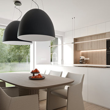
Clean white cabinetry, warm oak detailing and softly upholstered dining furniture create an elegant, cohesive kitchen and dining setting. Generous glazing opens the room towards the garden, bringing abundant daylight into the interior, while integrated storage, subtle lighting and carefully selected finishes keep the composition refined and uncluttered.
The kitchen is arranged as a continuous composition of white full-height and lower cabinets, with a warm oak-lined section defining the main working area. The timber finish introduces natural warmth between the crisp white fronts, while integrated black ovens provide a precise contrasting detail. Under-cabinet illumination highlights the pale worktop and light stone-effect backsplash, creating a softly illuminated horizontal band. A compact coffee machine and a few everyday kitchen details add a sense of use without disturbing the clean architectural lines.
Extending into the room, the substantial kitchen island provides additional workspace and storage while establishing a natural transition towards the dining area. Its white monolithic form contrasts with the surrounding oak and creates a bright centre to the composition. In front of it, a large dining table with softly rounded corners is finished in warm natural wood and supported by a sculptural central base. Six upholstered dining chairs in a light beige fabric surround the table, their curved backs and generous proportions adding softness and comfort.
Above the dining zone, two oversized black pendant lights with rounded dome-shaped shades create a bold visual accent. Their dark finish stands out against the predominantly white interior, while the smooth curves echo the rounded forms of the dining chairs and table. A slim linear pendant suspended above the kitchen worktop provides a more discreet source of light, complemented by concealed LED strips that emphasize the oak-lined section of the cabinetry.
Floor-to-ceiling glazing runs along the side of the dining area, providing an uninterrupted view towards the garden. Mature trees, a broad green lawn and the characteristic white vertical fence visible outside become part of the interior composition, adding colour and depth to the restrained palette. The abundant natural light also accentuates the subtle grain of the oak surfaces and the soft texture of the upholstered chairs.
The balance between white architectural cabinetry, warm timber, neutral textiles and strong sculptural lighting gives this Komfoo kitchen and dining area a sophisticated yet comfortable character. Functional elements are integrated into the overall architecture, allowing the interior to remain visually calm while retaining all the practical qualities of a contemporary family home. This considered approach reflects the work of STUDIO KONDE and its Poznań-based interior architecture practice, where material, proportion and everyday functionality are brought together in carefully designed residential interiors.
 EmilyPost
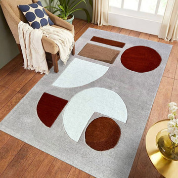
When it comes to defining a space, few elements are as transformative as a rug. Particularly in larger rooms, 9x12 rugs play a pivotal role in anchoring furniture, unifying aesthetics, and providing comfort underfoot. As home design continues to evolve, so do the styles, materials, and motifs that define contemporary rug choices. Whether you're redesigning a single room or curating an entire home, choosing the right 9x12 rug can dramatically influence the tone and function of your space. This blog explores the transition from classic to contemporary rug styles, highlighting current trends in design, texture, and sustainability. Read on to discover how 9x12 rugs are being used to redefine modern living environments in 2025.
Classic Rug Designs: Timeless Elegance and Historical Influence
Classic rugs have always been synonymous with tradition, craftsmanship, and sophistication. These pieces often draw inspiration from centuries-old techniques and cultural aesthetics, primarily seen in Persian, Oriental, and Turkish designs. A 9x12 classic rug is not merely a floor covering but a narrative woven through intricate patterns and deep, rich colors.
Traditional rug styles typically feature ornate borders, central medallions, and floral or geometric motifs. Colors like burgundy, deep navy, ivory, forest green, and gold dominate these designs, making them ideal for creating a warm, inviting atmosphere. The materials used often high-quality wool or silk add a luxurious texture and long-lasting durability. Hand-knotted techniques passed down through generations lend these rugs their intricate detail and resilience.
Today, classic rugs are being reimagined to fit modern sensibilities. Interior designers are pairing antique Persian rugs with contemporary furniture to create a unique, eclectic mix. For instance, a vintage 9x12 Rugs might lie beneath a minimalist glass coffee table and a sleek leather sectional, marrying old-world charm with modern clarity. In open-plan layouts, these rugs help delineate spaces and introduce visual interest. Their timeless beauty ensures that they remain relevant, even as design trends shift.
Moreover, the reintroduction of classic designs in modern colorways has allowed traditional rugs to appeal to a new generation. Muted tones, distressed finishes, and faded patterns give these rugs a more relaxed, lived-in feel that blends well with both rustic and urban interiors. For those seeking to infuse character and heritage into their living spaces, a classic 9x12 rug offers a versatile and enduring option.
Modern Minimalism: Embracing Simplicity and Subtlety in Large Rugs
As modern design trends continue to favor simplicity, functionality, and understated elegance, the demand for minimalist rugs has surged. The 9x12 rug format, given its expansive coverage, is particularly suited to minimalistic interiors where clean lines, neutral tones, and open spaces dominate the aesthetic.
Minimalist 9x12 rugs often utilize a restrained palette think beige, gray, ivory, taupe, and soft earth tones. These colors help maintain a calm, cohesive environment, especially in spaces where natural light plays a crucial role. Designs may be solid or include subtle patterns such as linear textures, tone-on-tone geometrics, or abstract gradients. The absence of elaborate ornamentation allows these rugs to blend seamlessly with contemporary furniture, making them a staple in Scandinavian, Japandi, and transitional interior styles.
Materials also play a crucial role in defining the minimalist look. Natural wool, bamboo silk, and viscose provide a soft, luxurious feel while maintaining a clean aesthetic. Flatweaves and low-pile constructions are popular choices, offering practicality alongside elegance.
 Karv One Design
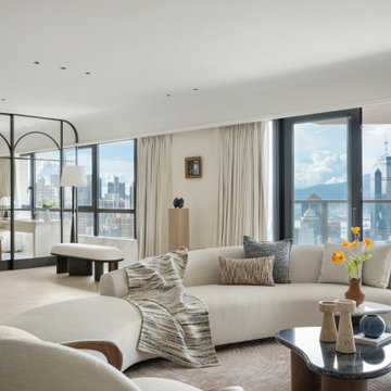
The Mid-Levels of Hong Kong Island is one of the most prominent luxury residential areas. This project - Estoril Court in Mid-Levels Central is one of the rare heritage mansions in Hong Kong with a "thousand-year lease," comprising a total of 240 units.
The young couple, with their two daughters, have settled here. For the wide experience husband, the most important aspect of a home is that it carries the "depth of love." His wife's preferences and the children's interests were frequently mentioned during this project. "I hope the design can break through conventions and avoid falling into the trap of popular but clichéd styles. Kyle and I resonate deeply on this point; we both pursue a 'more personal expression.' Family life should be relaxing, natural, and bringing joy to my family members."
This residence features a square layout and excellent natural lighting, with a practicality rate of nearly 90%. However, its over 40-year-old structure poses numerous constraints on renovations. Adhering to the existing structure and the wisdom of geomancy, Karv One Design has re-examined the relationship among the landscape, windows, and functional flow within the home. They have integrated practicality, beauty, and self-expression into every corner, enhancing the happiness of living.
Once stepping into the living room, you are greeted by Hong Kong's most spectacular vistas. The ever-changing scenery of Victoria Harbour, both day and night, the immense skyscrapers of different banks and commercial buildings and the panoramic views of the Peak are all within sight. The expansive dimensions of the living room are a response to the surrounding environment, providing ample space for family bonding and companionship, while also allowing the breathtaking skyline views to seamlessly integrate into daily life.
Unlike traditional whole-house decoration, the design of Hong Kong homes emphasizes collage and customization. The minimalist aesthetic of the space corresponds to the luxurious craftsmanship and time costs involved. Elements such as natural stone, artistic paint, parquet flooring, wood veneer, and leather have all been meticulously coordinated in terms of color and proportion, while a significant amount of storage space has been cleverly concealed within the walls.
The study room is deliberately positioned to one side of the living room, embracing the gentle stretch of sunlight. The arched iron partition, exuding a vintage flavor and traces of time, not only serves as a natural divider of space but also becomes a highlight of the interior decoration with its unique artistic form, creating a serene yet stylish atmosphere. It ensures privacy without compromising on openness, allowing the home owner to work in the study room while still keeping an eye on the children playing in the living room.
Custom-made artisanal furniture offers a whole new expression of comfort and practicality to the space. The Giorgetti HUG armchair combines a sculptural sense of form with a flowing sense of shape. When natural light filters in, a rich artistic atmosphere permeates and grows within, making the home a place of tranquility and peace of mind.
The original open-plan layout of the master bedroom has been reconfigured and divided. The ultimate goal of the enclosed space is to provide comfort and ease of sleep. The pale green color is also carefully coordinated, focusing on creating a serene and pleasant atmosphere. The combination of "green," "wood," and "metal elements" is based on Feng Shui considerations, serving to stabilize and concentrate the energy flow.
The children's room is simple yet cozy, where sunlight awakens the space and transparent glass windows bring in the ocean view. The palette of pale blue and white adds warmth and vitality to the space, inspiring children's boundless imagination about the unknown world and giving them the courage to see mountains, seas, and the world beyond.
The moment when the door is open, the magic of lighting begins. What greets the eye is an elegant and tastefully designed artistic foyer. The pace of work in Hong Kong is fast and efficient, often causing people to overlook family time. Therefore, the entrance is adorned with a large area of gentle ivory white, featuring sculptural-like display stands and flowers and vignettes that can be arranged according to the owner's mood. As night falls, the panoramic view of the Victoria Harbour's night scene comes into view, elevating the enjoyment to the utmost.
The lighting system in the space brings more enjoyable experiences to "living as you desire." The smart system caters to various states of living scenarios at different times, as well as to the subtle needs of ambient temperature, brightness, and tactile atmosphere. Whether it's solo time or family moments, day or night, everyone has a comfortable place to be.
The "Estoril Court" project is a full-service case that last for 12 months. We had hundreds of communications and exchanges with the home owner, and continuously coordinated and collaborated with the property management, on-site construction and installation workers, manufacturers, and various suppliers, striving for perfection in craftsmanship and meticulous attention to detail in execution. Finally, seeing the satisfied expressions of the home owner and their family, we felt that it was an ideal conveyance.
 VAULT®
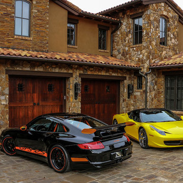
In the Tuscany region of central Italy, a region made famous around the world for its history, landscapes, traditions, artistic legacy and fine wine, perhaps nothing is more universally recognized than the old world villa’s that are nestled into the rolling countryside. Standing at approximately 10,500 square feet, this custom residence has all of the elegance, style and craftsmanship of those old world homes, but with all of the modern amenities of a new modern luxury home. This stunning residence was recognized by the National Association of Home Builders (NAHB) as the best custom built home in the country in 2010, a testament to the skillful designers and craftsmen who brought the homeowners vision into reality.
When Chad Haas, Founder of VAULT (www.vaultgarage.com), a company that prides itself in furnishing some of the most beautiful garages in the world, was brought into the project, the home and garage had already been built. The accolades of the gorgeous villa already awarded. But the homeowner felt that the exterior and interior of the garage lacked architectural harmony with the rest of the home and so he flew Mr. Haas out to visit the space directly so that he could assist hands-on with re-designing a new look and to add furnishings to accessories the space.
“When I first approached the villa from the street, I knew that I’d have my work cut out for me. Everything looked so perfect exactly the way it was designed and built. I questioned myself ‘how was I going to improve upon perfection?’, since remarkable attention was paid to even the smallest of details in the home” asked Haas.
The client’s goal was to engage Haas to design and furnish a garage where he could relax, separate from the home, enjoy his growing car collection and entertain family and friends.
After spending a short weekend together with the home owner to gather his ideas, Haas returned back to his Beaverton, Oregon-based company with a clearer vision: create the ultimate gentlemen’s retreat through the look of a turn-of-a-century Tuscan ‘car barn’.
Absolutely nothing in the garage was overlooked – and it shows. Every design element in the garage for color, texture and material was meticulously thought out to elicit just the right feeling and emotion in everyone that enters what may be one of the most beautifully elegant garages in America, a space commonly overlooked in the construction of homes today.
A main focal point of the exterior of garage is the beautiful view from the courtyard, where all three carriage doors can be seen. While the existing wood doors looked acceptable, it was agreed that something more befitting of the quality and beauty of the home were appropriate. Haas designed luxurious castle-style doors handcrafted from solid Mahogany and bathed in a rich dark brown stain that was complemented by hand-wrought iron grills, clavos and door pull hardware. The double-wide door, in particular, is truly remarkable in both its elegance, as well as its one-of-a-kind operation. “The client was concerned in this area of having mounting hardware and a motor on the ceiling. Because the cars in this area do not get brought out on a regular (daily) basis, the doors open manually by hand and operate accordion style on a track”. The homes main overhead garage doors feature jack-shaft operation which removes the clutter of a motor on the garage ceiling, but offers the convenience of powered operation. These extraordinary, custom-made castle doors look just as beautiful on the inside as the out and their unparalleled design and craftsmanship take the exterior of the home to even greater heights than before.
On to the interior, a black and white epoxy coating was stripped and replaced with porcelain tiles that resembled Italian travertine stone. To give the car barn a rustic feeling and a presence that it was older, not modern, Haas worked on the development and concept directly with the home owner to collaborate with a local millwork company that designed and hand-finished substantial wood beams from distressed Doug Fir. All of the walls were hand-plastered by a local artist using straw that was harvested from the immediate area surrounding the home and incorporated into the plaster to give it a rustic antique quality.
Haas conceived and designed a bar area and cabinetry for a work area that pulled inspiration from old ice boxes of the 1920’s that utilized heavy nickel-plated hardware, again to give storage spaces a rustic appearance.
The warm glow from several custom porcelain neon signs, each one meticulously built entirely by hand by VAULT, are dispersed throughout the space and transform the entire room and bring it to life. The client had never previously owned a neon sign before and along with the carriage doors felt that these items have transformed the space more than any other feature. Several antique gas pumps, restored in the client’s favorite petro bran, and a few additional porcelain signs will eventually furnish the rest of the space to complement the clients amazing car collection.
In addition to the countless details that set this showcase garage apart, its ability to seamlessly blend with the rest of the home and the natural, rustic setting of the Colorado Rockies, yet house modern automobiles in a manner in which they feel well placed and belong, is also noteworthy.
GARAGE DESIGN & FURNISHINGS
To learn more about VAULT visit them at: http://www.vaultgarage.com/
And on Facebook: http://www.facebook.com/VaultGarage
PHOTOGRAPHY
All photographs were used with the permission of photographer John Vanderpool (john.vanderpool5@gmail.com)
You can visit John Vanderpool on Facebook at: https://www.facebook.com/JVanderpoolPhotography
ARCHITECTURE
Jerry Gloss, Principal, KGA Architects: http://www.kgarch.com/
HOMEBUILDER
Thomas Sattler Home: http://thomassattlerhomes.com/
VEHICLES
Here is an overview of the cars that were photographed in this article:
1. 2014 Ferrari 458 Italia
2. 2013 Maserati GranTurismo Sport
3. 2007 Porsche 911 GT3 RS (997)
4. 2008 Porsche Cayenne GTS
5. 2008 Porsche GT3 RS
6. 2013 Porsche 911 Turbo S (997)
7. 2014 Porsche Panamera GTS
8. 2013 Ford SVT Raptor (6.2L CrewCab)’
Overview of project reprinted with permission of DuPont Registry.
Sponsored
Columbus, OH
Trish Takacs Design
Award Winning & Highly Skilled Kitchen & Bath Designer in Columbus
 Drury Design
The Setup:
After purchasing this home, the homeowners faced a unique opportunity to reimagine their kitchen and nearby spaces. Water damage from a burst pipe had left much of the home’s interior in need of repair, and while the existing kitchen was functional and in relatively good shape, it didn’t align with the family’s vision for their new home. The layout included a peninsula that wasn’t ideal, and there were some druthers with the nearby pantry.
Since the space needed to be rebuilt anyway, the homeowners saw this as a chance to create a kitchen that was both highly functional for their four young children and timeless in its design. The project also included a refresh of the adjacent message center and dining room — spaces that play key roles in the family’s daily life. The goal was to create a cohesive flow between these areas, balancing modern functionality with the craftsman-inspired character of the rest of the home.
Design Objectives:
- Replace the outdated peninsula with a large island to maximize counter space and create new seating options.
- Open up the space visually by removing soffits and rethinking the cabinetry layout.
Incorporate concealed refrigeration and freezer units to provide significant storage for the family while maintaining a streamlined aesthetic.
- Integrate black cabinetry into the design without making the space feel harsh or heavy.
- Ensure the lighting plan balances functional task lighting with ambient accent lighting.
- Avoid visual clutter in the cabinetry design while still giving a nod to the craftsman aesthetic.
- Incorporate a slab backsplash as a key design feature.
Design Challenges:
- The outdated peninsula left dead space in the kitchen and lacked sufficient seating for the family.
- The cooktop wall was cramped, with small cabinets flanking the hood, limited storage, and soffits that made the space feel closed-in.
- The family needed significant refrigeration space (two refrigerators and a freezer) but wanted to avoid a cluttered look with visible stainless steel appliances.
- Adding black cabinetry risked making the space feel too dark or heavy.
- The original lighting plan was insufficient, particularly over the dining table where a decorative fixture proved too dim.
- The family wanted shaker-style drawer fronts to match the home’s arts-and-crafts design but worried that too much shaker cabinetry might look overly busy.
- Prioritizing a slab backsplash in the wish list priority planning.
The Renewed Space
Design Solutions:
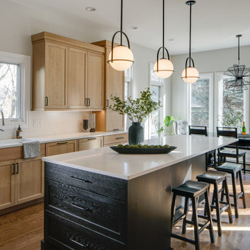
- A functional island: The peninsula was replaced with a large island that provides continuous countertop space for prepping and serving. The island also features seating for four people, creating a central hub for informal meals and activities.
- Streamlined cooktop wall: The soffits were removed, and the upper cabinets on the cooktop wall were eliminated to create a more open, streamlined design. A custom oversized hood became the focal point of the wall, with the blower unit offset inside it to align with the cooktop while maintaining exterior visual symmetry.
- Concealed refrigeration: Two column refrigerators and one freezer were integrated into the cabinetry, concealing them behind wood paneling that blends seamlessly with the overall design.
- Warm black cabinetry: The black cabinetry was crafted from hickory with a visible grain, softening its appearance and adding warmth. The grain detail gives the cabinetry a rich, textured look that avoids feeling stark or overpowering.
- Additional lighting: In the dining area, recessed can lights were added during an additional installation phase to supplement the gorgeous decorative fixture’s dim output. The new lighting plan creates a layered effect, combining functional task lighting with softer ambient lighting.
- Simplified cabinetry details: Slab drawer fronts were used on the upper drawers, while five-piece shaker fronts (with slightly less prominent rail and stile pieces) were reserved for the middle and lower drawers. This approach simplified the overall look while maintaining the craftsman-inspired aesthetic.
- Slab backsplash priority: The slab backsplash was prioritized by making thoughtful adjustments elsewhere, like opting not to extend cabinetry to the ceiling, which also helped visually prioritize the gorgeous slab backsplash. This decision also enhanced the kitchen’s furniture-like feel, aligning with the home’s craftsman character.
- This kitchen perfectly balances practicality with timeless style. By addressing the family’s functional needs — ample seating, smart storage, and effective lighting — while incorporating thoughtful design elements like warm black cabinetry and a striking slab backsplash, Alicia created a space that works beautifully for a busy household. The result is a cohesive, inviting kitchen that honors the home’s craftsman roots and will serve the family well for years to come.

 Attraction Lights
Frank Lloyd Wright inspired design! Design adaptations and photos by Attraction Lights, Lyle Braund
Inspiration for a craftsman landscaping in Minneapolis.
Inspiration for a craftsman landscaping in Minneapolis.
 Gallery KBNY
This renovation in Manhattan placed us within a block of Central Park, delivering a complete overhaul of an ideally-located 1800-square-foot condo. The project was for a young family, whose newly-purchased property is in a post-war building and was in sponsor-condition when we arrived, warranting quite a bit of love. By delivering a complete interior renovation of the apartment, including two bathrooms, kitchen, floors, lighting, and custom millwork, we provided a modern, highly-functional space the family can proudly call home for years to come.
PARENTS NEED SPACE
Storage was the most important factor in this renovation. With a small child ready to rumble at all hours, our clients knew they were going to have all kinds of stuff taking over their space. At the same time, they wanted to be able to have guests come in and not see clutter. Our solution was neatly designed opportunities for storage nestled throughout the apartment.
To start, we created a custom entertainment unit, offering storage below, with open shelves above. Built-in under the living room window is banquette seating with significant storage beneath. Not only does the dual-purpose nook offer areas to store toys galore, the cozy spot offers beautiful windows with views of the shimmering skyline and rooftop gardens, providing practical peace of mind. Every inch of this renovation was designed with intention, so no space is wasted.
UNIQUE KITCHEN DESIGN
There are various custom elements that make this particular NYC kitchen renovation stand-out. While the majority of the apartment has herringbone wood flooring, determination was made that having herringbone in the kitchen would have been way too busy. So, we went with straight planks for the kitchen, blended from the living room with a custom wood flooring design. The straight planks not only look better, they were most cost-effective. Additionally, there’s wood paneling lining the kitchen, accenting the off-white and chestnut cabinets with a touch of luxe. Finally, the quartz backsplash and countertop offer a nice and seamless touch to the overall modern design.
FORWARD-THINKING DESIGN FOR CHILDREN
Our goal with the kid’s bedroom design was to offer a multi-purpose space the child could enjoy and use as needs change over the years. Beyond the playful wallpaper, we provided plenty of timeless built-ins that can be used to store diapers and books early on, while also including a desk space for homework in later years (hopefully).
COMPLIMENTARY BATHROOMS
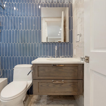
When we renovated the two bathrooms in this Manhattan apartment, our goal was to create similar but distinct designs between the two spaces, that still felt unique in their own right and blended with the rest of the home. The wood vanities incorporate the heavy wood tones from other rooms, while the strong accent tiles on the walls and big, bold marble floor tiling create elegant foundations for each space.
SOME HIGHLIGHTS
- Natural light drop ceilings offer nice recessed lighting throughout the entire apartment
- New doors & new hardware throughout, w/crystal doorknobs in various areas
- Built-in bar to accommodate guests, complete with lights under cabinet and distressed mirrored backsplash
- Plaster crown molding offering a very clean and classic touch throughout the transitional space
Considering an apartment renovation in NYC? We specialize in loft, condo and co-op, brownstone and private home renovations in Manhattan and Brooklyn, specializing in pre-war apartments. When you work with a design-build firm like Gallery to renovate your home, you get the full range of our expertise. We handle every step of the process, from architecture and design to filing permits and organizing schedules to sourcing custom pieces and managing all rounds of the remodel. Contact us today to bring your dream home to life.
 VAULT®
In the Tuscany region of central Italy, a region made famous around the world for its history, landscapes, traditions, artistic legacy and fine wine, perhaps nothing is more universally recognized than the old world villa’s that are nestled into the rolling countryside. Standing at approximately 10,500 square feet, this custom residence has all of the elegance, style and craftsmanship of those old world homes, but with all of the modern amenities of a new modern luxury home. This stunning residence was recognized by the National Association of Home Builders (NAHB) as the best custom built home in the country in 2010, a testament to the skillful designers and craftsmen who brought the homeowners vision into reality.
When Chad Haas, Founder of VAULT (www.vaultgarage.com), a company that prides itself in furnishing some of the most beautiful garages in the world, was brought into the project, the home and garage had already been built. The accolades of the gorgeous villa already awarded. But the homeowner felt that the exterior and interior of the garage lacked architectural harmony with the rest of the home and so he flew Mr. Haas out to visit the space directly so that he could assist hands-on with re-designing a new look and to add furnishings to accessories the space.
“When I first approached the villa from the street, I knew that I’d have my work cut out for me. Everything looked so perfect exactly the way it was designed and built. I questioned myself ‘how was I going to improve upon perfection?’, since remarkable attention was paid to even the smallest of details in the home” asked Haas.
The client’s goal was to engage Haas to design and furnish a garage where he could relax, separate from the home, enjoy his growing car collection and entertain family and friends.
After spending a short weekend together with the home owner to gather his ideas, Haas returned back to his Beaverton, Oregon-based company with a clearer vision: create the ultimate gentlemen’s retreat through the look of a turn-of-a-century Tuscan ‘car barn’.
Absolutely nothing in the garage was overlooked – and it shows. Every design element in the garage for color, texture and material was meticulously thought out to elicit just the right feeling and emotion in everyone that enters what may be one of the most beautifully elegant garages in America, a space commonly overlooked in the construction of homes today.
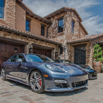
A main focal point of the exterior of garage is the beautiful view from the courtyard, where all three carriage doors can be seen. While the existing wood doors looked acceptable, it was agreed that something more befitting of the quality and beauty of the home were appropriate. Haas designed luxurious castle-style doors handcrafted from solid Mahogany and bathed in a rich dark brown stain that was complemented by hand-wrought iron grills, clavos and door pull hardware. The double-wide door, in particular, is truly remarkable in both its elegance, as well as its one-of-a-kind operation. “The client was concerned in this area of having mounting hardware and a motor on the ceiling. Because the cars in this area do not get brought out on a regular (daily) basis, the doors open manually by hand and operate accordion style on a track”. The homes main overhead garage doors feature jack-shaft operation which removes the clutter of a motor on the garage ceiling, but offers the convenience of powered operation. These extraordinary, custom-made castle doors look just as beautiful on the inside as the out and their unparalleled design and craftsmanship take the exterior of the home to even greater heights than before.
On to the interior, a black and white epoxy coating was stripped and replaced with porcelain tiles that resembled Italian travertine stone. To give the car barn a rustic feeling and a presence that it was older, not modern, Haas worked on the development and concept directly with the home owner to collaborate with a local millwork company that designed and hand-finished substantial wood beams from distressed Doug Fir. All of the walls were hand-plastered by a local artist using straw that was harvested from the immediate area surrounding the home and incorporated into the plaster to give it a rustic antique quality.
Haas conceived and designed a bar area and cabinetry for a work area that pulled inspiration from old ice boxes of the 1920’s that utilized heavy nickel-plated hardware, again to give storage spaces a rustic appearance.
The warm glow from several custom porcelain neon signs, each one meticulously built entirely by hand by VAULT, are dispersed throughout the space and transform the entire room and bring it to life. The client had never previously owned a neon sign before and along with the carriage doors felt that these items have transformed the space more than any other feature. Several antique gas pumps, restored in the client’s favorite petro bran, and a few additional porcelain signs will eventually furnish the rest of the space to complement the clients amazing car collection.
In addition to the countless details that set this showcase garage apart, its ability to seamlessly blend with the rest of the home and the natural, rustic setting of the Colorado Rockies, yet house modern automobiles in a manner in which they feel well placed and belong, is also noteworthy.
GARAGE DESIGN & FURNISHINGS
To learn more about VAULT visit them at: http://www.vaultgarage.com/
And on Facebook: http://www.facebook.com/VaultGarage
PHOTOGRAPHY
All photographs were used with the permission of photographer John Vanderpool (john.vanderpool5@gmail.com)
You can visit John Vanderpool on Facebook at: https://www.facebook.com/JVanderpoolPhotography
ARCHITECTURE
Jerry Gloss, Principal, KGA Architects: http://www.kgarch.com/
HOMEBUILDER
Thomas Sattler Home: http://thomassattlerhomes.com/
VEHICLES
Here is an overview of the cars that were photographed in this article:
1. 2014 Ferrari 458 Italia
2. 2013 Maserati GranTurismo Sport
3. 2007 Porsche 911 GT3 RS (997)
4. 2008 Porsche Cayenne GTS
5. 2008 Porsche GT3 RS
6. 2013 Porsche 911 Turbo S (997)
7. 2014 Porsche Panamera GTS
8. 2013 Ford SVT Raptor (6.2L CrewCab)’
Overview of project reprinted with permission of DuPont Registry.
Sponsored
Delaware, OH

Buckeye Basements, Inc.
Central Ohio's Basement Finishing ExpertsBest Of Houzz '13-'21
 Gallery KBNY
This renovation in Manhattan placed us within a block of Central Park, delivering a complete overhaul of an ideally-located 1800-square-foot condo. The project was for a young family, whose newly-purchased property is in a post-war building and was in sponsor-condition when we arrived, warranting quite a bit of love. By delivering a complete interior renovation of the apartment, including two bathrooms, kitchen, floors, lighting, and custom millwork, we provided a modern, highly-functional space the family can proudly call home for years to come.
PARENTS NEED SPACE
Storage was the most important factor in this renovation. With a small child ready to rumble at all hours, our clients knew they were going to have all kinds of stuff taking over their space. At the same time, they wanted to be able to have guests come in and not see clutter. Our solution was neatly designed opportunities for storage nestled throughout the apartment.
To start, we created a custom entertainment unit, offering storage below, with open shelves above. Built-in under the living room window is banquette seating with significant storage beneath. Not only does the dual-purpose nook offer areas to store toys galore, the cozy spot offers beautiful windows with views of the shimmering skyline and rooftop gardens, providing practical peace of mind. Every inch of this renovation was designed with intention, so no space is wasted.
UNIQUE KITCHEN DESIGN
There are various custom elements that make this particular NYC kitchen renovation stand-out. While the majority of the apartment has herringbone wood flooring, determination was made that having herringbone in the kitchen would have been way too busy. So, we went with straight planks for the kitchen, blended from the living room with a custom wood flooring design. The straight planks not only look better, they were most cost-effective. Additionally, there’s wood paneling lining the kitchen, accenting the off-white and chestnut cabinets with a touch of luxe. Finally, the quartz backsplash and countertop offer a nice and seamless touch to the overall modern design.
FORWARD-THINKING DESIGN FOR CHILDREN
Our goal with the kid’s bedroom design was to offer a multi-purpose space the child could enjoy and use as needs change over the years. Beyond the playful wallpaper, we provided plenty of timeless built-ins that can be used to store diapers and books early on, while also including a desk space for homework in later years (hopefully).
COMPLIMENTARY BATHROOMS
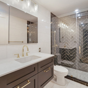
When we renovated the two bathrooms in this Manhattan apartment, our goal was to create similar but distinct designs between the two spaces, that still felt unique in their own right and blended with the rest of the home. The wood vanities incorporate the heavy wood tones from other rooms, while the strong accent tiles on the walls and big, bold marble floor tiling create elegant foundations for each space.
SOME HIGHLIGHTS
- Natural light drop ceilings offer nice recessed lighting throughout the entire apartment
- New doors & new hardware throughout, w/crystal doorknobs in various areas
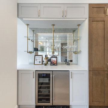
- Built-in bar to accommodate guests, complete with lights under cabinet and distressed mirrored backsplash
- Plaster crown molding offering a very clean and classic touch throughout the transitional space
Considering an apartment renovation in NYC? We specialize in loft, condo and co-op, brownstone and private home renovations in Manhattan and Brooklyn, specializing in pre-war apartments. When you work with a design-build firm like Gallery to renovate your home, you get the full range of our expertise. We handle every step of the process, from architecture and design to filing permits and organizing schedules to sourcing custom pieces and managing all rounds of the remodel. Contact us today to bring your dream home to life.
 Gallery KBNY
This renovation in Manhattan placed us within a block of Central Park, delivering a complete overhaul of an ideally-located 1800-square-foot condo. The project was for a young family, whose newly-purchased property is in a post-war building and was in sponsor-condition when we arrived, warranting quite a bit of love. By delivering a complete interior renovation of the apartment, including two bathrooms, kitchen, floors, lighting, and custom millwork, we provided a modern, highly-functional space the family can proudly call home for years to come.
PARENTS NEED SPACE
Storage was the most important factor in this renovation. With a small child ready to rumble at all hours, our clients knew they were going to have all kinds of stuff taking over their space. At the same time, they wanted to be able to have guests come in and not see clutter. Our solution was neatly designed opportunities for storage nestled throughout the apartment.
To start, we created a custom entertainment unit, offering storage below, with open shelves above. Built-in under the living room window is banquette seating with significant storage beneath. Not only does the dual-purpose nook offer areas to store toys galore, the cozy spot offers beautiful windows with views of the shimmering skyline and rooftop gardens, providing practical peace of mind. Every inch of this renovation was designed with intention, so no space is wasted.
UNIQUE KITCHEN DESIGN
There are various custom elements that make this particular NYC kitchen renovation stand-out. While the majority of the apartment has herringbone wood flooring, determination was made that having herringbone in the kitchen would have been way too busy. So, we went with straight planks for the kitchen, blended from the living room with a custom wood flooring design. The straight planks not only look better, they were most cost-effective. Additionally, there’s wood paneling lining the kitchen, accenting the off-white and chestnut cabinets with a touch of luxe. Finally, the quartz backsplash and countertop offer a nice and seamless touch to the overall modern design.
FORWARD-THINKING DESIGN FOR CHILDREN
Our goal with the kid’s bedroom design was to offer a multi-purpose space the child could enjoy and use as needs change over the years. Beyond the playful wallpaper, we provided plenty of timeless built-ins that can be used to store diapers and books early on, while also including a desk space for homework in later years (hopefully).
COMPLIMENTARY BATHROOMS
When we renovated the two bathrooms in this Manhattan apartment, our goal was to create similar but distinct designs between the two spaces, that still felt unique in their own right and blended with the rest of the home. The wood vanities incorporate the heavy wood tones from other rooms, while the strong accent tiles on the walls and big, bold marble floor tiling create elegant foundations for each space.
SOME HIGHLIGHTS
- Natural light drop ceilings offer nice recessed lighting throughout the entire apartment
- New doors & new hardware throughout, w/crystal doorknobs in various areas
- Built-in bar to accommodate guests, complete with lights under cabinet and distressed mirrored backsplash
- Plaster crown molding offering a very clean and classic touch throughout the transitional space
Considering an apartment renovation in NYC? We specialize in loft, condo and co-op, brownstone and private home renovations in Manhattan and Brooklyn, specializing in pre-war apartments. When you work with a design-build firm like Gallery to renovate your home, you get the full range of our expertise. We handle every step of the process, from architecture and design to filing permits and organizing schedules to sourcing custom pieces and managing all rounds of the remodel. Contact us today to bring your dream home to life.
 Aardvark Architecture
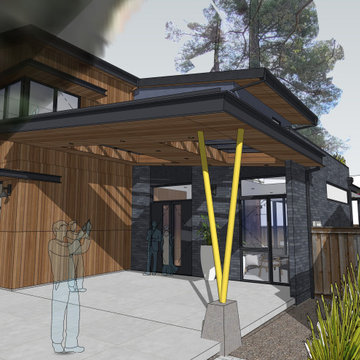
This proposal is for a new two-story home on the vacant heavily wooded lot with an existing 150-foot-long driveway lined by several beautiful oak trees culminating in a behemoth 43-inch oak tree where the driveway meets the main lot. The far end of the driveway terminates in a grove of three 43/40/43-inch redwoods and at the very center of the vacant lot stands a gargantuan V-twin 59-inch redwood tree paired with a “small” 29-inch redwood tree. The owners want to build a beautiful contemporary-styled home for their family that fully enjoys and embraces the mature trees on their cozy 65-foot by 100-foot lot.
As with all small, constrained lots, this project’s site design started first with meeting the relatively large parking and car maneuvering requirements. Menlo Park’s Department of Transportation typically requires side-facing garages to have 24-feet of backup space. So that they could give the largest feature redwood tree on site an added four feet (50%) of clearance outside of its critical root zone, the owners agreed to install a vehicle turntable at the end of their driveway to eliminate the extra four feet of space needed to back up and turnaround. This allowed them to pull their garage forward an additional four feet towards the front property line on the panhandle side, drastically reducing the rest of the home’s impact on the gargantuan V-Twin paired redwood tree at the center of the lot.
One of the owners has mobility issues, and accordingly, they first sought to design a one-story floor plan that incorporated all their family’s needs including plenty of covered patio and deck space to enjoy our fantastic California weather. But that single-story footprint spread too far into the critical root zones of several of the redwood trees on site, even despite the use of the vehicle turntable. During my interview process with the owners, they made it clear to me that one of their primary concerns is ensuring that the largest trees on site would thrive and become features of their new home after construction is complete. The single-story designs that removed the grove of three huge redwood trees were non-starters, as was the skimpy 5x10 master bath I designed when trying to squeeze the whole house program into an overly compromised single-story design. It was therefore deemed necessary to go with a two-story design despite the owner’s mobility issues. This two-story design has a much more compact ground floor footprint and has no bedrooms downstairs, other than the detached ADU. The owners must give up the floor area and incur the costs to install a residential elevator to access their upstairs master suite.
Our ground floor footprint is smaller due to the two-story design decision, and our foundation is pulled away from the trees thanks to the vehicle turntable. Yet, a tiny portion of the home’s ground floor footprint still encroaches into the critical root zones of the largest 59” redwood tree. Therefore, as outlined in the Arborist Report prepared by Aesculus Arboricultural Consulting, the structural engineers are incorporating an array of drilled piers and shallow-grade beams for the main home’s foundation and deck area nearest the redwood’s critical root zone. This drilled piers and grade beam foundation is a type of “bridging” foundation as outlined in Aesculus’ report to preserve the health of these trees that the property was designed around. The rest of the foundation will be constructed as an insulated slab-on-grade foundation to minimize the number of steps and ramps needed for the owners to enjoy their home and patio areas.
Despite the owner’s desire to keep as many trees as possible on site, and despite the smaller ground floor footprint and the advantage of the vehicle turntable, the need for a 20x20-foot garage and 20x20/25-foot guest parking space on our panhandle lot requires the removal of two heritage trees in the required driveway, a 16” coast redwood, and a 17” coast redwood. An alternate design, such as swapping the garage and guest parking locations north-to-south, still requires the removal of these two trees for vehicle maneuvering but has the added disadvantage of cutting off the home’s sightlines to the behemoth 43” oak tree just outside the currently proposed front patio space and living room. Jim Redman of Elements Landscape is proposing 13 new trees be planted on site to replace the lost value of these two heritage coast redwood trees.
This contemporary architectural design features clean lines, and an abundance of full-height windows and large skylights to best take in the immense trees on site. To blend in with the forest-like setting, the home boasts a mix of rich textures and features a color palette of natural wood tones contrasted with dark blue and black. Once through the new steel gate at the street and down the 150-foot tree-lined driveway, a large covered front patio becomes visible past the neighbor’s detached accessory structure. The covered patio is just across the driveway from the beautiful 43” behemoth coast live oak. The single plane of the covered patio roof is delicately supported by a pair of steel posts in a “V-twin” configuration much like the largest redwood trees that tower over the center of the lot and will still be visible above the new two-story home, even from the front yard. The patio is covered in a dark-colored standing seam roof, with steel C-channel fascias, and tongue-and-groove wood ceiling planks on the underside. Generously sized skylights on the patio roof and inside the living area allow for impressive views of the amazing oak canopy as well as precious natural light.
Supporting the sloped covered patio on the other side is the two-car garage with a secondary bedroom suite stacked above the garage. This two-story volume is to be clad in vertical clear-coated redwood siding, to tie in with the grove of three 43-inch redwood trees just beyond. The garage door, and the bank of windows for Bedroom#2 above feature a steel fascia eyebrow header feature to provide shade and overhang protection, as we are not proposing a large overhang at this “redwood trunk”. The garage and bedroom volume are pulled 16 feet away from the side property line, instead of the minimum required setback of 6’-6”, thus leaving plenty of room for the redwood grove and existing mature pear tree to continue to thrive. This existing mature green screen in this 16-foot-wide side yard is a feature worth soaking in, which is why tall windows with low sill heights are proposed for both the stairs and the upstairs hallway. Though it may be infrequent to approve side-facing 2nd floor windows with sill heights as low as what we’re proposing, we are confident that the mature green screen and the over 16-foot-wide side yard are sufficient to provide for the continued privacy of our neighbor’s rear yard space, especially considering theses windows are in walkway zones.
The covered patio at the front entry is also bound by the 10-foot-tall living room. The great room is clad in a dark blue brick veneer, which wraps around all three sides of the living room. Upon entering the home from the covered patio, you are immediately greeted with one of the most impressive features of the home’s design: a 10-foot-tall by 24-foot-wide set of sliding glass doors. From the entry, this huge opening gives merely an initial glimpse of the massive trunks of the gargantuan V-twin redwoods sitting at the center of the lot. All three sliding glass panels open directly out into the smaller partially covered deck in the rear. This roof overhang element matches the design of the front patio with a steel C-channel fascia and a large skylight. But the rear deck’s roof element is set flat at a ten-foot ceiling height so that the living room’s ceiling seems to float above and out beyond the expanse of full-height sliding doors, thus creating an indoor-outdoor living space that will feel much larger than the home’s actual footprint. This rear covered deck is smaller than the patio in the front and also has a mix of solid and open-slatted roofing to allow for more solar access for the relatively small amount of open sky available.
The downstairs living room is open to the dining and kitchen areas, as well as the stair-and-elevator tower beyond. The stair tower is very open and glassy, and the stairs wind up and around the redwood-clad elevator tower. From certain perspectives in the 16-foot-wide side yard, it will almost seem as if the grove of three redwoods has a fourth tree that the house and the stairs were carefully built around. Other than the 3-foot-wide windows, the exterior walls of the stair tower, downstairs utility spaces, and Bedroom#3 above are finished in cement plaster, painted dark blue and black. The sloped roof over the stair-and-elevator tower continues cleanly over the area of upstairs Bedroom#3. This roof level is set by the side daylight plane and only yields an inside wall height of just under 6 feet in height. The owners are satisfied that the rest of this upstairs room has a nice vaulted ceiling to make up for the one short wall under the daylight plane.
The rest of the ground floor adjacent to the stair tower consists of a small utility wing containing a half-bath, laundry, storage area, and an exterior alcove for the electric heat pump HVAC unit. This short wing also gives more accessible access to the rear yard deck, as well as a backdrop for an outdoor kitchen. The bright white stone backsplash for the outdoor kitchen provides contrast to the otherwise consistent use of cement plaster painted dark blue and black for the two-story wing closest to the detached ADU. Though Bedroom#3 is stacked directly above this small wing, it is relatively short to comply with the side daylight plane of this narrow lot. Still, to further help break up the scale of this wall, another steel fascia eyebrow element is set about 8 feet above the rear deck.
The master suite sits centered above the ten-foot-tall great room. The master bedroom and its balcony, as well as the master bathtub area, have a commanding view of the central redwood trees and their impressive canopy, though the balcony is mostly recessed and should pose no privacy concerns to the neighbor’s rear yards. The master balcony parapet is clad in the same brick veneer continuing up from the living room below. A dark-painted metal rail makes up the rest of the open guardrail height. The entire length of the master balcony is comprised of 9-foot-tall sliding glass doors, but the area above the doors, as well as the area below the master bathroom windows, is accented with more redwood siding. The remainder of the master suite bathroom and walk-in closet is finished in cement plaster painted dark blue. The master bathroom has one side yard-facing window but will be frosted glass for both the owner’s and the neighbor’s privacy.
The 2nd floor is capped under a simple gable roof design with one roof ridge and varying eave and rake overhangs depending on the 2nd-floor layout and solar orientation. Since these roof planes are quite difficult to see in the middle of the heavily wooded panhandle lot, we are proposing a white TPO roofing for these two upper roof planes as a more sustainable choice compared to more dark-colored roofing like the covered patios and detached ADU.
The owners also wish to build a detached 292-square-foot Accessory Dwelling Unit (ADU) as an office and guest suite. For the ADU foundation to be situated outside the central redwood tree’s critical root zone, this relatively tiny structure takes advantage of the narrower 4-foot side and rear setbacks allowed for ADUs smaller than 800 square feet. The small L-shaped detached ADU frames a wonderful quasi-courtyard around the gargantuan V-twin redwoods at the center of the lot. The ADU shares a matching material palette consisting of cement plaster painted blue and black, vertical redwood siding and soffits, and thin brick veneer. The ADU also features large full-height windows. The only difference between the main home and the ADU material palette is that the roofing will be a dark composition shingle roofing since it will be quite visible from the master balcony.
201