
Search results for "Challenges easier" in Home Design Ideas
 room2improve
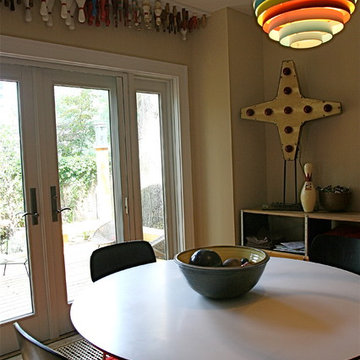
This was a fun and challenging consultation. The client wanted to show off her fun and eclectic collections of vintage and found pieces. The vintage blowing pin collection was wonderful, but hard to display and even harder to dust. We suggested suspending them over the French doors leading to the deck. This eliminated the need for more surface space in a small area and made dusting them so much easier. And we suggested using a round dining table for ease of traffic as the dining table was close to the French doors. This fun space was featured in two Magazine articles.
 Rodwin Architecture & Skycastle Construction
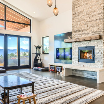
Located at the top of Flagstaff Rd., this new 4,700sf. mountain modern home embodies all there is to enjoy about Colorado. The owners love animals – and their bustling foothills ranch includes horses, dogs, cats and a couple of two footed little ones. Staying connected to nature was paramount to the owners. The home sits on a magnificent, private 35 acre property adjacent to Open Space, and covered in Doug Fir, beautiful rock outcroppings and open pastures. The house gracefully steps down the challenging terrain, stitching it into the hillside. This passive solar home is oriented to the epic views to the south. The soaring Great room, dining room and kitchen open out onto a giant covered porch for the ultimate in indoor/outdoor living. The open floor plan allows sunlight and views from every direction. The gourmet kitchen can accommodate the whole family and is filled with custom details.
Making life a little easier and more organized for the owners, they enter from the garage through a hard-working mud room/laundry with dog wash. The family dogs are a central part of their lives and the owner asked that we design bespoke kennels built-into the live-edge, Doug Fir slab casework in the dining room, so that the dogs could be with the family during meals, without giant plastic crates dominating the room.
The home is filled with custom details like built-in art niches in the Great Room, a unique front entry porch, and cozy window seats in the kid’s bedrooms.
Below a unique Aspen leaf chandelier, follow the stone walled stairwell down to the walk-out basement. The lower level includes a guest room, exercise room, a rec room/media room with wet-bar, and opens to a hot tub and a mountain lion-safe outdoor dog run.
The house is divided into three parts: the detached garage, the main social spaces + guest & kids bedrooms, and the Primary bedroom suite.
From the Great Room, the owners cross a dramatic glass bridge to reach the primary suite, giving a sense of privacy to this special retreat. The primary bedroom has a window seat, magical views, vaulted ceilings, its own private covered patio, and a barn door to the bathroom. The primary bathroom has a striking slot window between the floating vanities, again connecting the owners to nature at every turn. The sculptural soaking tub sits on an elevated plinth in a recessed nook – ideal for watching the deer, elk, moose, coyotes, raptors, turkeys, foxes, bears and mountain lions walk by.
The property also boasts a detached horse barn and hay barn, and an outdoor riding ring.
The near-Net-Zero (HERS 10) home’s green features include a ground source heat pump, 10KwH of solar photovoltaics, an ERV, foam insulation, and Energy Star windows. The native landscaping conserves water and minimized disruption to the idyllic site.
 Advance Design Studio, Ltd.
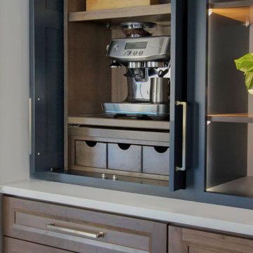
Our clients in Tower Lakes, IL, needed more storage and functionality from their kitchen. They were primarily focused on finding the right combination of cabinets, shelves, and drawers that fit all their cookware, flatware, and appliances. They wanted a brighter, bigger space with a natural cooking flow and plenty of storage. Soffits and crown molding needed to be removed to make the kitchen feel larger. Redesign elements included: relocating the fridge, adding a baking station and coffee bar, and placing the microwave in the kitchen island.
Advance Design Studio’s Claudia Pop offered functional, creative, and unique solutions to the homeowners’ problems. Our clients wanted a unique kitchen that was not completely white, a balance of design and function. Claudia offered functional, creative, and unique solutions to Chad and Karen’s kitchen design challenges. The first thing to go was soffits. Today, most kitchens can benefit from the added height and space; removing soffits is nearly always step one. Steely gray-blue was the color of choice for a freshly unique look bringing a sophisticated-looking space to wrap around the fresh new kitchen. Cherry cabinetry in a true brown stain compliments the stormy accents with sharp contrasting white Cambria quartz top balancing out the space with a dramatic flair.
“We wanted something unique and special in this space, something none of the neighbors would have,” said Claudia.
The dramatic veined Cambria countertops continue upward into a backsplash behind three complimentary open shelves. These countertops provide visual texture and movement in the kitchen. The kitchen includes two larder cabinets for both the coffee bar and baking station. The kitchen is now functional and unique in design.
“When we design a new kitchen space, as designers, we are always looking for ways to balance interesting design elements with practical functionality,” Claudia said. “This kitchen’s new design is not only way more functional but is stunning in a way a piece of art can catch one’s attention.”
Decorative mullions with mirrored inserts sit atop dual sentinel pantries flanking the new refrigerator, while a 48″ dual fuel Wolf range replaced the island cooktop and double oven. The new microwave is cleverly hidden within the island, eliminating the cluttered counter and attention-grabbing wall of stainless steel from the previous space.
The family room was completely renovated, including a beautifully functional entertainment bar with the same combination of woods and stone as the kitchen and coffee bar. Mesh inserts instead of plain glass add visual texture while revealing pristine glassware. Handcrafted built-ins surround the fireplace.
The beautiful and efficient design created by designer Claudia transitioned directly to the installation team seamlessly, much like the basement project experience Chad and Karen enjoyed previously.
“We definitely will and have recommended Advance Design Studio to friends who are looking to embark on a project small or large,” Karen said.
“Everything that was designed and built exactly how we envisioned it, and we are really enjoying it to its full potential,” Karen said.
Our award-winning design team would love to create a beautiful, functional, and spacious place for you and your family. With our “Common Sense Remodeling” approach, the process of renovating your home has never been easier. Contact us today at 847-665-1711 or schedule an appointment.
Find the right local pro for your project
 Advance Design Studio, Ltd.
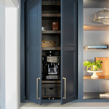
Our clients in Tower Lakes, IL, needed more storage and functionality from their kitchen. They were primarily focused on finding the right combination of cabinets, shelves, and drawers that fit all their cookware, flatware, and appliances. They wanted a brighter, bigger space with a natural cooking flow and plenty of storage. Soffits and crown molding needed to be removed to make the kitchen feel larger. Redesign elements included: relocating the fridge, adding a baking station and coffee bar, and placing the microwave in the kitchen island.
Advance Design Studio’s Claudia Pop offered functional, creative, and unique solutions to the homeowners’ problems. Our clients wanted a unique kitchen that was not completely white, a balance of design and function. Claudia offered functional, creative, and unique solutions to Chad and Karen’s kitchen design challenges. The first thing to go was soffits. Today, most kitchens can benefit from the added height and space; removing soffits is nearly always step one. Steely gray-blue was the color of choice for a freshly unique look bringing a sophisticated-looking space to wrap around the fresh new kitchen. Cherry cabinetry in a true brown stain compliments the stormy accents with sharp contrasting white Cambria quartz top balancing out the space with a dramatic flair.
“We wanted something unique and special in this space, something none of the neighbors would have,” said Claudia.
The dramatic veined Cambria countertops continue upward into a backsplash behind three complimentary open shelves. These countertops provide visual texture and movement in the kitchen. The kitchen includes two larder cabinets for both the coffee bar and baking station. The kitchen is now functional and unique in design.
“When we design a new kitchen space, as designers, we are always looking for ways to balance interesting design elements with practical functionality,” Claudia said. “This kitchen’s new design is not only way more functional but is stunning in a way a piece of art can catch one’s attention.”
Decorative mullions with mirrored inserts sit atop dual sentinel pantries flanking the new refrigerator, while a 48″ dual fuel Wolf range replaced the island cooktop and double oven. The new microwave is cleverly hidden within the island, eliminating the cluttered counter and attention-grabbing wall of stainless steel from the previous space.
The family room was completely renovated, including a beautifully functional entertainment bar with the same combination of woods and stone as the kitchen and coffee bar. Mesh inserts instead of plain glass add visual texture while revealing pristine glassware. Handcrafted built-ins surround the fireplace.
The beautiful and efficient design created by designer Claudia transitioned directly to the installation team seamlessly, much like the basement project experience Chad and Karen enjoyed previously.
“We definitely will and have recommended Advance Design Studio to friends who are looking to embark on a project small or large,” Karen said.
“Everything that was designed and built exactly how we envisioned it, and we are really enjoying it to its full potential,” Karen said.
Our award-winning design team would love to create a beautiful, functional, and spacious place for you and your family. With our “Common Sense Remodeling” approach, the process of renovating your home has never been easier. Contact us today at 847-665-1711 or schedule an appointment.
 Drury Design
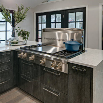
Entertaining and bringing people together is what this family is all about. Birthdays involve amazing cakes like you see on those TV shows, and groups of 30 people or more. Their ideal kitchen needed to accommodate that level of baking and hosting, but also support the daily rhythms of life.
Our collaborative design was guided by Vastu Shastra, an ancient architectural tradition that predates feng shui. Based on Vedic traditions that harmonize human behavior with natural forces in the world, Vastu Shanstra basically suggests how to inhabit a place in the best way possible.
The objectives were:
-Relocate the entire kitchen so the home’s heat source (oven) is in the southeast
-Incorporate symmetry into the overall design
-Create a large space for entertaining – open and airy with lots of light
-Simultaneously separate but join cooking and gathering spaces, allowing the cook to have a cook-specific zone that is still a part of any gathering
-Individual storage for small appliances – making them easier to use
-Simplicity – the space should be easy to use and maintain
Design challenges we solved for:
-Incorporate three load bearing points of the house
-Provide structural support that was not obvious
-Reconfigure kitchen utilities to another part of the home
-Maximize storage space
Design solutions and mindful innovations became an exciting motivation that drove the project:
-Double-horseshoe design features two symmetrical islands that seat 18 people comfortably
-Downdraft ventilation behind rangetop allows unobstructed views
-Overhead beams for structural support
-Equip nearby dining room with locking bar and wine cabinet
-Roll-out appliance shelves on back of cooking island are powered for easy use
-Symmetrical fridge and freezer columns separated by oven
-Cabinets along back of the cooking area for everyday items
-Tall pantry cabinet has four drawers for paperwork
-Spacious walk-in storage pantry has a counter with power outlets
-Coffee station has a trash can directly below for easy clean up
-Two sinks and dishwashers for easy cleanup
“A lot of relationships are built over food,” the homeowner told us. “This [kitchen] keeps our family close because we all love food. My kids sit in the kitchen all evening long every day – and I’m right there cooking. That’s life –to be together.”
We also collaborated with the homeowners to remodel their primary bathroom, primary bedroom closet and an additional bathroom.
 ALL Renovation & Design LLC
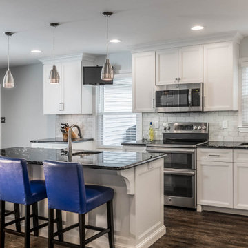
The old Bauman kitchen was terribly partitioned off. The laundry room and closet left a narrow hallway between the kitchen and the dining room. The Bauman’s really wanted an open space.
They connected with ALL Renovation & Design at a home show. And we immediately got to work modifying the existing space. This proved to be a challenge because there was almost nowhere for the ductwork that fed the upstairs to go. But with some creative planning, we rerouted the ducts to go inside the cabinet next to the wine rack. This allowed us to knock out the walls that separated the kitchen and the dining room giving a beautiful open space.
The homeowner had several requests that were designed to make their daily life easier. One was adding a second sink to the island. Another request was extending the kitchen past the window to allow for more cabinets and counter space. In between, we added a comfortable window seat.All the lighting was designed around how the space was going to be used. An example is how where the table was going to be positioned in the dining room next to the pantry and custom wine rack dictated where the ceiling fan and recessed lighting would be installed.The result is a beautiful, functional space that is completely open… just what the Bauman’s wanted.
Maple cabinets painted Simply White, Via Lactea Granite countertops, Arley Anatolia Classic 3”x6” tile backsplash in the Matte Carrara with the Mapei Pewter grout, Coretech Georgetown Oak Luxury Vinyl Tile flooring, and LED i-Lighting undercabinet lighting.
 Aquatica Plumbing Group
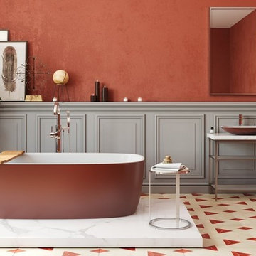
Coletta freestanding stone bathtub was designed with easy access as the principle advantage. The low profile walls of only 19.75” in height make it easier for older and physically challenged bathers such as those suffering from arthritis, to get in and out of the bathtub easily. Combining the low height feature and our firm yet smooth Aquatex material, the Coletta is a unique low step-in bathtub which puts it far ahead of the flimsy and obsolete looking competitor models found on the market.
Coletta – a charming bathtub of contrasts:
The Coletta freestanding bathtub is a wonderful paradox of contrasts. Large-scale capacity combines with elegance thanks to the carefully designed, fluid transition of the bath rim from very narrow to usefully wide. Its charm is further enhanced by the slightly tapered, narrower bath base, which looks delicate yet is very much in harmony with the rest of the design.
A small wooden masterpiece for a great number of Aquatica tubs
A stunning take on the traditional bathtub tray, this new bathtub tray incorporates the rich, warm tones of pure, solid, natural wood crafted in a very modern, uber chic design that exudes style. This is the ideal accessory for the most of Aquatica's bathtubs, as it reflects the same interpretation of the function in cleverly designed and beautifully rendered form. The solid wood balance and excellent strength. The overall size - 36.25 "x 8.25" (92 x 21 cm) gives you plenty of room to put all your bathing essentials right at hand. The wood used for this bathtub tray is 100% natural and has been treated with a teak oil to ensure waterproof impermeability and long life. It drains and self-dries freely. Can be made of Teak or Iroko wood upon request.
Integrated slot overflow brings sleek minimalistic design appeal, increased water depth, improved ergonomics, simpler and lower cost maintenance.


 Stearns Design Build
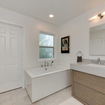
Before the remodel, this bathroom was not functional at all! It was a large space that felt very crowded, so our intention was to increase the size and maximize the space. Everything in this bathroom was cramped together and let’s not forget the awful phonebooth shower. (fingers crossed phonebooth showers stay in the past!) Collectively, we set out to re-envision a bathroom that is functional and relaxing.
In most cases, it’s difficult to accomplish everything on your wish list. By splitting up the double sinks and putting the shower in between the two, it made maneuvering around this bathroom much easier. Before this bathroom had a ton of wasted space and while it was a challenge; we were thrilled with the final design and outcome.

 J Design Group - Interior Designers Miami - Modern
AVENTURA MAGAZINE selected our client’s luxury 5000 Sf ocean front apartment in Miami Beach, to publish it in their issue and they Said:
Story by Linda Marx, Photography by Daniel Newcomb
Light & Bright
New York snowbirds redesigned their Miami Beach apartment to take advantage of the tropical lifestyle.
WHEN INTERIOR DESIGNER JENNIFER CORREDOR was asked to recreate a four-bedroom, six-bath condominium at The Bath Club in Miami Beach, she seized the opportunity to open the rooms and better utilize the vast ocean views.
In five months last year, the designer transformed a dark and closed 5,000-square-foot unit located on a high floor into a series of sweeping waterfront spaces and updated the well located apartment into a light and airy retreat for a sports-loving family of five.
“They come down from New York every other weekend and wanted to make their waterfront home a series of grand open spaces,” says Corrredor, of the J. Design Group in Coral Gables, a firm specializing in modern and contemporary interiors. “Since many of the rooms face the ocean, it made sense to open and lighten up the home, taking advantage of the awesome views of the sea and the bay.”
The designer used 40 x 40 all white tile throughout the apartment as a clean base. This way, her sophisticated use of color would stand out and bring the outdoors in.
The close-knit family members—two parents and three boys in college—like to do things together. But there were situations to overcome in the process of modernizing and opening the space. When Corredor was briefed on their desires, nothing seemed too daunting. The confident designer was ready to delve in. For example, she fixed an area at the front door
that was curved. “The wood was concave so I straightened it out,” she explains of a request from the clients. “It was an obstacle that I overcame as part of what I do in a redesign. I don’t consider it a difficult challenge. Improving what I see is part of the process.”
She also tackled the kitchen with gusto by demolishing a wall. The kitchen had formerly been enclosed, which was a waste of space and poor use of available waterfront ambience. To create a grand space linking the kitchen to the living room and dining room area, something had to go. Once the wall was yesterday’s news, she relocated the refrigerator and freezer (two separate appliances) to the other side of the room. This change was a natural functionality in the new open space. “By tearing out the wall, the family has a better view of the kitchen from the living and dining rooms,” says Corredor, who also made it easier to walk in and out of one area and into the other. “The views of the larger public space and the surrounding water are breathtaking.
Opening it up changed everything.”
They clients can now see the kitchen from the living and dining areas, and at the same time, dwell in an airy and open space instead of feeling stuck in a dark enclosed series of rooms. In fact, the high-top bar stools that Corredor selected for the kitchen can be twirled around to use for watching TV in the living room.
In keeping with the theme of moving seamlessly from one room to the other, Corredor designed a subtle wall of glass in the living room along with lots of comfortable seating. This way, all family members feel at ease while relaxing, talking, or watching sporting events on the large flat screen television. “For this room, I wanted more open space, light and a supreme airy feeling,” she says. “With the glass design making a statement, it quickly became the star of the show.”…….
….. To add texture and depth, Corredor custom created wood doors here, and in other areas of the home. They provide a nice contrast to the open Florida tropical feel. “I added character to the openness by using exotic cherry wood,” she says. “I repeated this throughout the home and it works well.”
Known for capturing the client’s vision while adding her own innovative twists, Corredor lightened the family room, giving it a contemporary and modern edge with colorful art and matching throw pillows on the sofas. She added a large beige leather ottoman as the center coffee table in the room. This round piece was punctuated with a bold-toned flowering plant atop. It effortlessly matches the pillows and colors of the contemporary canvas.
Miami,
Miami Interior Designers,
Miami Interior Designer,
Interior Designers Miami,
Interior Designer Miami,
Modern Interior Designers,
Modern Interior Designer,
Modern interior decorators,
Modern interior decorator,
Contemporary Interior Designers,
Contemporary Interior Designer,
Interior design decorators,
Interior design decorator,
Interior Decoration and Design,
Black Interior Designers,
Black Interior Designer,
Interior designer,
Interior designers,
Interior design decorators,
Interior design decorator,
Home interior designers,
Home interior designer,
Interior design companies,
Interior decorators,
Interior decorator,
Decorators,
Decorator,
Miami Decorators,
Miami Decorator,
Decorators Miami,
Decorator Miami,
Interior Design Firm,
Interior Design Firms,
Interior Designer Firm,
Interior Designer Firms,
Interior design,
Interior designs,
Home decorators,
Interior decorating Miami,
Best Interior Designers,
Interior design decorator,
 Advance Design Studio, Ltd.
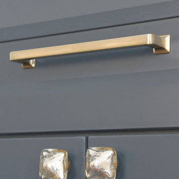
Our clients in Tower Lakes, IL, needed more storage and functionality from their kitchen. They were primarily focused on finding the right combination of cabinets, shelves, and drawers that fit all their cookware, flatware, and appliances. They wanted a brighter, bigger space with a natural cooking flow and plenty of storage. Soffits and crown molding needed to be removed to make the kitchen feel larger. Redesign elements included: relocating the fridge, adding a baking station and coffee bar, and placing the microwave in the kitchen island.
Advance Design Studio’s Claudia Pop offered functional, creative, and unique solutions to the homeowners’ problems. Our clients wanted a unique kitchen that was not completely white, a balance of design and function. Claudia offered functional, creative, and unique solutions to Chad and Karen’s kitchen design challenges. The first thing to go was soffits. Today, most kitchens can benefit from the added height and space; removing soffits is nearly always step one. Steely gray-blue was the color of choice for a freshly unique look bringing a sophisticated-looking space to wrap around the fresh new kitchen. Cherry cabinetry in a true brown stain compliments the stormy accents with sharp contrasting white Cambria quartz top balancing out the space with a dramatic flair.
“We wanted something unique and special in this space, something none of the neighbors would have,” said Claudia.
The dramatic veined Cambria countertops continue upward into a backsplash behind three complimentary open shelves. These countertops provide visual texture and movement in the kitchen. The kitchen includes two larder cabinets for both the coffee bar and baking station. The kitchen is now functional and unique in design.
“When we design a new kitchen space, as designers, we are always looking for ways to balance interesting design elements with practical functionality,” Claudia said. “This kitchen’s new design is not only way more functional but is stunning in a way a piece of art can catch one’s attention.”
Decorative mullions with mirrored inserts sit atop dual sentinel pantries flanking the new refrigerator, while a 48″ dual fuel Wolf range replaced the island cooktop and double oven. The new microwave is cleverly hidden within the island, eliminating the cluttered counter and attention-grabbing wall of stainless steel from the previous space.
The family room was completely renovated, including a beautifully functional entertainment bar with the same combination of woods and stone as the kitchen and coffee bar. Mesh inserts instead of plain glass add visual texture while revealing pristine glassware. Handcrafted built-ins surround the fireplace.
The beautiful and efficient design created by designer Claudia transitioned directly to the installation team seamlessly, much like the basement project experience Chad and Karen enjoyed previously.
“We definitely will and have recommended Advance Design Studio to friends who are looking to embark on a project small or large,” Karen said.
“Everything that was designed and built exactly how we envisioned it, and we are really enjoying it to its full potential,” Karen said.
Our award-winning design team would love to create a beautiful, functional, and spacious place for you and your family. With our “Common Sense Remodeling” approach, the process of renovating your home has never been easier. Contact us today at 847-665-1711 or schedule an appointment.
 C&K Custom Remodeling Inc.
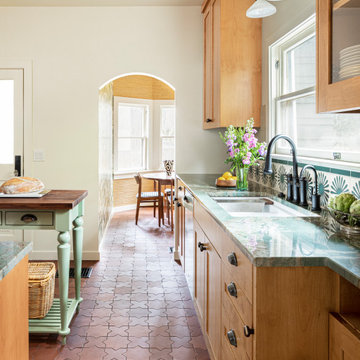
This kitchen in a 1911 Craftsman home has taken on a new life full of color and personality. Inspired by the client’s colorful taste and the homes of her family in The Philippines, we leaned into the wild for this design. The first thing the client told us is that she wanted terra cotta floors and green countertops. Beyond this direction, she wanted a place for the refrigerator in the kitchen since it was originally in the breakfast nook. She also wanted a place for waste receptacles, to be able to reach all the shelves in her cabinetry, and a special place to play Mahjong with friends and family.
The home presented some challenges in that the stairs go directly over the space where we wanted to move the refrigerator. The client also wanted us to retain the built-ins in the dining room that are on the opposite side of the range wall, as well as the breakfast nook built ins. The solution to these problems were clear to us, and we quickly got to work. We lowered the cabinetry in the refrigerator area to accommodate the stairs above, as well as closing off the unnecessary door from the kitchen to the stairs leading to the second floor. We utilized a recycled body porcelain floor tile that looks like terra cotta to achieve the desired look, but it is much easier to upkeep than traditional terra cotta. In the breakfast nook we used bold jungle themed wallpaper to create a special place that feels connected, but still separate, from the kitchen for the client to play Mahjong in or enjoy a cup of coffee. Finally, we utilized stair pullouts by all the upper cabinets that extend to the ceiling to ensure that the client can reach every shelf.
 RAJ Kitchen and Bath, LLC
 “Full apartment design”.
IF you have not yet seen this apartment conversion before, we strongly urge you to go to the bottom left of this page and click on the short 2-minutes video. It would put a lot of things into perspective when you come back and continue reading this.
It is true we were literally handed the keys and told a list of things that they wanted to have happen and we were to go into the apartment, look at the space and come up with a design that would satisfy all of that need. UNTIL we showed up! The unit had really seen some better days but we knew we had to look past that and come up with a concept that would work for them.
The immediate challenges were centered around 3 big ideas:
1. Adding a second bedroom to the already small footprint
2. Figuring out a way to make the kitchen bigger, better and brighter
3. Creating a master room walk in closet
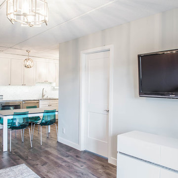
It’s always difficult to add new rooms into existing footprint without expanding out or up and not incurring any opportunity cost. In this case, that was exactly what we had to do. Item one and two above had to be tackled as one. We went ahead and switched out the location of the dining room and eliminating an area where there was a “nook” type eat-in area. By doing so, we were able to cut right into that footprint and change the layout of the kitchen.
That one move allowed us to dig into the kitchen design because it was now the main focal point in the apartment. It was no longer an option to keep it in that tiny hole where it was, so we had to ensure that this design was functional and aesthetically pleasing at the same time. By adding the table into the space where an Island typically would go, we were able to both cut cost and still provide a dining experience. The Table serves as an Island as well when cooking.
We then proceeded to block in the existing doorway to the dining room. By doing this, we were able to create a full room which allowed us to put a door on the other side and called that room Bedroom #2. This was easier to do because all of the mechanicals were already in that space (light, heater and windows). By shifting things around, we also achieved a huge wall to wall closet from inside. PERFECT!
Then we moved into the Single bedroom. We thought it was a big room with a small closet, so by creatively adding an L shaped wall and steal some footprint into the bedroom side, we were able to put a door on that new room and design it for the walk-in closet. Even after this, the bedroom still holds a queen size bed with 2 night stands, a TV on the wall, a sitting chair and plenty of room to walk around. This was done by rethinking the location for the bed and night stands.
The bathroom was gutted to make sure there was no leaks and rebuild from the ground up. We kept all of the plumbing where it was, added a new vanity, medicine cabinet, tiles and lighting and it was done.
From there, the rest of the unit had new flooring all throughout, paint, and lighting. After completion and walk through, this project was handed over back to the clients.
Execution and collaboration between all the trades were: Reggie and his team from Premier Interiors and Rohan from RD Mechanical Services.
p.s. Please see our website to see the video.
 Reico Kitchen & Bath
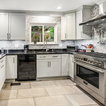
Dave Wilhide of Reico Kitchen and Bath in Woodbridge, VA collaborated with Professional Home Improvements to create a transitional kitchen remodel featuring Merillat Classic cabinetry.
The kitchen cabinets are the Rowan 5-piece door style in a Mist finish. The countertop is Absolute Black granite.
Also included in the remodel is a Maravilla Aleutian Isles Aluminum Linear Marble Mosaic backsplash.
The client expressed their satisfaction with Dave's coordination of the project. “Determining color scheme took time as supply chain issues and using multiple vendors for appliances was a challenge. Working with Dave was the bright spot as he was the conduit who made everything easier. The suggestions made by Dave to find the right cabinets balancing costs and objectives especially on the pantry cabinet and wine rack helped keep everything in a budget.”
“My favorite part of the new kitchen is the larger look gained by removing the soffit and raising the cabinets to the ceiling. My favorite cabinet is the three drawer base cabinet made for pots and pans. No more bending over to dig around and find cooking pots. Everything is now easy to get to,” said the client.
Photos courtesy of BTW Images.
 Concrete Designs
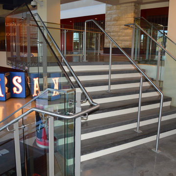
This project consisted of The Grand Staircase in Allen Field House at the University of Kansas and 2 staircases in the adjoining DeBruce center. We went way out of our comfort zone on this project! We created and installed concrete stair treads that were colored and polished with exposed aggregate. The Grand Staircase consisted of nearly 500 square feet of precast concrete. The landing pieces ranged in size from 2 feet by 9 feet to 5.5 feet by 9 feet. After the precast pieces were finished, they were transported from Lenexa to Lawrence, then carefully placed via forklift. The 1 foot by 9 foot stair treads were placed by hand, all 20 of them.
In the DeBruce Center, which houses Dr. Naismith’s Original Rules Of Basketball, we completed 2 stairwells that covered 3 stories each. These pieces were much smaller than the Field House stairs, measuring only 2″ thick by 5 foot wide. While these were easier to handle, we created 120 pieces for this half of the project, totaling nearly 500 square feet.
While this took us out of our comfort zone, it was an incredible project and we were fortunate to place our artwork there. We were able to overcome the challenges, such as transport and installation of pieces that were much larger than we are accustomed to. We are honored to have our work be in such a historical building for many years to come!
 Woodsmith Construction Inc
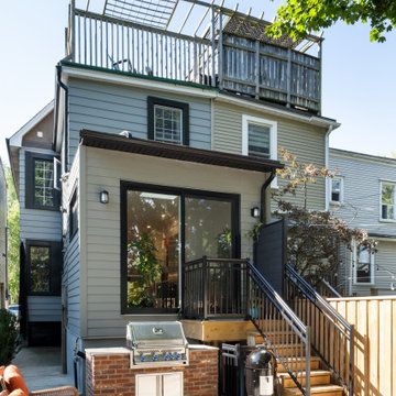
Transforming a classic Riverdale semi-detached home requires more than just good design—it demands precision, strategy, and a respect for how these older Toronto homes were originally built. This renovation on Withrow Ave came with all the challenges you’d expect from working in the city: restricted access for equipment, tight parking conditions, and trades working inches away from neighbouring homes. The homeowners didn’t want a cosmetic update—they wanted a home that felt brighter, more open, and easier to live in day-to-day. Achieving that meant removing structural walls, installing engineered beams, and pulling as much natural light through the space as possible. At the same time, they envisioned a new basement walkout that would change how they used the lower level, making it a real part of their everyday routine instead of a dark, overlooked space. The transformation is dramatic. The ground floor now feels like an entirely different home, with clean sightlines and a sense of openness that didn’t exist before. Light moves through the space naturally, and the new layout finally matches how a modern Toronto family wants to live. The basement walkout has become a functional everyday entry point—perfect for dropping off gear, coming and going effortlessly, and accessing ample storage space. This project is proof that even the most traditional Toronto semi can be completely reimagined when design and construction work hand in hand with purpose.
 Advance Design Studio, Ltd.
Our clients in Tower Lakes, IL, needed more storage and functionality from their kitchen. They were primarily focused on finding the right combination of cabinets, shelves, and drawers that fit all their cookware, flatware, and appliances. They wanted a brighter, bigger space with a natural cooking flow and plenty of storage. Soffits and crown molding needed to be removed to make the kitchen feel larger. Redesign elements included: relocating the fridge, adding a baking station and coffee bar, and placing the microwave in the kitchen island.
Advance Design Studio’s Claudia Pop offered functional, creative, and unique solutions to the homeowners’ problems. Our clients wanted a unique kitchen that was not completely white, a balance of design and function. Claudia offered functional, creative, and unique solutions to Chad and Karen’s kitchen design challenges. The first thing to go was soffits. Today, most kitchens can benefit from the added height and space; removing soffits is nearly always step one. Steely gray-blue was the color of choice for a freshly unique look bringing a sophisticated-looking space to wrap around the fresh new kitchen. Cherry cabinetry in a true brown stain compliments the stormy accents with sharp contrasting white Cambria quartz top balancing out the space with a dramatic flair.
“We wanted something unique and special in this space, something none of the neighbors would have,” said Claudia.
The dramatic veined Cambria countertops continue upward into a backsplash behind three complimentary open shelves. These countertops provide visual texture and movement in the kitchen. The kitchen includes two larder cabinets for both the coffee bar and baking station. The kitchen is now functional and unique in design.
“When we design a new kitchen space, as designers, we are always looking for ways to balance interesting design elements with practical functionality,” Claudia said. “This kitchen’s new design is not only way more functional but is stunning in a way a piece of art can catch one’s attention.”
Decorative mullions with mirrored inserts sit atop dual sentinel pantries flanking the new refrigerator, while a 48″ dual fuel Wolf range replaced the island cooktop and double oven. The new microwave is cleverly hidden within the island, eliminating the cluttered counter and attention-grabbing wall of stainless steel from the previous space.
The family room was completely renovated, including a beautifully functional entertainment bar with the same combination of woods and stone as the kitchen and coffee bar. Mesh inserts instead of plain glass add visual texture while revealing pristine glassware. Handcrafted built-ins surround the fireplace.
The beautiful and efficient design created by designer Claudia transitioned directly to the installation team seamlessly, much like the basement project experience Chad and Karen enjoyed previously.
“We definitely will and have recommended Advance Design Studio to friends who are looking to embark on a project small or large,” Karen said.
“Everything that was designed and built exactly how we envisioned it, and we are really enjoying it to its full potential,” Karen said.
Our award-winning design team would love to create a beautiful, functional, and spacious place for you and your family. With our “Common Sense Remodeling” approach, the process of renovating your home has never been easier. Contact us today at 847-665-1711 or schedule an appointment.
 Chicagoland Home Products
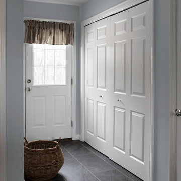
Chicagoland Home Products arrived in Gurnee, Illinois with storage solutions that helped a garage to become all that it could be. In fact, if garages could talk and fill out surveys, 100% of those surveyed would want to be like this one. Every garage wants to be more than a place to park a car or a home to the haphazardly stored.
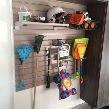
The Gurnee goal was to deliver a custom garage storage package that, among other things, helped kids easily access their play brooms and shovels. Part of that solution, also, gave the children a way to put away their rakes and little lawnmowers. What parent wouldn’t be pleased to see a child’s playthings neatly placed on hooks and shelves, specifically designed, to be within reach of the child? It’s just possible this would make it easier to pull the car into the garage without stopping to clear a path.
Since it works for kids to have a storage solution of their own, why not give equal opportunity for the adults to put away their toys and tools? With custom garage storage like this, your golf clubs, shoes and accessories, will have a home. They will want to leap out of your vehicle and onto their convenient shelves.
Just about anything can be hung on the slat wall – it is perfect for holding lawn equipment, tools and even more toys. With so many things needing to be recharged these days, note the convenient work surface and charging area.
One other thing, those garages that were surveyed, wanted to look good too. While your garage can choose what fits its own style, this garage wanted its storage to be wrapped in a Merapi finish with square brushed chrome handles. Now, it looks good, has lots of room, is accessible for kids and adults, is organized, and ready to handle the challenges that you give it.
 Renovisions
This client requested that we design her new kitchen space to look and function with her and her family’s usage in mind. She was not happy with her existing kitchen due to builder-grade ceramic flooring, lack of countertop space, poor lighting, inadequate and unorganized storage and the closed off feel of the area. Renovisions resolved all of these issues by designing and building an impressive, transitional styled kitchen; delivering a beautifully well thought-out space that provides a multi-functional approach and meets the needs of this busy and dynamic household.
Typically, we encounter challenges in every project, and this was no different. The upstairs bathroom plumbing ran across the entire length of the kitchen sink wall and it was necessary to work with it by moving the plumbing as far up as possible and then building a soffit to hide it.
Creating a space that has a more open feel was top of mind for our client. Installing a new wood floor that matched the existing dining room floor helped with this and in addition, warmed up the room. By relocating the refrigerator to the opposite wall and adding a bar area at the end toward the family room, the flow of traffic for family members and guests became more managed.
The open floor plan allowed for additional island cabinets to accommodate smart storage and better functionality when prepping meals, sitting to eat or gathering with friends and family. We believe having ample countertop surface space is a critical improvement in any renovation and this particular project now boasts a large countertop area with a stunning wide vein pattern that accentuates the design instead of overpowering it. The soft look of the Blanco Arabescato quartz enhances the space and looks lovely with the white inset styled cabinetry.
Beauty and function go hand-in-hand in this kitchen with several exceptional elements such as under-cabinet lighting with dimmers to control the mood light. Glass doors were added to the wall cabinets which flank the wine rack for displaying their decorative glassware and a beverage cooler below provided added convenience and access to cold beverages. The GE Café line of appliances in ‘Slate’ and ‘Stainless Steel’ finishes are a stunning contrast here.
The sensational looking decorative marble 6”x6” backsplash tile over the gas range and in the bar area creates nice focal points by creating a unique look for her that family and guests love.
Convenient and functional elements were added such as a blind corner pull-out for easier pot/pan storage, a sweep-o-vac under cabinet vacuum system for those constant quick clean-ups, a pull-out caddy under the sink base for storage of cleaning products and a protective mat to collect potential spills.
Our client let us know it was time for a change and we listened. She shared a few pictures she loved from a home magazine, we shared our insight and then designed/built the kitchen of her dreams! … A fabulous and functional space.
 Reico Kitchen & Bath
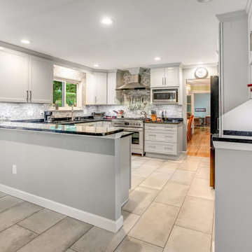
Dave Wilhide of Reico Kitchen and Bath in Woodbridge, VA collaborated with Professional Home Improvements to create a transitional kitchen remodel featuring Merillat Classic cabinetry.
The kitchen cabinets are the Rowan 5-piece door style in a Mist finish. The countertop is Absolute Black granite.
Also included in the remodel is a Maravilla Aleutian Isles Aluminum Linear Marble Mosaic backsplash.
The client expressed their satisfaction with Dave's coordination of the project. “Determining color scheme took time as supply chain issues and using multiple vendors for appliances was a challenge. Working with Dave was the bright spot as he was the conduit who made everything easier. The suggestions made by Dave to find the right cabinets balancing costs and objectives especially on the pantry cabinet and wine rack helped keep everything in a budget.”
“My favorite part of the new kitchen is the larger look gained by removing the soffit and raising the cabinets to the ceiling. My favorite cabinet is the three drawer base cabinet made for pots and pans. No more bending over to dig around and find cooking pots. Everything is now easy to get to,” said the client.
Photos courtesy of BTW Images.
 Reico Kitchen & Bath
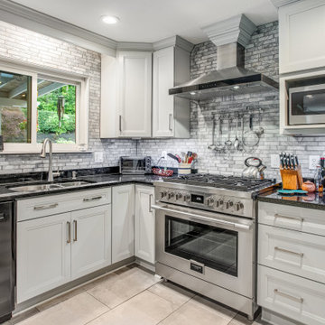
Dave Wilhide of Reico Kitchen and Bath in Woodbridge, VA collaborated with Professional Home Improvements to create a transitional kitchen remodel featuring Merillat Classic cabinetry.
The kitchen cabinets are the Rowan 5-piece door style in a Mist finish. The countertop is Absolute Black granite.
Also included in the remodel is a Maravilla Aleutian Isles Aluminum Linear Marble Mosaic backsplash.
The client expressed their satisfaction with Dave's coordination of the project. “Determining color scheme took time as supply chain issues and using multiple vendors for appliances was a challenge. Working with Dave was the bright spot as he was the conduit who made everything easier. The suggestions made by Dave to find the right cabinets balancing costs and objectives especially on the pantry cabinet and wine rack helped keep everything in a budget.”
“My favorite part of the new kitchen is the larger look gained by removing the soffit and raising the cabinets to the ceiling. My favorite cabinet is the three drawer base cabinet made for pots and pans. No more bending over to dig around and find cooking pots. Everything is now easy to get to,” said the client.
Photos courtesy of BTW Images.
25