
Search results for "Challenges faced" in Home Design Ideas
 Windy City Painters
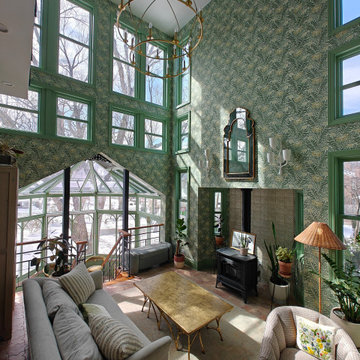
Professional wallpaper installation transformed this Evanston sunroom into a stunning focal point. Evanston's diverse architecture, from historic homes to contemporary residences, requires specialized expertise to ensure wallpaper installation complements existing design elements.
Materials and Products
We utilized premium moisture-resistant wallpaper specifically designed for sunroom environments, paired with professional-grade adhesives from trusted manufacturers like Roman and Zinsser for superior bonding and longevity.
Installation Process
First, thorough surface preparation including cleaning and priming. Second, precise measurements and pattern planning for seamless alignment. Third, careful adhesive application using professional tools. Fourth, meticulous installation with attention to corners and edges.
Chicago Home Challenges
Evanston properties face unique challenges including temperature fluctuations, humidity variations, and aging surfaces. Our wallpaper installation process addresses these concerns through proper surface preparation and climate-appropriate materials.
Results Achieved
The finished sunroom showcases flawless wallpaper installation with perfect pattern matching, smooth application, and professional-quality results that will withstand years of use and seasonal changes.
H2 Professional Tips
Always prime surfaces before wallpaper installation, choose moisture-resistant papers for sunrooms, and hire experienced professionals familiar with Chicago's climate challenges and building characteristics.
See more work and request free estimate at windypainters.com.
Q: What type of wallpaper works best for Evanston sunrooms? / A: Moisture-resistant vinyl or fabric-backed wallpaper handles humidity and temperature changes better than standard paper in sunroom wallpaper installation projects.
Q: How long does professional wallpaper installation take? / A: Most sunroom wallpaper installation projects require 1-2 days depending on room size, pattern complexity, and surface preparation needs.
Q: Can you install wallpaper over existing paint? / A: Yes, wallpaper installation over painted surfaces is possible after proper cleaning, priming, and surface preparation to ensure adhesion.
Q: Do you remove old wallpaper before installation? / A: Professional wallpaper installation often includes complete removal of existing coverings and thorough surface preparation for optimal results.
Q: What preparation is needed for wallpaper installation? / A: Wallpaper installation requires clean, smooth, primed surfaces with all imperfections filled and sanded for professional results.
Q: How do you handle wallpaper seams and patterns? / A: Expert wallpaper installation includes precise measuring, cutting, and alignment to create invisible seams and perfect pattern matching.
Q: Is wallpaper installation suitable for high-humidity areas? / A: Yes, proper wallpaper installation using moisture-resistant materials and techniques works excellently in sunrooms and humid environments.
Q: What warranty do you provide on wallpaper installation? / A: Windy City Painters backs all wallpaper installation work with comprehensive warranties covering materials and workmanship for customer peace of mind.
Q: Can wallpaper installation be done in winter? / A: Professional wallpaper installation can be performed year-round with proper climate control and material handling for optimal adhesion.
Q: How do you ensure wallpaper installation quality? / A: Our wallpaper installation process includes thorough preparation, premium materials, professional techniques, and detailed quality inspection for lasting results.
 Solar Wind Designs
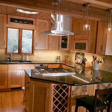
Before this full kitchen expansion/remodel our clients had a very tight, roughly 92 sq./ft. galley kitchen with a standard size door opening at the far left and a single window in the facing wall. The kitchen couldn’t accommodate more than one person comfortably and felt a little dated and dark, even with a large overhead fluorescent fixture. To begin, we doubled the size of the entry into the whole dining room/kitchen area by taking out 3’ of the entryway wall, opening up the space to the rest of the house. We (SWD) knocked out the wall facing the dining room and expanded the kitchen by about 30 sq./ft by moving the stairs to the living room to the right and adding a 2-sided functional peninsula (complete with a range and wine racks) in place of the wall. One end of the peninsula T’s into a counter facing the gorgeous living room view of the surrounding woods. We stretched our design skills to the max to create a design with a significant amount of additional storage cabinets and more conveniently placed all-new appliances, while keeping a very open feel. The natural shaker vertical and stacked horizontal cabinets are contrasted with the dark Verde Peacock granite countertops creating a modern and clean, yet timeless look. The continuous backsplash of khaki glass subway tiles tie the soft and hard elements together. We replaced the dated fluorescent overhead light with an energy efficient LED whose curved glass and stainless steel elements mimic the range hood, and added super-slim dimmable under counter LED lighting. This kitchen now provides our clients with maximum function and style from a size-challenged space.
 Designs by Shahin
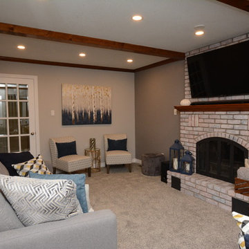
Finding the perfect blend of rustic and modern was a challenge in this room, but it paid off! The wood burning fireplace went from being a dated element, to a rustic focal point.
Find the right local pro for your project
 Jasper + Phoenix
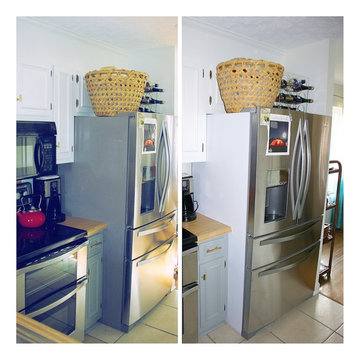
We were challenged with having very little space between the fridge and counter for plywood. WE didn't want to paint it and it would have been too time consuming to cut perfectly to create a face to meet up above the counter and against the hunk o'appliance. We came up with the clever idea of using white magnetic roll used for vehicle advertising.
 Solar Wind Designs
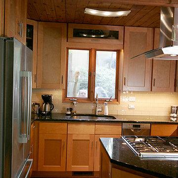
Before this full kitchen expansion/remodel our clients had a very tight, roughly 92 sq./ft. galley kitchen with a standard size door opening at the far left and a single window in the facing wall. The kitchen couldn’t accommodate more than one person comfortably and felt a little dated and dark, even with a large overhead fluorescent fixture. To begin, we doubled the size of the entry into the whole dining room/kitchen area by taking out 3’ of the entryway wall, opening up the space to the rest of the house. We (SWD) knocked out the wall facing the dining room and expanded the kitchen by about 30 sq./ft by moving the stairs to the living room to the right and adding a 2-sided functional peninsula (complete with a range and wine racks) in place of the wall. One end of the peninsula T’s into a counter facing the gorgeous living room view of the surrounding woods. We stretched our design skills to the max to create a design with a significant amount of additional storage cabinets and more conveniently placed all-new appliances, while keeping a very open feel. The natural shaker vertical and stacked horizontal cabinets are contrasted with the dark Verde Peacock granite countertops creating a modern and clean, yet timeless look. The continuous backsplash of khaki glass subway tiles tie the soft and hard elements together. We replaced the dated fluorescent overhead light with an energy efficient LED whose curved glass and stainless steel elements mimic the range hood, and added super-slim dimmable under counter LED lighting. This kitchen now provides our clients with maximum function and style from a size-challenged space.
 Jacobson Construction
From Attic to Awesome
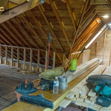
Many of the classic Tudor homes in Minneapolis are defined as 1 ½ stories. The ½ story is actually an attic; a space just below the roof and with a rough floor often used for storage and little more. The owners were looking to turn their attic into about 900 sq. ft. of functional living/bedroom space with a big bath, perfect for hosting overnight guests.
This was a challenging project, considering the plan called for raising the roof and adding two large shed dormers. A structural engineer was consulted, and the appropriate construction measures were taken to address the support necessary from below, passing the required stringent building codes.
The remodeling project took about four months and began with reframing many of the roof support elements and adding closed cell spray foam insulation throughout to make the space warm and watertight during cold Minnesota winters, as well as cool in the summer.
You enter the room using a stairway enclosed with a white railing that offers a feeling of openness while providing a high degree of safety. A short hallway leading to the living area features white cabinets with shaker style flat panel doors – a design element repeated in the bath. Four pairs of South facing windows above the cabinets let in lots of South sunlight all year long.
The 130 sq. ft. bath features soaking tub and open shower room with floor-to-ceiling 2-inch porcelain tiling. The custom heated floor and one wall is constructed using beautiful natural stone. The shower room floor is also the shower’s drain, giving this room an open feeling while providing the ultimate functionality. The other half of the bath consists of a toilet and pedestal sink flanked by two white shaker style cabinets with Granite countertops. A big skylight over the tub and another north facing window brightens this room and highlights the tiling with a shade of green that’s pleasing to the eye.
The rest of the remodeling project is simply a large open living/bedroom space. Perhaps the most interesting feature of the room is the way the roof ties into the ceiling at many angles – a necessity because of the way the home was originally constructed. The before and after photos show how the construction method included the maximum amount of interior space, leaving the room without the “cramped” feeling too often associated with this kind of remodeling project.
Another big feature of this space can be found in the use of skylights. A total of six skylights – in addition to eight South-facing windows – make this area warm and bright during the many months of winter when sunlight in Minnesota comes at a premium.
The main living area offers several flexible design options, with space that can be used with bedroom and/or living room furniture with cozy areas for reading and entertainment. Recessed lighting on dimmers throughout the space balances daylight with room light for just the right atmosphere.
The space is now ready for decorating with original artwork and furnishings. How would you furnish this space?
 Holthouse Enterprises, LLC
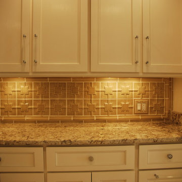
The backsplash was quite a challenge. The hand Made, Hand Glazed Tiles were purchased from Kenwood Tile. When I told them how I didn't want a cut in the Deco Tile, they didn't think it could be done. I then called the manufacturer of the tile and sent the measurements. They said they didn't think it could be done. I brought in the tile setter. He felt it was too difficult.The more everyone said we couldn't do it, the more determined I was to do it! Made the paper patterns for each area. Tom Brown was able to work off my pattern and did a beautiful job of setting the tile!


 Solar Wind Designs
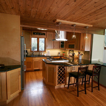
Before this full kitchen expansion/remodel our clients had a very tight, roughly 92 sq./ft. galley kitchen with a standard size door opening at the far left and a single window in the facing wall. The kitchen couldn’t accommodate more than one person comfortably and felt a little dated and dark, even with a large overhead fluorescent fixture. To begin, we doubled the size of the entry into the whole dining room/kitchen area by taking out 3’ of the entryway wall, opening up the space to the rest of the house. We (SWD) knocked out the wall facing the dining room and expanded the kitchen by about 30 sq./ft by moving the stairs to the living room to the right and adding a 2-sided functional peninsula (complete with a range and wine racks) in place of the wall. One end of the peninsula T’s into a counter facing the gorgeous living room view of the surrounding woods. We stretched our design skills to the max to create a design with a significant amount of additional storage cabinets and more conveniently placed all-new appliances, while keeping a very open feel. The natural shaker vertical and stacked horizontal cabinets are contrasted with the dark Verde Peacock granite countertops creating a modern and clean, yet timeless look. The continuous backsplash of khaki glass subway tiles tie the soft and hard elements together. We replaced the dated fluorescent overhead light with an energy efficient LED whose curved glass and stainless steel elements mimic the range hood, and added super-slim dimmable under counter LED lighting. This kitchen now provides our clients with maximum function and style from a size-challenged space.
 Solar Wind Designs
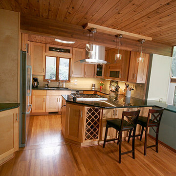
Before this full kitchen expansion/remodel our clients had a very tight, roughly 92 sq./ft. galley kitchen with a standard size door opening at the far left and a single window in the facing wall. The kitchen couldn’t accommodate more than one person comfortably and felt a little dated and dark, even with a large overhead fluorescent fixture. To begin, we doubled the size of the entry into the whole dining room/kitchen area by taking out 3’ of the entryway wall, opening up the space to the rest of the house. We (SWD) knocked out the wall facing the dining room and expanded the kitchen by about 30 sq./ft by moving the stairs to the living room to the right and adding a 2-sided functional peninsula (complete with a range and wine racks) in place of the wall. One end of the peninsula T’s into a counter facing the gorgeous living room view of the surrounding woods. We stretched our design skills to the max to create a design with a significant amount of additional storage cabinets and more conveniently placed all-new appliances, while keeping a very open feel. The natural shaker vertical and stacked horizontal cabinets are contrasted with the dark Verde Peacock granite countertops creating a modern and clean, yet timeless look. The continuous backsplash of khaki glass subway tiles tie the soft and hard elements together. We replaced the dated fluorescent overhead light with an energy efficient LED whose curved glass and stainless steel elements mimic the range hood, and added super-slim dimmable under counter LED lighting. This kitchen now provides our clients with maximum function and style from a size-challenged space.
 Solar Wind Designs
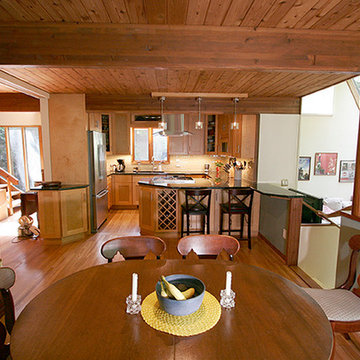
Before this full kitchen expansion/remodel our clients had a very tight, roughly 92 sq./ft. galley kitchen with a standard size door opening at the far left and a single window in the facing wall. The kitchen couldn’t accommodate more than one person comfortably and felt a little dated and dark, even with a large overhead fluorescent fixture. To begin, we doubled the size of the entry into the whole dining room/kitchen area by taking out 3’ of the entryway wall, opening up the space to the rest of the house. We (SWD) knocked out the wall facing the dining room and expanded the kitchen by about 30 sq./ft by moving the stairs to the living room to the right and adding a 2-sided functional peninsula (complete with a range and wine racks) in place of the wall. One end of the peninsula T’s into a counter facing the gorgeous living room view of the surrounding woods. We stretched our design skills to the max to create a design with a significant amount of additional storage cabinets and more conveniently placed all-new appliances, while keeping a very open feel. The natural shaker vertical and stacked horizontal cabinets are contrasted with the dark Verde Peacock granite countertops creating a modern and clean, yet timeless look. The continuous backsplash of khaki glass subway tiles tie the soft and hard elements together. We replaced the dated fluorescent overhead light with an energy efficient LED whose curved glass and stainless steel elements mimic the range hood, and added super-slim dimmable under counter LED lighting. This kitchen now provides our clients with maximum function and style from a size-challenged space.
 Solar Wind Designs
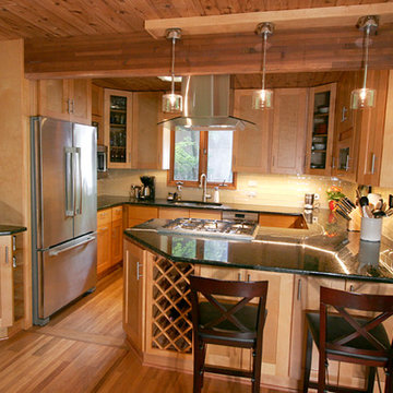
Before this full kitchen expansion/remodel our clients had a very tight, roughly 92 sq./ft. galley kitchen with a standard size door opening at the far left and a single window in the facing wall. The kitchen couldn’t accommodate more than one person comfortably and felt a little dated and dark, even with a large overhead fluorescent fixture. To begin, we doubled the size of the entry into the whole dining room/kitchen area by taking out 3’ of the entryway wall, opening up the space to the rest of the house. We (SWD) knocked out the wall facing the dining room and expanded the kitchen by about 30 sq./ft by moving the stairs to the living room to the right and adding a 2-sided functional peninsula (complete with a range and wine racks) in place of the wall. One end of the peninsula T’s into a counter facing the gorgeous living room view of the surrounding woods. We stretched our design skills to the max to create a design with a significant amount of additional storage cabinets and more conveniently placed all-new appliances, while keeping a very open feel. The natural shaker vertical and stacked horizontal cabinets are contrasted with the dark Verde Peacock granite countertops creating a modern and clean, yet timeless look. The continuous backsplash of khaki glass subway tiles tie the soft and hard elements together. We replaced the dated fluorescent overhead light with an energy efficient LED whose curved glass and stainless steel elements mimic the range hood, and added super-slim dimmable under counter LED lighting. This kitchen now provides our clients with maximum function and style from a size-challenged space.
 Jacobson Construction
From Attic to Awesome
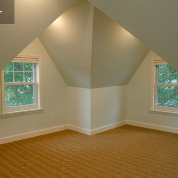
Many of the classic Tudor homes in Minneapolis are defined as 1 ½ stories. The ½ story is actually an attic; a space just below the roof and with a rough floor often used for storage and little more. The owners were looking to turn their attic into about 900 sq. ft. of functional living/bedroom space with a big bath, perfect for hosting overnight guests.
This was a challenging project, considering the plan called for raising the roof and adding two large shed dormers. A structural engineer was consulted, and the appropriate construction measures were taken to address the support necessary from below, passing the required stringent building codes.
The remodeling project took about four months and began with reframing many of the roof support elements and adding closed cell spray foam insulation throughout to make the space warm and watertight during cold Minnesota winters, as well as cool in the summer.
You enter the room using a stairway enclosed with a white railing that offers a feeling of openness while providing a high degree of safety. A short hallway leading to the living area features white cabinets with shaker style flat panel doors – a design element repeated in the bath. Four pairs of South facing windows above the cabinets let in lots of South sunlight all year long.
The 130 sq. ft. bath features soaking tub and open shower room with floor-to-ceiling 2-inch porcelain tiling. The custom heated floor and one wall is constructed using beautiful natural stone. The shower room floor is also the shower’s drain, giving this room an open feeling while providing the ultimate functionality. The other half of the bath consists of a toilet and pedestal sink flanked by two white shaker style cabinets with Granite countertops. A big skylight over the tub and another north facing window brightens this room and highlights the tiling with a shade of green that’s pleasing to the eye.
The rest of the remodeling project is simply a large open living/bedroom space. Perhaps the most interesting feature of the room is the way the roof ties into the ceiling at many angles – a necessity because of the way the home was originally constructed. The before and after photos show how the construction method included the maximum amount of interior space, leaving the room without the “cramped” feeling too often associated with this kind of remodeling project.
Another big feature of this space can be found in the use of skylights. A total of six skylights – in addition to eight South-facing windows – make this area warm and bright during the many months of winter when sunlight in Minnesota comes at a premium.
The main living area offers several flexible design options, with space that can be used with bedroom and/or living room furniture with cozy areas for reading and entertainment. Recessed lighting on dimmers throughout the space balances daylight with room light for just the right atmosphere.
The space is now ready for decorating with original artwork and furnishings. How would you furnish this space?
 Jacobson Construction
From Attic to Awesome
Many of the classic Tudor homes in Minneapolis are defined as 1 ½ stories. The ½ story is actually an attic; a space just below the roof and with a rough floor often used for storage and little more. The owners were looking to turn their attic into about 900 sq. ft. of functional living/bedroom space with a big bath, perfect for hosting overnight guests.
This was a challenging project, considering the plan called for raising the roof and adding two large shed dormers. A structural engineer was consulted, and the appropriate construction measures were taken to address the support necessary from below, passing the required stringent building codes.
The remodeling project took about four months and began with reframing many of the roof support elements and adding closed cell spray foam insulation throughout to make the space warm and watertight during cold Minnesota winters, as well as cool in the summer.
You enter the room using a stairway enclosed with a white railing that offers a feeling of openness while providing a high degree of safety. A short hallway leading to the living area features white cabinets with shaker style flat panel doors – a design element repeated in the bath. Four pairs of South facing windows above the cabinets let in lots of South sunlight all year long.
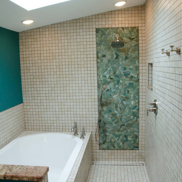
The 130 sq. ft. bath features soaking tub and open shower room with floor-to-ceiling 2-inch porcelain tiling. The custom heated floor and one wall is constructed using beautiful natural stone. The shower room floor is also the shower’s drain, giving this room an open feeling while providing the ultimate functionality. The other half of the bath consists of a toilet and pedestal sink flanked by two white shaker style cabinets with Granite countertops. A big skylight over the tub and another north facing window brightens this room and highlights the tiling with a shade of green that’s pleasing to the eye.
The rest of the remodeling project is simply a large open living/bedroom space. Perhaps the most interesting feature of the room is the way the roof ties into the ceiling at many angles – a necessity because of the way the home was originally constructed. The before and after photos show how the construction method included the maximum amount of interior space, leaving the room without the “cramped” feeling too often associated with this kind of remodeling project.
Another big feature of this space can be found in the use of skylights. A total of six skylights – in addition to eight South-facing windows – make this area warm and bright during the many months of winter when sunlight in Minnesota comes at a premium.
The main living area offers several flexible design options, with space that can be used with bedroom and/or living room furniture with cozy areas for reading and entertainment. Recessed lighting on dimmers throughout the space balances daylight with room light for just the right atmosphere.
The space is now ready for decorating with original artwork and furnishings. How would you furnish this space?
 Solar Wind Designs
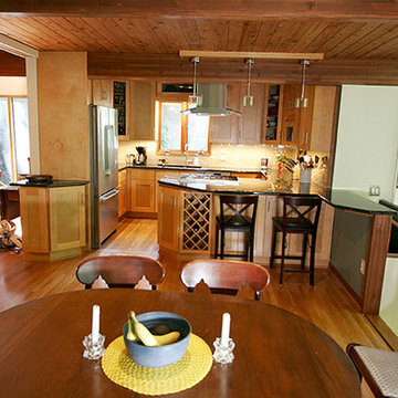
Before this full kitchen expansion/remodel our clients had a very tight, roughly 92 sq./ft. galley kitchen with a standard size door opening at the far left and a single window in the facing wall. The kitchen couldn’t accommodate more than one person comfortably and felt a little dated and dark, even with a large overhead fluorescent fixture. To begin, we doubled the size of the entry into the whole dining room/kitchen area by taking out 3’ of the entryway wall, opening up the space to the rest of the house. We (SWD) knocked out the wall facing the dining room and expanded the kitchen by about 30 sq./ft by moving the stairs to the living room to the right and adding a 2-sided functional peninsula (complete with a range and wine racks) in place of the wall. One end of the peninsula T’s into a counter facing the gorgeous living room view of the surrounding woods. We stretched our design skills to the max to create a design with a significant amount of additional storage cabinets and more conveniently placed all-new appliances, while keeping a very open feel. The natural shaker vertical and stacked horizontal cabinets are contrasted with the dark Verde Peacock granite countertops creating a modern and clean, yet timeless look. The continuous backsplash of khaki glass subway tiles tie the soft and hard elements together. We replaced the dated fluorescent overhead light with an energy efficient LED whose curved glass and stainless steel elements mimic the range hood, and added super-slim dimmable under counter LED lighting. This kitchen now provides our clients with maximum function and style from a size-challenged space.
 Solar Wind Designs
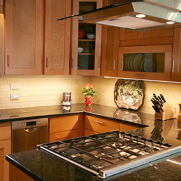
Before this full kitchen expansion/remodel our clients had a very tight, roughly 92 sq./ft. galley kitchen with a standard size door opening at the far left and a single window in the facing wall. The kitchen couldn’t accommodate more than one person comfortably and felt a little dated and dark, even with a large overhead fluorescent fixture. To begin, we doubled the size of the entry into the whole dining room/kitchen area by taking out 3’ of the entryway wall, opening up the space to the rest of the house. We (SWD) knocked out the wall facing the dining room and expanded the kitchen by about 30 sq./ft by moving the stairs to the living room to the right and adding a 2-sided functional peninsula (complete with a range and wine racks) in place of the wall. One end of the peninsula T’s into a counter facing the gorgeous living room view of the surrounding woods. We stretched our design skills to the max to create a design with a significant amount of additional storage cabinets and more conveniently placed all-new appliances, while keeping a very open feel. The natural shaker vertical and stacked horizontal cabinets are contrasted with the dark Verde Peacock granite countertops creating a modern and clean, yet timeless look. The continuous backsplash of khaki glass subway tiles tie the soft and hard elements together. We replaced the dated fluorescent overhead light with an energy efficient LED whose curved glass and stainless steel elements mimic the range hood, and added super-slim dimmable under counter LED lighting. This kitchen now provides our clients with maximum function and style from a size-challenged space.
 Solar Wind Designs
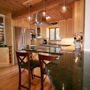
Before this full kitchen expansion/remodel our clients had a very tight, roughly 92 sq./ft. galley kitchen with a standard size door opening at the far left and a single window in the facing wall. The kitchen couldn’t accommodate more than one person comfortably and felt a little dated and dark, even with a large overhead fluorescent fixture. To begin, we doubled the size of the entry into the whole dining room/kitchen area by taking out 3’ of the entryway wall, opening up the space to the rest of the house. We (SWD) knocked out the wall facing the dining room and expanded the kitchen by about 30 sq./ft by moving the stairs to the living room to the right and adding a 2-sided functional peninsula (complete with a range and wine racks) in place of the wall. One end of the peninsula T’s into a counter facing the gorgeous living room view of the surrounding woods. We stretched our design skills to the max to create a design with a significant amount of additional storage cabinets and more conveniently placed all-new appliances, while keeping a very open feel. The natural shaker vertical and stacked horizontal cabinets are contrasted with the dark Verde Peacock granite countertops creating a modern and clean, yet timeless look. The continuous backsplash of khaki glass subway tiles tie the soft and hard elements together. We replaced the dated fluorescent overhead light with an energy efficient LED whose curved glass and stainless steel elements mimic the range hood, and added super-slim dimmable under counter LED lighting. This kitchen now provides our clients with maximum function and style from a size-challenged space.
 Jacobson Construction
From Attic to Awesome
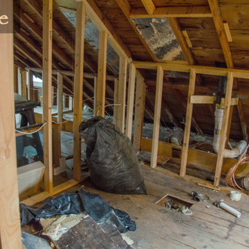
Many of the classic Tudor homes in Minneapolis are defined as 1 ½ stories. The ½ story is actually an attic; a space just below the roof and with a rough floor often used for storage and little more. The owners were looking to turn their attic into about 900 sq. ft. of functional living/bedroom space with a big bath, perfect for hosting overnight guests.
This was a challenging project, considering the plan called for raising the roof and adding two large shed dormers. A structural engineer was consulted, and the appropriate construction measures were taken to address the support necessary from below, passing the required stringent building codes.
The remodeling project took about four months and began with reframing many of the roof support elements and adding closed cell spray foam insulation throughout to make the space warm and watertight during cold Minnesota winters, as well as cool in the summer.
You enter the room using a stairway enclosed with a white railing that offers a feeling of openness while providing a high degree of safety. A short hallway leading to the living area features white cabinets with shaker style flat panel doors – a design element repeated in the bath. Four pairs of South facing windows above the cabinets let in lots of South sunlight all year long.
The 130 sq. ft. bath features soaking tub and open shower room with floor-to-ceiling 2-inch porcelain tiling. The custom heated floor and one wall is constructed using beautiful natural stone. The shower room floor is also the shower’s drain, giving this room an open feeling while providing the ultimate functionality. The other half of the bath consists of a toilet and pedestal sink flanked by two white shaker style cabinets with Granite countertops. A big skylight over the tub and another north facing window brightens this room and highlights the tiling with a shade of green that’s pleasing to the eye.
The rest of the remodeling project is simply a large open living/bedroom space. Perhaps the most interesting feature of the room is the way the roof ties into the ceiling at many angles – a necessity because of the way the home was originally constructed. The before and after photos show how the construction method included the maximum amount of interior space, leaving the room without the “cramped” feeling too often associated with this kind of remodeling project.
Another big feature of this space can be found in the use of skylights. A total of six skylights – in addition to eight South-facing windows – make this area warm and bright during the many months of winter when sunlight in Minnesota comes at a premium.
The main living area offers several flexible design options, with space that can be used with bedroom and/or living room furniture with cozy areas for reading and entertainment. Recessed lighting on dimmers throughout the space balances daylight with room light for just the right atmosphere.
The space is now ready for decorating with original artwork and furnishings. How would you furnish this space?
 Jacobson Construction
From Attic to Awesome
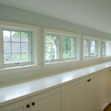
Many of the classic Tudor homes in Minneapolis are defined as 1 ½ stories. The ½ story is actually an attic; a space just below the roof and with a rough floor often used for storage and little more. The owners were looking to turn their attic into about 900 sq. ft. of functional living/bedroom space with a big bath, perfect for hosting overnight guests.
This was a challenging project, considering the plan called for raising the roof and adding two large shed dormers. A structural engineer was consulted, and the appropriate construction measures were taken to address the support necessary from below, passing the required stringent building codes.
The remodeling project took about four months and began with reframing many of the roof support elements and adding closed cell spray foam insulation throughout to make the space warm and watertight during cold Minnesota winters, as well as cool in the summer.
You enter the room using a stairway enclosed with a white railing that offers a feeling of openness while providing a high degree of safety. A short hallway leading to the living area features white cabinets with shaker style flat panel doors – a design element repeated in the bath. Four pairs of South facing windows above the cabinets let in lots of South sunlight all year long.
The 130 sq. ft. bath features soaking tub and open shower room with floor-to-ceiling 2-inch porcelain tiling. The custom heated floor and one wall is constructed using beautiful natural stone. The shower room floor is also the shower’s drain, giving this room an open feeling while providing the ultimate functionality. The other half of the bath consists of a toilet and pedestal sink flanked by two white shaker style cabinets with Granite countertops. A big skylight over the tub and another north facing window brightens this room and highlights the tiling with a shade of green that’s pleasing to the eye.
The rest of the remodeling project is simply a large open living/bedroom space. Perhaps the most interesting feature of the room is the way the roof ties into the ceiling at many angles – a necessity because of the way the home was originally constructed. The before and after photos show how the construction method included the maximum amount of interior space, leaving the room without the “cramped” feeling too often associated with this kind of remodeling project.
Another big feature of this space can be found in the use of skylights. A total of six skylights – in addition to eight South-facing windows – make this area warm and bright during the many months of winter when sunlight in Minnesota comes at a premium.
The main living area offers several flexible design options, with space that can be used with bedroom and/or living room furniture with cozy areas for reading and entertainment. Recessed lighting on dimmers throughout the space balances daylight with room light for just the right atmosphere.
The space is now ready for decorating with original artwork and furnishings. How would you furnish this space?
 ASSEMBLY ARCHITECTURE & BUILD
An award-winning Asheville Home.
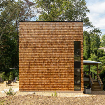
The original plan for this project was much more complex, but due to the site being used as a dumping ground over the decades, the soil was unsuitable for such a design. Our challenge then became to create space that still felt contemporary and comfortable, all while staying small.
As a result, the footprint of the house is modest – 24’ wide by 32’ deep. Rather than using traditional on-site framing, this project used a prefabricated, panelized system, which was a first for the office. This allowed the house to be vertical within a matter of a couple days, but admittedly, required adjustments once installed. It is insulated beyond code requirements and includes high-efficiency mechanical systems, making it net-zero ready. Just add solar panels, and this house can create as much energy as it consumes.
Inside, the project has 3 bedrooms and 1-½ bathrooms. At the entry there is a double-height, plywood clad stairwell, lit by tall windows above the front door. Turning away from the stair on the main level takes you past the first bedroom (or home office) and half bath, and into the living/dining/kitchen space. Windows in this space look out onto the side- and backyard, and strategically avoid views onto the covered deck, which is accessed past the dining area. Upstairs, there are two bedrooms, the full bathroom, and a laundry closet. Skylights punctuate the upper level, bringing sunlight into all areas of the house.
This home is the recipients of two awards from the 2025 WNC Parade of Homes, Including the Silver Craftsmanship award and the Green Innovation Award.
 Solar Wind Designs
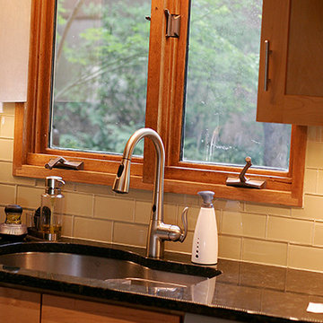
Before this full kitchen expansion/remodel our clients had a very tight, roughly 92 sq./ft. galley kitchen with a standard size door opening at the far left and a single window in the facing wall. The kitchen couldn’t accommodate more than one person comfortably and felt a little dated and dark, even with a large overhead fluorescent fixture. To begin, we doubled the size of the entry into the whole dining room/kitchen area by taking out 3’ of the entryway wall, opening up the space to the rest of the house. We (SWD) knocked out the wall facing the dining room and expanded the kitchen by about 30 sq./ft by moving the stairs to the living room to the right and adding a 2-sided functional peninsula (complete with a range and wine racks) in place of the wall. One end of the peninsula T’s into a counter facing the gorgeous living room view of the surrounding woods. We stretched our design skills to the max to create a design with a significant amount of additional storage cabinets and more conveniently placed all-new appliances, while keeping a very open feel. The natural shaker vertical and stacked horizontal cabinets are contrasted with the dark Verde Peacock granite countertops creating a modern and clean, yet timeless look. The continuous backsplash of khaki glass subway tiles tie the soft and hard elements together. We replaced the dated fluorescent overhead light with an energy efficient LED whose curved glass and stainless steel elements mimic the range hood, and added super-slim dimmable under counter LED lighting. This kitchen now provides our clients with maximum function and style from a size-challenged space.
32