
Search results for "Challenges faced" in Home Design Ideas
 Solar Wind Designs
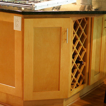
Before this full kitchen expansion/remodel our clients had a very tight, roughly 92 sq./ft. galley kitchen with a standard size door opening at the far left and a single window in the facing wall. The kitchen couldn’t accommodate more than one person comfortably and felt a little dated and dark, even with a large overhead fluorescent fixture. To begin, we doubled the size of the entry into the whole dining room/kitchen area by taking out 3’ of the entryway wall, opening up the space to the rest of the house. We (SWD) knocked out the wall facing the dining room and expanded the kitchen by about 30 sq./ft by moving the stairs to the living room to the right and adding a 2-sided functional peninsula (complete with a range and wine racks) in place of the wall. One end of the peninsula T’s into a counter facing the gorgeous living room view of the surrounding woods. We stretched our design skills to the max to create a design with a significant amount of additional storage cabinets and more conveniently placed all-new appliances, while keeping a very open feel. The natural shaker vertical and stacked horizontal cabinets are contrasted with the dark Verde Peacock granite countertops creating a modern and clean, yet timeless look. The continuous backsplash of khaki glass subway tiles tie the soft and hard elements together. We replaced the dated fluorescent overhead light with an energy efficient LED whose curved glass and stainless steel elements mimic the range hood, and added super-slim dimmable under counter LED lighting. This kitchen now provides our clients with maximum function and style from a size-challenged space.
 Solar Wind Designs
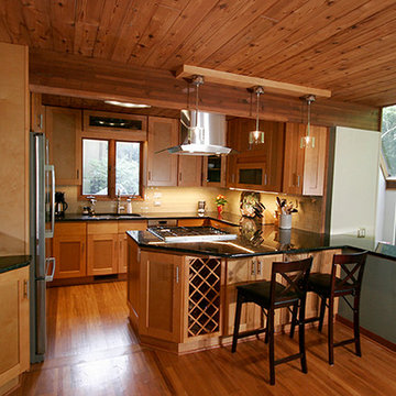
Before this full kitchen expansion/remodel our clients had a very tight, roughly 92 sq./ft. galley kitchen with a standard size door opening at the far left and a single window in the facing wall. The kitchen couldn’t accommodate more than one person comfortably and felt a little dated and dark, even with a large overhead fluorescent fixture. To begin, we doubled the size of the entry into the whole dining room/kitchen area by taking out 3’ of the entryway wall, opening up the space to the rest of the house. We (SWD) knocked out the wall facing the dining room and expanded the kitchen by about 30 sq./ft by moving the stairs to the living room to the right and adding a 2-sided functional peninsula (complete with a range and wine racks) in place of the wall. One end of the peninsula T’s into a counter facing the gorgeous living room view of the surrounding woods. We stretched our design skills to the max to create a design with a significant amount of additional storage cabinets and more conveniently placed all-new appliances, while keeping a very open feel. The natural shaker vertical and stacked horizontal cabinets are contrasted with the dark Verde Peacock granite countertops creating a modern and clean, yet timeless look. The continuous backsplash of khaki glass subway tiles tie the soft and hard elements together. We replaced the dated fluorescent overhead light with an energy efficient LED whose curved glass and stainless steel elements mimic the range hood, and added super-slim dimmable under counter LED lighting. This kitchen now provides our clients with maximum function and style from a size-challenged space.
 Solar Wind Designs
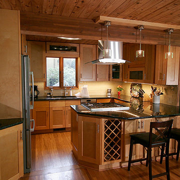
Before this full kitchen expansion/remodel our clients had a very tight, roughly 92 sq./ft. galley kitchen with a standard size door opening at the far left and a single window in the facing wall. The kitchen couldn’t accommodate more than one person comfortably and felt a little dated and dark, even with a large overhead fluorescent fixture. To begin, we doubled the size of the entry into the whole dining room/kitchen area by taking out 3’ of the entryway wall, opening up the space to the rest of the house. We (SWD) knocked out the wall facing the dining room and expanded the kitchen by about 30 sq./ft by moving the stairs to the living room to the right and adding a 2-sided functional peninsula (complete with a range and wine racks) in place of the wall. One end of the peninsula T’s into a counter facing the gorgeous living room view of the surrounding woods. We stretched our design skills to the max to create a design with a significant amount of additional storage cabinets and more conveniently placed all-new appliances, while keeping a very open feel. The natural shaker vertical and stacked horizontal cabinets are contrasted with the dark Verde Peacock granite countertops creating a modern and clean, yet timeless look. The continuous backsplash of khaki glass subway tiles tie the soft and hard elements together. We replaced the dated fluorescent overhead light with an energy efficient LED whose curved glass and stainless steel elements mimic the range hood, and added super-slim dimmable under counter LED lighting. This kitchen now provides our clients with maximum function and style from a size-challenged space.
Find the right local pro for your project
 Art of the Land
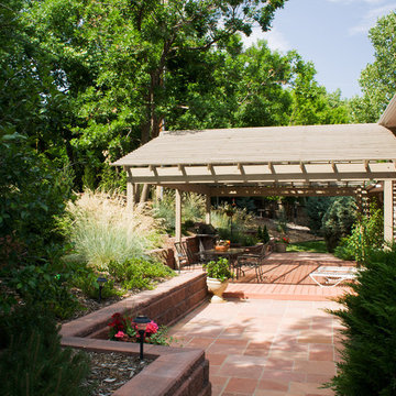
What was once a difficult and hot back yard is now a retreat. The pergola over the main doorway and table area softens the most intense sun and the terraced hill creates intimacy instead of a mowing challenge.
 Jacobson Construction
From Attic to Awesome
Many of the classic Tudor homes in Minneapolis are defined as 1 ½ stories. The ½ story is actually an attic; a space just below the roof and with a rough floor often used for storage and little more. The owners were looking to turn their attic into about 900 sq. ft. of functional living/bedroom space with a big bath, perfect for hosting overnight guests.
This was a challenging project, considering the plan called for raising the roof and adding two large shed dormers. A structural engineer was consulted, and the appropriate construction measures were taken to address the support necessary from below, passing the required stringent building codes.
The remodeling project took about four months and began with reframing many of the roof support elements and adding closed cell spray foam insulation throughout to make the space warm and watertight during cold Minnesota winters, as well as cool in the summer.
You enter the room using a stairway enclosed with a white railing that offers a feeling of openness while providing a high degree of safety. A short hallway leading to the living area features white cabinets with shaker style flat panel doors – a design element repeated in the bath. Four pairs of South facing windows above the cabinets let in lots of South sunlight all year long.
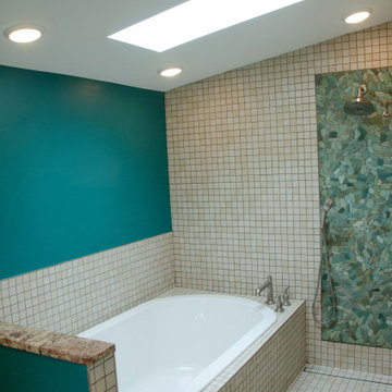
The 130 sq. ft. bath features soaking tub and open shower room with floor-to-ceiling 2-inch porcelain tiling. The custom heated floor and one wall is constructed using beautiful natural stone. The shower room floor is also the shower’s drain, giving this room an open feeling while providing the ultimate functionality. The other half of the bath consists of a toilet and pedestal sink flanked by two white shaker style cabinets with Granite countertops. A big skylight over the tub and another north facing window brightens this room and highlights the tiling with a shade of green that’s pleasing to the eye.
The rest of the remodeling project is simply a large open living/bedroom space. Perhaps the most interesting feature of the room is the way the roof ties into the ceiling at many angles – a necessity because of the way the home was originally constructed. The before and after photos show how the construction method included the maximum amount of interior space, leaving the room without the “cramped” feeling too often associated with this kind of remodeling project.
Another big feature of this space can be found in the use of skylights. A total of six skylights – in addition to eight South-facing windows – make this area warm and bright during the many months of winter when sunlight in Minnesota comes at a premium.
The main living area offers several flexible design options, with space that can be used with bedroom and/or living room furniture with cozy areas for reading and entertainment. Recessed lighting on dimmers throughout the space balances daylight with room light for just the right atmosphere.
The space is now ready for decorating with original artwork and furnishings. How would you furnish this space?
 Catrina's Ranch Interiors
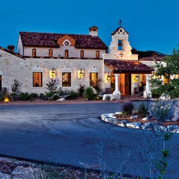
It was in every way, Ramsey says, a once-in-a-lifetime professional and personal experience. “My favorite part of this project was the glow on John and Betty’s faces upon the completion of the hacienda,” she says. “They became not only satisfied clients, but friends for life. It was very challenging but so rewarding.” Helping her and the Martins embrace the home’s challenges was Kendrick, who has been in the design business for more than 40 years. Despite her long career, Kendrick admits to being speechless when she first viewed the ranch’s blueprints and renderings. “The central courtyard had a bell tower over the front entrance gate — a real one,” she says. “The main house had an observation tower that overlooked the dammed-up river and a picturesque view of heaven on earth. There was a magnificent outdoor kitchen off of an enormous porch. This home was to have all the bells and whistles, with unimaginable details, while sparing no expense.”
All three women embraced the challenges of creating the Kemosabe Ranch abode, including designing and building 58 chandeliers and sconces, dozens of custom doors and cabinets, two fully tricked-out kitchens — one inside, one out — and myriad accessories such as candle holders. Regardless of a proposed element’s complexity, like the hammered copper panels in the cabinet doors, Kendrick’s response was the same: “No problem.”
Betty Martin is as apt to talk reverently about all of the craftsmen, contractors and suppliers who worked on her home’s features, from the 10-foot Mexican limestone fountain in the courtyard to the outdoor fossil art wall, as she is to want to bask in the grandeur of the finished project. That’s not surprising, given its scope to rival that of the Taj Mahal. But having been so intimately involved in the process has given her an even greater sense of pride in ownership of her dazzling dwelling. “It’s hard for me to pick out the part of the project that I love the most,” she says.
 Solar Wind Designs
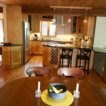
Before this full kitchen expansion/remodel our clients had a very tight, roughly 92 sq./ft. galley kitchen with a standard size door opening at the far left and a single window in the facing wall. The kitchen couldn’t accommodate more than one person comfortably and felt a little dated and dark, even with a large overhead fluorescent fixture. To begin, we doubled the size of the entry into the whole dining room/kitchen area by taking out 3’ of the entryway wall, opening up the space to the rest of the house. We (SWD) knocked out the wall facing the dining room and expanded the kitchen by about 30 sq./ft by moving the stairs to the living room to the right and adding a 2-sided functional peninsula (complete with a range and wine racks) in place of the wall. One end of the peninsula T’s into a counter facing the gorgeous living room view of the surrounding woods. We stretched our design skills to the max to create a design with a significant amount of additional storage cabinets and more conveniently placed all-new appliances, while keeping a very open feel. The natural shaker vertical and stacked horizontal cabinets are contrasted with the dark Verde Peacock granite countertops creating a modern and clean, yet timeless look. The continuous backsplash of khaki glass subway tiles tie the soft and hard elements together. We replaced the dated fluorescent overhead light with an energy efficient LED whose curved glass and stainless steel elements mimic the range hood, and added super-slim dimmable under counter LED lighting. This kitchen now provides our clients with maximum function and style from a size-challenged space.


 Solar Wind Designs
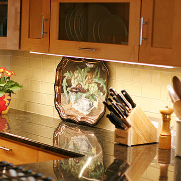
Before this full kitchen expansion/remodel our clients had a very tight, roughly 92 sq./ft. galley kitchen with a standard size door opening at the far left and a single window in the facing wall. The kitchen couldn’t accommodate more than one person comfortably and felt a little dated and dark, even with a large overhead fluorescent fixture. To begin, we doubled the size of the entry into the whole dining room/kitchen area by taking out 3’ of the entryway wall, opening up the space to the rest of the house. We (SWD) knocked out the wall facing the dining room and expanded the kitchen by about 30 sq./ft by moving the stairs to the living room to the right and adding a 2-sided functional peninsula (complete with a range and wine racks) in place of the wall. One end of the peninsula T’s into a counter facing the gorgeous living room view of the surrounding woods. We stretched our design skills to the max to create a design with a significant amount of additional storage cabinets and more conveniently placed all-new appliances, while keeping a very open feel. The natural shaker vertical and stacked horizontal cabinets are contrasted with the dark Verde Peacock granite countertops creating a modern and clean, yet timeless look. The continuous backsplash of khaki glass subway tiles tie the soft and hard elements together. We replaced the dated fluorescent overhead light with an energy efficient LED whose curved glass and stainless steel elements mimic the range hood, and added super-slim dimmable under counter LED lighting. This kitchen now provides our clients with maximum function and style from a size-challenged space.
 Jacobson Construction
From Attic to Awesome
Many of the classic Tudor homes in Minneapolis are defined as 1 ½ stories. The ½ story is actually an attic; a space just below the roof and with a rough floor often used for storage and little more. The owners were looking to turn their attic into about 900 sq. ft. of functional living/bedroom space with a big bath, perfect for hosting overnight guests.
This was a challenging project, considering the plan called for raising the roof and adding two large shed dormers. A structural engineer was consulted, and the appropriate construction measures were taken to address the support necessary from below, passing the required stringent building codes.
The remodeling project took about four months and began with reframing many of the roof support elements and adding closed cell spray foam insulation throughout to make the space warm and watertight during cold Minnesota winters, as well as cool in the summer.
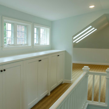
You enter the room using a stairway enclosed with a white railing that offers a feeling of openness while providing a high degree of safety. A short hallway leading to the living area features white cabinets with shaker style flat panel doors – a design element repeated in the bath. Four pairs of South facing windows above the cabinets let in lots of South sunlight all year long.
The 130 sq. ft. bath features soaking tub and open shower room with floor-to-ceiling 2-inch porcelain tiling. The custom heated floor and one wall is constructed using beautiful natural stone. The shower room floor is also the shower’s drain, giving this room an open feeling while providing the ultimate functionality. The other half of the bath consists of a toilet and pedestal sink flanked by two white shaker style cabinets with Granite countertops. A big skylight over the tub and another north facing window brightens this room and highlights the tiling with a shade of green that’s pleasing to the eye.
The rest of the remodeling project is simply a large open living/bedroom space. Perhaps the most interesting feature of the room is the way the roof ties into the ceiling at many angles – a necessity because of the way the home was originally constructed. The before and after photos show how the construction method included the maximum amount of interior space, leaving the room without the “cramped” feeling too often associated with this kind of remodeling project.
Another big feature of this space can be found in the use of skylights. A total of six skylights – in addition to eight South-facing windows – make this area warm and bright during the many months of winter when sunlight in Minnesota comes at a premium.
The main living area offers several flexible design options, with space that can be used with bedroom and/or living room furniture with cozy areas for reading and entertainment. Recessed lighting on dimmers throughout the space balances daylight with room light for just the right atmosphere.
The space is now ready for decorating with original artwork and furnishings. How would you furnish this space?
 Solar Wind Designs
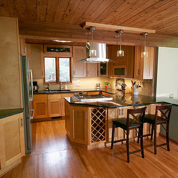
Before this full kitchen expansion/remodel our clients had a very tight, roughly 92 sq./ft. galley kitchen with a standard size door opening at the far left and a single window in the facing wall. The kitchen couldn’t accommodate more than one person comfortably and felt a little dated and dark, even with a large overhead fluorescent fixture. To begin, we doubled the size of the entry into the whole dining room/kitchen area by taking out 3’ of the entryway wall, opening up the space to the rest of the house. We (SWD) knocked out the wall facing the dining room and expanded the kitchen by about 30 sq./ft by moving the stairs to the living room to the right and adding a 2-sided functional peninsula (complete with a range and wine racks) in place of the wall. One end of the peninsula T’s into a counter facing the gorgeous living room view of the surrounding woods. We stretched our design skills to the max to create a design with a significant amount of additional storage cabinets and more conveniently placed all-new appliances, while keeping a very open feel. The natural shaker vertical and stacked horizontal cabinets are contrasted with the dark Verde Peacock granite countertops creating a modern and clean, yet timeless look. The continuous backsplash of khaki glass subway tiles tie the soft and hard elements together. We replaced the dated fluorescent overhead light with an energy efficient LED whose curved glass and stainless steel elements mimic the range hood, and added super-slim dimmable under counter LED lighting. This kitchen now provides our clients with maximum function and style from a size-challenged space.
 Solar Wind Designs
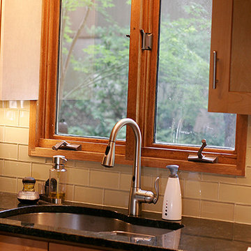
Before this full kitchen expansion/remodel our clients had a very tight, roughly 92 sq./ft. galley kitchen with a standard size door opening at the far left and a single window in the facing wall. The kitchen couldn’t accommodate more than one person comfortably and felt a little dated and dark, even with a large overhead fluorescent fixture. To begin, we doubled the size of the entry into the whole dining room/kitchen area by taking out 3’ of the entryway wall, opening up the space to the rest of the house. We (SWD) knocked out the wall facing the dining room and expanded the kitchen by about 30 sq./ft by moving the stairs to the living room to the right and adding a 2-sided functional peninsula (complete with a range and wine racks) in place of the wall. One end of the peninsula T’s into a counter facing the gorgeous living room view of the surrounding woods. We stretched our design skills to the max to create a design with a significant amount of additional storage cabinets and more conveniently placed all-new appliances, while keeping a very open feel. The natural shaker vertical and stacked horizontal cabinets are contrasted with the dark Verde Peacock granite countertops creating a modern and clean, yet timeless look. The continuous backsplash of khaki glass subway tiles tie the soft and hard elements together. We replaced the dated fluorescent overhead light with an energy efficient LED whose curved glass and stainless steel elements mimic the range hood, and added super-slim dimmable under counter LED lighting. This kitchen now provides our clients with maximum function and style from a size-challenged space.
 Solar Wind Designs
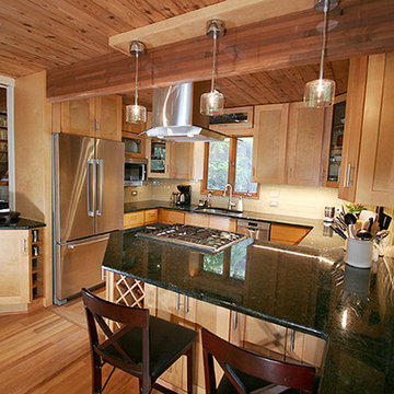
Before this full kitchen expansion/remodel our clients had a very tight, roughly 92 sq./ft. galley kitchen with a standard size door opening at the far left and a single window in the facing wall. The kitchen couldn’t accommodate more than one person comfortably and felt a little dated and dark, even with a large overhead fluorescent fixture. To begin, we doubled the size of the entry into the whole dining room/kitchen area by taking out 3’ of the entryway wall, opening up the space to the rest of the house. We (SWD) knocked out the wall facing the dining room and expanded the kitchen by about 30 sq./ft by moving the stairs to the living room to the right and adding a 2-sided functional peninsula (complete with a range and wine racks) in place of the wall. One end of the peninsula T’s into a counter facing the gorgeous living room view of the surrounding woods. We stretched our design skills to the max to create a design with a significant amount of additional storage cabinets and more conveniently placed all-new appliances, while keeping a very open feel. The natural shaker vertical and stacked horizontal cabinets are contrasted with the dark Verde Peacock granite countertops creating a modern and clean, yet timeless look. The continuous backsplash of khaki glass subway tiles tie the soft and hard elements together. We replaced the dated fluorescent overhead light with an energy efficient LED whose curved glass and stainless steel elements mimic the range hood, and added super-slim dimmable under counter LED lighting. This kitchen now provides our clients with maximum function and style from a size-challenged space.
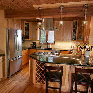 Solar Wind Designs
Before this full kitchen expansion/remodel our clients had a very tight, roughly 92 sq./ft. galley kitchen with a standard size door opening at the far left and a single window in the facing wall. The kitchen couldn’t accommodate more than one person comfortably and felt a little dated and dark, even with a large overhead fluorescent fixture. To begin, we doubled the size of the entry into the whole dining room/kitchen area by taking out 3’ of the entryway wall, opening up the space to the rest of the house. We (SWD) knocked out the wall facing the dining room and expanded the kitchen by about 30 sq./ft by moving the stairs to the living room to the right and adding a 2-sided functional peninsula (complete with a range and wine racks) in place of the wall. One end of the peninsula T’s into a counter facing the gorgeous living room view of the surrounding woods. We stretched our design skills to the max to create a design with a significant amount of additional storage cabinets and more conveniently placed all-new appliances, while keeping a very open feel. The natural shaker vertical and stacked horizontal cabinets are contrasted with the dark Verde Peacock granite countertops creating a modern and clean, yet timeless look. The continuous backsplash of khaki glass subway tiles tie the soft and hard elements together. We replaced the dated fluorescent overhead light with an energy efficient LED whose curved glass and stainless steel elements mimic the range hood, and added super-slim dimmable under counter LED lighting. This kitchen now provides our clients with maximum function and style from a size-challenged space.
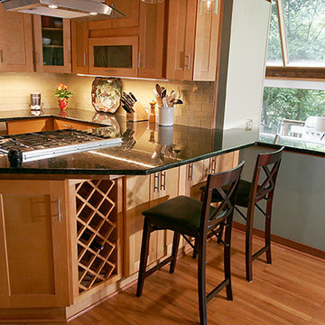 Solar Wind Designs
Before this full kitchen expansion/remodel our clients had a very tight, roughly 92 sq./ft. galley kitchen with a standard size door opening at the far left and a single window in the facing wall. The kitchen couldn’t accommodate more than one person comfortably and felt a little dated and dark, even with a large overhead fluorescent fixture. To begin, we doubled the size of the entry into the whole dining room/kitchen area by taking out 3’ of the entryway wall, opening up the space to the rest of the house. We (SWD) knocked out the wall facing the dining room and expanded the kitchen by about 30 sq./ft by moving the stairs to the living room to the right and adding a 2-sided functional peninsula (complete with a range and wine racks) in place of the wall. One end of the peninsula T’s into a counter facing the gorgeous living room view of the surrounding woods. We stretched our design skills to the max to create a design with a significant amount of additional storage cabinets and more conveniently placed all-new appliances, while keeping a very open feel. The natural shaker vertical and stacked horizontal cabinets are contrasted with the dark Verde Peacock granite countertops creating a modern and clean, yet timeless look. The continuous backsplash of khaki glass subway tiles tie the soft and hard elements together. We replaced the dated fluorescent overhead light with an energy efficient LED whose curved glass and stainless steel elements mimic the range hood, and added super-slim dimmable under counter LED lighting. This kitchen now provides our clients with maximum function and style from a size-challenged space.
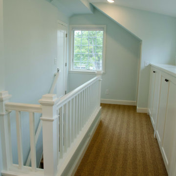 Jacobson Construction
From Attic to Awesome
Many of the classic Tudor homes in Minneapolis are defined as 1 ½ stories. The ½ story is actually an attic; a space just below the roof and with a rough floor often used for storage and little more. The owners were looking to turn their attic into about 900 sq. ft. of functional living/bedroom space with a big bath, perfect for hosting overnight guests.
This was a challenging project, considering the plan called for raising the roof and adding two large shed dormers. A structural engineer was consulted, and the appropriate construction measures were taken to address the support necessary from below, passing the required stringent building codes.
The remodeling project took about four months and began with reframing many of the roof support elements and adding closed cell spray foam insulation throughout to make the space warm and watertight during cold Minnesota winters, as well as cool in the summer.
You enter the room using a stairway enclosed with a white railing that offers a feeling of openness while providing a high degree of safety. A short hallway leading to the living area features white cabinets with shaker style flat panel doors – a design element repeated in the bath. Four pairs of South facing windows above the cabinets let in lots of South sunlight all year long.
The 130 sq. ft. bath features soaking tub and open shower room with floor-to-ceiling 2-inch porcelain tiling. The custom heated floor and one wall is constructed using beautiful natural stone. The shower room floor is also the shower’s drain, giving this room an open feeling while providing the ultimate functionality. The other half of the bath consists of a toilet and pedestal sink flanked by two white shaker style cabinets with Granite countertops. A big skylight over the tub and another north facing window brightens this room and highlights the tiling with a shade of green that’s pleasing to the eye.
The rest of the remodeling project is simply a large open living/bedroom space. Perhaps the most interesting feature of the room is the way the roof ties into the ceiling at many angles – a necessity because of the way the home was originally constructed. The before and after photos show how the construction method included the maximum amount of interior space, leaving the room without the “cramped” feeling too often associated with this kind of remodeling project.
Another big feature of this space can be found in the use of skylights. A total of six skylights – in addition to eight South-facing windows – make this area warm and bright during the many months of winter when sunlight in Minnesota comes at a premium.
The main living area offers several flexible design options, with space that can be used with bedroom and/or living room furniture with cozy areas for reading and entertainment. Recessed lighting on dimmers throughout the space balances daylight with room light for just the right atmosphere.
The space is now ready for decorating with original artwork and furnishings. How would you furnish this space?
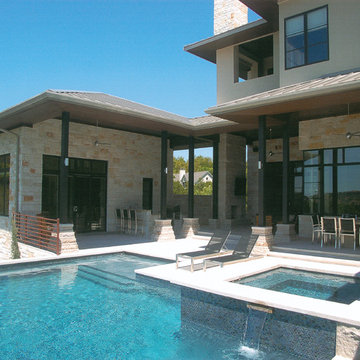
 Natural Stone Institute
The challenge for this project was to find materials that fit into the owners' architectural style, selfentitled "Texas Hill Country Contemporary"; warm and inviting, but also clean and contemporary. The architect and the owners were determined not to copy the typical "Tuscan" style so popular for upscale homes in the Austin area. The main feature of the house is the use of both indoor and outdoor spaces and is designed so that everyday life flows through all of the spaces. The material selections had to be compatible to color schemes inside and out, blending with the local cut stone used on the exterior of the house, but also functional in their application.
Interior flooring: AG&M furnished hone finish Selina Gold limestone tile from Egypt for the majority of ground floor paving. This material has a wide range of color, the selection was made from a particular quarry and a particular layer within that quarry.
Exterior paving, pool coping, fireplace facing: Goldstone granite was chosen because it performs well in exterior applications and has the soft coloring of limestone. The paving and coping is chisel finish and the outdoor fireplace is clad with split face Goldstone to match.
Kitchen countertops: Apollo Storm granite in a polish finish with matching full-height, endmatched backsplash.
 Holthouse Enterprises, LLC
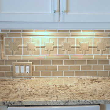
The backsplash was quite a challenge. The hand Made, Hand Glazed Tiles were purchased from Kenwood Tile. When I told them how I didn't want a cut in the Deco Tile, they didn't think it could be done. I then called the manufacturer of the tile and sent the measurements. They said they didn't think it could be done. I brought in the tile setter. He felt it was too difficult.The more everyone said we couldn't do it, the more determined I was to do it! Made the paper patterns for each area. Tom Brown was able to work off my pattern and did a beautiful job of setting the tile!
 Michael Nash Design, Build & Homes
2011 NARI CAPITAL COTY FINALIST AWARD WINNER
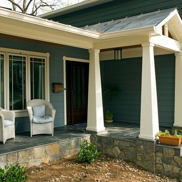
This 1970’s split-level single-family home in an upscale Arlington neighborhood had been neglected for years. With his surrounding neighbors all doing major exterior and interior remodeling, however, the owner decided it was time to renovate his property as well. After several consultation meetings with the design team at Michael Nash Design, Build & Homes, he settled on an exterior layout to create an Art & Craft design for the home.
It all got started by excavating the front and left side of the house and attaching a wrap-around stone porch. Key design attributes include a black metal roof, large tapered columns, blue and grey random style flag stone, beaded stain ceiling paneling and an octagonal seating area on the left side of this porch. The front porch has a wide stairway and another set of stairs leads to the back yard.
All exterior walls of the home were modified with new headers to allow much larger custom-made windows, new front doors garage doors, and French side and back doors. A custom-designed mahogany front door with leaded glass provides more light and offers a wider entrance into the home’s living area.
Design challenges included removing the entire face of the home and then adding new insulation, Tyvek and Hardiplank siding. The use of high-efficiency low-e windows makes the home air tight.
The Arts & Crafts design touches include the front gable over the front porch, the prairie-style grill pattern on the windows and doors, the use of tapered columns sitting over stone columns and the leaded glass front door. Decorative exterior lighting provides the finishing touches to this look.
Inside, custom woodwork, crown molding, custom glass cabinets and interior pillars carry the design. Upon entering the space, visitors face a large partition that separates the living area from a gourmet Arts & Crafts kitchen and dining room.
The home’s signature space, the kitchen offers contrasting dark and light cherry cabinets. Wide plank hard wood floors, exotic granite counters and stainless steel professional-grade appliances make this a kitchen fit for any chef.
 JRP Design & Remodel
Our clients are seasoned home renovators. Their Malibu oceanside property was the second project JRP had undertaken for them. After years of renting and the age of the home, it was becoming prevalent the waterfront beach house, needed a facelift. Our clients expressed their desire for a clean and contemporary aesthetic with the need for more functionality. After a thorough design process, a new spatial plan was essential to meet the couple’s request. This included developing a larger master suite, a grander kitchen with seating at an island, natural light, and a warm, comfortable feel to blend with the coastal setting.
Demolition revealed an unfortunate surprise on the second level of the home: Settlement and subpar construction had allowed the hillside to slide and cover structural framing members causing dangerous living conditions. Our design team was now faced with the challenge of creating a fix for the sagging hillside. After thorough evaluation of site conditions and careful planning, a new 10’ high retaining wall was contrived to be strategically placed into the hillside to prevent any future movements.
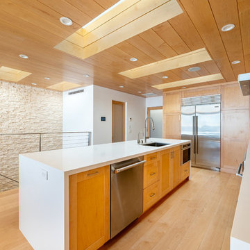
With the wall design and build completed — additional square footage allowed for a new laundry room, a walk-in closet at the master suite. Once small and tucked away, the kitchen now boasts a golden warmth of natural maple cabinetry complimented by a striking center island complete with white quartz countertops and stunning waterfall edge details. The open floor plan encourages entertaining with an organic flow between the kitchen, dining, and living rooms. New skylights flood the space with natural light, creating a tranquil seaside ambiance. New custom maple flooring and ceiling paneling finish out the first floor.
Downstairs, the ocean facing Master Suite is luminous with breathtaking views and an enviable bathroom oasis. The master bath is modern and serene, woodgrain tile flooring and stunning onyx mosaic tile channel the golden sandy Malibu beaches. The minimalist bathroom includes a generous walk-in closet, his & her sinks, a spacious steam shower, and a luxurious soaking tub. Defined by an airy and spacious floor plan, clean lines, natural light, and endless ocean views, this home is the perfect rendition of a contemporary coastal sanctuary.
PROJECT DETAILS:
• Style: Contemporary
• Colors: White, Beige, Yellow Hues
• Countertops: White Ceasarstone Quartz
• Cabinets: Bellmont Natural finish maple; Shaker style
• Hardware/Plumbing Fixture Finish: Polished Chrome
• Lighting Fixtures: Pendent lighting in Master bedroom, all else recessed
• Flooring:
Hardwood - Natural Maple
Tile – Ann Sacks, Porcelain in Yellow Birch
• Tile/Backsplash: Glass mosaic in kitchen
• Other Details: Bellevue Stand Alone Tub
Photographer: Andrew, Open House VC
 AV Architects + Builders
AV Architects + Builders
Location: Tysons, VA, USA
The Home for Life project was customized around our client’s lifestyle so that he could enjoy the home for many years to come. Designed with empty nesters and baby boomers in mind, our custom design used a different approach to the disparity of square footage on each floor.
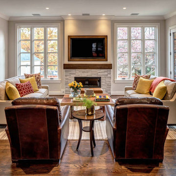
The main level measures out at 2,300 square feet while the lower and upper levels of the home measure out at 1000 square feet each, respectively. The open floor plan of the main level features a master suite and master bath, personal office, kitchen and dining areas, and a two-car garage that opens to a mudroom and laundry room. The upper level features two generously sized en-suite bedrooms while the lower level features an extra guest room with a full bath and an exercise/rec room. The backyard offers 800 square feet of travertine patio with an elegant outdoor kitchen, while the front entry has a covered 300 square foot porch with custom landscape lighting.
The biggest challenge of the project was dealing with the size of the lot, measuring only a ¼ acre. Because the majority of square footage was dedicated to the main floor, we had to make sure that the main rooms had plenty of natural lighting. Our solution was to place the public spaces (Great room and outdoor patio) facing south, and the more private spaces (Bedrooms) facing north.
The common misconception with small homes is that they cannot factor in everything the homeowner wants. With our custom design, we created an open concept space that features all the amenities of a luxury lifestyle in a home measuring a total of 4300 square feet.
Jim Tetro Architectural Photography
33