
Search results for "Character modification" in Home Design Ideas
 Arani Construction
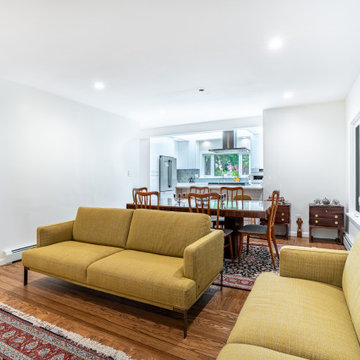
This photo illustrates the open concept relationship between the living room, dining area, and kitchen following a full house renovation completed by Arani Construction Inc. in the Kerrisdale neighbourhood of Vancouver. Prior to renovation, interior walls separated these areas, creating smaller and more compartmentalized rooms.
During the renovation, structural walls were removed and engineered beams were installed to support the building loads while opening the entire main floor. This structural modification created a continuous layout extending from the living room seating area through the dining space and into the kitchen.
The original hardwood flooring was professionally resurfaced and refinished, restoring the wood grain while maintaining the home’s character. New recessed ceiling pot lights were installed to provide balanced illumination across the expanded space. The result is a bright and cohesive main floor environment designed for modern open living.
 Infinite Home
A Kitchen Made for Gathering
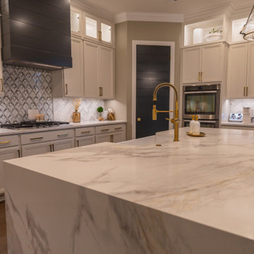
The kitchen was already a well-loved space, so instead of starting from scratch, we gave it a thoughtful refresh by refinishing the existing cabinets, making a few modifications, and updating the color for a fresh, elevated look. To add extra dimension and warmth, we installed cubbies with LED lighting above the cabinets; this not only served to give the space some visual variety but also helped open the space up and give it a more airy feeling when you walk in. The island was expanded to create more space for gathering. To tie it all together, we paired the perfect countertop stone with a mosaic backsplash that adds timeless character.
 Soucie Horner, Ltd.
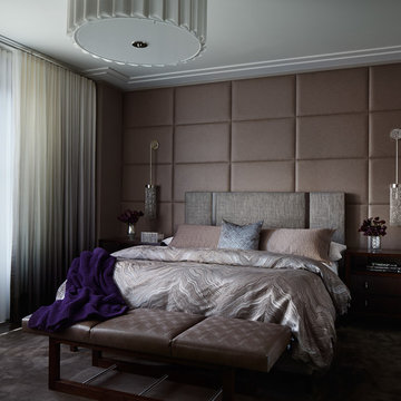
Glamorous. Refined. Luxurious. Kid-friendly? Indeed! In fact, this Michigan Avenue weekend retreat is home-away-from-home for a family of six, including four young children. Still, serenity and sophistication reign, thanks to a rich array of shimmering, shining, glossy, glassy surfaces, from subtly patterned fabrics that disguise peanut butter and jelly fingerprints to luminous accents that cast an urbane glow as the sunsets over the Lake Michigan sky. Mostly-neutral interiors are energized by strategic pops of color; custom architectural embellishments infuse additional character. Floor plan modifications ensure expansive sightlines throughout, and accentuate skyline views.
Find the right local pro for your project
 Sativa McGee Designs
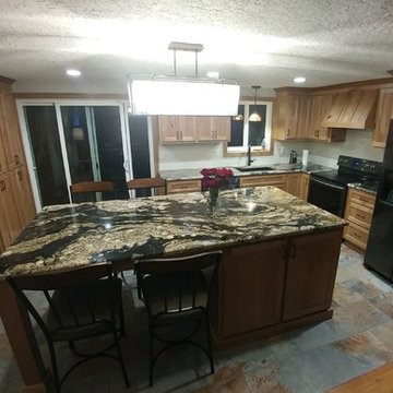
Kitchen Renovation: layout modification and aesthetic upgrades.
Cabinets: Rustic Cherry Natural
Counter tops: Golden Supreme Granite
Back splash: Rittenhouse square bisquit
Appliances: Samsung Black Stainless
This was a traditional ranch style home with a small kitchen that lacked counter top space and had a cramped dining room that blocked access to the garage and back patio. The renovation focused on creating better flow, opening up the walkways, increasing storage and was upgraded to our aesthetic taste.
The island incorporates dining seating for up to 5 while also providing storage for the Microwave, Trash/Recycling and Storage for dog food/board games. We designed a custom hood surround to fit within our limited ceiling height. This simple design added character and visual interest to a simple space plan. Full height pantry storage was added on the end of the kitchen by the patio doors, leaving just enough room before the garage door for the dog food bowls.
Electrical was upgraded for the whole space, going from 2 outlets in the kitchen to 7 has increased the usability of the space. A USB outlet was added to the end of the island so that people can charge their phones. Prior to the renovation there was a lack of lighting, we added can lights and an island pendant to increase visibility for prep.
 Gardner Architects LLC
Photography by Ken Wyner
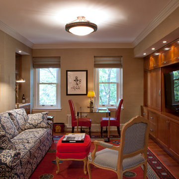
2101 Connecticut Avenue (c.1928), an 8-story brick and limestone Beaux Arts style building with spacious apartments, is said to have been “the finest apartment house to appear in Washington between the two World Wars.” (James M. Goode, Best Addresses, 1988.) As advertised for rent in 1928, the apartments were designed “to incorporate many details that would aid the residents in establishing a home atmosphere, one possessing charm and dignity usually found only in a private house… the character and tenancy (being) assured through careful selection of guests.” Home to Senators, Ambassadors, a Vice President and a Supreme Court Justice as well as numerous Washington socialites, the building still stands as one of the undisputed “best addresses” in Washington, DC.)
So well laid-out was this gracious 3,000 sf apartment that the basic floor plan remains unchanged from the original architect’s 1927 design. The organizing feature was, and continues to be, the grand “gallery” space in the center of the unit. Every room in the apartment can be accessed via the gallery, thus preserving it as the centerpiece of the “charm and dignity” which the original design intended. Programmatic modifications consisted of the addition of a small powder room off of the foyer, and the conversion of a corner “sun room” into a room for meditation and study. The apartment received a thorough updating of all systems, services and finishes, including a new kitchen and new bathrooms, several new built-in cabinetry units, and the consolidation of numerous small closets and passageways into more accessible and efficient storage spaces.
 European Kitchen Design
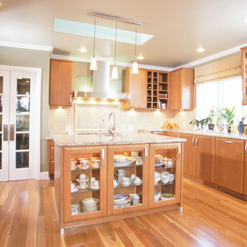
This house was never remodeled since it was built, so the remodeling scale had went through the entire house, including the kitchen. The house has a modern elegant architecture character, and therefore the decision to use the Alno Soft in the wood veneer cherry color was the right fit to emphasize this look. This door style has also soft curved corners, and the combination of the cherry wood floors had given the right balance and made the kitchen more of a furniture look.
Door Style Finish: Alno Soft, Wood veneer door style, in the natural cherry color finish.
 Infinite Home
A Kitchen Made for Gathering
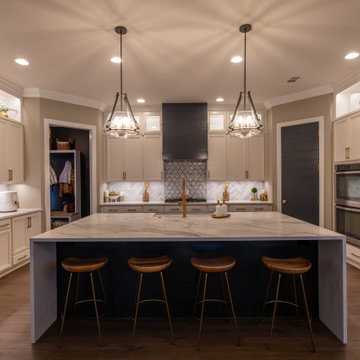
The kitchen was already a well-loved space, so instead of starting from scratch, we gave it a thoughtful refresh by refinishing the existing cabinets, making a few modifications, and updating the color for a fresh, elevated look. To add extra dimension and warmth, we installed cubbies with LED lighting above the cabinets; this not only served to give the space some visual variety but also helped open the space up and give it a more airy feeling when you walk in. The island was expanded to create more space for gathering. To tie it all together, we paired the perfect countertop stone with a mosaic backsplash that adds timeless character.
 Infinite Home
A Kitchen Made for Gathering
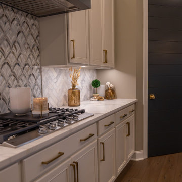
The kitchen was already a well-loved space, so instead of starting from scratch, we gave it a thoughtful refresh by refinishing the existing cabinets, making a few modifications, and updating the color for a fresh, elevated look. To add extra dimension and warmth, we installed cubbies with LED lighting above the cabinets; this not only served to give the space some visual variety but also helped open the space up and give it a more airy feeling when you walk in. The island was expanded to create more space for gathering. To tie it all together, we paired the perfect countertop stone with a mosaic backsplash that adds timeless character.
 Gardner Architects LLC
Photography by Ken Wyner
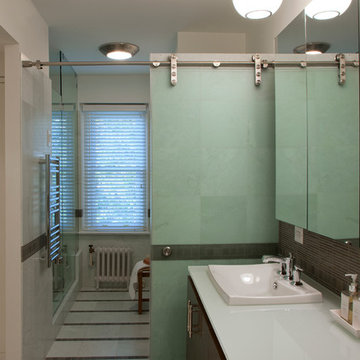
2101 Connecticut Avenue (c.1928), an 8-story brick and limestone Beaux Arts style building with spacious apartments, is said to have been “the finest apartment house to appear in Washington between the two World Wars.” (James M. Goode, Best Addresses, 1988.) As advertised for rent in 1928, the apartments were designed “to incorporate many details that would aid the residents in establishing a home atmosphere, one possessing charm and dignity usually found only in a private house… the character and tenancy (being) assured through careful selection of guests.” Home to Senators, Ambassadors, a Vice President and a Supreme Court Justice as well as numerous Washington socialites, the building still stands as one of the undisputed “best addresses” in Washington, DC.)
So well laid-out was this gracious 3,000 sf apartment that the basic floor plan remains unchanged from the original architect’s 1927 design. The organizing feature was, and continues to be, the grand “gallery” space in the center of the unit. Every room in the apartment can be accessed via the gallery, thus preserving it as the centerpiece of the “charm and dignity” which the original design intended. Programmatic modifications consisted of the addition of a small powder room off of the foyer, and the conversion of a corner “sun room” into a room for meditation and study. The apartment received a thorough updating of all systems, services and finishes, including a new kitchen and new bathrooms, several new built-in cabinetry units, and the consolidation of numerous small closets and passageways into more accessible and efficient storage spaces.
 SV Design
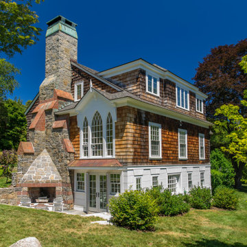
The owners of this 1941 cottage, located in the bucolic village of Annisquam, wanted to modernize the home without sacrificing its earthy wood and stone feel. Recognizing that the house had “good bones” and loads of charm, SV Design proposed exterior and interior modifications to improve functionality, and bring the home in line with the owners’ lifestyle. The design vision that evolved was a balance of modern and traditional – a study in contrasts.
Prior to renovation, the dining and breakfast rooms were cut off from one another as well as from the kitchen’s preparation area. SV's architectural team developed a plan to rebuild a new kitchen/dining area within the same footprint. Now the space extends from the dining room, through the spacious and light-filled kitchen with eat-in nook, out to a peaceful and secluded patio.
Interior renovations also included a new stair and balustrade at the entry; a new bathroom, office, and closet for the master suite; and renovations to bathrooms and the family room. The interior color palette was lightened and refreshed throughout. Working in close collaboration with the homeowners, new lighting and plumbing fixtures were selected to add modern accents to the home's traditional charm.
 Wheelhouse Construction
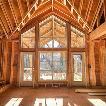
Originally a classic floor plan, the owner—an engineer—made significant modifications to ensure ample space for four children, homeschooling, and a dedicated work-from-home office.
Wheelhouse Construction cleared and milled the land, carefully utilizing a significant portion of the milled beams for the porches. Inside, architectural-grade glulam beams were installed, allowing for an exposed, vaulted ceiling that enhances the home's warmth and character.
 Re:Vision Architecture
Prior to its complete transformation, the Carversville Farmhouse had a dark, cave-like feel with low ceilings, cramped spaces, and crumbling surfaces. And yet, there were elements of charm in the 1850s farmhouse that were worth saving. In addition, the property was under an agricultural easement that prevented modification of the building footprint. So, Re:Vision set to work with what ‘should’ be saved, and what ‘needed’ to be. Using Passive House building principles, continuous insulation was added to the building exterior which was then re-clad. Major moves on the interior included resetting floor locations to add head height, and removing an attic to make a vaulted ceiling. Wood from the floors and log cabin addition were re-purposed for architectural woodwork on the interior; stone walls were also salvaged for re-use. An existing fireplace was restored and made into a center point by creating circulation around it, and by featuring a previously hidden massive wood lintel. The resulting building evokes warmth in materials and character while remaining thoroughly modern in its openness, lightness, and energy efficiency.
Photo Credit: Re:Vision Architecture
 Infinite Home
A Kitchen Made for Gathering
The kitchen was already a well-loved space, so instead of starting from scratch, we gave it a thoughtful refresh by refinishing the existing cabinets, making a few modifications, and updating the color for a fresh, elevated look. To add extra dimension and warmth, we installed cubbies with LED lighting above the cabinets; this not only served to give the space some visual variety but also helped open the space up and give it a more airy feeling when you walk in. The island was expanded to create more space for gathering. To tie it all together, we paired the perfect countertop stone with a mosaic backsplash that adds timeless character.
 Moto Designshop
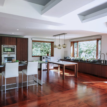
Over the years, this Gladwyne home suffered numerous piecemeal renovations and modifications, and was in dire need of a cohesive vision. Seeing past this, the new owners purchased the property because of the home’s unique siting on the land. Abutting the eastern property line, they noticed the potential of a proper renovation which would unify the home and create expansive views across the 2 acre site to the west.
Our office was commissioned to create a cohesive design which emphasized these ideas. This completed master bedroom and bathroom suite, marks the end of the first renovation phase. The master suite was expanded and focused around a new 16’ window overlooking the property. The bed is flanked at both sides with a sitting area and custom casework. The perpendicular floor boards define the space and pull the eye into the closet/bath. A composition of reflections distort boundaries, pulling outside inward and provide an evolving seasonal experience.
For the lower floor renovation, the client requested the removal of all dividing walls to make the space as visually open as possible. To do this, the entire 2nd floor was temporarily propped up while the 1st floor structure was removed and a strategically designed new structural steel frame system was installed. The remaining central bearing wall also stabilizes the custom stair treads while the guardrails suspend the opposite end from the ceiling. The floor to ceiling glazing opens the views of the sprawling grounds and provides a casual sitting area. A sliding bright red wall divides the office / family room area and the rough sawn wood cabinetry maintain a handmade warm character to the contemporary design.
 Glass Vibes Studio
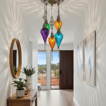
Introduce a mesmerizing focal point to your space with the "Chromatic Balance" Pendant collection. Each fixture is a unique labor of love, featuring hand-blown glass and handcrafted genuine brass elements. This commitment to artisanal quality ensures every piece carries a distinct character and enduring value. We offer comprehensive customization: you can select the glass colors and the finish of the brass hardware to perfectly match your interior palette. Our design maintains visual harmony through proportional sizing: the glass element's diameter (D) is scaled 1:2 to its total length (L) (e.g., 15 cm Diameter pairs with 30 cm Length).
Key Features & Customization:
Artisanal Quality: Constructed from hand-blown glass and hand-fabricated brass.
Color & Finish Customization: Available with custom glass colors and custom brass finishes.
Proportional Sizing: Diameter is scaled 1:2 to the total length (D 15cm = L 30cm, and so on).
Mounting Plate: Circular/Oval Ceiling Plate, 40 cm (15.7 inches) diameter/length.
Maximum Drop Length: The longest available drop is 60 cm (23.6 inches) from the ceiling.
Available Dimensions (Example Proportional Set):
D 15 cm (5.9 in) / L 30 cm (11.8 in)
Important Note: We use only genuine, premium materials. We welcome any further customization or modification requests for the design, materials, or dimensions. Please contact us to discuss the details.
 Infinite Home
A Kitchen Made for Gathering
The kitchen was already a well-loved space, so instead of starting from scratch, we gave it a thoughtful refresh by refinishing the existing cabinets, making a few modifications, and updating the color for a fresh, elevated look. To add extra dimension and warmth, we installed cubbies with LED lighting above the cabinets; this not only served to give the space some visual variety but also helped open the space up and give it a more airy feeling when you walk in. The island was expanded to create more space for gathering. To tie it all together, we paired the perfect countertop stone with a mosaic backsplash that adds timeless character.
 Gardner Architects LLC
Photography by Ken Wyner
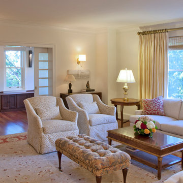
2101 Connecticut Avenue (c.1928), an 8-story brick and limestone Beaux Arts style building with spacious apartments, is said to have been “the finest apartment house to appear in Washington between the two World Wars.” (James M. Goode, Best Addresses, 1988.) As advertised for rent in 1928, the apartments were designed “to incorporate many details that would aid the residents in establishing a home atmosphere, one possessing charm and dignity usually found only in a private house… the character and tenancy (being) assured through careful selection of guests.” Home to Senators, Ambassadors, a Vice President and a Supreme Court Justice as well as numerous Washington socialites, the building still stands as one of the undisputed “best addresses” in Washington, DC.)
So well laid-out was this gracious 3,000 sf apartment that the basic floor plan remains unchanged from the original architect’s 1927 design. The organizing feature was, and continues to be, the grand “gallery” space in the center of the unit. Every room in the apartment can be accessed via the gallery, thus preserving it as the centerpiece of the “charm and dignity” which the original design intended. Programmatic modifications consisted of the addition of a small powder room off of the foyer, and the conversion of a corner “sun room” into a room for meditation and study. The apartment received a thorough updating of all systems, services and finishes, including a new kitchen and new bathrooms, several new built-in cabinetry units, and the consolidation of numerous small closets and passageways into more accessible and efficient storage spaces.
 Infinite Home
A Kitchen Made for Gathering
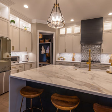
The kitchen was already a well-loved space, so instead of starting from scratch, we gave it a thoughtful refresh by refinishing the existing cabinets, making a few modifications, and updating the color for a fresh, elevated look. To add extra dimension and warmth, we installed cubbies with LED lighting above the cabinets; this not only served to give the space some visual variety but also helped open the space up and give it a more airy feeling when you walk in. The island was expanded to create more space for gathering. To tie it all together, we paired the perfect countertop stone with a mosaic backsplash that adds timeless character.
 G Michael's Restoration
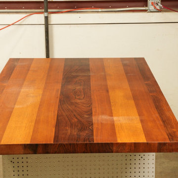
This dining table features a wide-plank butcher-block style top constructed from alternating strips of multiple wood species. The species present include a dense, dark-grained exotic wood alongside lighter, warm-toned domestic species, producing a strong visual rhythm of contrasting tones and grain patterns across the full surface. The table includes a leaf extension mechanism.
Scope of Work:
Surface Preparation - The tabletop was prepared through careful sanding across the full surface, working with the grain of multiple species simultaneously. Multi-species surfaces require particular attention during sanding as different species have varying hardness and respond differently to abrasion, requiring a measured approach to achieve a level, consistent surface across all materials.
Finish Application - A clear finish was applied to protect the surface while preserving the full visual contrast and grain character of the different wood species. The finish strategy for a multi-species top prioritizes clarity and depth rather than color modification, allowing each species to read at its natural tone under the finish coat.
The completed surface presents strong tonal contrast between species with grain detail fully visible throughout. G. Michaels Restoration handles table refinishing and surface restoration for wood pieces of all types throughout Fort Collins and the greater Denver area.
11